All posts by Carolina V Gentry

A Tour of Carolina Gentry’s Dallas Home

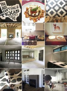
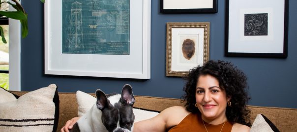
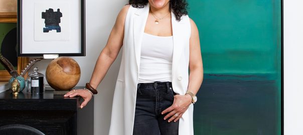
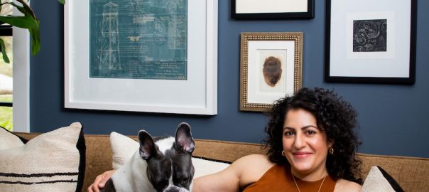
One of the most popular features in any design magazine is when an interior designer showcases a tour of their own home. People – our clients included – love to see what’s behind the door at a designers’ house. It’s an inside peek at how the professionals live! So we’ve asked Pulp co-founder Carolina Gentry to take us on a tour of her gorgeous Dallas home, along with some of her best design tips.
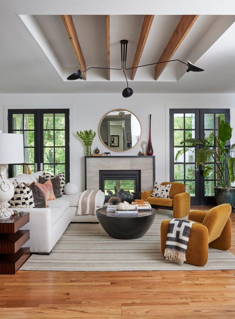
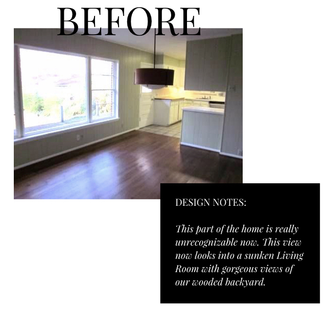
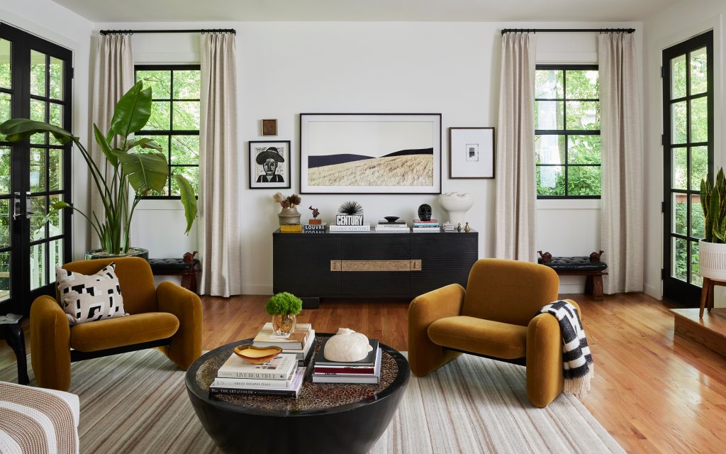
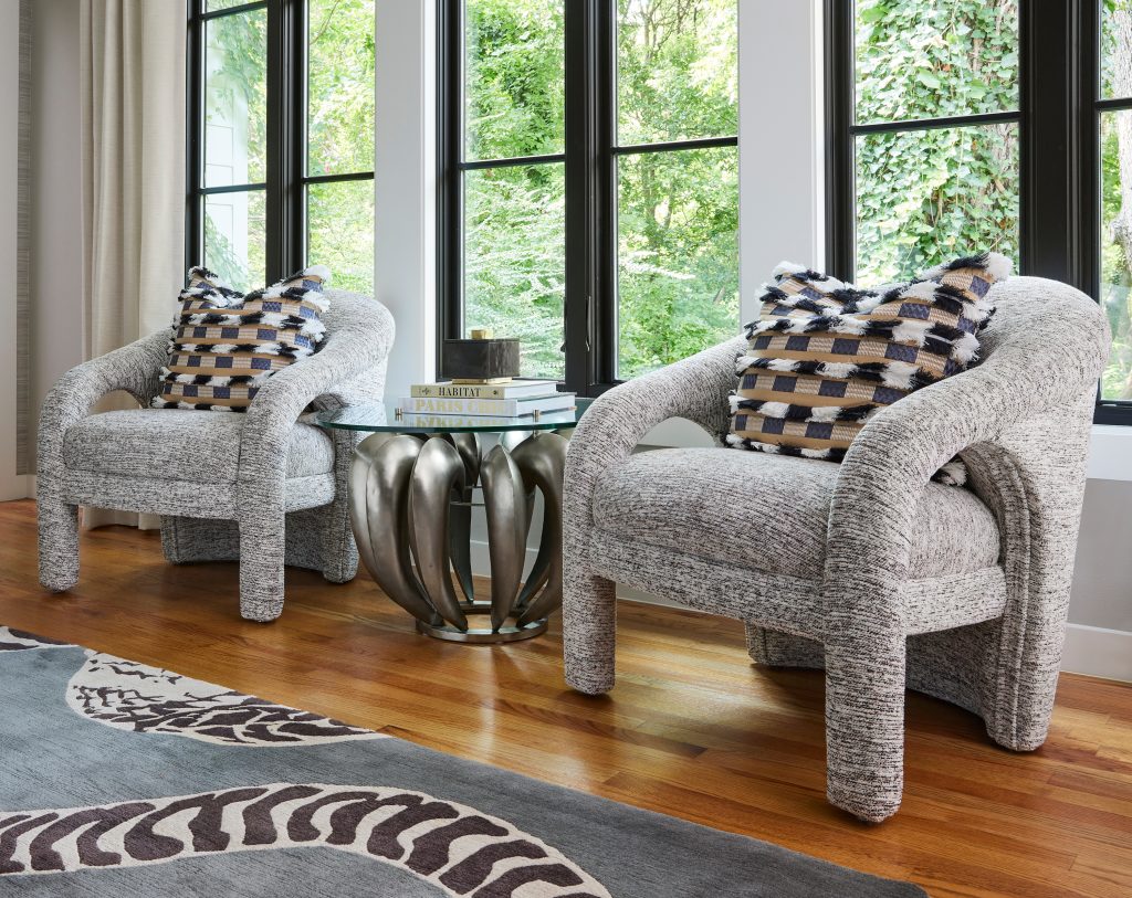
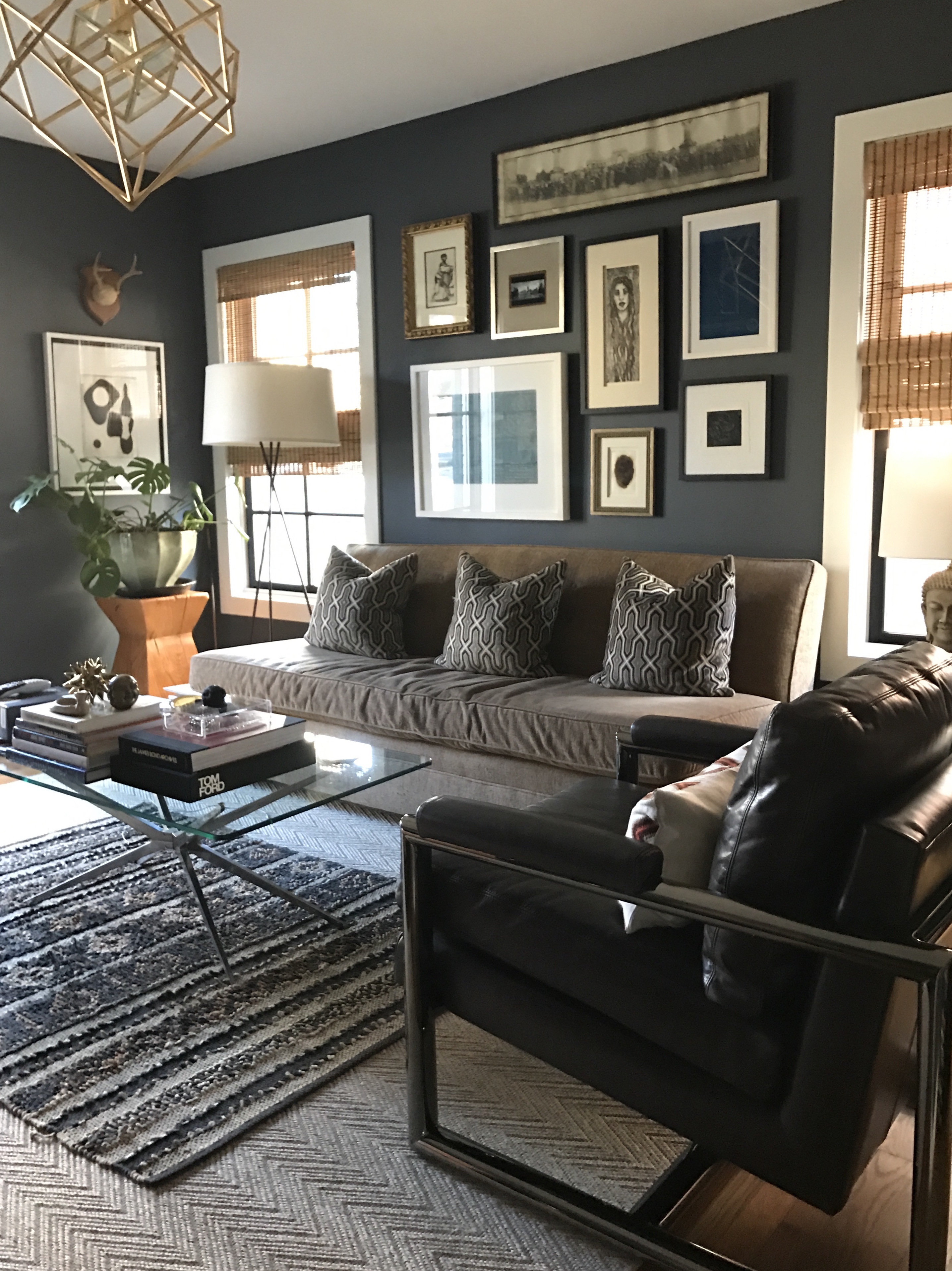
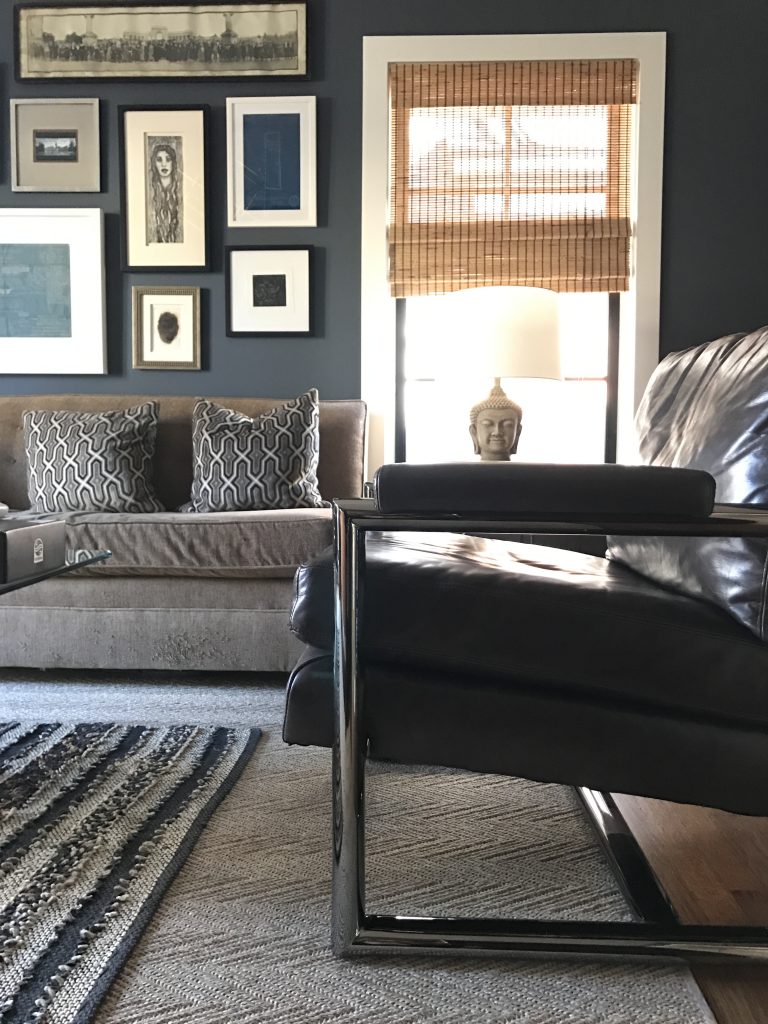
The Living Room

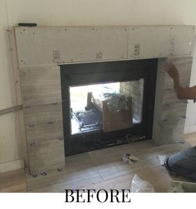
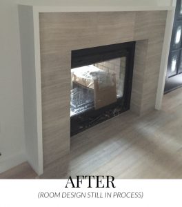
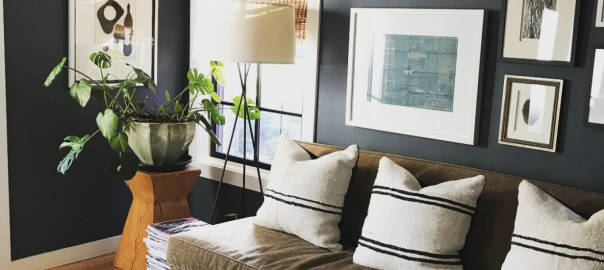
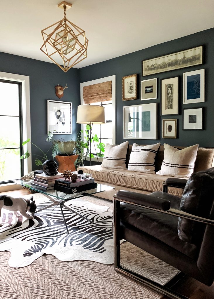
“What I love most about our living room is the feeling of an indoor/outdoor space,” Carolina says. “This house had been in my husband’s family for decades. It was originally built in 1953 by his grandparents and it’s where his mother grew up. It took us nearly three years to design plans, obtain permits, wade through conservation approvals, and eventually execute our own vision for the space. But now this is definitely our dream home!” Incredible detail: The indoor/outdoor fireplace that can be accessed from the living room or the porch. The surround was created with Daltile.
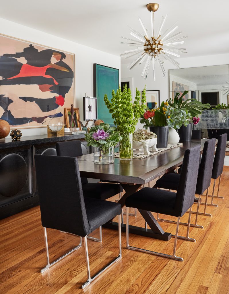
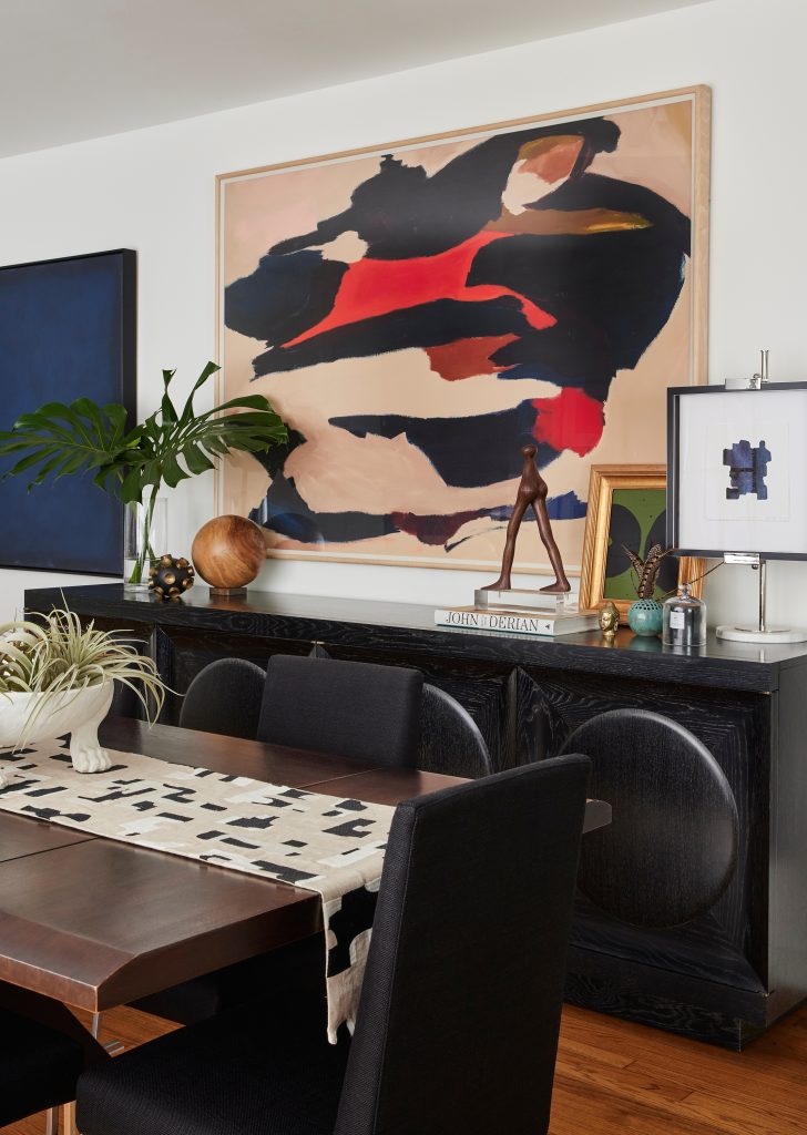
The Dining Room

“While we aren’t having a lot of people over right now, this room is perfect for celebrations and dinners with friends and family,” Carolina says. “I added a mirror at one end from Julian Chichester to create a feeling of space, and it also helps to bounce the light around from the windows or that lovely Arteriors chandelier. One of my favorite pieces in the room is the Century sideboard – you can’t have too much storage in a dining room!” Incredible detail: The layered approach to art in the room – a Pulp signature look.
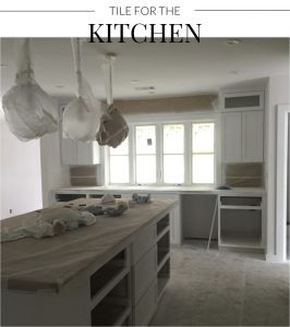
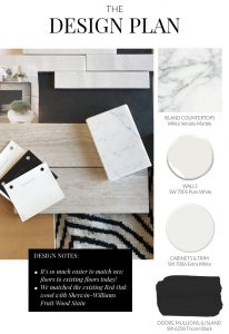
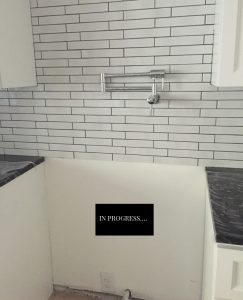
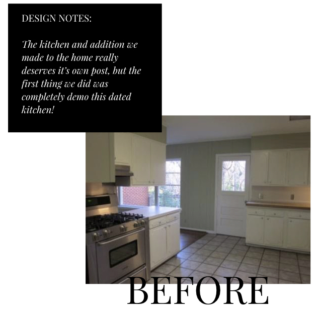
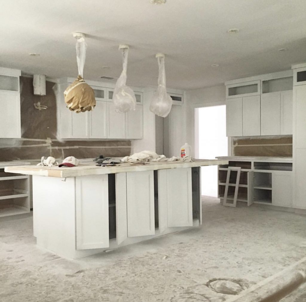
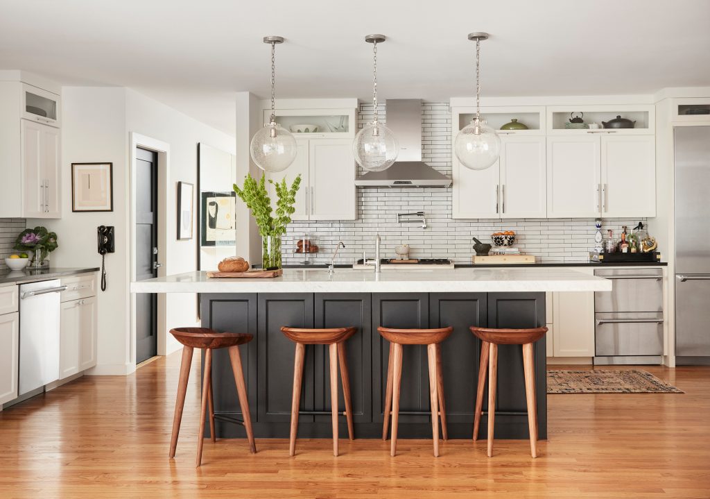
The Kitchen

Carolina: “The kitchen took on the largest transformation… If you know me at all, you know I am a huge lover of food! We are major cooks and we love to entertain (when it isn’t a pandemic). We have had so many holiday gatherings in our home and the kitchen is the center of that. This is the most important room in the home and had to be the largest.  And, since we lived in a loft for so many years, the open concept was really important to us.” Appliances are by Thermador and the pendants are from Visual Comfort. Incredible detail: The darker color on the island that “grounds” the look. It’s Sherwin-Williams Tricorn.
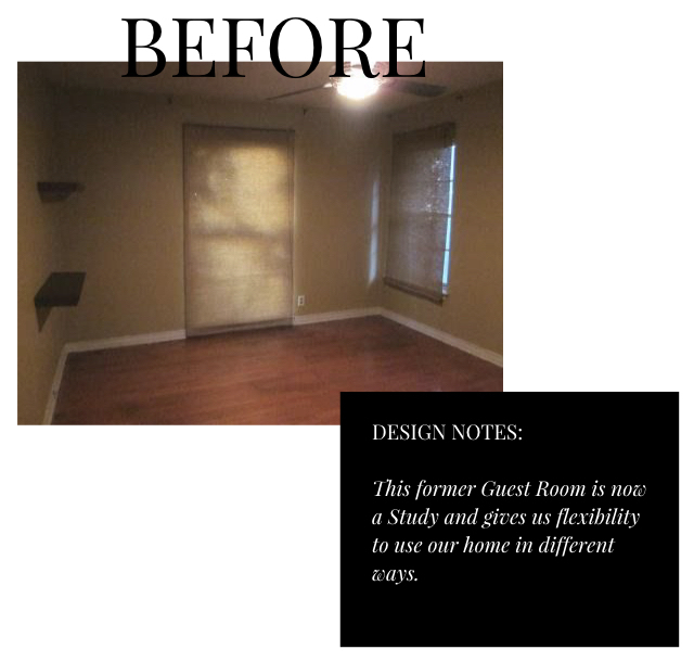
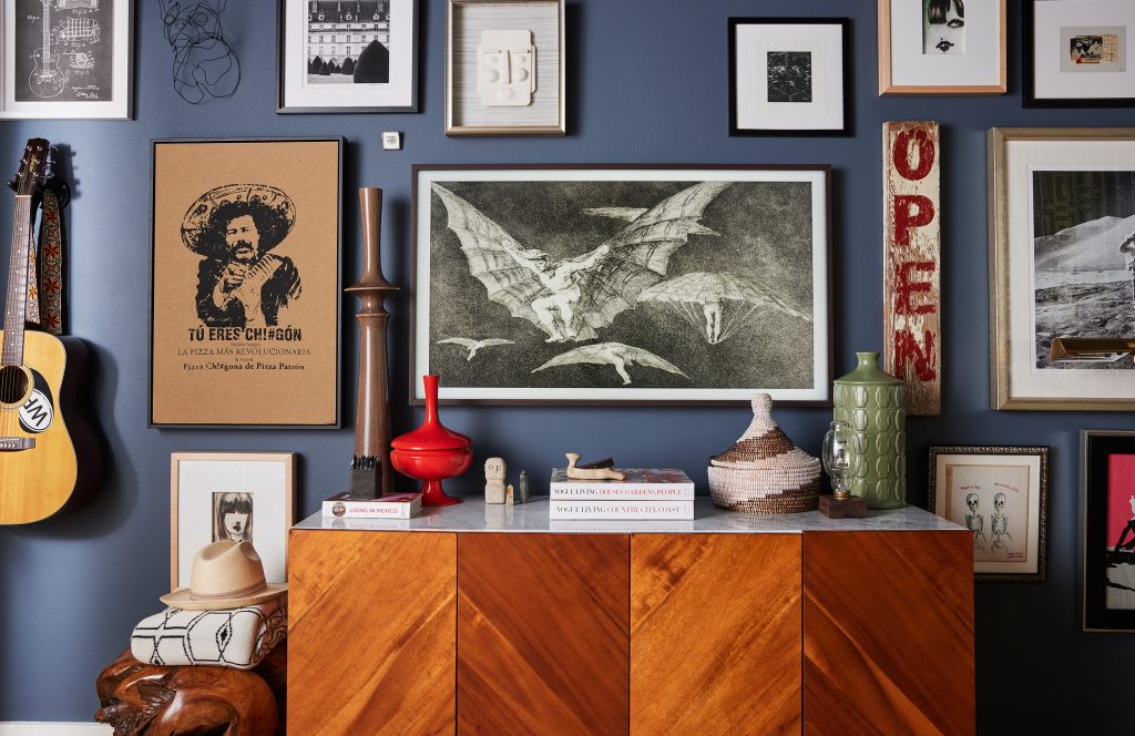
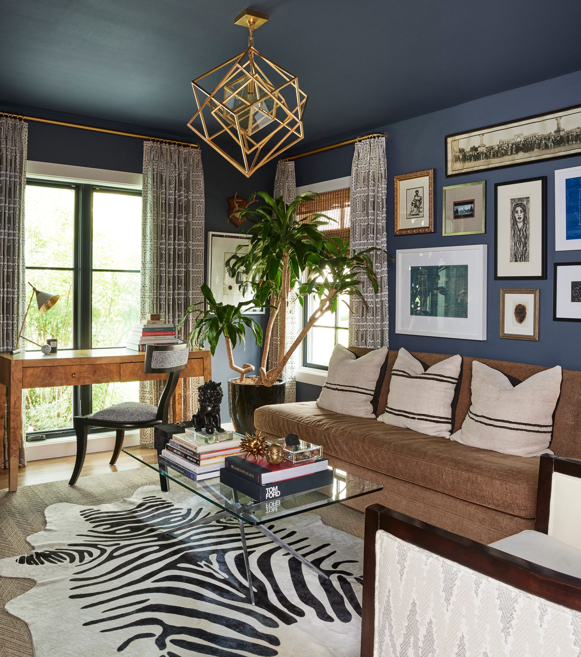
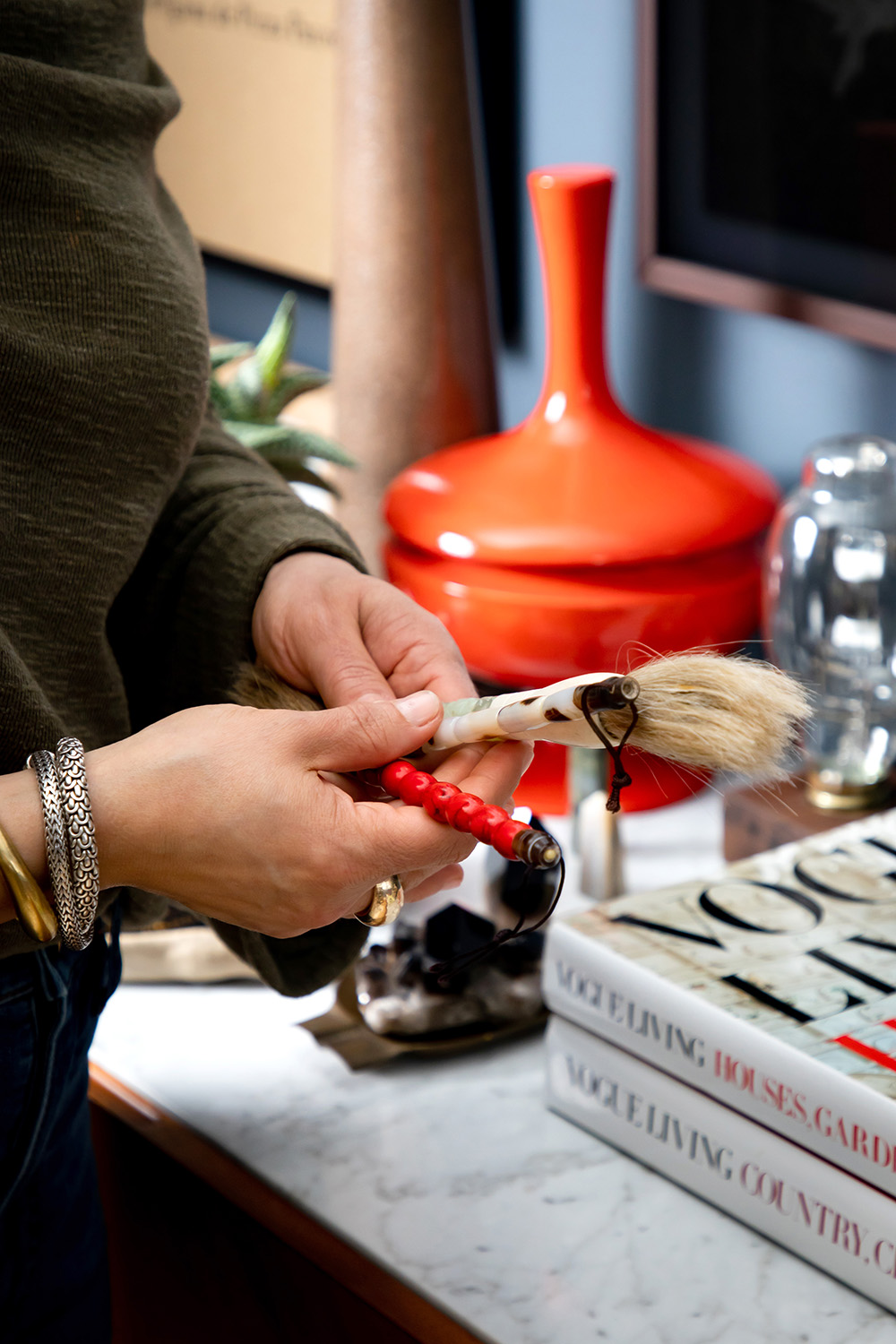
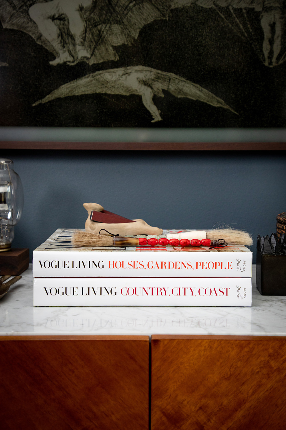
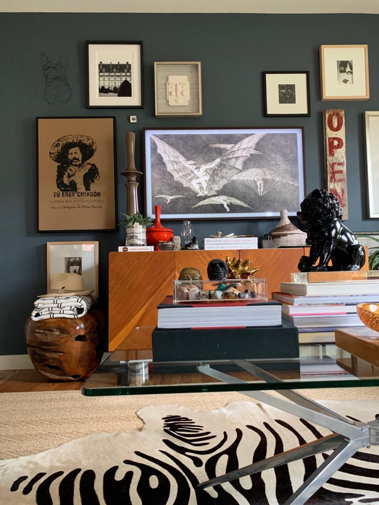
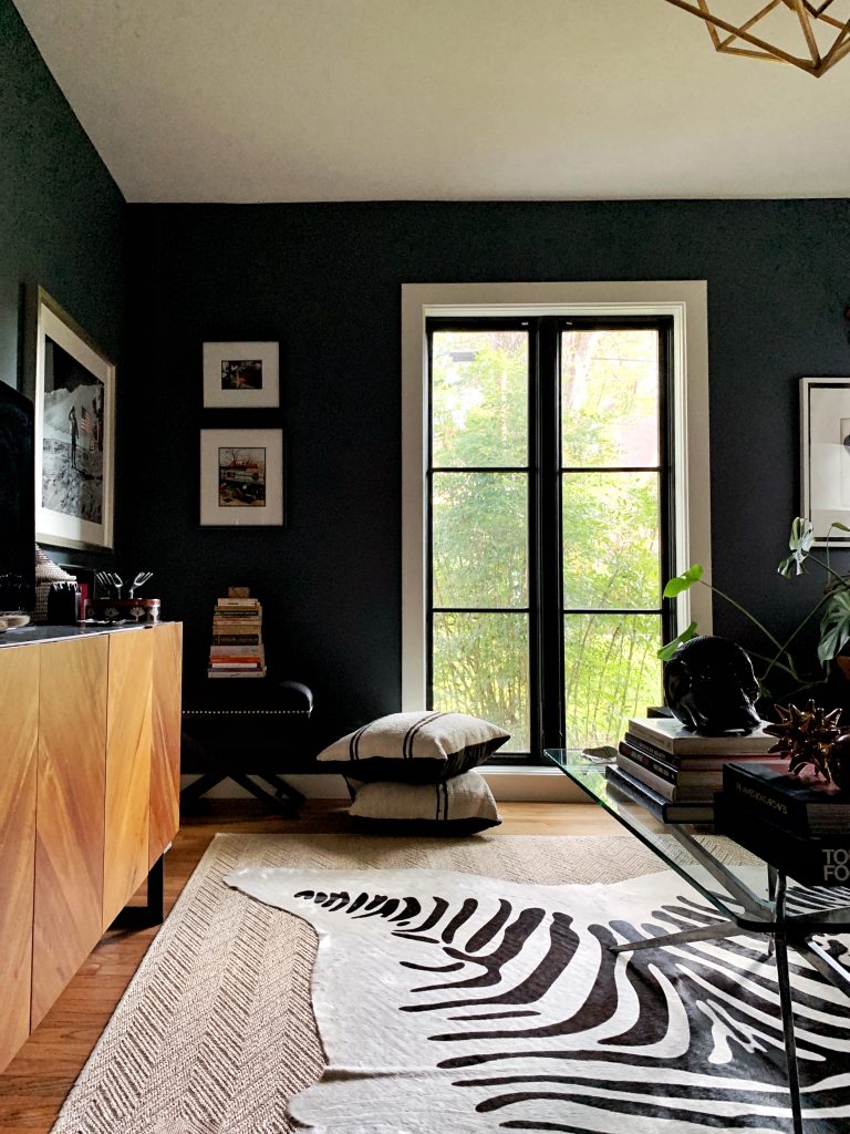
The Study

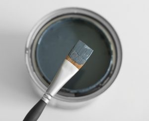
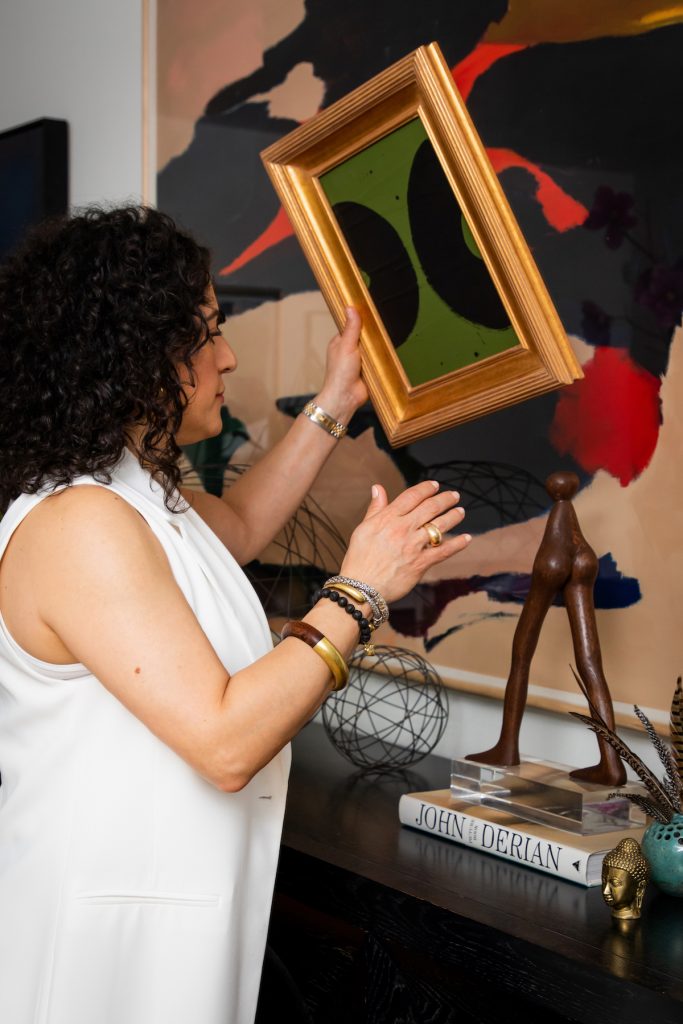
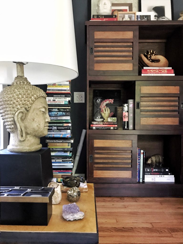
“This is probably the most popular spot in the house,” laughs Carolina. ” This was a guest bedroom, but we turned it  into something completely different. We took the closet out and turned it into a library and TV room. It’s a great place for me to watch my Bravo shows while my husband has sports on. We made it extra cozy with that dark Outer Space paint color from Sherwin-Williams. It’s such a great multi-purpose room with its own vibe.” Additional sources include a light fixture from Kelly Wearstler for Visual Comfort and a sofa by Mitchell Gold. Incredible detail: The Samsung Frame TV that looks more like a stunning framed piece of art (do you see it??).

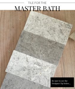
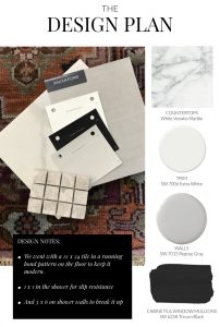
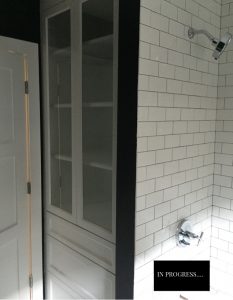
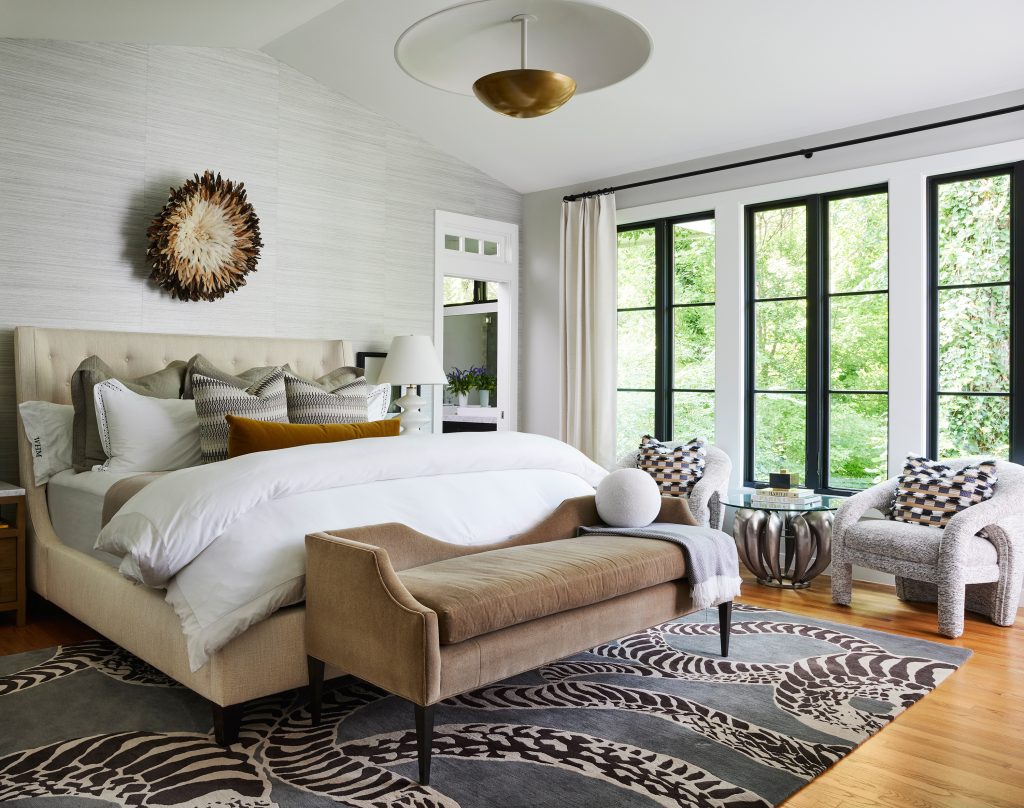
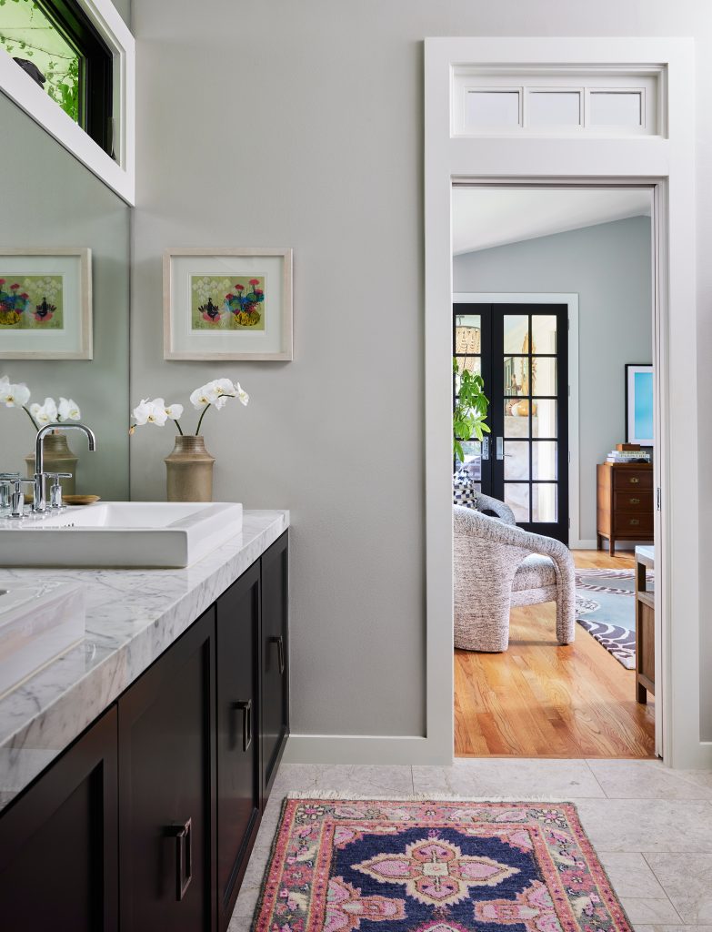
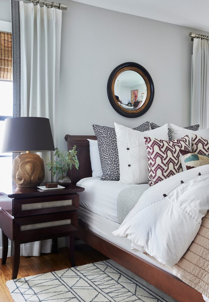
The Principal Bedroom and Bath

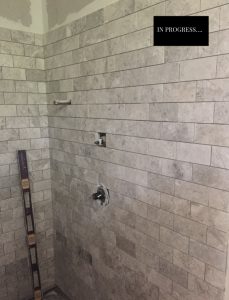
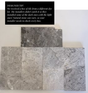
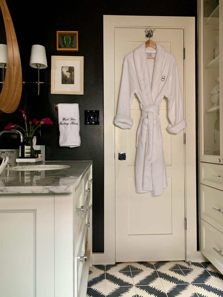
“This is my oasis from the world!” Carolina says. “It took us a while to get this suite just right, and now we absolutely love it – we never want to leave. That Bernhardt bed with the gorgeous Matouk linens is always calling my name! And finding those vintage chairs, now covered in upholstery from Pollack Textiles, was the perfect final touch for the room.” Additional sources include a Theodore Alexander light fixture, Holly Hunt wallpaper, Fabricut drapery, and a Vanguard bench in the bedroom. In the bathroom is Daltile Arctic Grey Limestone on the floor, and White Venatio Marble on the counter. Incredible detail: All of the amazing natural light – and the fabulously ssssnaky rug from The Rug Company.

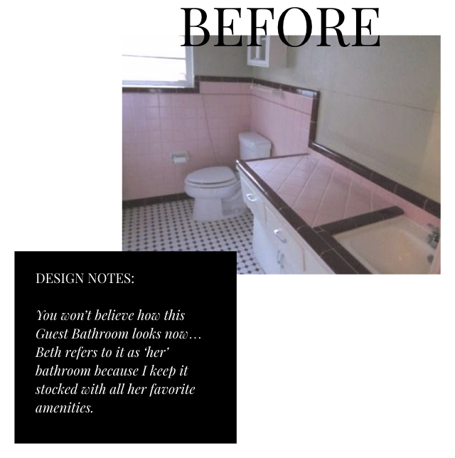
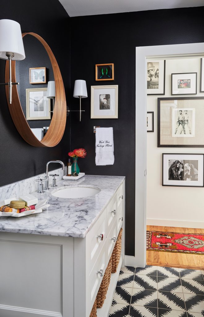
Guest Bedroom and Bath

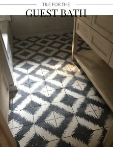
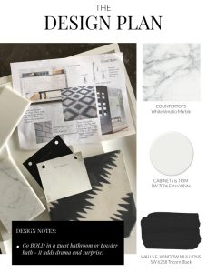
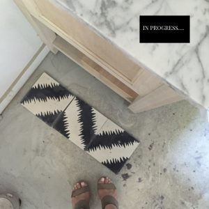
Beth Dotolo, Carolina’s co-founder of Pulp, is the person who calls this space “home,” Carolina says. “I keep this space stocked with all of Beth’s favorite amenities, so she says it is her space!” The key to the best guest rooms is to make them as welcoming as possible, Carolina points out. “I include fabulous linens and as many pillows as possible for the bed. And in the bath there are a selection of soaps, amazing lotions, and even a Pulp-branded fluffy robe. It’s all designed to give guests a luxe experience.” Incredible detail: Those graphic and gorgeous cement tiles for the floor – they are Ann Sacks Popham Designs Paccha Zig Zag Tile.

If you have any comments or questions, follow and direct message us over at our instagram accounts at @pulpdesigns, @carolinavgentry, and @bethdotolo!

Pulp at Home: Carolina’s Tips for Cozy Spaces

As the weather turns cooler and the days are shorter, there’s nothing better than curling up in a cozy room in your home. The Pulp team loves to create these warm and inviting spaces for our clients, so we asked Pulp co-founder Carolina Gentry to give us her best tips for a cozy home. Here she walks us through her guest room makeover and shows us how she took it from boring to inviting!

The boring space BEFORE!

1. Find The Right Color

Color is SO key for setting the right mood. I wanted this guest room to have dark walls because that would create an immediate cozy feeling and would be a great background for our art. I chose Sherwin-Williams Outerspace for the walls (one of my faves). It’s like a dark charcoal shade with blue undertones, so it’s a deep color, but soothing at the same time. This room gets great light during the day, so I knew it could handle this shade without seeming too “heavy.”

Then I complemented the wall color with black window casements and bright white on molding and the ceiling. It creates a really crisp look with the dark gray!

Define The Details

Anyone can bring furniture into a room and call it a day, but the details are where you create a mood and show your personality! I like bringing everything into the room so I can see what I have to work with. My husband and I had collected a lot of art and fabulous items through our travels together over the years, and I really wanted this room to be a space for all of those cool pieces to come together.

You can see how each unique and one-of-a-kind piece sets the room apart. It’s an interior that isn’t cookie-cutter and won’t be like anyone else’s. You want to use the shelves, walls, and tabletops as your personal canvas, to show people what you love and who you are!

Add Cozy Layers

Layering in textures and accessories helped me create that cozy feeling I was going for. For example, I doubled up the rugs to add warmth and pattern. And I began putting in comfortable pillows to curl up with on the sofa. Each of those details creates a layering effect in the room, giving it depth and adding even more personality!

Textiles are a great way to add coziness as I did with our own Pulp Icon reversible throw blanket above. And the warm wood pieces bring in a natural element – they also look fantastic against the dark walls.

Search Out the Unique

Beth and I are always on the lookout for unusual and one-of-a-kind artisanal items for our clients – and for our own homes. You can do this, too! Look for things that are intriguing, different, and interesting. This den is the one room in the house that has most of the oddities and curiosities I have collected over the years, some creepy and some cool, but all of them are unique and very ME. That’s the key!

In the completed room, you can see how layers of textiles, art, and those personal details create a super-cozy and comfortable room that’s chic and full of personality!

If you want to create coziness in your home, give our Pulp team a call! We’d love to give your spaces a design that’s uniquely your own.

Carolina’s Tips for Creating an Art-Filled Room

If you’re following along with our art series, Pulp has given you great tips for layering art in your home. In this post, we’re going to show you how to do it, step-by-step, in cofounder Carolina Gentry’s own home! Here are her tips:

Over the years my husband and I have collected art from travels or just random places or pop-up shops here in town. For years we lived in a loft and didn’t have much wall space but kept collecting art in an art portfolio to have framed in the future. I’m so glad I did because it made it a lot easier to have that art framed once we moved into our house! When we created a cozy den out of a second bedroom, we wanted this room to have every wall covered in artwork. It’s been a process, and slowly but surely we are getting there. Here are some steps for creating an art-filled room!

Create Your Collection

Building a collection takes time! You should try to buy art when you travel, even if you’re not going to hang it right away. Always keep your eye out for pieces that grab your attention. They don’t have to be expensive or “fine art,” if you like it, then you should get it! The art doesn’t have to have rhyme or reason – an eclectic mix is always fun. And your frames don’t need to match, either. Your art should just show your personality and be items that you love.

Tell a Story

Besides buying new art, we also love to frame photos and memorabilia from our families. It totally makes this room special and a great place for storytelling. In the photo above you can see some of our personal pieces. In this room, we have a large photograph of family vacationing in Colorado (circa 1930s) from my husband’s family. He found it in the attic before we demo’d the house. We also have the original blueprint of the land plot of our house, charcoal sketches from art shows, as well as lithographs and photographs from college. My uncle was an artist in Mexico and I have some of his pieces and random fun finds from over the years. The collection keep s growing but I love sitting in this room looking at all of the art and remembering the fun times we had together acquiring each piece.

Find the Perfect Placement

The real key to finishing your art-filled room is to place the art correctly. No one wants to have to move a nail and end up with holes in your newly-painted walls. So as you can see above, I like to lay my art on the floor and start moving it around the room, creating grids and ideas as I go. For each wall you can use Contact strips to temporarily place the art until it looks the way you want – then you can go back and give it a permanent hanger. Another good rule of thumb is to keep the center of the art at eye level – most people tend to hang their art too high up on the wall.

For the perfect gallery wall, select one piece as a starting point – it will be in the center – and build around it. I called a professional to hang my art, but if you want to attempt this yourself, you can cut out paper templates in the size of  your art and tape them to the wall to set your hanging locations. It’s much easier to move a piece of paper then a framed painting!

Art adds personality and style to every room. Start reviewing the art you have now and plan what you want to add for fabulous art-filled spaces in your home!

If you have any comments or questions, follow and direct message us over at our instagram accounts at @pulpdesigns!

transform your space.001

6 Tips for Layering Art

We’ve talked a lot on this blog about the importance of art in home decor, including how to select the right pieces for your home. But once you have that art in your house, it can be difficult to know how to display it. The Pulp team loves to layer art in the interiors we design, so we have 6 expert tips to help you showcase your favorite pieces. And we’re heading into co-founder Carolina Gentry’s home to show you exactly how it’s done!

1. Mix Your Media

In your displays of art, be sure to mix things up. Use sculpture with drawings, found objects with paintings, or pottery with photography. It makes for a more textural and unique showcase – one with a lot of personality! You can see above how Carolina makes a statement all her own with a unique combination of art. It tells a story of who she is and what she loves!

2. Consider Scale

Scale is something we talk about for every aspect of interior design, but it’s critically important when choosing and displaying art. In the gorgeously layered vignette that Carolina created above, you can see that there is an oversized framed piece, then a medium one, and finally a smaller one. Then a tall sculpture and a tiny piece of pottery. It gives the eye a focal point, but allows it to travel to take it all in. Vary the scale of what you layer together and you’ll always succeed.

3. Balance and Symmetry

Two more important concepts in design are balance and symmetry. You want a vignette to be harmonious. Put too many things on one side and it won’t have that polished look you’re going for. Too many things layered in the center and not enough left or right, and the symmetry will be completely off. So, just as Carolina is doing above, you’ll need to move things around and then step back to look at the grouping as a whole. You’ll feel it when the balance is on point!


4. In the Frame

Framing is KEY to getting a layered look right, and there are 2 ways to think about your frames. First, you could go with a wall or display where every piece is in a similar frame, like all black. Or, for more visual interest and an eclectic look, you can mix things up. If you go or the mix, think about varying the thickness and design of the frame, too! So you can use a thicker gold frame, like the one Carolina is carrying, and pair it with a thinner black frame like the one on the credenza.


5. Lean Into It

One common mistake that people make is to insist on hanging everything that is in a frame. It’s impossible to layer art that way! We like to lean some pieces, especially on mantels and table surfaces, as you can Carolina doing above. That creates the depth and interest that makes all the difference!

6. Art in Every Room

This is a super-important tip: You can and SHOULD use art in every single room. Yes, even the bathroom and the kitchen. These are great rooms for showcasing smaller framed pieces, photography, or fun found objects. We once hung a faux manhole cover in a client’s bathroom that had Sewer stamped across it. It was witty and our clients loved it! So think out of the box when selecting art for these rooms.

The Pulp team is expert at curating and displaying art. If you need help, give us a call!

Feliz Cinco de Mayo with Our Famous Cocktail: The Michelada

Cinco de Mayo is right around the corner and it’s a day the Pulp Team loves to celebrate! For Cinco de Mayo, I always make my favorite cocktail, The Michelada. I’ve shared this recipe before but wanted to share it again in honor of the upcoming holiday and because it’s the best Mexican beer cocktail out there. Follow along below to recreate this drink at home. I like it spicy with extra dashes of Cholula hot sauce, but you can make it to your own taste.

Pulp’s Famous Michelada Recipe

INGREDIENTS

1 Mexican Beer (Dos Equis Light is my favorite but Corona, Tecate Light, and Bohemia all work great too!) | 2 tablespoons fresh lime juice | 1oz. Clamato Juice | 2 -3 dashes Cholula Hot Sauce (How hot do you like it?) | 2 dashes Maggi Seasoning or Soy Sauce | 2-3 dashes Worcestershire Sauce | Dash of Black Pepper | Pinch of Course Salt | 1/2 teaspoon Tajin* | Ice

*BTW this is awesome on fruit, cucumbers, jicama, and popcorn

EQUIPMENT

1 16oz. Glass or Mug | Bar Spoon

INSTRUCTIONS

Grab a glass and rim the edge with Tajin. Add lime, Clamato, Cholula, Maggi, Worcestershire sauce, salt, pepper & Tajin to glass.  Mix well and add ice, tilt the glass slightly, and slowly pour beer into the glass. Stir gently to prevent over-fizzing. Voila…Fiesta in a glass!

Want to take your Cinco de Mayo to the next level? Check out my must-haves for Cinco de Mayo. Trust me you’re going to want to make this corn dip!

Salute!


Pulp at Home: Carolina Transforms a Second Bedroom into a Cozy Den

One core thing about our design process at Pulp Design Studios is that we always encourage our clients to think outside the box when it comes to their homes. And that includes how they use each room. Just because a room is “supposed to be” a dining room, doesn’t mean you have to keep it for that purpose! If you don’t dine formally with your family, then you don’t need that room. Maybe you’d rather have a library or an extended family room. The key is, when it comes to your home, you do YOU!

The original second bedroom in my home

My husband and I don’t have any children and wanted to maximize our home based on our lifestyle. So we decided to turn one of our guest bedrooms into a small TV room, similar to a den. It’s close to the guest bedroom for when we have visitors, so it’s almost like a sitting room for guests, too. (Warning – Room in progress)


Trying furniture layouts in the new den

At first thought, I wondered if we were making a mistake by turning this room into another sitting room, but it’s actualIy turned into a fun little hang-out. We removed a closet to give us more space in the room, overall. But it’s still cozy, which is what we wanted.

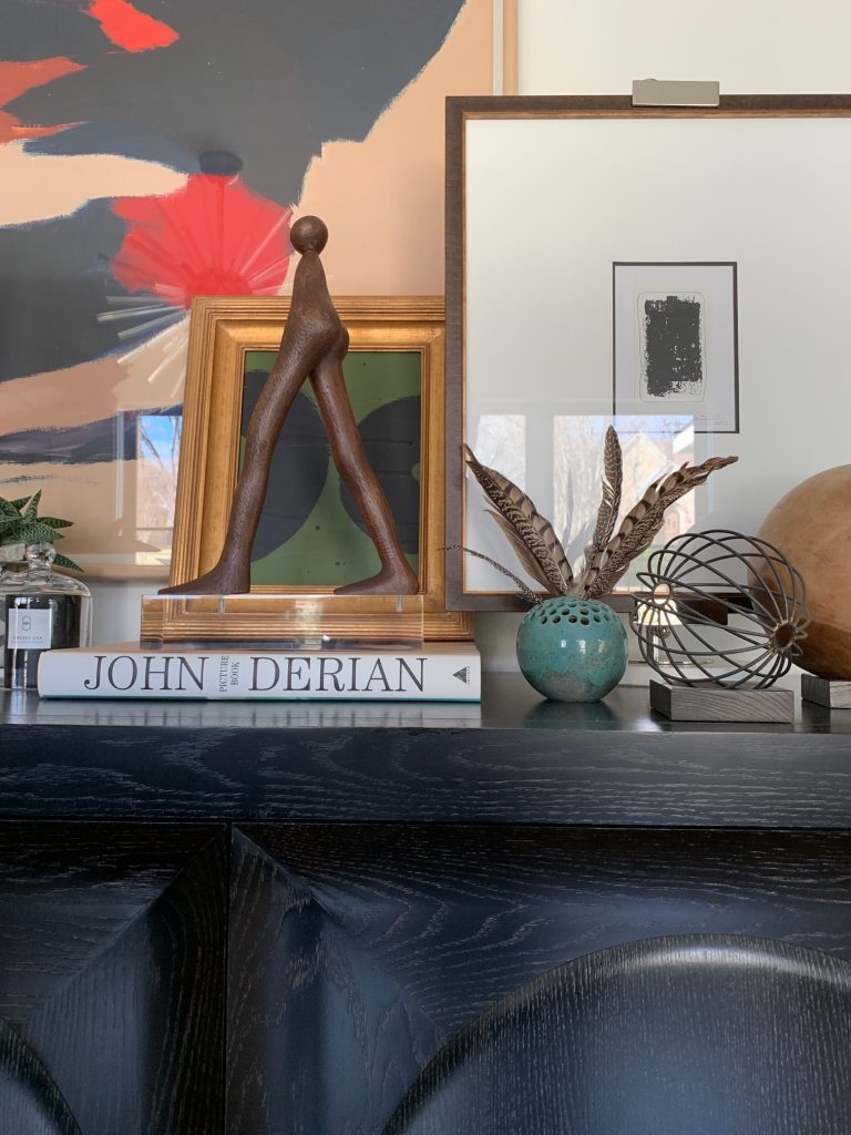
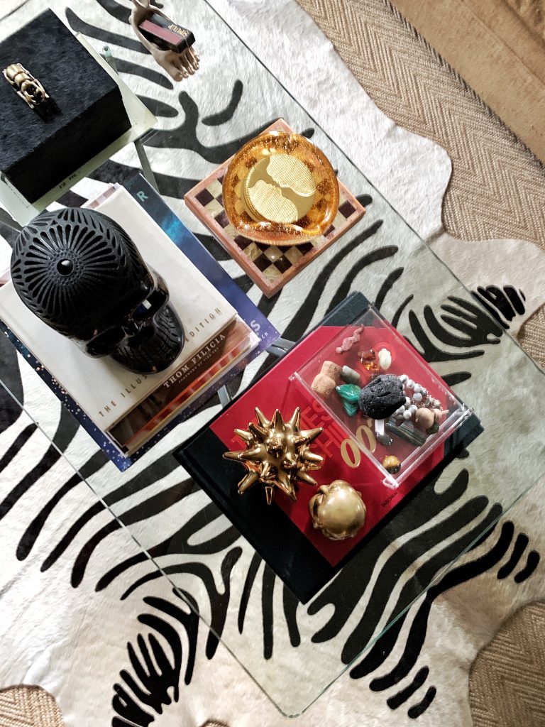
Layering accessories and rugs 

It’s also a great room where I can watch Bravo and Dateline during football season, if you know what I mean…LOL!

I love the light that comes into this room, and the dark paint really gives it such a comfortable feeling.

Now our new den is used in so many ways…as an overflow conversation area from the dining room for parties or after-dinner drinks for adults. It’s my teenage nephew’s video game room and bedroom when he stays with us. (Add a sleeper sofa and it’s still a multi-functional second bedroom!)

During the holidays the kiddos hang out and watch TV or take a nap in here. Guests can retire for the evening and hang out in their own “living room.” It’s even a great place for conference calls when working from home.

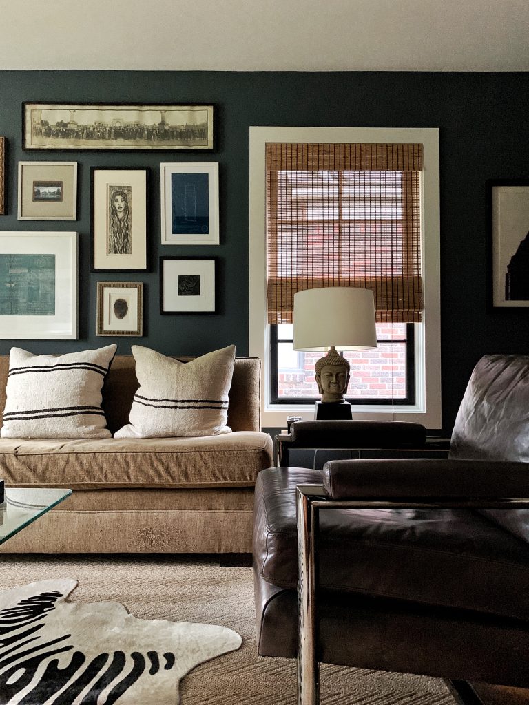
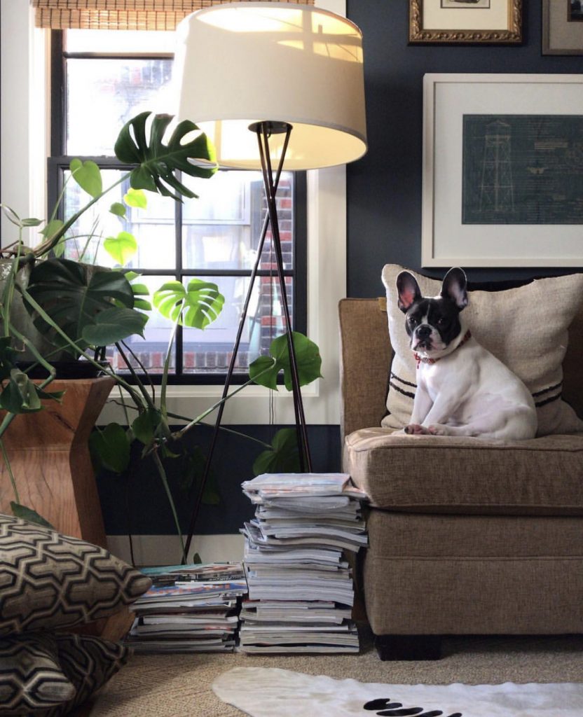
Luna loves this room too! 

Stay tuned – This room is a work in progress and we will keep you posted along the way.  In upcoming blog posts, I’m going to reveal how I designed the cozy mood in this room, and how I created the perfect grid for the gallery wall!  Next steps are re-upholstering the sofa, new drapery and wall covering on the ceiling.

If you have any comments or questions, follow and direct message us over at our instagram accounts at @pulpdesigns!

Carolina’s #PulpAtHome:
Read the posts + @carolinavgentry on instagram + #TheValenciaProject on instagram

Beth’s #PulpAtHome:
Read the posts +  @bethdotolo on instagram + #FigTreeRambler on instagram

transform your space.001

Pulp at Home: Carolina’s Tips for Tile

My project is a little different than Beths’s since we gutted the existing house and added square feet, so our stories will be a little different during the design process of our home projects. I won’t go over the paint selections in my home since Beth copied all of my colors for her home and shared them last week. LOL!
What can I say??! We are each very different but we do like the same things. Also, great paint colors work in different spaces, but always be sure to check the light levels in your home when making a selection.

This week, let’s chat about tile! We had the opportunity to add a master bath, kitchen and guest bath all at the same time to my home. Of course I was thinking about the ’50s ranch style of the house and how we could stay within the style in an updated way. Since we were making a big investment in this home we didn’t want anything too overly trendy with something as permanent as tile. (I’d like wait at least a decade before I rip it out and do it again!) We decided to move forward with a neutral palette but have a little fun in the guest bath. Let’s take a look!

Pulp At Home - Templates.001
One thing to really consider in a whole-home renovation is budget! When you do a huge renovation you don’t always have the luxury of splurging on every space, so we definitely had to make smart cost-effective choices. We splurged on windows and on an architect (my friend Eddie Maestri at Maestri Studios).  We had plans to splurge on a lot of other things, but as building costs add up or end up being more than you think, you start thinking about where you can cut and make smart choices. You’ll see some of those below!
Pulp At Home - Templates.002
Pulp At Home - Templates.003
Love this ceramic tile with subtle texture. I wanted a white tile but didn’t want a 3×6 so we opted for a tile that had a subtle detail to it in a long thin shape and contrasted it with a dark grout.

We also had a fireplace in the open-plan kitchen. So I had to consider a tile for the surround – one that would also coordinate with the kitchen!
Pulp At Home - Templates.004
Remember when I mentioned budget?! I had to come up with a cost-effective detail for the fireplace surround and Daltile Chenille White 12 x 24  was a great choice.
Pulp At Home - Templates.005
page 1.001
I liked the Idea of using stone on the floor so we went with a warm grey limestone.  We didn’t want it to look too cold and sleek. So the thought of a honed stone was appealing to us…something durable that would stand the test of time and add a soft, natural look to the space. BUT – we had one issue! See the Design Tip below!
Pulp At Home - Templates.002

Pulp At Home - Templates.003

I love this Daltile Arctic Grey Limestone in a honed finish for the floor.

Pulp At Home - Templates.004

Pulp At Home - Templates.005

Pulp At Home - Templates.001
We wanted to add something fun in this space so we jazzed it up with the flooring. Love how this tile has a mod retro vibe!
Pulp At Home - Templates.002

Pulp At Home - Templates.003

The cement tiles for the floor are Ann Sacks Popham Designs Paccha Zig Zag Tile.

Pulp At Home - Templates.004

The shower wall tile is Daltile Rittenhouse Square, 0100 White, 3 x 6 Grout: #19 Pewter.

 Pulp At Home - Templates.001
Our laundry room is tiny (that’s another story – originally we were converting part of our existing garage into a mud room/ laundry but the neighborhood conservation didn’t approve it so we converted what was going to be a huge pantry into the laundry room). A designer’s job is never boring – we are daily problem solvers. or as I say “firefighters” because we put out fires every day!
Pulp At Home - Templates.002
We didn’t want to spend too much money on the finishes in this space so we went for a color body porcelain for durability and cost effectiveness.

I didn’t want to show the complete after shots in every space today…sorry!  I mean, I need to have something to talk about down the road! I’ll be sure to show you each space in detail when the time comes.
Keep following along and checking out the progress of both our homes!  Until next time – here’s another sneak peek tease for you of #TheValenciaProject…

Pulp At Home - Templates.001

If you have any comments or questions, follow and direct message us over at our instagram accounts at @pulpdesigns!

Carolina’s #PulpAtHome:

Read the posts + @carolinavgentry on instagram + #TheValenciaProject on instagram

Beth’s #PulpAtHome:

Read the posts +  @bethdotolo on instagram + #FigTreeRambler on instagram

transform your space.001

Pulp at Home: The Story of Carolina’s Dallas Home

Shifting Gears

Hello! Carolina Gentry, here. As Beth shared last week, we are excited to share that we are making a little shift on the Pulp blog…  We have always exclusively shared our client’s homes, design trends and tips, and now we are pulling back the curtain and opening the door to our own humble homes.

Don’t worry, we’re still sharing all the latest in projects and trends in an editorial way, especially in our magazine ICON. But, here, we’re rolling up our sleeves a little and giving you a look into our personal design processes and life. As designers, our homes are a constant work in progress, ever-changing, and since we are small business owners who work on luxury residences for our clients, we’re jumping into this with a little vulnerability, too… Beth and I will both kick off the series sharing how we came to live in the homes we’re in now, in our new series: Pulp at Home.

The Story of Carolina’s Dallas Home

Now, for my story… This house had been in my husband’s family for years. It was originally built by his Grandparents and where his mother grew up. Rather than selling it they kept it in the family. My husband and each of his three sisters had lived it this home in varying stages in their lives during and after college. When I started dating my husband 18 years ago, he was living there. Naturally, I spent a ton of time there and, as a designer, I always envisioned the potential. The house was not in great shape, but it was in an amazing location in a conservation district in Dallas. Lafe and I eventually moved in together and purchased a cool urban loft in an old textile mill. And, as Pulp history has it, it was the same loft where Beth lived across the hall from me with her boyfriend (now husband) where Pulp was officially conceived and began over 12 years ago!

But, back to the story of my home… As all of my husbands siblings moved on to their own homes no one wanted to take on this house, because of the tricky nuances of renovating in a conservation district, and they didn’t want to leave it empty. So, my husband’s parents decided to put it on the market. A ton of offers were made to tear it down and use it for the land. The thought of losing the home, that had been in my husband’s family for so long, was heartbreaking.

So, we decided to purchase it from his family and take on the renovation ourselves. After all, who better to handle it than a designer!? We decided to gut and add on to the existing 1400 square foot home and turn it into something special… I was finally able to create the home I had envisioned all those years ago when I was just dating Lafe and hanging out at his house. It took us nearly three years to design plans, obtain permits, and wade through the conservation approvals, and eventually execute our vision. We finally moved into our home in November of 2015, right before Thanksgiving, and it’s been a work in progress ever since.

With that, I’d like to introduce you to our home (and, our cute pup Luna)…


IMG_0731


Built in 1953, our home is a 50’s ranch-style home… when it was built, it was a red brick home with two bedrooms and one bath. That all has changed now, of course, which we will share in upcoming posts. We wanted to keep the integrity of the original style, so we kept that in mind when selecting finishes, but we seriously overhauled this home!


Pulp At Home - Carolina Home Intro.002


We ran into a ton of challenges with the city and the conservation rules of the neighborhood. Many of the things I originally dreamed about weren’t possible, so as a designer does, we adapted. I’ll share many of those challenges next week when I share my renovation plans!


Pulp At Home - Carolina Home Intro.001


We don’t have children and don’t have plans to have any, so our needs for bedrooms are unique! We definitely needed a guest room for Beth’s many visits to the Pulp Dallas office and for when our family visits. But, for the additional Guest bedroom below, we turned it  into something completely different. We took the closet out and turned it into a Library and TV room. It’s now a great place for me to watch my Bravo shows while my husband has sports on. And, my nephew calls it his ‘bedroom’ when he comes for the weekends. He often kicks back to play video games and feels right at home. It’s such a great multi-purpose room with it’s own vibe. Wait until you see how it looks today… it’s currently the most complete room in the house!


Pulp At Home - Carolina Home Intro.003


Pulp At Home - Carolina Home Intro.004


The original finishes in our Guest Bath had to go… our respect for history only goes so far when you’re working with pink and maroon! The original layout worked well, but we overhauled the finishes and gave this bathroom great storage. Wait until you see the ‘after’!


Pulp At Home - Carolina Home Intro.005


The kitchen took on the largest transformation… If you know me at all, you know I am a huge lover of food (You can follow #CVGeats for proof on instagram). We are huge cooks and love to entertain. We have most holiday gatherings in our home and the Kitchen is the center of that. This is the most important room in the home and had to be the largest.  And, since we lived in a loft for so many years, the open concept was important to us. The ‘Splendid Living’ approach to our client projects, where we dig deep on how our clients live in their homes before we design for them comes intuitively for me. I had the opportunity to design this addition to the home, not only for how I live and use my space, but for for how I envisioned living splendidly in my home.


Pulp At Home - Carolina Home Intro.006

IMG_0730


Even though we have lived in our house for almost 4 years, there is still so much to do and take on. We haven’t touched the landscaping and we still have so much of our existing furniture. Where Beth wants everything done NOW (nightmare client- ha!), I am one to wait until the right items show themselves and I design my home over time (also, our nightmare client- ha!).  I need something to call my name and be unique. I think that’s why we are excited to share this process with you. We want to inspire people who aren’t the ideal candidates to work with a designer, while still showing you and our clients how we design for real living. We love working through the process to make our house a true reflection of who we are and how we live.

I’m excited to show you our renovation plans in my next post, right after Beth shares all about her painting experience. But, for now, I’m leaving you with a little bit of pretty, after a lot of before vibes. Here’s where things are over at #TheValenciaProject


IMG_0732


If you have any comments or questions, follow and direct message us over at our instagram accounts at @pulpdesigns!


Carolina’s #PulpAtHome:

Read the posts  + @carolinavgentry on instagram + #TheValenciaProject on instagram

Beth’s #PulpAtHome:

Read the posts +  @bethdotolo on instagram + #FigTreeRambler on instagram


transform your space.001

Healthy Baked Salmon Quinoa Bowl Recipe

A Delicious Salmon Recipe To Kickstart Your New Year

New year, new me… right? Whether or not you make resolutions, the New Year is the perfect time to assess your goals and jumpstart healthy living for the rest of the year. It’s the peak week for dusting off those old gym shoes and scouring the depths of Pinterest for the best healthy recipes you can find.

We are all about a good healthy bowl. Not only are they mouth-watering  and delicious, but they are ultra nutritious and easy to make. After posting one of my favorites on Instagram, I was flooded with questions for the recipe and had to share because it is so simple! You’re welcome…

Your New Favorite Healthy Meal

Healthy Baked Salmon Quinoa Bowl Recipe


INGREDIENTS

Salmon
Quinoa
Steamed Broccoli
Grape Tomatoes
Diane’s Signature Italian Dressing (it’s sugar free!)

RECIPE

Preheat oven to 400 degrees.

Rinse 1 cup of quinoa and add to saucepan with 2 cups of water. Bring to a boil, cover and let simmer on low to medium heat for 15 minutes.

Dress 4-6oz pieces of salmon with salt, pepper, herbs de Provence and a tiny pat of butter.

Bake at 400 degrees for 20 minutes. Steam broccoli while salmon is baking.

Add all ingredients to bowl and enjoy!

SHOP IT

Portland Bowl
Rush Gold Slotted Serving Spoon
Gemini Tea Towel

That’s it! Healthy meals that are delicious and easy to make really are the best… especially during the busy work week. Simple and nutritious meals make sticking to your New Years plans pleasantly easy — plus they look great when served in stylish wear… a Pulp necessity!

For professional interior design services, contact Pulp Design Studios®.

Pulp Design Studios Design from Afar - Aspen Colorado

Design From Afar: From Dallas to Aspen

Adventure is essential at Pulp Design Studios. Whether we are designing for a well-traveled interior design client or creating a collected and global feel in an imaginative space, we always approach design with a sense of exploration.

The end of summer marked the perfect time to jump in the car for a road trip through some of the most beautiful and inspiration-filled of Dallas’ neighbors. Two weeks, 2,400 miles and countless design finds produced one momentous experience for the books.

Santa Fe

TO SEE: Canyon Road

Pulp Design Studios Design from Afar - Sante Fe

Santa Fe is every creative’s playground. Full of extraordinary food, a myriad of galleries and   cool shops with shelves of coveted and disparate goods, it feels like every corner holds an eye-catching”something” worth stopping in for.

One of the greatest aspects of this sliver of town is the  variety of art– it’s bursting with creativity at every seam! One moment you can enjoy modern design and the next you can bask in the traditional architecture of the region.

Pulp Design Studios Design from Afar - Sante Fe

Pulp Design Studios Design from Afar - Sante Fe

The Rainbow Man had a wealth of cool Mexican and Native American home goods and art. I had to take one of these skulls home to add an touch of Santa Fe flair. I always love collecting interesting pieces with a story to integrate into my own home design.

Pulp Design Studios Design from Afar - Santa Fe

Can you say obsessed? Made by a jeweler and beautifully displayed in Chocolate + Cashmere, this vertebrae hook is just the kind of addition that captivates and creates interest in any space it is placed. I instantly loved the concept and aesthetic of this piece. Plus, the shop sold all of life’s necessities– chocolate, cashmere and curated local artisan goods.

TO EXPERIENCE: Ten Thousand Waves

Pulp Design Studios Design from Afar - Ten Thousand Waves

Pulp Design Studios Design from Afar - Ten Thousand Waves

A visit to Santa Fe necessitates a visit to Ten Thousand Waves. Inspired by Japanese mountain hot spring resorts, this retreat is complete tranquility. A day soaking in the baths and indulging in the spa is the perfect way to spend a day between gallery visits and shopping.

The grounds are absolutely breathtaking and thoughtfully create the perfect ambiance for relaxation.

TO TASTE: Geronimo

Pulp Design Studios Design from Afar - Geronimo, Sante Fe

Pulp Design Studios Design from Afar - Geronimo, Sante Fe

We couldn’t visit Santa Fe and miss the chance to experience some of the best cuisine and dining in the country. Geronimo is an abolute must-visit for any and all food lovers. We thoroughly enjoyed an evening of unbelievable delicious food in the ultra-luxurious restaurant.

Denver

TO SEE + EXPERIENCE: Union Station + The Crawford Hotel

Pulp Design Studios Design from Afar - Denver

Pulp Design Studios Design from Afar - Denver

Pulp Design Studios Design from Afar - Union Station, Denver

Look no further for one of the coolest spots in Denver than Union Station. I was in love with all the interesting and quirky design elements found throughout– jackalopes, good food and an eclectic mix of shops make a brilliant marriage in this modern-yet-classic landmark. We stayed in the station’s on-site hotel, The Crawford, where we happily rested our heads after days full of enjoying everything that Denver has to offer. We will certainly be back.

TO TASTE: The Cruise Room

Pulp Design Studios Design from Afar - Denver

Moody red lights and style straight from the 1920s makes this post-prohibition bar an evening destination hotspot. The Cruise Room opened the day after the prohibition ended in 1933 and still is alive and well, exuding spirit and design from the era. Just across from The Crawford Hotel, I highly recommend stopping by to enjoy the wine-shaped lounge design and tasty drinks.

Aspen

TO SEE: The Rocky’s

Pulp Design Studios Design from Afar - Aspen

Pulp Design Studios Design from Afar - Aspen

When you come from  bustling city life to Aspen, you have to take a step back and do all you can to soak in the natural beauty. It’s hard to grasp just how beautiful the Rocky Mountains are. Between taking a gondola high into the mountains and getting knee-deep in fly fishing, I feel like I properly commenced the stay in the opulent mountain town.

We had an amazing time on the river with Taylor Creek Fly Shop. There’s nearly no better way to experience the Rocky Mountains than by casting a rod and catching some fish. Our absolute favorite guide was Nick– he made the experience that much more awesome.

TO EXPERIENCE: The Caribou Club

Pulp Design Studios Design from Afar - Caribou Club, Aspen

The Caribou Club... We had the opportunity to spend an evening at the exclusive Aspen club and it was nothing short of an experience. Rustic vibes and taxidermy had us feeling like we were sipping cocktails in the Wild West– a very luxurious Wild West at that.

TO TASTE: The White House Tavern + The Bearded Lady

Pulp Design Studios Design from Afar - Aspen

The White House Tavern had the most delicious sandwiches. For quick and casual bites, this was the perfect lunch spot.

Pulp Design Studios Design from Afar - Aspen

A cute food truck with to-go packets of Cholula, are you kidding me? Yes! The Bearded Lady made the best stop for delicious tacos as we got back on the long road home.

Aspen was the perfect last-stop on our road trip. With no shortage of fresh air, beauty and amazing bites, we thoroughly enjoyed our time savoring the health-conscious and laid-back atmosphere.

Time to take all that inspiration to the drawing boards as we start designing a new season of Pulp projects…

For professional interior design services, contact Pulp Design Studios℠.