Better Homes & Gardens – Up To The Challenge
 Better Homes & Gardens — November 2017
By: Becky Mollenkamp
Photos: Lisa Romerein
Styling: Liz Strong
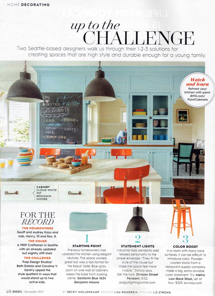
UP TO THE CHALLENGE
Two Seattle-based designers walk us through their 1-2-3 solutions for creating spaces that are high style and durable enough for a young family.
For the Record
The Homeowners: Geoff and Audrey Kozu and kids, Hentry, 10, and Rex, 8.
The House
A 1909 Craftsman in Seattle with an already updated but slightly stiff shell.
THE CHALLENGE
Pulp Design Studios’ Beth Dotolo and Carolina V. Gentry upped the style quotient in ways that would stand up to two active kids.
1. Starting Point. Previous homeowners had updated the kitchen using elegant neutrals. The space worked great but was a tad formal for the Kozus’ taste. Blue-gray paint on one wall of cabinets keeps the base from looking sterile. Santorini Blue 1634 Benjamin Moore
2. Statement Lights. Industrial-look pendants add relaxed personality to the simple envelope. “They fit the style of the house but make the space feel more livable,” Dotolo says. Get the look: Division Street Pendant, $152; seagulllightingonline.com.
3. Color Boost. In a room with many hard surfaces, it can be difficult to introduce color. Powder-coated stools from a restaurant-supply company make a big, extra-durable color statement. Try: Metro Low-Back Stool, set of four, $329; eurway.com.
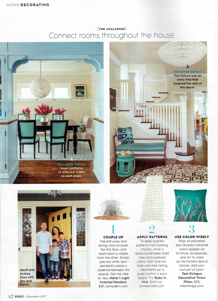
THE CHALLENGE
Connect rooms throughout the house
DESIGNER DETAIL: Layer patterns of different scales so each pops.
DESIGNER DETAIL: This fixture was an early find that inspired the rest of the decor.
1. Couple Up. The entryway and dining room bracket the first floor, and each room is visible from the other. Similar pieced white resin pendants create a cadence between the spaces. Get the vibe for less: Metal 1-Light Inverted Pendant, $181; allmodern.com.
2. Apply Patterns. To keep layered patterns from looking chaotic, strike a balance between bold lines and subdued colors, Soft tone-on-tone walls and ceiling treatments set a quiet rhythm in each space. Try: Baby in Mist, $165/roll; aimeewilder.com.
3. Use Color Wisely. Pops of saturated teal (Audrey’s favorite color) appear on furniture, accessories, and art to wake up the home’s neutral canvas. Add your own jolt of color: Teal Octopus Decorative Throw Pillow, $35; inkanddrags.com.
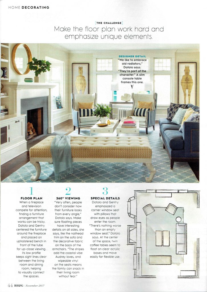
THE CHALLENGE
Make the floor plan work hard and emphasize unique elements.
DESIGNER DETAIL: “We like to embrace old radiators,” Dotolo says. ‘They’re part of the character.” A slim console table frames this one.
1. Floor Plan. When a fireplace and television compete for attention, finding a furniture arrangement that works can be tricky. Dotolo and Gentry centered the furniture around the fireplace and placed an upholstered bench in front of the tube for up-close viewing. Its low profile keeps sight lines clear between the living room and dining room, helping to visually connect the spaces.
2. 360° Viewing. “Very often, people don’t consider how their furniture looks from every angle,” Dotolo says. Make sure floating pieces have interesting details on all sides, she says, like the nailhead trim on the sofa and the decorative fabric on the back of the armchairs. “The stripes add the coastal vibes Audrey loves, and wipeable vinyl on the seats means the family can snack in their living room without fear.”
3. Special Details. Dotolo and Gentry emphasized a corner window seat with pillows that draw eyes as people enter the room. “There’s nothing worse than an empty window seat,” Dotolo says. At the center of the space, twin coffee tables seem to float on clear acrylic bases and move easily for flexible use.
THE CHALLENGE
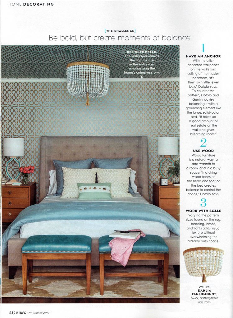
Be bold, but create moments of balance
DESIGNER DETAIL: The wallpaper mimics the light fixture in the entryway, emphasizing the home’s cohesive story.
1. Have an anchor. With metallic-accented wallpaper on the walls and ceiling of the master bedroom, “It’s their own little jewel box,” Dotolo says. To counter the pattern, Dotolo and Gentry advise balancing it with a grounding element like the large, solid-color bed. “It takes up a good amount of real estate on the wall and gives breathing room.”
2. Use wood. Wood furniture is a natural way to add warmth to a room, and in a busy space, “matching wood tones at the head and foot of the bed creates balance to control the chaos,” Dotolo says.
3. Work with scale. Varying the pattern sizes found on the rug, bedding, lamps, and light adds visual texture without overwhelming the already busy space.
We like: Dahlia Flushmount, $249; potterybarnkids.com
THE CHALLENGE
Give kid spaces extra style.
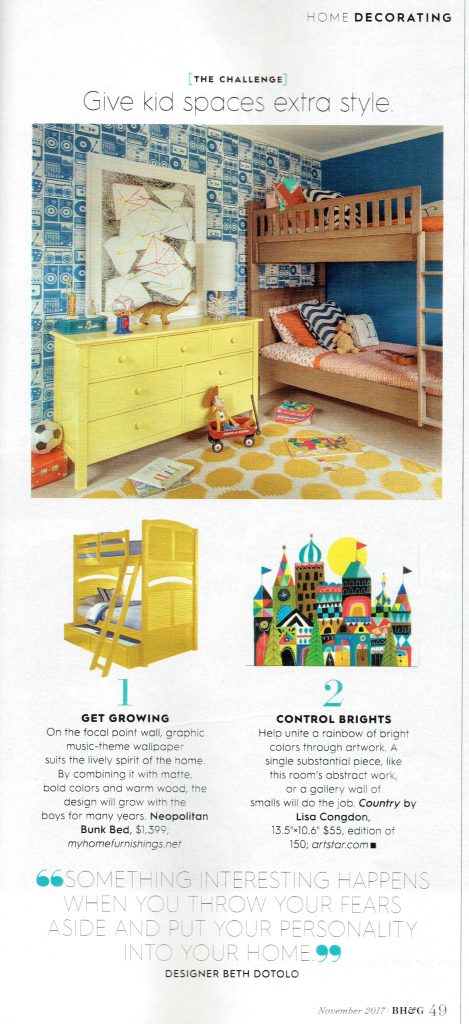
1. Get growing. On the focal point wall, graphic music-theme wallpaper suits the lively spirit of the home. By combining it with matte, bold colors and warm wood, the design will grow with the boys for many years. Neapolitan Bunk Bed, $1,399; myhomefurnishings.net
2. Control Brights. Help unite a rainbow of bright colors through artwork. A single substantial piece like this room’s abstract work, or a gallery wall of smalls with do the job. Country by Lisa Congdon. 13.5”x10.6”, edition of 150; artstar.com
“Something interesting happens when you throw your fears aside and put your personality into your home.” Designer Beth Dotolo
