D Home Magazine, January – February 2016 Issue
 Treating a Highland Park House Like a Blank Canvas
By Holly Haber | From D Home January – February 2016 | Photography by Stephen Karlisch
Homeowners Tonya and Todd Ramsey took their home from wonky to wow—with a little help from their friends.
The aphorism about too many cooks spoiling the broth didn’t hold true for the home of Tonya and Todd Ramsey.
“There’s no telling how many people whose ideas we took,” says Tonya as she describes the design process.
Admitted “Type A attorneys,” the Ramseys ruminated for months about the home they had purchased, soliciting advice from a host of design-savvy friends, including contemporary art aficionados Lisa and John Runyon.
“We’d just stop by and sit and look and think, ‘What do we want to do?’” Todd explains. “And we’d invite friends from different backgrounds. It was a collaborative process.”
The house was, frankly, odd. Built by a landscape architect for himself, the two-story brick modern sheltered an incongruous hacienda-style interior with folksy tile accents and a straight staircase dressed with iron basket balusters. An indented patio split the kitchen from the family room, which was dominated by a spiral staircase that swallowed valuable space in the family room.
Moreover, upstairs lay a living quarters with a full kitchen that was pointless for a couple with three young daughters.
But, says Tonya, “It just had a good feeling,” and they loved the courtyard and its six towering bald cypress trees.
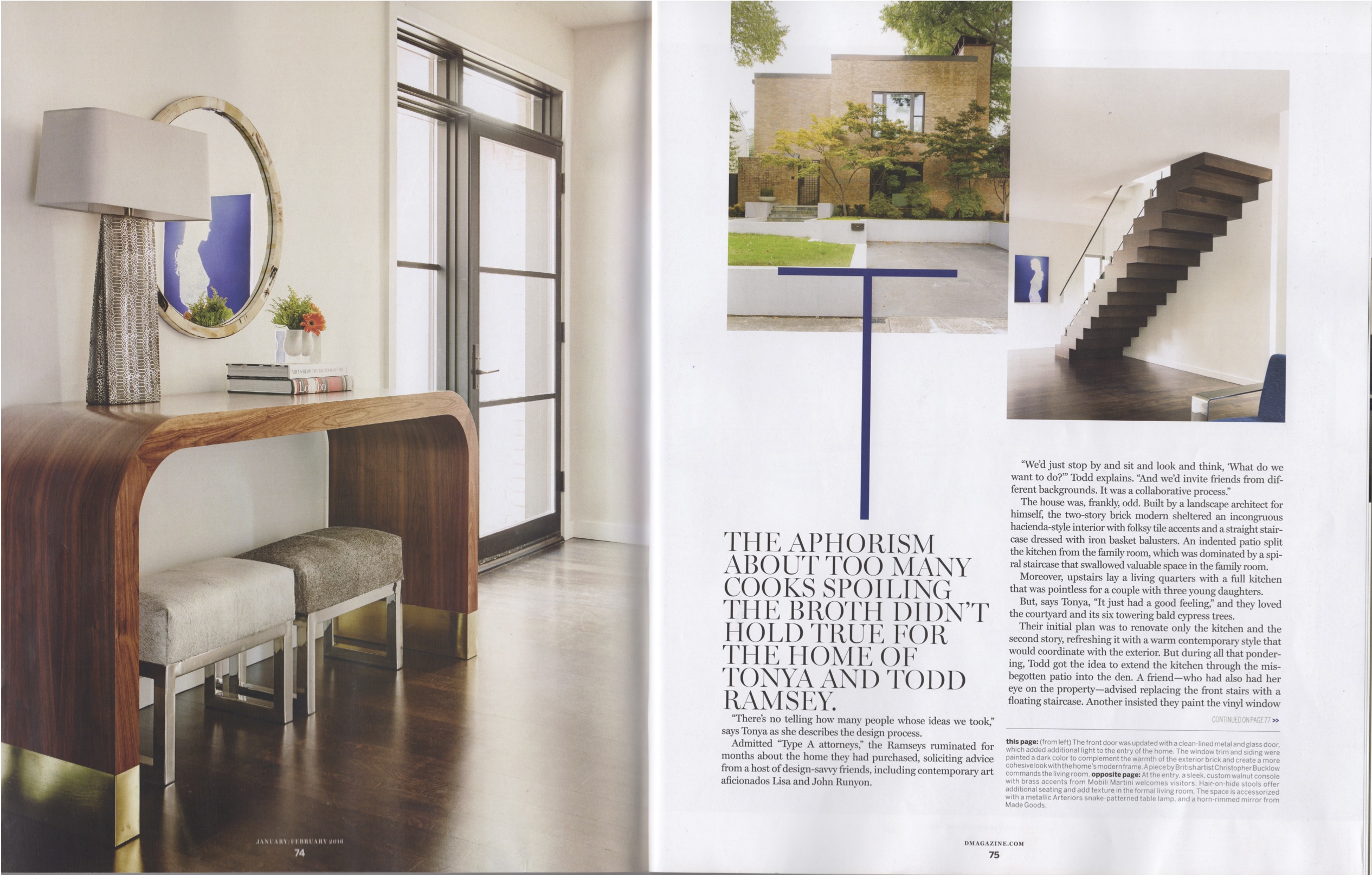
Their initial plan was to renovate only the kitchen and the second story, refreshing it with a warm contemporary style that would coordinate with the exterior. But during all that pondering, Todd got the idea to extend the kitchen through the misbegotten patio into the den. A friend—who had also had her eye on the property—advised replacing the front stairs with a floating staircase. Another insisted they paint the vinyl window frames black—a small detail with big impact—and rewire the entire electrical system for updated four-inch light canisters.
It’s always great when somebody hires you for a job and they let you do it.
– Carolina Gentry
“We really did not plan to take everything down to the studs,” says Tonya with a laugh. Then Todd settled a lucrative personal injury case, and they went all in.
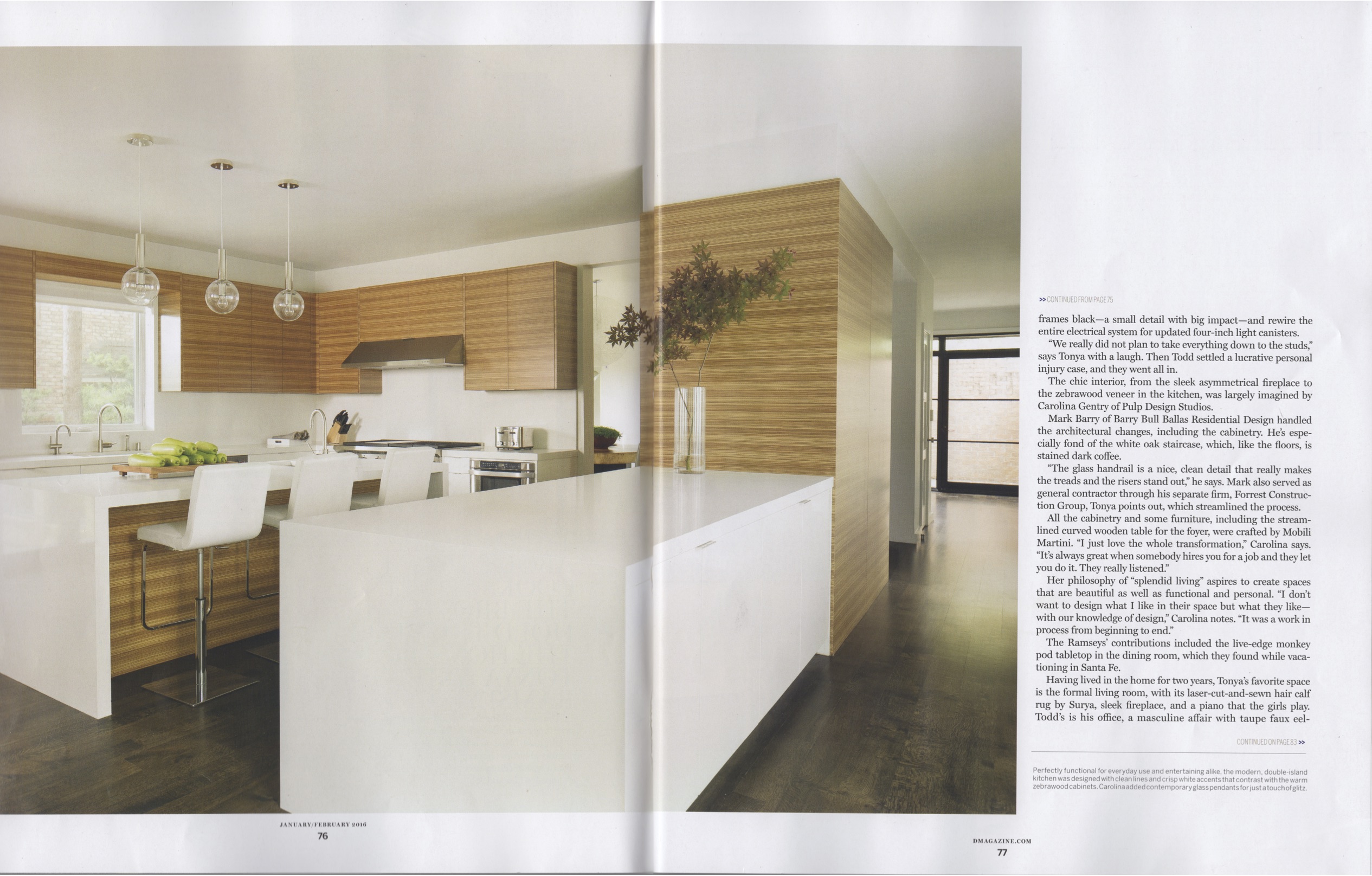
The chic interior, from the sleek asymmetrical fireplace to the zebrawood veneer in the kitchen, was largely imagined by Carolina Gentry of Pulp Design Studios.
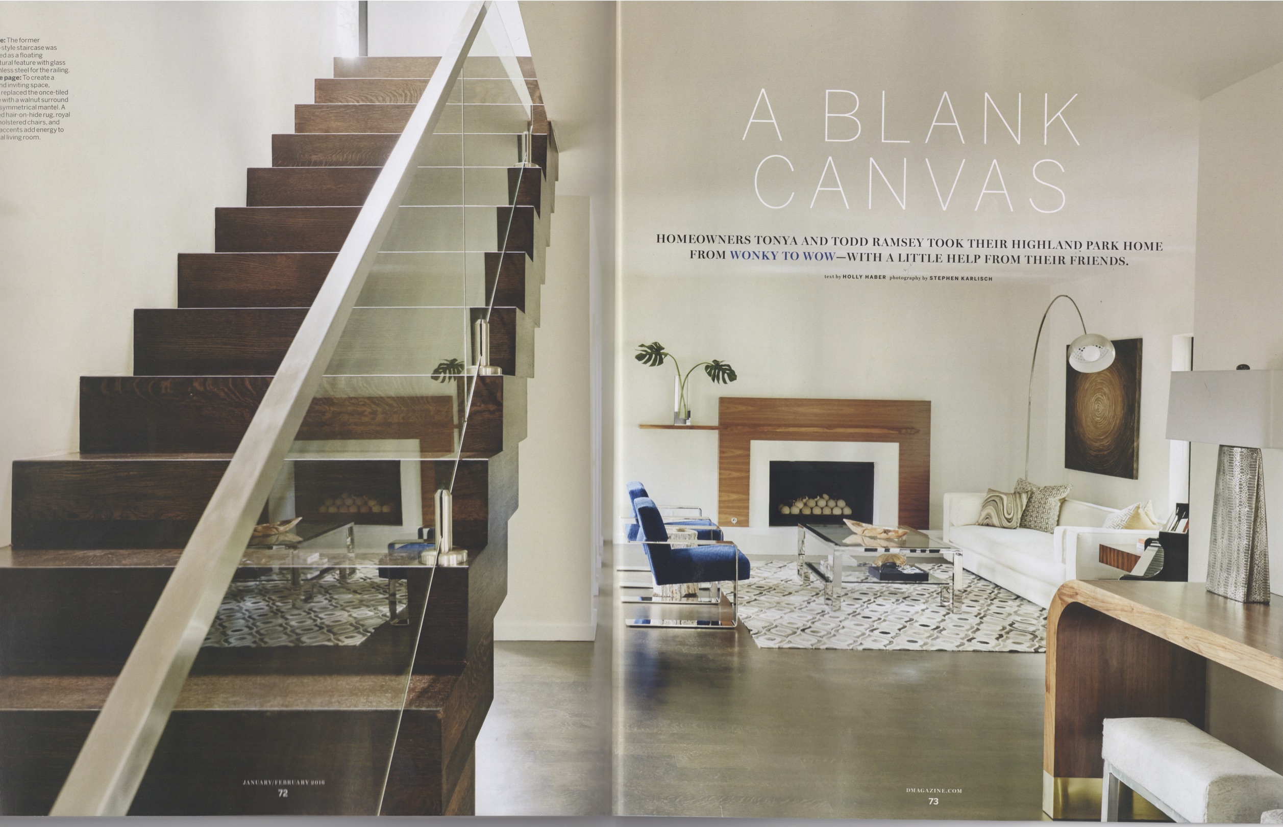
Mark Barry of Barry Bull Ballas Residential Design handled the architectural changes, including the cabinetry. He’s especially fond of the white oak staircase, which, like the floors, is stained dark coffee.
“The glass handrail is a nice, clean detail that really makes the treads and the risers stand out,” he says. Mark also served as general contractor through his separate firm, Forrest Construction Group, Tonya points out, which streamlined the process.
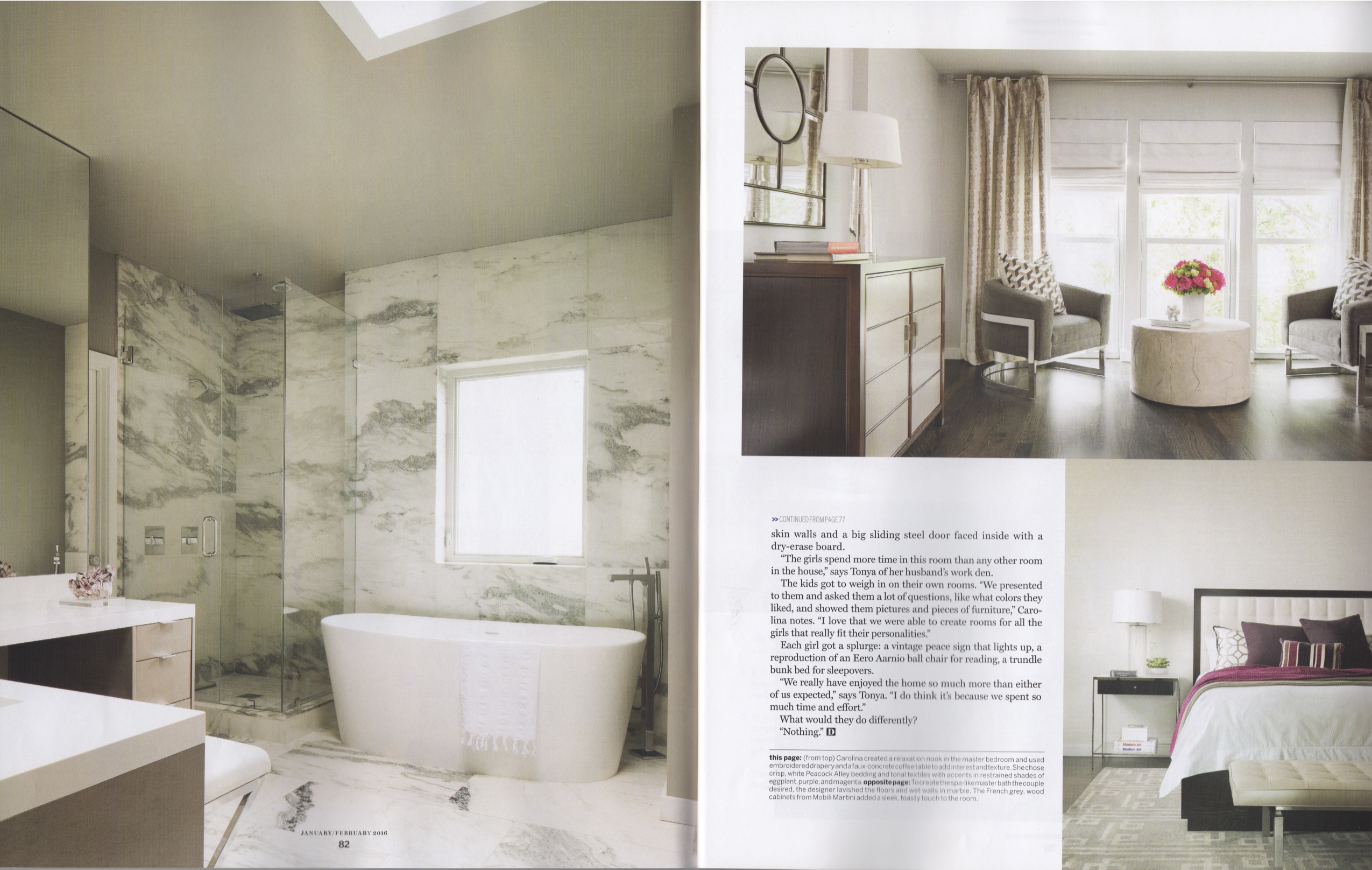
All the cabinetry and some furniture, including the streamlined curved wooden table for the foyer, were crafted by Mobili Martini. “I just love the whole transformation,” Carolina says. “It’s always great when somebody hires you for a job and they let you do it. They really listened.”
Her philosophy of “splendid living” aspires to create spaces that are beautiful as well as functional and personal. “I don’t want to design what I like in their space but what they like—with our knowledge of design,” Carolina notes. “It was a work in process from beginning to end.”
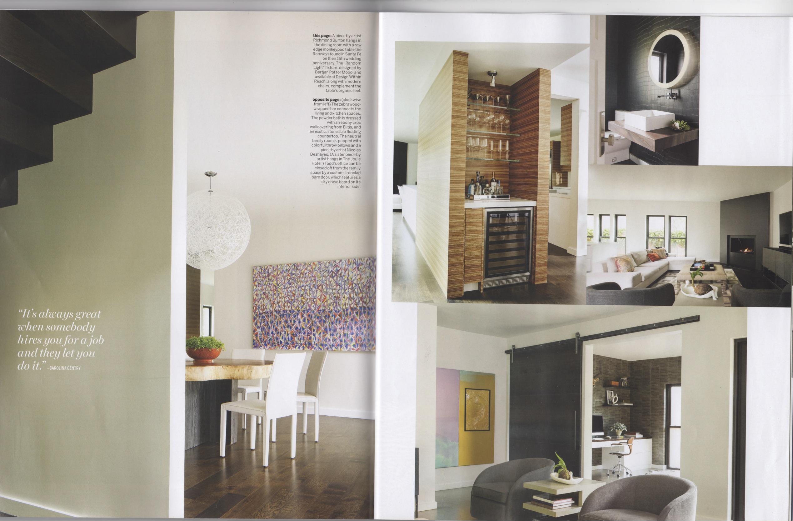
The Ramseys’ contributions included the live-edge monkey pod tabletop in the dining room, which they found while vacationing in Santa Fe.
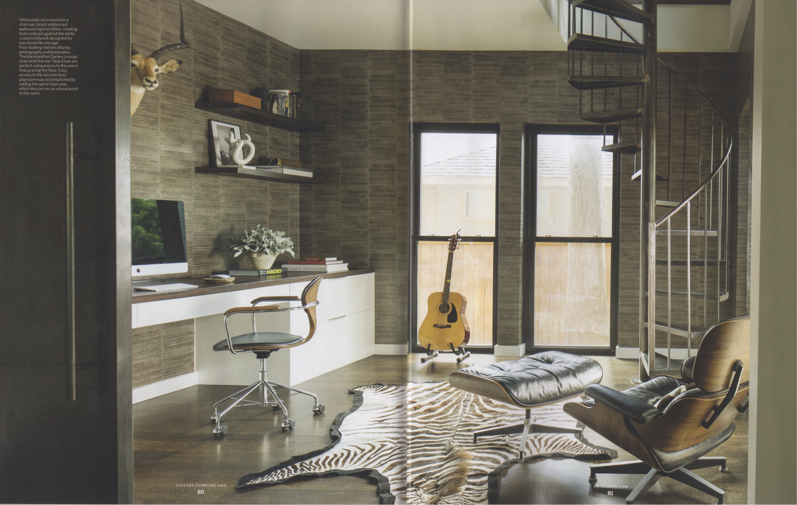
Having lived in the home for two years, Tonya’s favorite space is the formal living room, with its laser-cut-and-sewn hair calf rug by Surya, sleek fireplace, and a piano that the girls play. Todd’s is his office, a masculine affair with taupe faux eel-skin walls and a big sliding steel door faced inside with a dry-erase board.
“The girls spend more time in this room than any other room in the house,” says Tonya of her husband’s work den.
The kids got to weigh in on their own rooms. “We presented to them and asked them a lot of questions, like what colors they liked, and showed them pictures and pieces of furniture,” Carolina notes. “I love that we were able to create rooms for all the girls that really fit their personalities.”
Each girl got a splurge: a vintage peace sign that lights up, a reproduction of an Eero Aarnio ball chair for reading, a trundle bunk bed for sleepovers.
“We really have enjoyed the home so much more than either of us expected,” says Tonya. “I do think it’s because we spent so much time and effort.”
What would they do differently?
“Nothing.”


