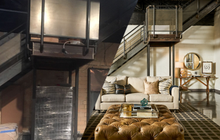
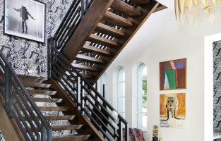
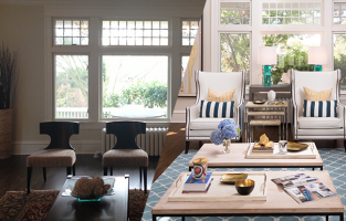
Before + After: A Modern Family Home with Edge in Seattle
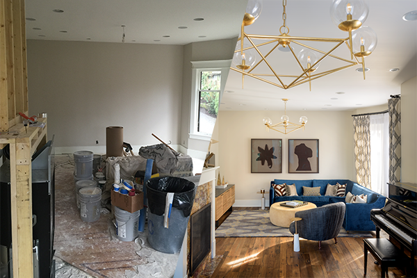
My, oh my have we been eagerly (and a little impatiently) waiting to release this project into the interior design airwaves. We love a project where we get to take two very different client styles and bring them together into one, cohesive and dynamic space filled with Pulp surprises of all kinds — we’re talking edgy meets traditional and maybe, just maybe, a playroom decked out with a climbing wall. Could it be true? All this in one, 1900’s era home? See it to believe it…
Tour an Energetic and Dynamic Queen Anne Home
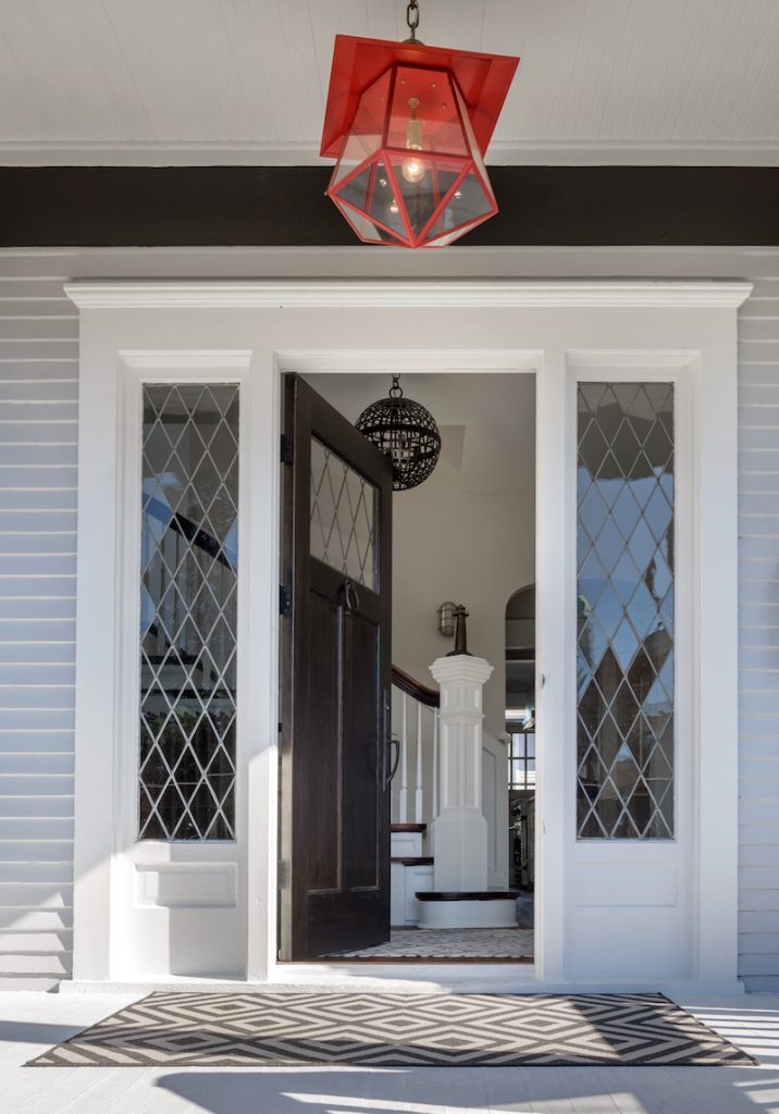
PROJECT OVERVIEW
The Clients:
A family of four with an on-point sense of fashion
The Decision:
Our clients were in the midst of installing lighting they had selected from big-box retailers when they realized they just couldn’t make their home the reflection of their styles and personalities they wanted it to be. They brought Pulp on to perfect the lighting and after realizing the impact of our design approach, they decided to have us tackle the entire home.
The Home:
Full of character! Built in 1906 and originally owned by a shipyard manager
The Goal:
A modern design that brought together our clients’ differing tastes with the Pulp flair, of course.
The Timeline:
About 7 months — Rome wasn’t built in a day, people!
ENTRYWAY
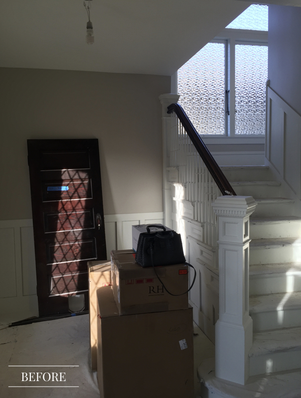
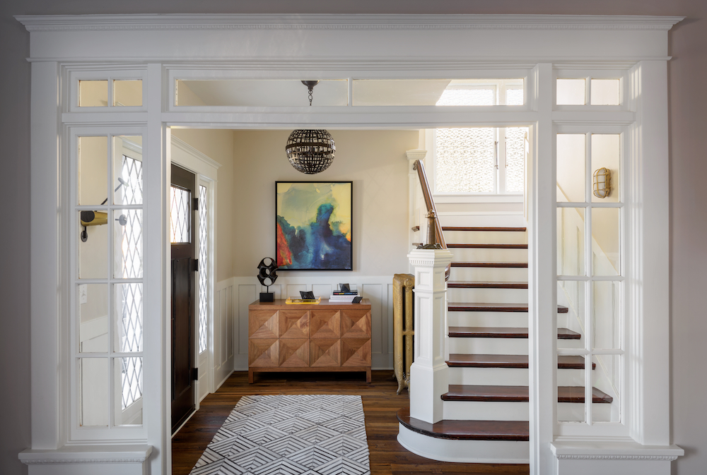
“This house was built in the 1900s and the original owner is believed to have been a shipyard manager. We took the history of the house and played our design off a vision of a modern nautical theme. The house is really dynamic, but you’ll find little details throughout that pay tribute to the home’s history.” — Beth Dotolo
LIVING ROOM
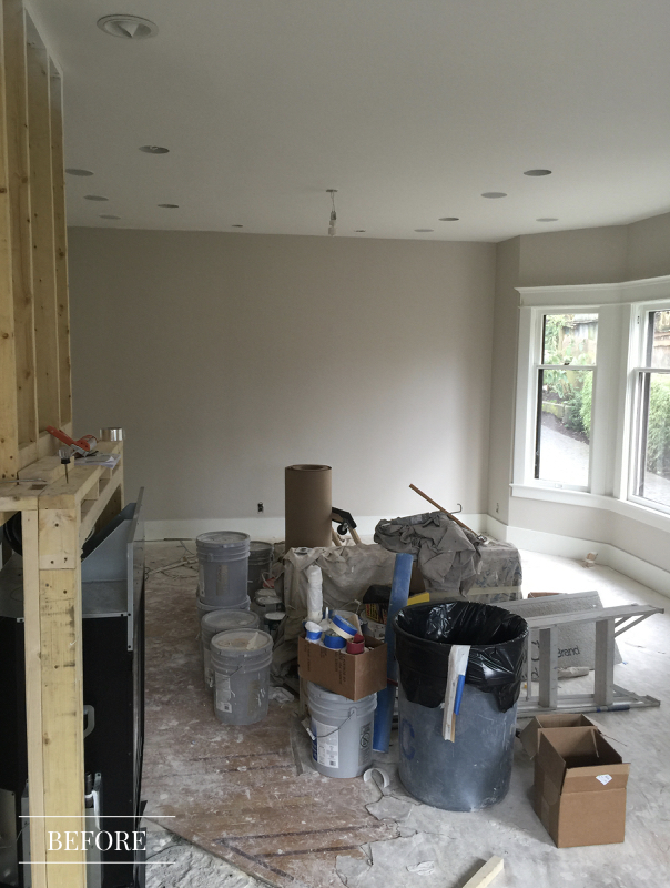
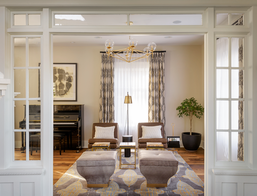
“The living room is one of our favorite spaces in the house. The layout was interesting to work around, but in the end we created this moody, but modern space where our clients can spend time together and entertain. We wanted to leave them with something they would be excited to show off.” — Carolina Gentry
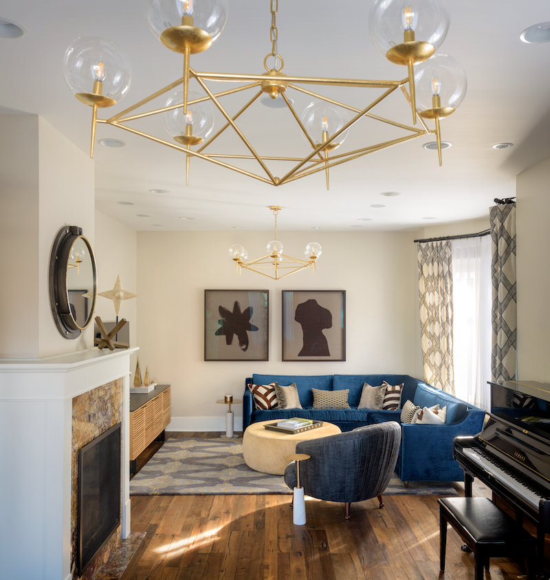
“Having a really pretty living room and a professionally designed space I think has changed the way we care for the space… I really enjoyed the process working with Pulp. We definitely get a lot of pleasure out of having a beautiful home.” — Rachel, Pulp Design Studios Client
KITCHEN
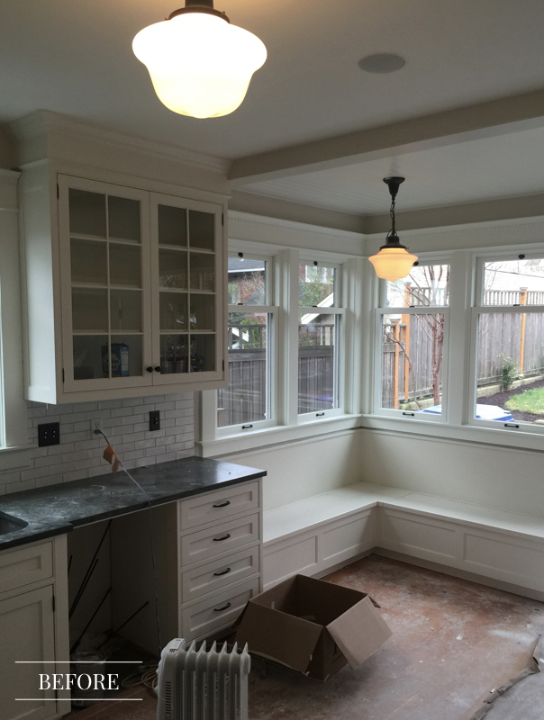
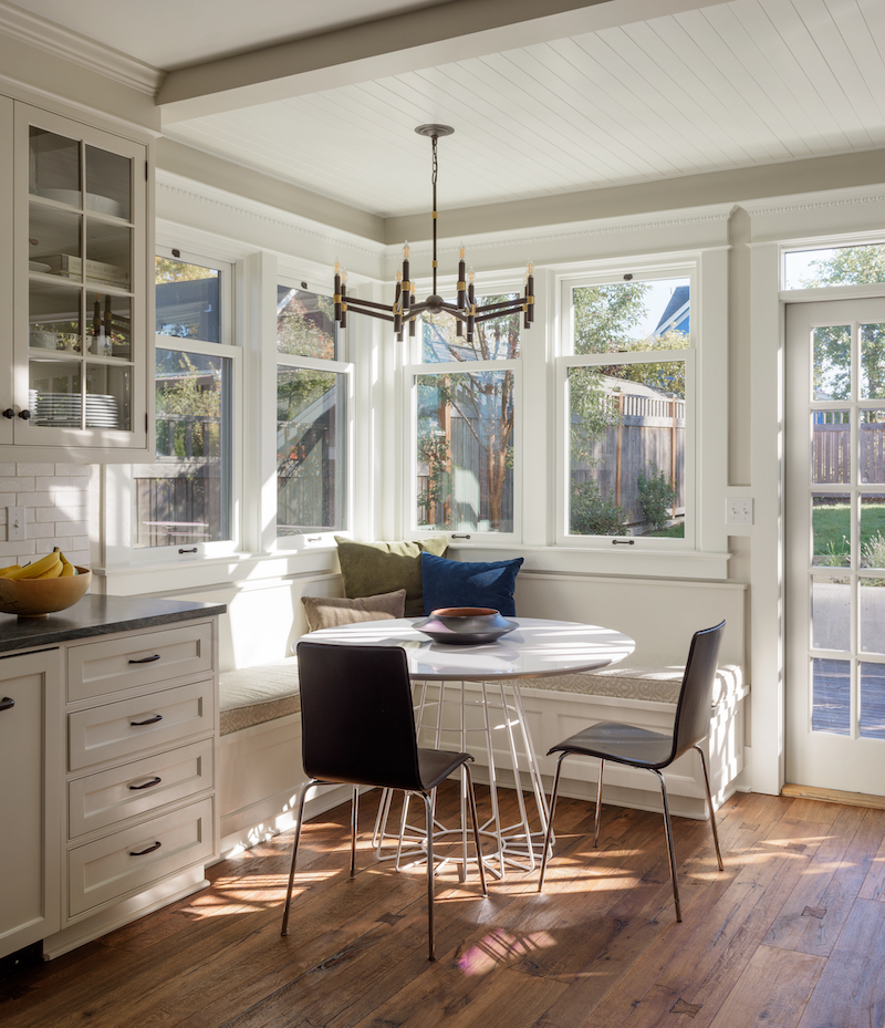
“I thought Pulp did a really good job during their discovery process of understanding where we were both coming from aesthetically and then presenting some options that blended those two together.” — Mark, Pulp Design Studios Client
MASTER BEDROOM
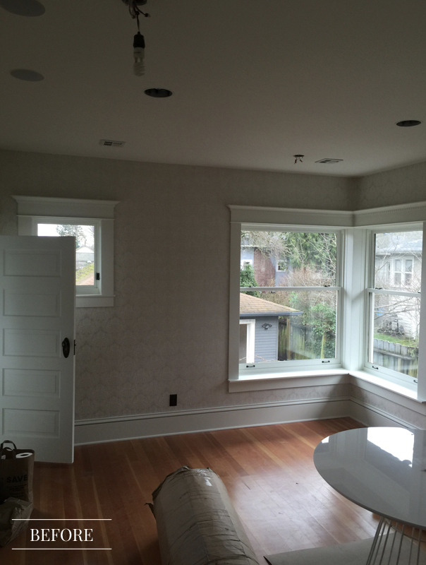
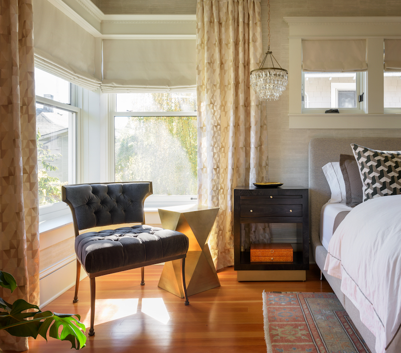
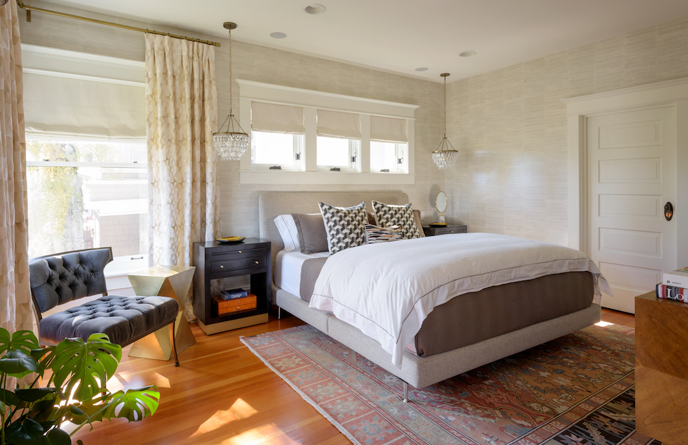
“When you walk into the master you instantly get a sense of both styles, but find yourself standing in a really cohesive and sophisticated space.” — Beth Dotolo
Take a Tour
Tour the entire home!
Credits

SECTIONS
Design InsiderEntertaining + Home Living
Health + Beauty
News + Announcements
Pulp At Home
Pulp Design Work
Shopping Guide
The Business of Design
The Pulp Edit
Travel
Videos
GET INSPIRED
SUBSCRIBE TO OUR NEWSLETTER TO
GET AN INSIDER LOOK IN YOUR INBOX


