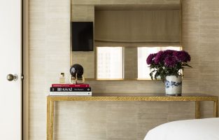
Before + After: Ponder Modern Master Bedroom
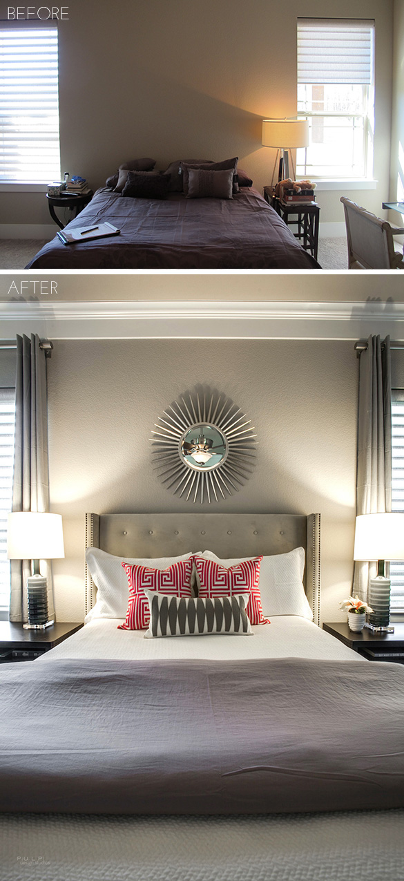
We’ve been getting lots of requests to see ‘Before’ photos of our interior design work! It’s hard to see a newly designed space and imagine how it would apply to you or to your life. So, we’ve decided to start doing more of our ‘Before and After’ posts so that you can see how some unassuming and ordinary rooms have been transformed into spaces that reflect the individual style of each of our clients, all while functioning splendidly for each of their lifestyles!
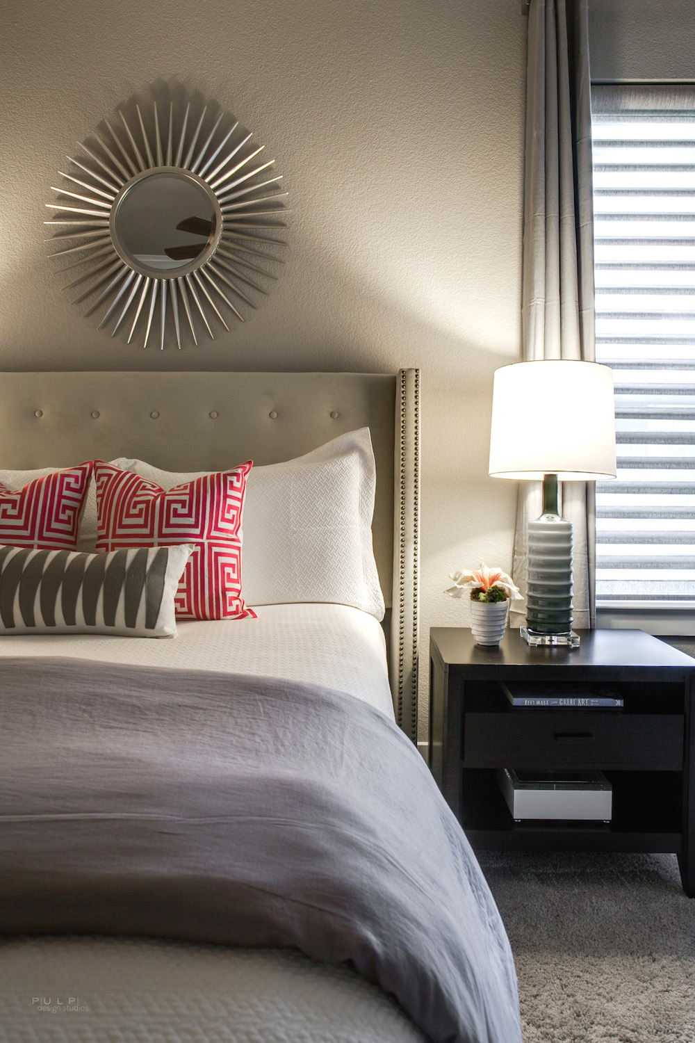
What started as a simple space that was not at all reflective of our client’s stylish and vibrant personality, is now a haven that she can turn to each day for relaxation and to set the tone for her day.
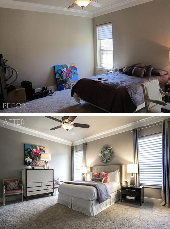
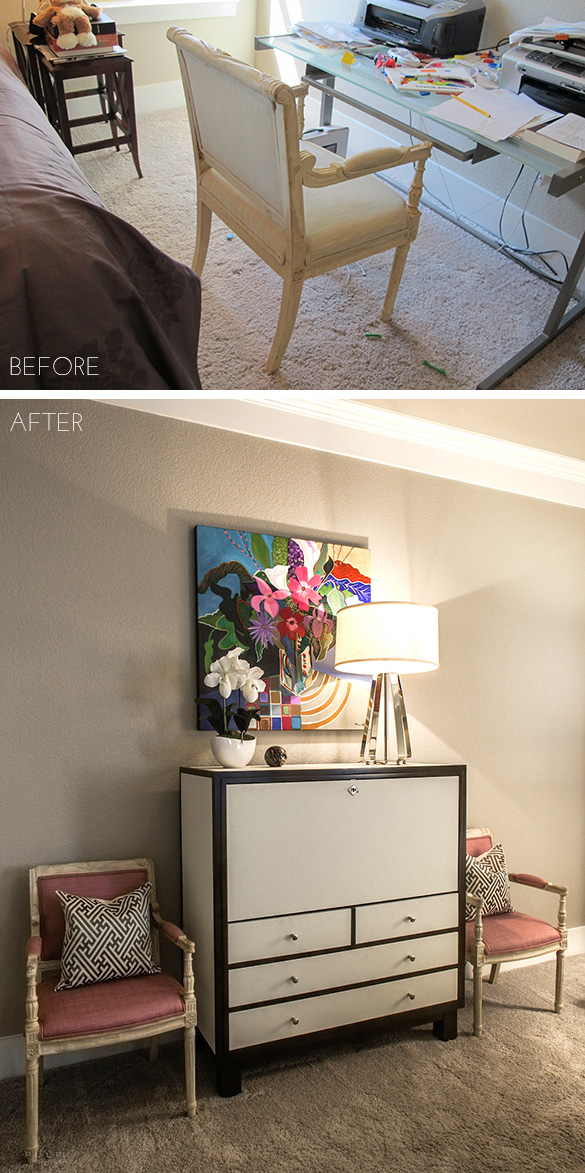
We played with the layout of the space and moved the open desk (complete with messy papers and work) to the other side of the room. We gave our client a concealed secratary-style desk that would allow her to close down her work and conceal the mess.
We also reupholstered her existing chairs to make them pop and exude our client’s happy personality.
This transformation helps showcase how a run-of-the mill room can be transformed with a keen design eye, a bit of clever repurposing, and thought behind how our client and homeowner functions. This simple bit of styling (we didn’t even paint!) made a world of difference on this budget project.
See the entire project on our website:
PONDER MODERN RESIDENCE
If you have a space you’d love to get the ‘Pulp treatment’, give us a shout and tell us about your project!
Credits

SECTIONS
Design InsiderEntertaining + Home Living
Health + Beauty
News + Announcements
Pulp At Home
Pulp Design Work
Shopping Guide
The Business of Design
The Pulp Edit
Travel
Videos
GET INSPIRED
SUBSCRIBE TO OUR NEWSLETTER TO
GET AN INSIDER LOOK IN YOUR INBOX


