Before & After: A Home Office Makeover
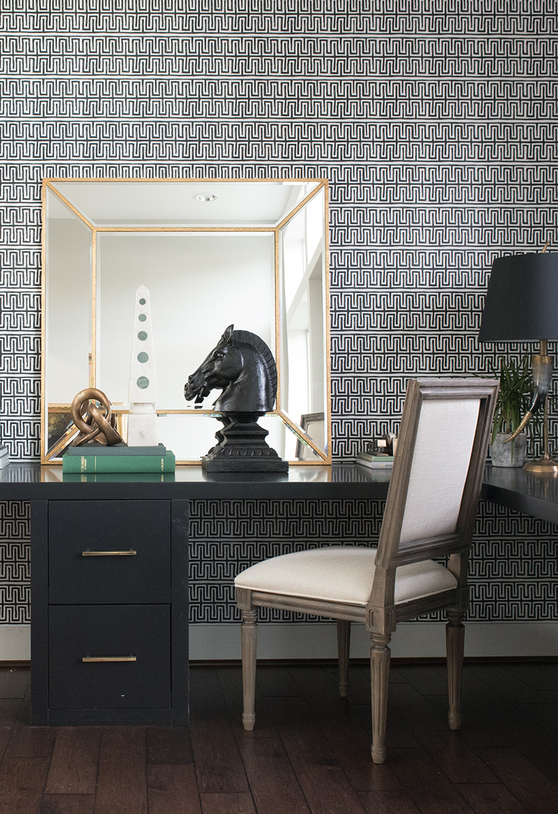
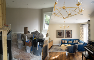
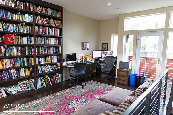
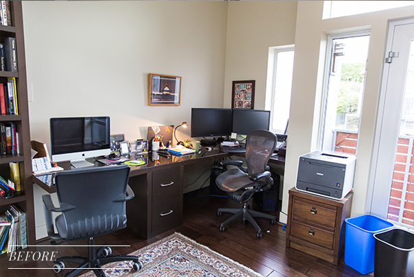
Earlier this year, we completed a Showhouse project with ATG Stores and Decorist to redesign the rooms of an amazing residence. Pulp was asked to design the Home Office and sourced everything solely from the ATG Stores website, and we designed it completely virtually. See how we transformed this space using only the before images you see below and some room measurements.
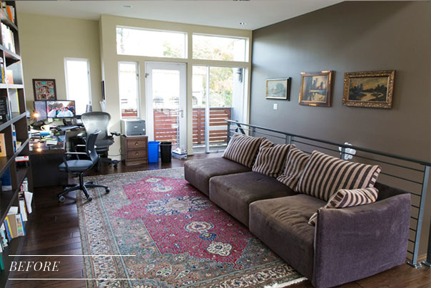
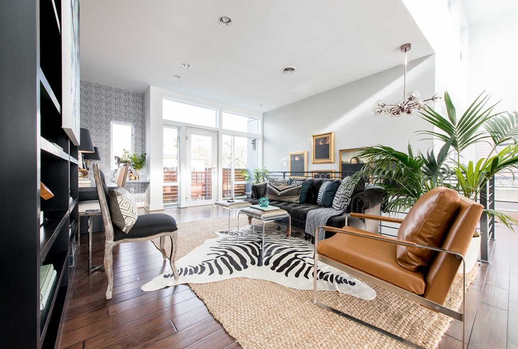
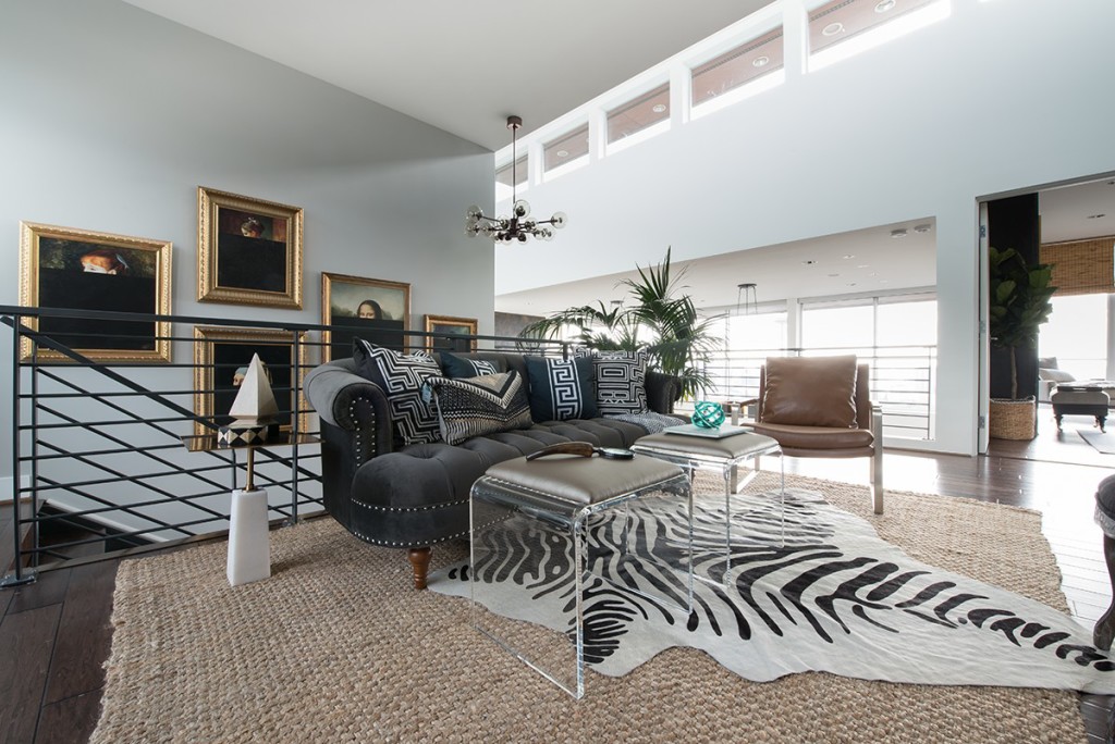
As you can see in the before photos, the space was basically a vestibule needing a little personality. We wanted to create a more neutral palette with lots of texture, while also showcasing the gorgeous downtown Seattle views the space had to offer.
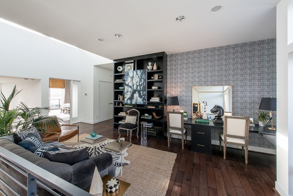
Faced with giving a room without four walls purpose, we were able to design this office space to exude a more inviting feel while also incorporating serious ambiance and style.
“We fearlessly mixed metals for added flair, incorporated amazing lighting to create mood and ambience, and brought in a graphic wall covering for heightened style.” – Beth + Carolina
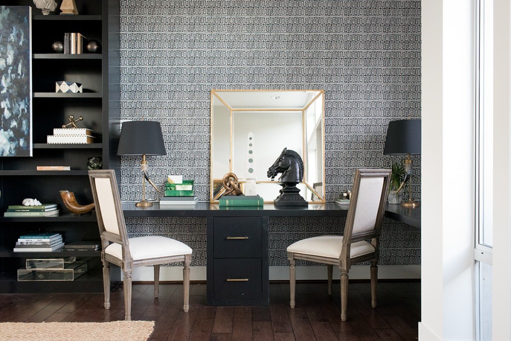
It’s amazing what new furnishings and style can do for the feel and functionality of a space, and this home office proves just that.
See the whole Home Office transformation!
Credits

SECTIONS
Design InsiderEntertaining + Home Living
Health + Beauty
News + Announcements
Pulp At Home
Pulp Design Work
Shopping Guide
The Business of Design
The Pulp Edit
Travel
Videos
GET INSPIRED
SUBSCRIBE TO OUR NEWSLETTER TO
GET AN INSIDER LOOK IN YOUR INBOX


