Home Tour: Lakehouse Retreat
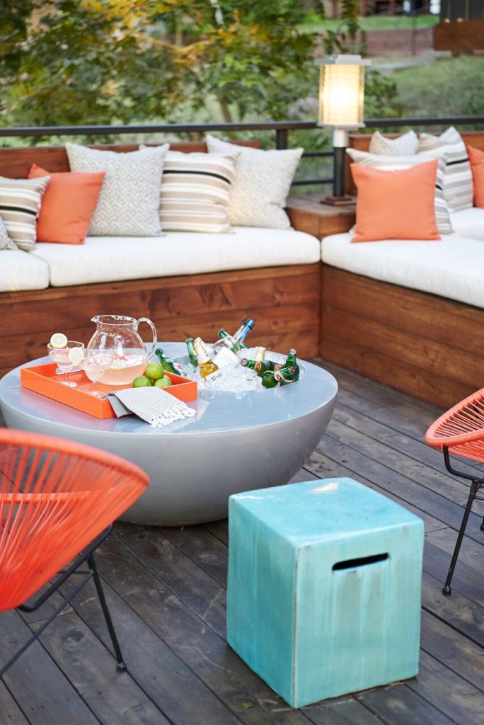
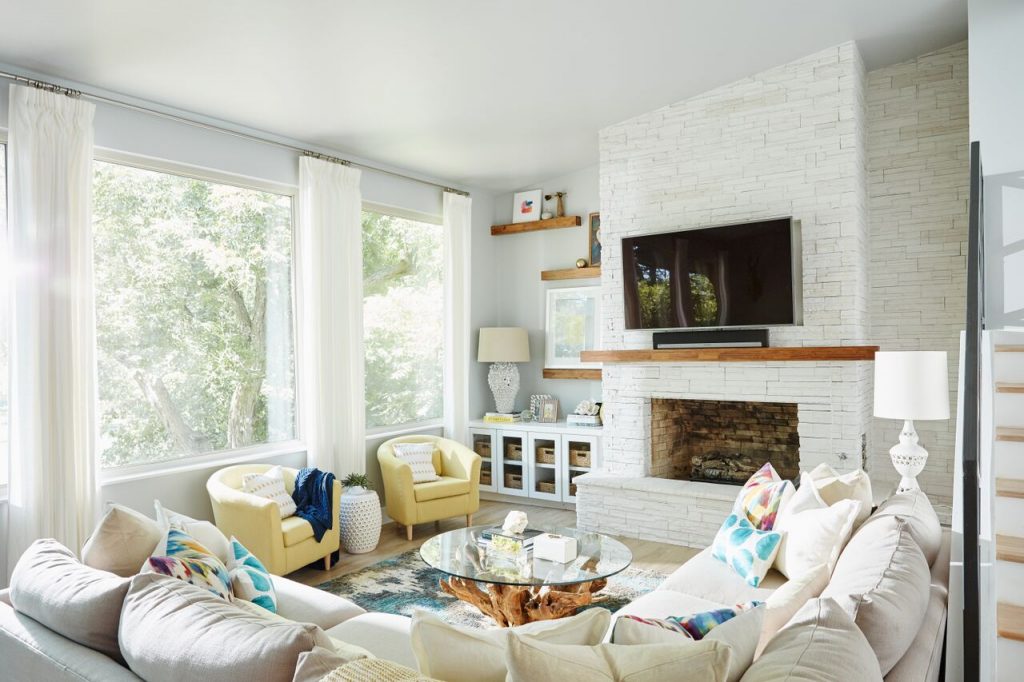
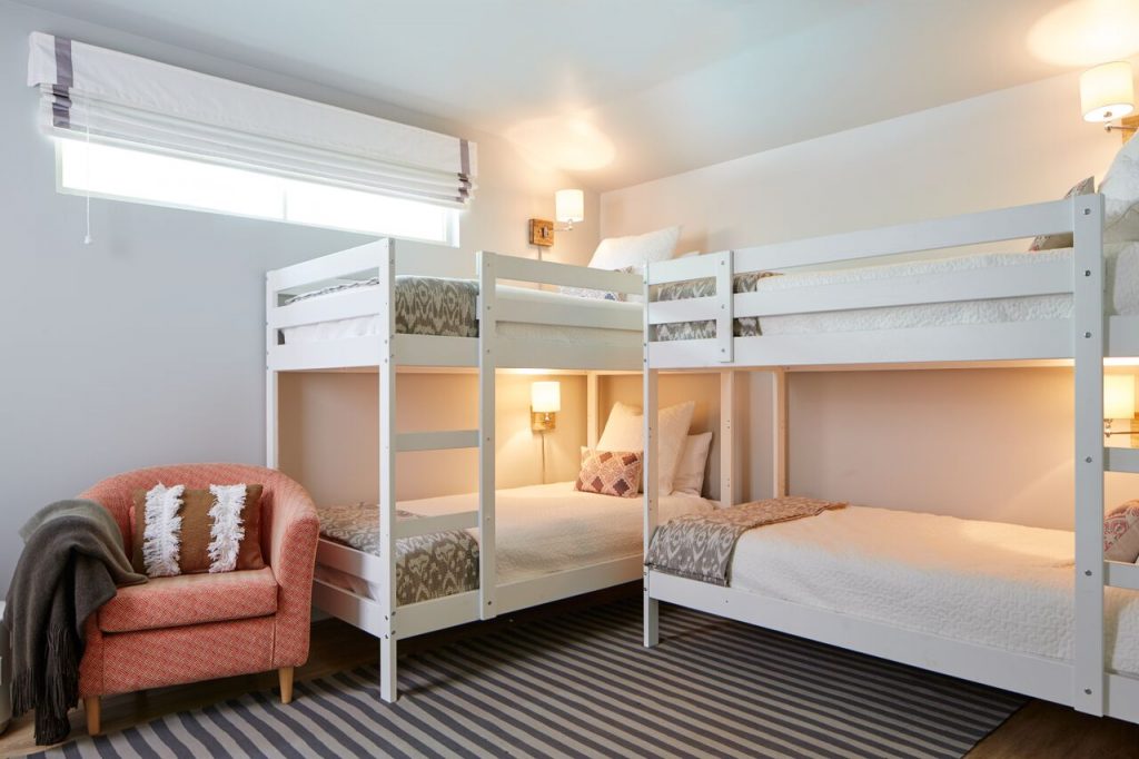
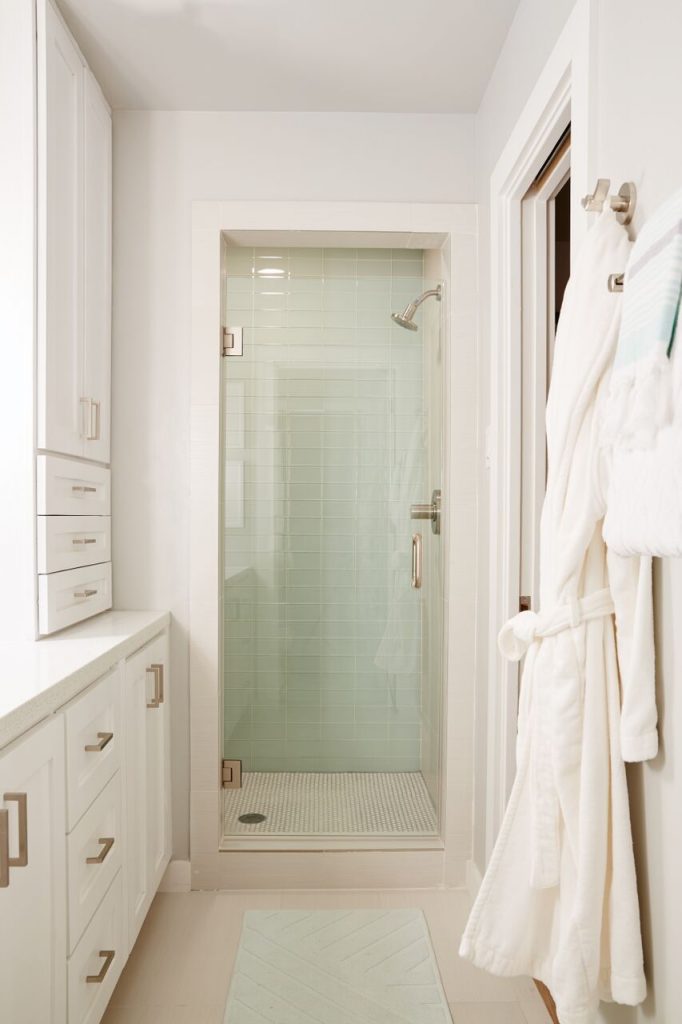
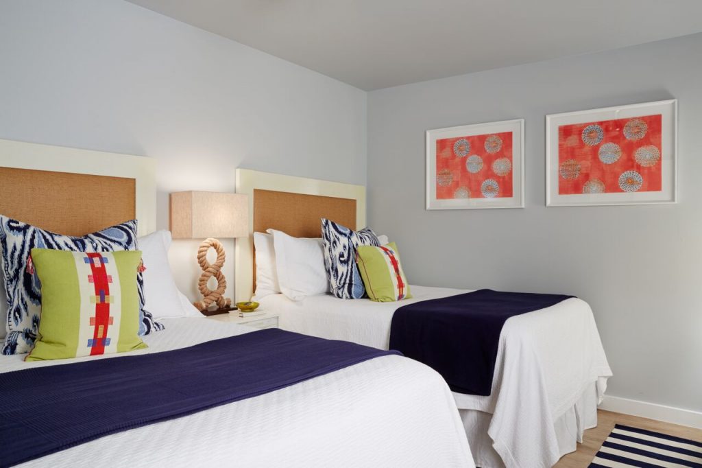
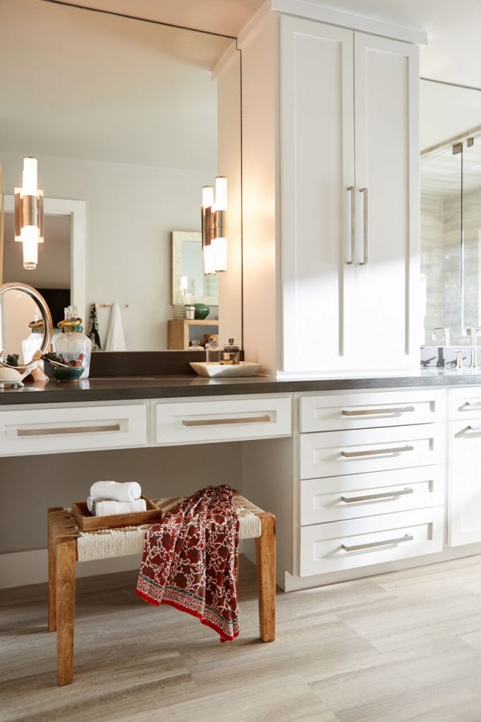
We completely renovated this home inside and out to accommodate 16 guests in a stylish, hotel-like setting. Owned by a long-time client of ours, this home reflects the owner’s personal style — well-traveled and eclectic — while also serving as a landing pad for her large family. We created spa-like guest bathrooms equipped with robes and lotions, guest bedrooms with multiple beds and high-quality comforters, and a party deck with a bar/entertaining area, to create the ultimate getaway for our client.
View the entire project here and don’t forget to see the before-and-after photos here.
Q. WHO IS OUR CLIENT AND HOW DID THEY FIND US?
We’ve been working with this client for years — we’ve designed several of her business locations and another of her homes. When she decided to invest in this lakeside residence, she knew it needed a serious overhaul and called us in immediately.
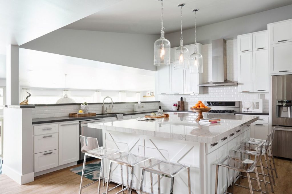
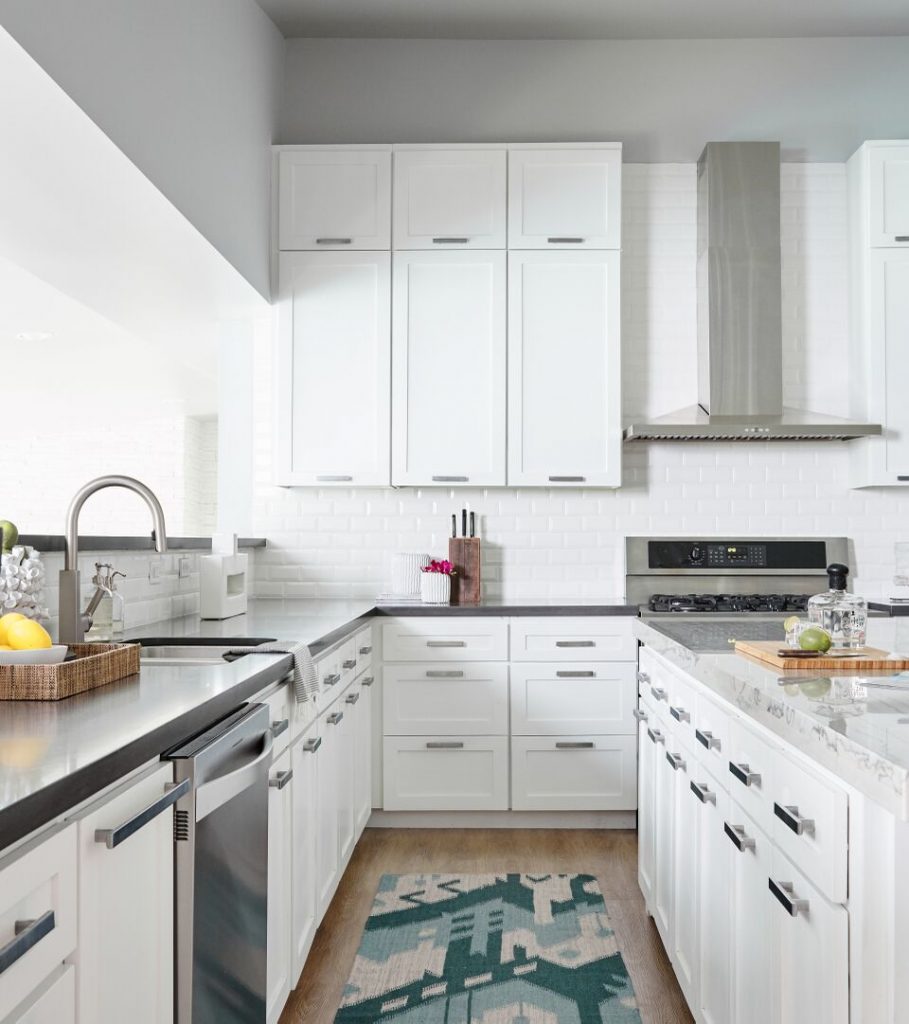
Q. WHAT WAS THE CLIENT’S PROJECT SCOPE AND WHY DID THEY SEEK OUT A DESIGNER RATHER THAN ATTEMPTING IT ON THEIR OWN?
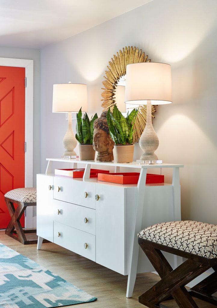
This was a complete top-to-bottom renovation. With an unstable deck that needed to be replaced, dark and dreary wood paneling throughout the home, and a worn-down interior, this home needed to be completely transformed. Our client knew she wouldn’t be able to do this without us, so we were her first call.
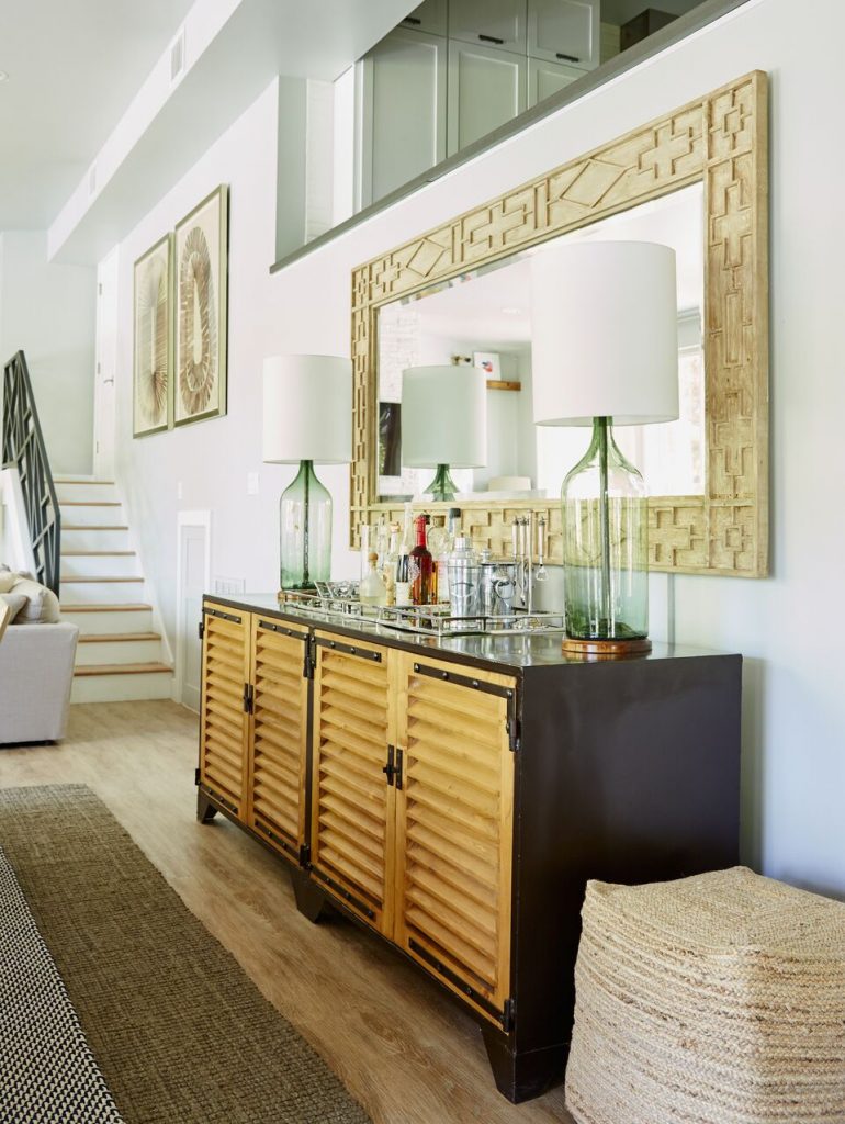
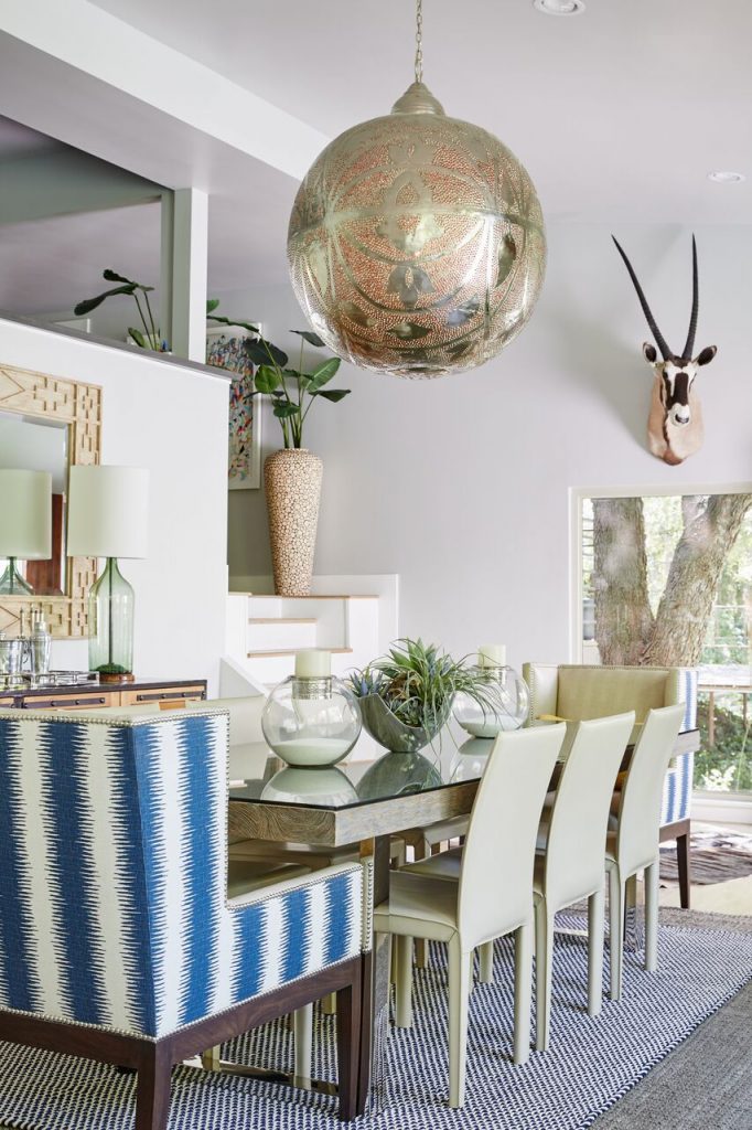
Q. WHAT WAS THE BIGGEST PROJECT CHALLENGE?
Making room for 16 beds in a four-bedroom house was challenging in itself, let alone making sure that the space looks stylish and not cluttered. The home needed to be durable and cleanable since there would be plenty of guests coming straight in from a swim in the lake, and it needed to feel open and fresh despite accommodating a large group.
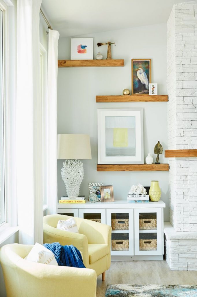
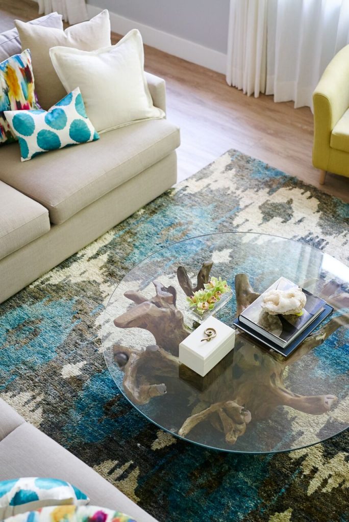
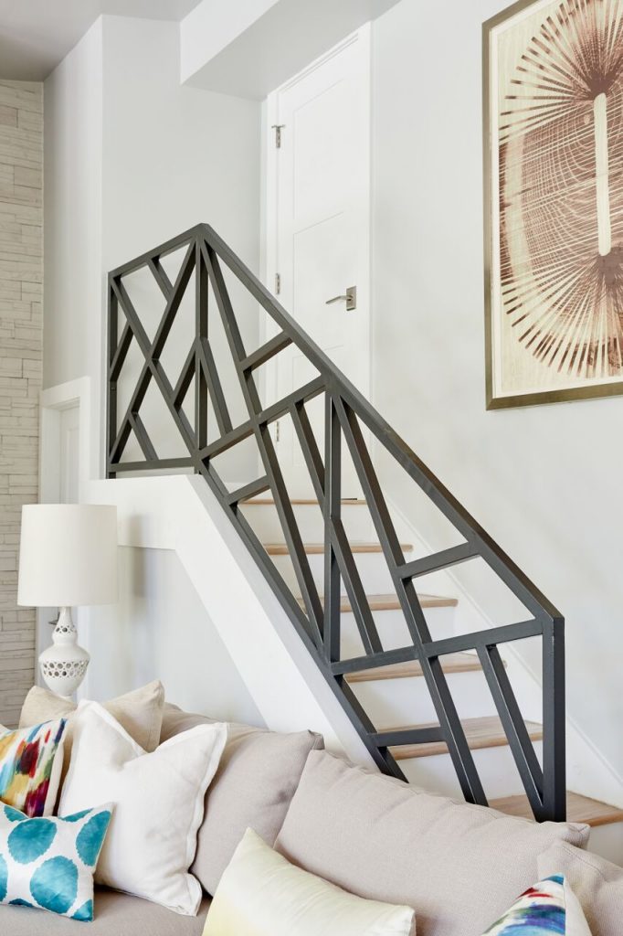
Q. WHAT WAS THE MOST DRAMATIC TRANSFORMATION?
The entire home is mind-blowing to look at before-and-after photos of, even for us. Filled with dark, dated wood and worn-down finishes, it’s barely recognizable as this new, bright and airy space. See before and after photos here
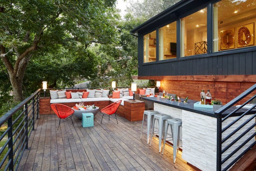
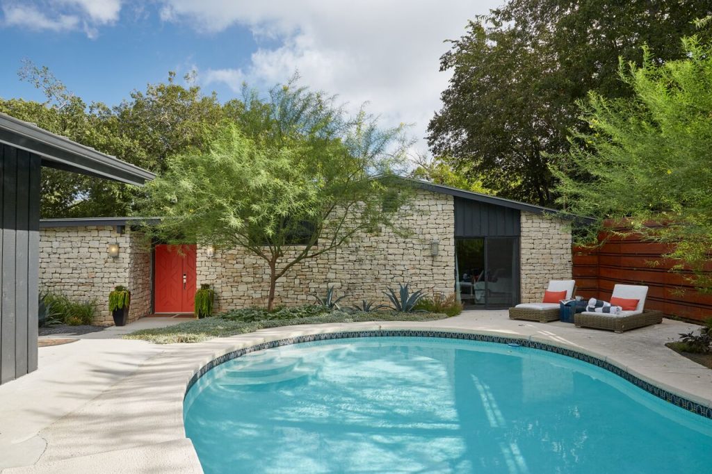
Q. CAROLINA, WHAT IS YOUR FAVORITE PART OF THIS SPACE?
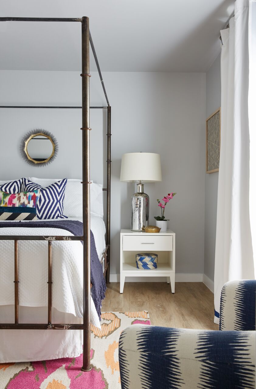
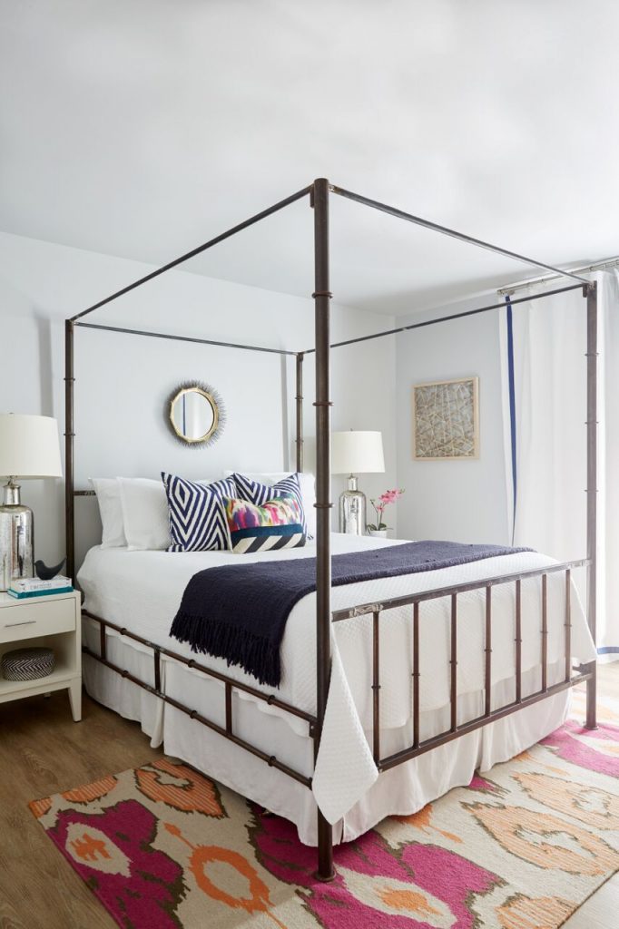
The guest room with a master bed and attached bathroom is full of layered patterns and textures. It’s gorgeous and completely captures the eclectic, global vibe the client was after. It really feels like you’re staying in a luxurious hotel, with robes and amenities available in the bathroom and a lounging area in the bedroom. In fact, I’ve stayed in this room before and enjoyed it

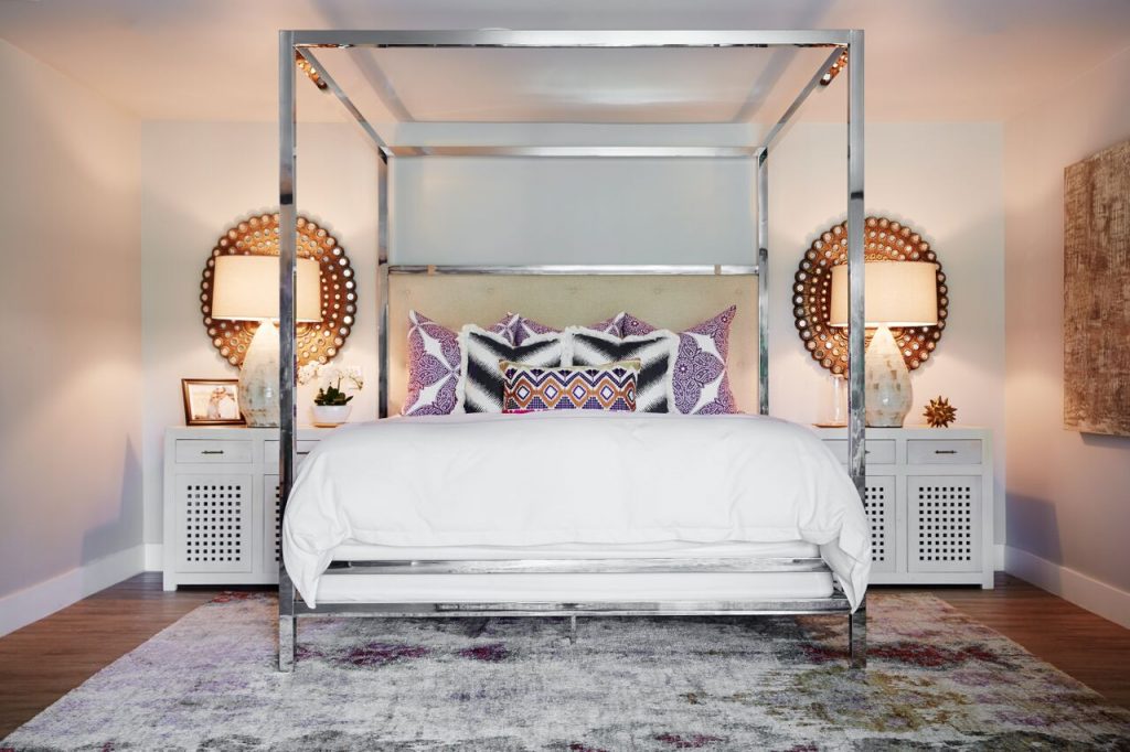
Q. BETH, WHAT IS YOUR FAVORITE PART OF THIS SPACE?
This was an incredibly fun project. We refreshed the entire space to feel more like the happy medium between a hotel and a residence. Our team added little touches to the bathrooms, like plush robes and shampoos, to make the space feel lush and inviting. In terms of completed spaces, I love the entire master suite — knowing that the homeowner will be able to retreat into her own little space, with both a gorgeous master bath and a den attached to the master bedroom, feels like the perfect touch. Its layered patterns and global feel are sophisticated and inviting. Our team did a gorgeous job.
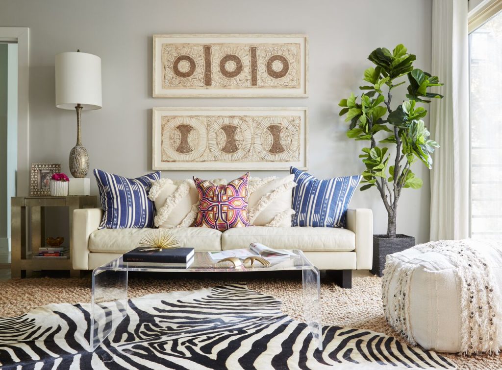
Continue exploring the space by watching our home tour video below…
What was your favorite part of this project?
For professional interior design services, contact Pulp Design Studios℠.
Credits

SECTIONS
Design InsiderEntertaining + Home Living
Health + Beauty
News + Announcements
Pulp At Home
Pulp Design Work
Shopping Guide
The Business of Design
The Pulp Edit
Travel
Videos
GET INSPIRED
SUBSCRIBE TO OUR NEWSLETTER TO
GET AN INSIDER LOOK IN YOUR INBOX


