House Tour: University Park Transitional
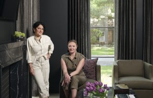
Pulp projects range from new builds to renovations to requests for furnishings and finishes. For this transitional project in the Dallas University Park neighborhood, we were called in by a fellow interior designer who had started the project, but wanted Pulp’s help. It’s so hard to design your own home when you’re the professional (the Pulp duo can relate!), and she loved our aesthetic. So this project was about taking the design over the finish line. Let’s take a tour!
ENTRY
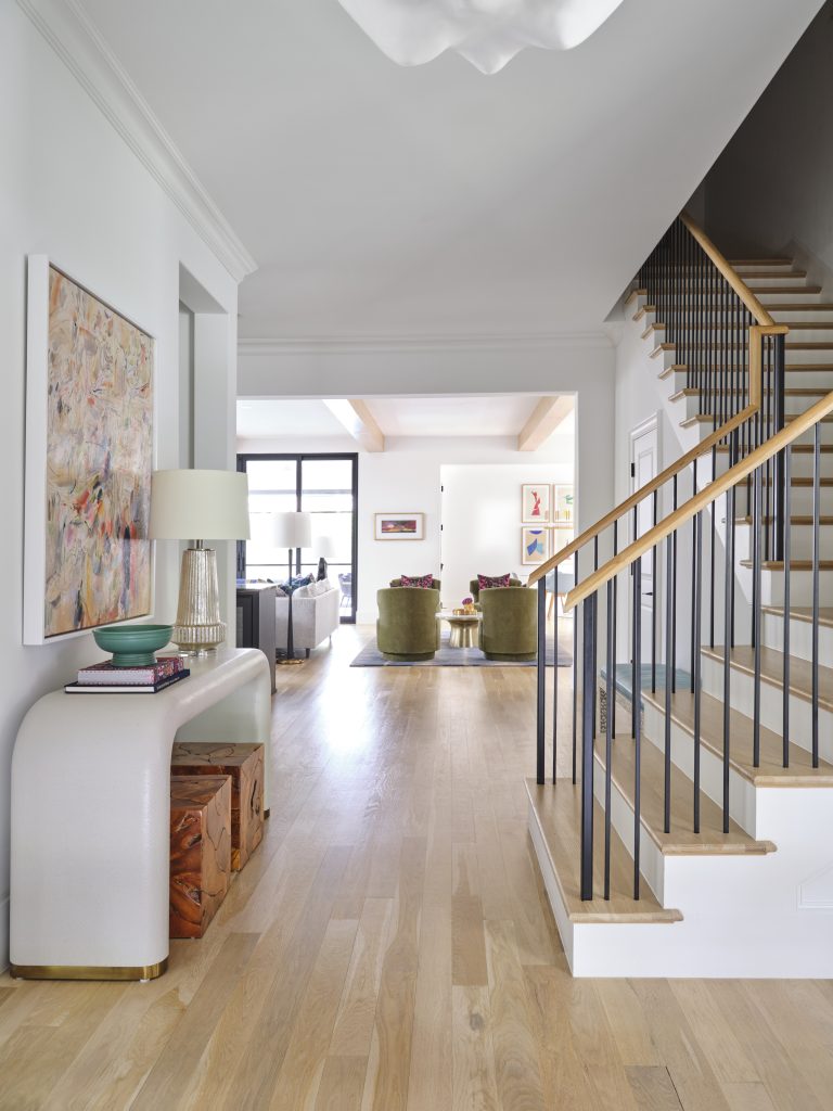
The house has an open plan filled with gorgeous natural light. Pulp loved the light wood floors and the white surfaces. We brought in modern furnishings to complement the home’s design and add beautiful shapes and visual interest.
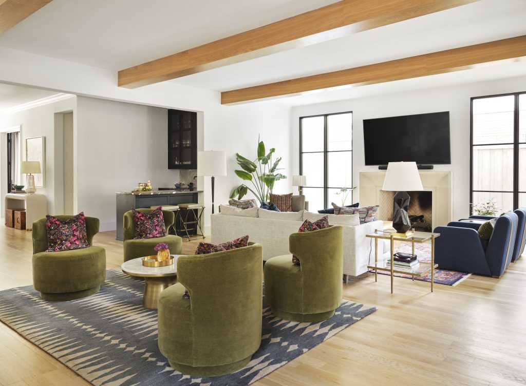
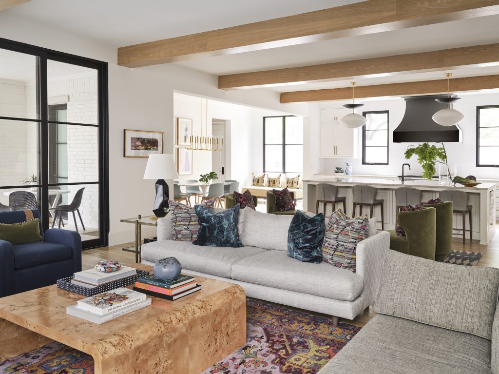
GREAT ROOM
The open-area great room is a very large space in this house, so Pulp crafted different zones to create a more intimate setting. There’s a traditional seating area in front of the television, as well as a conversation area with four swivel chairs. This room is one of our client’s favorites. She loves all the patterns the Pulp team layered in, as well as the palette. And because her family includes a dog and kids, we invested in performance fabrics that will hold up to anything the family can throw at them.
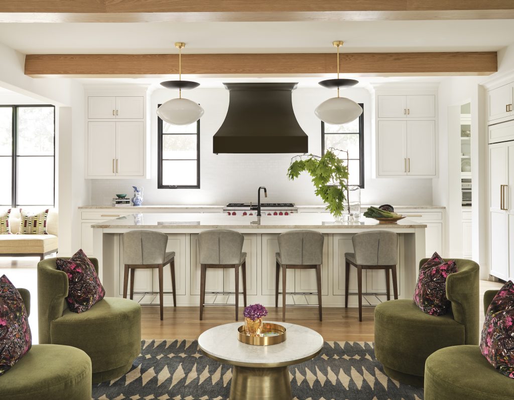
KITCHEN
The kitchen is a gorgeous modern gathering space. Pulp brought in modern seating and contemporary pendants to add a little edge to the more timeless white-kitchen design. We love those unexpected touches.
POWDER ROOM
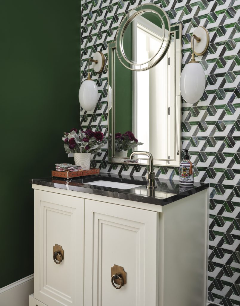
The dramatic powder room design is one of Pulp’s favorite spaces in the house. The geometric glass mosaic tile behind the sink is almost like a David Hicks pattern. It looks like a wallcovering, but is a bolder and more dimensional design.
DINING ROOM
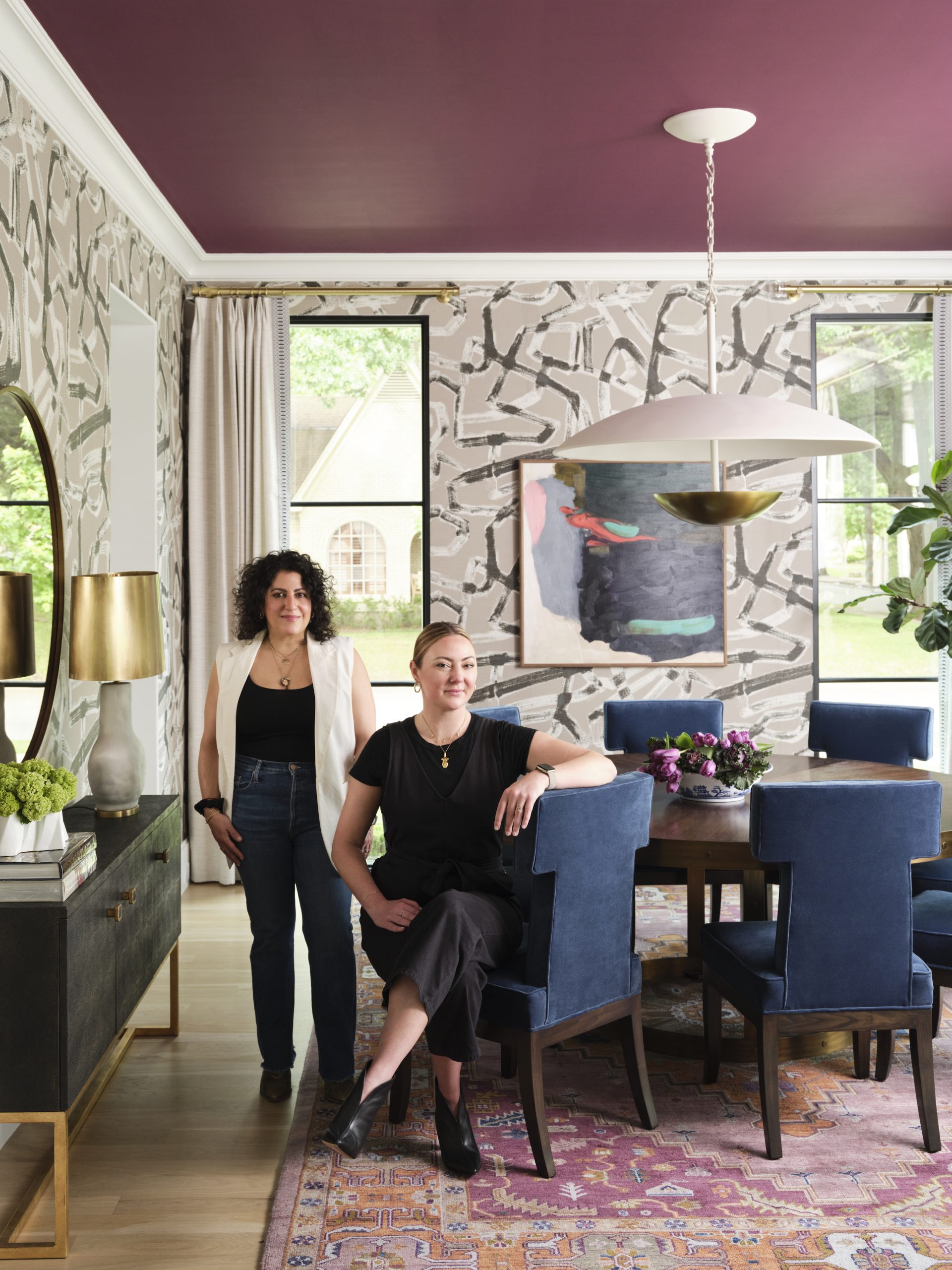
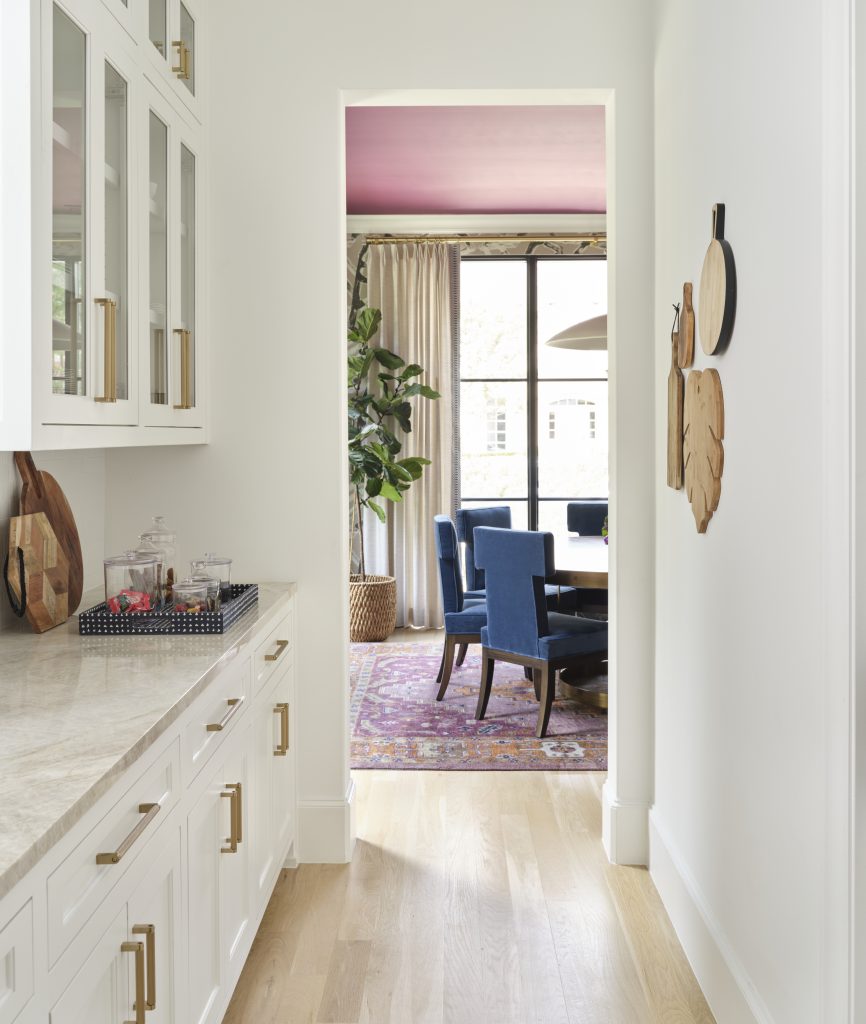
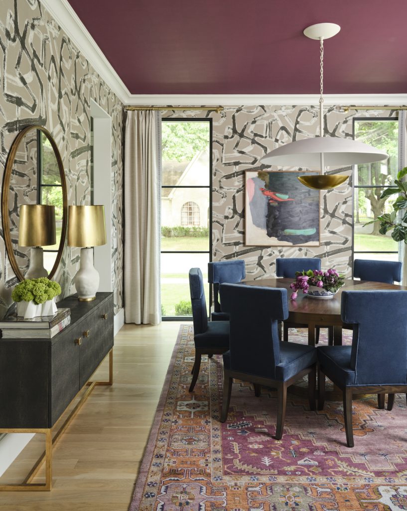
The family loves color and pattern, so the Pulp team created a magical mix in the dining room, including a Pulp-exclusive wallpaper that’s from one of our fabric patterns for S. Harris. We also used different textures and a gorgeous raspberry paint color on the ceiling. It’s an adventurous look that makes this house very unique and personalized.
THE STUDY
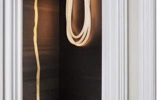
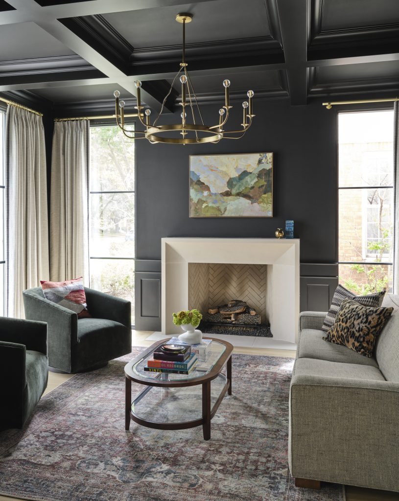
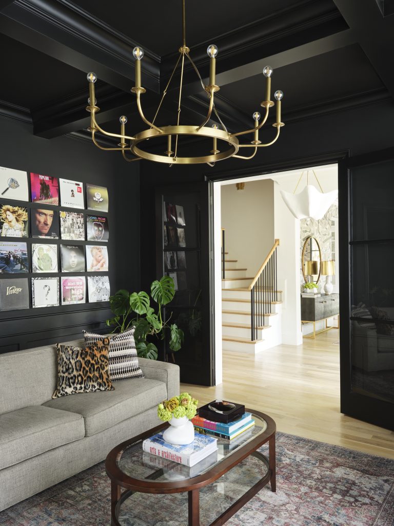
We took a bolder approach with color for the study, saturating the room in a deep, dark black. It’s the perfect backdrop for that bold light fixture and the art.
PRIMARY SUITE
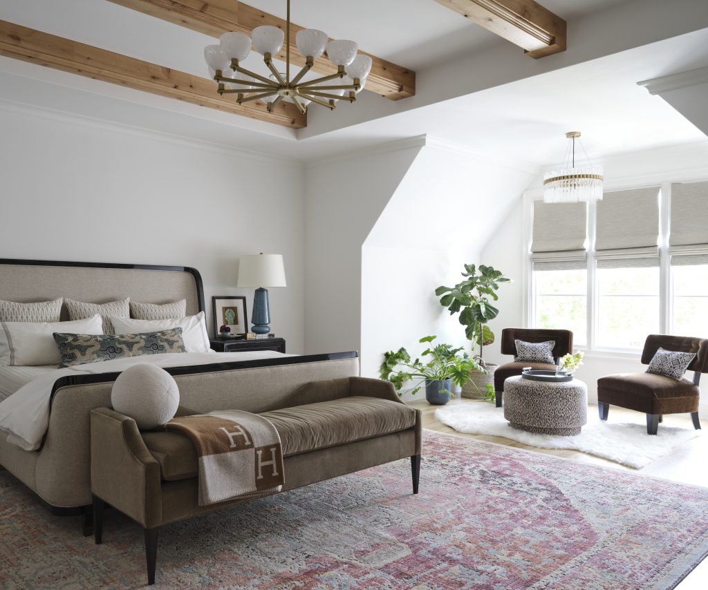
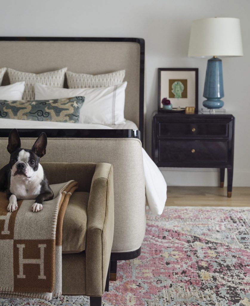
We loved the architecture in the house, especially in the principal bedroom suite. We kept things neutral and calm, crafting a retreat for our clients. And we included a reading area where they can have some quiet time on their own.
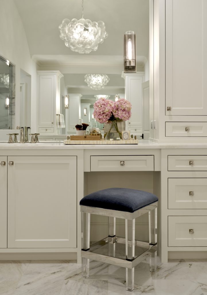
In the principal bathroom, Pulp’s goal was to add lovely design touches to elevate the space, including a lucite stool, a lovely fixture, and updated details.
It’s those details that really make a Pulp project stand out. If you need a makeover for your home, give our team a call! And to see more of this project, click here.
Credits

SECTIONS
Design InsiderEntertaining + Home Living
Health + Beauty
News + Announcements
Pulp At Home
Pulp Design Work
Shopping Guide
The Business of Design
The Pulp Edit
Travel
Videos
GET INSPIRED
SUBSCRIBE TO OUR NEWSLETTER TO
GET AN INSIDER LOOK IN YOUR INBOX


