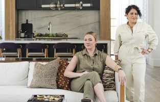
Perfecting the Palette
How does Pulp select the perfect palette for the homes we design? We often find our best inspiration just outside the doors! And then we add our signature element of surprise. Let’s take a look at a lakeside Seattle home and how we built its color story.
NATURALLY COLORFUL
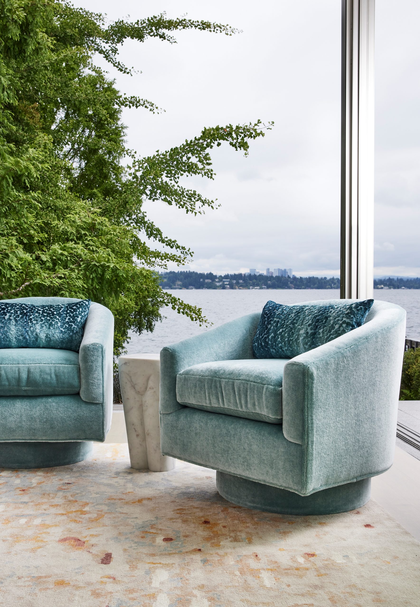
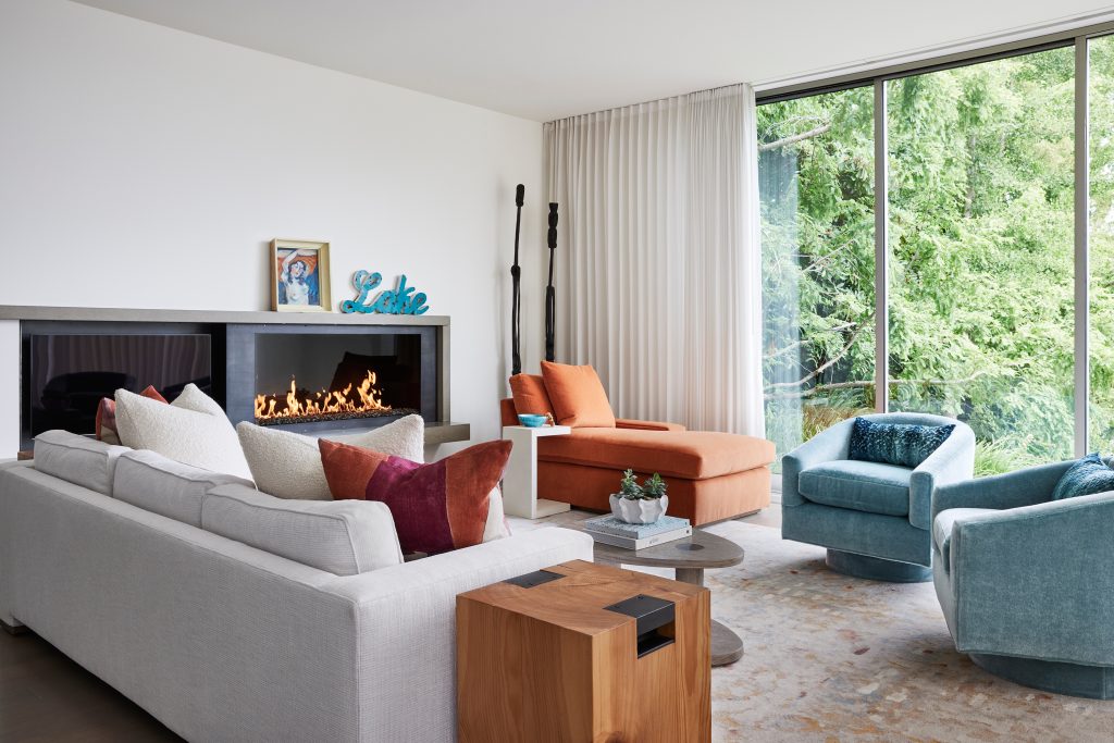
Mother Nature has an incredible way with color, so for the gorgeous room with a view you can see above, we took our inspiration from the lake views and lovely plants and trees outside. You’ll see an array of blues in the home, all from the every-changing color of the lake’s water. And there are neutral colors like sand, bark, and stone in every room.
PACKING A PUNCH
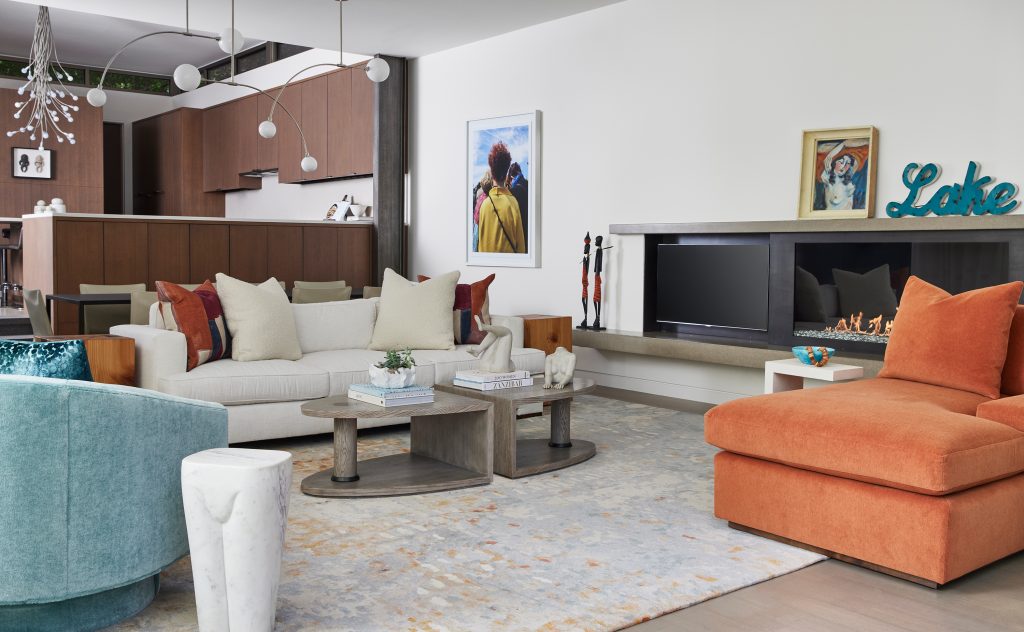
We always love to surprise and delight our clients, as we did with the bold punches of orange and deep red in the living room. Those colors can be part of the stunning sunrises each evening on the lake, and they definitely add balance to this home’s color palette.
WATER COLORS
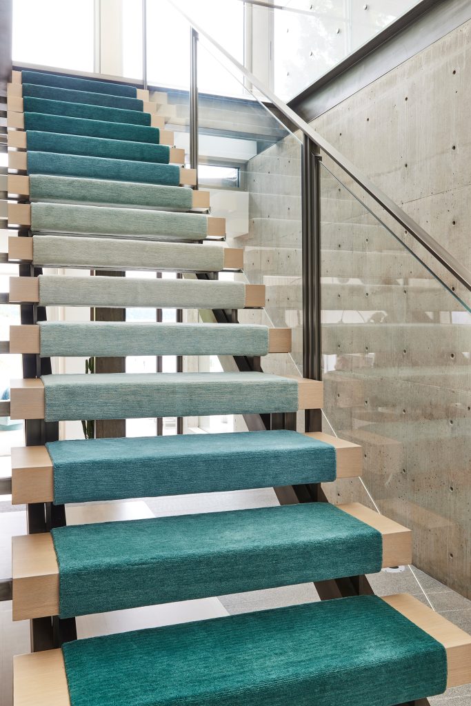
One of our favorite parts of this home is the open staircase. We gave it a lot of personality with a custom ombré stair runner in watery blues. It looks so beautiful against the view of the lake just behind it.
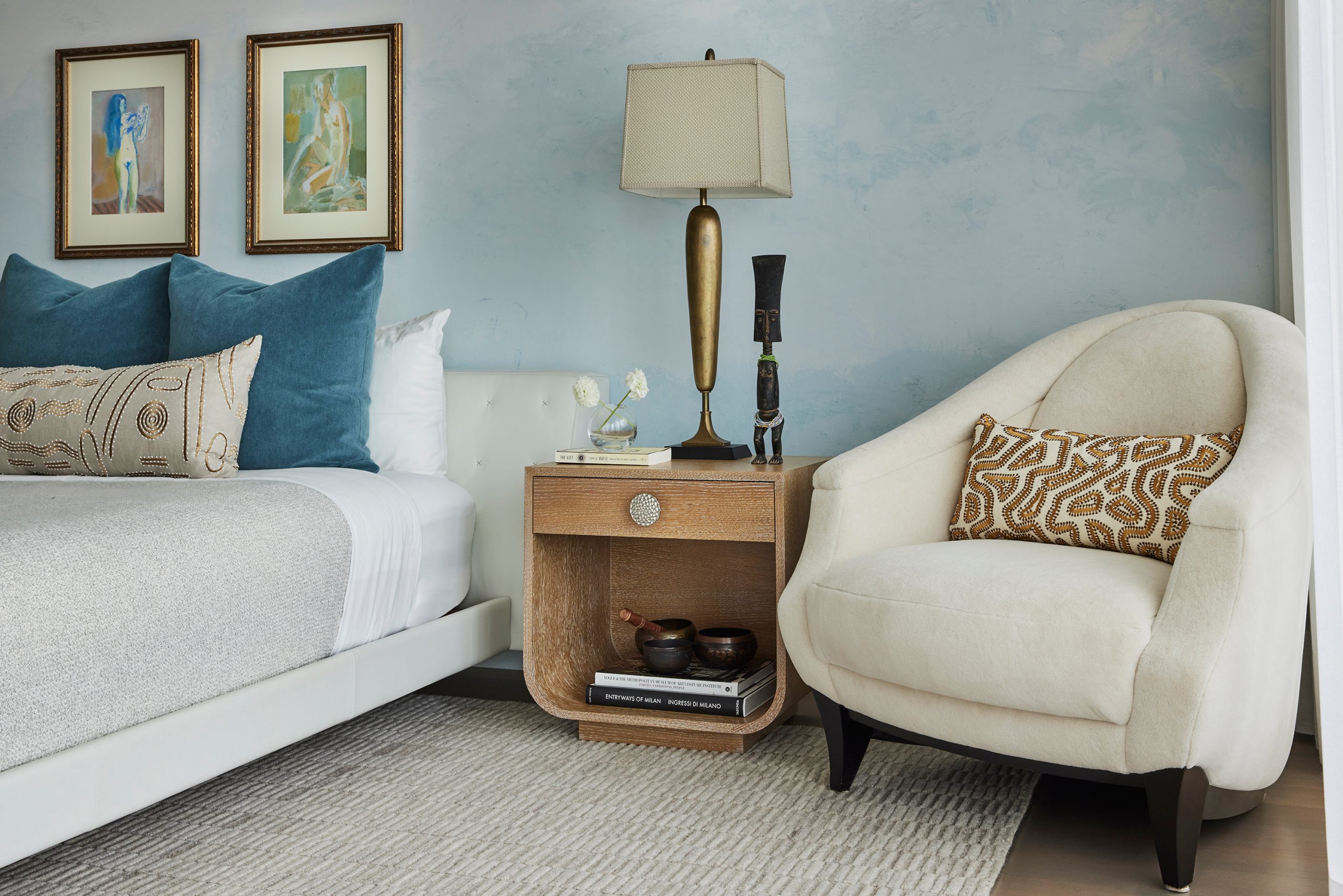
In the primary bedroom we had a local artist plaster the bedroom wall, giving it a texture that looks like waves of water.
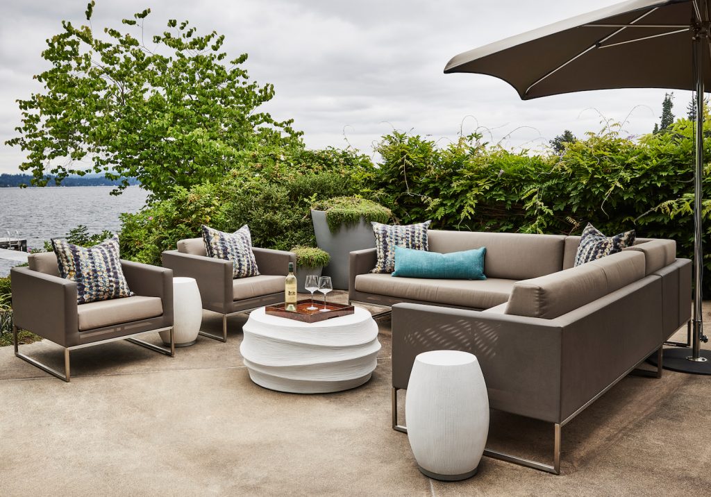
In the outdoor setting, the neutral look for the furnishings is accented with blues in the pillows. The patterned fabric is from our collection with S. Harris – it’s Old Cairo in the aptly named Lagoon colorway.
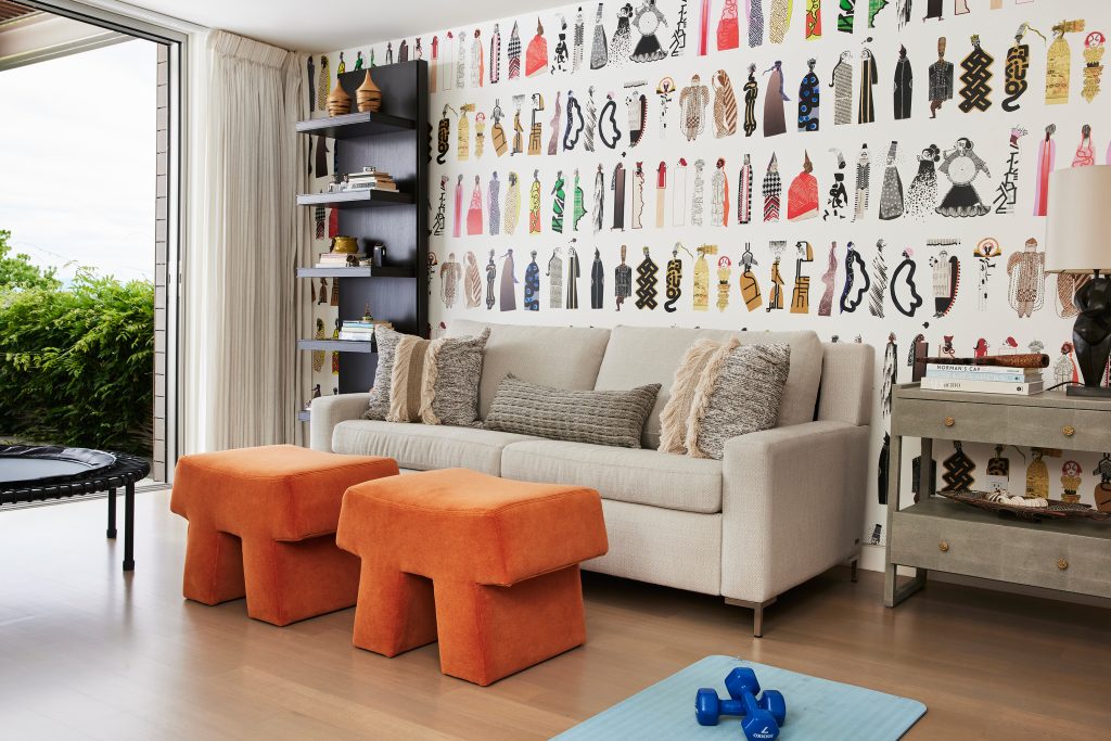
MULTICOLOR TASKING
A lot of rooms now serve many purposes, like the den below. Our clients wanted a workout room, an extra guest room, a TV room, and a great hang-out space – all in one space! We made it happen, and we made it chic and colorful. The bold orange is perfect in a room where you need some energy. And that’s also why we selected the incredible wallpaper on the walls, too.
The WONDERS OF WOOD
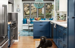
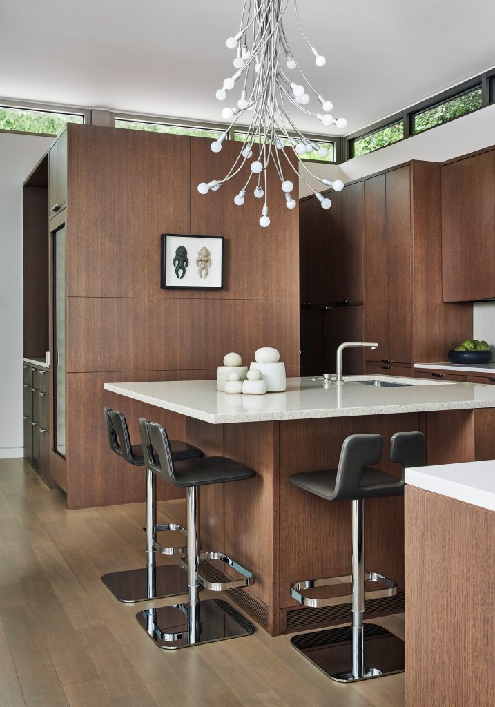
We love the look of natural wood, and this home was perfect for an organic look like that. In the kitchen, we expertly mixed several wood tones to create a stunning look for the cabinetry and floor. And don’t you love those windows around the top? The view of the greenery makes it look as if the wood cabinets are the source for the leaves.
We kept that neutral look going in the nearby dining space. The art by Kevin Dotolo gave us the perfect opportunity to bring in more of those gorgeous blues.
![]()
Need help selecting the perfect palette for your home? Give our team a call!
Credits

SECTIONS
Design InsiderEntertaining + Home Living
Health + Beauty
News + Announcements
Pulp At Home
Pulp Design Work
Shopping Guide
The Business of Design
The Pulp Edit
Travel
Videos
GET INSPIRED
SUBSCRIBE TO OUR NEWSLETTER TO
GET AN INSIDER LOOK IN YOUR INBOX