Architectural Digest — Sourcebook
 Architectural Digest — June 2018
Written By Hadley Keller
HOW TWO DESIGNERS LEVERAGED THEIR ONLINE PRESENCE TO CREATE A LICENSED TEXTILE COLLECTION
Beth Dotolo and Carolina V. Gentry of Pulp Design Studios share the origins of their line for S. Harris
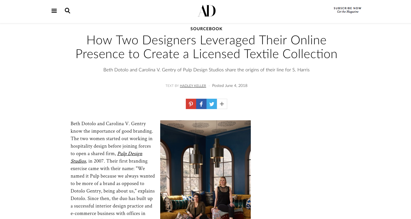
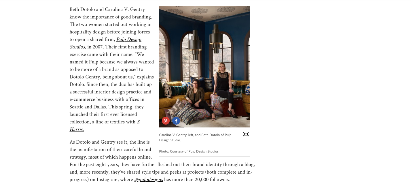
Beth Dotolo and Carolina V. Gentry know the importance of good branding. The two women started out working in hospitality design before joining forces to open a shared firm, Pulp Design Studios, in 2007. Their first branding exercise came with their name: “We named it Pulp because we always wanted to be more of a brand as opposed to Dotolo Gentry, being about us,” explains Dotolo. Since then, the duo has built up a successful interior design practice and e-commerce business with offices in Seattle and Dallas. This spring, they launched their first ever licensed collection, a line of textiles with S. Harris.
As Dotolo and Gentry see it, the line is the manifestation of their careful brand strategy, most of which happens online. For the past eight years, they have further fleshed out their brand identity through a blog, and, more recently, they’ve shared style tips and peeks at projects (both complete and in-progress) on Instagram, where @pulpdesigns has more than 20,000 followers.
“They said that’s how they found us—through Instagram,” says Dotolo of the team at S. Harris who approached them. “Then they got to our site and saw all the videos we do and our blog, and they decided we were a brand they were excited about and wanted to align with.”
To the designers, this reasoning, while exciting, was far from surprising. Dotolo and Gentry have long been using digital platforms to grow their business. “We’ve been blogging for about eight years now,” Gentry says. “Our blog has been a huge part of growing our firm, because when we started, no one knew who we were and we had no clients. We used social to get clients first. If it weren’t for our blog, we wouldn’t be as well-branded or as well-known.”
Through the blog and social media, though, Pulp has been able to establish a clear aesthetic and voice, something its two designers say many creatives miss. “You need to establish your values and your brand voice clearly,” Dotolo says. “Document it; write it down.”
“And know who your target client is,” adds Gentry. “Right, you don’t want to fall into the trap of posting something just because its pretty. You have to articulate yourself and speak to someone within your values, and be consistent about it,” agrees Dotolo.
It was that savvy that inspired S. Harris to call Dotolo and Gentry into their offices for a brainstorming session on how they could work together. “They weren’t coming for us for a licensed collection initially,” Gentry says. “So that goes to show you need to ask for want you want! Initially it was just about doing something together and we were exploring the possibilities of how we would work with our social media or e-commerce.”
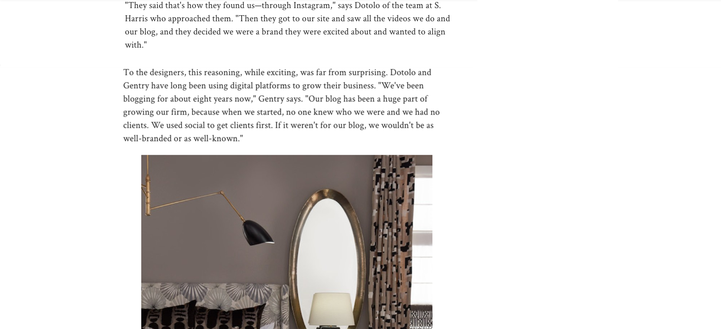
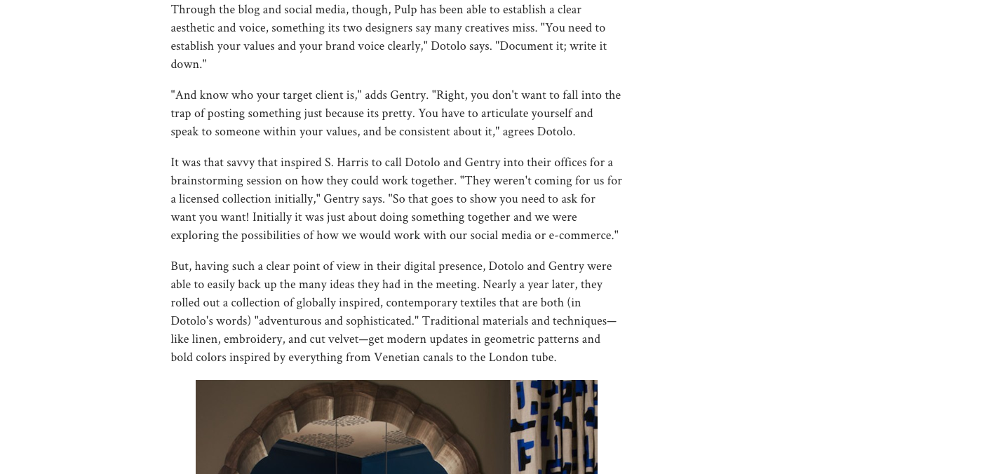
But, having such a clear point of view in their digital presence, Dotolo and Gentry were able to easily back up the many ideas they had in the meeting. Nearly a year later, they rolled out a collection of globally inspired, contemporary textiles that are both (in Dotolo’s words) “adventurous and sophisticated.” Traditional materials and techniques—like linen, embroidery, and cut velvet—get modern updates in geometric patterns and bold colors inspired by everything from Venetian canals to the London tube.
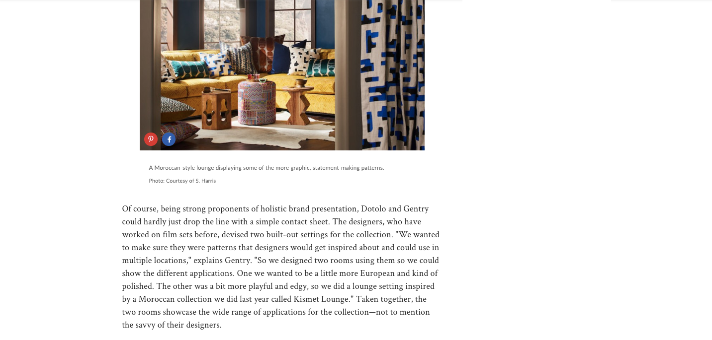
Of course, being strong proponents of holistic brand presentation, Dotolo and Gentry could hardly just drop the line with a simple contact sheet. The designers, who have worked on film sets before, devised two built-out settings for the collection. “We wanted to make sure they were patterns that designers would get inspired about and could use in multiple locations,” explains Gentry. “So we designed two rooms using them so we could show the different applications. One we wanted to be a little more European and kind of polished. The other was a bit more playful and edgy, so we did a lounge setting inspired by a Moroccan collection we did last year called Kismet Lounge.” Taken together, the two rooms showcase the wide range of applications for the collection—not to mention the savvy of their designers.


