Gray. – The Masterworks Issue
 Gray – No. #55
By: Rachel Gallaher, Photography: John Granen & Stephen Karlisch


OPPOSITES ATTRACT
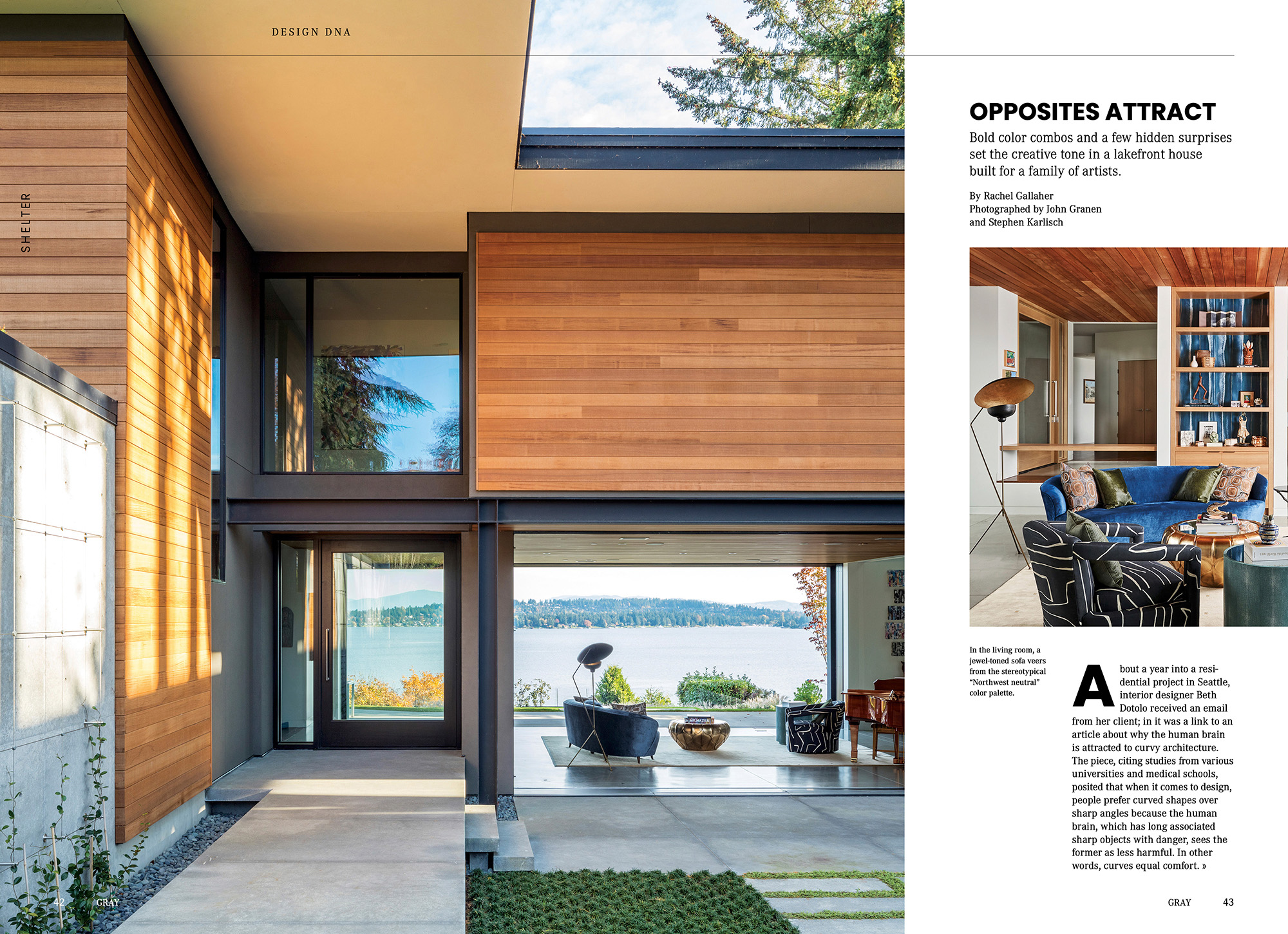
Bold color combos and a few hidden surprises set the creative tone in a lakefront house built for a family of artists.
About a year into a residential project in Seattle, interior designer Beth Dotolo received an email from her client; in it was a link to an article about why the human brain is attracted to curvy architecture. The piece, citing studies from various universities and medical schools, posited that when it comes to design, people prefer curved shapes over sharp angles because the human brain, which has long associated sharp objects with danger, sees the former as less harmful. In other words, curves equal comfort.
“Curves evoke creativity and intelligence,” says Dotolo, principal, and co-founder of Seattle- and Dallas- based Pulp Design Studios. “The clients are a family of artists and one of the things that they wanted was for the home to feel liberated.”
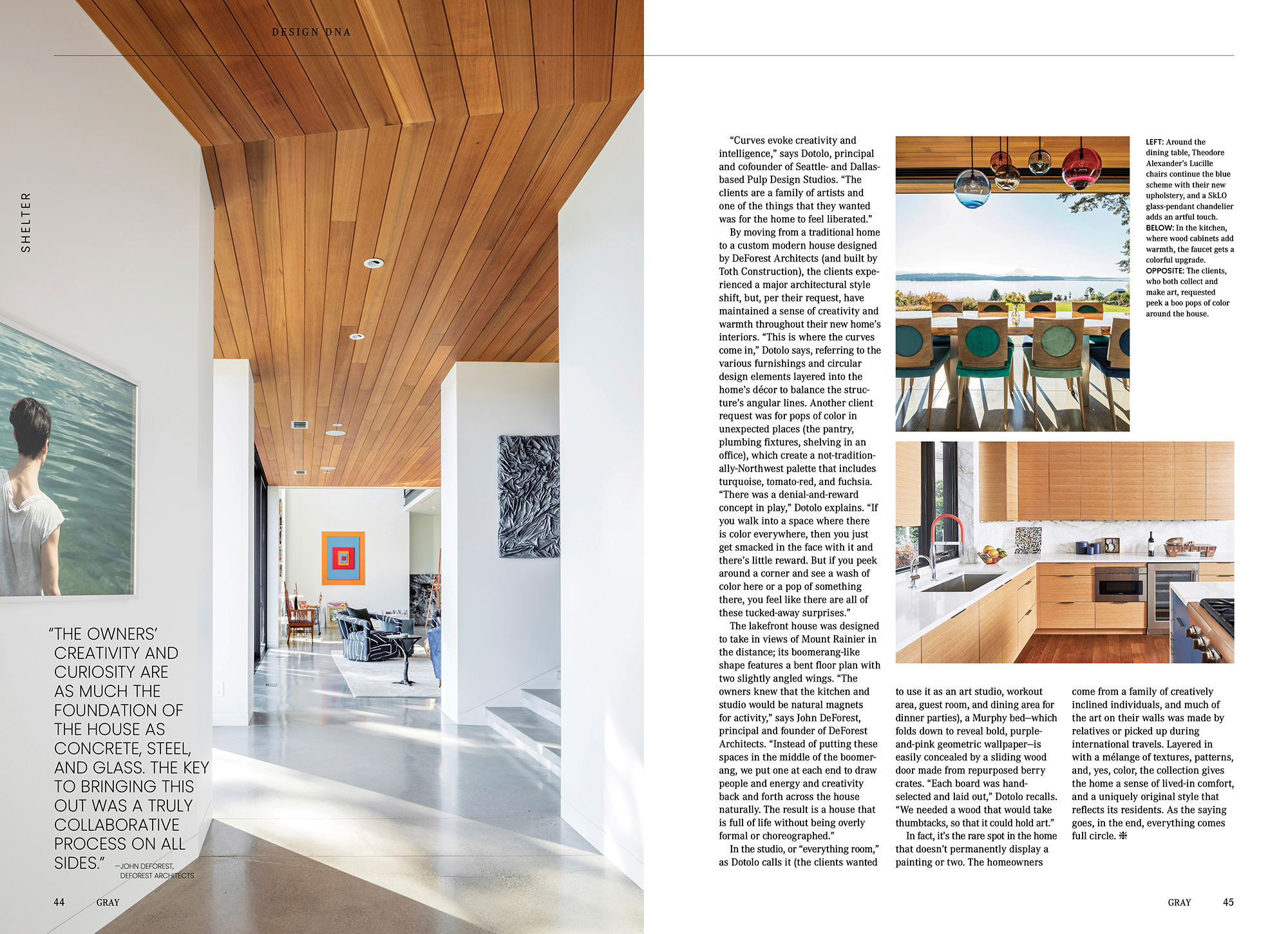
By moving from a traditional home to a custom modern house designed by DeForest Architects (and built by Toth Construction), the clients experienced a major architectural style shift, but, per their request, have maintained a sense of creativity and warmth throughout their new home’s interiors. “This is where the curves come in,” Dotolo says, referring to the various furnishings and circular design elements layered into the home’s décor to balance the structure’s angular lines. Another client request was for pops of color in unexpected places (the pantry, plumbing fixtures, shelving in an office), which create a not-traditionally-Northwest palette that includes turquoise, tomato-red, and fuchsia. “There was a denial-and-reward concept in play,” Dotolo explains. “If you walk into a space where there is color everywhere, then you just get smacked in the face with it and there’s little reward. But if you peek around a corner and see a wash of color here or a pop of something there, you feel like there are all of these tucked-away surprises.”
The lakefront house was designed to take in views of Mount Rainier in the distance; its boomerang-like shape features a bent floor plan with two slightly angled wings. “The owners knew that the kitchen and studio would be natural magnets for activity,” says John DeForest, principal and founder of DeForest Architects. “Instead of putting these spaces in the middle of the boomerang, we put one at each end to draw people and energy and creativity back and forth across the house naturally. The result is a house that is full of life without being overly formal or choreographed.”
In the studio, or “everything room,” as Dotolo calls it (the clients wanted to use it as an art studio, workout area, guest room, and dining area for dinner parties), a Murphy bed—which folds down to reveal bold, purple- and-pink geometric wallpaper—is easily concealed by a sliding wood door made from repurposed berry crates. “Each board was hand-selected and laid out,” Dotolo recalls. “We needed a wood that would take thumbtacks so that it could hold art.”
In fact, it’s the rare spot in the home that doesn’t permanently display a painting or two. The homeowners come from a family of creatively inclined individuals, and much of the art on their walls was made by relatives or picked up during international travels. Layered in with a mélange of textures, patterns, and, yes, color, the collection gives the home a sense of lived-in comfort and a uniquely original style that reflects its residents. As the saying goes, in the end, everything comes full circle.


