My Domaine – Makeover of the Week

My Domaine – December 2, 2021
By: Colleen Sullivan
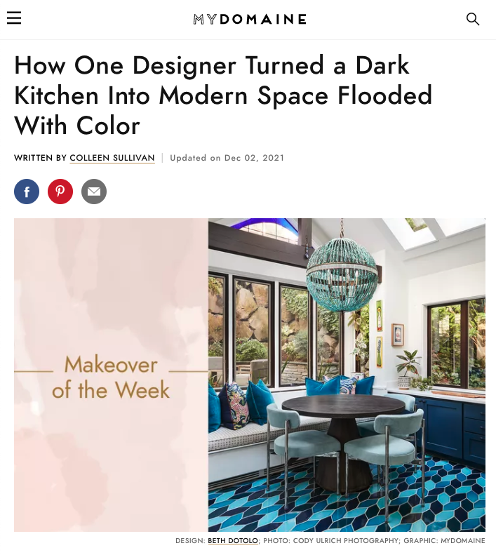
How One Designer Turned a Dark Kitchen Into Modern Space Flooded With Color
If there’s something we never get tired of seeing, it’s a great makeover. Whether it’s transforming a retro bathroom into a modern oasis or giving a lackluster bedroom a fresh look, pros perform these design miracles all the time.
To give designers a chance to showcase their favorite makeovers—and to bring you plenty of inspiration for your own home—we’re sharing the best before and afters we’ve seen in our series, Makeover of the Week. Take notes for your next renovation.
“The homeowners and their daughter purchased this 1902 bungalow when they moved from New York to Seattle twenty years ago,” interior designer Beth Dotolo says. “They were finally ready to brighten up their kitchen to make it more airy and welcoming. They also wanted to infuse some color and personality into the space.”
Meet the Expert: Interior designer Beth Dotolo is the owner of Pulp Design Studios in Seattle, Washington. She likes to combine luxury design with a flair for the unexpected.
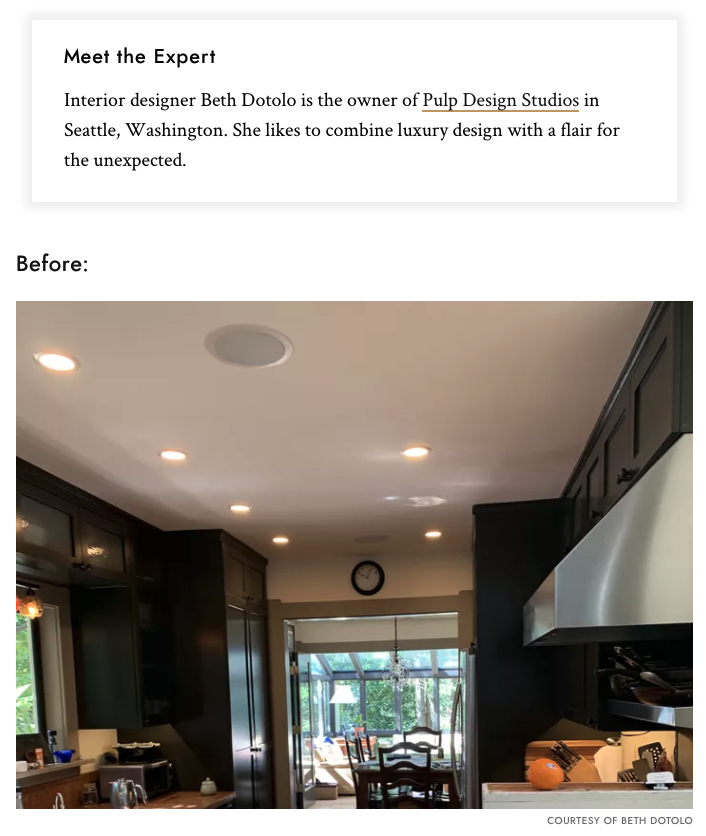
Before: “The kitchen’s galley layout is long and narrow and includes two family areas—where the family eats, reads, and plays—at both ends of the room,” Dotolo shares. “All the spaces were dated and in need of a refresh.”
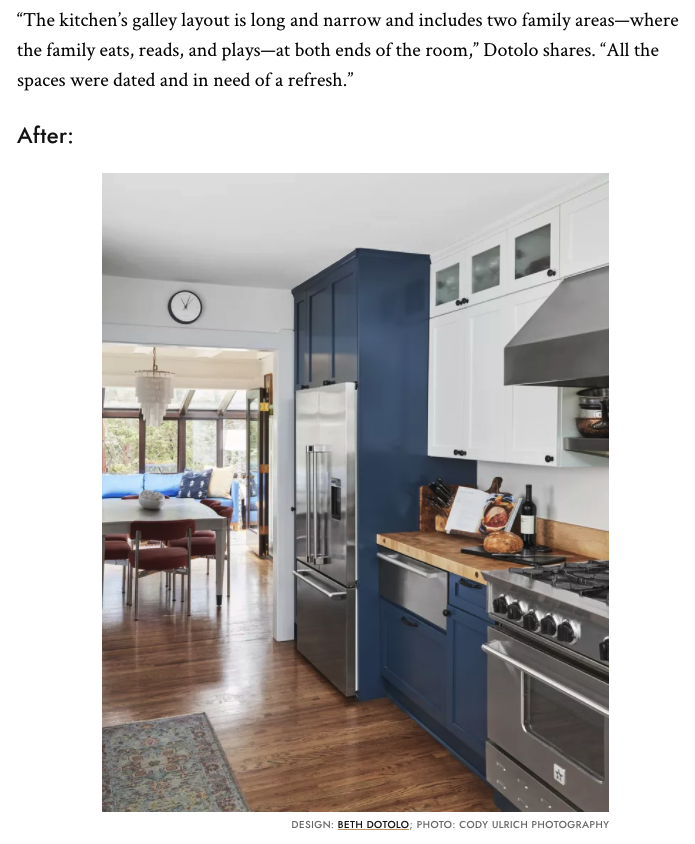
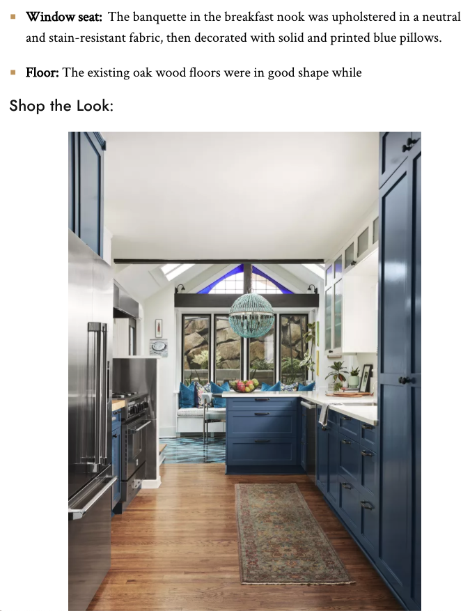
After: “We didn’t change the function or layout of this space, we simply gave it a cosmetic micro-renovation—painting the walls, cabinets, and updating the countertop and the décor of the breakfast nook and sunroom that bookend the galley kitchen—creating sunnier spots perfect for entertaining or for the family to enjoy,” Dotolo notes.
What Changed:
- Color theme: Shades of blue, white, and gray reflect the Seattle weather.
- Cabinets: Shaker-style cabinets were painted in a navy shade that reads as a bright blue (Benjamin Moore Gentleman’s Grey), while the upper cabinets and ceiling were coated in a bright white (Pure White by Sherwin Williams).
- Countertops: A durable white quartz countertop ties together all the white and blue cabinetry.
- Backsplash: The quartz countertop is carried up the backsplash to create a uniform and modern look that’s easy to maintain—no grout to clean.
- Rug: A wool runner is sturdy enough to handle spills and foot traffic while bringing pattern and color to the space.
- Appliances: The modern stainless steel appliances were relatively new so didn’t need updating.
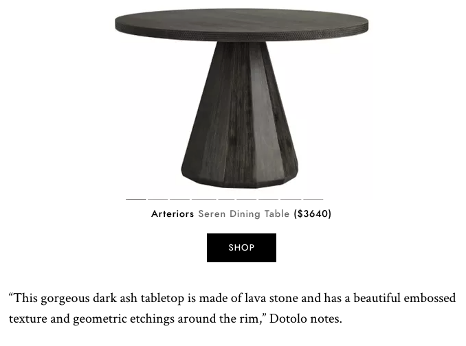
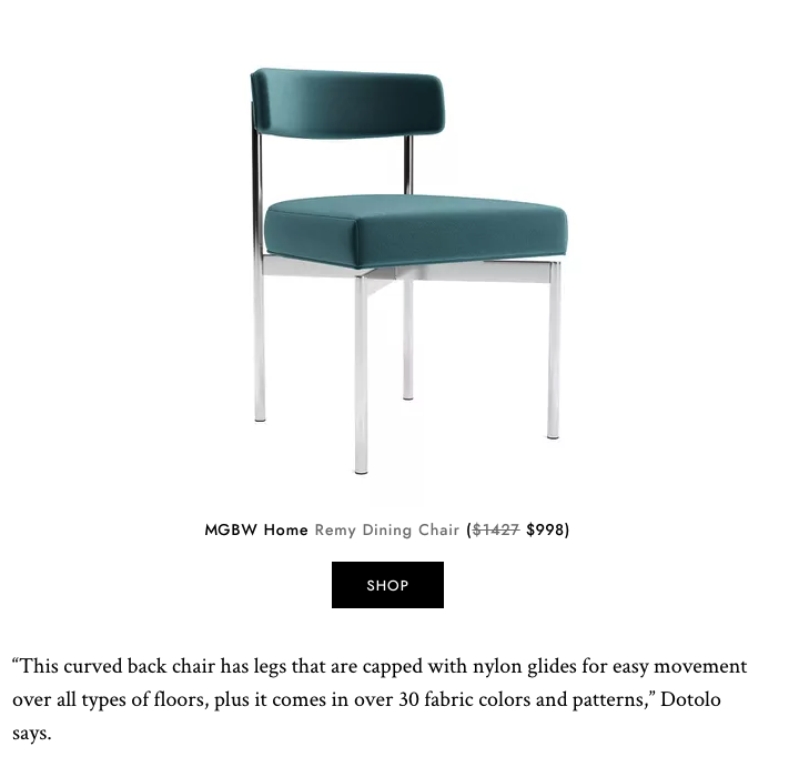
- Seating: A gray round table and four chairs are matched with a banquette to create more functional seating.
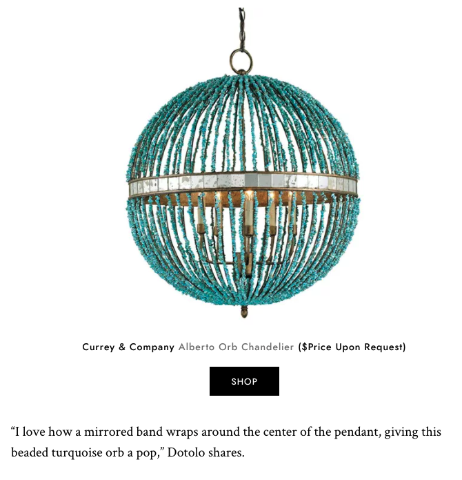
- Pendant: Turquoise marble beads add an artistic touch and become the focal point over the breakfast nook table, while the multilayered glass plates in the steel-framed pendant add a touch of quirkiness to the sunroom.
- Window seat: The banquette in the breakfast nook was upholstered in a neutral and stain-resistant fabric, then decorated with solid and printed blue pillows.
- Floor: The existing oak wood floors were in good shape while


