Portrait Portland: Transformed Tudor
 PORTRAIT PORTLAND, VOLUME 62
TRANSFORMED TUDOR
written by DONNA PIZZI
photography by CODY ULRICH
A BOLD PALETTE OF FABRICS, FURNISHINGS AND EXQUISITE ART TURN THIS 1913 SEATTLE TUDOR WITH FINE ARCHITECTURAL BONES INTO A CLASSIC GEM THAT GLITTERS ALONGSIDE LAKESIDE VIEWS.
THIS HISTORIC 1913 LAURELHURST TUDOR perched on the shores of Lake Washington, was taken under wing by Beth Dotolo of Seattle’s Pulp Design Studios and transformed by replacing a recent hyper-trendy makeover with a more artful aesthetic. The previous owners had wisely updated the kitchen with modern-day amenities, but their choice of a Legacy Grand design overflowing with glitzy gold and crazy pattern on patterns throughout did not suit her clients’ taste.
Dotolo calls the work she and her team did “a micro renovation,” which focused on blending the home’s existing Tudor bones, including its handsome stained-glass windows and original fireplace surround, with the clients’ modern art collection and Pulp Design’s fashion-forward furnishings. After visiting the homeowners’ former home where their significant modern art collection was set against a warm palette featuring subdued greens, oranges and lavenders, it confirmed her choice to accentuate the classic Tudor with a more art-driven update. “As a textile driven design firm,” says Dotolo, “we designed the home around textiles that were more artistic in nature with a color palette that amped up
the typical Northwest home.”
Making use of her clients’ favorite furnishings, including a prized apothecary chest, as well as an exquisite Eames chair – along with their remarkable collection of art – gave these recent empty nesters a familiar, yet delightful transition into their freshly redesigned historic home. From the moment you enter the historic Tudor, you are greeted with the juxtaposition of old and new. Whether it’s the original arched oak door crowned with a tiered glass chandelier, or the stark modern art grounded by a wrought iron bench trimmed in a deep velvet that echoes the original marble floors, the contrast is instantly achieved. “We placed the painting before we collected the textile for the bench,” recalls Dotolo, who adds that she selected a fabric that plays off the art, rather than taking away from it.
An exquisitely embroidered fabric chosen to trim a pair of sofas used to anchor the so-called “cocktail meeting room,” features all the colors found in the home’s new palette. Like a magnet, the embroidered art deco style fabric draws visitors into the room, where the sofas’ lush, durable performance ruby-red velvet cushions ensure a care-free entertaining experience. A pair of neutral-colored chairs can swivel to allow enjoyment of the stunning lake views as seen across a gold tête-à-tête chaise lounge. “We wanted to create a furniture layout in a more intimate setting within a room that is also the center point of the home which connects to all the other rooms,” says Dotolo, who adds: “A pair of moveable chocolatey gray stools, upholstered with one of our studio’s line of textiles, make the room feel more approachable and less formal.” Watching over it all is the homeowners’ very airy artwork by Alden Mason, a perfect conversation piece.
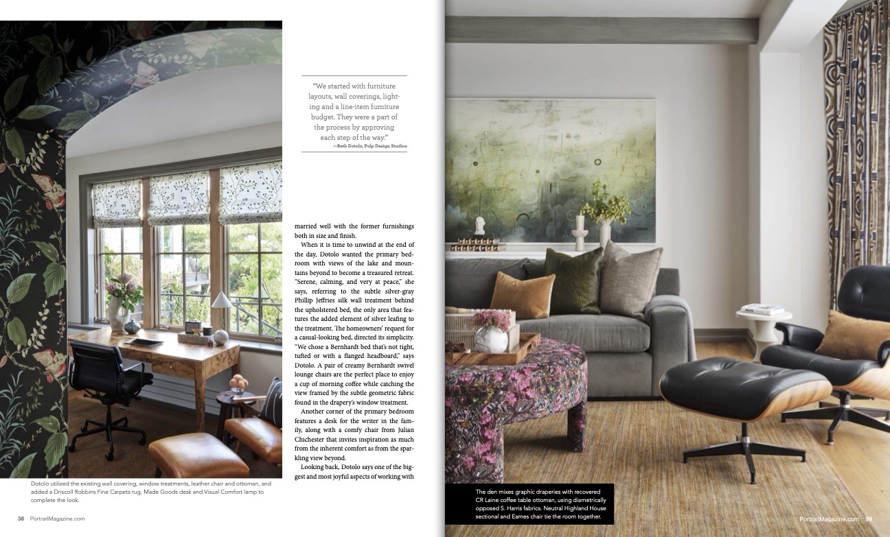
Sharing the stellar lake view is the more intimate den which is located immediately adjacent to the cocktail meeting room. As a place for the homeowners to unplug and recharge, it features the family’s Eames chair and ottoman alongside their collection of guitars on one side and a plush gray velvet Highland House sectional on the other. The latter’s soothing fabric choice echoes the adjacent Emmi Whitehorse artwork that exudes a peaceable vibe all its own. Reuse of the homeowners’ rust brown rug grounds the room, which offers views of the water flanked by curtains with a geometric patterned fabric from one angle, and someone cooking in the de-glammed kitchen in the other. Perhaps the most eye-catching element in the otherwise serene room is the fabric-covered coffee table ottoman whose flashes of velvety hot pink remind the home-owners that every now and then a visual “hot lick” can add spice to one’s serenity.
Dotolo continues the den’s peaceful feeling in the once “super glammy” dining room. Here, a hand painted geometric wallcovering by Porter Teleo draws the eye upward toward the ceiling where the room’s only nod to a former glammy look includes the sumptuous Gisele chandelier from Oly Studio. While the homeowners’ own cozy amethyst cushioned dining chairs pair with a Julian Chichester dining table, a bit of whimsey is found in the nod to rock n’ roll with the addition of a Johnny Cash mugshot whose silvery tones are reminiscent of historic tintype photos.
Downstairs, a former gym has blossomed into a cozy office that offers views of the lake and mountains for inspiration. “We put the offices there to capture the view, but we kept the former wallcovering and Roman shades intact, which is a good example of how to make use of existing pieces. Not everything needs to be new,” says Dotolo. The one important addition was the desk from Made Goods, which married well with the former furnishings
both in size and finish.
When it is time to unwind at the end of the day, Dotolo wanted the primary bed-
room with views of the lake and mountains beyond to become a treasured retreat. “Serene, calming, and very at peace,” she says, referring to the subtle silver-gray Phillip Jeffries silk wall treatment behind the upholstered bed, the only area that features the added element of silver leafing to the treatment. The homeowners’ request for a casual-looking bed, directed its simplicity. “We chose a Bernhardt bed that’s not tight, tufted or with a flanged headboard,” says Dotolo. A pair of creamy Bernhardt swivel lounge chairs are the perfect place to enjoy a cup of morning coffee while catching the view framed by the subtle geometric fabric found in the drapery’s window treatment.
Another corner of the primary bedroom features a desk for the writer in the family, along with a comfy chair from Julian Chichester that invites inspiration as much from the inherent comfort as from the sparkling view beyond.
Looking back, Dotolo says one of the biggest and most joyful aspects of working with this very talented couple was to create a home that reflected who and what they are with the clients’ total trust in her team’s vision.
“They relied on us to find a new style for them to move into that is at once cool and eclectic, and that also reflects how they like to live and entertain. As art collectors, they were, for example, unafraid of the colors or pattern we selected to highlight their sofas. Happily, intrusting us to do our job, they not only enabled us to do our very best but have chosen to once again engage us to design yet another home for them as well.” ■
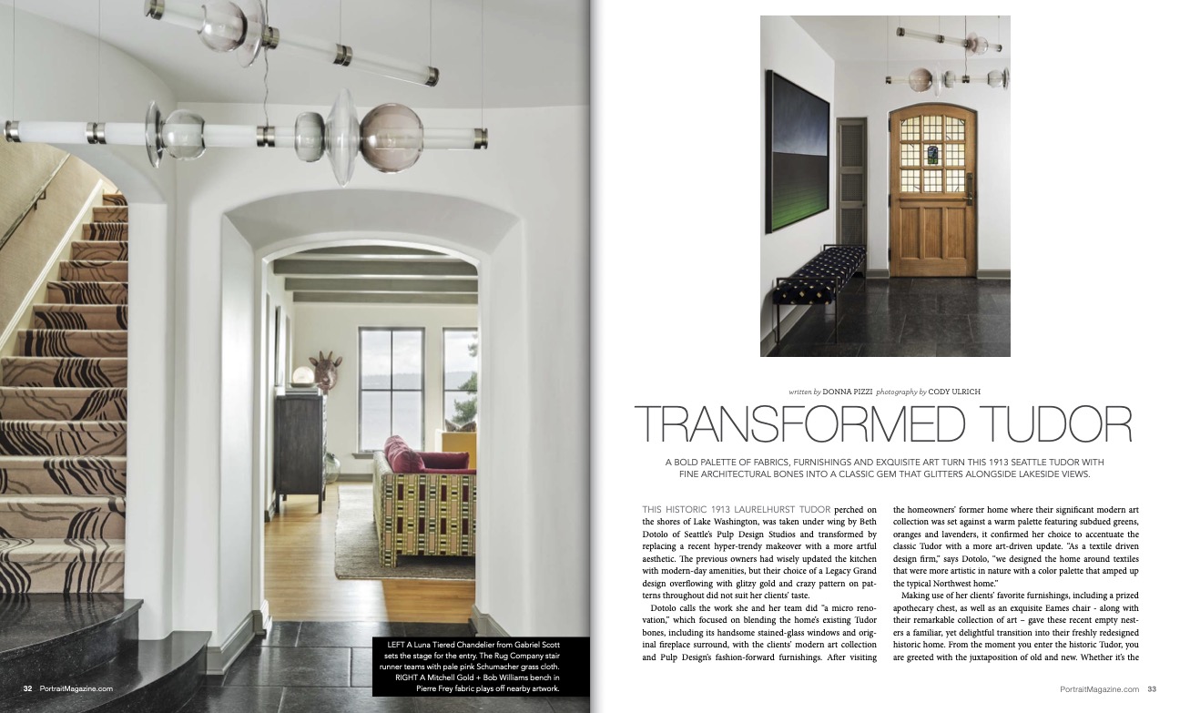
LEFT A Luna Tiered Chandelier from Gabriel Scott sets the stage for the entry. The Rug Company stair runner teams with pale pink Schumacher grass cloth. RIGHT A Mitchell Gold + Bob Williams bench in Pierre Frey fabric plays off nearby artwork.
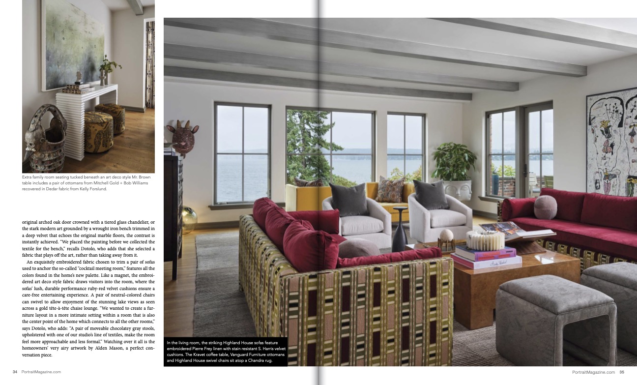
Extra family room seating tucked beneath an art deco style Mr. Brown table includes a pair of ottomans from Mitchell Gold + Bob Williams recovered in Dedar fabric from Kelly Forslund.
In the living room, the striking Highland House sofas feature embroidered Pierre Frey linen with stain resistant S. Harris velvet cushions. The Kravet coffee table, Vanguard Furniture ottomans and Highland House swivel chairs sit atop a Chandra rug.
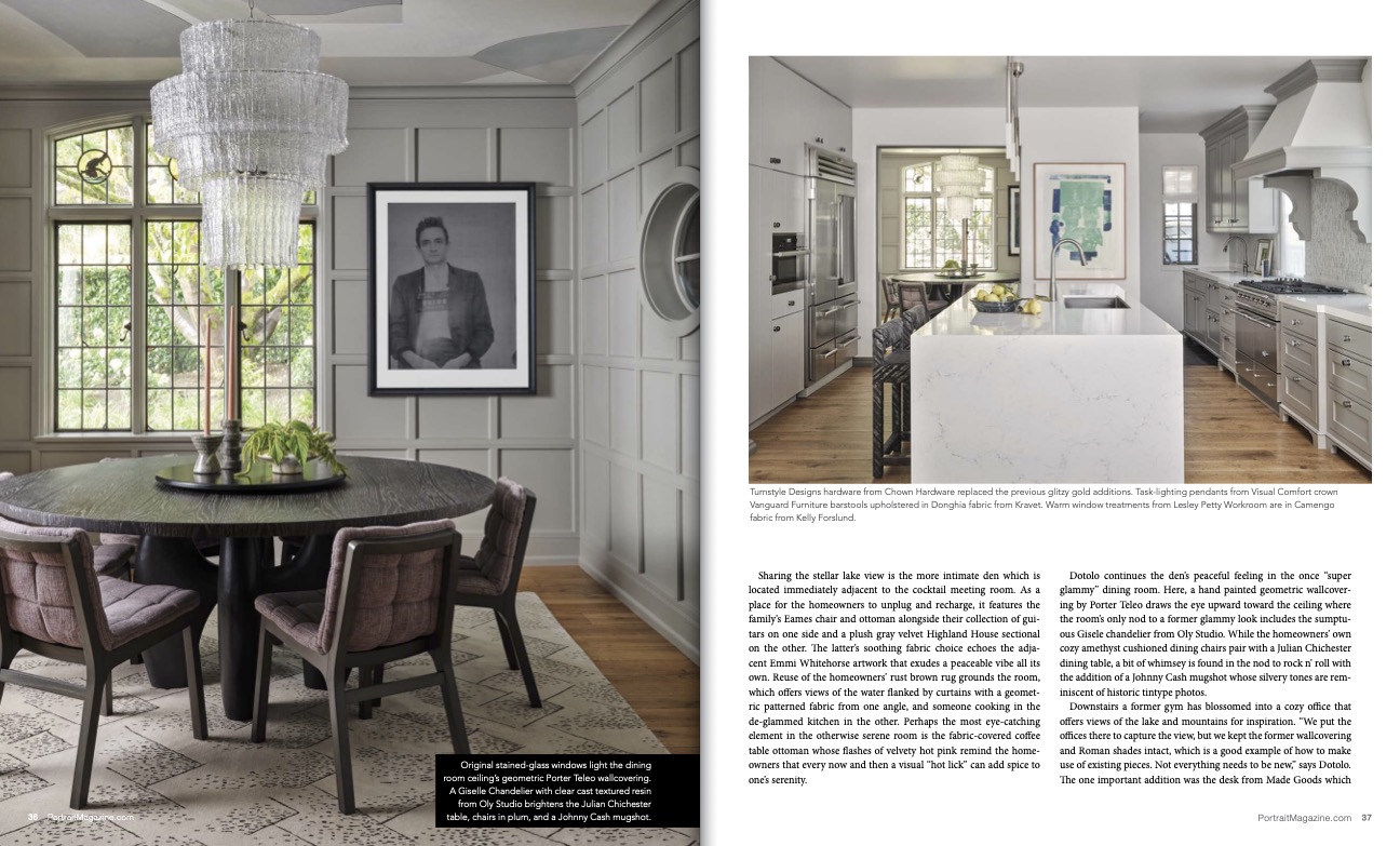
Original stained-glass windows light the dining room ceiling’s geometric Porter Teleo wallcovering. A Giselle Chandelier with clear cast textured resin from Oly Studio brightens the Julian Chichester table, chairs in plum, and a Johnny Cash mugshot.
Turnstyle Designs hardware from Chown Hardware replaced the previous glitzy gold additions. Task-lighting pendants from Visual Comfort crown Vanguard Furniture barstools upholstered in Donghia fabric from Kravet. Warm window treatments from Lesley Petty Workroom are in Camengo fabric from Kelly Forslund.
“We started with furniture layouts, wall coverings, lighting and a line-item furniture
budget. They were a part of the process by approving each step of the way.”
—Beth Dotolo, Pulp Design Studios
Dotolo utilized the existing wall covering, window treatments, leather chair and ottoman, and added a Driscoll Robbins Fine Carpets rug, Made Goods desk and Visual Comfort lamp to complete the look.
The den mixes graphic draperies with recovered CR Laine coffee table ottoman, using diametrically opposed S. Harris fabrics. Neutral Highland House sectional and Eames chair tie the room together.
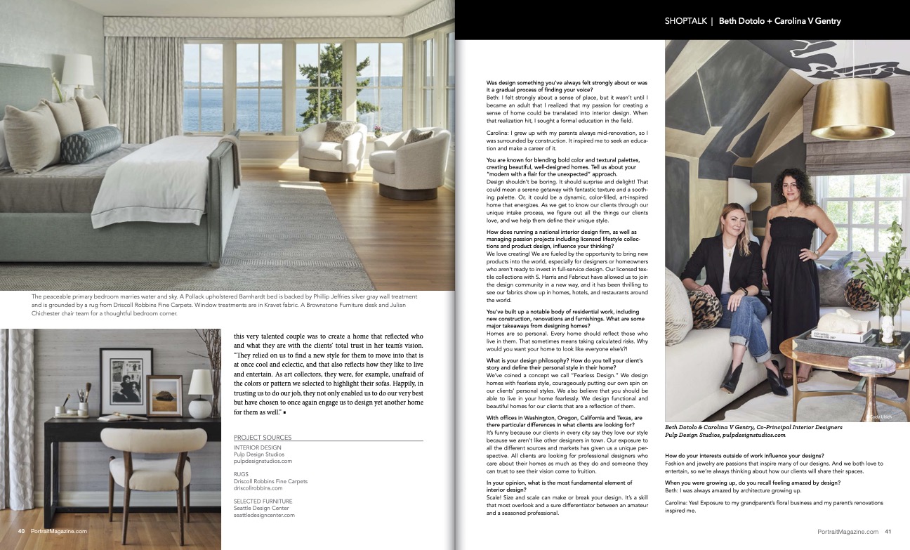
The peaceable primary bedroom marries water and sky. A Pollack upholstered Barnhardt bed is backed by Phillip Jeffries silver gray wall treatment and is grounded by a rug from Driscoll Robbins Fine Carpets. Window treatments are in Kravet fabric. A Brownstone Furniture desk and Julian Chichester chair team for a thoughtful bedroom corner.
PROJECT SOURCES
INTERIOR DESIGN
Pulp Design Studios
RUGS
Driscoll Robbins Fine Carpets
SELECTED FURNITURE
Seattle Design Center


