USA Today Home – Spring 2021
USA Today Home – Spring 2021
Bright Horizons – Keep Calm and Carry On with these Colors
Written by: Amy Sinatra Ayres
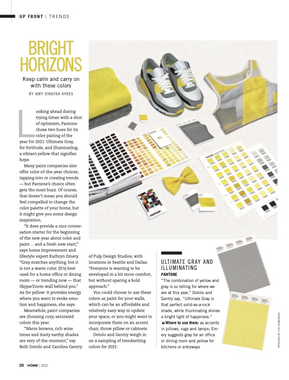
Looking ahead during trying times with a shot of optimism, Pantone chose two hues for its color pairing of the year for 2021: Ultimate Gray, for fortitude, and Illuminating, a vibrant yellow that signifies hope.
Many paint companies also offer color-of-the-year choices, tapping into or creating trends — but Pantone’s choice often gets the most buzz. Of course, that doesn’t mean you should feel compelled to change the color palette of your home, but it might give you some design inspiration.
“It does provide a nice conversation starter for the beginning of the new year about color and paint … and a fresh new start,” says home improvement and lifestyle expert Kathryn Emery. “Gray matches anything, but it is not a warm color. (It’s) best used for a home office or dining room — or trending now — that Skype/Zoom wall behind you.” As for yellow: It provides energy where you want to evoke emotion and happiness, she says.
Meanwhile, paint companies are choosing cozy, saturated colors this year.
“Warm browns, rich wine tones, and dusty earthy shades are very of the moment,” say Beth Dotolo and Carolina Gentry of Pulp Design Studios, with locations in Seattle and Dallas. “Everyone is wanting to be enveloped in a bit more comfort, but without sparing a bold approach.”
You could choose to use these colors as paint for your walls, which can be an affordable and relatively easy way to update your space, or you might want to incorporate them on an accent chair, throw pillow, or cabinets.
Dotolo and Gentry weigh in on a sampling of trendsetting colors for 2021:
ULTIMATE GRAY AND ILLUMINATING
PANTONE
“The combination of yellow and gray is so telling for where we are at this year,” Dotolo and Gentry say. “Ultimate Gray is that perfect solid-as-a-rock shade, while Illuminating shines a bright light of happiness.” Where to use them: as accents in pillows, rugs, and lamps; Emery suggests gray for an office or dining room and yellow for kitchens or entryways
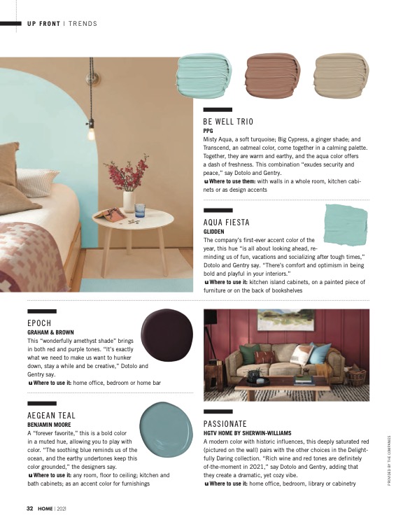
BE WELL TRIO
PPG
Misty Aqua, a soft turquoise; Big Cypress, a ginger shade; and Transcend, an oatmeal color, come together in a calming palette. Together, they are warm and earthy, and the aqua color offers a dash of freshness. This combination “exudes security and peace,” say Dotolo and Gentry. Where to use them: with walls in a whole room, kitchen cabinets, or as design accents
AQUA FIESTA
GLIDDEN
The company’s first-ever accent color of the year, this hue “is all about looking ahead, reminding us of fun, vacations, and socializing after tough times,” Dotolo and Gentry say. “There’s comfort and optimism in being bold and playful in your interiors.” Where to use it: kitchen island cabinets, on a painted piece of furniture, or on the back of bookshelves
EPOCH
GRAHAM & BROWN
This “wonderfully amethyst shade” brings in both red and purple tones. “It’s exactly what we need to make us want to hunker down, stay awhile and be creative,” Dotolo and Gentry say. Where to use it: home office, bedroom, or home bar
AEGEAN TEAL
BENJAMIN MOORE
A “forever favorite,” this is a bold color in a muted hue, allowing you to play with
color. “The soothing blue reminds us of the ocean, and the earthy undertones keep this
color grounded,” the designers say. Where to use it: any room, floor to ceiling; kitchen and bath cabinets; as an accent color for furnishings
PASSIONATE
HGTV HOME BY SHERWIN-WILLIAMS
A modern color with historic influences, this deeply saturated red (pictured on the wall) pairs with the other choices in the Delightfully Daring collection. “Rich wine and red tones are definitely of the moment in 2021,” says Dotolo and Gentry, adding that they create a dramatic, yet cozy vibe. Where to use it: home office, bedroom, library, or cabinetry