Seattle Showhouse Home Office Design
LOCATION
Seattle, WAPROJECT
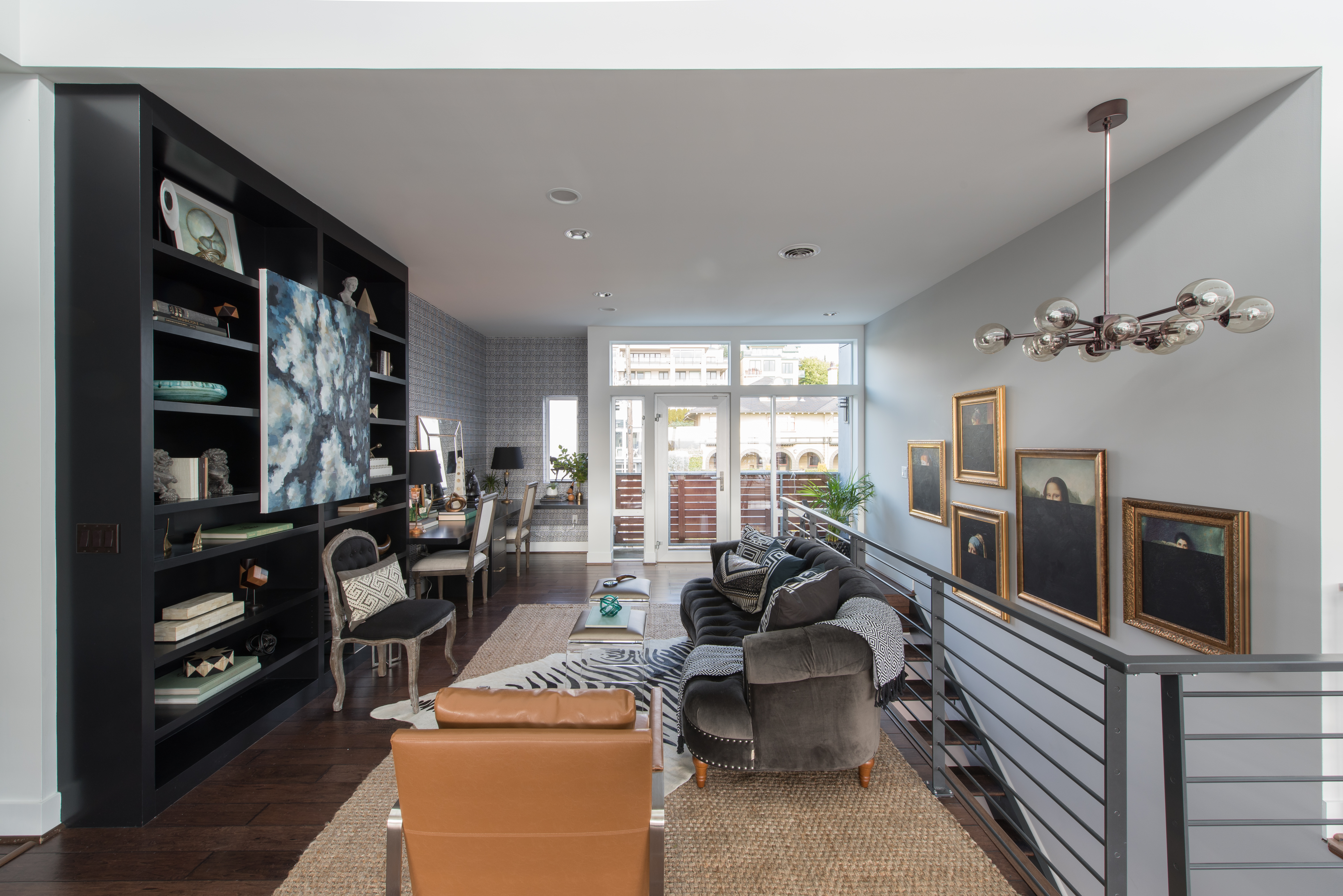
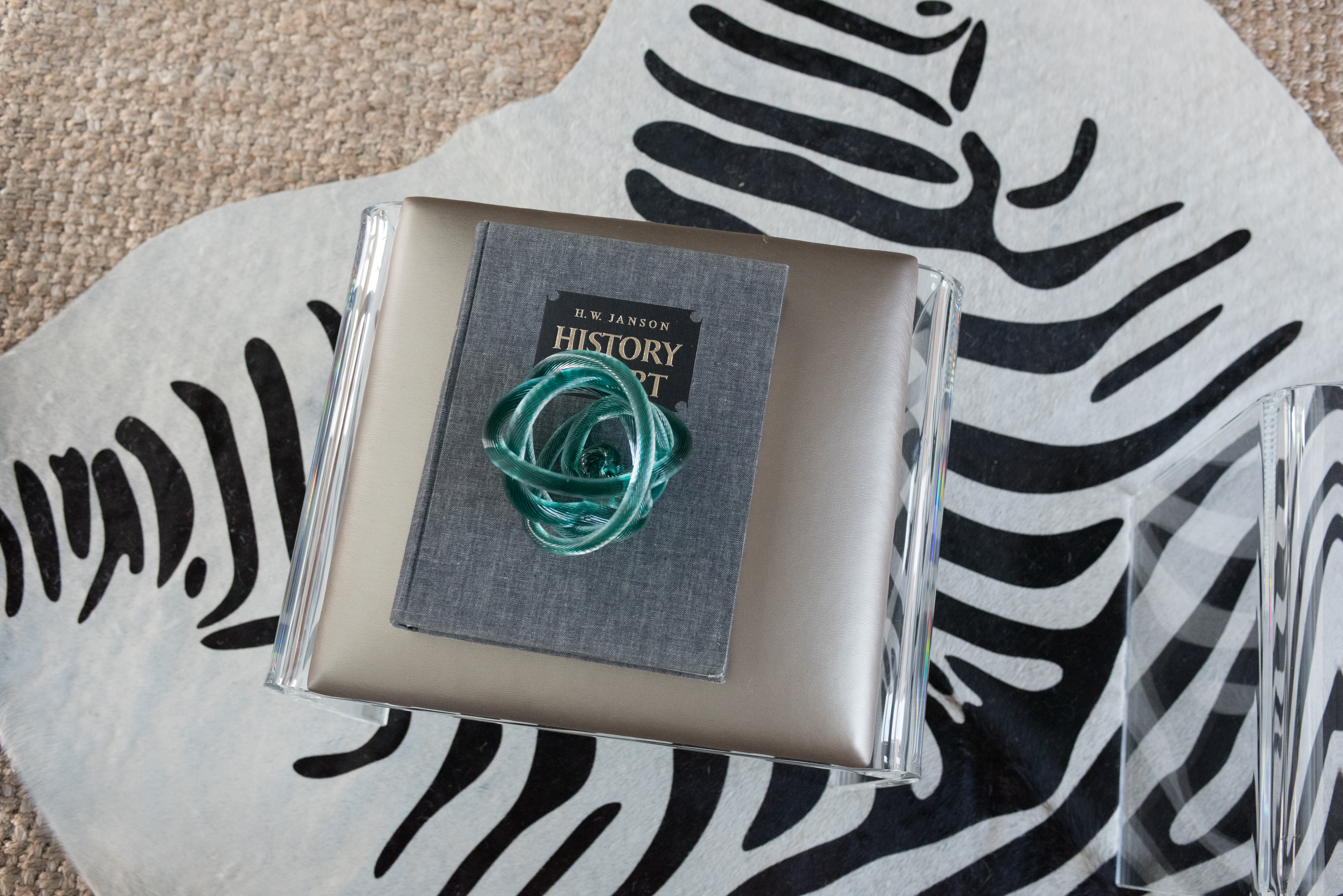
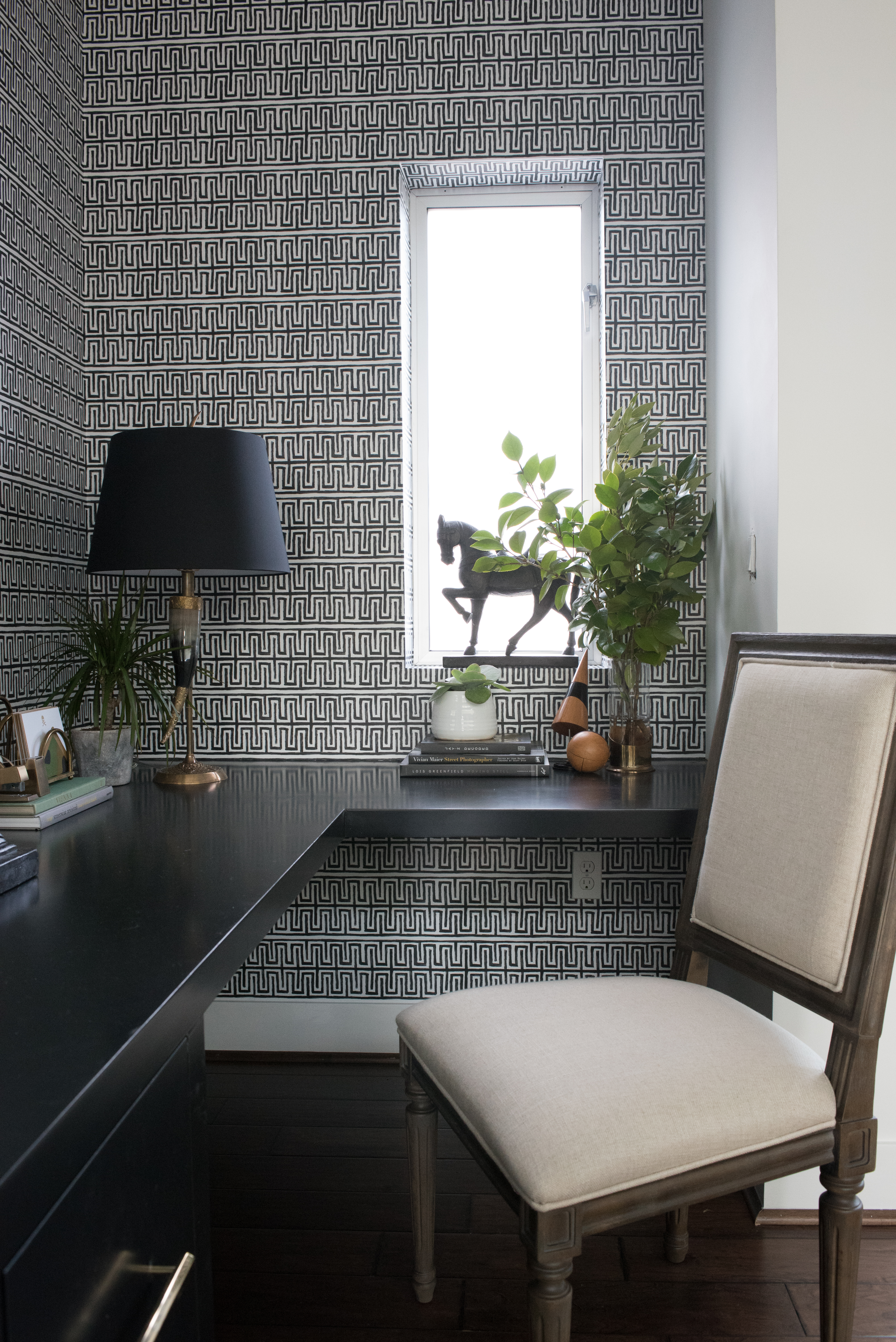
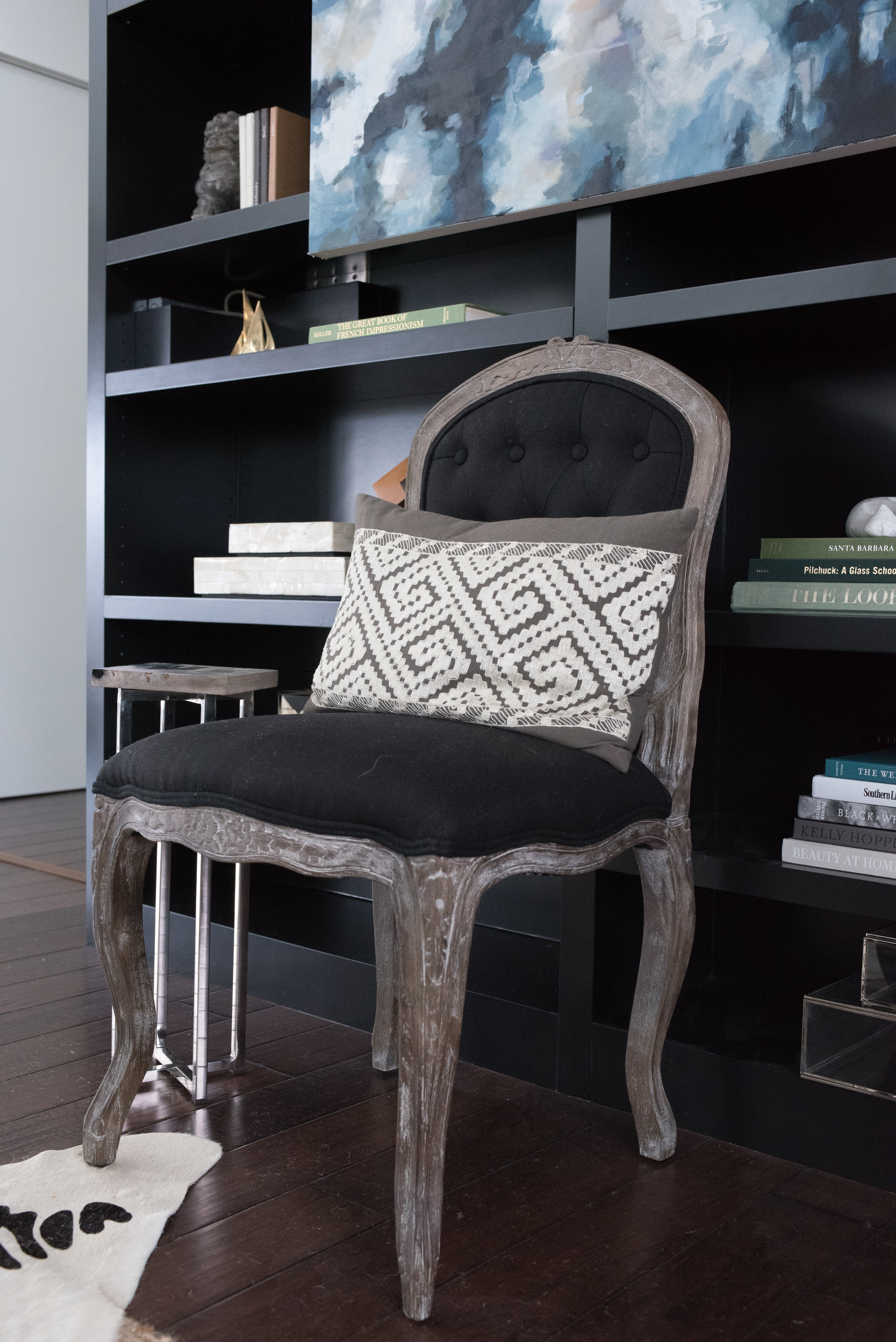
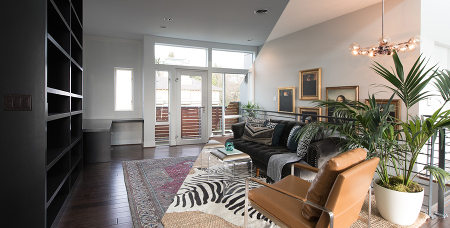
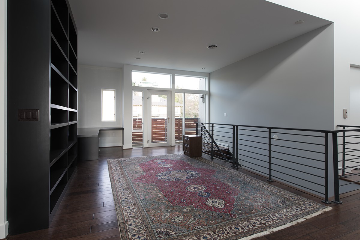
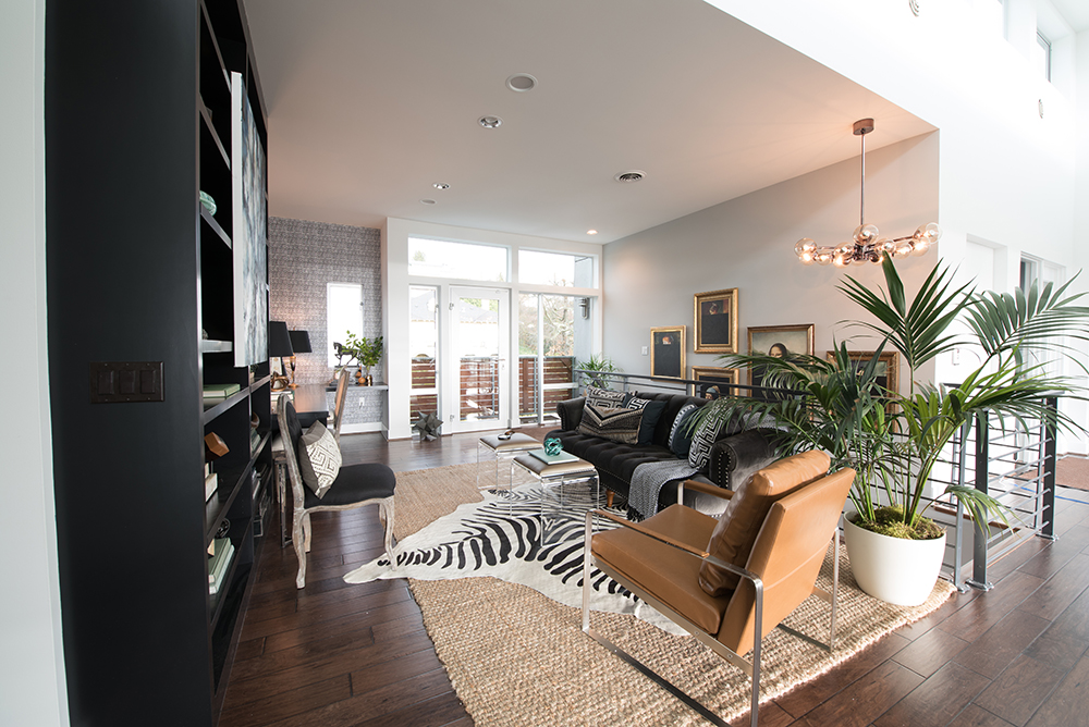
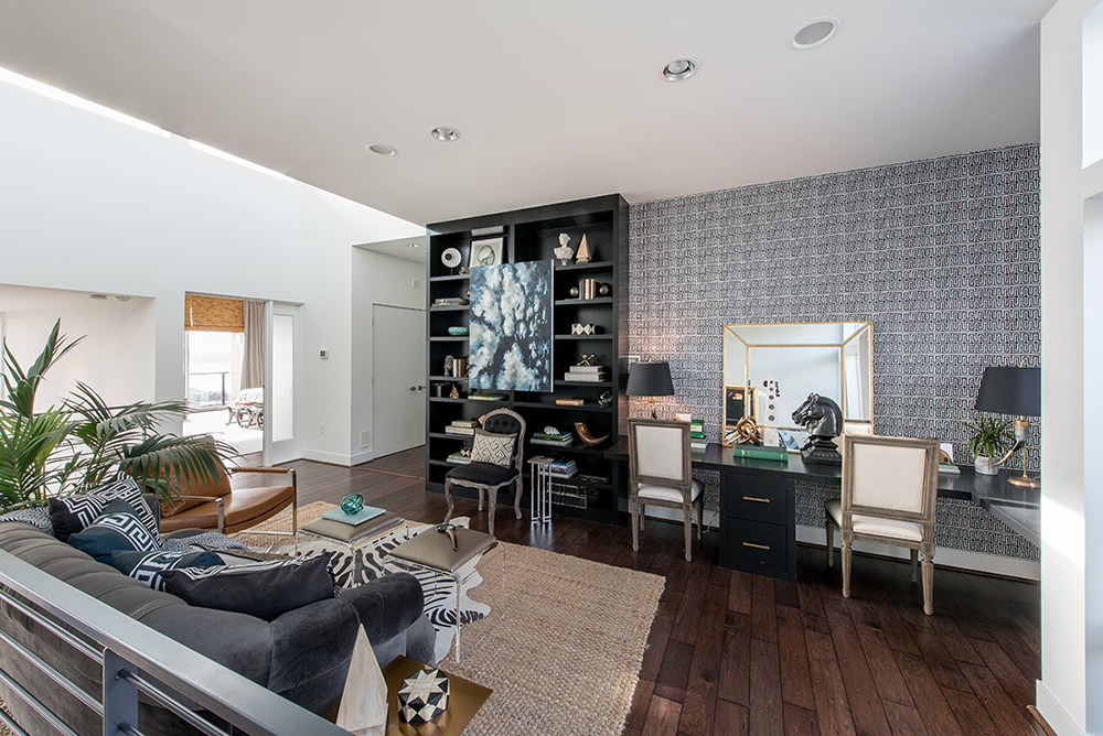
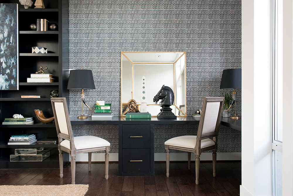
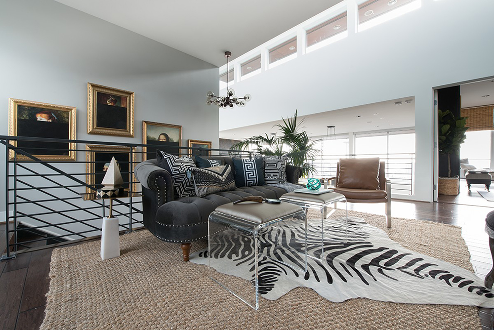
As part of a partnership with ATG Stores and Decorist to design a home office in a Seattle showhouse, our goal was to create an eclectic and lived-in feel for the homeowners. Since the office is situated in a central part of the home, open to the double-volume space and with prime views of the downtown Seattle waterfront, we wanted to keep the palette fairly neutral. We filled this neutral palette with personality and character, creating great contrast and layering on lots of texture. We fearlessly mixed metals for added flair, incorporated amazing lighting to create mood and ambience, and brought in a graphic wall covering for heightened style. With the existing built-ins remaining, we applied our firm’s Splendid Living approach to create functional style and an open office feel by optimizing storage, giving the whole unit an upgrade with a fresh coat of paint and then adding Pulp Home hardware. The result is a functional home office that exudes fearless style.AS SEEN IN

COLLABORATOR
Jeff Beck, Photographer
We filled this neutral palette with personality and character, creating great contrast and layering on lots of texture. The result is a functional home office that exudes fearless style.


