The Pulp Edit: July 2017
July has been full of spaces with a creative and vibrant flair here at Pulp. With summer in full swing, we rounded up our top 10 interior design trends of July 2017…
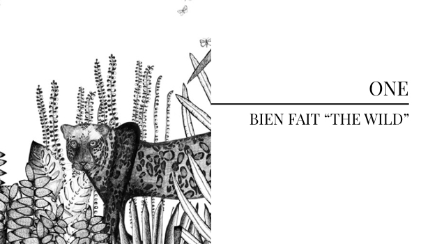
This wallcovering from Bien Fait is the definition of a design element with a flair for the unexpected. The captivating illustration feels straight out of an enchanting children’s book, but is so striking we could see it in a space for adults or youth.
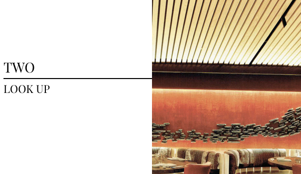
The dynamic floor-to-celing design of Nobu’s relocated New York location has us wanting to make a trip back to the city. Photographed by Eric Laignel in Interior Design‘s June 2017 issue, the paneled ceiling leaves no inch of the space untouched, demonstrating just how powerful bold design can be.
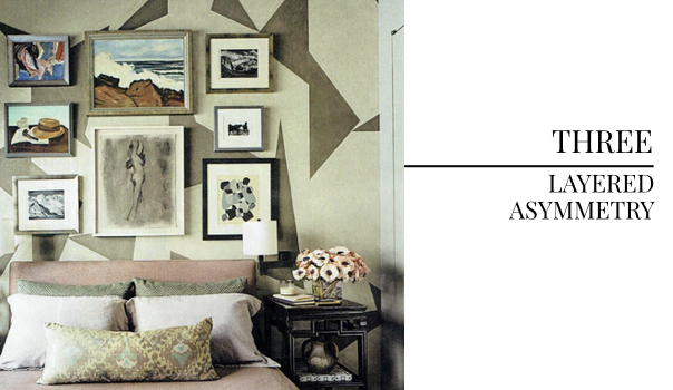
We love the way the layered asymmetry in this room designed by Herdandez Greene gives the space a curated artisan feel. The geometric wallcovering paired with various sized artwork creates contrast that draws the eye, but still feels cohesive. We discovered this stunning room photographed by Peter Murdoch in House Beautiful May 2017.
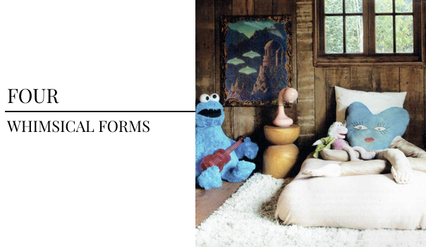
We featured frameless furniture in last month’s Pulp Edit and were instantly obsessed when we found this kid’s room in Domino Magazine. The whimsical details sprinkled throughout the space set the perfect tone for an imaginative children’s room. This photo by Skye Parrot is sure to inspire.
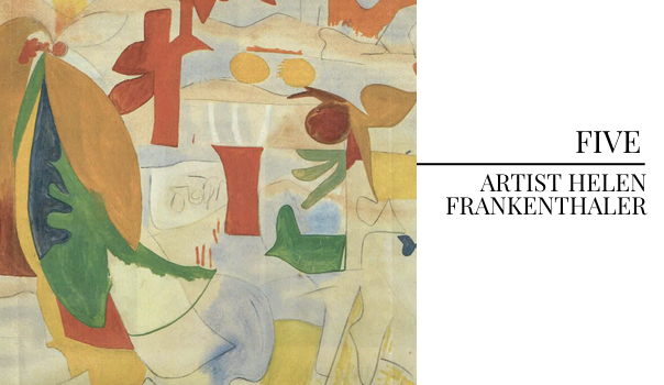
Spotted in Elle Decor, this piece by Helen Frankenthaler is an intriguing abstractionist representation of a natural landscape. We approach design with an eye for adventure, artisan pieces and all things with a flair for the unexpected which has us loving abstract art.
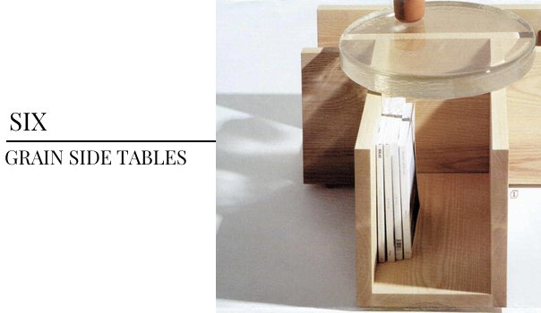
These side tables, crafted in the Pacific Northwest by Chelsea and James Minola and featured in Interior Design June 2017, are simply amazing. Not only do they offer ample surface space for organization, but the modern design is truly something you cannot find elsewhere. Definitely a piece to spark conversation…
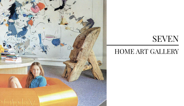
A house built to display an art collection — we couldn’t love it more. We love working with clients who have collection impressive artwork over the years. Creating a gallery feel in your home makes the entire space exude sophistication. Featured in August’s issue of Architectural Digest and photographed by François Dischinger, this striking image is awe-inspiring.
Which design trend are you loving most this month?
For professional interior design services, contact Pulp Design Studios℠.
Credits

SECTIONS
Design InsiderEntertaining + Home Living
Health + Beauty
News + Announcements
Pulp At Home
Pulp Design Work
Shopping Guide
The Business of Design
The Pulp Edit
Travel
Videos
GET INSPIRED
SUBSCRIBE TO OUR NEWSLETTER TO
GET AN INSIDER LOOK IN YOUR INBOX


