The Pulp Edit: May 2017
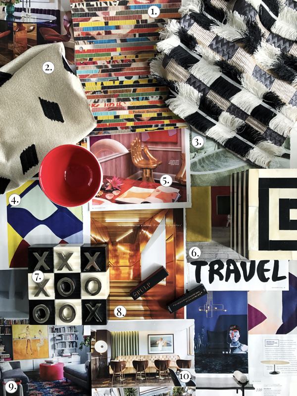
It’s no secret that we’re in love with art at Pulp Design Studios — we firmly believe that a room will never be finished without art and accessories, the final 15 percent. This month on Pulp Editorial, we’re sharing everything we love about art — see our top 10 interior design trends for May 2017 below.
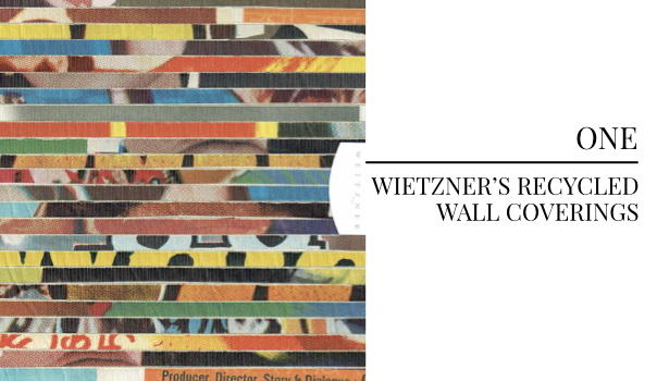
Wietzner’s recycled wall coverings — made by hand from recycled content — have an artisan feel that can’t be replicated by machines. The gorgeous colors of this Cinema Posters wall covering feel like art in and of itself… The whole piece is so lavishly detailed.
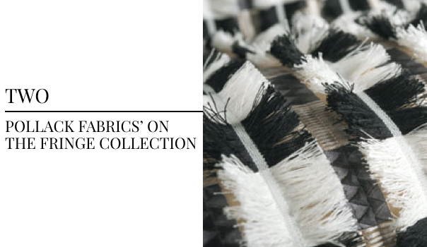
Pollack Fabrics‘ On The Fringe collection has completely stolen our hearts. This lust-worthy collection of intricate fabrics are an amazing departure from Pollack’s tried-and-true essentials line… This fashion-forward line is making us swoon.
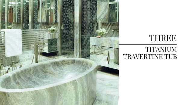
A Lebanese ski resort home owned by Nicholas and Michele Garzouzi features a mirror-walled bathroom with a massive tub made out of Iranian titanium travertine. Featured in Architectural Digest and designed by Thierry Lemaire, the smooth lines of this carved tub are completely drool-worthy.
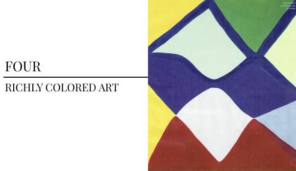
Featured in Elle Decor and painted by Marina Adams, these pieces are filled with radiant hues and smooth geometric designs. We’ve been falling in love with richly colored artwork lately, and these pieces made us fall head over heels.
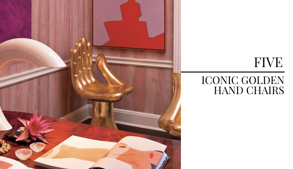
We can’t help but fall completely in love with these iconic hand chairs designed by Pedro Friedeberg, featured here in Kelly Wearstler’s L.A. home office as shown in Architectural Digest. The design is now completely iconic — a conversation piece, this chair began its story as a joke but is now lusted after by every fashionista.
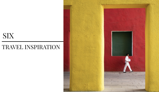
Travel can be the catalyst for the best art — beyond being an incredible source for unique pieces, traveling through new cities and experiencing cultures allows you to seek inspiration.
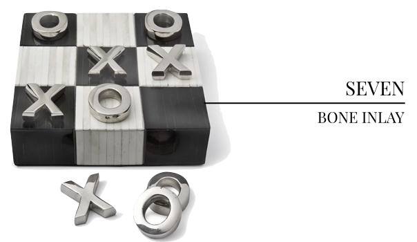
We’ve long been in love with bone inlay — it’s such an elegant touch that elevates everyday objects, like the coffee table in our Jewel-box Townhouse project and the breakfast nook table in our Eclectic Abode project. These bone inlay accessories are completely swoon-worthy.
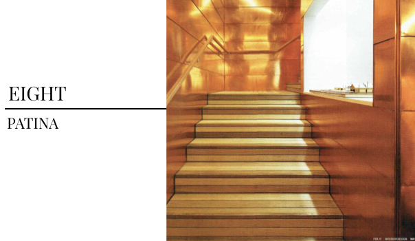
There’s something so beautiful about the way that natural materials wear over time — the way that hair-on-hide pieces begin to bald naturally or that metals begin to grow weathered and green. This copper stairwell in the East Hampton office of Bates Masi, featured in Interior Design Magazine, will begin to oxidize over time, hinting at its history.
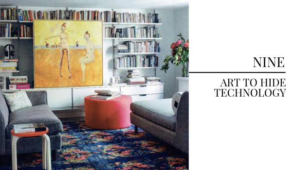
This cleverly placed piece of art could easily hide a television or speakers when not in use… Just add some sliders to the back of the frame and you’ve won the mounted TV versus focal art piece argument. Featured by Elle Decor, this West Village apartment was designed by Work + Sea — painting by Madeleine Huttenbach.
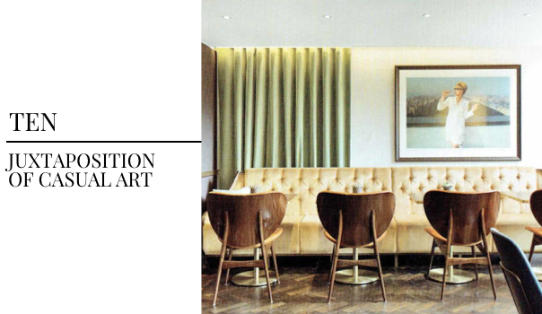
This elegant, refined room finds a breath of fresh air with this casual-cool portrait. Sophisticated tufting and opulent materials balance perfectly against this piece, making the room immediately feel more personal. We used this approach in our Relaxed Luxury project, pairing an elegant living room with a focal point painting of an unmade bed. This design was featured in Interior Design Magazine.
With an expert eye, curating art can immediately make a room feel opulent. Thinking about art as more than just paintings is a must — as designers, we find beauty in materials, shapes and juxtapositions within the design. Of course, a room never feels finished without art and accessories, but our top 10 trends this month find art in both classic artworks and everything else.
For professional interior design services, contact Pulp Design Studios℠.
Credits

SECTIONS
Design InsiderEntertaining + Home Living
Health + Beauty
News + Announcements
Pulp At Home
Pulp Design Work
Shopping Guide
The Business of Design
The Pulp Edit
Travel
Videos
GET INSPIRED
SUBSCRIBE TO OUR NEWSLETTER TO
GET AN INSIDER LOOK IN YOUR INBOX


