10 Interior Design Trends You’ll See Everywhere This Fall
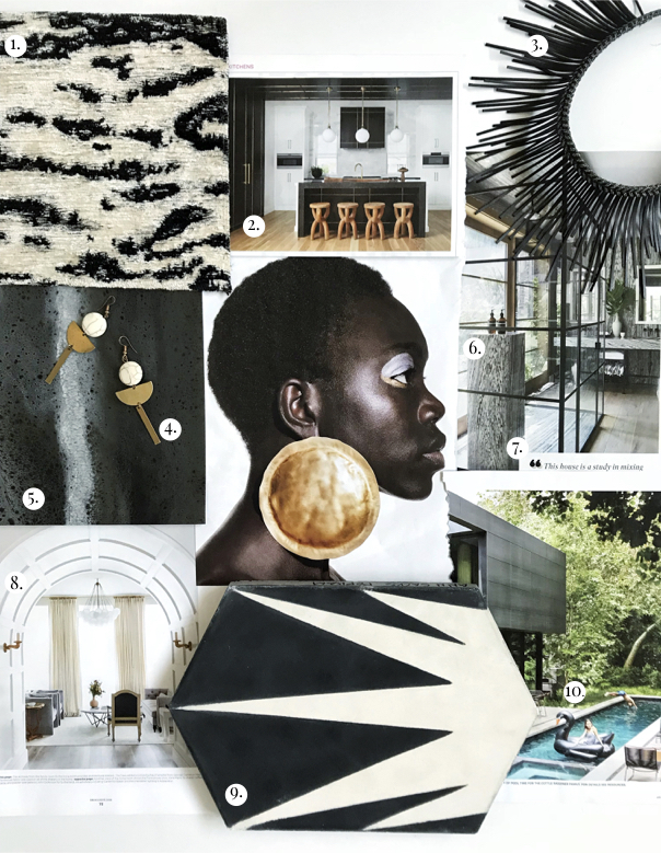
We’ve been getting our hands dirty with new and current client projects, so inspiration has been plentiful around the Pulp studios! It’s always hard to edit the list down to just 10 of our favorites, but we think this month’s Pulp Edit does a pretty good job of capturing all the things inspiring us, from textiles to fashion!
The Top 10 Interior Design Trends of August 2018
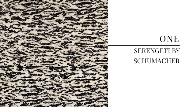
Animal patterns are hard to do well, without looking tacky and cliche, but Schumacher totally nailed it with their Serengeti textile. We love this adventurous modern classic! Not a spec of cliche in sight!
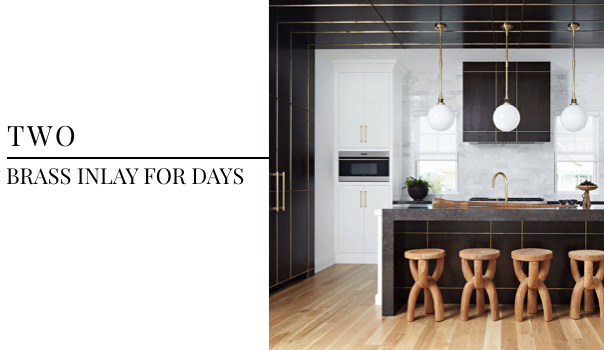
Black and brass have held a comfortable seat on our list of favorite trends this year, but this brass inlay, spanning from the cabinets to ceiling, takes everything we love about this trend to a new level. Designed by Gary Ciuffo and photographed by Werner Straube for Traditional Home‘s July/August 2018 issue, this space is absolutely to die for.
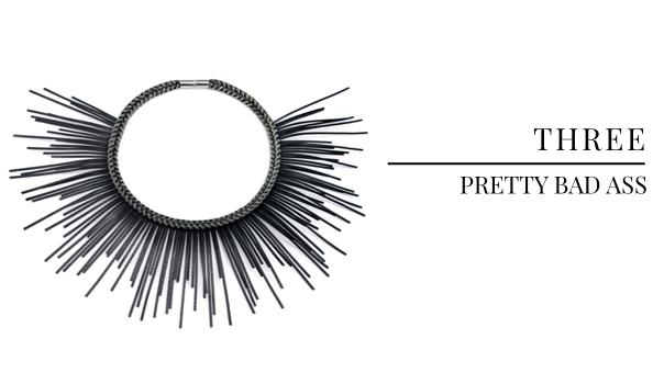
The wonderful Traci Zeller gifted us these amazing necklaces by Leyla Gans after her “Is Pretty Passe” panel at the Wesley Hall showroom at High Point Market this spring. We were so honored to take part in the panel with such kick a** women and love how this necklace brings everything we love about pretty, yet edgy details to life!
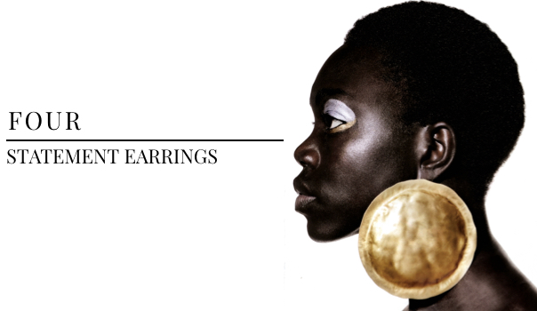
Just like we love to add unexpected details to an interior design client’s space, we have been obsessing over statement earrings with an otherwise neutral look. Our flair for the unexpected design approach meets fashion and style!
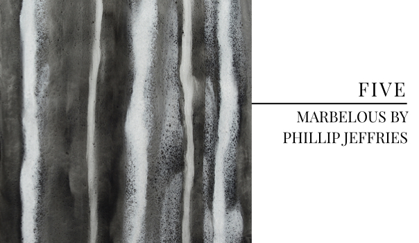
We’re using this stunning Phillip Jeffries wallcovering in a different color in a current project in Seattle — it’s going to look so amazing in their space! We love when the natural world serves as inspiration, so we were instantly draw to this wallcovering, patterned after one of the best natural stones for design.
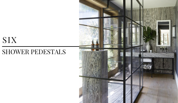
A shower pedestal? Yes, please! Designed by Martyn Lawrence Bullard and photographed by Roger Davies, we spotted this space in the July/August issue of House Beautiful and instantly fell in love with how chic the pedestal makes an already beautiful space.
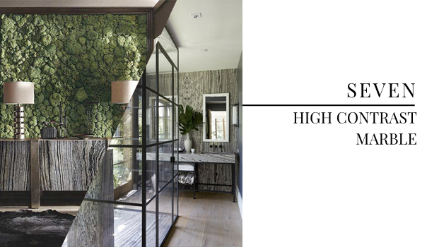
Let’s talk about high contrast marble… we first spotted this trend starting to emerge with Bernhardt’s Black Forest Marble at High Point Market and have had our eyes out for it ever since. The space from #6 does more than just the shower pedestal right — check out that marble!
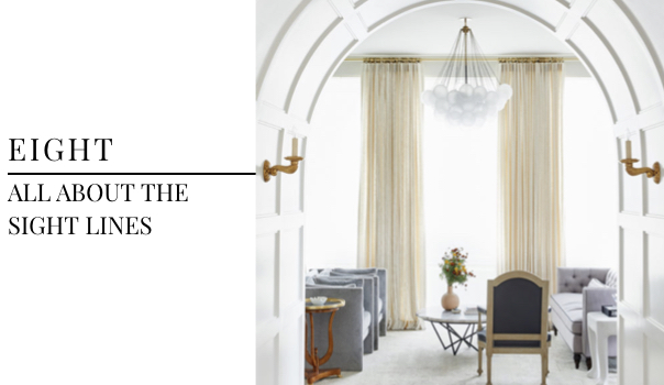
When we design spaces for our clients, we focus on the way a room is experienced and how the human eye will naturally move throughout. This space designed by Sees Designs and photographed by Cody Ulrich for D Magazine, defines what it means to create beautiful sight lines that elevate the effect of great design.
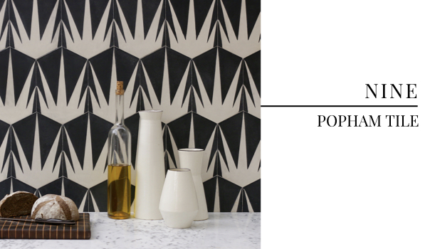
You can’t go wrong with a statement tile, especially when it’s as full of life as Popham Tile for Ann Sacks. This beauty is going in a repeat Pulp client’s wine cellar as part of their basement renovation in progress.
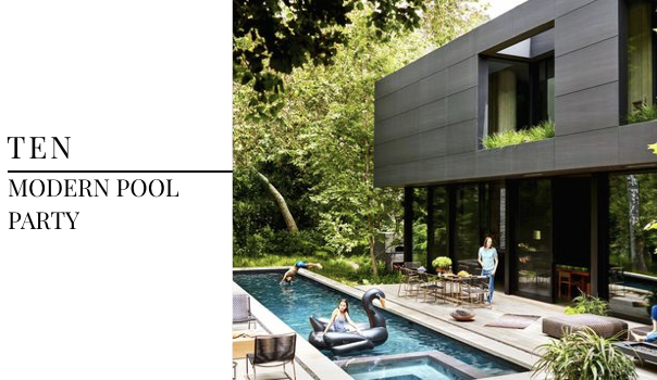
There’s only so much time left to throw to best pool party of the summer, so we’re drawing major inspiration from this cool and neutral palette, designed by Ron Radziner and photographed by Trever Tondro for Architectural Digest‘s July/August issue.
Credits
SECTIONS
Design InsiderEntertaining + Home Living
Health + Beauty
News + Announcements
Pulp At Home
Pulp Design Work
Shopping Guide
The Business of Design
The Pulp Edit
Travel
Videos
GET INSPIRED
SUBSCRIBE TO OUR NEWSLETTER TO
GET AN INSIDER LOOK IN YOUR INBOX


