Before + After: Big Style in a Small Space
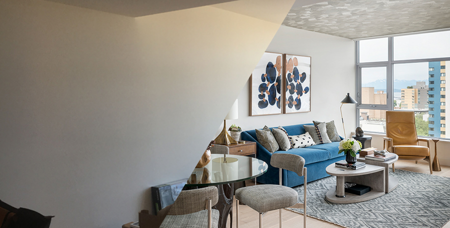
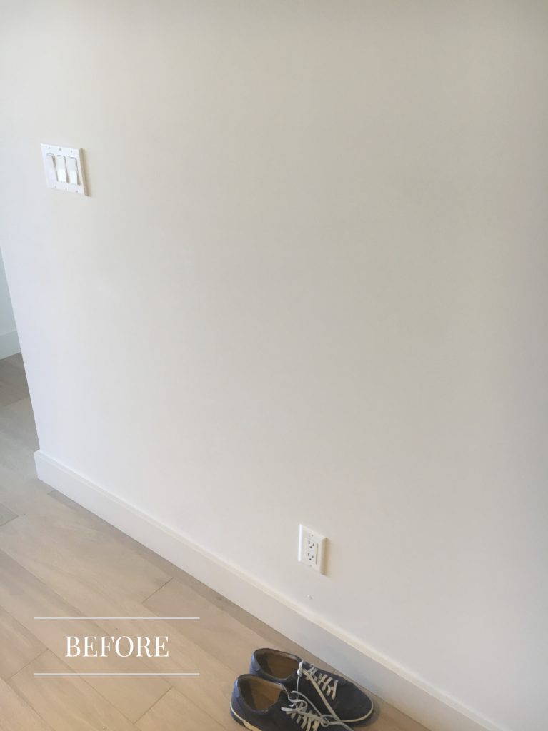
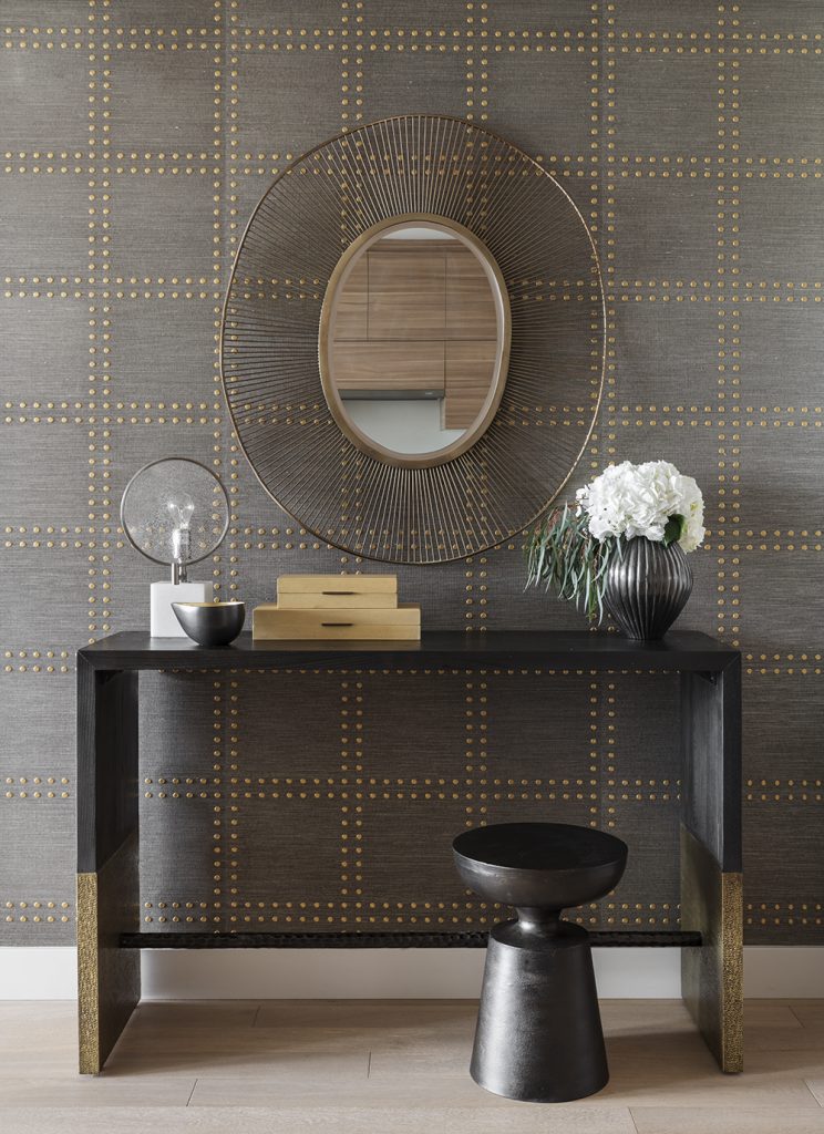
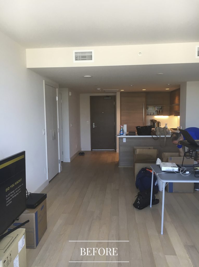
When our client purchased a luxury condo in a premier Seattle high rise, he wanted more than just the plain box style that he started out with. Without any construction, we gave him a home made for entertaining, with clever ideas to make the most of every square inch. He loved the design we presented so much that he had no changes. We transformed his interiors from zero personality to maximum style!
Entry Hall
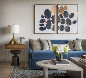
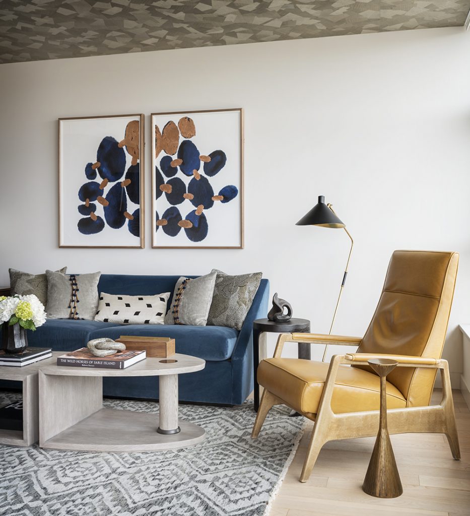
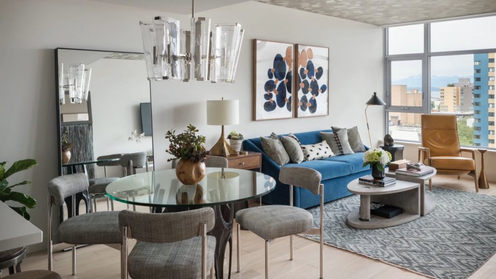
Living Room
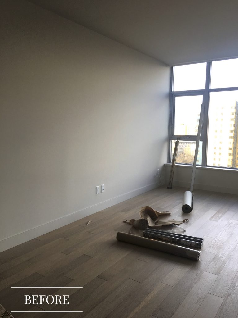
“Using wallpaper on the ceiling to define the living room as a separate space from the kitchen/dining area really gave the illusion of more space in this condo.”
– Beth Dotolo
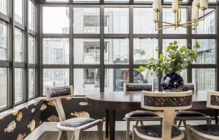
Kitchen/Dining
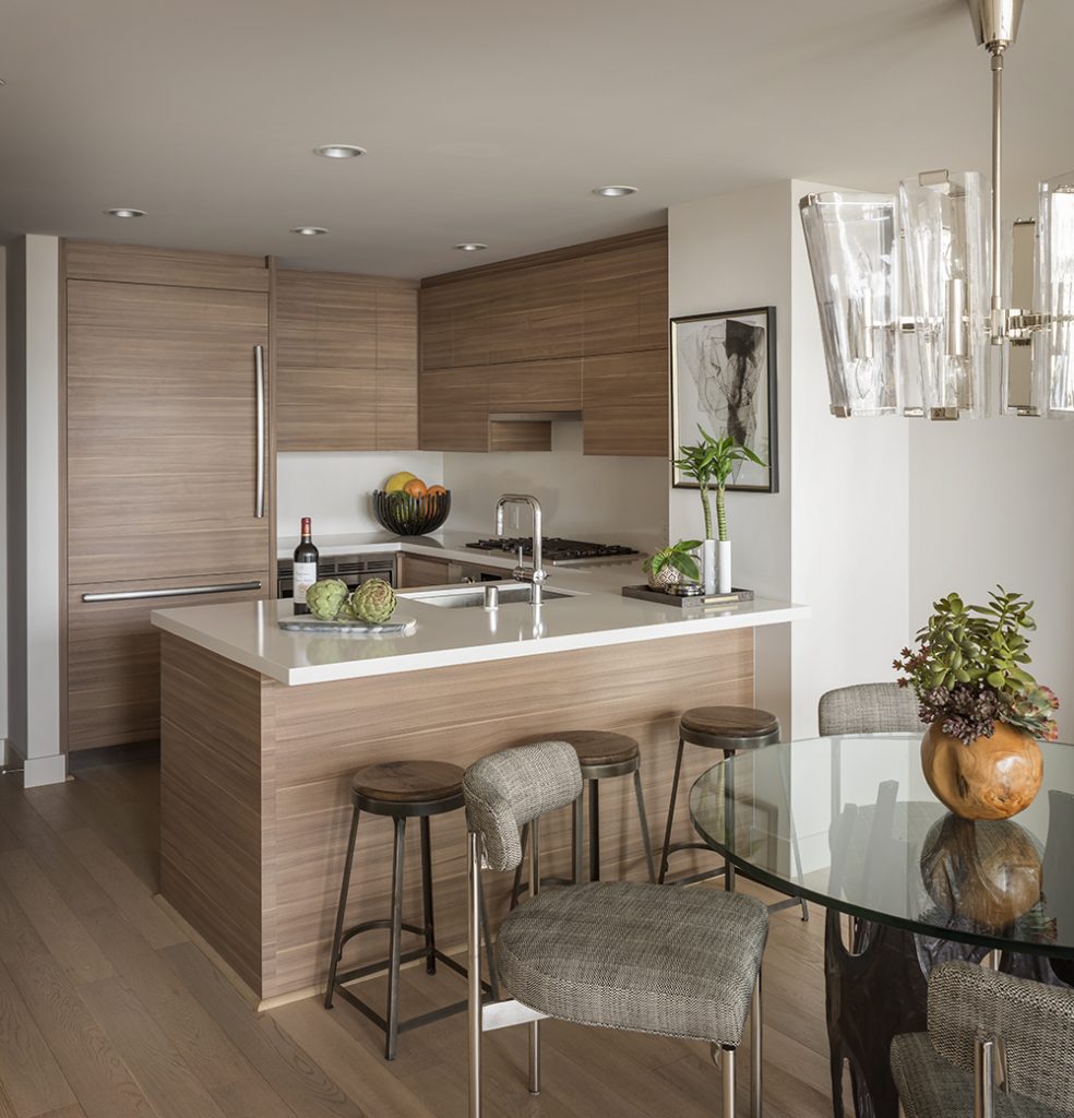
“I never thought my place could look so amazing. The colors, the furniture, and the accessories are all just incredible.”
– Gary E. Pulp Design Studios Client
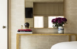
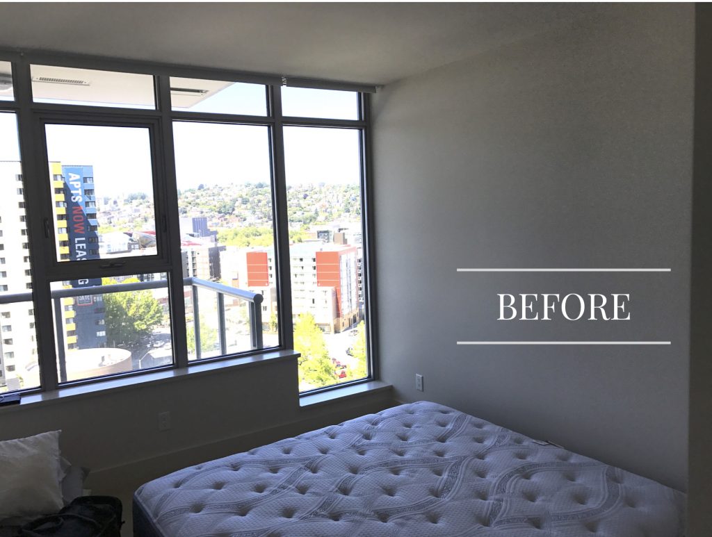
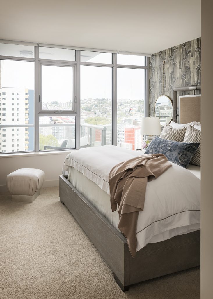
Bedroom
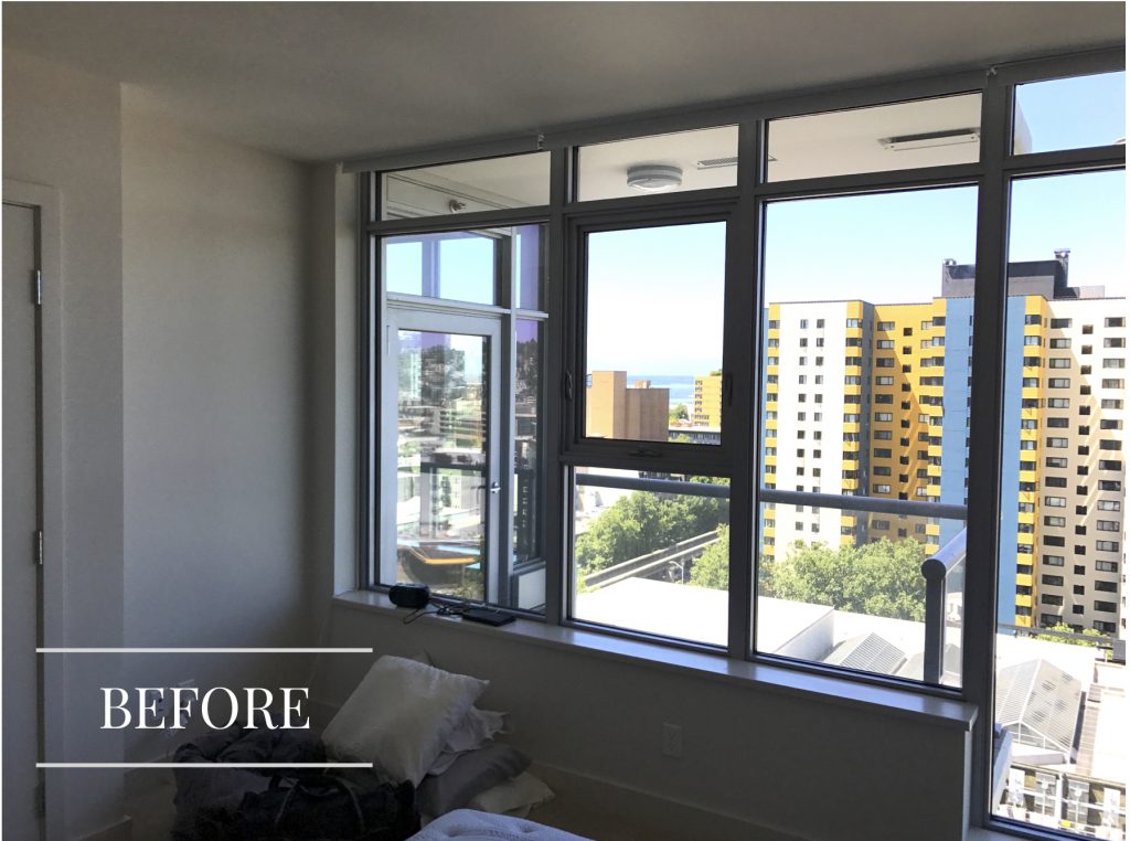
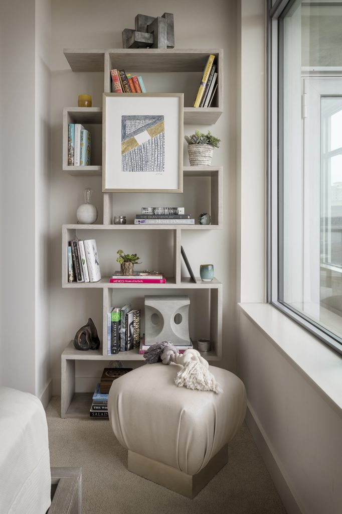
There’s even more to see in the full project – just click here to take a tour!
Want to know how we can transform YOUR home?
Book a complimentary call to discuss how we can help!
Credits

SECTIONS
Design InsiderEntertaining + Home Living
Health + Beauty
News + Announcements
Pulp At Home
Pulp Design Work
Shopping Guide
The Business of Design
The Pulp Edit
Travel
Videos
GET INSPIRED
SUBSCRIBE TO OUR NEWSLETTER TO
GET AN INSIDER LOOK IN YOUR INBOX


