Before and After: Kips Bay Show House
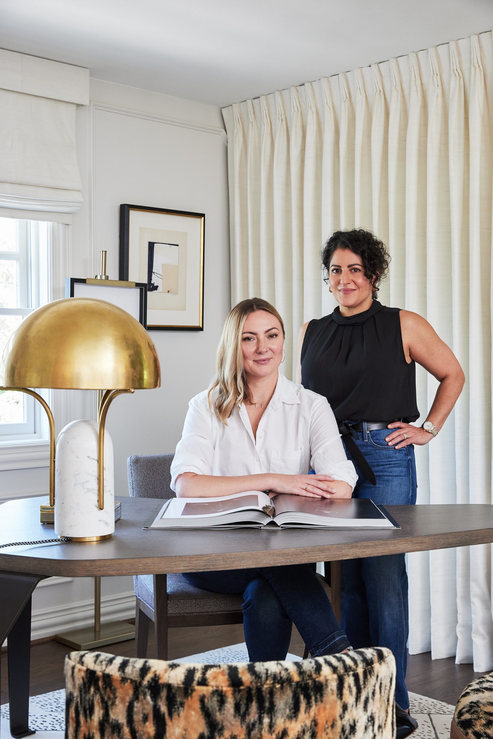
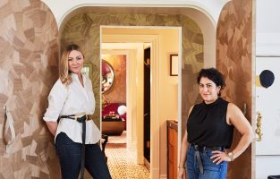
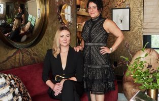
Pulp co-founders Beth Dotolo and Carolina Gentry have given you a tour of their daring Wise & Wicked space at the Kips Bay Dallas Show House (if you missed it, click here!). But they haven’t shown you how they got from the original house to those stunning interiors! It was a long creative road with lots of challenges and teamwork. So here is a before-and-after look at how the gorgeous loft space came together.
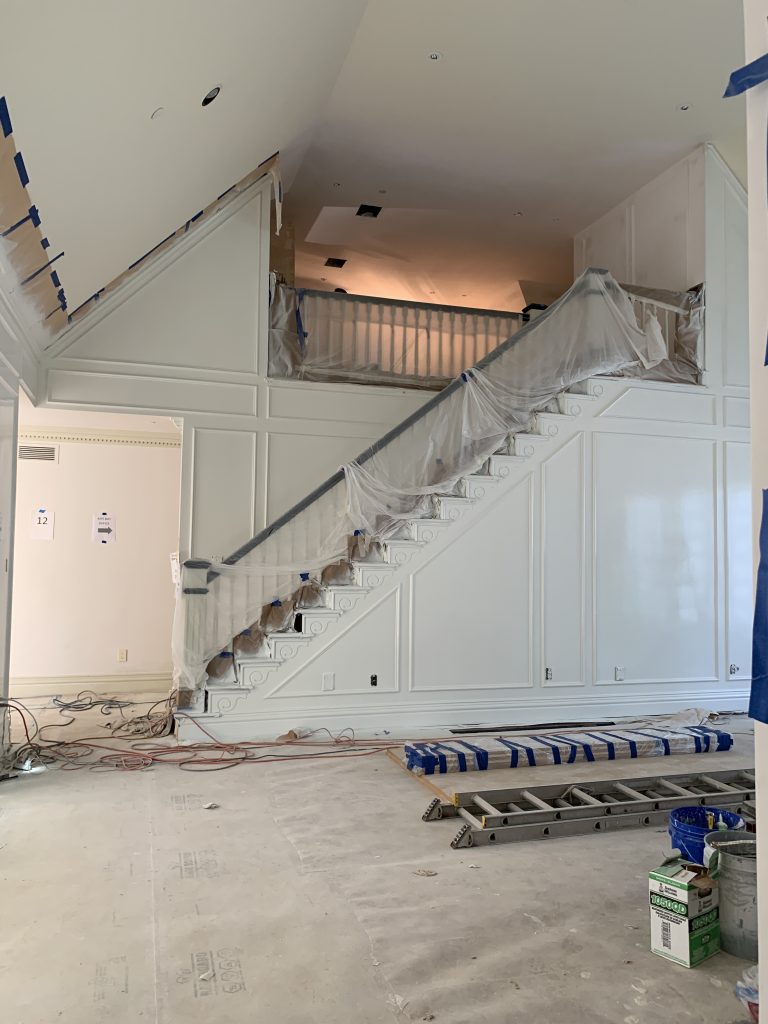
The Office
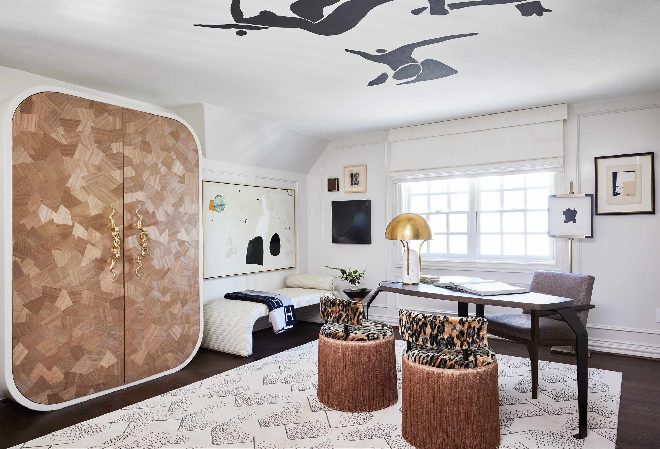
The entrance to the entire loft area was in the office, accessed by stairs from the lower level. The ceiling and the floorplan included a lot of odd angles and turns, giving the Pulp team a challenge right from the start.
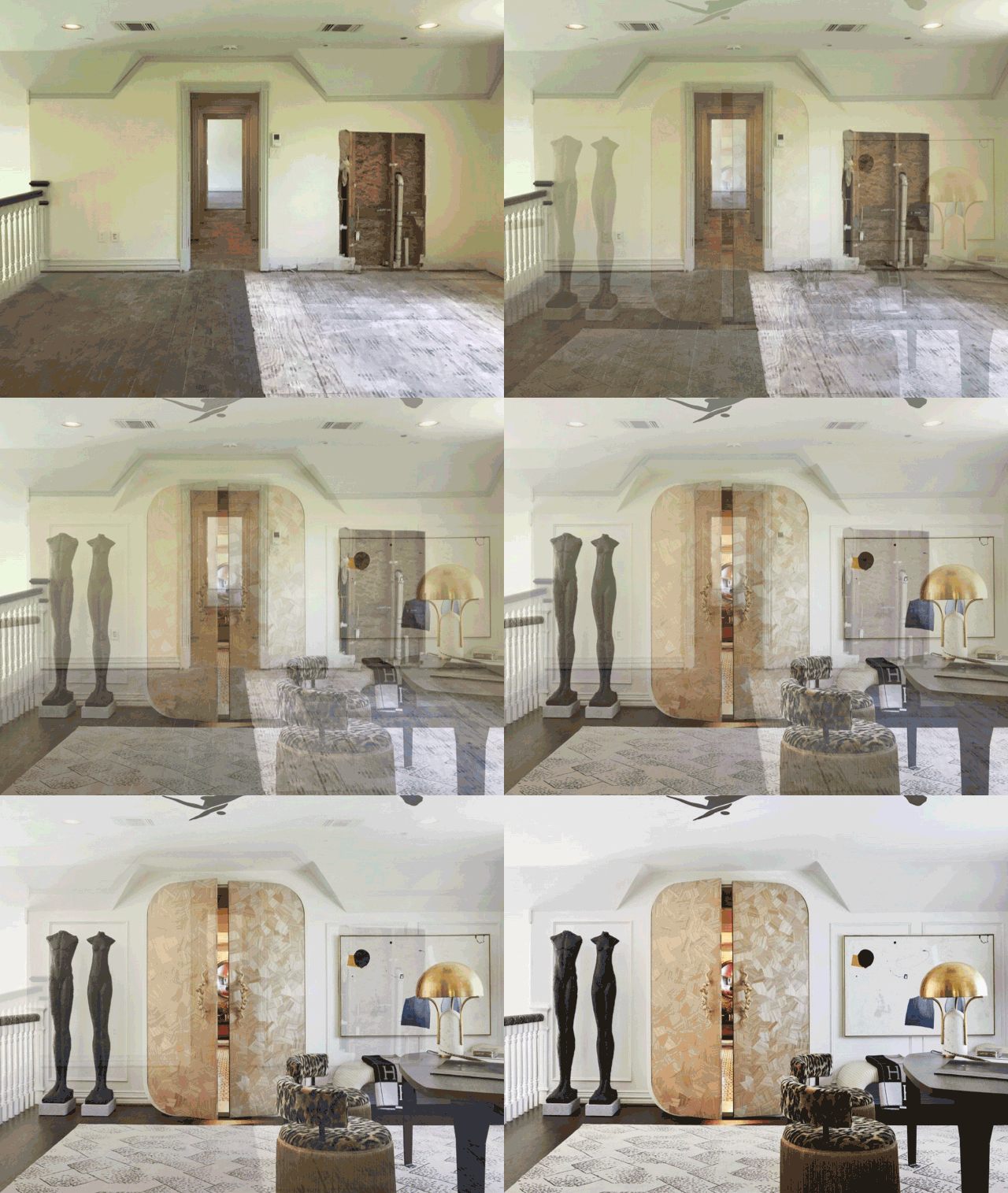
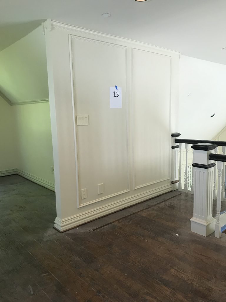
A series of panels created with molding was in the downstairs area and one part of the upstairs loft. The team decided to continue that molding through the office to create a refined and defined look.
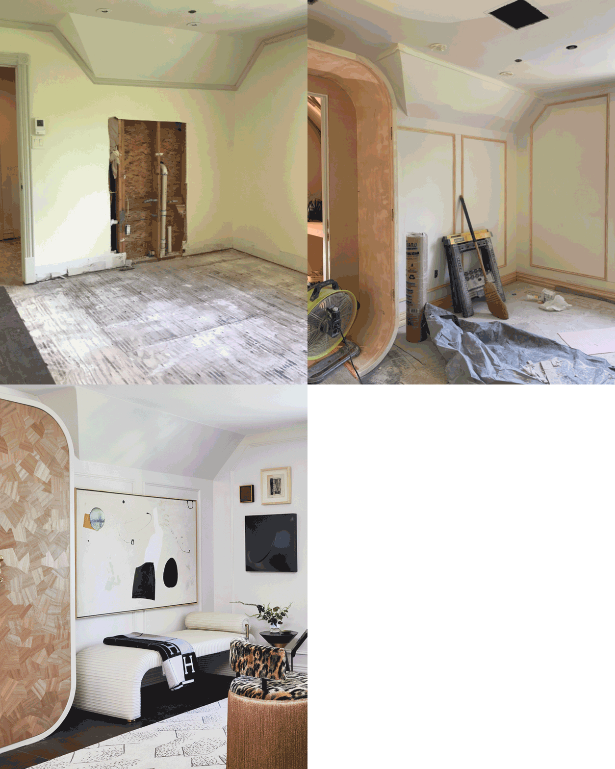
Pulp went with a very clean color palette so it would be a space with no distractions. This woman is in charge and all business, but obviously, she wants her surroundings to also inspire her. So there’s a lot of art and very fashion-forward seating.
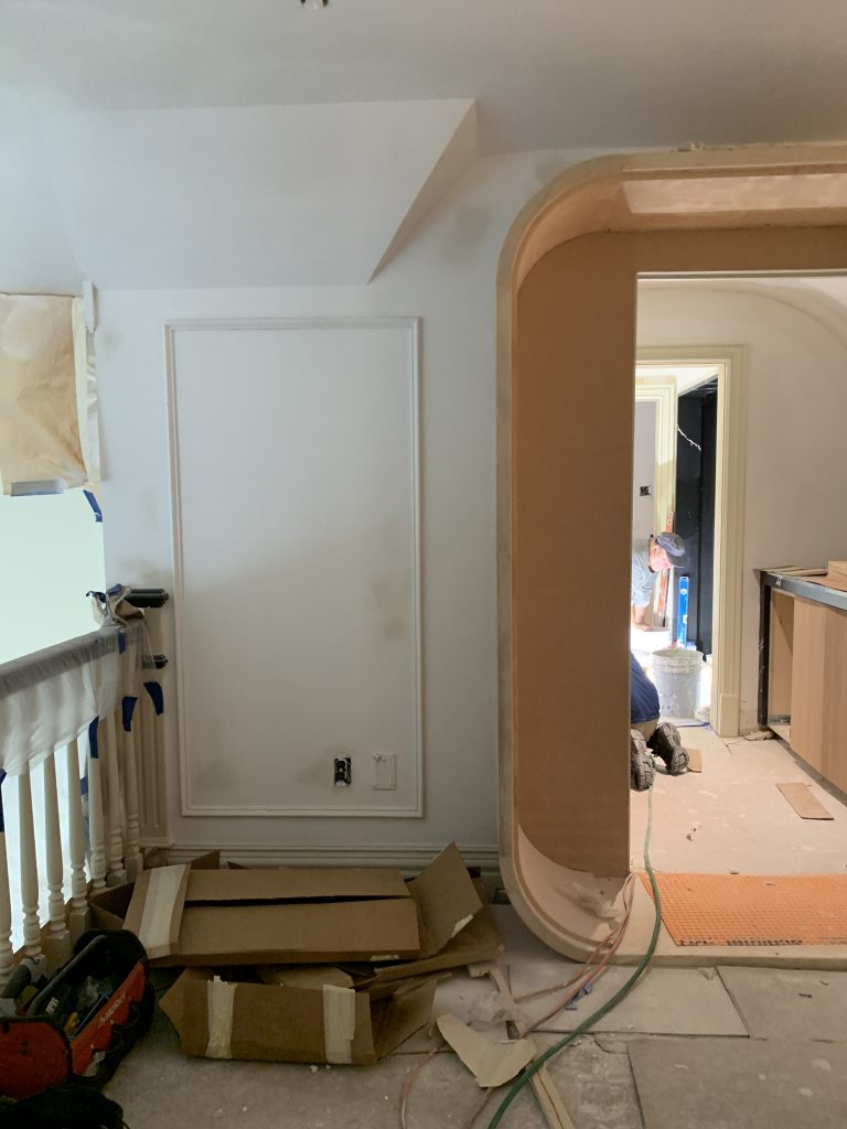
The Pulp team worked with the amazing More Design + Build to design a custom cabinet that would be a hidden passage from the office to the fabulous lounge at the other end of their space. The doors of the custom cabinet include Innovations’ Origami wallcovering, designed to look like a unique wood pattern.
The Office Nook
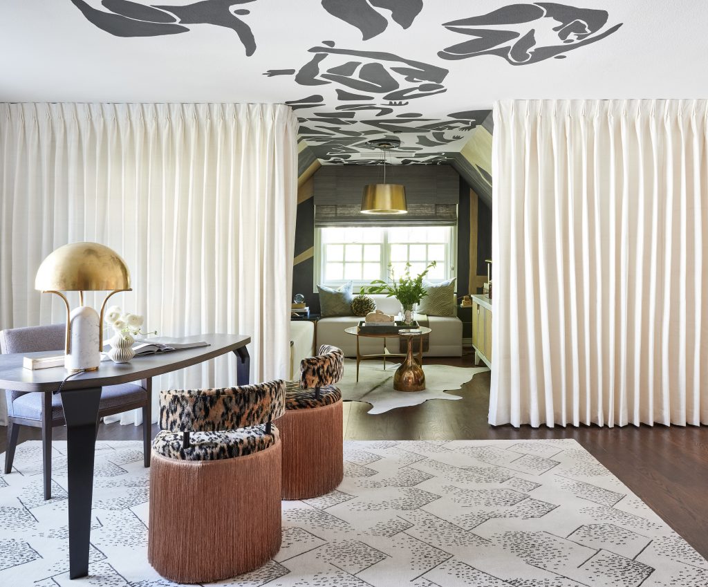
Directly off the office on the opposite side from the hall and lounge was a small nook with a window. The Pulp team decided to create a small space that could operate as a “Zoom room,” or just a space for quiet contemplation during the workday. Every Zoom backdrop needs to be fabulous, especially for Pulp’s dynamic muse, so the Porter Teleo wallpaper was the perfect selection.
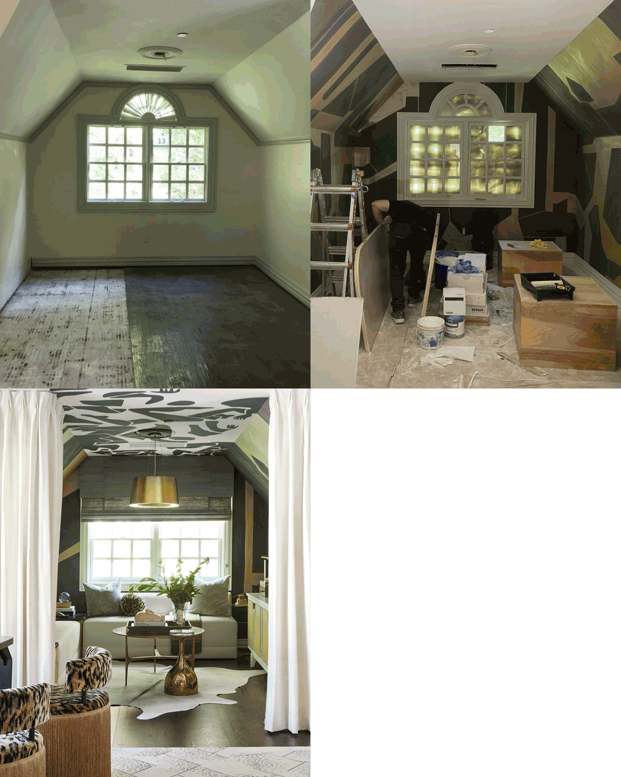
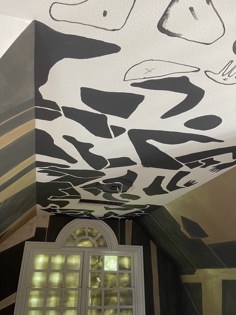
To keep that artistic vibe going, Pulp hired a muralist to create a ceiling that was designed to look as if the shapes of the wallpaper were taking flight. The mural extends into the office as if the creativity couldn’t be contained.
On one side of the finished office is a wall of drapery. When pulled back, it reveals a super-stylish nook, quiet contemplation, for quick meetings, or as an amazing Zoom backdrop.
The Bath and Hall
Through the custom cabinetry, a hallway leads to the lounge on the other side of the loft. Pulp wanted this passage to be more magical and unique, like a hidden world or a speakeasy entrance. This raw space did originally have a bathroom, but it was more of an afterthought and didn’t make good use of the space.
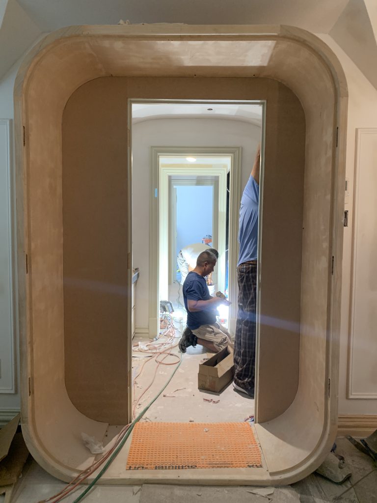
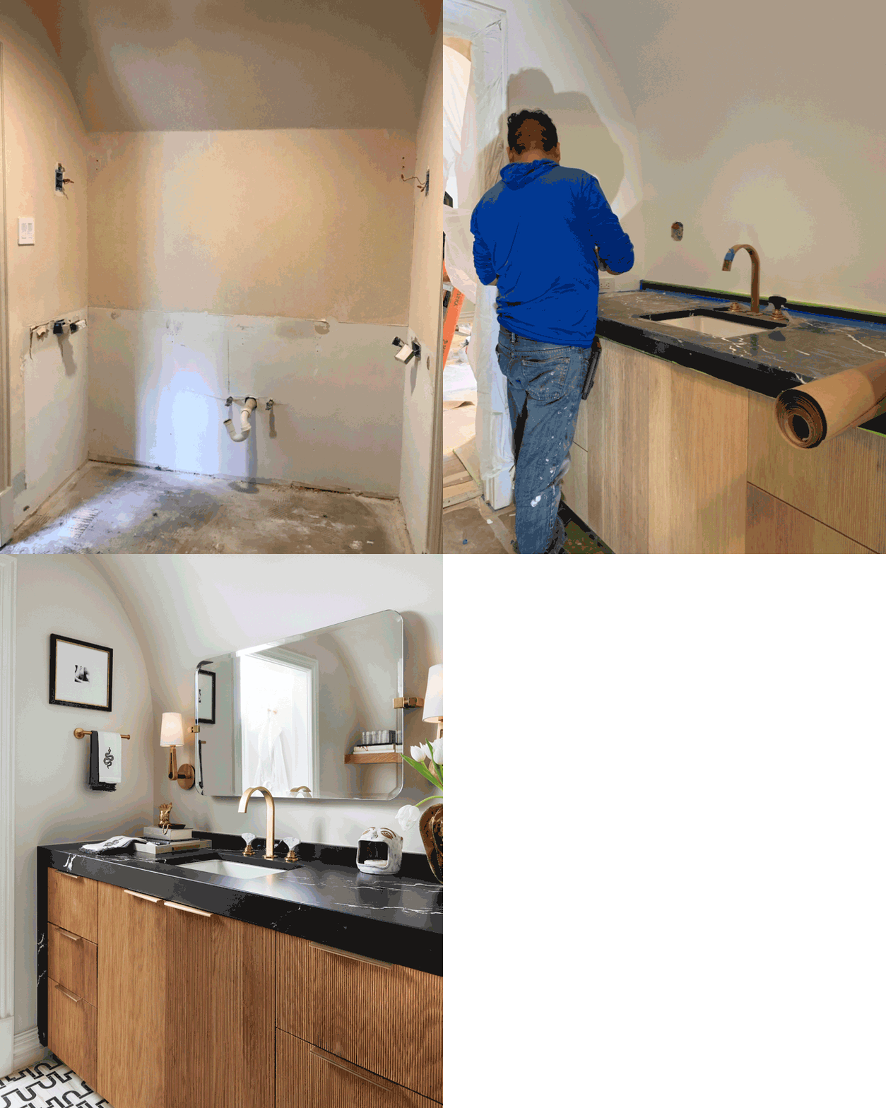
To create that sense of adventure and discovery in the hall, Pulp designed a barrel ceiling that would offer a cozier feeling more like a hidden tunnel or passage than a hallway.
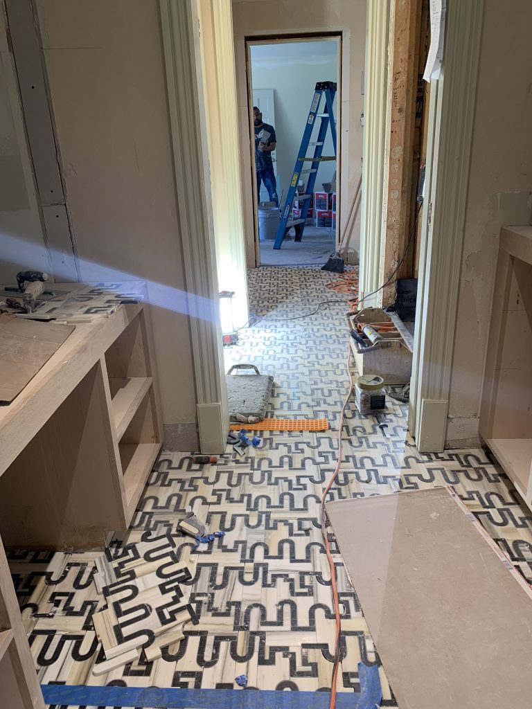
The Ann Sacks tile floor was selected because it offered a look inspired by Oz’s yellow brick road. The Pulp team again wanted to inspire a feeling of stepping into a surreal world on the way to an exciting adventure.
Taking advantage of every square inch of space, the Pulp team created nooks for a sink, vanity and shower in the hallway, offering a place for their businesswoman to transform into her wickedly fun alter ego as she moves into the lounge.
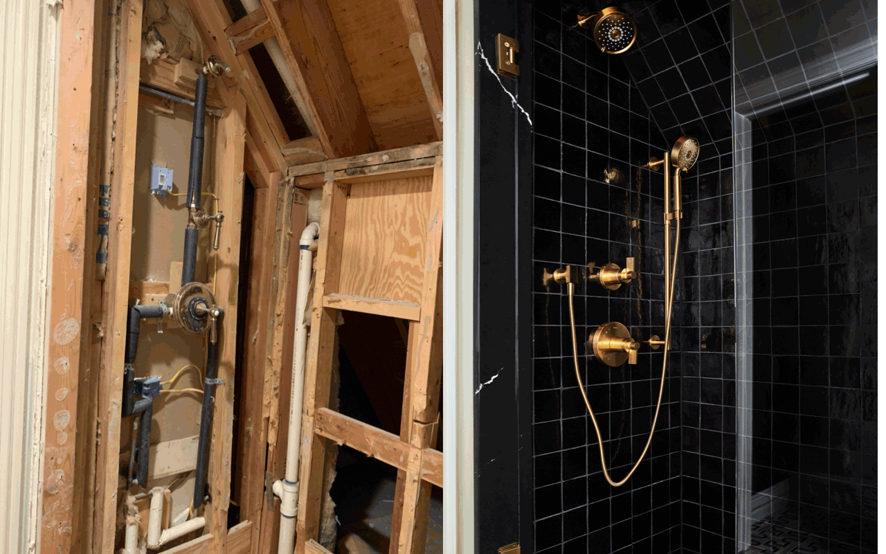
The all-black tiles from Ann Sacks are a bold look for the shower, especially with the glam brass fixtures, and it continues that feeling of mystery and drama.
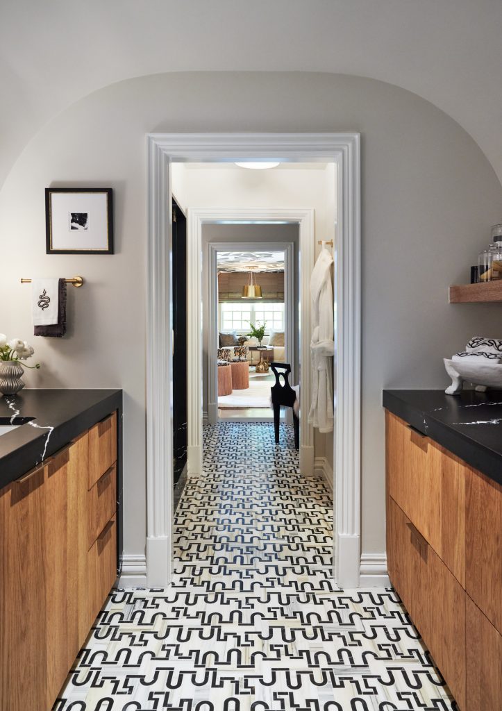
Pulp is known for adventurous design, and that floor definitely gives this space that feeling of pushing boundaries. The Ann Sacks tile (which is the Garde pattern from the Liaison collection) is almost like the yellow brick road, in that you want to follow it to see where it leads you.
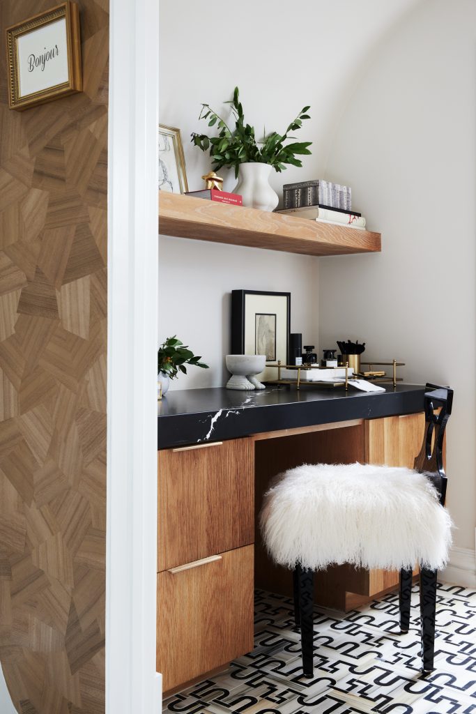
The vanity is in a niche at the other end of the hall. The chair has the sophistication of the office space, combined with the daring design you see in the ‘Sinner’s Den.’
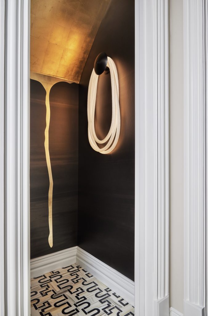
A water closet is a functional and necessary room, but why does that mean it should be boring? Pulp wanted it to be unexpected and eye-catching, and the wallcovering by Calico hits the mark. The light fixture from Luke Lamp Co. is also completely out-of-the-box.
The Lounge
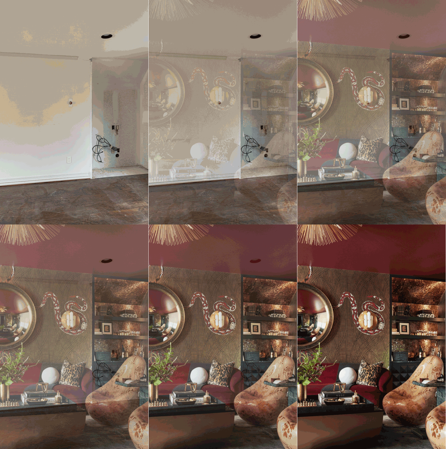
The original space for the lounge was very vanilla, with a lot of doors and unused closets. This area’s transformation is definitely the most dramatic for Pulp’s Wise & Wicked design!
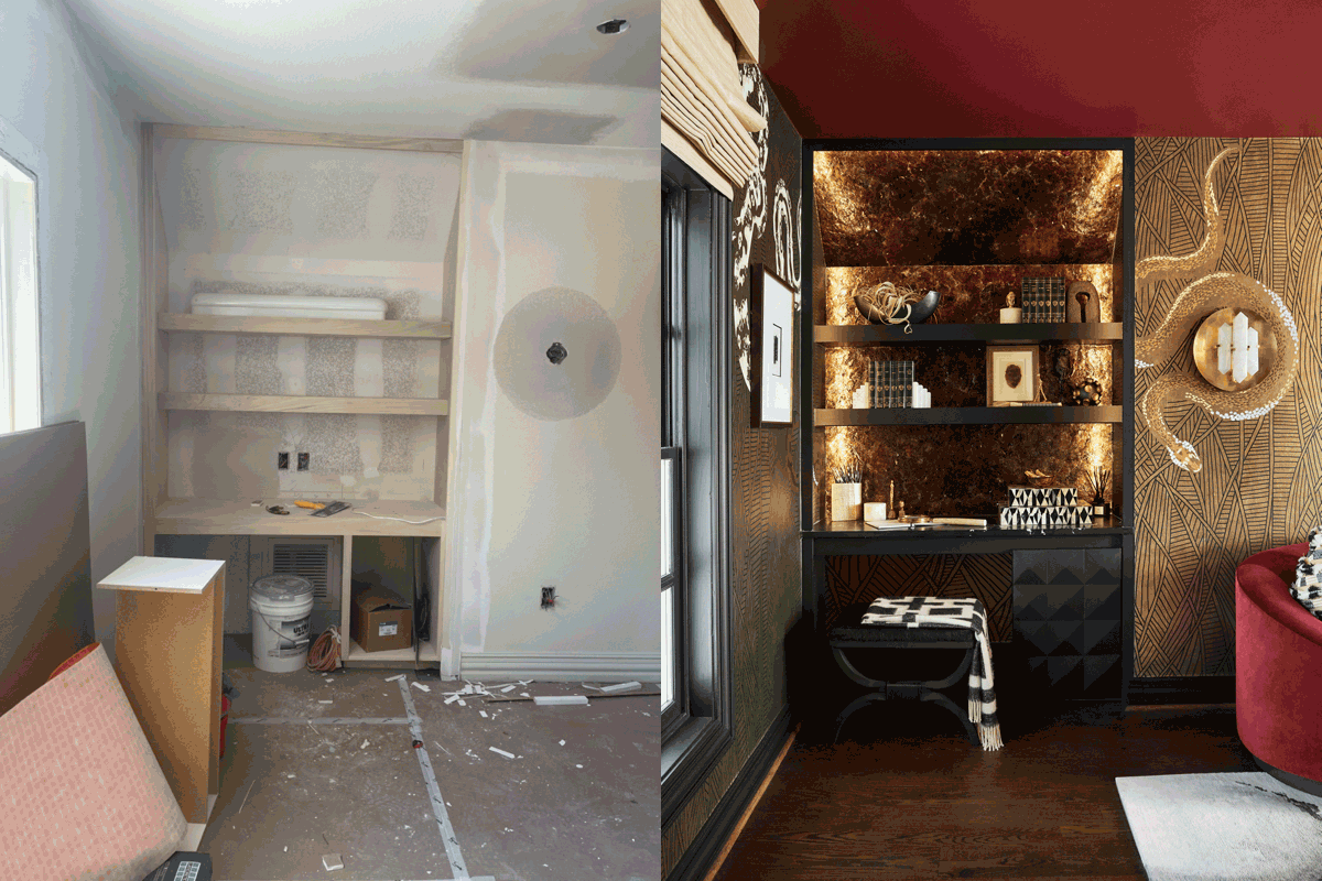
Two closets were redesigned to be shelves and storage, offering a more practical use of the space. Custom cabinetry on the bottom of the shelves was designed to hide a myriad of “sins,” like a bar cabinet or storage for cards and dice.
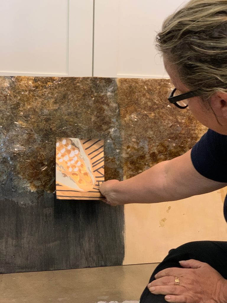
To complement the wallpaper selection for this room, artist Brenda Houston created muscovite mineral walls behind the shelves, mimicking the look of snake skin.
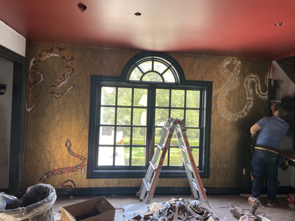
A deep black and a red called Dinner Party – both from Benjamin Moore – define the moody and dramatic look that Pulp wanted for this “Sinner’s Den.”
Pulp is known for bold and adventurous design, for rooms that are super-dynamic but are also livable. In the lounge, the mood is dramatic, quirky, and unexpected. A sense of fun and fabulousness reveals itself in the evocative wallpaper, shapely sofa, and exquisitely unique chairs.
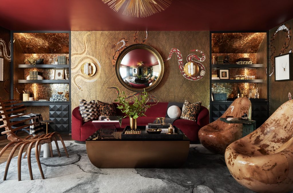
Pulp designed the space to be edgy and fun, a place that everyone wants to be in, almost like the coolest speakeasy you’ve ever experienced. The team worked with Fromental to customize the Les Boas pattern so the snakes would wrap around the gorgeous Visual Comfort sconces.
To tour the full finished space, click here! And to create your own dramatically livable space, contact the Pulp team.
Pulp would like to thank vendors who provided stunning products for the Wise & Wicked spaces, including: More Design + Build; Arteriors; Visual Comfort c/o Taylors by Jane; Tech Lighting c/o Taylors by Jane; Sylvan S.F. c/o Allan Knight; Fromental; Brenda Houston; Bettinger Studio; S. Harris/Fabricut; Kevin McLean; The Rug Company; Bungalow 5; HD Walls; and Glass House. We would also like to thank the sponsors for the showhouse: Leontine Linens; Kohler; Cambria; Ann Sacks; The Shade Store; and Benjamin Moore.
Credits

SECTIONS
Design InsiderEntertaining + Home Living
Health + Beauty
News + Announcements
Pulp At Home
Pulp Design Work
Shopping Guide
The Business of Design
The Pulp Edit
Travel
Videos
GET INSPIRED
SUBSCRIBE TO OUR NEWSLETTER TO
GET AN INSIDER LOOK IN YOUR INBOX


