From Paper to Product: Color

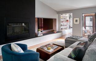
Hi! I hope everyone is having a great start to 2013. This month’s Paper to Product is all about color and how similar color techniques are applied to both graphic design and home products. It’s interesting to see how color plays out in different mediums. Though I’ve never thought about using neon in home decor, I love those bright, wooden bowls. They are super fun and have just the right pop of color. You’ll also never go wrong mixing metallics with neutral colors— no matter what the medium, the effect is always sophisticated. Do any of the products or uses of color above tickle your fancy?
Products:
1. B2 Iron Circle 30” Clock / 2. BHLDN Silvery Chevron Tray / 3. Land of Nod Between a Rock Lamp Base / 4. Etsy Wooden Mini Bowls / 5. Leif Printed Breakfast Tray / 6. Ferm Living Black Stripe Cushion / 7. Omaggio Teapot / 8. Steven Alan Large Night Carafe / 9. West Elm Sunset Throw / 10. Anthroplogie Multiples Pencil Holder
Graphic Design Recourses:
1. Metallics with Neutrals / 2. Pop of Neon / 3. Overlapping Colors / 4. Black and White / 5. Ombre
Credits
SECTIONS
Design InsiderEntertaining + Home Living
Health + Beauty
News + Announcements
Pulp At Home
Pulp Design Work
Shopping Guide
The Business of Design
The Pulp Edit
Travel
Videos
GET INSPIRED
SUBSCRIBE TO OUR NEWSLETTER TO
GET AN INSIDER LOOK IN YOUR INBOX