Good Bones: Redesigning a Home’s Exterior
A gorgeous home isn’t just about the rooms inside. The Pulp team loves to ensure that the exterior of our clients’ home is just as stunning as any of the interiors! For this Laredo, Texas, home, we were brought in at the very beginning, when our client was still shopping for the perfect location. Together we found a house with “good bones,” that just needed some updating and renovation work to make it absolutely perfect for her and her family. You’ve seen how we transformed the interiors, but we’ve never shown you how we redesigned the exterior of this fabulous house. So here is your exclusive look!
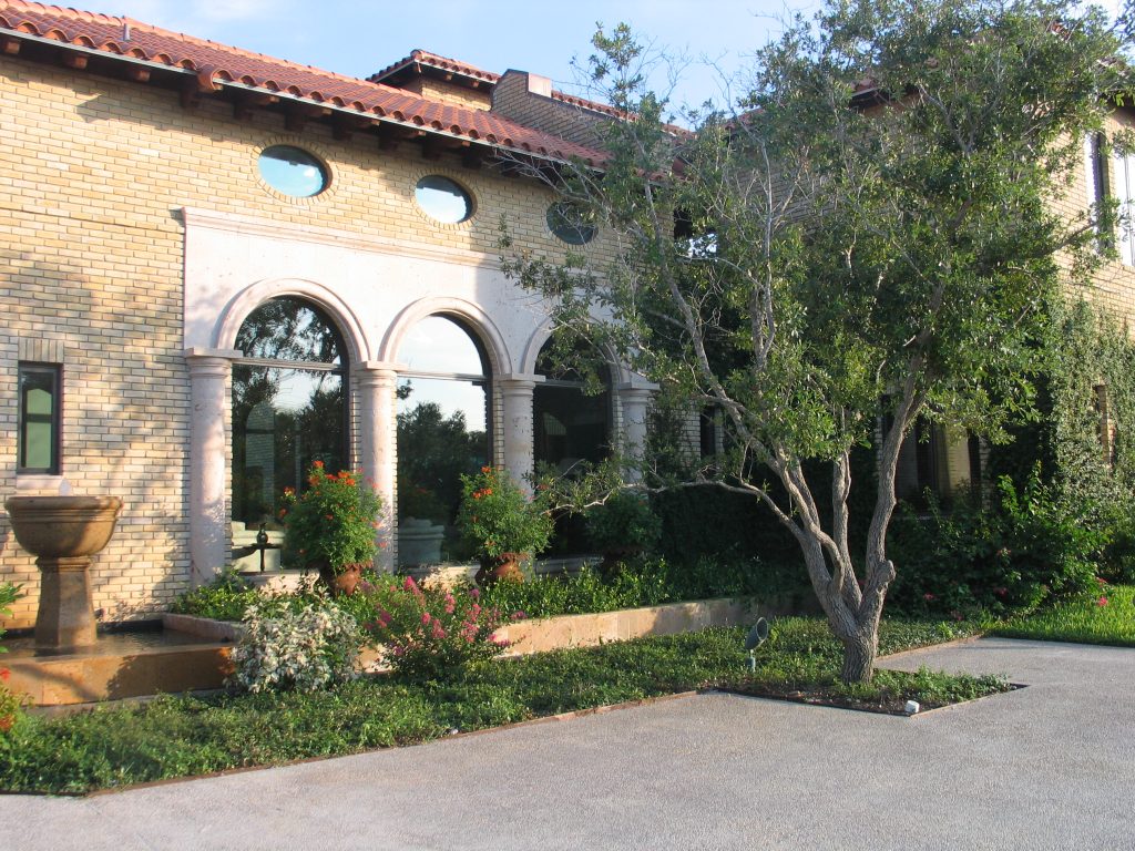
Architectural Details
When we first saw this Mediterranean home, we could see past its dated exterior to the beautiful architectural details. Unique windows, engaged columns, arches, and a fabulous roofline are things that give a home incredible personality. It just needed updating and modernizing to create a more casual and lovely structure.
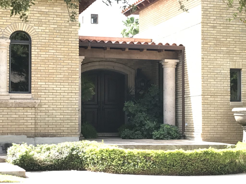
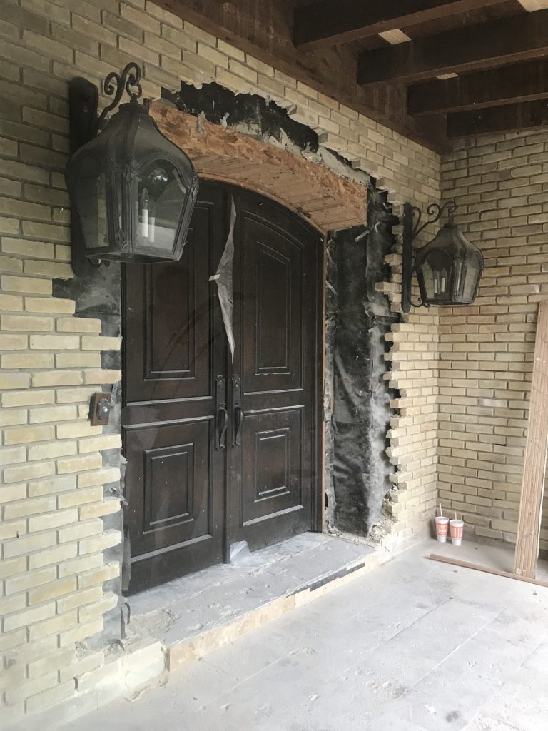
The entry was also unique, with a fabulous arched door. But it was dark and dated, and we wanted to allow more light into the home here to help brighten the interiors. So at this point we knew that a facelift would make a world of difference for this house, along with a few special surprises that we knew would thrill our client!
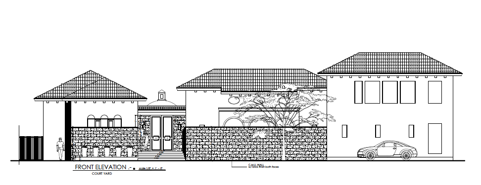
Open + Private
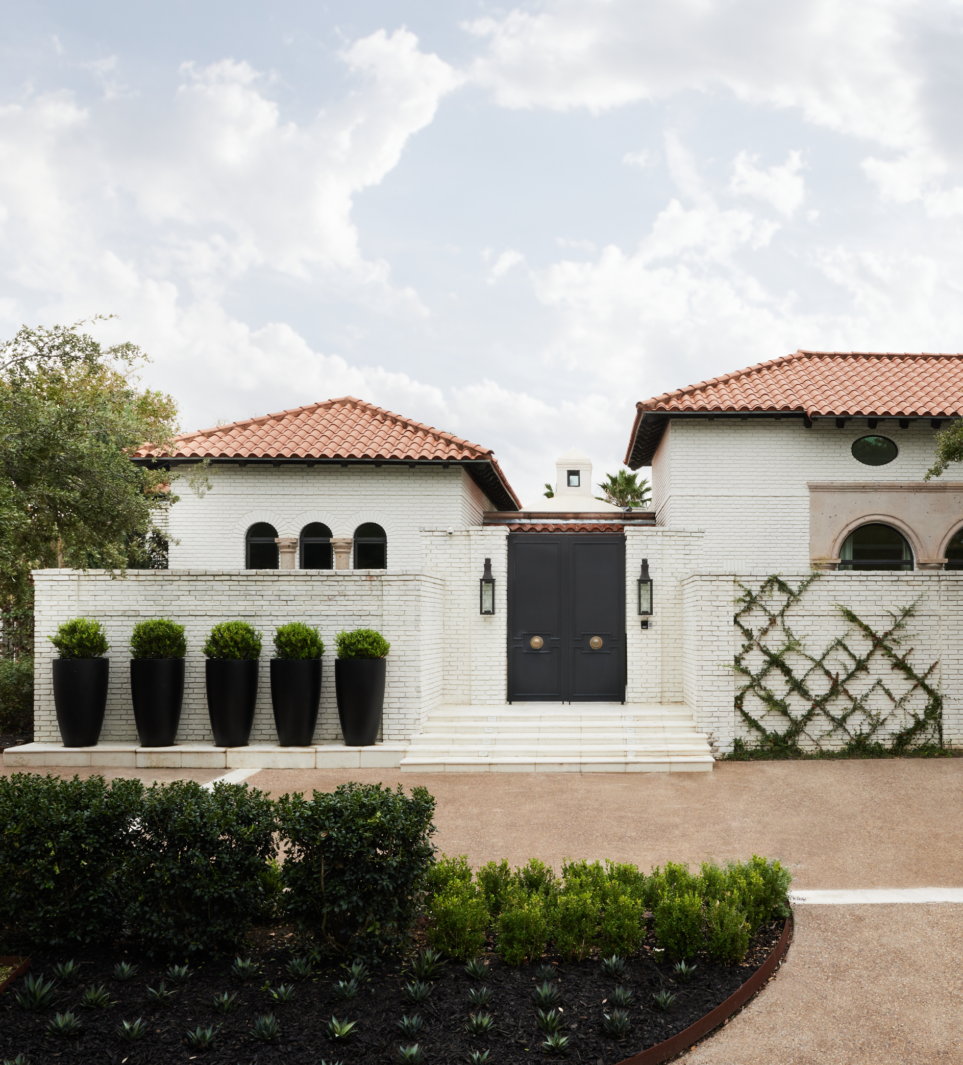
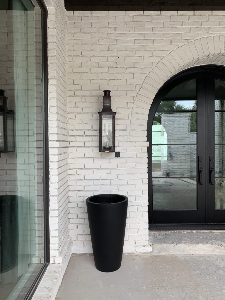
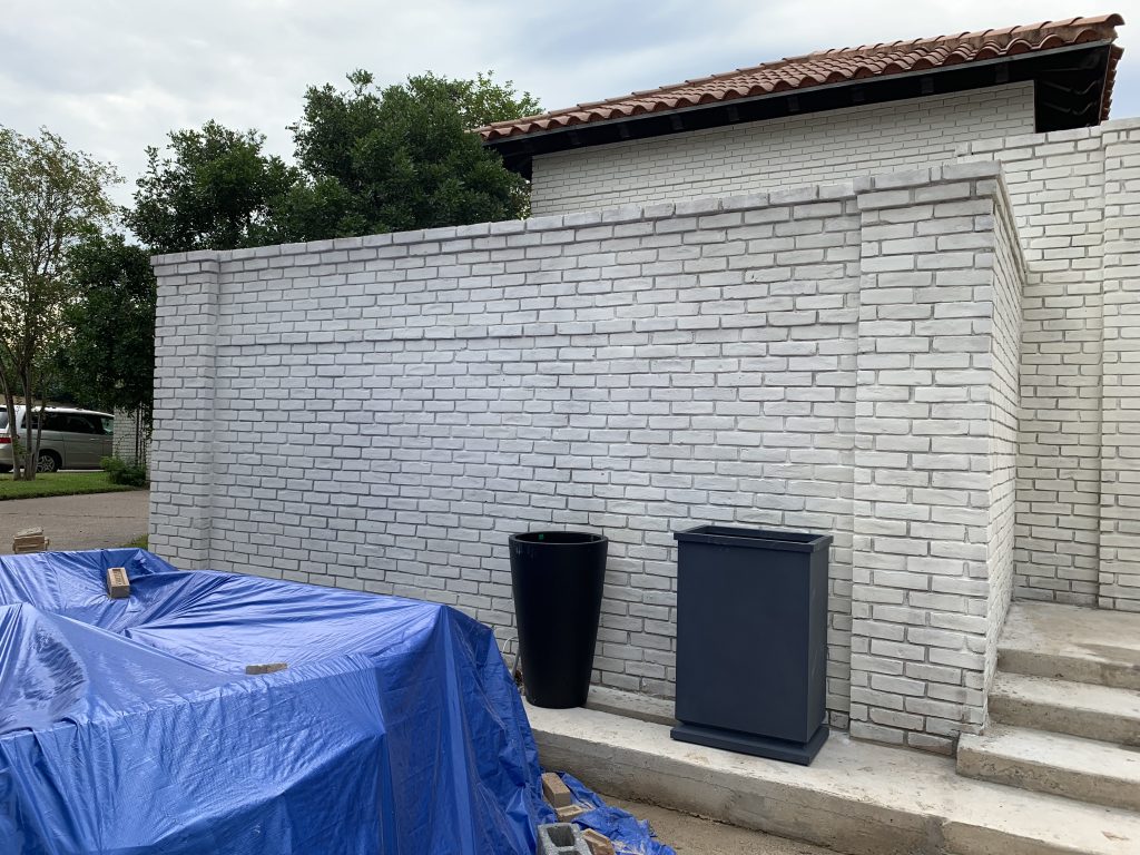
So how can a home be both open AND private?? Pulp designed the perfect solution. We created an exterior wall with doors and planters to offer more privacy for the entrance of the house. It also adds incredible personality and curb appeal.
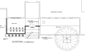
The wall gave us the chance to create courtyards and green spaces. Now we could open up the windows and allow more natural light into the house, while still giving our clients privacy. Having that wall gave us the chance to rethink the front door, too. We removed the old heavy design (and those dated lights!) and put in a more modern door with lots of glass.
Modern + Bright
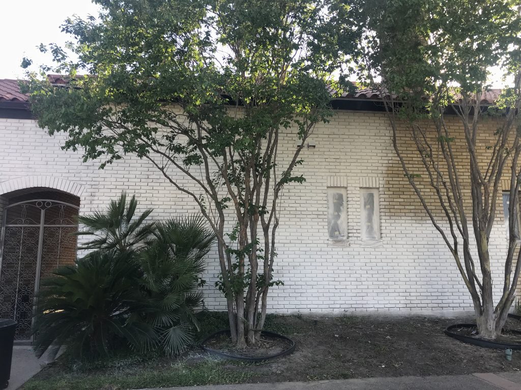
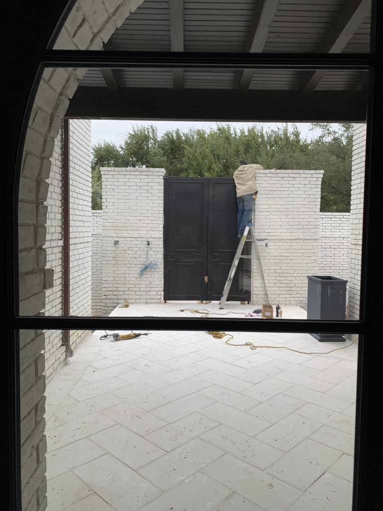
Now that you’ve seen the new front door, you also know that we completely reworked the color palette for the exterior. That old yellowed brick was just too tired and unattractive. Because we knew our client wanted a more modern look, we went with a stunning black and white scheme that would highlight the greenery around the home and would also work well with that fabulous tile roof. You can see the start of the new wall below, as well as the new paint going onto the brick exterior.
Details, Details
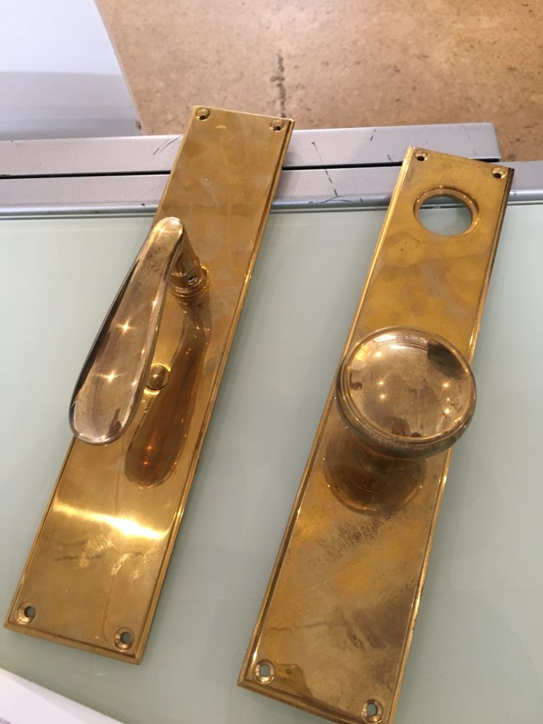
No detail is too small for the Pulp team! To craft a cohesive look, we selected everything from the perfect pavers to the just-right door handles. Even the brass finish needed to be very specific. We still wanted it to have a worn look, as if it was original to the home.
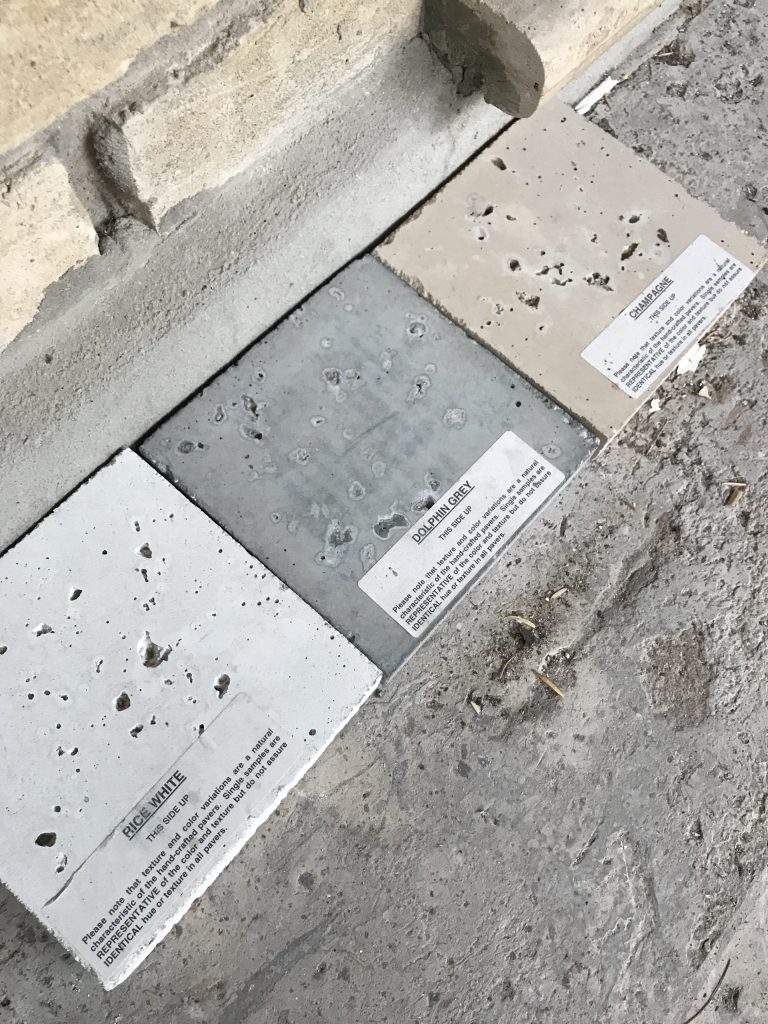
Below you can see some of the new pavers placed in the entry courtyard, between the home’s new gate and the front door.
The Big Reveal
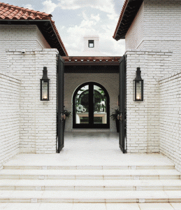
With some new planters, landscaping, and fab outdoor furnishings, we were ready for the big reveal of the gorgeous transformation. Here is the gate into that new stunning courtyard and front door.
And a view of the green space just inside the front gates is below. The furnishings are a mix of old and new, in keeping with the home’s new exterior. And we kept to that fresh black-and-white palette for a gorgeous look.
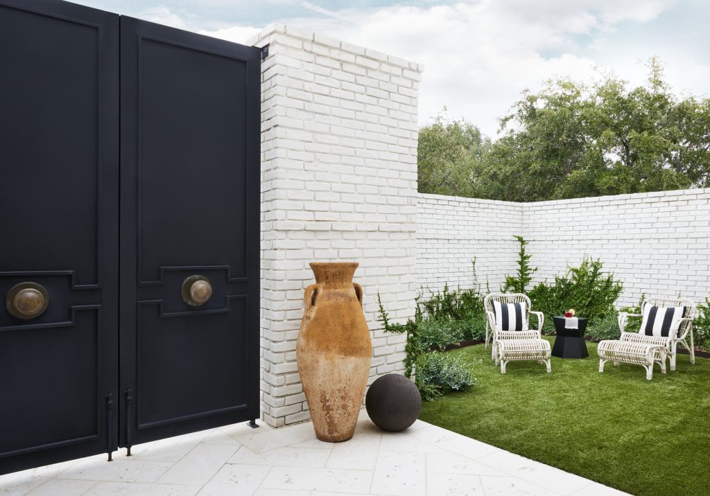
And here is the stunning new look for this Laredo house exterior, completely transformed into a modern and chic home. Isn’t it lovely?!
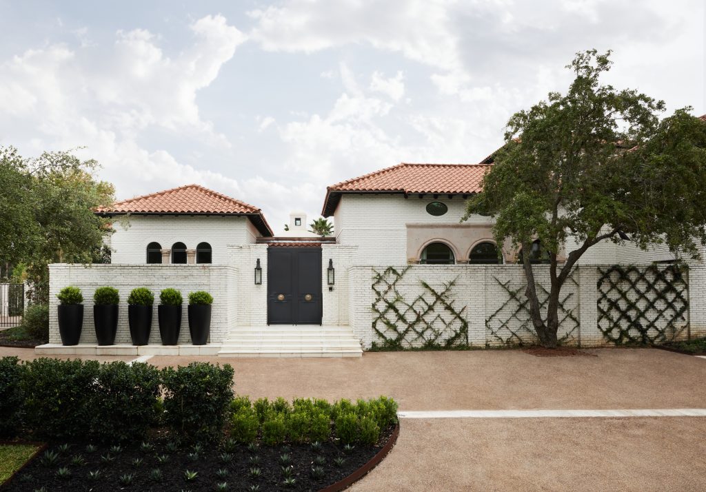
To find your perfect home, sometimes you have to look beyond a dated exterior to see what the possibilities are! That’s where Pulp can definitely help, so give us a call when you’re looking for your dream home!
Credits

SECTIONS
Design InsiderEntertaining + Home Living
Health + Beauty
News + Announcements
Pulp At Home
Pulp Design Work
Shopping Guide
The Business of Design
The Pulp Edit
Travel
Videos
GET INSPIRED
SUBSCRIBE TO OUR NEWSLETTER TO
GET AN INSIDER LOOK IN YOUR INBOX


