Home Tour: A Spectacular Pacific Pied-à-Terre
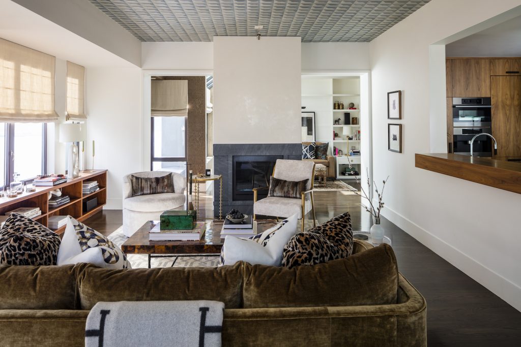
When these Pulp clients had to leave their Seattle home for their careers, they knew they still would need a small place in their favorite city to come back to. So they purchased a high-rise penthouse with views of the Puget Sound, downtown Seattle, and the Seattle Art Museum. While the views were spectacular, the interiors were dated and didn’t fit our clients’ personalities. Although it’s a second home, the Pulp team wanted it to feel special and bring a jewel box quality to it. Let’s take a tour of the chic results!
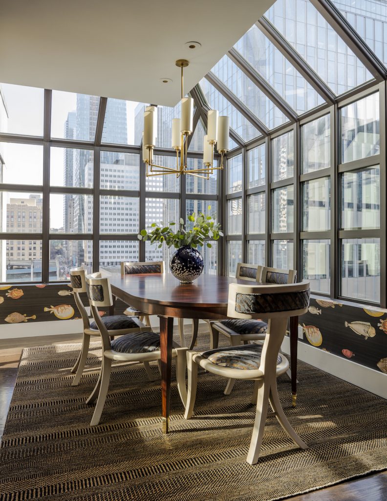
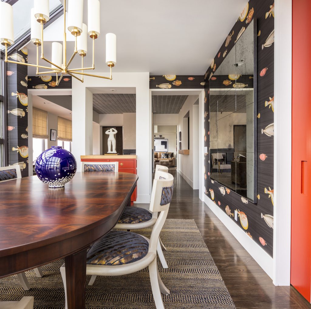
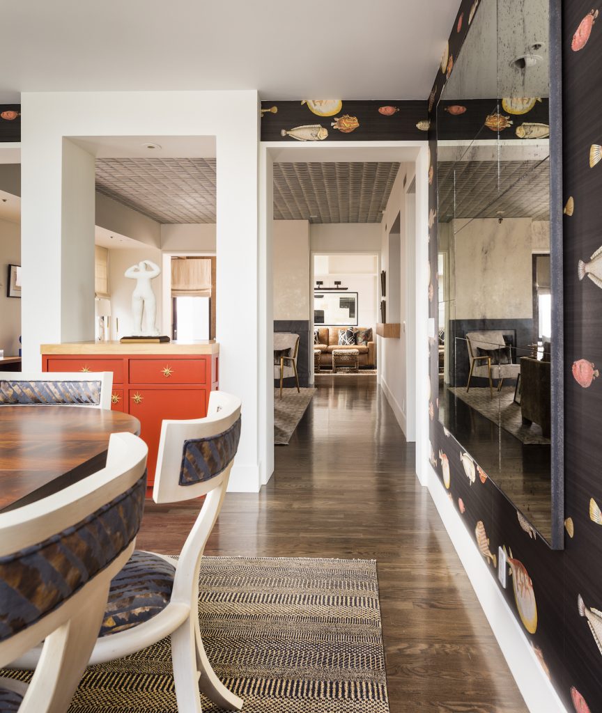
Q: What was the overall look you were going for in this home’s design?
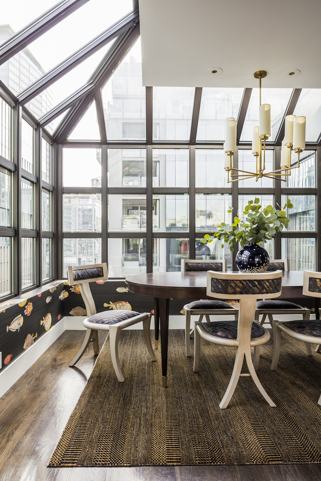
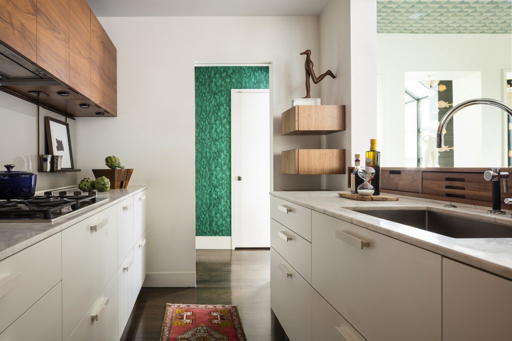
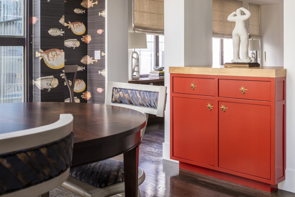
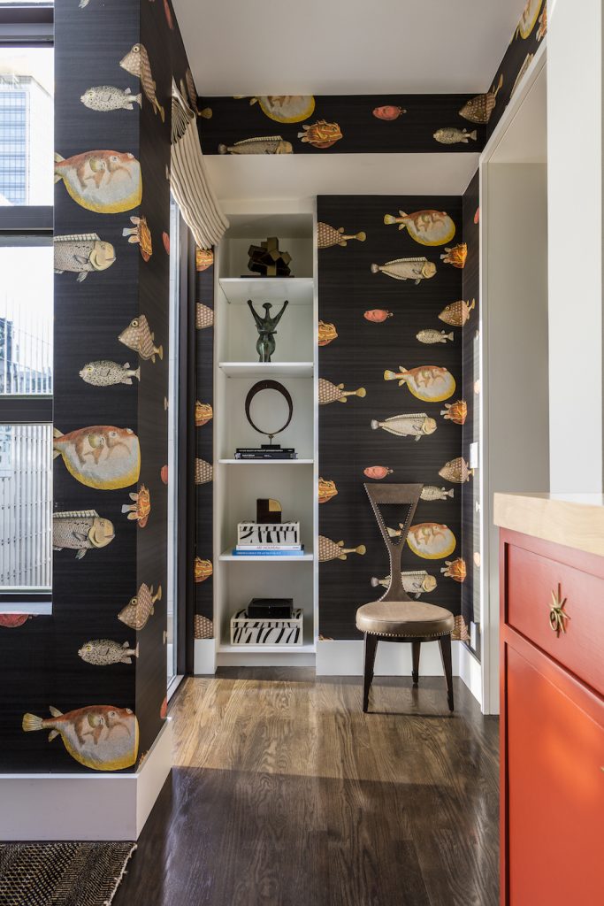
For this pied-à-terre, we wanted to give our clients the look of a chic Parisian getaway, but with a Pacific Coast vibe. The dining room has the look of those gorgeous and iconic apartments in Paris with ceilings made of glass, so we added chic details that would be at home in France. We also combined that with fantastic Kravet wallpaper that adds a little cheekiness and pays tribute to the coastal location. Finally, a bold red lacquered wall and cabinetry elevates the look with an unexpected pop. That’s a signature Pulp design detail!
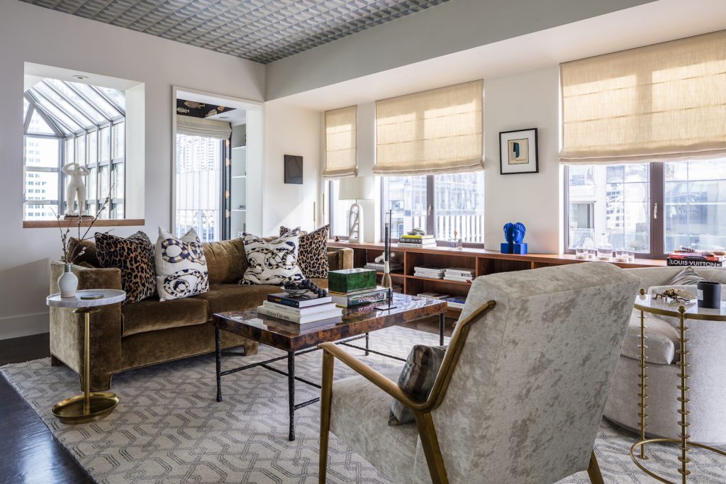
Q: How do you give a small space like this one the feeling of a larger home?
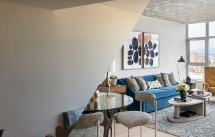
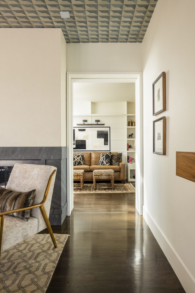
The rooms flow from one to the other in an open way, which makes the entire space seem larger. It helps to have those banks of windows, but we also kept the overall palette light and airy on the walls, which also creates the illusion of space.
Q: What’s the most important tip you can give someone who lives in a smaller space?
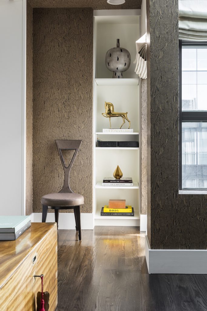
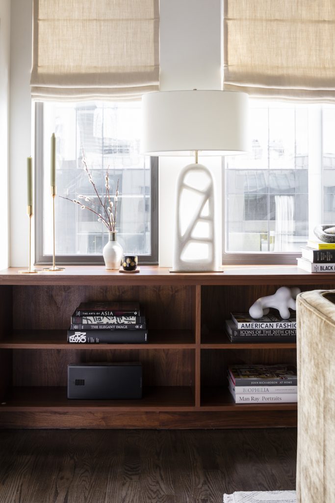
It’s all about storage! We used every nook and niche for extra shelves and drawers, and we built a custom cabinet in the dining room to hide away china and serving items. You need to take advantage of every square inch in a smaller home.
Q: Is this just a one bedroom penthouse, or is there any room for guests?
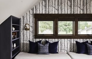
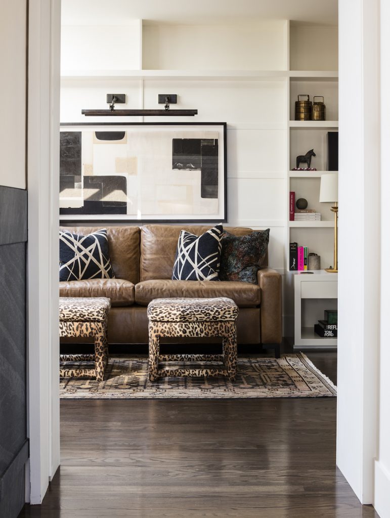
We designed the study, located beyond the living room and kitchen, to play double duty. It houses the clients’ books as a library by day and it transforms into a guest room as needed at night. We included a sleeper sofa that’s super-comfortable, so our clients can host guests in their gorgeous apartment.
Q: Which space would your clients say is their favorite in the home?
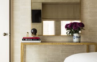
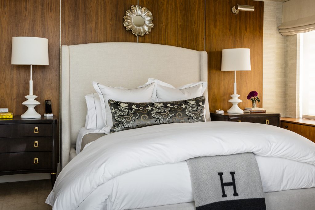
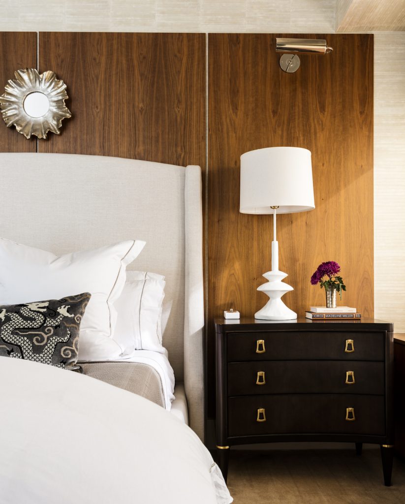
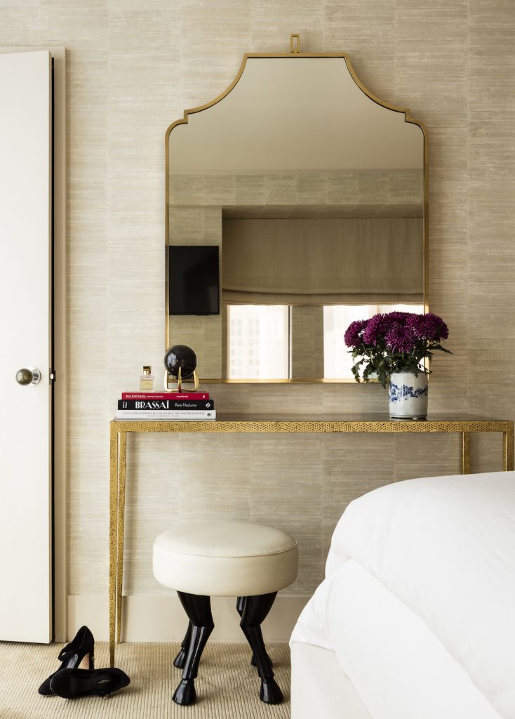
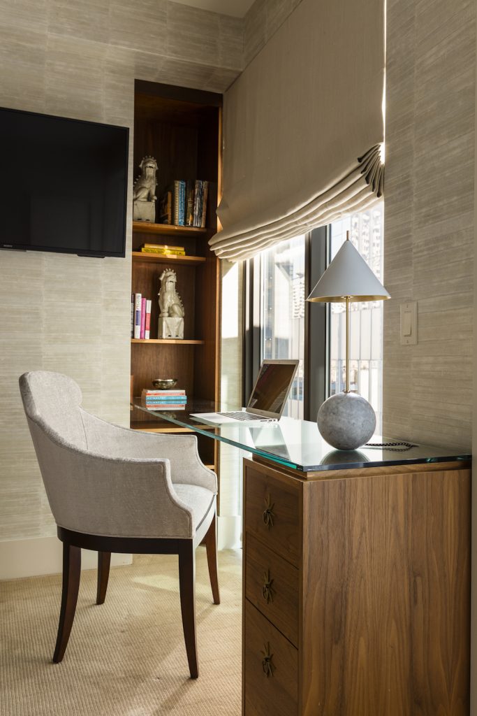
Definitely the bedroom! It’s tucked behind that gorgeous lacquered pocket door in the dining room, but it offers a lot of function in that small space. We included a desk area so our clients can use it as a home office. And we gave them an fabulously comfortable bed, with an upholstered headboard and lighting designed for reading in bed. It’s a sophisticated and multifunctional room.
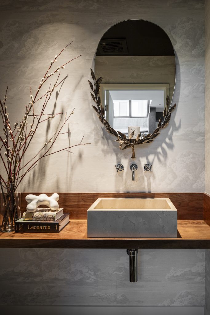
Q: And what is your favorite space in the penthouse?
The guest bath is so lovely! It has a wallcovering from Schumacher that offers a moody homage to the Seattle skyline. And a mirror from Arteriors gives an organic touch to this pretty space.
Read about this space in our latest issue of ICON magazine!
Credits

SECTIONS
Design InsiderEntertaining + Home Living
Health + Beauty
News + Announcements
Pulp At Home
Pulp Design Work
Shopping Guide
The Business of Design
The Pulp Edit
Travel
Videos
GET INSPIRED
SUBSCRIBE TO OUR NEWSLETTER TO
GET AN INSIDER LOOK IN YOUR INBOX


