Kips Bay Show House Tour: The Office
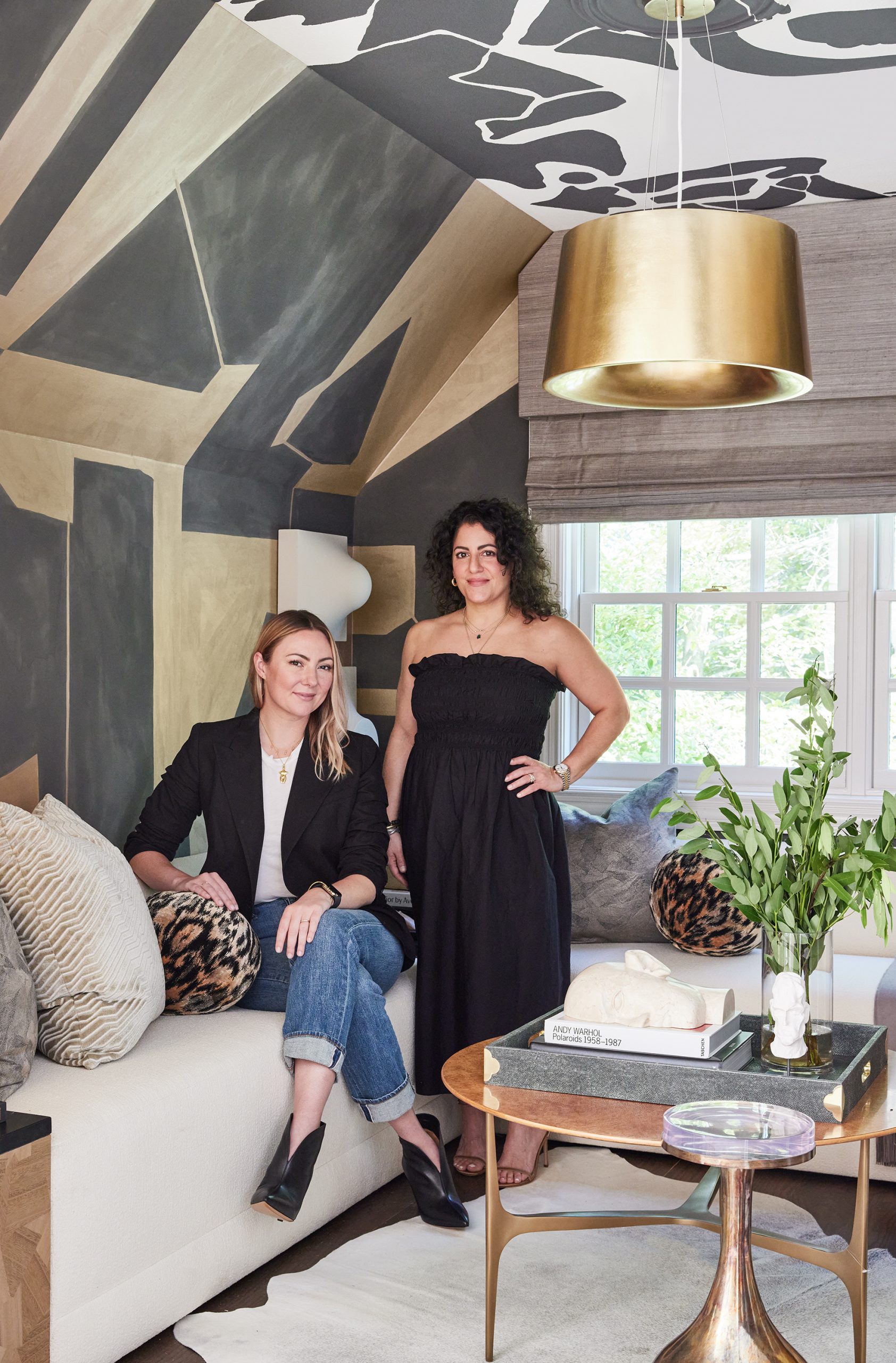
When Beth Dotolo and Carolina Gentry, co-founders of Pulp Design Studios, were named to the design team for the Kips Bay Dallas Show House, they knew they wanted to make a big statement and to push the envelope on interior design. Their Wise & Wicked space is bold and beautiful, and tells the story of iconic women like the Pulp duo. We asked Beth and Carolina to walk us through each of the rooms in their Kips Bay space, giving us insight into their design vision. First up is the office, or the Wise side of their Wise & Wicked interior. To see the entire space, just click here!
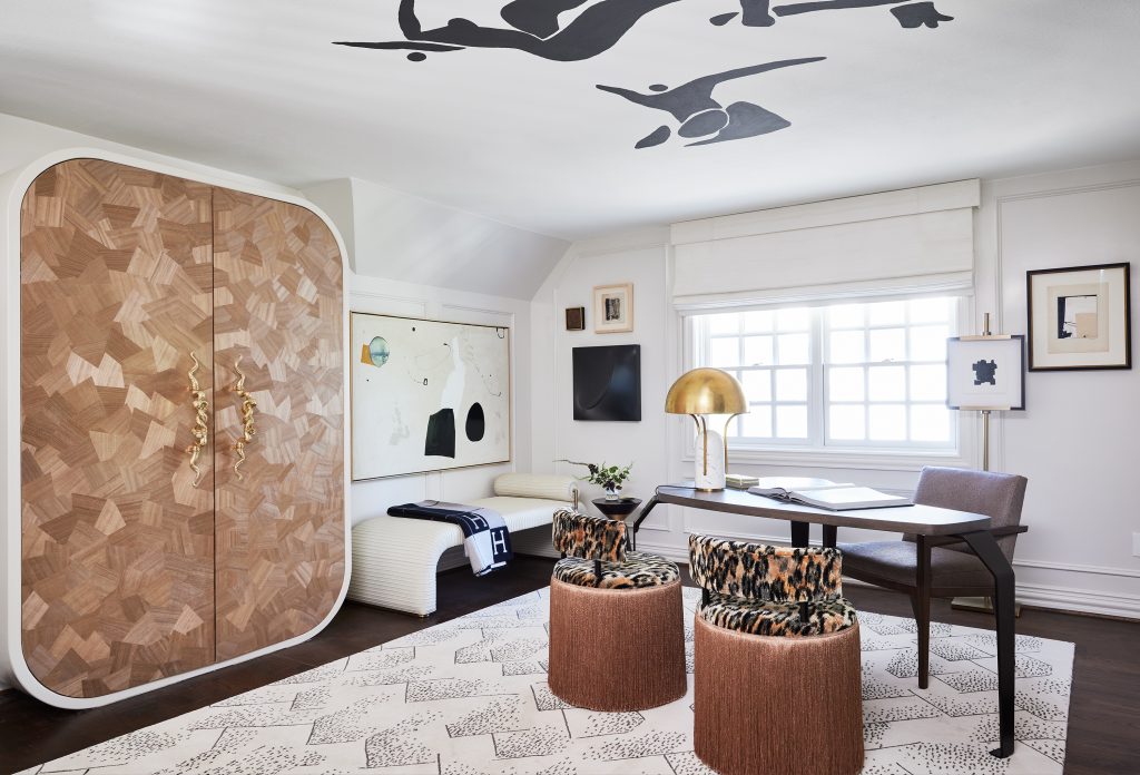
Q: How did you determine your design, and what made you decide that Wise & Wicked would be your theme?
Carolina: The raw space was a loft area with two rooms linked by a hallway. It was a bit of an awkward layout but immediately we thought about how each area could work together with one theme. We started talking about duality and how everyone has several sides to their personalities. That led to us thinking about a work space and a “play” space.
Beth: Working with that idea allowed us to think about the women we know who are all business when they are working, but have a playful or more adventurous side that loves to dance or have cocktails with friends. It’s that sense of being two (or more) people inside of one body: a mom, a business owner, an adventurous spirit, a person with a wicked sense of humor. That led us to The Wise & The Wicked, with an office representing the Wise side and a lounge that was much more Wicked.
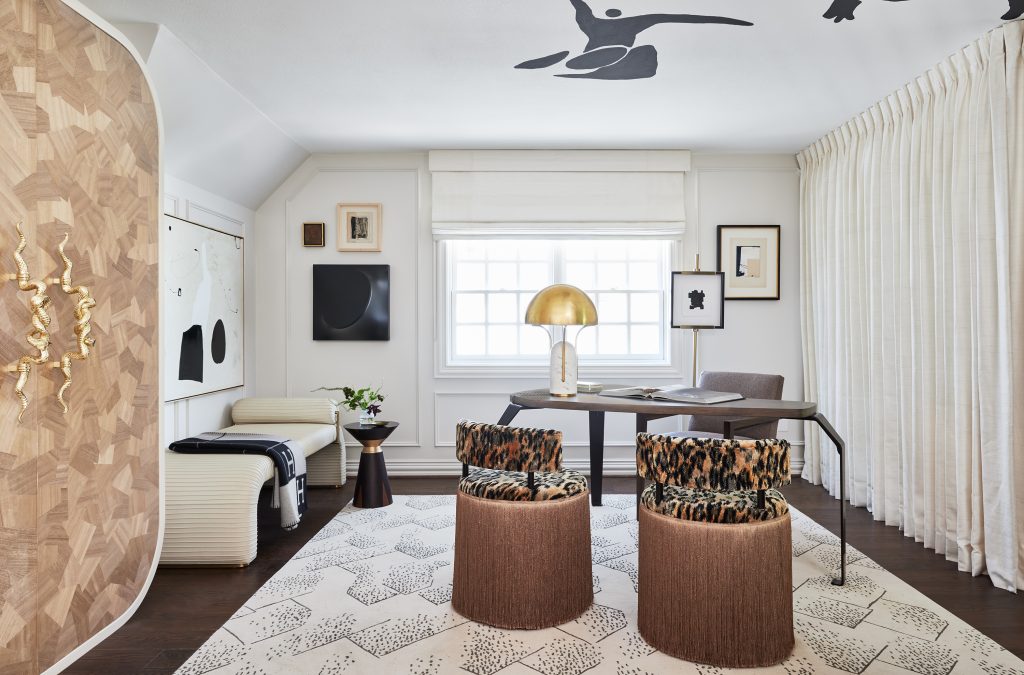
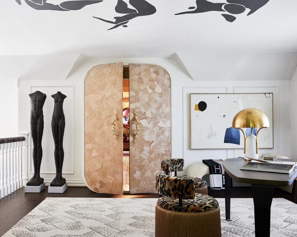
Q: When you come up the stairs, the first view of your space is the one above – how does the office represent the Wise theme?
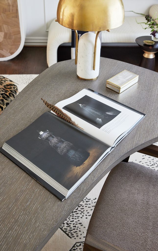
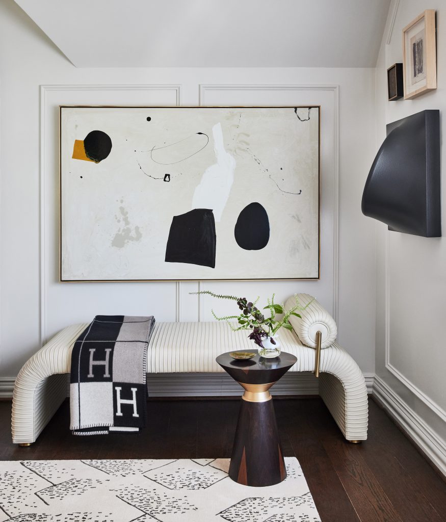
Carolina: The cosmopolitan office area is a creative space where deals are made and contracts are signed. It’s refined but with a distinct personality, as defined by the asymmetrical desk from David Sutherland, a Rug Company rug, and gorgeous upholstered custom stools and a chaise from Global Views. This is a woman in charge, who knows how to get things done.
Beth: We went with a very clean color palette so it would be a space with no distractions. This woman is in charge and all business, but obviously she wants her surroundings to also inspire her. So there’s a lot of art and two very fashion-forward seats with heavy fringe. And of course her desk should be just as unique and cutting-edge as the woman who works here.
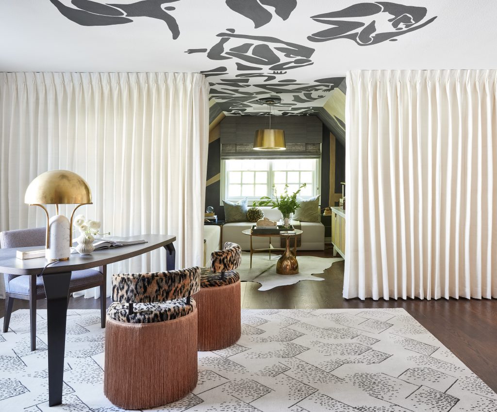
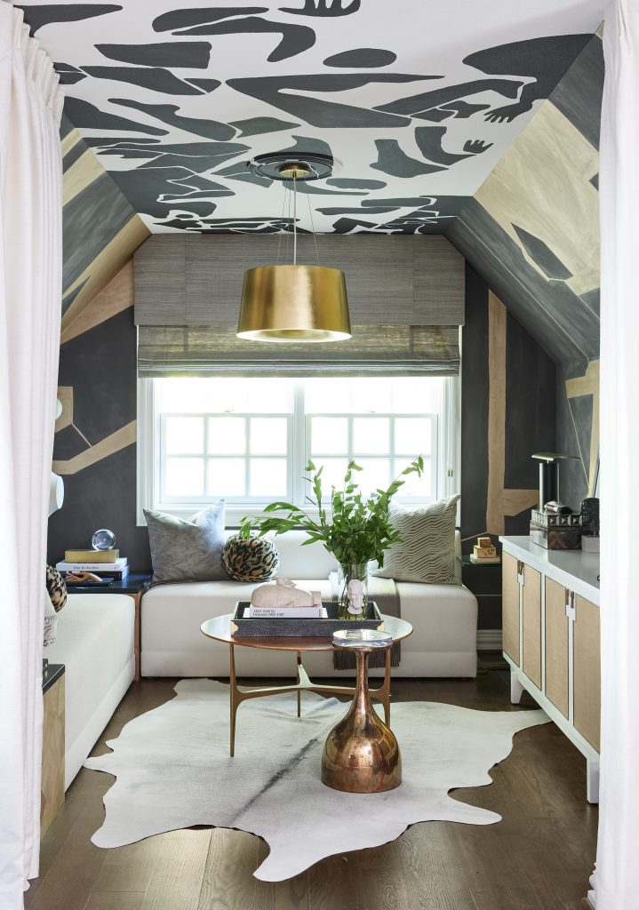
Q: On one side of the office is a wall of drapery. When it’s pulled back, it reveals a super-stylish nook. What is this area meant to be?
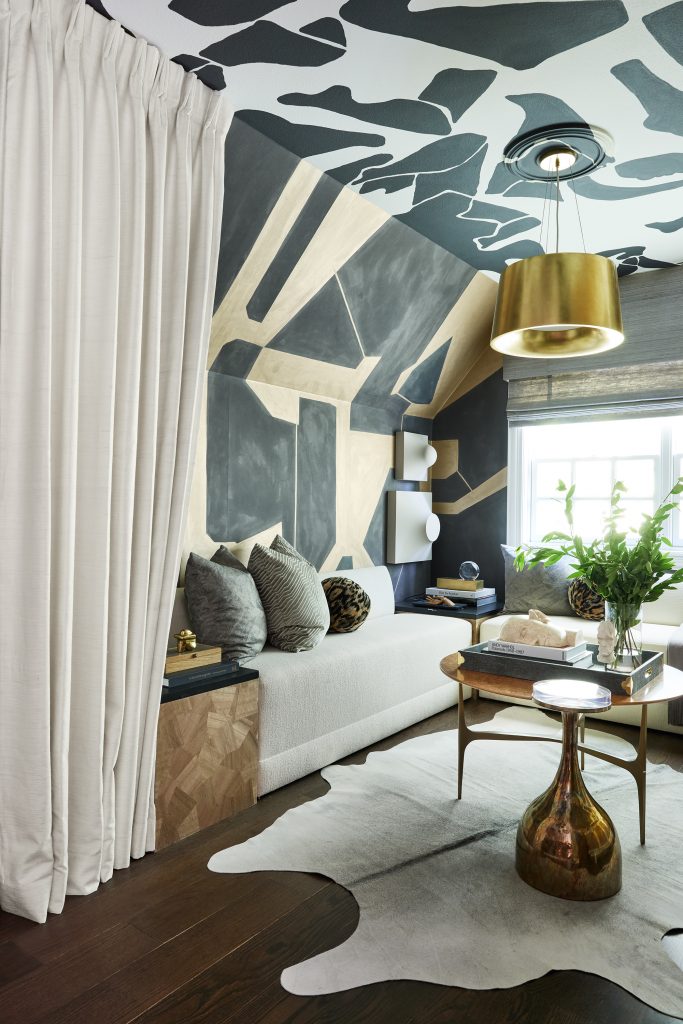
Beth: We imagined this nook as a place for quiet contemplation, for quick meetings, or as an amazing Zoom backdrop for our Wise woman. The Porter Teleo wallpaper is definitely an eye-catching pattern that everyone on Zoom will be asking about. Our businesswoman can even close the drapery for a moment to herself as she recharges her batteries during the day.
Carolina: We also wanted to be sure that this space was just as inspiring creatively as her office, so we asked a muralist to create a stunning ceiling that would look as if the wallpaper pattern flew off the walls and escaped across the ceiling into the office. And we had a custom banquette created for comfortable seating in the nook.
Q: On the other side of the office is a stunning large cabinet. Tell us about that.
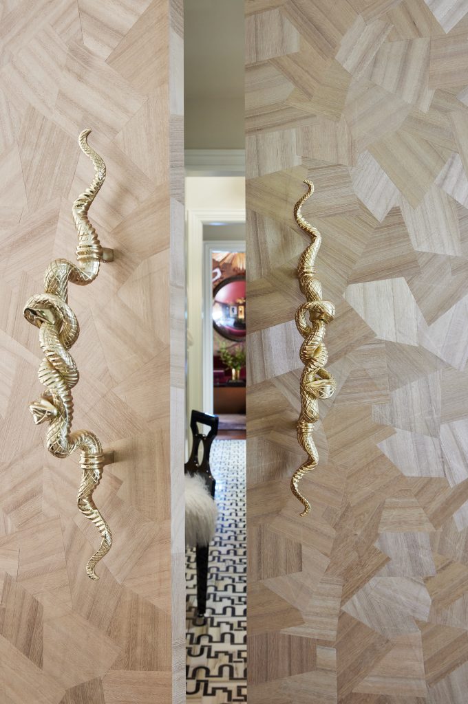
Beth: This is one of our favorite design elements in the space. We had a custom cabinet created that looks as if it’s just stylish storage. But when you open it, it reveals the hidden hallway to the Wicked lounge, which we started calling the Sinner’s Den! We love to create unexpected moments in our designs, and this definitely fits that idea. Stepping through is like starting an adventure, and you don’t know quite what you’ll discover. And those snakes on the doors are a bit of a hint!
Carolina: It has the feeling of Alice in Wonderland or Through the Looking Glass! Especially with those large Tom Corbin statues looking as if they’re ready to step through with you. We also loved the idea of how all women – including me and Beth – have these hidden sides to them. If you get to know us well, you’ll be able to learn more about all the layers we each have. This is like peeling back one of those layers for our Wise & Wicked woman.
Q: Other than that amazing cabinet, what is your favorite part of this space?
Carolina: Definitely the nook and its sitting area. I like to work in a space that is less about a desk and more about being comfortable. I would sit in that nook all day!
Beth: Oh wow – I love every part, so this is hard. But I do covet that amazing chaise from Global Views. That’s an area of the room that’s another option for working on a laptop. It’s such a sculptural piece, too.
Beth and Carolina will give us a tour of their other, more “wicked,” spaces for the Kips Bay Dallas Show House coming soon, so stay tuned! If you’re in the Dallas area, you can tour the house through Oct. 24. Learn more and get tickets here.
The Pulp team would like to thank vendors who provided stunning products for the Wise & Wicked spaces, including: More Design + Build, Visual Comfort c/o Taylors by Jane; Tech Lighting c/o Taylors by Jane; Calico Wallpaper; Fromental; Brenda Houston; Porter Teleo; Bettinger Studio; Kevin McLean; and Innovations. We would also like to thank the sponsors for the showhouse: Leontine Linens; Kohler; Cambria; Ann Sacks; The Shade Store; and Benjamin Moore.
Credits

SECTIONS
Design InsiderEntertaining + Home Living
Health + Beauty
News + Announcements
Pulp At Home
Pulp Design Work
Shopping Guide
The Business of Design
The Pulp Edit
Travel
Videos
GET INSPIRED
SUBSCRIBE TO OUR NEWSLETTER TO
GET AN INSIDER LOOK IN YOUR INBOX


