Pulp’s Favorite Moody Hues
Color is the one thing that can set a mood and make a statement in your home. The Pulp team is known for embracing bold color for fearless interiors. We especially love the paint hues that create a moody space. Here are four of our very favorite showstopper shades.
Sherwin Williams Greenblack
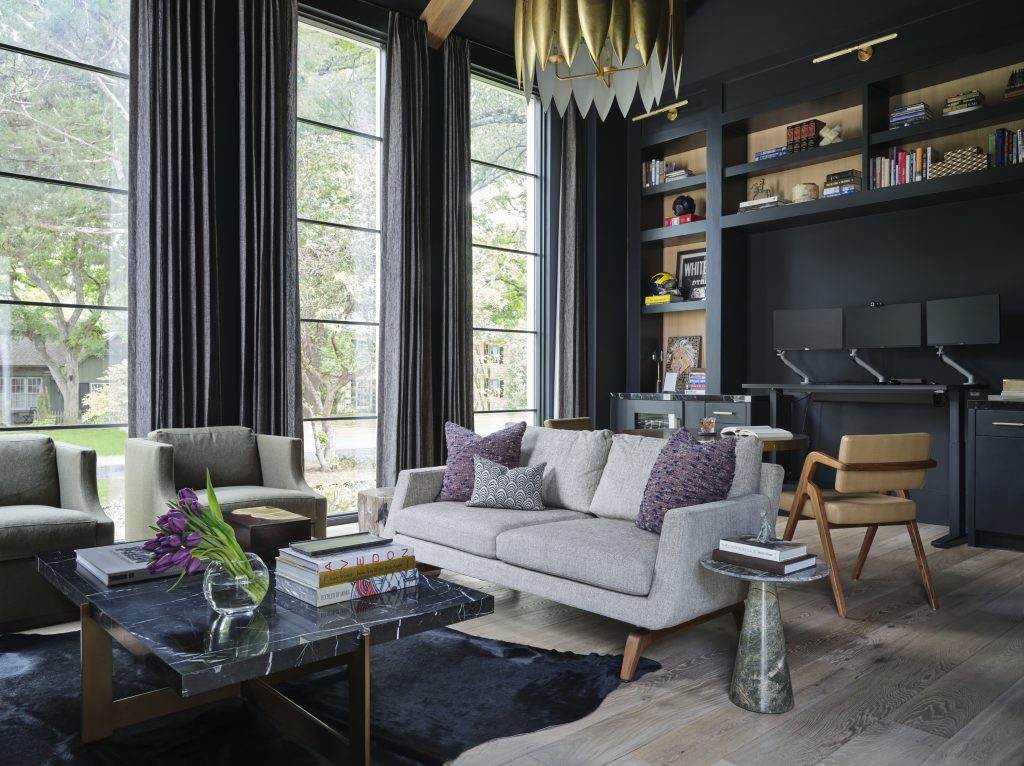
Dark colors have been proved to give you focus, so we drenched this home office and study in a deep paint color. This paint has a lot of visual depth because it does have a good mix of both green and black. We love how it changes with the natural light during the day, too.
Benjamin Moore Dinner Party
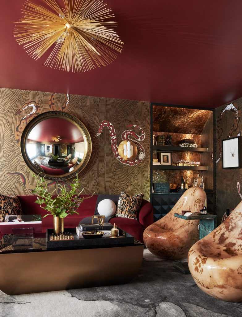
In the lounge of our Kips Bay project, we definitely wanted to create stunning eye candy for anyone who entered. As a counterpoint to the snakes on the wallpaper and the beautiful sofa, we selected a deep red color for the ceiling. It not only sets a glam tone for the room, but it allows the brass light fixture to really shine against that bold backdrop.
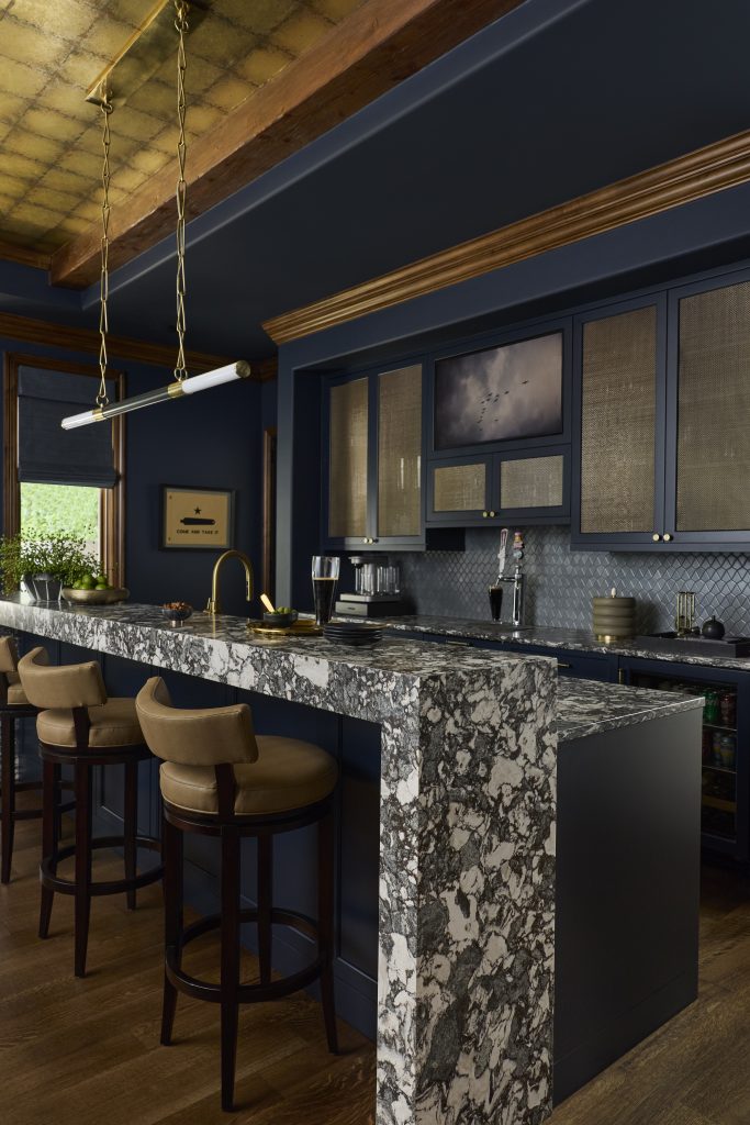
Sherwin Williams Outer Space
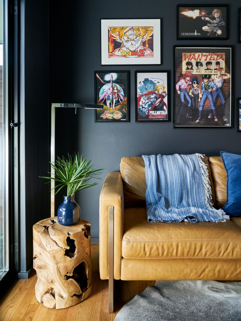
In the Dallas home above, we balanced natural wood tones and buttery leather with a deep, dark gray. It has a blue undertone that really works with the blue accessories Pulp selected for the space. These darker paint colors also work so well with an art collection, allowing the pieces to really pop!
Sherwin Williams Custom Blue
We also love to mix our own paint colors, and so many companies offer a great mixing service that gives you exactly the shade you need. For a Plano entertainment lounge, we used a paint match system to perfectly mimic the color of the wine fridge. That gave us a seamless look that’s sophisticated and daring.
What bold colors are your favorites? If you’re looking for a more fearless design for your home, give our team a call!
Credits

SECTIONS
Design InsiderEntertaining + Home Living
Health + Beauty
News + Announcements
Pulp At Home
Pulp Design Work
Shopping Guide
The Business of Design
The Pulp Edit
Travel
Videos
GET INSPIRED
SUBSCRIBE TO OUR NEWSLETTER TO
GET AN INSIDER LOOK IN YOUR INBOX