The Most Calming Color Palettes
Home is a haven for us more than ever before. Really, it’s our refuge against all the craziness happening out in the world. To make the most of your oasis, use these colors to create serene rooms that will destress your family and help you stay cool, calm, and collected.
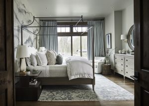
ICY BLUE
In color psychology, a grayed blue creates a feeling of harmony, peace, and calm in people who view it. Mix in a quiet gray color and you have an icy combo that will chill any bad vibes.
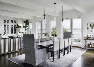
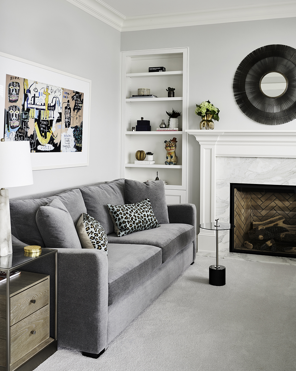
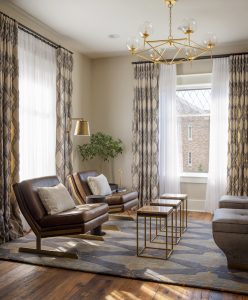
GRAPHITE
Gray symbolizes neutrality and balance – and it’s a color that everyone loves. This mid-gray creates a seamless sightline from the room to the lake beyond, designed to soothe away our clients’ cares.
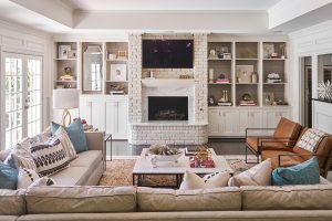
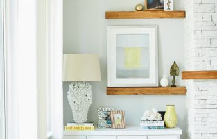
LINEN
Shades of white gives us a feeling of softness and tranquility – perfect for a family room that doubles as a family oasis. Color psychology also shows that this color makes us think of innocence and sincerity, so it’s great hue for making you feel better about the world.
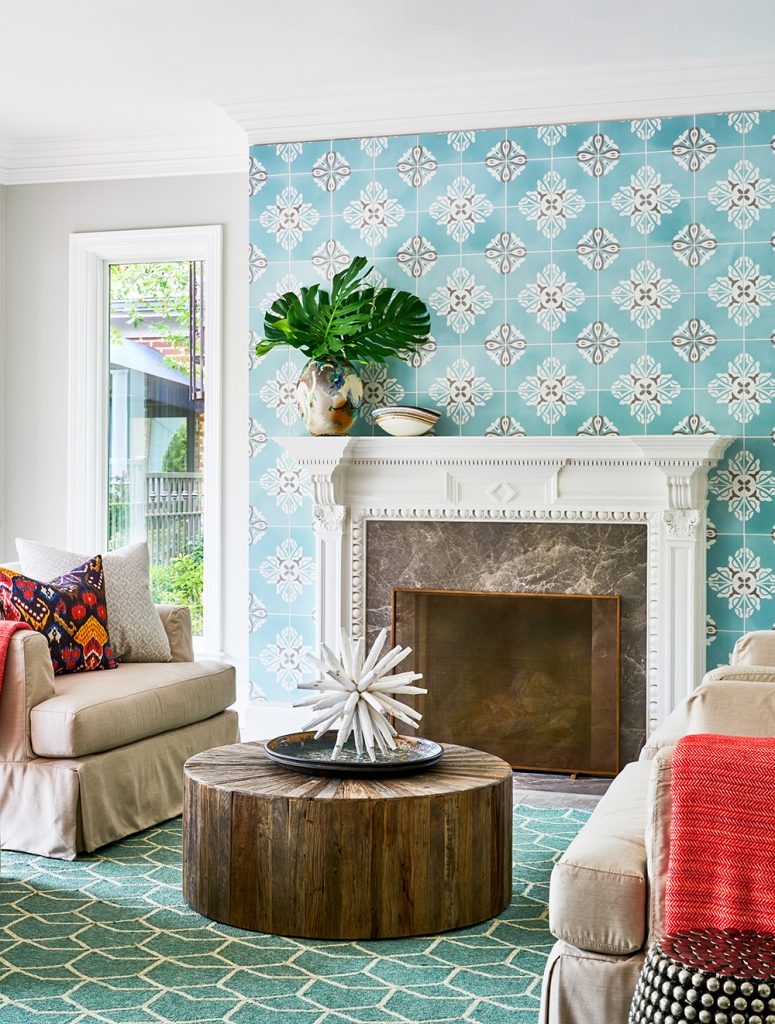
OCEAN
The perfect mixture of blue and green, this color evokes the sea and the sky. Being near water is proven to lower blood pressure, so creating this “watery” mood was our way of bring that outdoor setting inside.
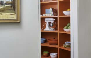
CAROB
Brown is an earthy color that represents security, comfort, and a down-to-earth quality. Creating a room around this color helps it become cozy and almost intimate – the perfect hideaway from the world.
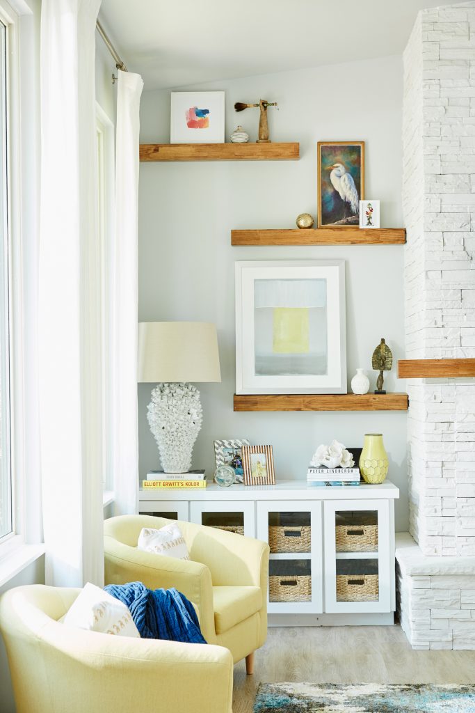
DAFFODIL
In color psychology, yellow speaks to optimism, happiness, and positivity – and couldn’t we all use more of that? Using pale yellow in a room is almost guaranteed to make you smile, so we added this uplifting color to our client’s family room to keep their spirits high.
Need to create an oasis in your home? Contact us for a free consulting call here!
Credits

SECTIONS
Design InsiderEntertaining + Home Living
Health + Beauty
News + Announcements
Pulp At Home
Pulp Design Work
Shopping Guide
The Business of Design
The Pulp Edit
Travel
Videos
GET INSPIRED
SUBSCRIBE TO OUR NEWSLETTER TO
GET AN INSIDER LOOK IN YOUR INBOX