6 Ways to Fill Your Home with Art
Art is an essential part of interior design — a project will never feel complete without those finishing touches. We curate, hand-pick and hunt for the perfect pieces for our busy clients, filling a home with gallery original art, commissioned, customized, limited edition, ready-made and objet d’art works depending on the type of investment our client wants to make. Take a look below at some of our favorite selections from Pulp-designed projects.
1. GALLERY ORIGINAL ART
For our clients who are looking for a life-long piece to invest in, we work with our favorite galleries to hunt for pieces that our clients feel connected to. We have strong relationships with art dealers who have amazing taste in emerging and defined artists — we frequently walk away from meeting with them with amazing art in hand.
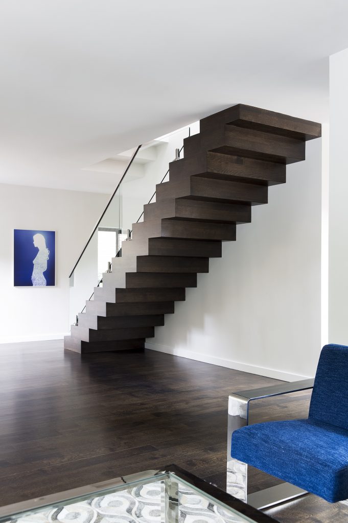
This high-end original gallery piece is featured in our Contemporary Warmth project. In the entryway of the home, this gorgeous piece plays off of the blue in the living room chairs and creates a wonderful first impression of the space for guests.
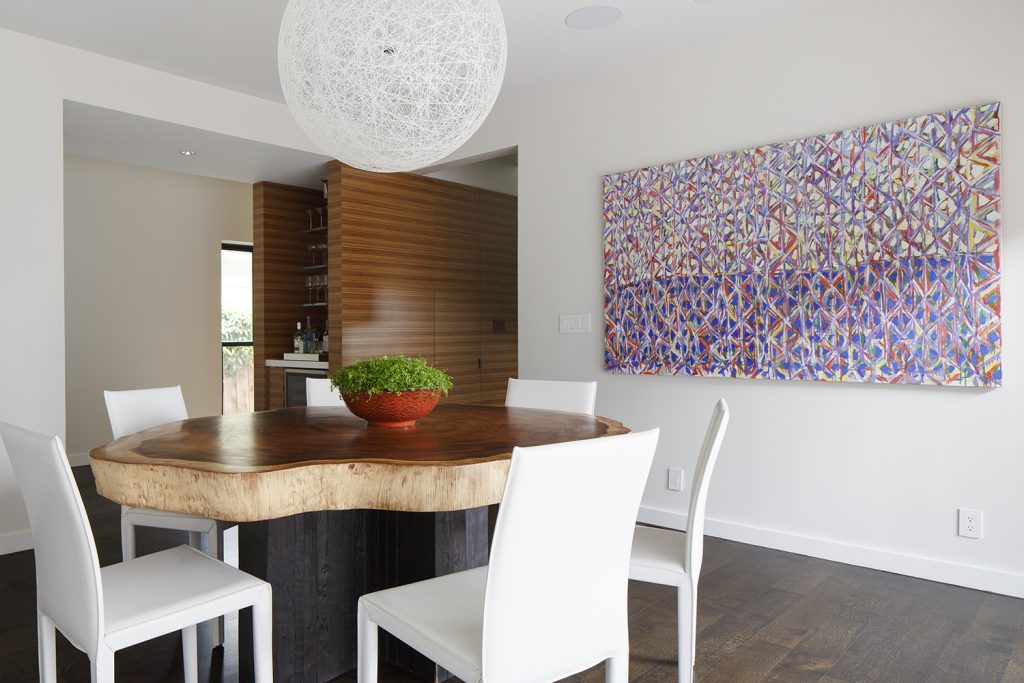
This original piece is straight from the gallery and adds a pop of high-end, graphic fun to the Dining/Kitchen area — exactly the feel we were going for with this casual dining area next to the built-in bar in the Contemporary Warmth project.
2. COMISSIONED ART
When we can perfectly envision what piece we’re looking for but can’t find anything that matches our vision, we commission artists to hand-make pieces that are exactly what we’re looking for.
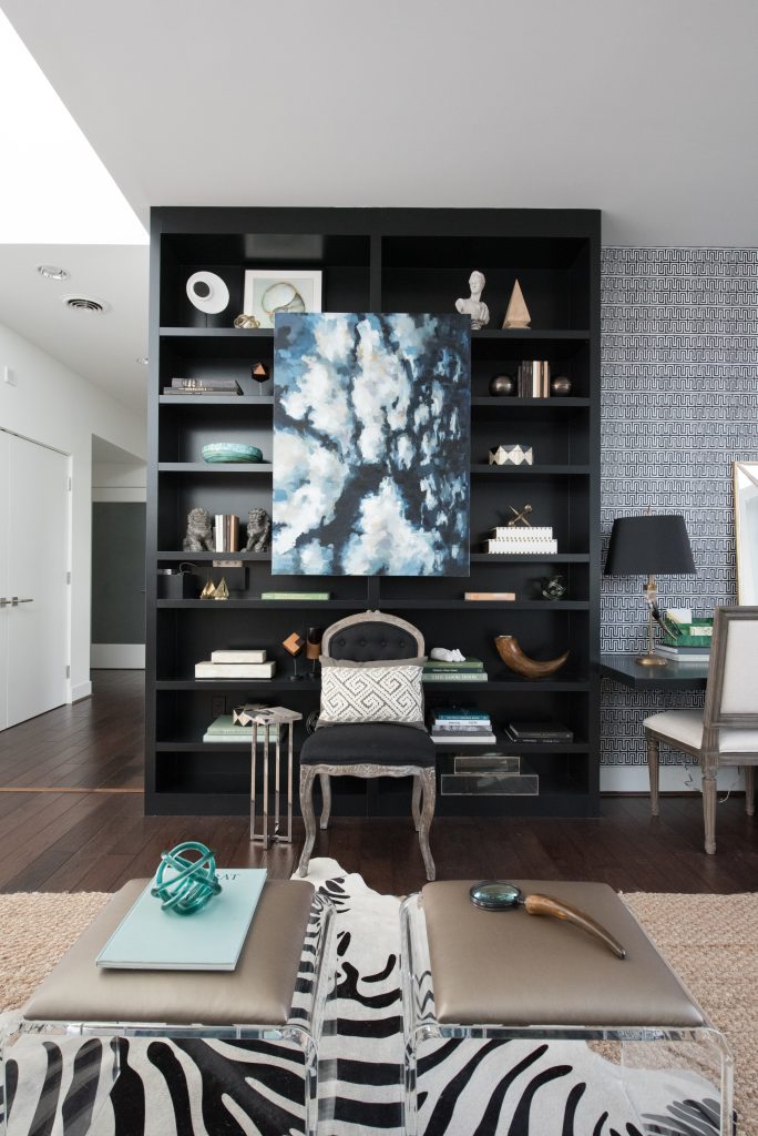
We commissioned this gorgeous artwork for this home office, turning a built-in bookcase into a showcase. Featured in combination with the art pieces above the stairwell, this project feels elevated.
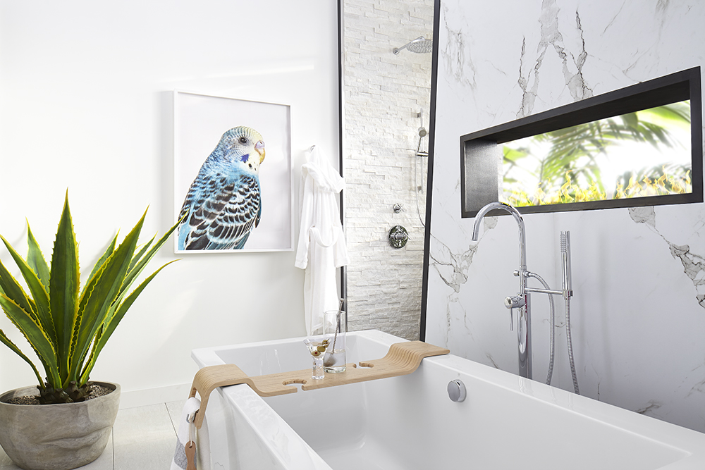 For our Palm Springs Modern bathroom design for luxury plumbing brand DXV‘s national ad campaign, we commissioned a photographer to create the colorful bird image we were envisioning. The photographer rented parrots and took images in her studio — we sorted through them to find the perfect shot.
3. CUSTOMIZED ART
When we find art that almost (but not quite) fits what we’re envisioning, we customize pieces to fit perfectly in a home. We can scale pieces to fit a wall at exactly the right size, recolor ready-made prints to better match the home’s aesthetic, and add finishing touches to make your pieces completely unique.
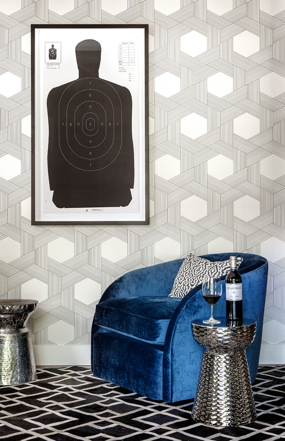
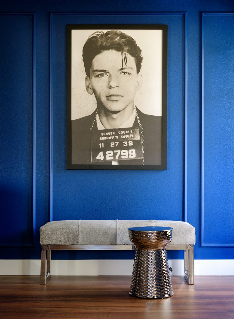 A fun crime-related art piece that we resized for the space — this just might be our client’s favorite piece of art in all of Guardian Cellars!
4. LIMITED EDITION ART
When our clients are looking to stand out with unique art but don’t want to go with an original gallery piece, we frequently turn to limited edition works. More unique than a ready-made piece but not as high of an investment as an original work, limited-edition art pieces strike the perfect balance.
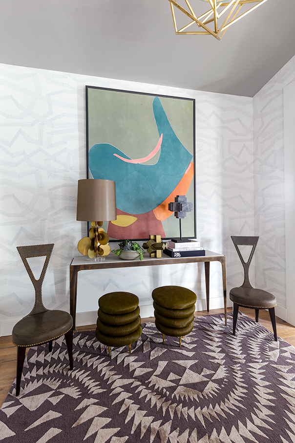 This limited-edition piece was purchased from one of our favorite art galleries for our design in Traditional Home‘s Napa Valley Showhouse 2017. We had the piece customized by printing it in a larger size — the perfect fit for our design.
5. READY-MADE ART
Sometimes when a wall needs to be filled but we’re not looking for a large investment, we turn to ready-made art to fill the space. We carefully curate these pieces, taking time to scout out pieces that look high-end — it can be a challenge to find pieces like these, but with our professional know-how, we know exactly what to look for.
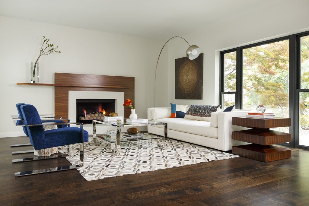 In our Contemporary Warmth project, we featured a wide range of art, from original pieces straight from the gallery to ready-made pieces.
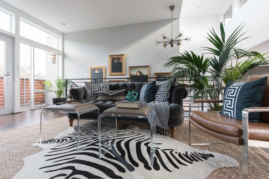 These classic art prints were customized by having everything below the eyes painted black, immediately making the prints feel higher-end — the finished product is a sleek new home office.
6. OBJET D’ART
Framing important objects and turning items into art can create some of our favorite displays. When our clients mention that they have an object they feel incredibly connected to, we often turn that object into art by framing it or displaying it in a way that feels artistic and fresh… It’s a great way to display something that our clients already love.
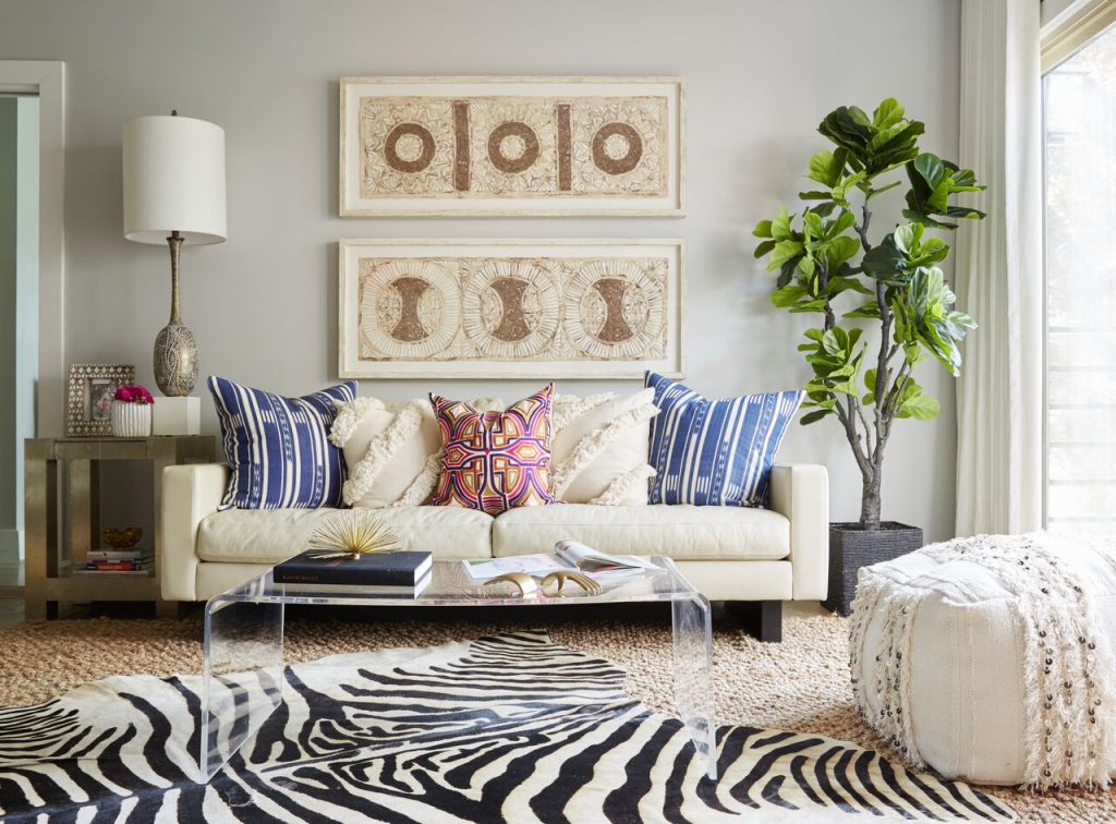 Incredibly well-traveled, the client behind our Lakehouse Retreat project collected these prints throughout her travels around the world. We took these papers and framed them for a personal touch in her Master Suite.
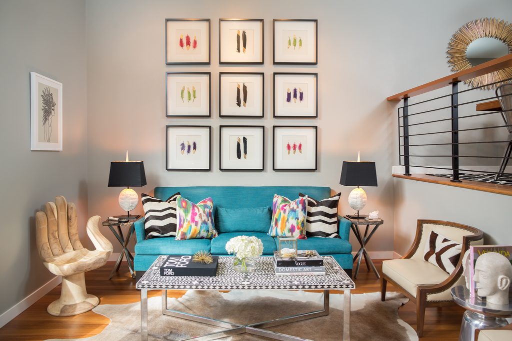 We took the high-low approach in our West Seattle Townhouse project, keeping the space feeling elevated and high-end while sprinkling personal touches throughout. Our clients fell in love with these paint-dipped feathers, so we framed them to make a focal point in this high-ceiling space.
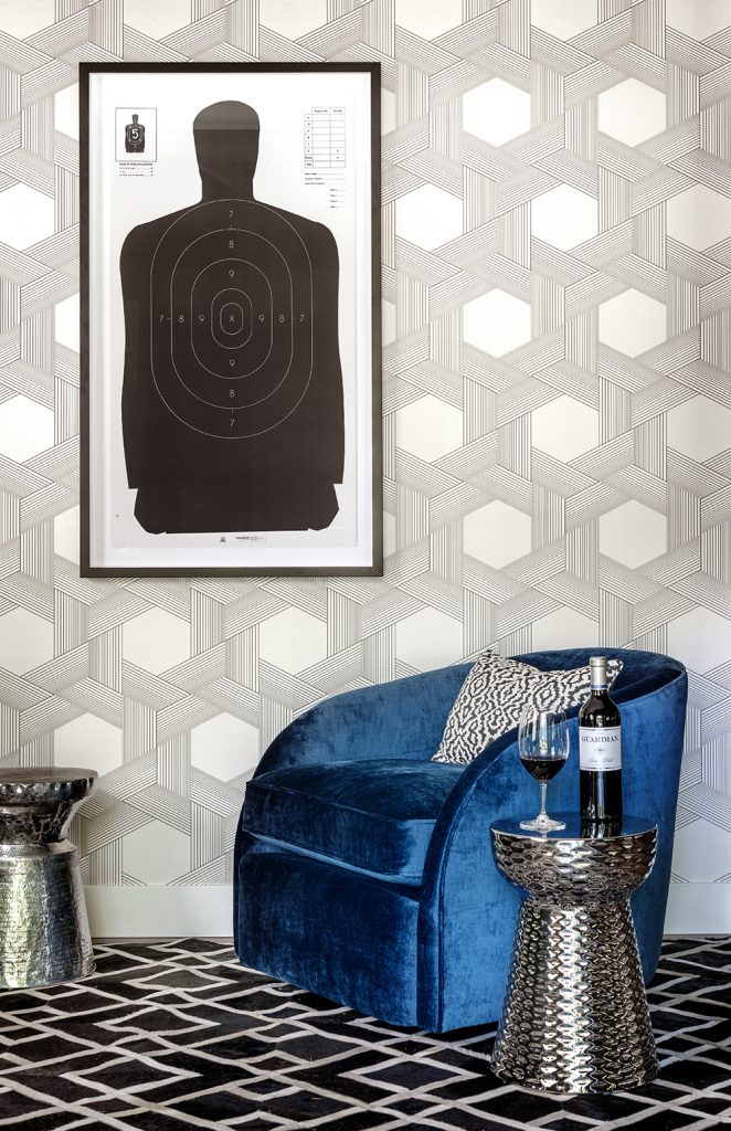 Owned by a husband-and-wife team who met while on the job as a cop and crime reporter, we wanted to infuse their story into the personality of the space. We framed a shooting range target for a clever and low-investment piece of art in Guardian Cellars‘ tasting room.
With an expert eye, tried-and-true sources, and experience, we’re able to take a high/low approach to most of our projects. Use a full range of art makes it possible for us to create sophisticated designs while staying true to the kind of investment the client is looking to make.
For professional interior design services, contact Pulp Design Studios℠.
Credits

SECTIONS
Design InsiderEntertaining + Home Living
Health + Beauty
News + Announcements
Pulp At Home
Pulp Design Work
Shopping Guide
The Business of Design
The Pulp Edit
Travel
Videos
GET INSPIRED
SUBSCRIBE TO OUR NEWSLETTER TO
GET AN INSIDER LOOK IN YOUR INBOX


