Before + After: Dream Home Makeover
This fabulous Dallas home (featured in the latest issue of ICON!) was modern on the outside, but dated on the inside. Our clients loved the feel, but knew it needed a major overhaul. Being incredibly busy and having never taken on a renovation of this scale, they knew they needed help to make this space their own. After a referral from a former Pulp client, they called on us to make their dreams a reality. We started with a down-to-the-studs renovation, moving walls and some stairs, resulting in a dramatic makeover. The result is a well-lived-in and stylish home designed for every member of the family, where memories are made daily.
Living Room
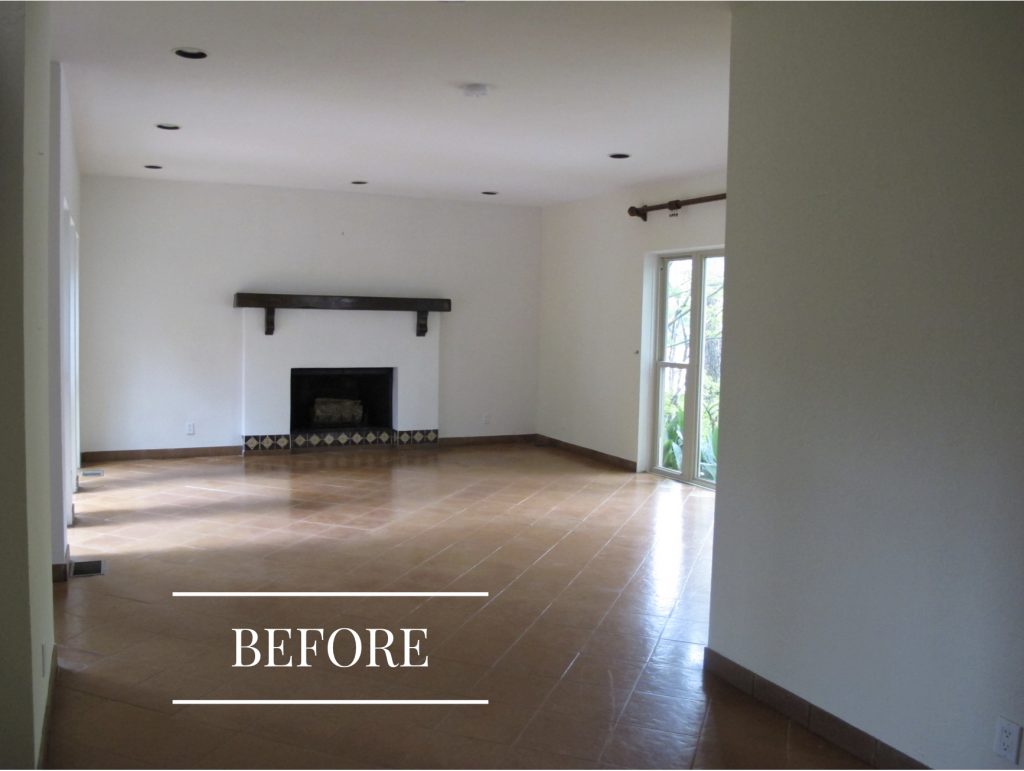
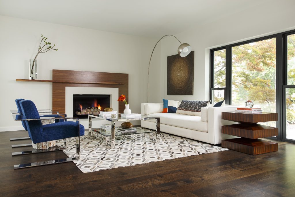
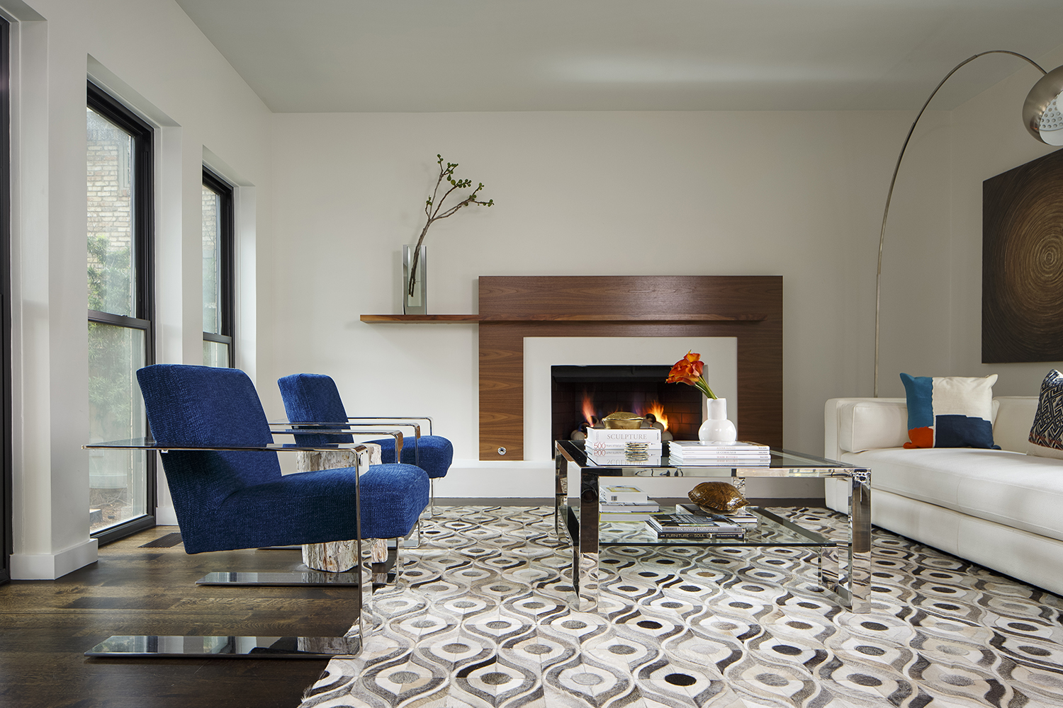
The house had dated floor tiles throughout, and poorly applied tiles on the fireplaces and in the kitchen. It was a Southwestern mess. In this room we updated the vibe to a chic modern look, including an asymmetrical fireplace, sleek furnishings, and a darker finish on the floor-to-ceiling windows.
The Staircase
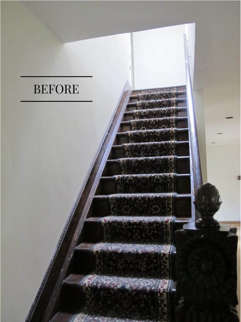
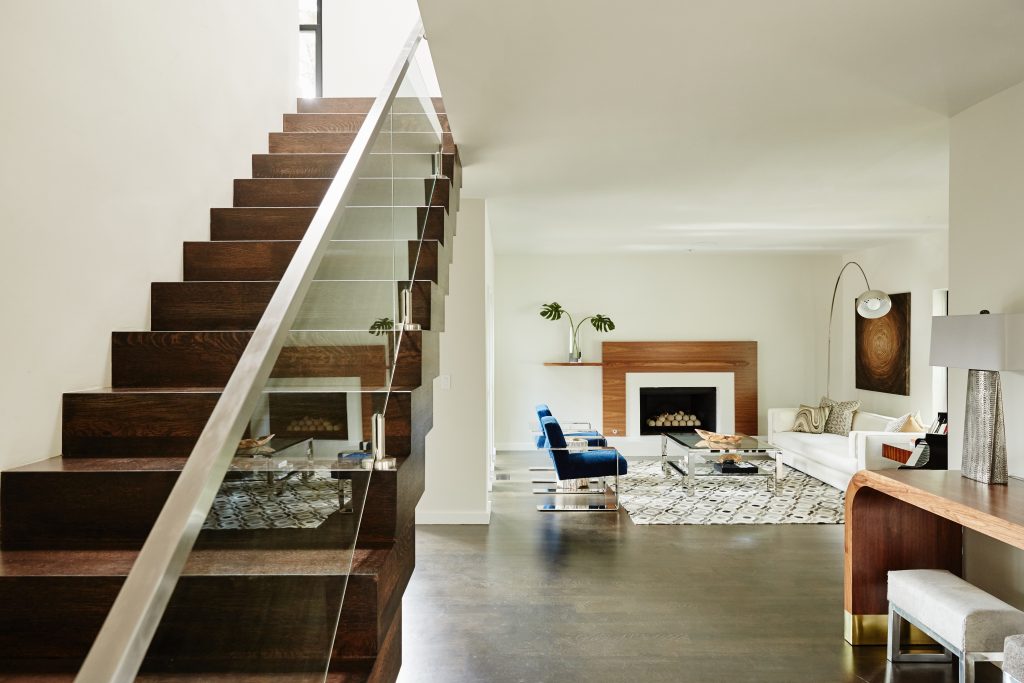
A cramped and dark stairwell (kind of spooky, too!) gave way to an open staircase that modernizes the space. The glass under the banister helps create an open area for light and air – giving the home a chic and sleek look. This family also loves to entertain, and the updated rooms offer a better flow for guests and family.
The Kitchen
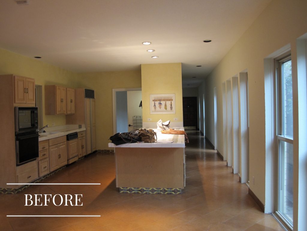
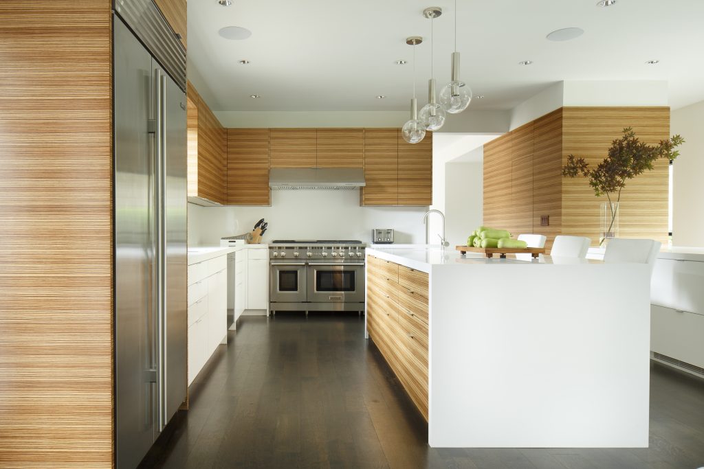
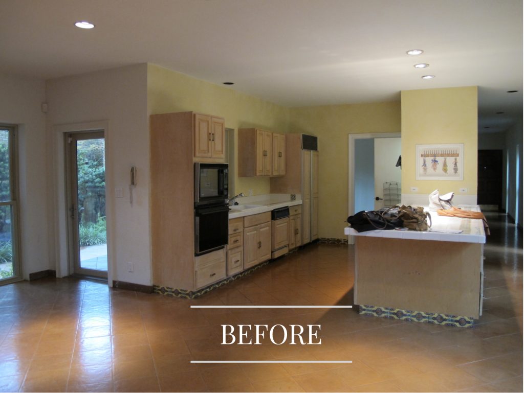
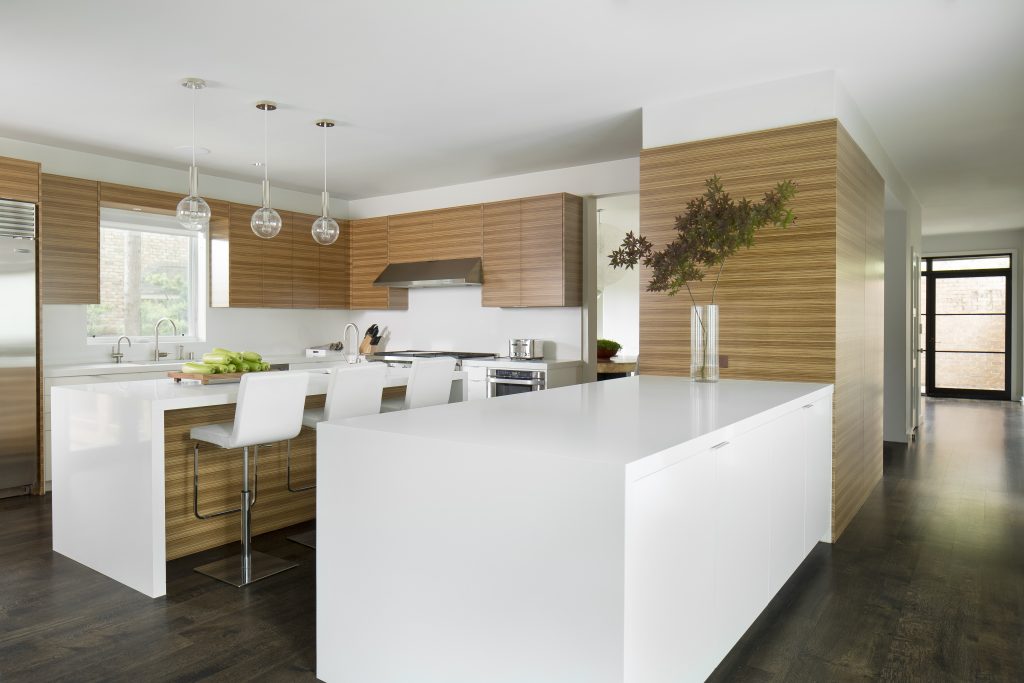
Despite all the windows, the original kitchen was dark and dreary. We brought in the light by expanding the kitchen out into what was a patio area and adding gorgeous light wood cabinetry, white counters, and updated appliances, Glass pendants also bring the light down to the island for tasks and meals.
The Dining Room
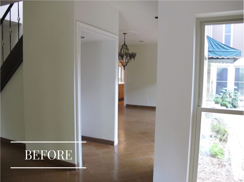
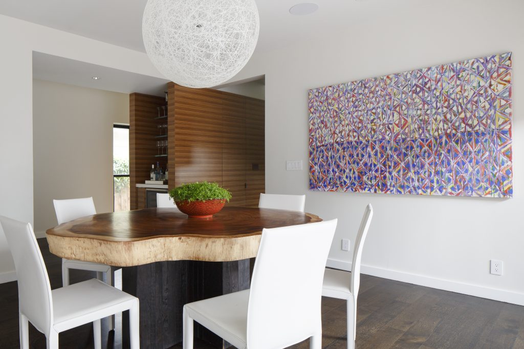
We took advantage of the open space under the old stairwell to create a new bar area next to the dining room. Modern art and furnishings gave this space a much-needed update.
The Powder Room
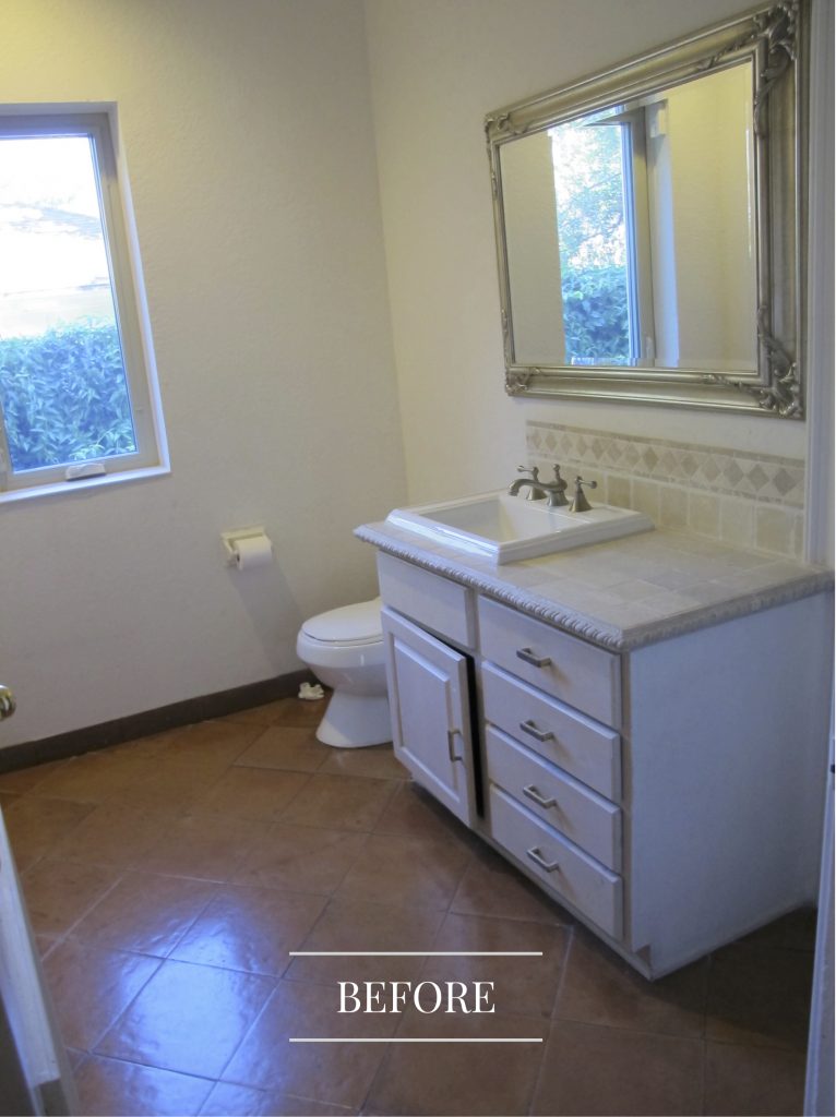
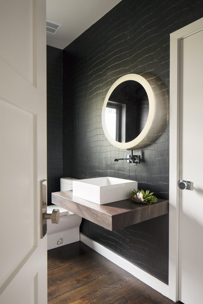
The powder bathroom was blah and boring. We turned up the glam quotient by adding a faux croc wallpaper in deepest black, along with an ultra-mod floating vanity.
The Family Room
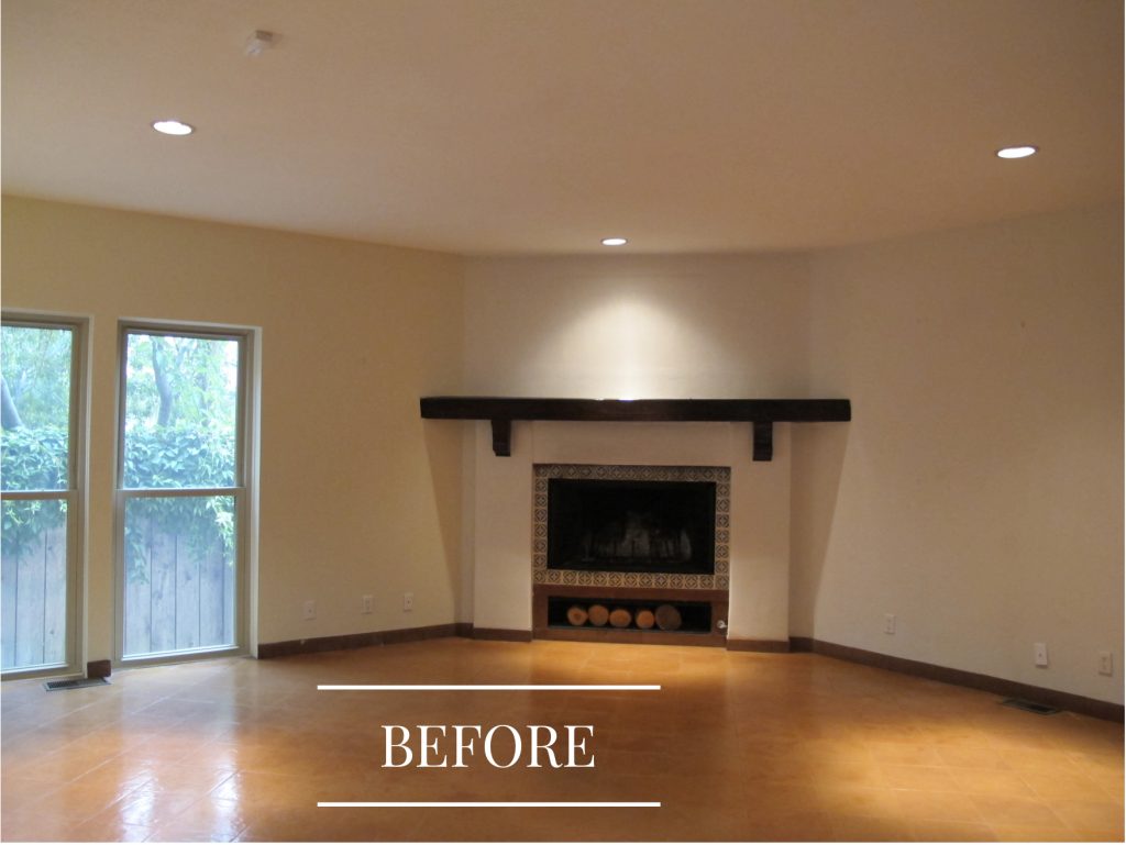
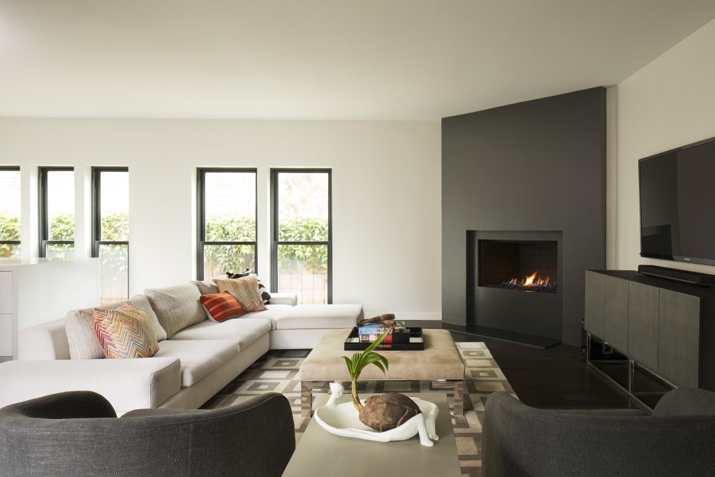
Corner fireplaces can be awkward and this one just didn’t have any style at all, so we updated it with a black surround that goes from floor to ceiling. Now, rather than a strange fixture, it’s a standout star of the room.
The Home Office
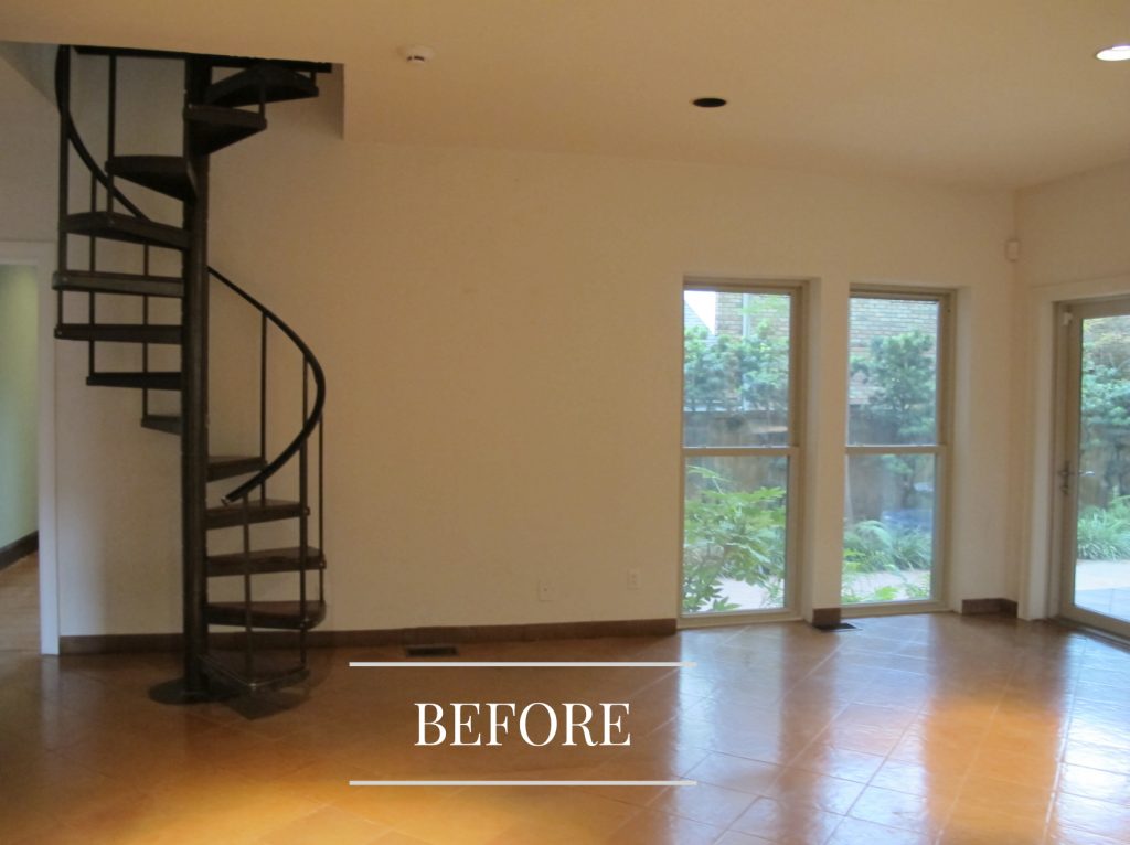
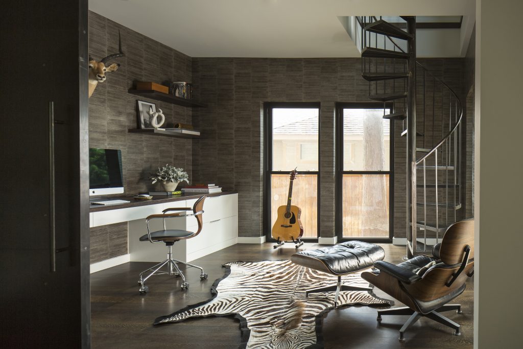
Moving walls is a much easier process than moving a spiral staircase, plus it adds so much charm. So we kept it as part of a new home office that also doubles as a music room.
The Master Suite
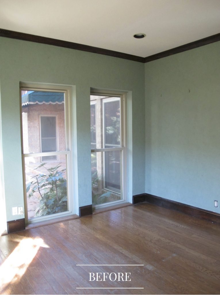
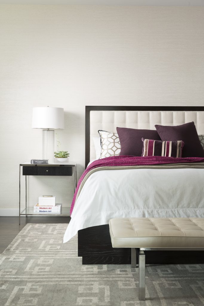
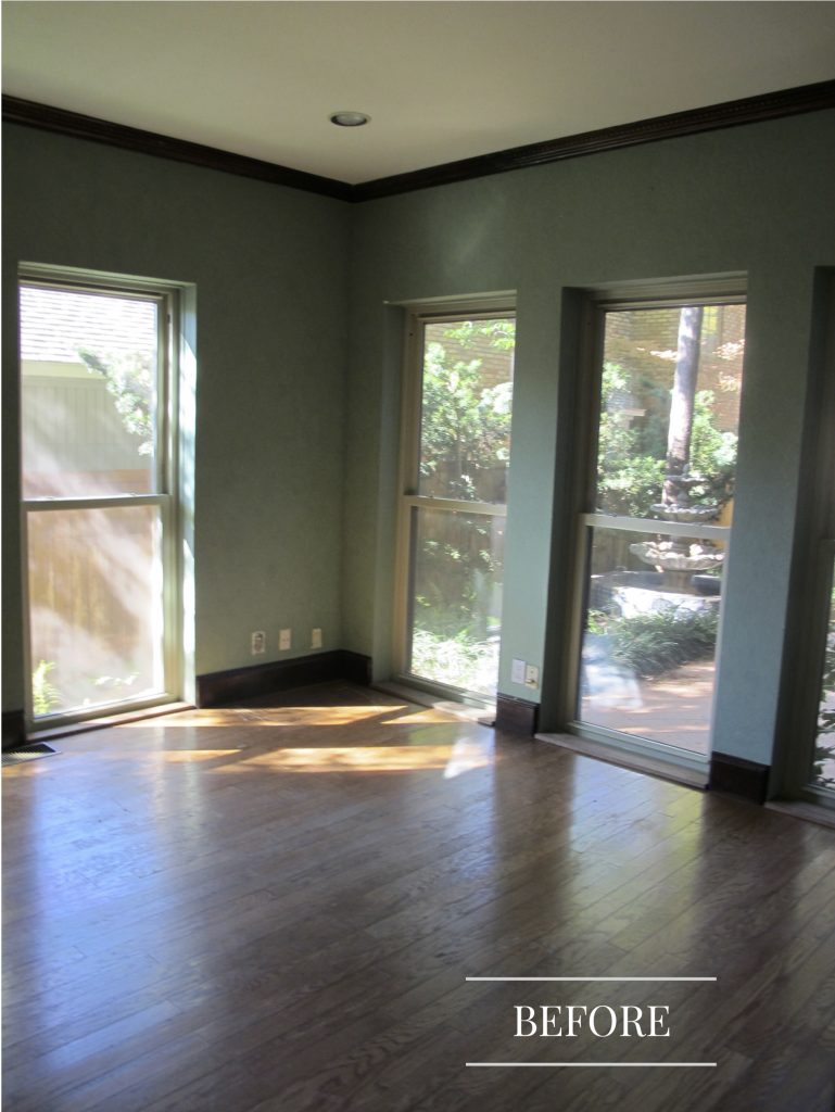
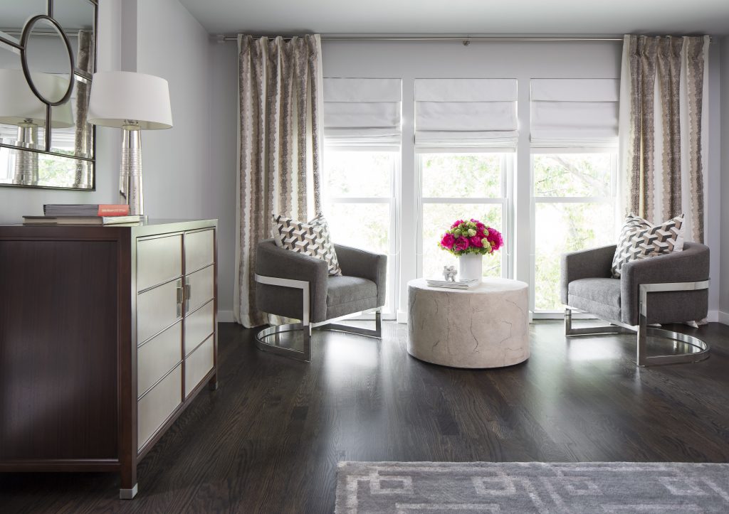
New paint and floors made a more modern backdrop for contemporary – but comfortable – furnishings in the master suite.
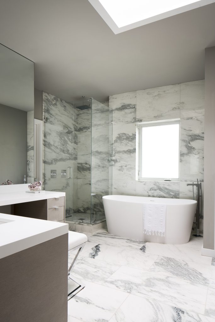
To round out this oasis for our clients, we designed an all-new luxury bathroom with bold marble tile from floor to ceiling.
Want to know how we can transform YOUR home?
Book a complimentary call to discuss how we can help!
And be sure to see our latest issue of ICON here.
Credits

SECTIONS
Design InsiderEntertaining + Home Living
Health + Beauty
News + Announcements
Pulp At Home
Pulp Design Work
Shopping Guide
The Business of Design
The Pulp Edit
Travel
Videos
GET INSPIRED
SUBSCRIBE TO OUR NEWSLETTER TO
GET AN INSIDER LOOK IN YOUR INBOX


