Before and After: Modernizing a Highland Park Home
We love a good before-and-after, and this one shows the power of paint, lighting, and wallpaper. When our clients bought a 4,300-square-foot home in Dallas’ Highland Park neighborhood, they had a very specific list of needs. The home had a French Provincial style, which was too stuffy and formal for this dynamic couple and their fun little dog. So they asked Pulp to modernize the spaces to make them more vibrant and chic. We used our micro-renovation service with a furnishings, art, and accessories package to give them exactly what they wanted! Let’s go room by room to show you the results.
THE ENTRY
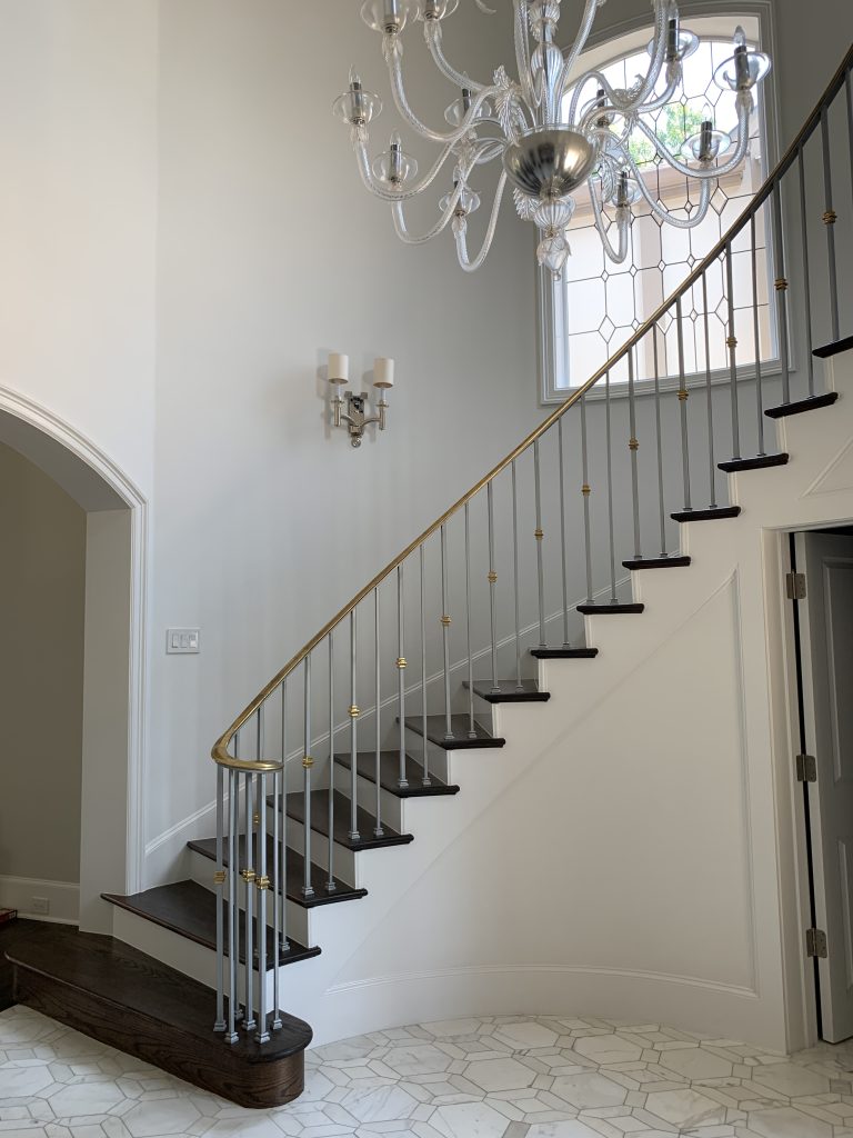
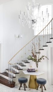
The entry had a lovely tile floor and a gorgeous stair railing. But the details were too dated. We added a new sconce that was a better complement to the chandelier. And we put a modern table and fun stools in the curve of the stairs. It adds an unexpected moment that is much more exciting as guests and family enter.
POWDER ROOM
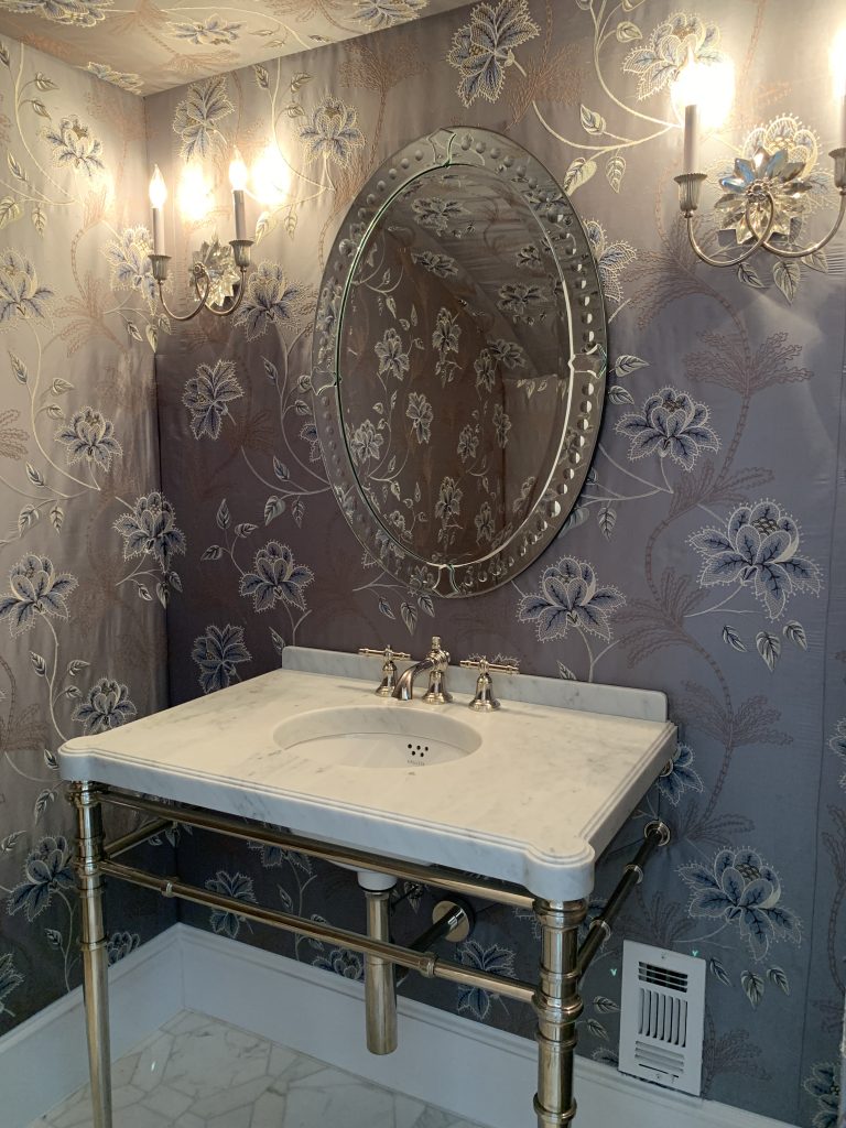
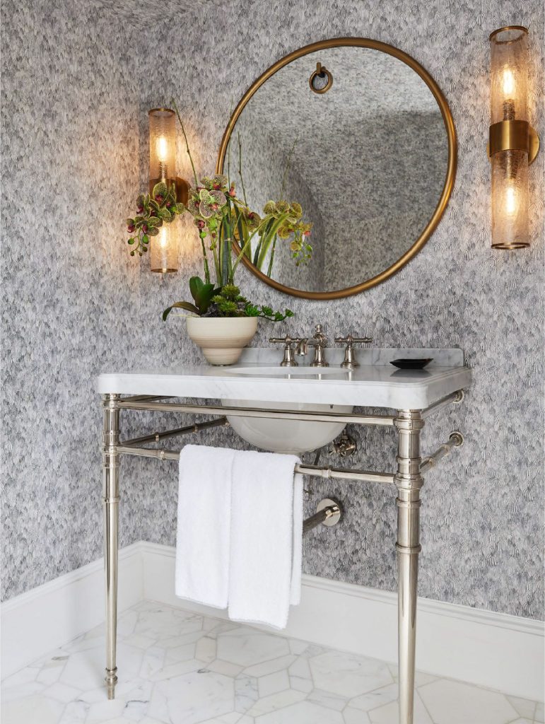
The powder room, just off the entry, had an out-of-fashion wall covering and ornate lighting, creating a drab feeling. A lighter color and subtler pattern for the wallpaper made all the difference, as it lightened and brightened the space. The modern sconces add a touch of contemporary glam and the simpler mirror gives a sleek and chic vibe.
LIVING ROOM
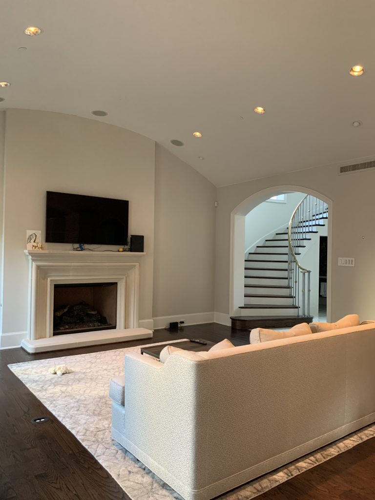
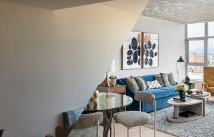
The living room had gorgeous natural light flooding in and a beautiful curved ceiling. But it was too vanilla and needed more interest and modern design elements.
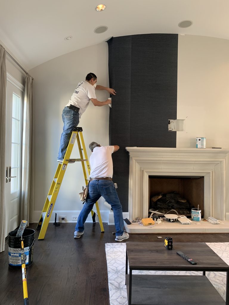
We used a stunning blue grasscloth to cover the fireplace surround, creating a feature wall that updated the room’s design and offering a textural treat for the eyes. Then we provided a gorgeous package of furnishings, accessories, and art to create an updated and comfortable space that’s perfect for entertaining or hanging with family.
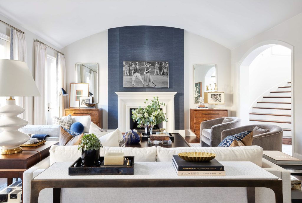
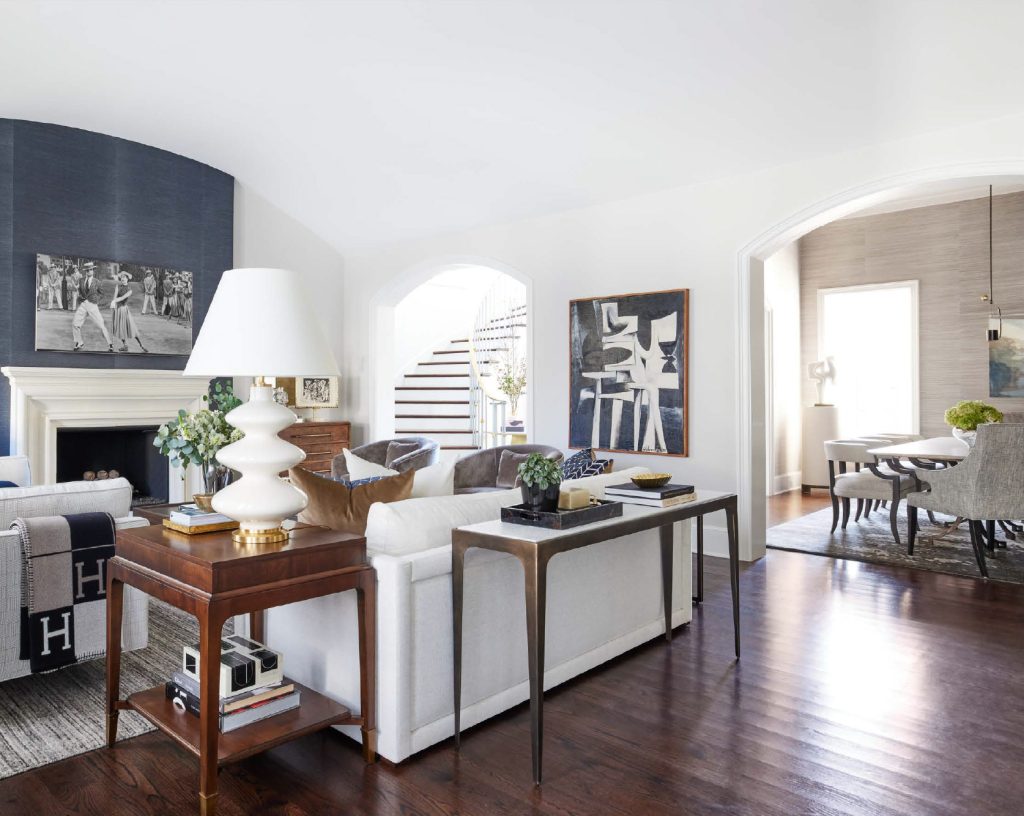
Now let’s talk about that stunning dining room you can see just off the living room!
DINING ROOM
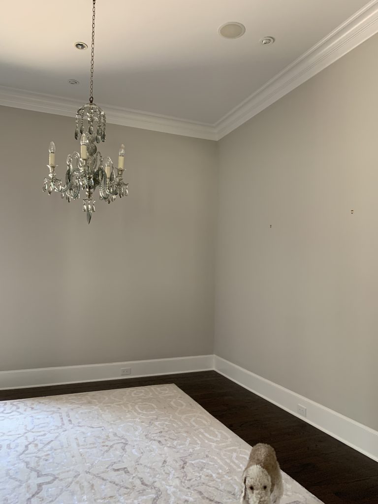
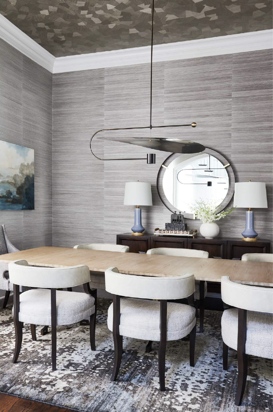
The dining room, like the rest of the house, wasn’t bad. It was just a bit boring. Even our client’s little dog blended in. But look at what wallpaper, new lighting, and fab furnishings can do – now the room is a showstopper! It’s also a more modern space that exudes sophistication.

KITCHEN
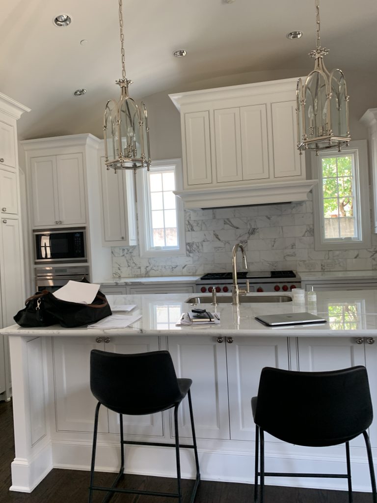
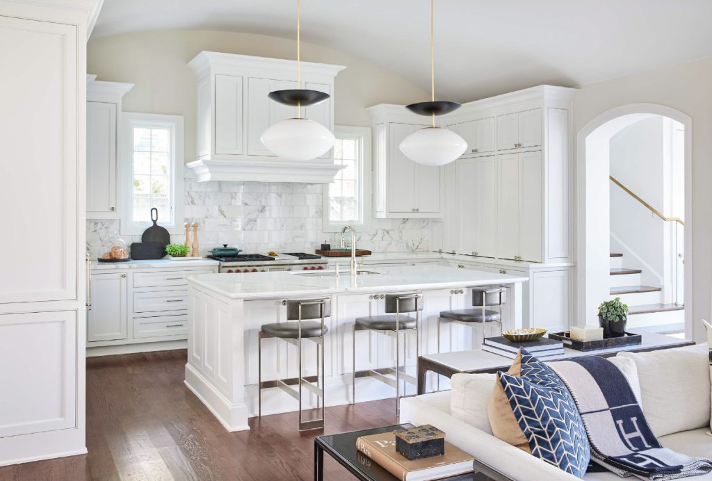
The smallest details can change everything in how a room looks. Lighting, new stools, paint, and custom storage in the cabinetry made this room more modern and much more functional for our clients. Those fabulous pendants are some of our absolute favorites!
HALLWAY
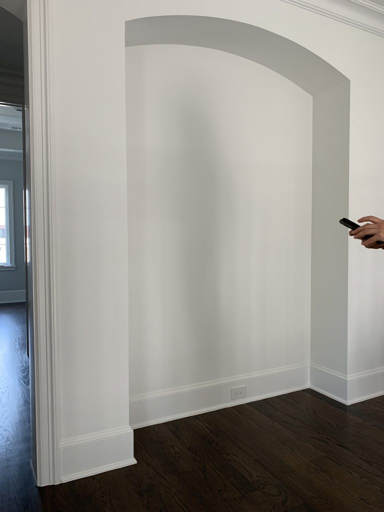
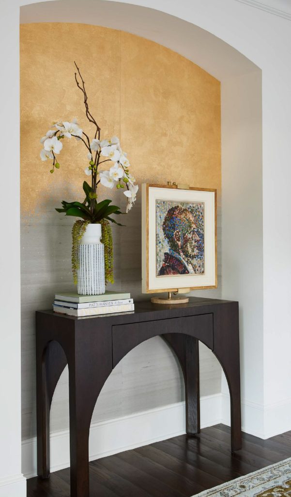
Architectural details like a niche can add visual interest to a hall or entry, but people often don’t know what to do with them. That’s where having an expert team like Pulp can make all the difference. We added an ombre wallcovering to make this niche pop, and then we used a fabulous table and art to create an eye-catching spot that gives major personality.
PRIMARY BEDROOM
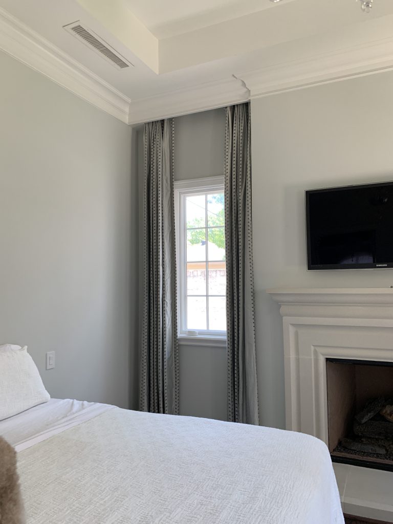
The primary bedroom was another super-formal room without a lot of life in it. We wanted this to be an oasis, a space that would reflect the chic sophistication of our very modern clients, and a room that would help them recharge after a long day. We worked closely with our clients to source incredible lighting, special pieces of original art, and unique accents for each room. They love this primary bedroom and its gorgeous new design!
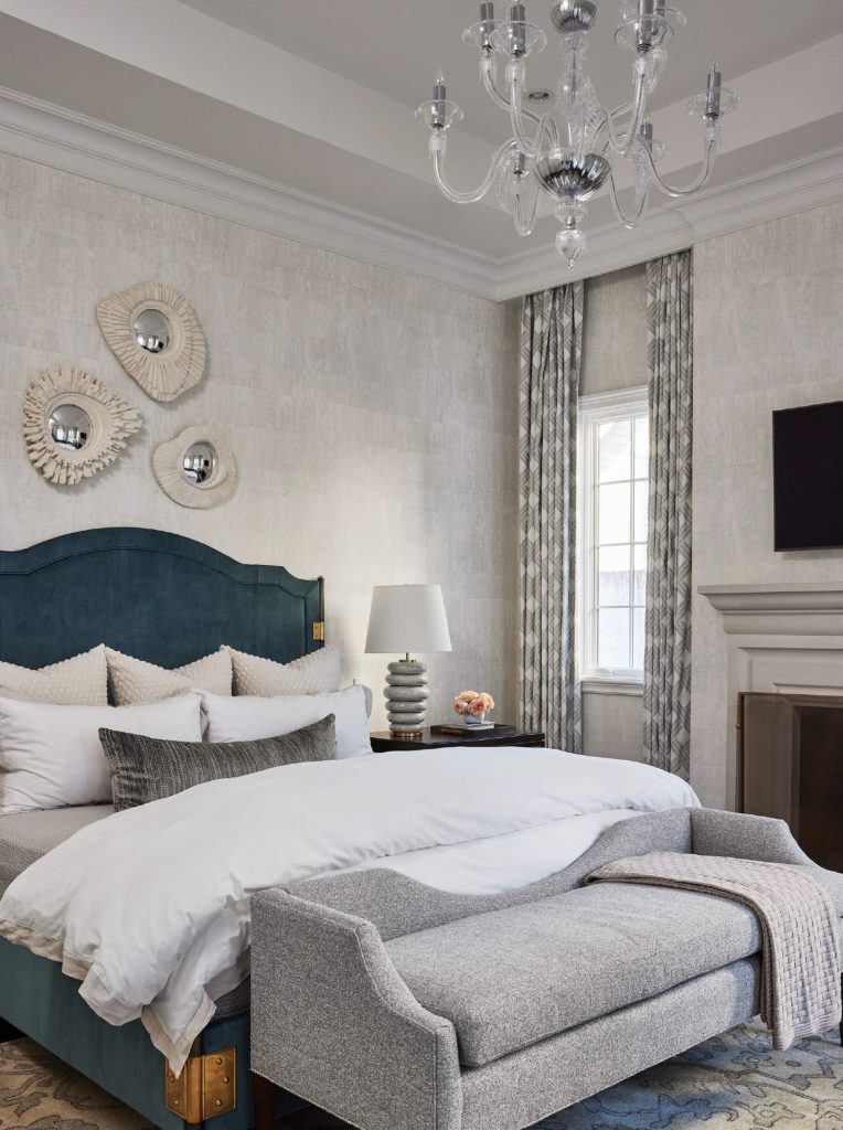
This home really showcases how much a furnishings package and minor renovations can completely transform a home into exactly the space you’ve always wanted! If you want to call in the Pulp team for your own special transformation, contact us here!
And be sure to follow us on Instagram by clicking here!
Credits

SECTIONS
Design InsiderEntertaining + Home Living
Health + Beauty
News + Announcements
Pulp At Home
Pulp Design Work
Shopping Guide
The Business of Design
The Pulp Edit
Travel
Videos
GET INSPIRED
SUBSCRIBE TO OUR NEWSLETTER TO
GET AN INSIDER LOOK IN YOUR INBOX


