Colors to Watch in 2019
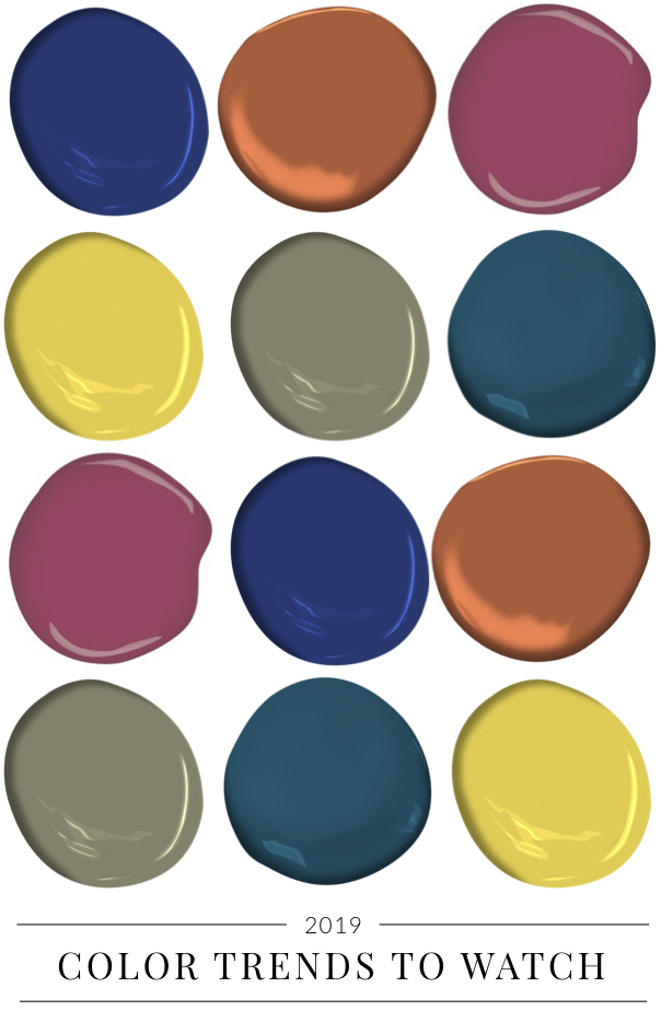
We love this time of year, when Colors of the Year are announced by paint companies and color forecasters. We have a unique take on color trends because we travel to cities and shows around the world where we see the latest products and new ideas for the home.
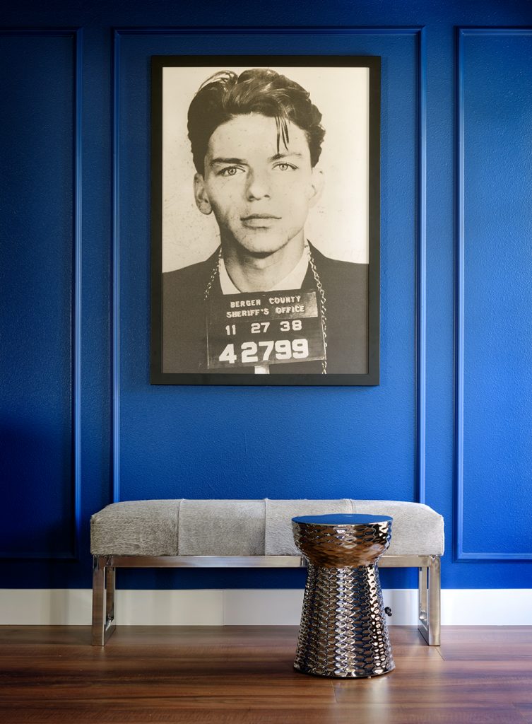
What we’re seeing for 2019 is a palette of muted brights – colors that are highly saturated, but with a tint or shade that makes them more subdued, like this gorgeous blue we used in a winery project.
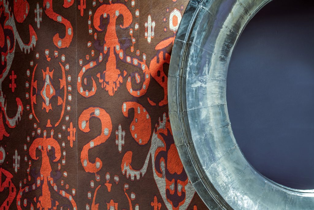
Muting an intense color makes it classic, polished, and just different enough to stand out, like this toned-down red-orange in a powder room we designed.
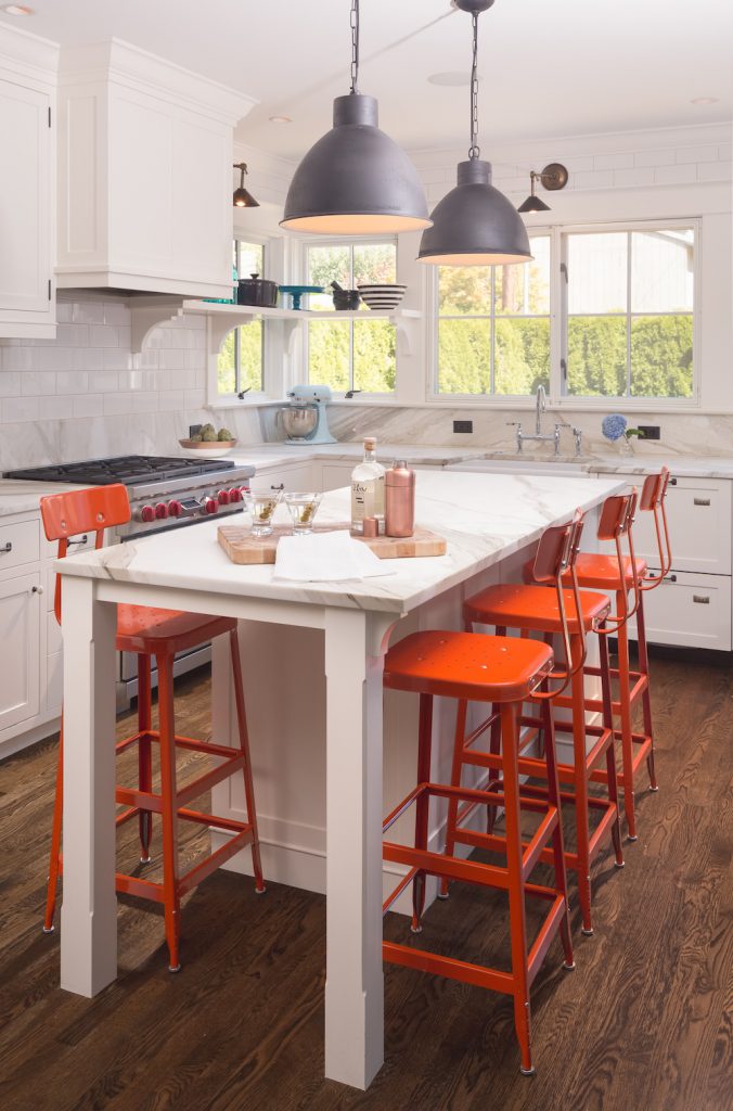
Another muted bright we’re loving is an orange with a bit of gray in it. If you’re worried about using a color like that on your walls, consider it for and accent like counter stools in a kitchen, as we did in this family-friendly home.
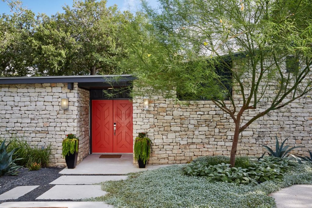
Or use a toned-down orange on the front door – it’s a perfect complement to the stone exterior on a house we designed in Dallas. Front doors are a great place to experiment with color!
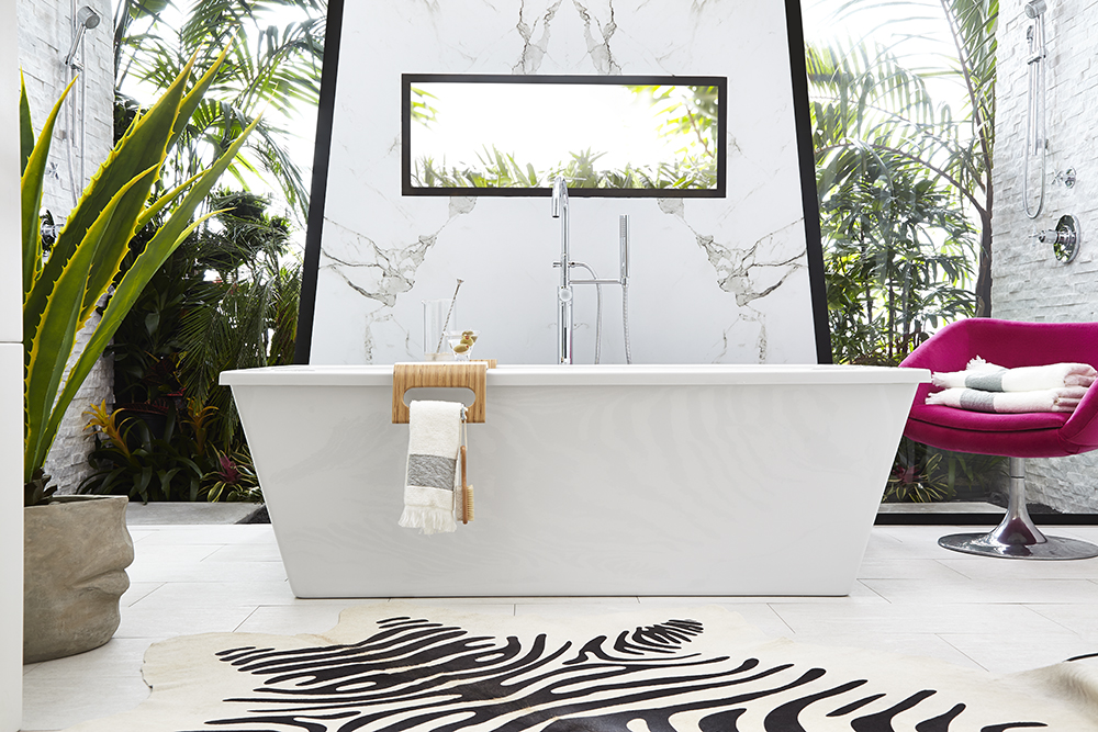
A less-dramatic fuchsia is another favorite of ours, and here it adds just the right punch in a white-and-bright bathroom we designed for DXV.
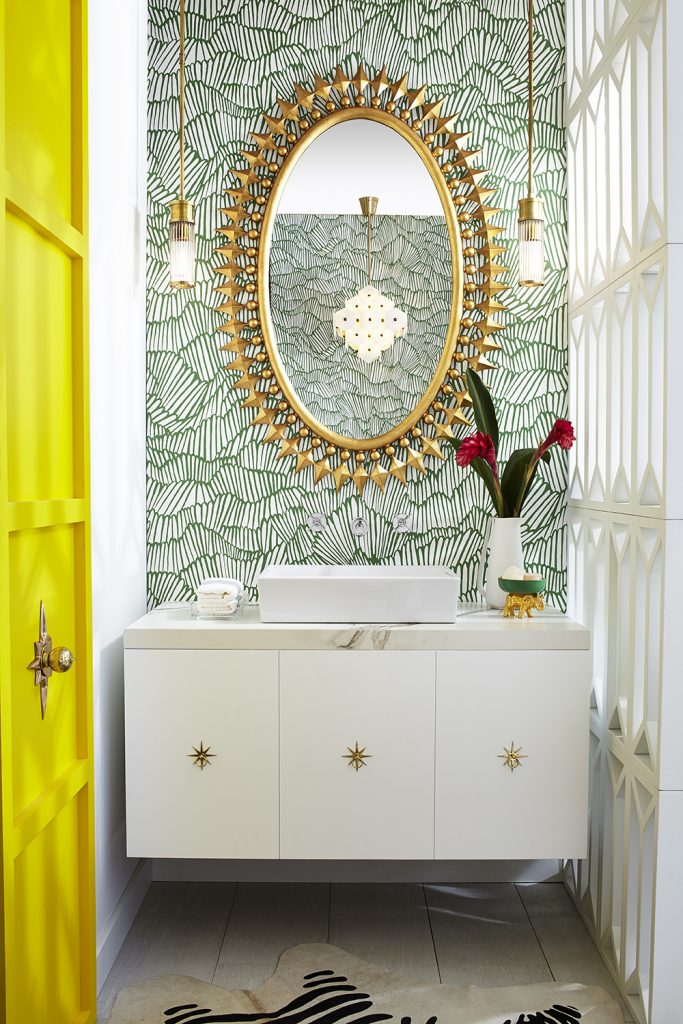
Yellow can be a super-intense color, but the muted version is less intimidating to consider in your home. It makes a fantastic accent color for the bright green wallpaper in this bathroom.
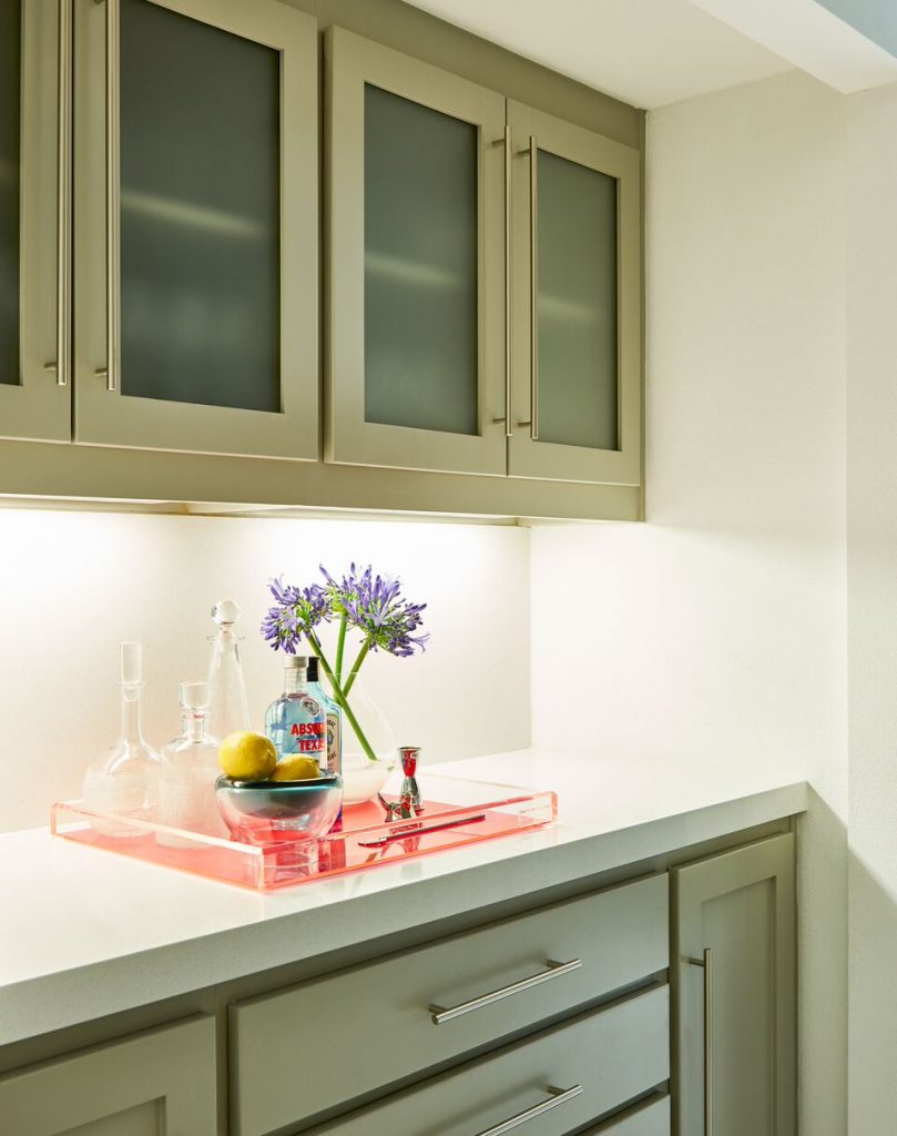
Greens are definitely going to be big in 2019, especially in the quieter olive or almost khaki shades.
A deep teal is also one to watch. It adds a richness and suppleness, with a bit of mystique, to any color story or space.
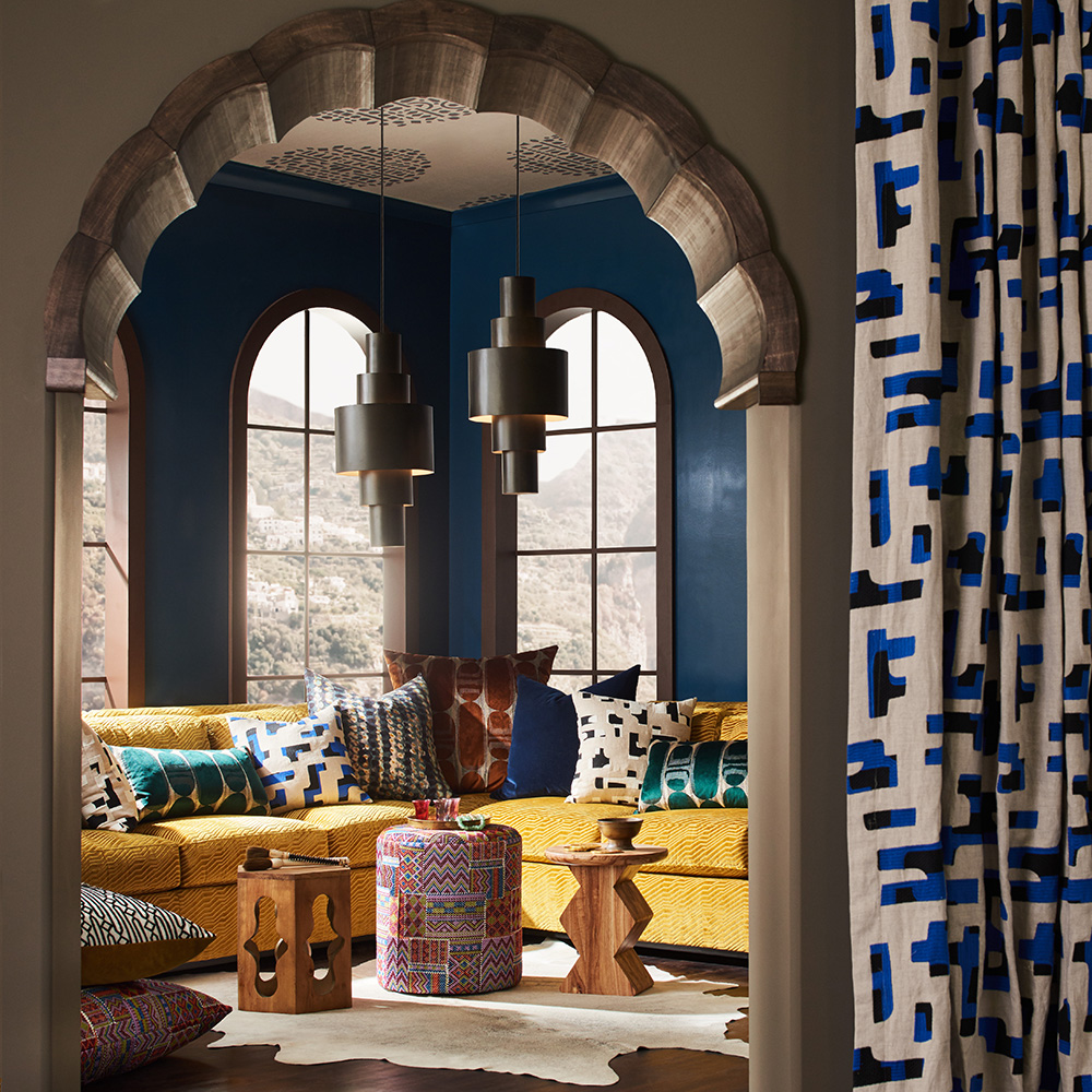
Use our color guides to help you choose the perfect new palette for your home in 2019.
Credits

SECTIONS
Design InsiderEntertaining + Home Living
Health + Beauty
News + Announcements
Pulp At Home
Pulp Design Work
Shopping Guide
The Business of Design
The Pulp Edit
Travel
Videos
GET INSPIRED
SUBSCRIBE TO OUR NEWSLETTER TO
GET AN INSIDER LOOK IN YOUR INBOX


