Our 4 Go-To White Paint Colors
Choosing a white paint color sounds so simple. But it’s the one thing people ask us about most! White paint is rarely ever perfectly white. There are a lot of undertones that a white paint can have, like gray, yellow, pink, blue, and even green. Any color next to a white with undertones is going to either complement it, or make it look like an entirely different color! And then different light – natural, yellow bulbs, clear bulbs, etc. – can change it again. Here are our 4 top picks for white paints, and why!
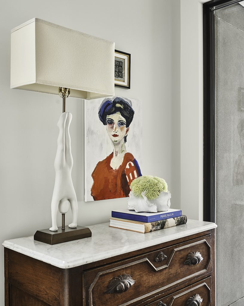
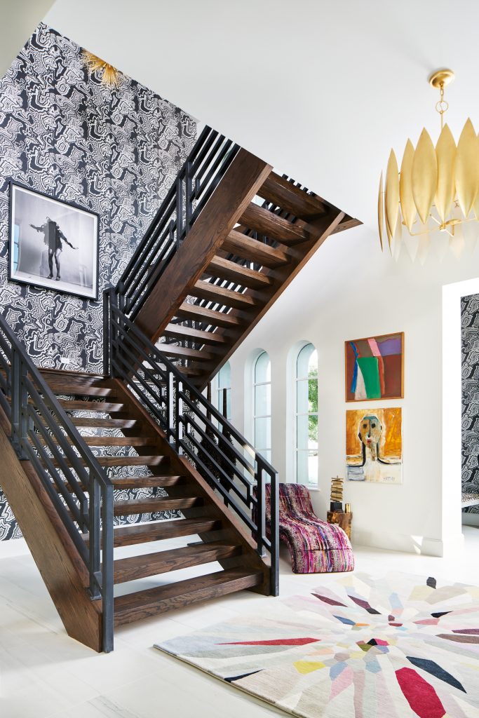
Sherwin-Williams Moderne
In the home above, we chose Moderne from Sherwin-Williams because it is a lovely white that has a gray undertone. As you can see, it really works with the grays in the painting and the marble on the antique chest. This is also a very contemporary home with a lot of color in the accessories and art, so we wanted to provide a neutral palette that would support other colors well.
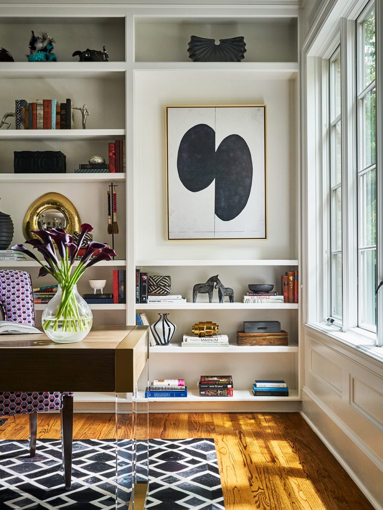
Sherwin-Williams Pure White
In this office, we used Sherwin-Williams Pure White because it’s a great crisp look. It isn’t too bright and reflective, but it also isn’t too creamy and warm, either. One key to getting exactly the right white is to paint a sample in a room and then look at it in all sorts of light. Natural light can change it, even from morning to evening. And different bulbs in lighting can also make it look like another color entirely.
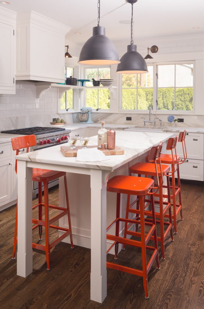
Benjamin Moore Mascarpone
Mascarpone is a creamier shade of white with a yellow undertone, so it works really well in a kitchen. You can see above in the kitchen we designed that it doesn’t look quite as creamy in the photo – that’s due to the lights the photographer used. We told you that whites can change in different lights! But the reason we chose this particular color was because we wanted it to give the kitchen a more traditional look, and we wanted a shade that works well with the orange stools and the wood. A bright white would have been too stark.
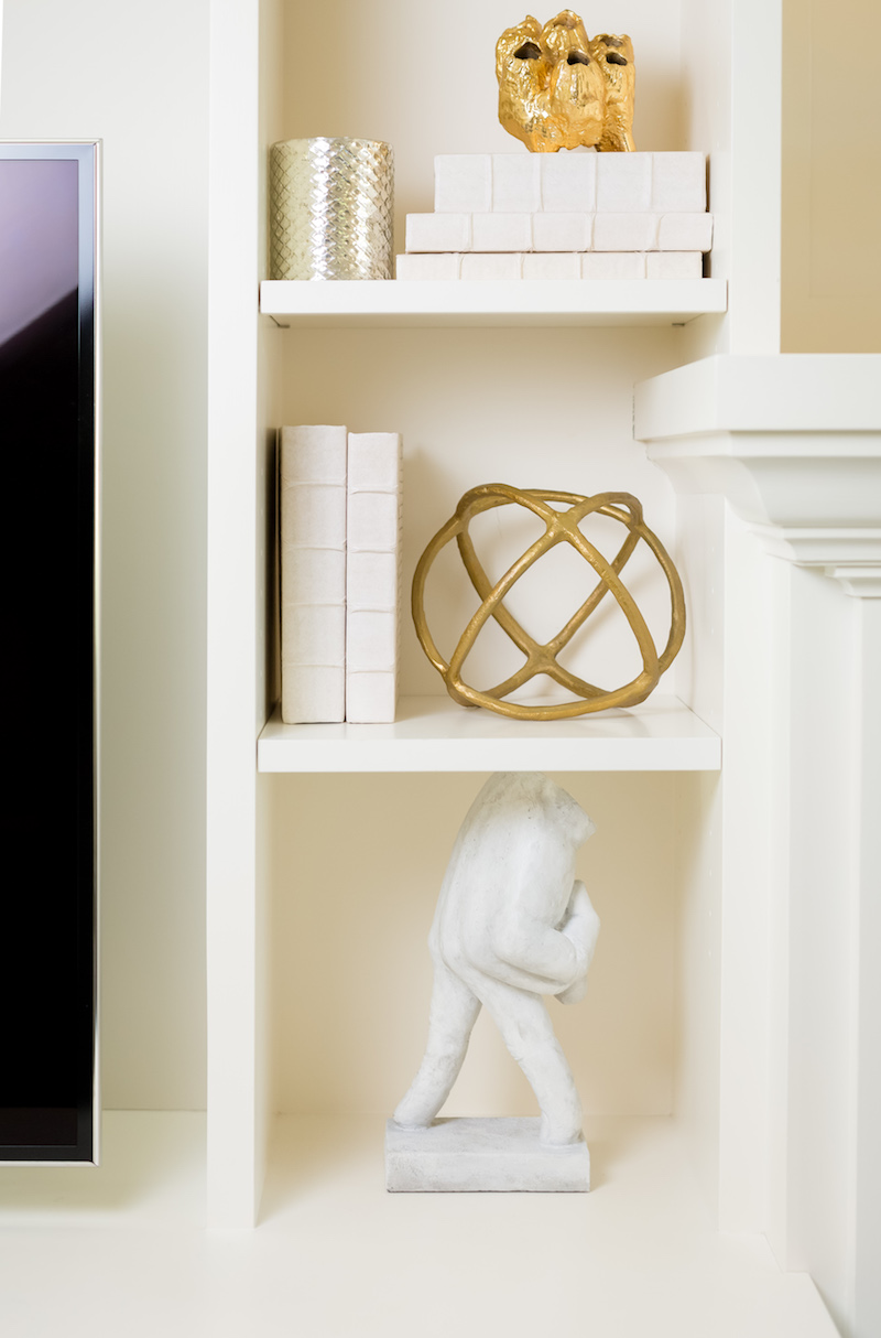
Behr Nano White
Believe it or not, this white has a little bit of a blue undertone, and that makes it a nice sharp white without being too glaring. Nano White is great as a supporting player to bold, bright palettes. And it really plays well with black, making it look like a perfectly tailored pair!
Use these go-to whites to start your search for the perfect one in your home. But again, be sure you sample the paint and watch the light in each room! Good luck!
Credits

SECTIONS
Design InsiderEntertaining + Home Living
Health + Beauty
News + Announcements
Pulp At Home
Pulp Design Work
Shopping Guide
The Business of Design
The Pulp Edit
Travel
Videos
GET INSPIRED
SUBSCRIBE TO OUR NEWSLETTER TO
GET AN INSIDER LOOK IN YOUR INBOX