Tour a Fearless Family Home + Meet the Clients
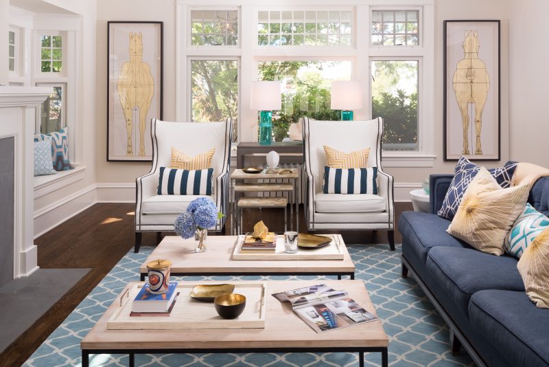
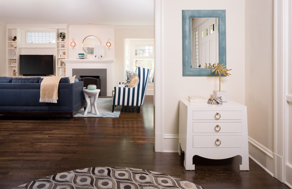
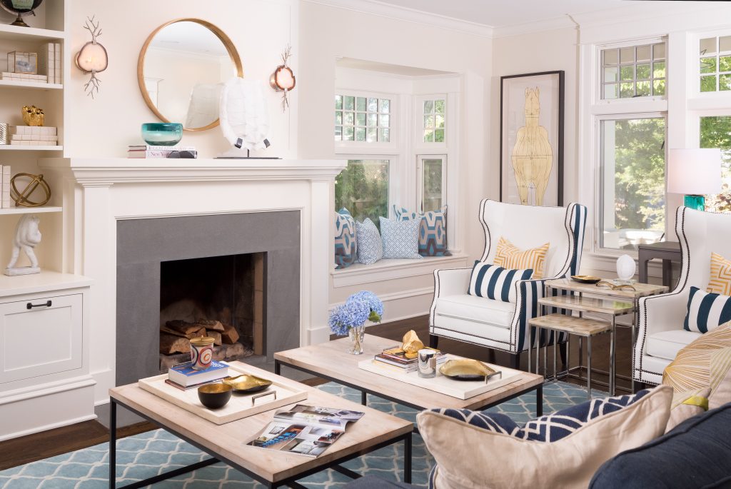
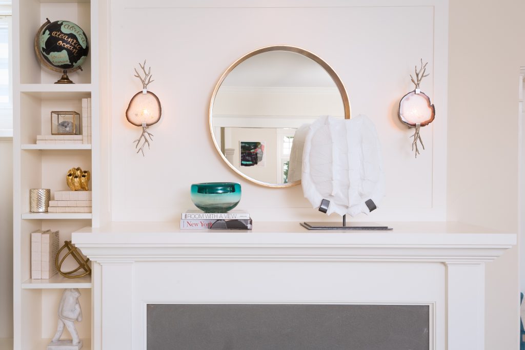
Bedecked in pattern and meticulously filled with quirky conversation pieces, this updated craftsman is a stylish kid-friendly mecca. Cleanable seating, custom homework stations and a family table for gathering make this home as functional as it is stylish. These clients were fearless when it comes to color and pattern. The result is a home with stylish heart-happy moments our clients aren’t afraid to live in.
Tour this incredible home, featured in the November 2017 issue of Better Homes & Gardens.
Q. WHO IS THE CLIENT AND HOW DID THEY FIND PULP?
Two hip professionals with school-aged children were searching for a designer in Seattle to help them personalize and finish their new home. After realizing that they couldn’t make their home as stylish as they wanted it to be, they began their search for an interior designer and found Pulp. After checking out our work, they decided Pulp was the team to bring their dream home to life.
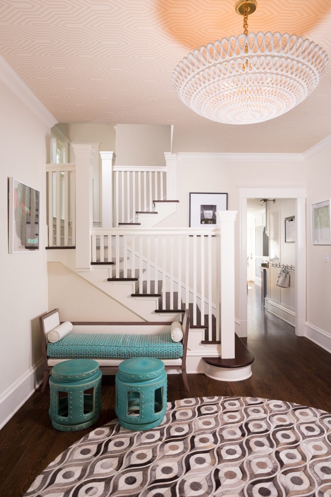
“The clients’ house was already structurally beautiful, but just wasn’t personalized. The main focus of this project was to take the beautiful bones of the home and personalize every inch.”
Q. WHY DID THEY SEEK OUT A DESIGNER RATHER THAN ATTEMPTING IT ON THEIR OWN ?
These clients had great personal style as it is. They had similar tastes, but both liked different things and found that every time they tried to pull something together on their own, it never turned out as exceptional as they wanted. They knew they needed to bring in a designer to create a cohesive, yet dynamic home that illustrated both of their styles to perfection.
Q. WHAT WAS THE CLIENT’S PROJECT SCOPE?
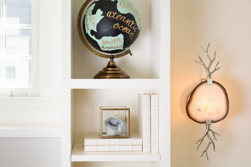
The clients’ house was already structurally beautiful, but just wasn’t personalized. The main focus of this project was to take the beautiful bones of the home and personalize every inch through bold wallcovering, lighting, furnishings and unique accessories to maximize the personal touch.
“Anytime you take a statement wallcovering to four walls and a ceiling, you’re bound to create a jaw-dropping transformation.”
Q. WHAT WAS THE MOST DRAMATIC TRANSFORMATION?
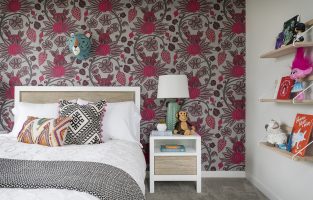
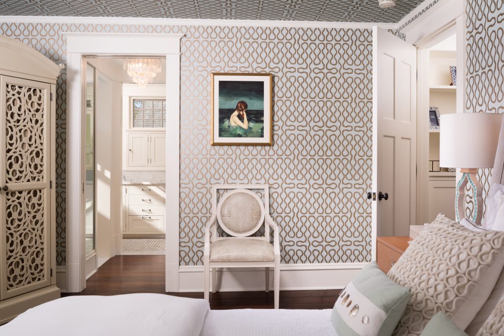
Easy. The transformation in the master bedroom was stunning. Anytime you take a statement wallcovering to four walls and a ceiling, you’re bound to create a jaw-dropping transformation.
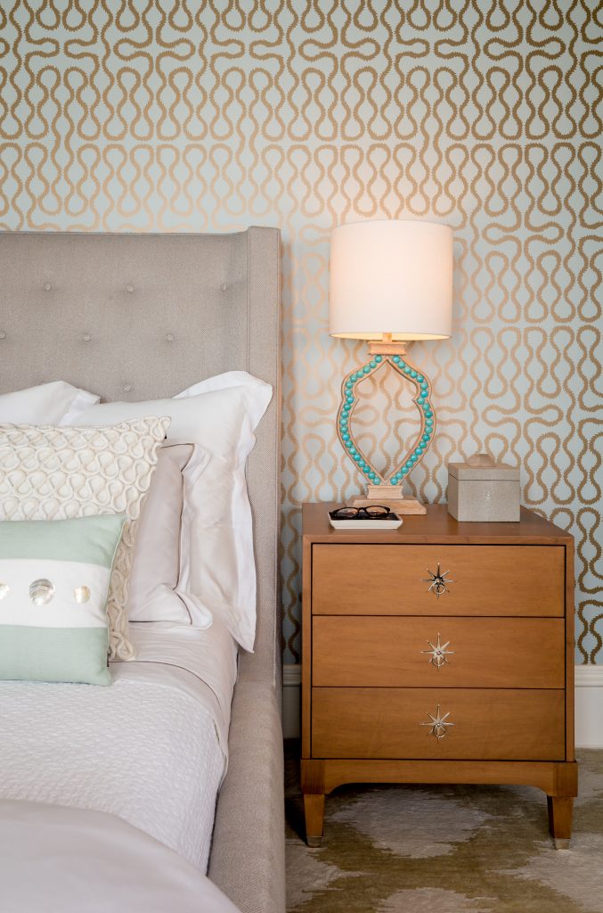
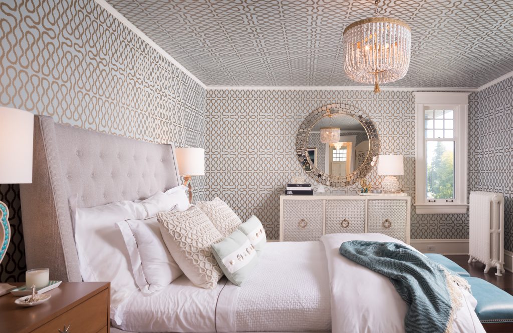
Q. BETH, WHAT IS YOUR FAVORITE PART OF THE SPACE?
I have to say the bedroom is my favorite space in the home. I think we have to give ourselves a pat on the back for creating a room that is soothing and collected, but full of bold pattern.
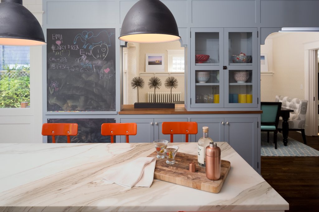
“I wanted someone to help me style it the way I wanted and bring me out of my comfort zone” – Audrey, Homeowner
Q. CAROLINA, WHAT IS YOUR FAVORITE PART OF THE SPACE?
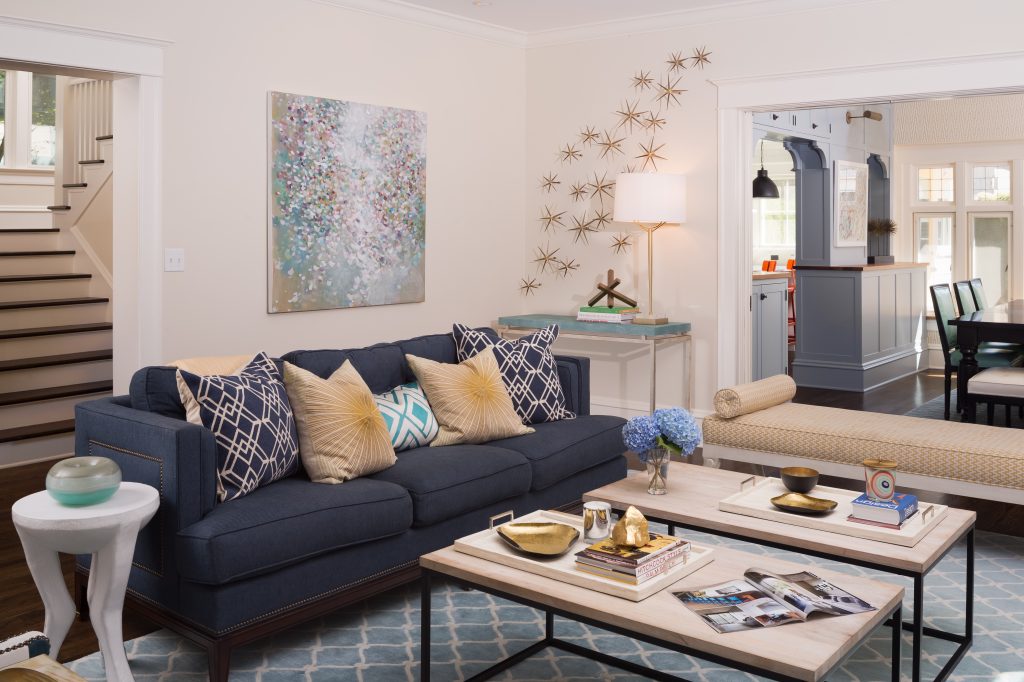
I love the living room. It’s filled with so many statement pieces, from the dynamic art selections to the layered patterns throughout. It comes together for an absolutely beautiful space.
Q. WHAT WAS THE BIGGEST PROJECT CHALLENGE?
The TV was not centered, which prevented us from framing the design around the TV. This family primarily uses the living room to gather and watch TV together, so the off-centered placement created a challenge. We always design spaces to function seamlessly into our clients’ everyday lives, so we had to figure out a way to work around the layout. We added a chaise in front of the TV so the family could lounge and watch together, while enjoying the living space.
MEET THE CLIENTS
See the rest of the project and read our four-page spread in Better Homes & Gardens.
For professional interior design services, contact Pulp Design Studios℠.
Credits

SECTIONS
Design InsiderEntertaining + Home Living
Health + Beauty
News + Announcements
Pulp At Home
Pulp Design Work
Shopping Guide
The Business of Design
The Pulp Edit
Travel
Videos
GET INSPIRED
SUBSCRIBE TO OUR NEWSLETTER TO
GET AN INSIDER LOOK IN YOUR INBOX


