Home Tour: Traditional with a Twist
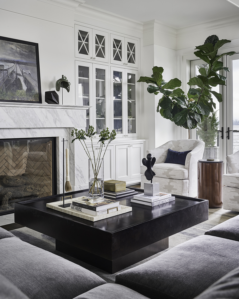
The clients for this Seattle design project – medical professionals with three children – came to Pulp because the interiors in their new build house weren’t a true representation of their lifestyle or their personalities. We knew exactly how to solve that problem! We brought our signature process to the table, offering an in-depth consultation along with a bit of fun homework to allow us to really get to know the clients and their needs. Armed with all that information, we created an understated and classic home, including some of our best ideas and fantastic unexpected details like a hidden wine room and creating a home bar around an existing roll-up window. Let’s take a tour!
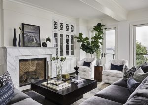
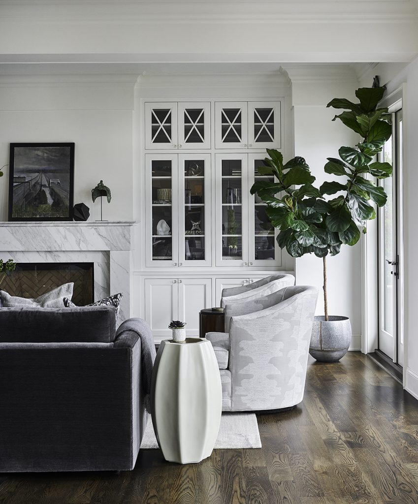
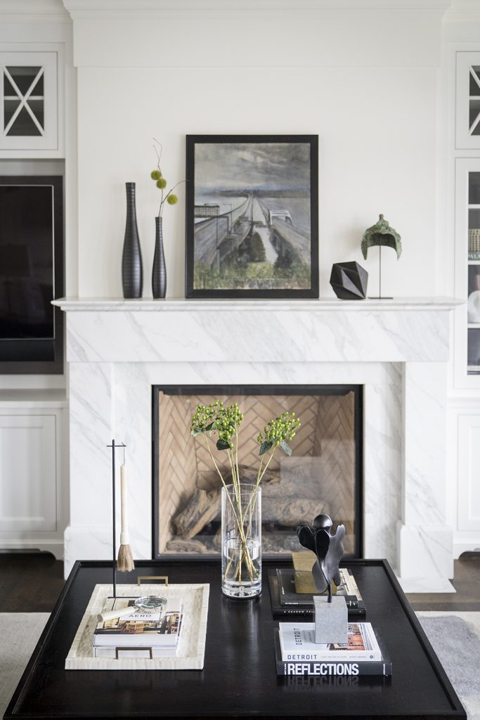
Q: In an open-plan house like this one, how do you keep that sense of space for each living or dining area?
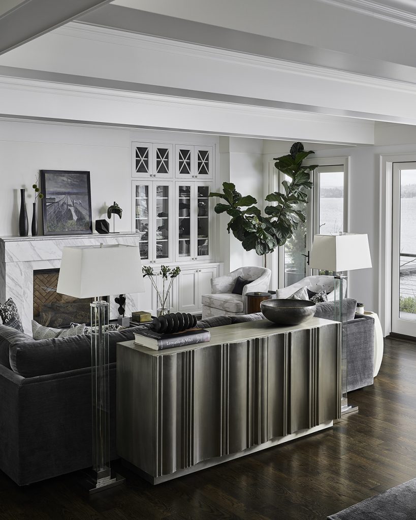
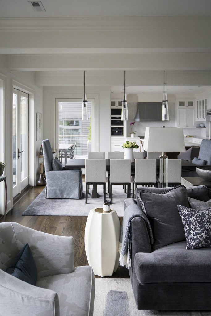
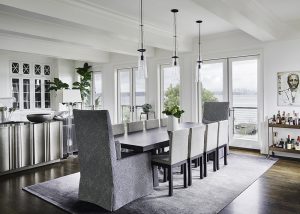
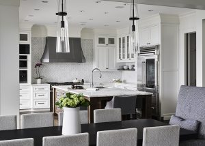
We used the furniture to set the boundaries for each space. So a great Bernhardt credenza helps divide the living room from the dining room. And the dining table itself helps divide the dining area from both the living room and the kitchen. It allows the space to have a great open flow, but still seem cozy and well-planned.
Q: How did you showcase the family members’ personalities in the design of the home?
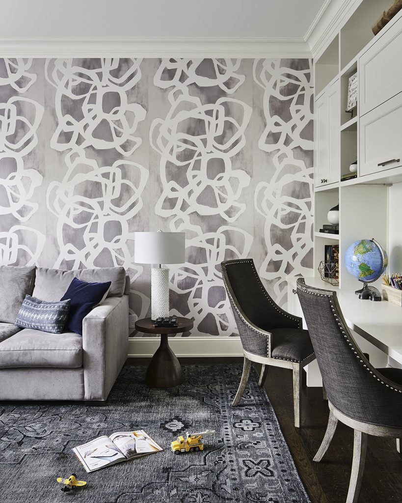
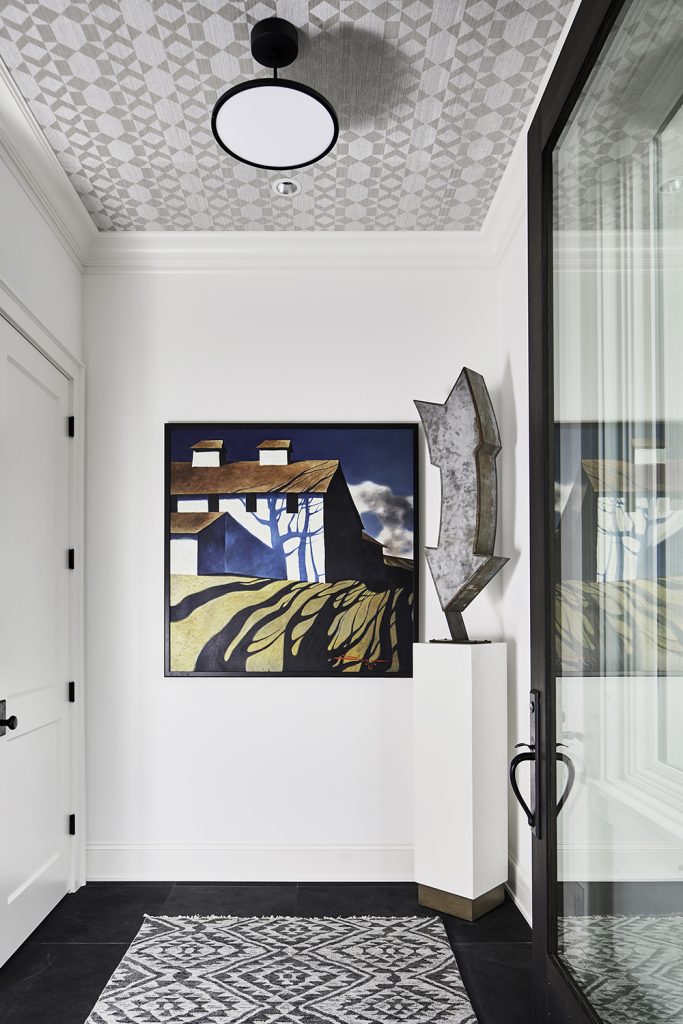
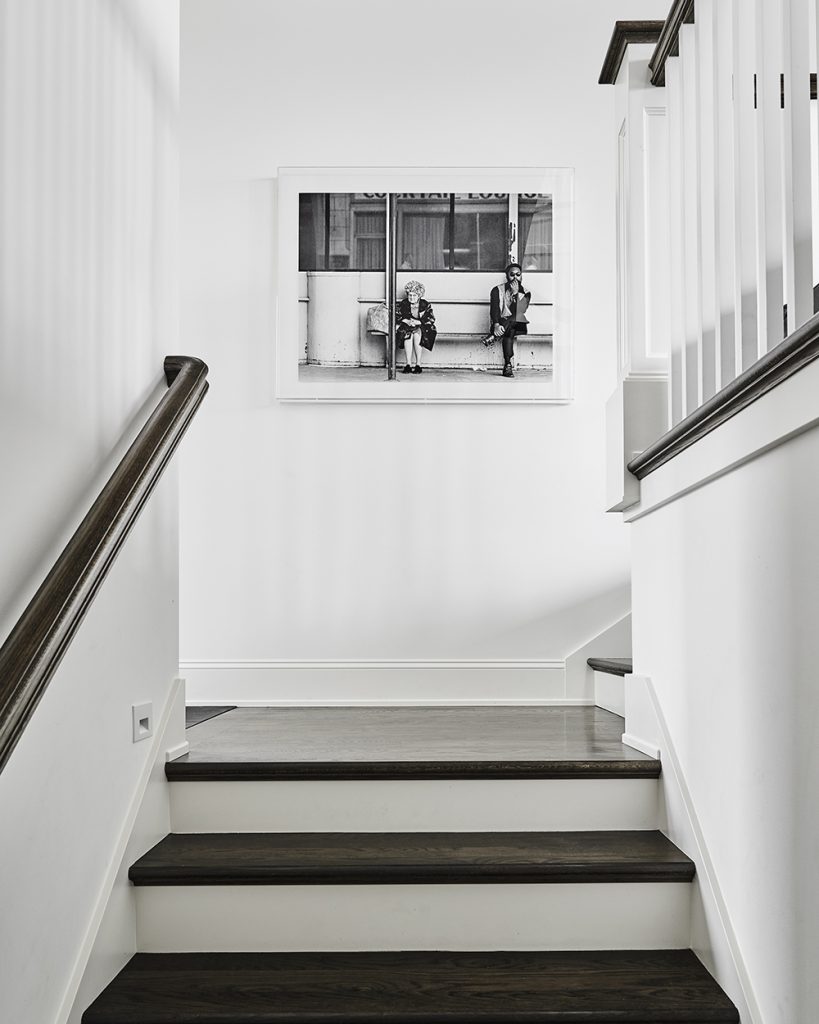
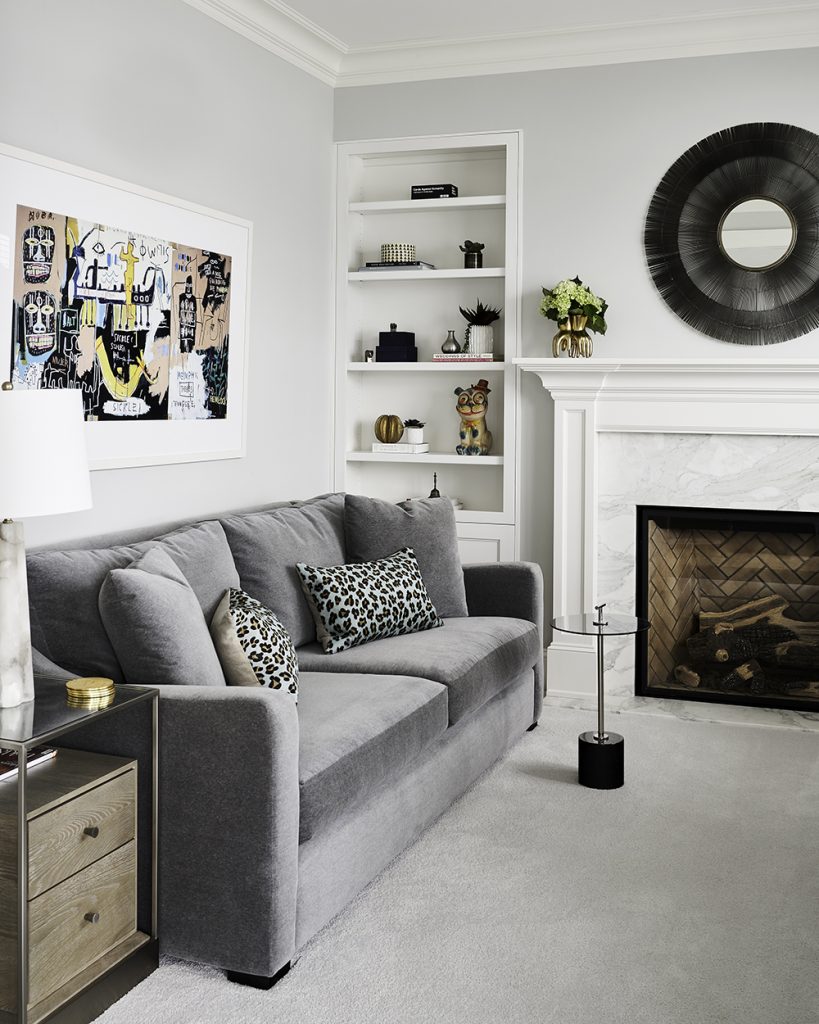
We like to use pattern and art as great indicators of the personality of people in the home. Wallpaper is perfect for that – it can show creativity, exuberance, calmness and so much more! So we used a few great wallpapers in the home, like in the study and entry. We also like to use art to set a home apart. We found a fabulous photograph that had been taken by our client’s father. It really spoke to the notion of family, so we had it enlarged and framed, and now it welcomes visitors to the home and offers an idea of the family that lives in this fabulous new space.
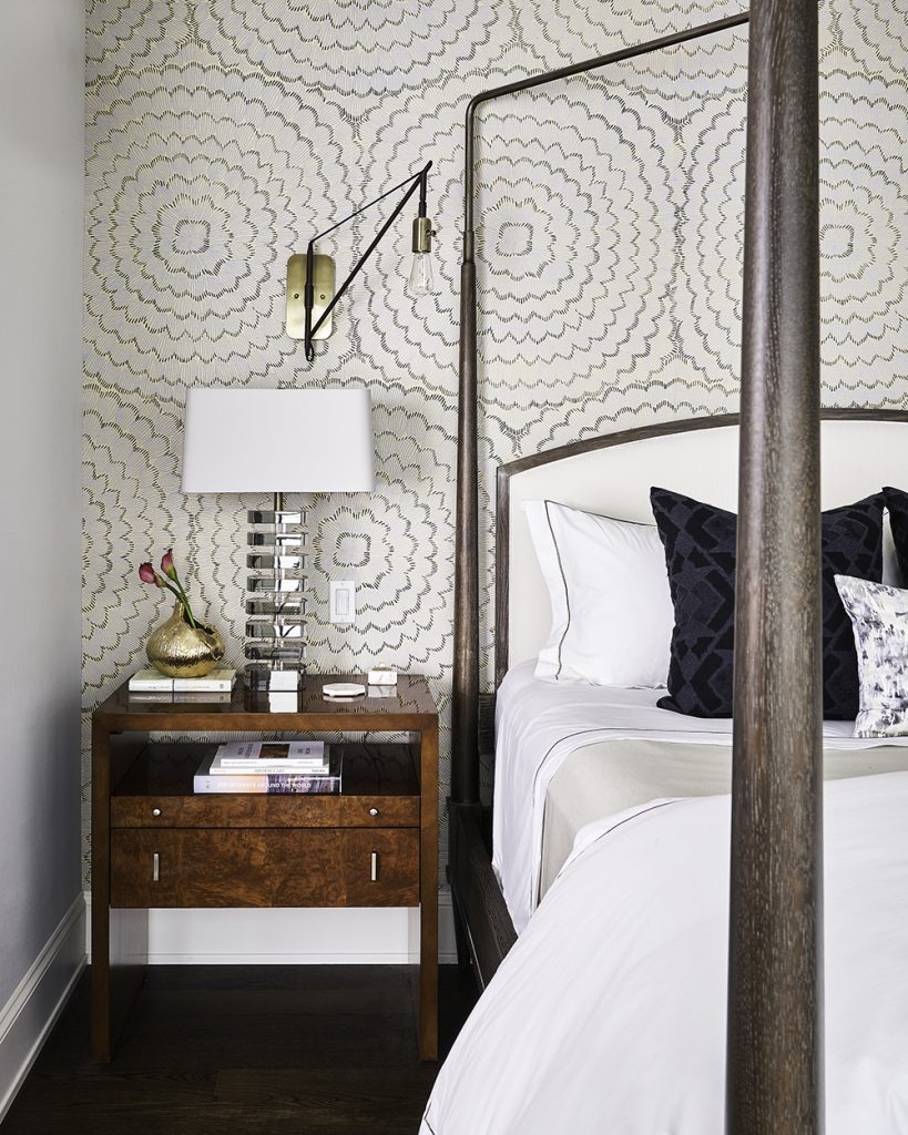
Q: This home also features an incredible master suite – what was important for you to incorporate into the design?
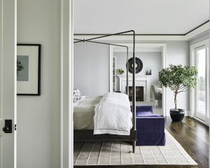
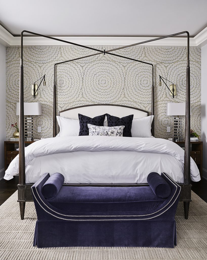
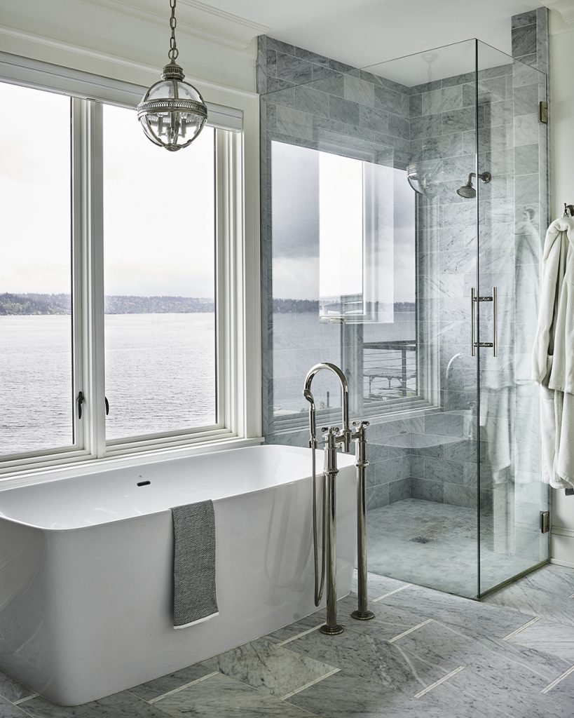
We wanted to be sure we captured the feeling of sanctuary to create an oasis for our clients. And the views in the home are incredible, too, so we wanted each room to take advantage of that! In the master bedroom, the bed is oriented toward an amazing look at the lake outdoors, and we set up the master study to have the furniture placed for the view, too. Then in the bathroom, the shower and tub almost feel like they are in the outdoor space because of the large windows!
Q: What is your favorite room in the house?
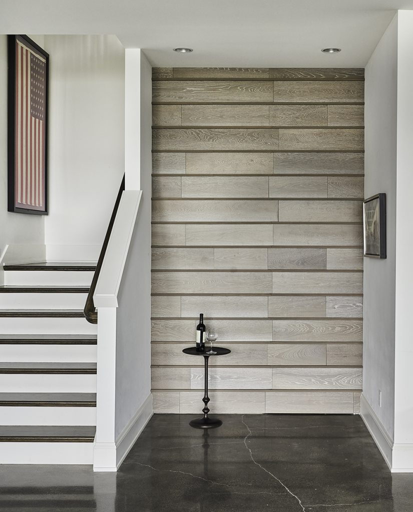
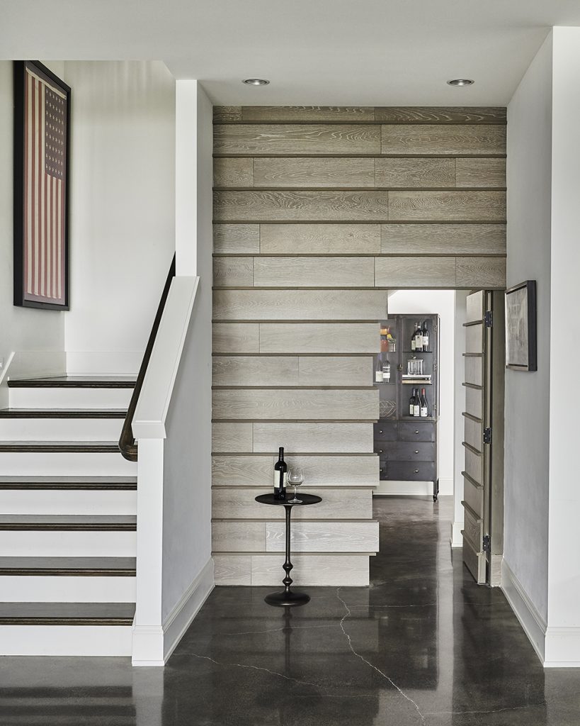
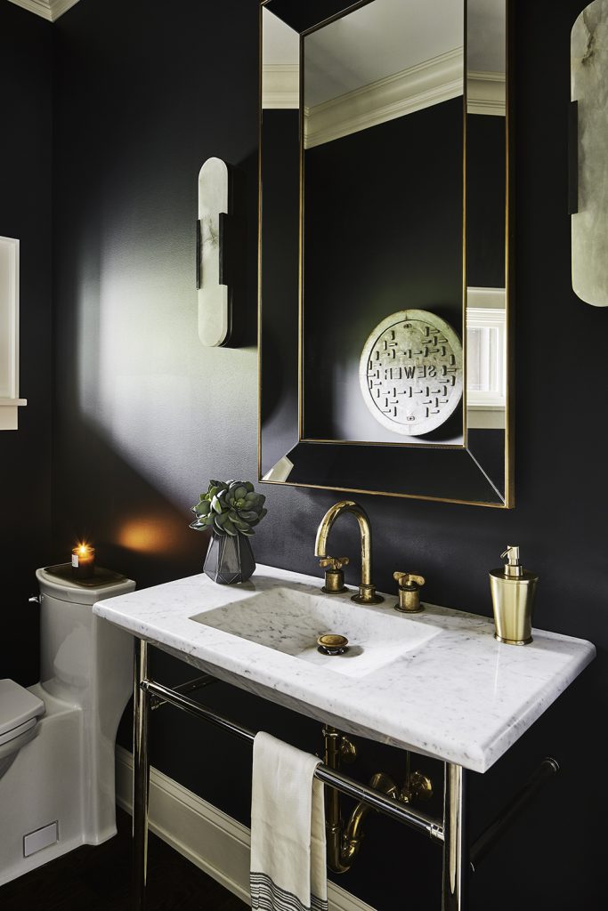
That’s a hard one! It’s probably a tie between the hidden wine room and the glam powder bath. We reworked the original wine room in this home because it had an awkward entry/exit. We used the space under the stairs to create a fun hidden door that offers a more direct route to the wine storage. And then in that powder bath – there’s just so much chic glamour! It’s painted deep black, with mixed metal details and super-sexy sconces. It’s a lot of look for a small space!
Q: What do you think your clients would say is their favorite place in the home?
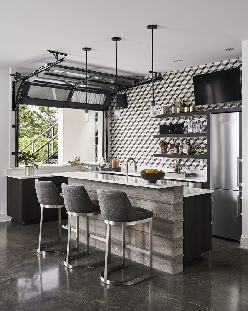
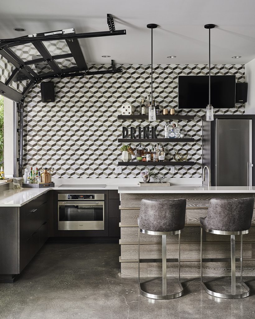
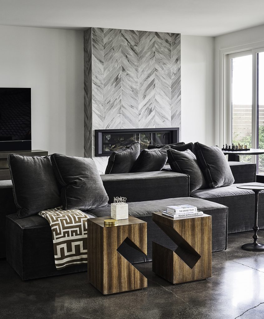
Because our clients love to entertain family and friends, it would definitely be the bar and family room area downstairs! We made the bar a standout with dimensional tile and sleek seating, and it has a great roll-up window that lets you serve drinks to guests outside on the deck. The open seating area nearby has a fabulous fireplace, a game table, and modular seating. It’s just a great open space for entertaining!
Take the full tour of this Seattle project here, or read about it in ICON magazine!
Credits

SECTIONS
Design InsiderEntertaining + Home Living
Health + Beauty
News + Announcements
Pulp At Home
Pulp Design Work
Shopping Guide
The Business of Design
The Pulp Edit
Travel
Videos
GET INSPIRED
SUBSCRIBE TO OUR NEWSLETTER TO
GET AN INSIDER LOOK IN YOUR INBOX


