How We Solved Our Biggest Design Dilemmas
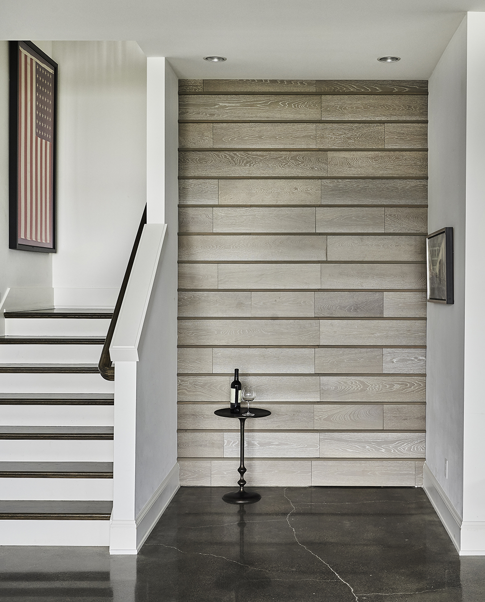
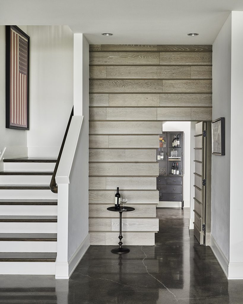
We recently revealed to Architectural Digest what our biggest design dilemma has been in the last few years. We told the editor that it was an awkward space under our client’s stairs, and that we transformed it into a magical hidden door to a fabulous wine room – you can see the door closed above, and open below. In our business, you run into dilemmas a lot, and we had a few projects to choose from that gave us issues to work around. But the Pulp team loves a challenge – it lets us put our creativity into high gear. Take a look at these projects that offered dilemmas, and how we solved them!
Getting the Perfect Finish
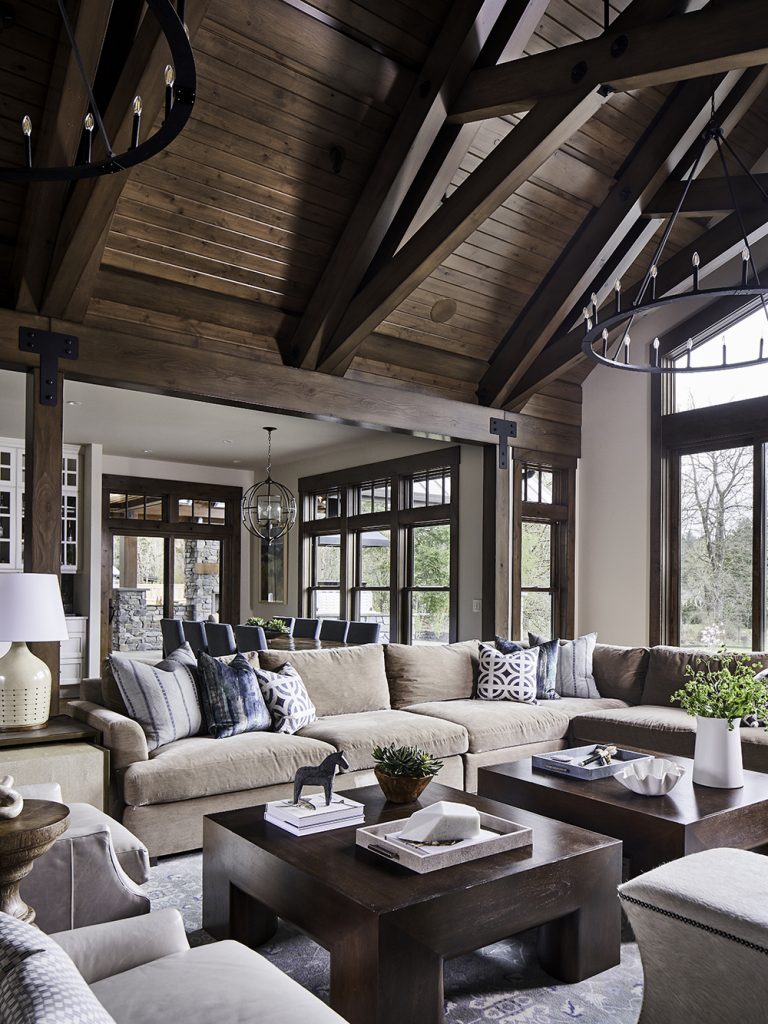
In the photo below, all you see now are gorgeous beams and lots of beautiful wood tones. But getting that fabulous lodge look was a challenging multistep process that took hundreds of hours of applying finishes and comparing results. We literally had 15 reapplications of stains. Our clients had two very different design styles. He wanted a more rustic look and she was more into a modern transitional design. So getting these finishes right was key to combining what they wanted into a cohesive style. They love the finished look!
From Dingy to Dynamite
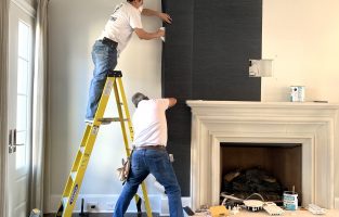
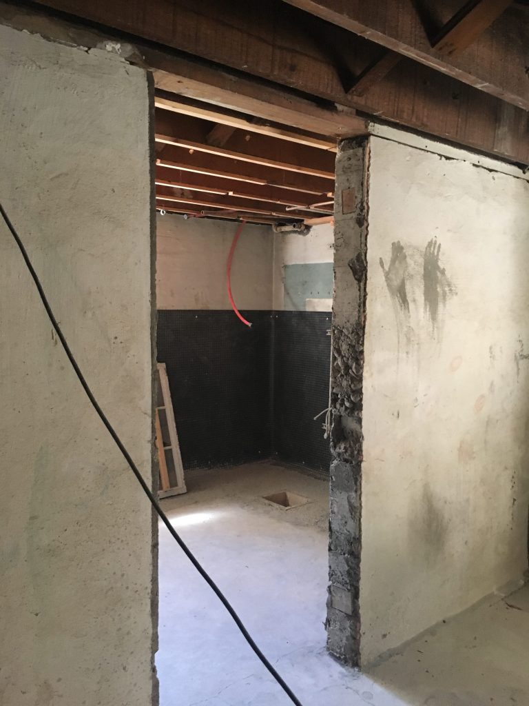
The project below required a lot of vision on our part because what we started with was a dark and dreary basement. In fact, it was so bad that we had to show you the before photo below. It was a HUGE challenge to work through the renovation and create a family room and bathroom that was a stunning as the interiors upstairs (which Pulp finished a couple of years ago). We added fabulous wallpaper and art, built-in storage, and lots of great seating to create a stunning hangout that made our clients want to show off this space to everyone who came to their home (pre-COVID, of course).
That Awkward Corner
Every interior designer who sees a corner fireplace, especially at an angle, will roll her eyes. It can be such a pain to design around these, and really they should just be removed. So when our clients said they wanted to keep their midcentury modern dream house but needed it to be reworked, we knew the fireplace below had to go. They also needed more room, so our solution was actually a win-win. We gutted the structure, creating an addition that opened up the floorplan. That let us expand this room and add a new (NOT angled) fireplace! See before and after photos below.
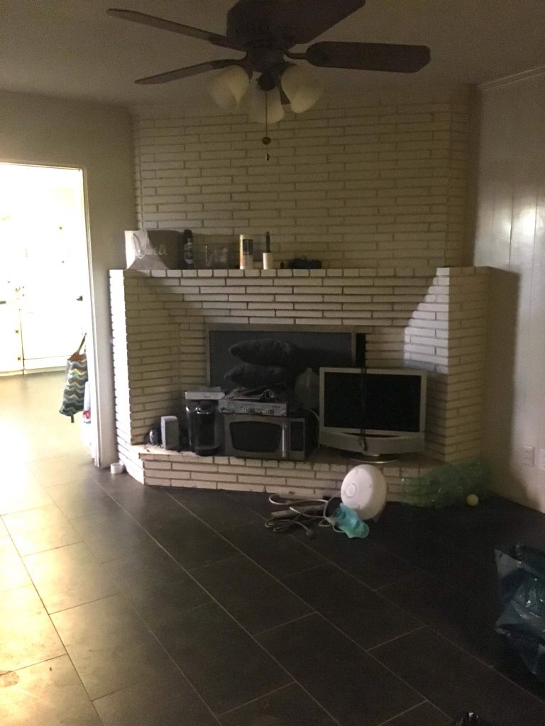
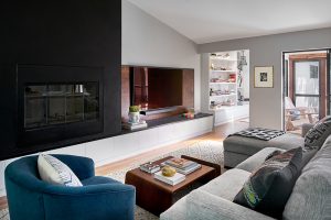
Do you have a design dilemma? We would love to help you find the perfect solution! Just get in touch with us by clicking here!
Credits

SECTIONS
Design InsiderEntertaining + Home Living
Health + Beauty
News + Announcements
Pulp At Home
Pulp Design Work
Shopping Guide
The Business of Design
The Pulp Edit
Travel
Videos
GET INSPIRED
SUBSCRIBE TO OUR NEWSLETTER TO
GET AN INSIDER LOOK IN YOUR INBOX


