Kips Bay Showhouse Tour: The Bathroom
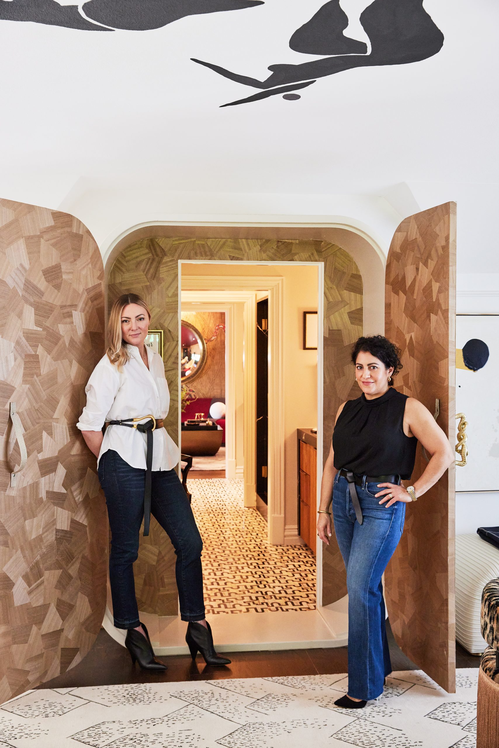
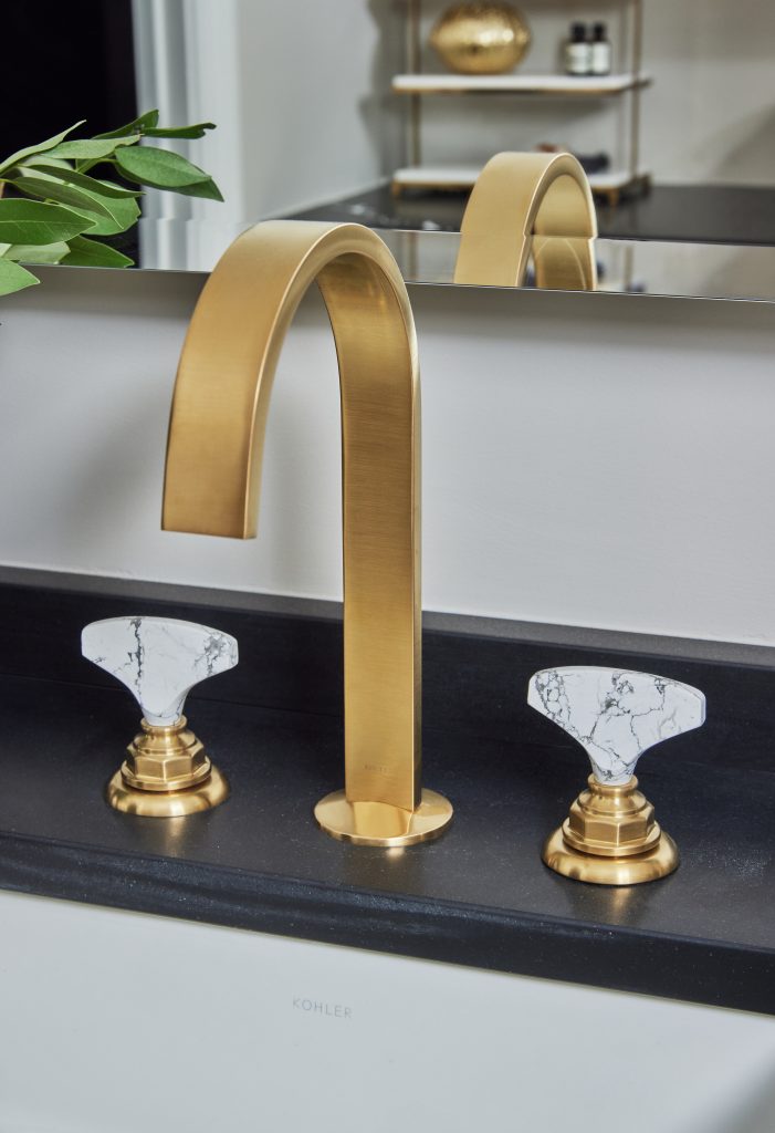
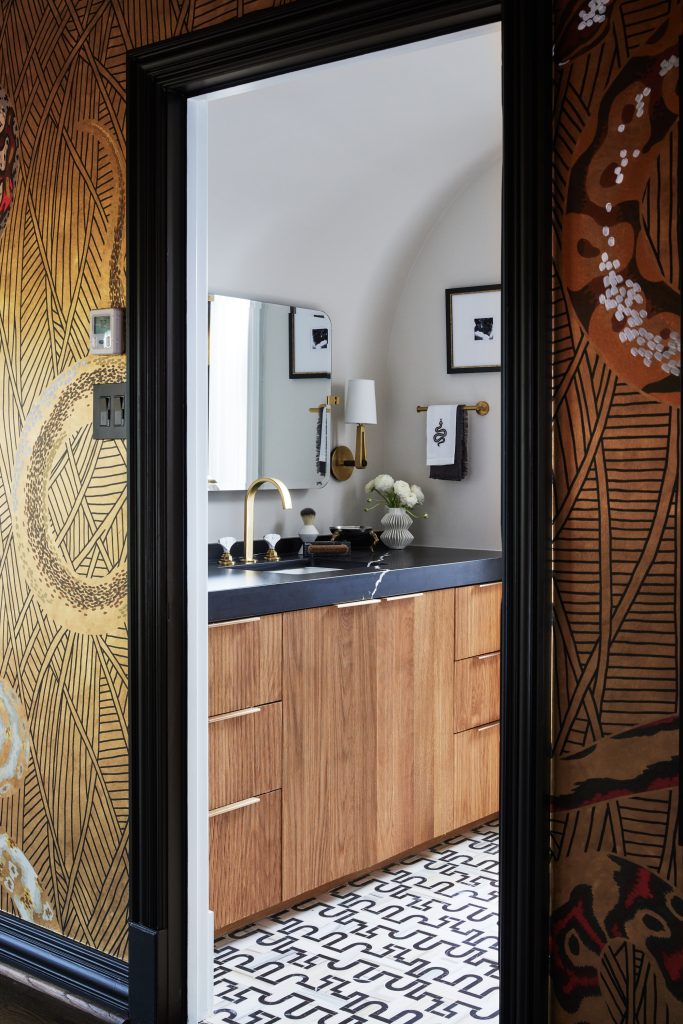
In their Kips Bay Dallas Show House space, Beth Dotolo and Carolina Gentry, co-founders of Pulp Design Studios, were inspired by a modern woman, one who works hard and plays hard. So their loft area was divided into a sophisticated office and super-chic lounge area. The link between the two was originally an awkward space that was more of a hallway. Beth and Carolina wanted it to be an unexpected but practical transition between the two main rooms, so they created an ultra-luxe bathroom for a fashion-forward and glam woman. We asked Beth and Carolina to give us a tour of this incredible space – if you want to view the entire Wise & Wicked loft, just click here.
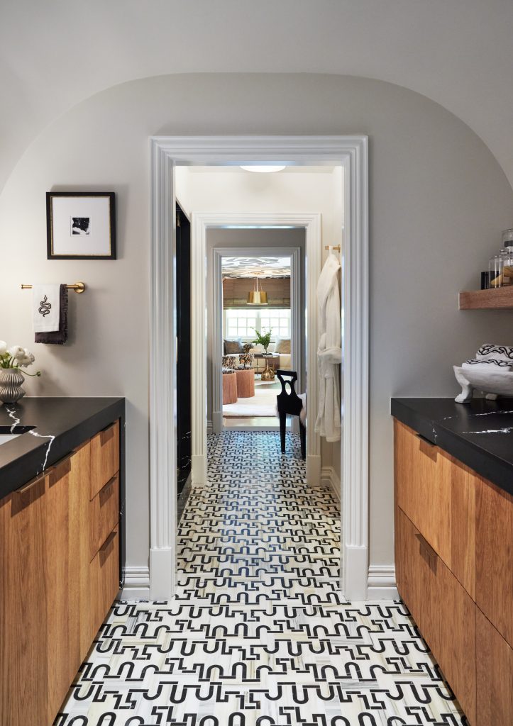
Q: This really is a transition space that offers a long view from the office to the lounge, and vice versa. How did you create a feeling of continuity?
Beth: The woman we had in mind as our muse is sophisticated and edgy at the same time. So we wanted this hall and bath to still stand out and create that feeling of chic glamour. The Ann Sacks tile, which is the Garde pattern from the Liaison collection, is an incredible pattern that definitely makes an unexpected and bold statement.
Carolina: We are really known for adventurous design, and that floor definitely gives this space that feeling of pushing boundaries. This was a tough space to design and we really wanted to make an impact. I also love that the floor is almost like the yellow brick road, in that you want to follow it to see where it leads you!
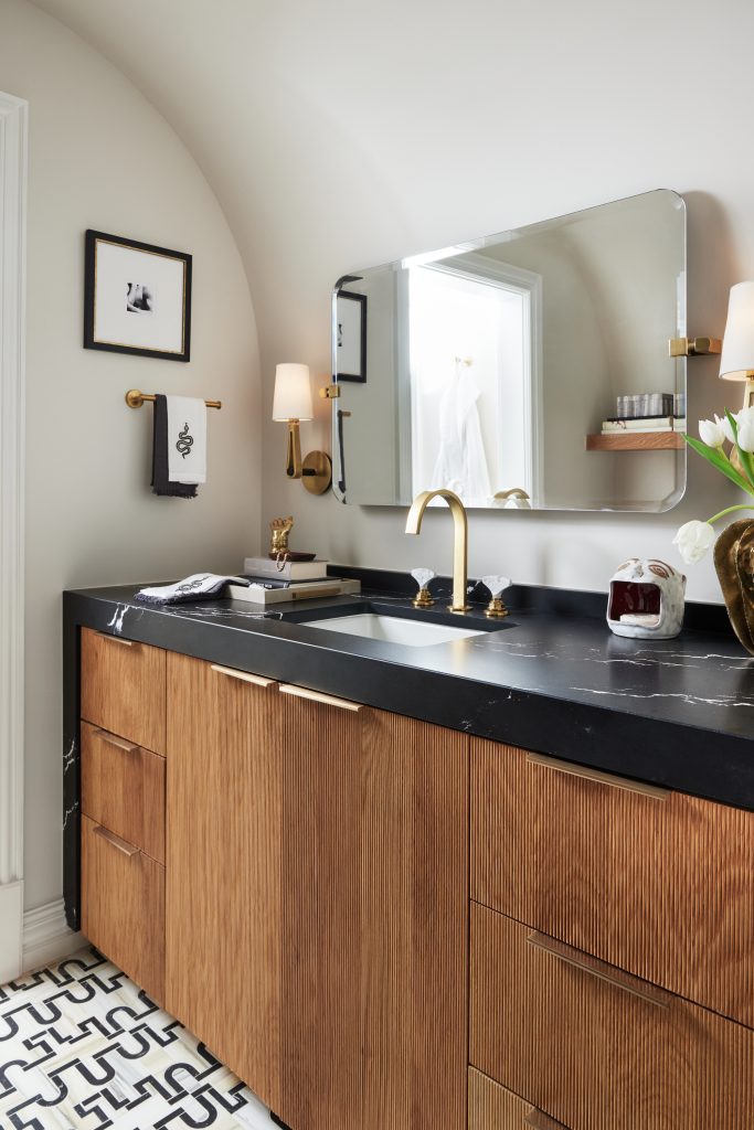
Q: When you first approach the space, it just looks like a hallway, but then there are niches on each side. Which of these areas are your favorites?
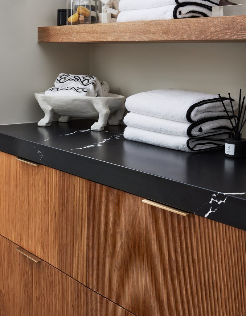
Carolina: I love the sink area because it really captures the entire vibe we were going for – especially with those unique waterfall counters by Cambria. They gorgeously frame the custom reeded drawer and door fronts. We also created a barrel ceiling to continue that theme of adventure and walking into another world.
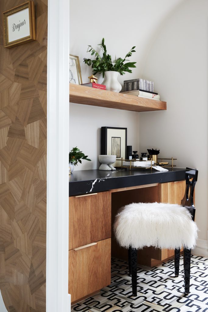
Bath: I also love the vanity at the other end of the hall. The chair has the sophistication of the office space, combined with the daring design you see in the ‘Sinner’s Den.’ I can just see our modern woman sitting there to freshen up before her friends arrive for cocktails!
Q: There also are two very dramatic spaces that take the idea of a bathroom to a whole new level – tell us about those.
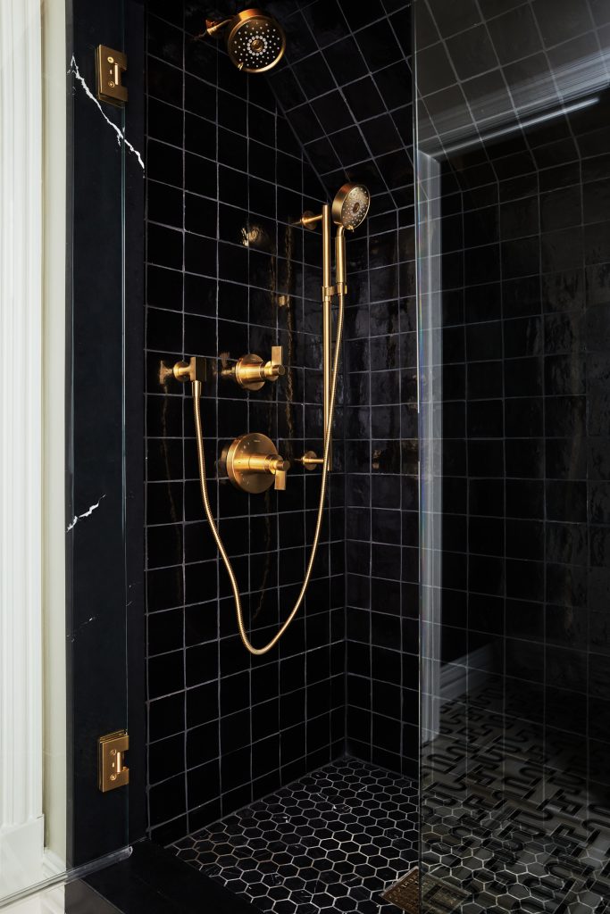
Carolina: The shower is definitely dramatic! The all-black tiles from Ann Sacks are a bold look, especially with the glam brass fixtures. A shower is so utilitarian and is often given a more functional or traditional look. We wanted this to be a wow-worthy space, one that would stop you in your tracks!
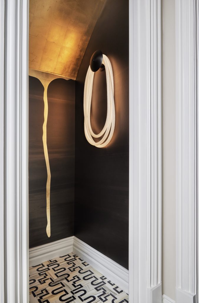
Beth: I would say the same for the water closet. It’s a functional and necessary room, but why does that mean it should be boring? We wanted it to be unexpected and eye-catching, and that wallcovering by Calico hits the mark. The light fixture from Luke Lamp Co. is also completely out-of-the-box, which is exactly what we wanted this entire Wise & Wicked space to be!
The Kips Bay Dallas Show House was an incredible project and it took months of work, so stay tuned for a before-and-after look at how the Pulp team took this space from a boring attic to this amazing loft!
The Pulp team would like to thank vendors who provided stunning products for the Wise & Wicked spaces, including: More Design + Build, Kohler, Visual Comfort c/o Taylors by Jane, Tech Lighting c/o Taylors by Jane, Emissary c/o Taylors by Jane, Calico Wallpaper, Bettinger Studio, Luke Lamp Co., Pat McLaughlin c/o ID Collection, and Glass House. We would also like to thank the sponsors for the showhouse: Leontine Linens; Kohler; Cambria; Ann Sacks; The Shade Store; and Benjamin Moore.
Credits

SECTIONS
Design InsiderEntertaining + Home Living
Health + Beauty
News + Announcements
Pulp At Home
Pulp Design Work
Shopping Guide
The Business of Design
The Pulp Edit
Travel
Videos
GET INSPIRED
SUBSCRIBE TO OUR NEWSLETTER TO
GET AN INSIDER LOOK IN YOUR INBOX


