7/15/19
Pulp at Home: Carolina’s Tips for Tile
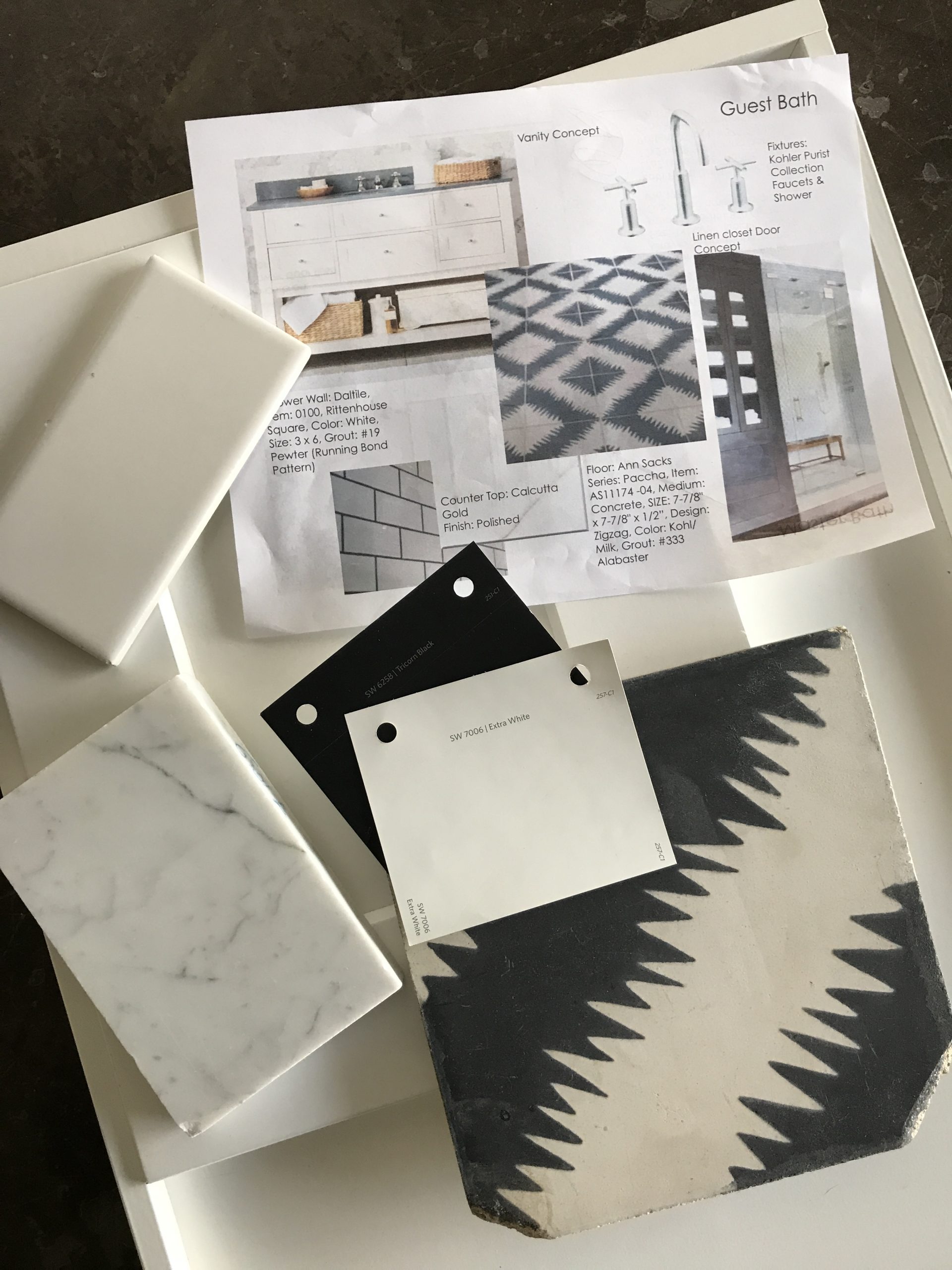
My project is a little different than Beths’s since we gutted the existing house and added square feet, so our stories will be a little different during the design process of our home projects. I won’t go over the paint selections in my home since Beth copied all of my colors for her home and shared them last week. LOL!
What can I say??! We are each very different but we do like the same things. Also, great paint colors work in different spaces, but always be sure to check the light levels in your home when making a selection.
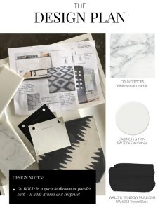
This week, let’s chat about tile! We had the opportunity to add a master bath, kitchen and guest bath all at the same time to my home. Of course I was thinking about the ’50s ranch style of the house and how we could stay within the style in an updated way. Since we were making a big investment in this home we didn’t want anything too overly trendy with something as permanent as tile. (I’d like wait at least a decade before I rip it out and do it again!) We decided to move forward with a neutral palette but have a little fun in the guest bath. Let’s take a look!
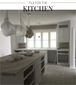
One thing to really consider in a whole-home renovation is budget! When you do a huge renovation you don’t always have the luxury of splurging on every space, so we definitely had to make smart cost-effective choices. We splurged on windows and on an architect (my friend Eddie Maestri at Maestri Studios). We had plans to splurge on a lot of other things, but as building costs add up or end up being more than you think, you start thinking about where you can cut and make smart choices. You’ll see some of those below!
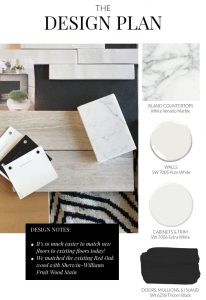
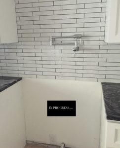
Love this ceramic tile with subtle texture. I wanted a white tile but didn’t want a 3×6 so we opted for a tile that had a subtle detail to it in a long thin shape and contrasted it with a dark grout.
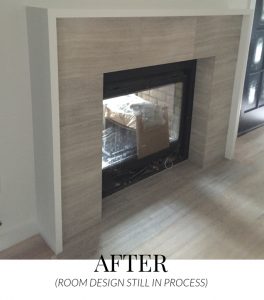
We also had a fireplace in the open-plan kitchen. So I had to consider a tile for the surround – one that would also coordinate with the kitchen!
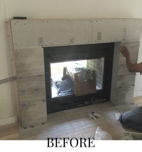
Remember when I mentioned budget?! I had to come up with a cost-effective detail for the fireplace surround and Daltile Chenille White 12 x 24 was a great choice.
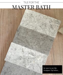
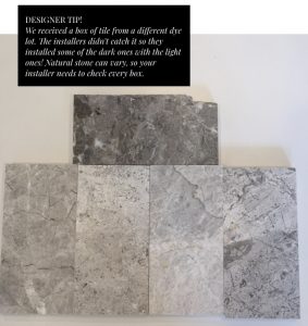
I liked the Idea of using stone on the floor so we went with a warm grey limestone. We didn’t want it to look too cold and sleek. So the thought of a honed stone was appealing to us…something durable that would stand the test of time and add a soft, natural look to the space. BUT – we had one issue! See the Design Tip below!
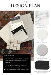
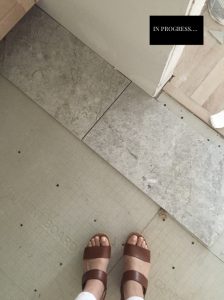
I love this Daltile Arctic Grey Limestone in a honed finish for the floor.
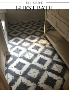
We wanted to add something fun in this space so we jazzed it up with the flooring. Love how this tile has a mod retro vibe!
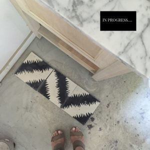
The cement tiles for the floor are Ann Sacks Popham Designs Paccha Zig Zag Tile.
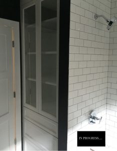
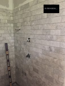
The shower wall tile is Daltile Rittenhouse Square, 0100 White, 3 x 6 Grout: #19 Pewter.
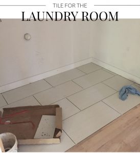
Our laundry room is tiny (that’s another story – originally we were converting part of our existing garage into a mud room/ laundry but the neighborhood conservation didn’t approve it so we converted what was going to be a huge pantry into the laundry room). A designer’s job is never boring – we are daily problem solvers. or as I say “firefighters” because we put out fires every day!
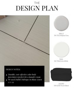
We didn’t want to spend too much money on the finishes in this space so we went for a color body porcelain for durability and cost effectiveness.
I didn’t want to show the complete after shots in every space today…sorry! I mean, I need to have something to talk about down the road! I’ll be sure to show you each space in detail when the time comes.
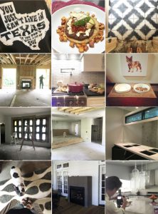
Keep following along and checking out the progress of both our homes! Until next time – here’s another sneak peek tease for you of #TheValenciaProject…
If you have any comments or questions, follow and direct message us over at our instagram accounts at @pulpdesigns!
Carolina’s #PulpAtHome:
Read the posts + @carolinavgentry on instagram + #TheValenciaProject on instagram
Beth’s #PulpAtHome:
Read the posts + @bethdotolo on instagram + #FigTreeRambler on instagram
Credits

SECTIONS
Design InsiderEntertaining + Home Living
Health + Beauty
News + Announcements
Pulp At Home
Pulp Design Work
Shopping Guide
The Business of Design
The Pulp Edit
Travel
Videos
GET INSPIRED
SUBSCRIBE TO OUR NEWSLETTER TO
GET AN INSIDER LOOK IN YOUR INBOX


