The Pulp Edit: August 2017
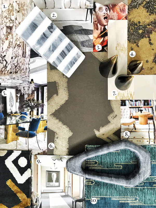
We are loving so many things this August, it was hard to narrow down our favorites to just ten. These ten interior design trends have us jumping for joy at all to nods to design with a flair for the unexpected.
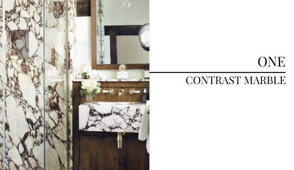
The high contrast of this marble selection is dramatic, bold and all around glamourous. Using the same material on multiple surfaces gives the room an audacious yet cohesive feel. A simply stunning bath photographed by Simon Upton.
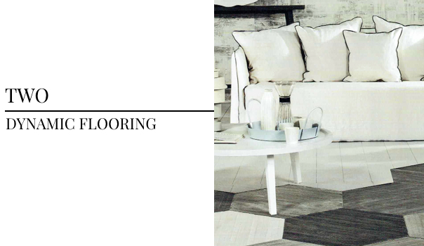
This design for Gervasoni’s recent campaign has us eyeing much more than the sofa. The dynamic flooring is a definite center of interest and makes this minimalistic and coastal room feel hip and modern.
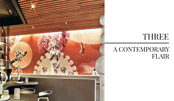
Classic pieces serve as great inspiration for contemporary creativity. The integration of Boticelli’s Venus on this vibrant wall piece is sure to be a conversation starter in this hip German restaurant. Photographed by Eric Laignal in Interior Design’s July 2017 issue, we always love seeing a good unexpected twist.
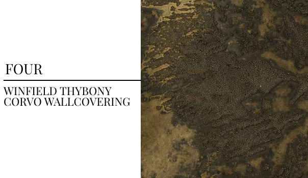
The texture on this wall covering by Winfield Thybony is unprecedented. The beaded pattern and deep warm tones would give a space an instantly elevated feel by adding texture and interest. The moment we saw (and felt!) this wallcovering, we were dreaming up ways we could use it in projects.
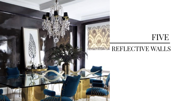
Our Seattle team recently visited the Yayoi Kusama Infinity Mirror exhibit, which has all our eyes on reflective walls. We love a moody, dark wall– the lacquer finish in this opulent dining room is nothing if not daring. We’re all about this trend, photographed by Eric Piasecki.
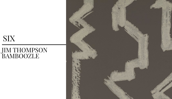
We love giving our projects an artisan flair wherever possible. This wallcovering by Jim Thompson was designed to resemble bamboo, but looks painted giving it a personal, artistic touch. The colors and uncomplicated sophistication of the design make it a beautiful selection for a number of design schemes.
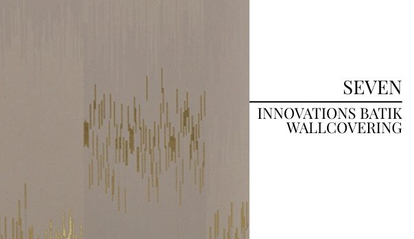
A little gold and flair in a wallcovering? Yes, please. The Batik line by Innovations is the definition of a chic-yet-hip must-have. We love the little touches of gold within the soft-yet-statement color scheme.
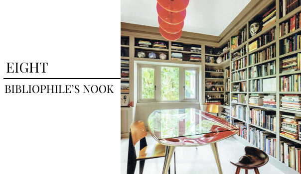
We love designing rooms that you won’t find in every home. We’ve shared our guides to wellness and listening rooms, but we are loving this home library that would be any book-lover’s favorite retreat.
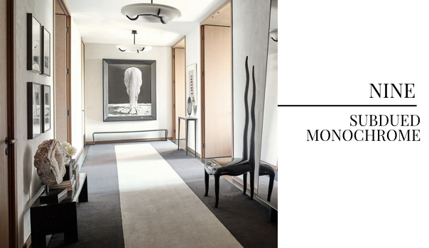
Alexander Wang’s NYC apartment is a neutral dream. Featured in the September 2017 issue of Architectural Digest and photographed by Anthony Cotsifas, the prolific fashion designers home is layered with understated neutrals and funky furnishings. We love this subdued color concept brought to life by brilliant art selections and whimsical furniture.
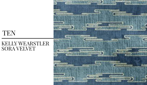
You cannot go wrong with a Kelly Wearstler fabric. Our entire design team has been loving this Sora Velvet design for its luxurious feel and cool blues. We think this would make for some pretty amazing pieces of custom furniture…
We draw inspiration everywhere and love seeing such fearless design. Which trend are you loving this month?
For professional interior design services, contact Pulp Design Studios℠.
Credits
SECTIONS
Design InsiderEntertaining + Home Living
Health + Beauty
News + Announcements
Pulp At Home
Pulp Design Work
Shopping Guide
The Business of Design
The Pulp Edit
Travel
Videos
GET INSPIRED
SUBSCRIBE TO OUR NEWSLETTER TO
GET AN INSIDER LOOK IN YOUR INBOX


