Monthly Archives: March 2017
Home Tour: Eclectic Abode
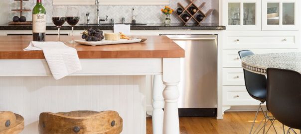
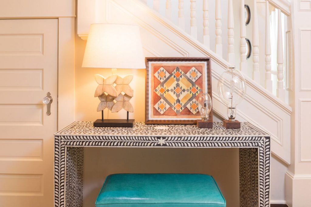
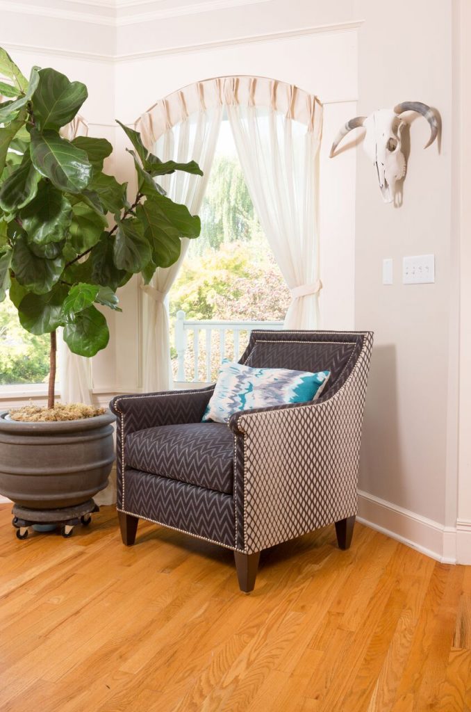
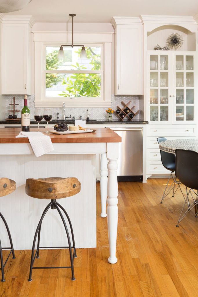
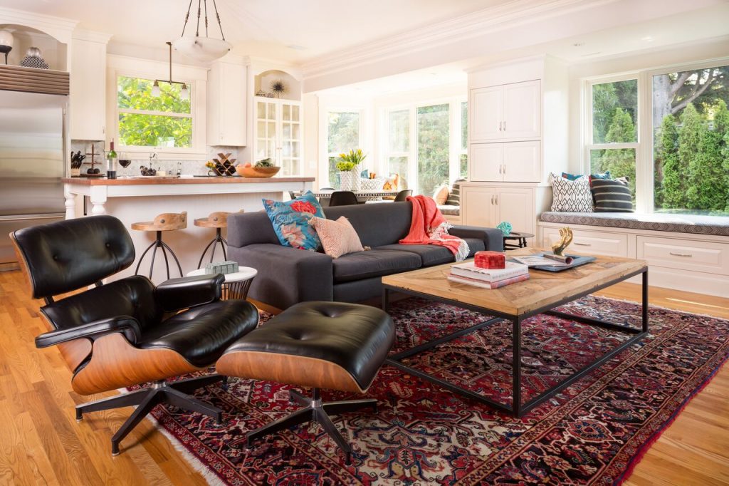
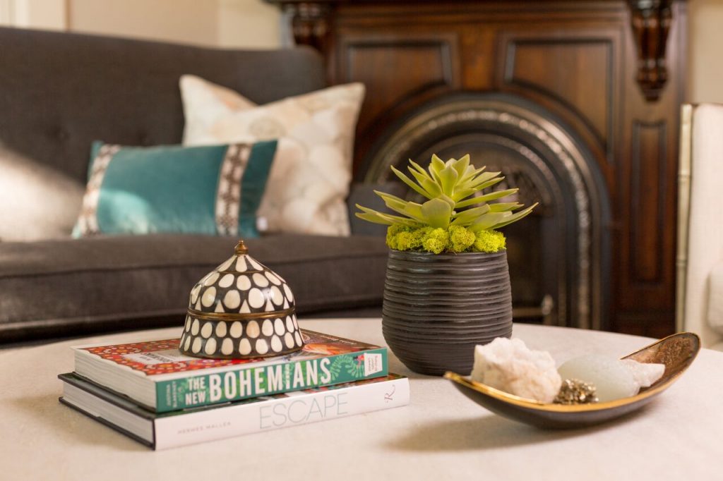
Traditional with an eclectic twist, this historic Queen Anne home is highly personalized without losing its roots. Full of pops of teal and red amidst a background of textured neutrals, this home is a careful balance of warm grays and blacks set against bright whites, color and natural woods. Designed with kids in mind, this home is both beautiful and durable — a highly curated space ready to stand the test of time.
Take a tour of the space while learning more about the client and their experiences with Pulp…
Q. WHO IS OUR CLIENT AND HOW DID THEY FIND US?
A pair of busy medical professionals with two young kids, these clients lived next door to our clients from the Fearless Style home. When talking to their neighbors about their experience with Pulp, these clients realized that we would be a great fit for them and their design needs.
“We finally found our forever home, and I just wanted to finish it and make it beautiful.” – Dominique M., Client
Q. WHAT WAS THE CLIENT’S PROJECT SCOPE AND WHY DID THEY SEEK OUT A DESIGNER RATHER THAN ATTEMPTING IT ON THEIR OWN?
After trying to design the home on their own, these clients realized that their home never felt as finished as they wanted it to be. While they had never before envisioned themselves using an interior designer, they realized that Pulp could make a huge impact on their home.
Initially, these clients brought Pulp on to do exclusively furnishings — after chatting with Pulp’s designers, they realized that adding a cosmetic refresh could dramatically increase their home value. Along with doing doing furnishings, Pulp repainted the kitchen and refinished the fireplace.
“I wanted somebody that actually had a good eye for things and also knew more about what was out there to pull from.” – Dominique M., Client
Q. WHAT WAS THE BIGGEST PROJECT CHALLENGE?
To keep the integrity of the home’s Victorian roots, our clients wanted to keep the original lighting. Designing around the existing lighting was a challenging process, since we wanted to update the home to feel more fresh and inviting while also involving this vintage lighting.
“I remember being really surprised that after we had talked for a bit, you came back and everything being like, ‘That is exactly what I want.'” – Dominique M., Client
Q. WHAT WAS THE MOST DRAMATIC TRANSFORMATION?
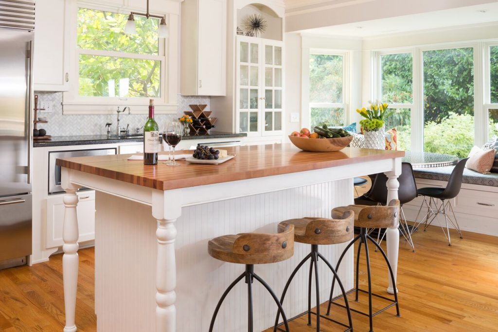
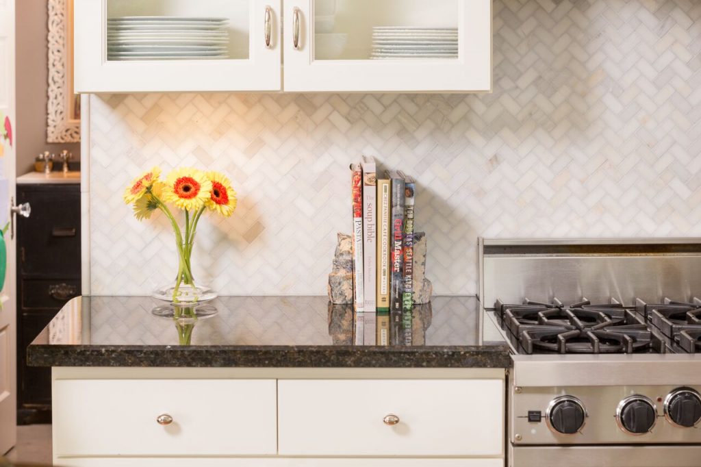
We gave the kitchen a cosmetic refresh, making the room feel bright and airy from just a coat of paint and a few accessory and furnishing changes.
The clients originally weren’t interested in updating the kitchen at all — our designers slipped a slide into their presentation featuring some of the before and after images from refreshed kitchens in previous projects and the clients realized how much of an impact painting the cabinets can make. Now, the room feels so much larger, more expensive, and fresh, while also dramatically improving the home’s value.
“It’s bright and it’s light and it still feels homey.” – Dominique M., Client
Q. CAROLINA, WHAT IS YOUR FAVORITE PART OF THIS SPACE?
I absolutely love the change in the kitchen. It’s incredible how little needed to be done to create such a dramatic difference in the feel of the room. Visually, painting the kitchen and adding some finishing touches makes the biggest difference in the entire Great Room area.
Q. BETH, WHAT IS YOUR FAVORITE PART OF THIS SPACE?
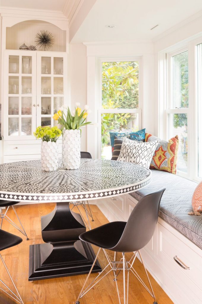
Refreshing the Breakfast Nook in the kitchen area made an incredible difference to to the home and to the usability of the space. We reupholstered the cushions in the window seat to make them durable and kid-friendly, as well as adding in wipeable pillows to add to the comfort of the space. Now, the family uses the space not only for quick meals, but also for spending time together. I’m so excited it made such a difference!
See the entire project for yourself, complete with a brand new Before + After gallery and client testimonial:
Don’t forget to hear about the project from the clients themselves through Pulp TV…
Happy exploring!
10 Years of Pulp: Then and Now
Happy 10 year anniversary, Pulp! Beth + Carolina talk about 2007 and now…

Pulp TV: WATCH 10 Years of Pulp, Then and Now
Happy 10-year anniversary, Pulp! It’s been 10 years since Beth and Carolina started their humble business, which grew into what is now a nationally recognized design company published in Vanity Fair and Architectural Digest.
To celebrate 10 years, Beth and Carolina reflect on then and now… Let’s take a trip back to 2007, when Pulp got its start.
WATCH NOW: 10 Years of Pulp, Then and Now
See all of our videos on Pulp TV and look back at 10 years of Pulp!
For the Perfect Green Home
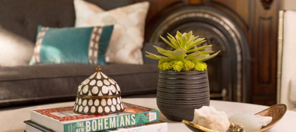
We’ve fallen head-over-heels in love with greens this season… And no, it has nothing to do with impending St. Patrick’s Day — this hue is a stunner year-round. Our interior design team chose some of their favorite pieces to infuse a little bit of green into the home.
BETH’S PICK
Co-Founder + Principal Interior Designer
“Chic metallic silvers are catching my eye now more than ever. Paired with a cushioned green velvet, this round stool is the perfect pick for a well-curated seating area.”
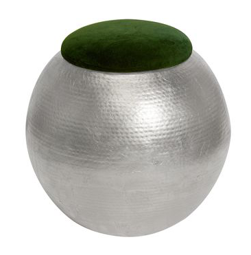
Tabouret Round Stool (Contact Pulp to purchase)
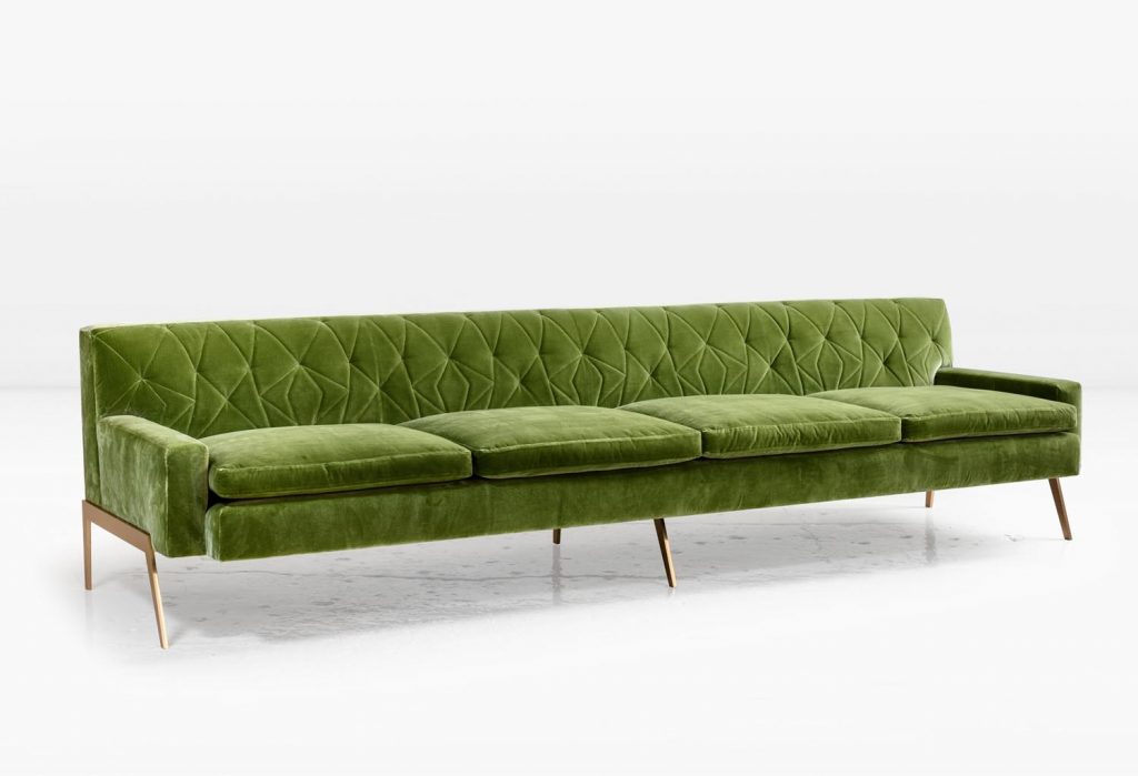
CAROLINA’S PICK
Co-Founder + Principal Interior Designer
“The geometric tufting and sculptural legs of this lengthy sofa are completely drool-worthy. Its long shape ensures that all of your guests can get a spot, but its shape and color make it an artful addition to the room.”
TRACY’S PICK
Senior Interior Designer + Purchasing Manager
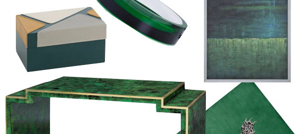
“This multi-toned emerald paired with metal inlay make this coffee table absolutely to die for. Its sculptural feel ensures that it will be the focal point of the room while perfectly encompassing its owners’ personal style.”
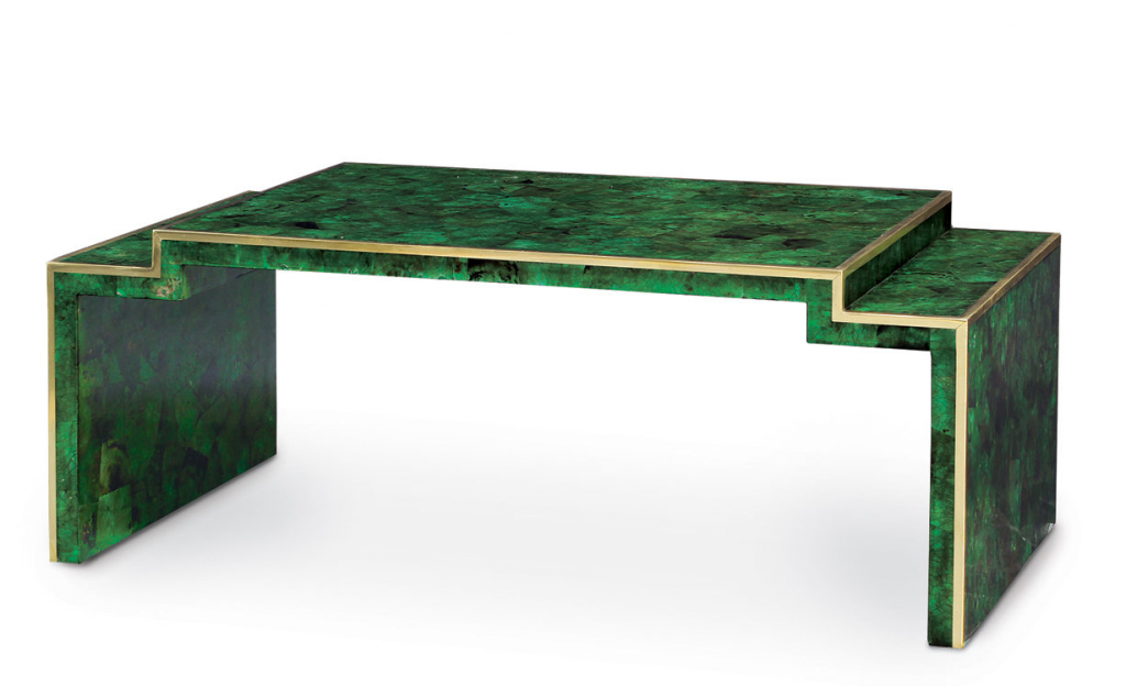
Savona Emerald Coffee Table by Palecek (Contact Pulp to purchase)
TARA’S PICK
Junior Interior Designer
“The acrylic collection from DVF is one of our favorites for sophisticated accessories. This kelly green bowl is an instant crowd-pleaser at dinner parties.”
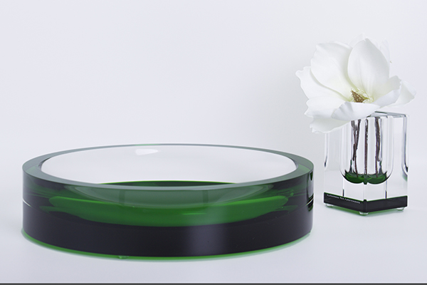
AVF Acrylic Infinity Bowl in Emerald
SHANNON’S PICK
Junior Interior Designer
“This rug hits both my love of bright, solid colors and my love for patterns, all in one. It’s a more subtle way to add some pizazz without jumping head-first into an all-pattern rug. Plus, who doesn’t love this gorgeous hue?”
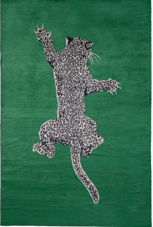
Climbing Leopard Rug by Diane von Furstenberg for The Rug Company
EMILY’S PICK
Marketing + Communication Coordinator
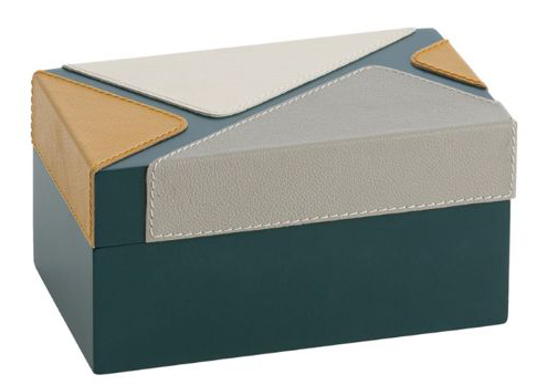
“This small, fashion-forward box is a subtle nod to color-blocking runways. I’m obsessed with this blue-toned green in combination with the mustard-hued tan and grays… It’s such a fun way to add pops of color without feeling overwhelmed by green.”
EM’S PICK
Design Intern
“Imagine how gorgeous this piece of green art would be in an all-neutral room… The perfect pop of color. If there’s one thing I’ve learned at Pulp, it’s that you can’t forget the art in an interior design!”
What’s your favorite way to incorporate bright colors into design?
Geode + Geometric
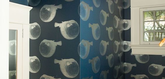
Get the Look: 3 Jewel-Box Powder Baths
This March, we’re focusing on individuality and customization… One of our favorite spaces to design for our interior design clients are powder baths. It’s an easy way to pack a punch of personality into your home without feeling like you’re overwhelming the space.
Take a look at how to get some of the powder baths we’ve decided for our clients. All three are jewel-tone baths with a twist…
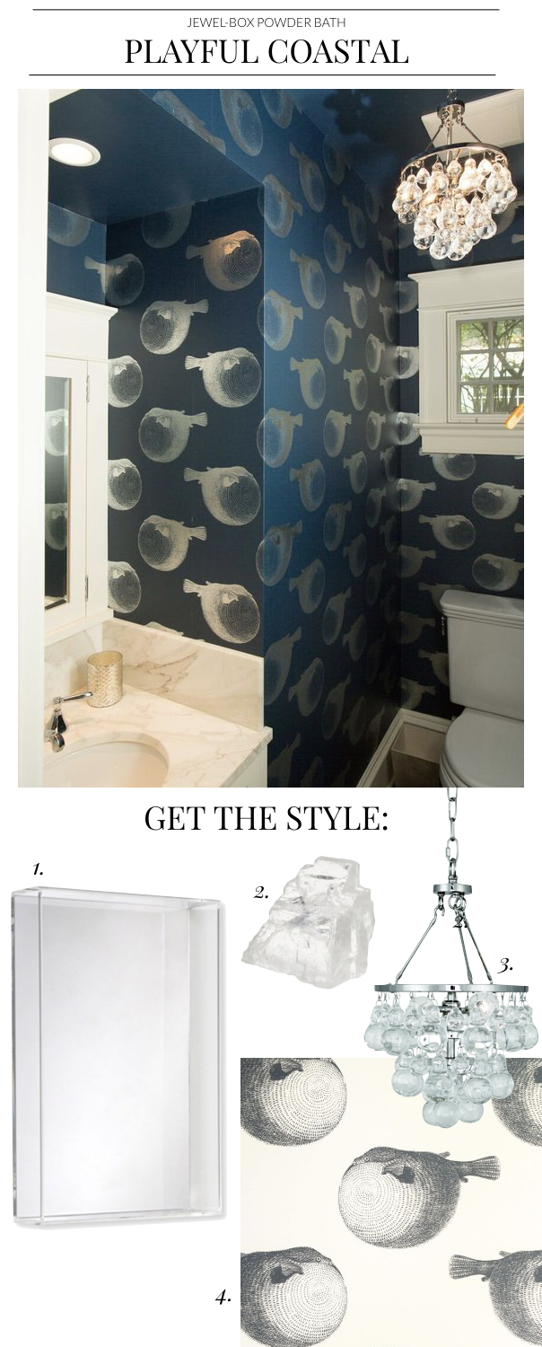
1. Skylar Rectangular Mirror | 2. Crystal Specimen | 3. Robert Abbey Two-Light Pendant | 4. Abnormals Anonymous Mr. Blow Wall Covering
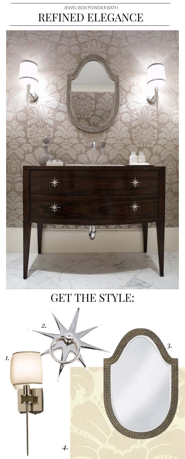
1. Topanga Ada Sconce | 2. Pulp Home Starburst Pull in Nickel | 3. Lancelot Mirror | 4. Edo Wall Covering
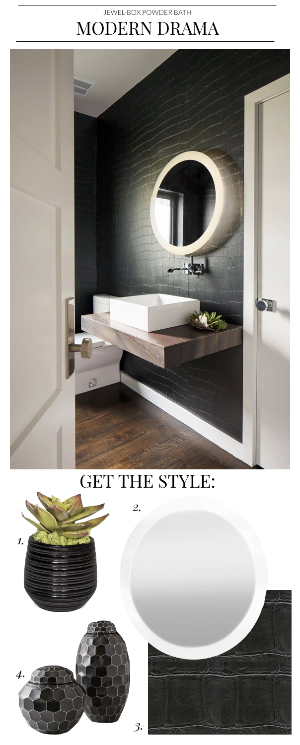
1. Succulent and Moss in Ribbed Ceramic Container | 2. Claris Back-Lit Mirror | 3. Elitis Big Croco Wall Covering | 4. Facets Black-Covered Jar
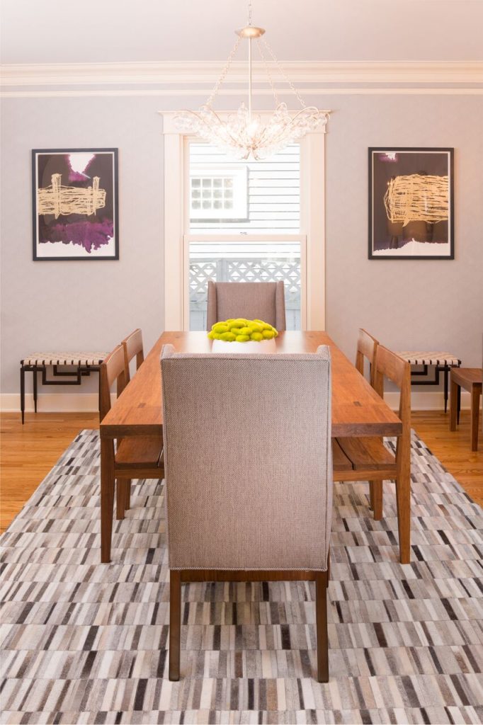
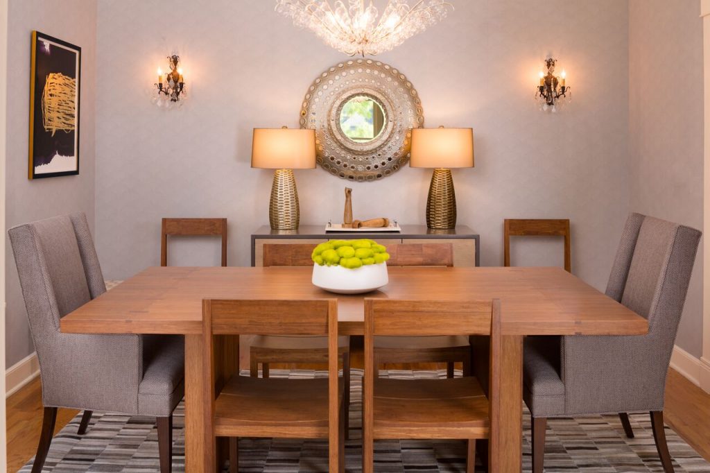
Pulp Project Tour: Queen Anne Victorian
Meet the clients behind this Victorian home with an eclectic, personalized twist in Seattle’s Upper Queen Anne neighborhood.
Pulp TV: WATCH Eclectic Abode Home Tour
We’re thrilled to be launching a new project, this eclectic Victorian home in Seattle’s Upper Queen Anne neighborhood! This residence is a highly personalized home for two busy medical professionals with two young kids. Filled with textured neutrals and pops of teals and reds, this home perfectly reflects the family while still being highly durable and cleanable.
WATCH NOW: Queen Anne Victorian Home Tour
See all of our videos on Pulp TV!
The Pulp Edit: March 2017
March 2017 is all about customization and individualization on Pulp Editorial. We rounded up our favorite tricks and trends for making a space feel custom and personalized on this month’s Pulp Edit…
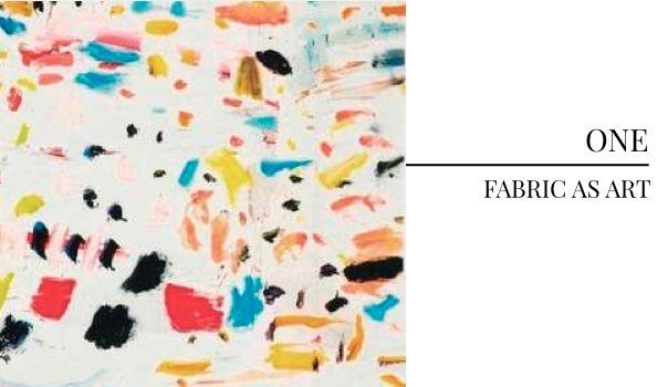
This drool-worthy Pierre Frey linen is bound to be a statement piece in any room. To make a room feel even more customized, don’t feel afraid to step out of the boundaries and swap out neutrals for bold fabrics like this, creating a feeling of customized art in the room. This fabric is even slated to be in one of our upcoming clients’ designs.
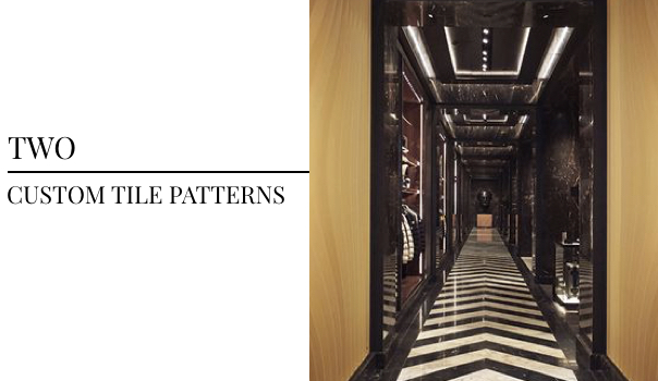
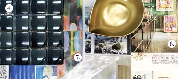
This installation from Bardula Studio in Moncler’s new Madison Avenue storefront — as featured in Architectural Digest — makes the room feel like a standalone piece of art. Installing custom tile patterns in your home immediately makes the room feel incredibly individualized. Why not commission tiles to perfectly reflect your design sensibilities?
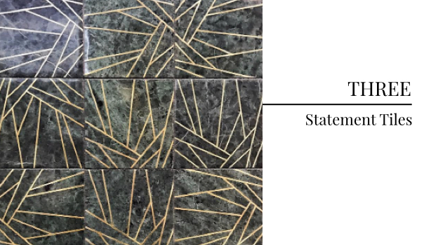
Since seeing these gorgeous Kelly Wearstler by ANN Sacks tiles at KBIS this year, we’ve been obsessing over the idea of putting these little beauties into one of our clients’ homes. These statement tiles with metal inlay would be a perfect match for one of our interior design clients with a big, bold design personality… Finding a statement tile that matches your aesthetic is one of our favorite ways to make a home feel more individualistic.
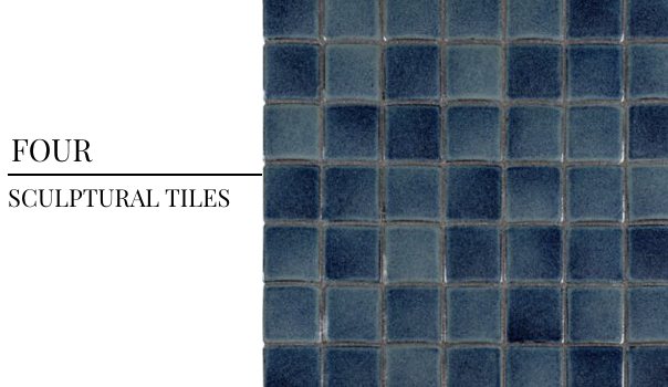
Don’t forget about how important texture and shape is to a home. As much as we love bold colors and patterns, texture and shape can sometimes speak even louder. These sculptural tiles from ANN Sacks have an amazing convex exterior that make them feel art-worthy in their own right. Want a customized feel without feeling like your home is overbearing? Sculptural tiles might be the answer.
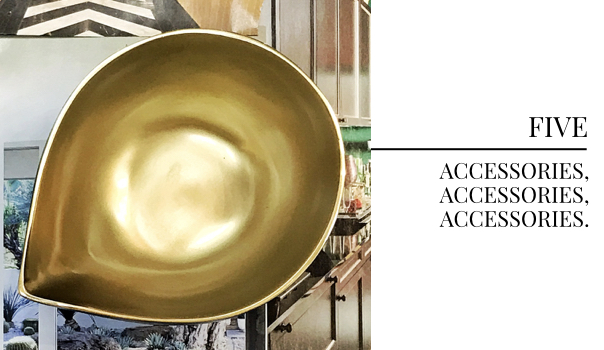
We’ve said it once (or maybe twice, or maybe one hundred times), but we’ll say it again because this month is all about customization… A design just doesn’t feel complete without the final 15 percent — ACCESSORIES. There’s no quicker way to make a design feel more personal than by adding home decor accessories that speak to your personality and individual aesthetic.
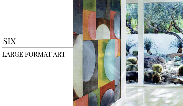
There’s no bigger way to make a statement than by going big: literally. Large-format art takes up whole-wall spaces or wraps around a room, filling a room with its personality. This piece by Charles Arnoldi is in a home designed for business executive Paul Boschetto by decorator Sheldon Harte and featured in Elle Decor. Nothing speaks more to a client’s personality than their taste in art — why not go big, bold and intrinsically individualistic?
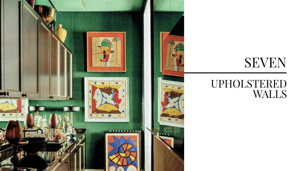
This personable kitchen is in the home of Spanish interior designer Manolo March and features floor-to-ceiling velvet-upholstered walls — swoon. Nothing feels more swanky or custom than upholstered walls. If you’re as in love with this trend as we are, don’t be afraid to pull the trigger and make your home feel maximum-level personal. We spotted this design in the pages of Elle Decor.
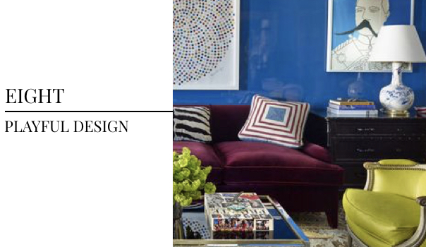
This design by Nick Olsen, featured in the pages of House Beautiful, breaks just about all of the “rules” of design. But we’re in love with rule-breakers here at Pulp… We encourage everyone not to shy away from picking colors outside of the same color family or items from a variety of design eras. This curated design has us falling in love with its bold, personable vibe. We can absolutely imagine who lives in this space, and we’re sure that the close friends of whomever lives here agree that it matches them perfectly.
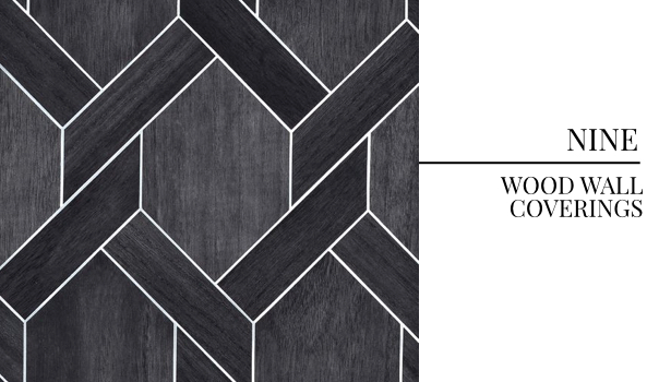
There’s nothing more compelling than wall coverings in fresh materials, like this hand-cut wall covering from Phillip Jeffries. These beautifully cut natural wood pieces overlay a silver metallic background, a welcome take on the storied wood wall trend of the ’70s.
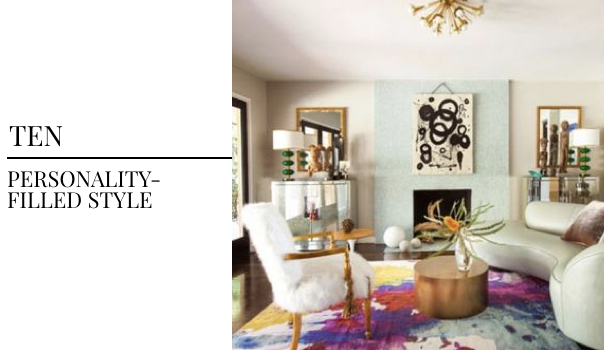
We’re obsessed with the big, bold personality that shines through this space — everything from the lighting fixture to the art and watercolor-print rug is perfectly on point. Ron Woodson designed this home featured in California Home + Design — after speaking on a Modernism Week panel with both Ron Woodson and his design partner Jaime Rummerfield, we fell in love with their California aesthetic and the huge personality in each of their spaces.
Keep an eye on Pulp Editorial as we talk all month about customization and individualization, and don’t forget to check out all of the Pulp Edits we’ve published previously.