6 Tips for Layering Art
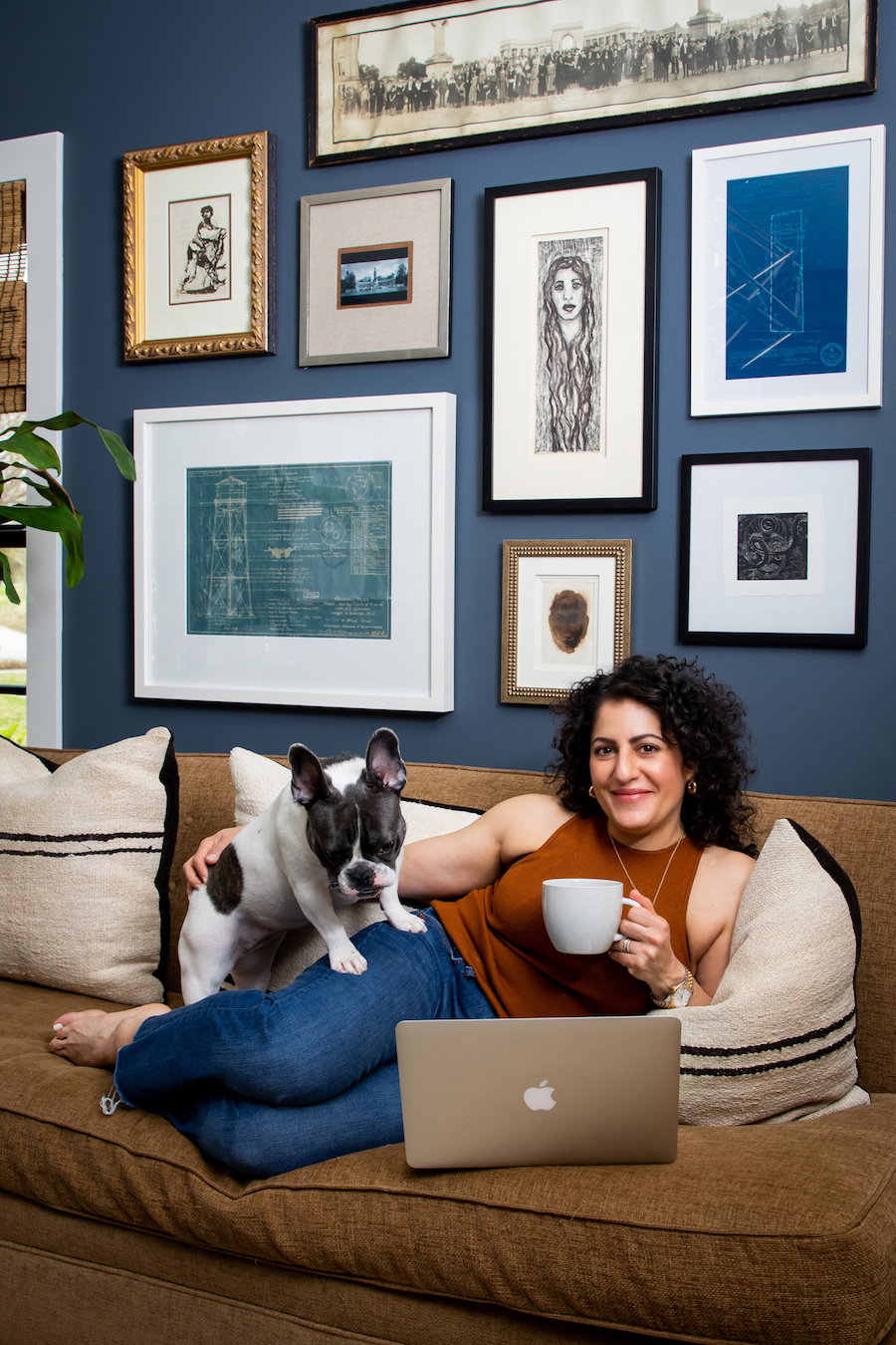
We’ve talked a lot on this blog about the importance of art in home decor, including how to select the right pieces for your home. But once you have that art in your house, it can be difficult to know how to display it. The Pulp team loves to layer art in the interiors we design, so we have 6 expert tips to help you showcase your favorite pieces. And we’re heading into co-founder Carolina Gentry’s home to show you exactly how it’s done!
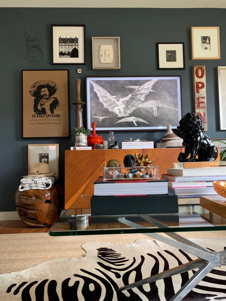
1. Mix Your Media
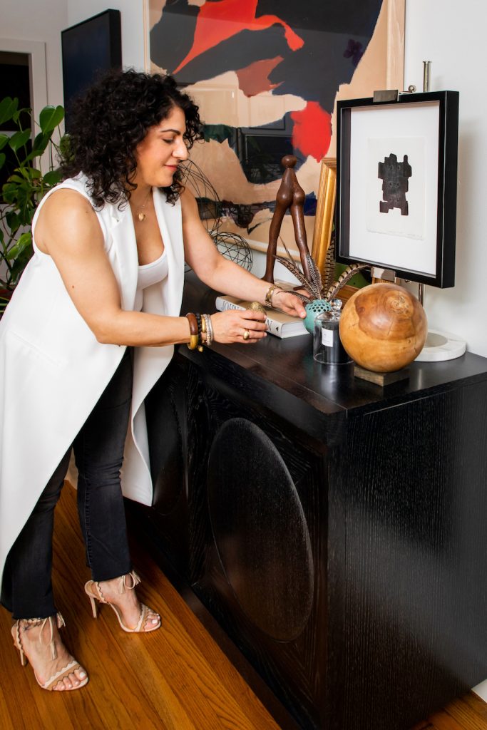
In your displays of art, be sure to mix things up. Use sculpture with drawings, found objects with paintings, or pottery with photography. It makes for a more textural and unique showcase – one with a lot of personality! You can see above how Carolina makes a statement all her own with a unique combination of art. It tells a story of who she is and what she loves!
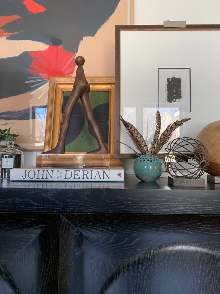
2. Consider Scale
Scale is something we talk about for every aspect of interior design, but it’s critically important when choosing and displaying art. In the gorgeously layered vignette that Carolina created above, you can see that there is an oversized framed piece, then a medium one, and finally a smaller one. Then a tall sculpture and a tiny piece of pottery. It gives the eye a focal point, but allows it to travel to take it all in. Vary the scale of what you layer together and you’ll always succeed.
3. Balance and Symmetry
Two more important concepts in design are balance and symmetry. You want a vignette to be harmonious. Put too many things on one side and it won’t have that polished look you’re going for. Too many things layered in the center and not enough left or right, and the symmetry will be completely off. So, just as Carolina is doing above, you’ll need to move things around and then step back to look at the grouping as a whole. You’ll feel it when the balance is on point!
4. In the Frame
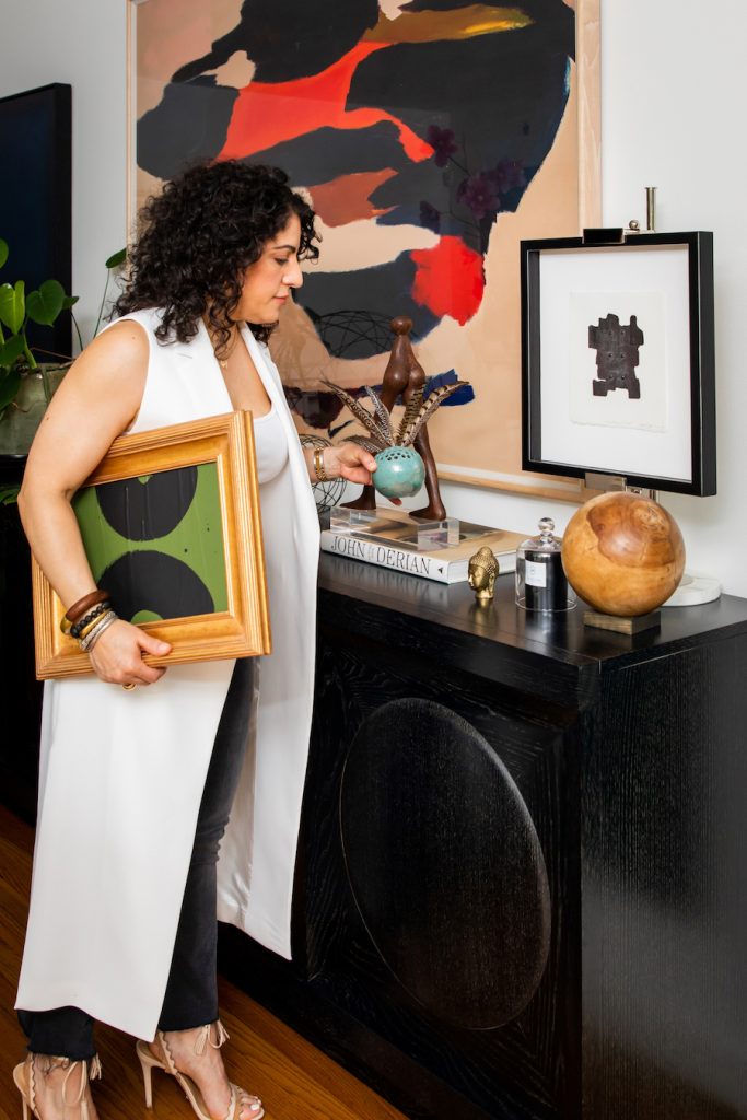
Framing is KEY to getting a layered look right, and there are 2 ways to think about your frames. First, you could go with a wall or display where every piece is in a similar frame, like all black. Or, for more visual interest and an eclectic look, you can mix things up. If you go or the mix, think about varying the thickness and design of the frame, too! So you can use a thicker gold frame, like the one Carolina is carrying, and pair it with a thinner black frame like the one on the credenza.
5. Lean Into It
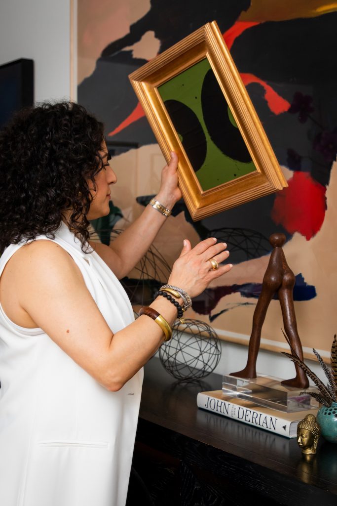
One common mistake that people make is to insist on hanging everything that is in a frame. It’s impossible to layer art that way! We like to lean some pieces, especially on mantels and table surfaces, as you can Carolina doing above. That creates the depth and interest that makes all the difference!
6. Art in Every Room
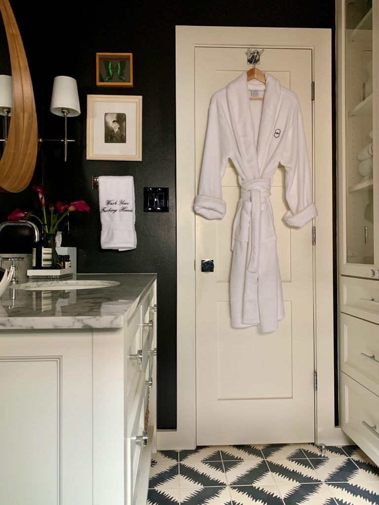
This is a super-important tip: You can and SHOULD use art in every single room. Yes, even the bathroom and the kitchen. These are great rooms for showcasing smaller framed pieces, photography, or fun found objects. We once hung a faux manhole cover in a client’s bathroom that had Sewer stamped across it. It was witty and our clients loved it! So think out of the box when selecting art for these rooms.
The Pulp team is expert at curating and displaying art. If you need help, give us a call!
Credits

SECTIONS
Design InsiderEntertaining + Home Living
Health + Beauty
News + Announcements
Pulp At Home
Pulp Design Work
Shopping Guide
The Business of Design
The Pulp Edit
Travel
Videos
GET INSPIRED
SUBSCRIBE TO OUR NEWSLETTER TO
GET AN INSIDER LOOK IN YOUR INBOX


