A Tour of Carolina Gentry’s Dallas Home
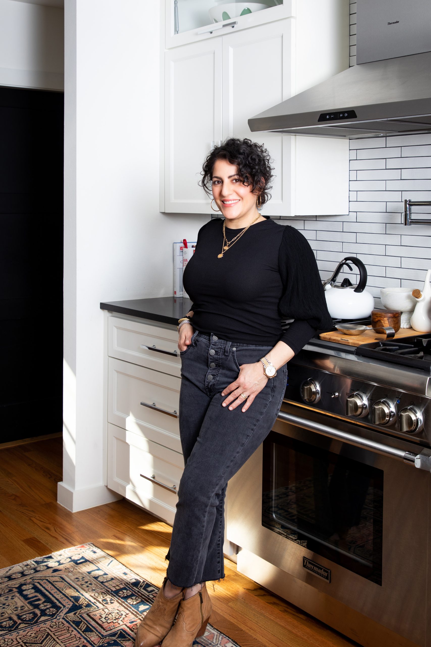
One of the most popular features in any design magazine is when an interior designer showcases a tour of their own home. People – our clients included – love to see what’s behind the door at a designers’ house. It’s an inside peek at how the professionals live! So we’ve asked Pulp co-founder Carolina Gentry to take us on a tour of her gorgeous Dallas home, along with some of her best design tips.
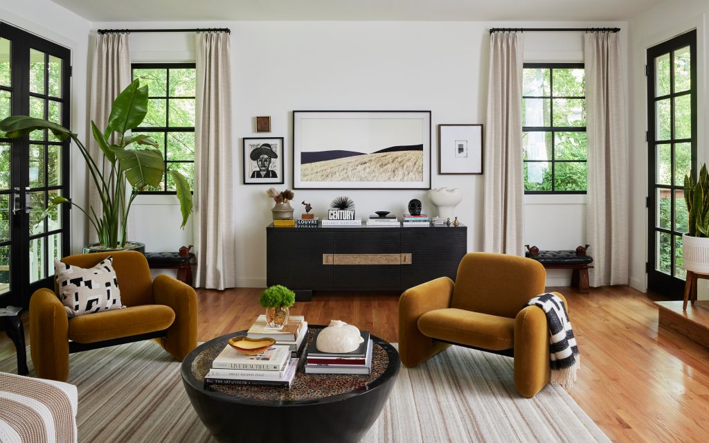
The Living Room
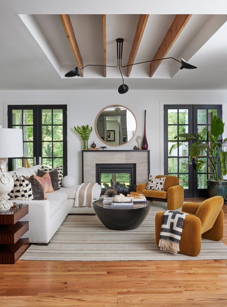
“What I love most about our living room is the feeling of an indoor/outdoor space,” Carolina says. “This house had been in my husband’s family for decades. It was originally built in 1953 by his grandparents and it’s where his mother grew up. It took us nearly three years to design plans, obtain permits, wade through conservation approvals, and eventually execute our own vision for the space. But now this is definitely our dream home!” Incredible detail: The indoor/outdoor fireplace that can be accessed from the living room or the porch. The surround was created with Daltile.
The Dining Room
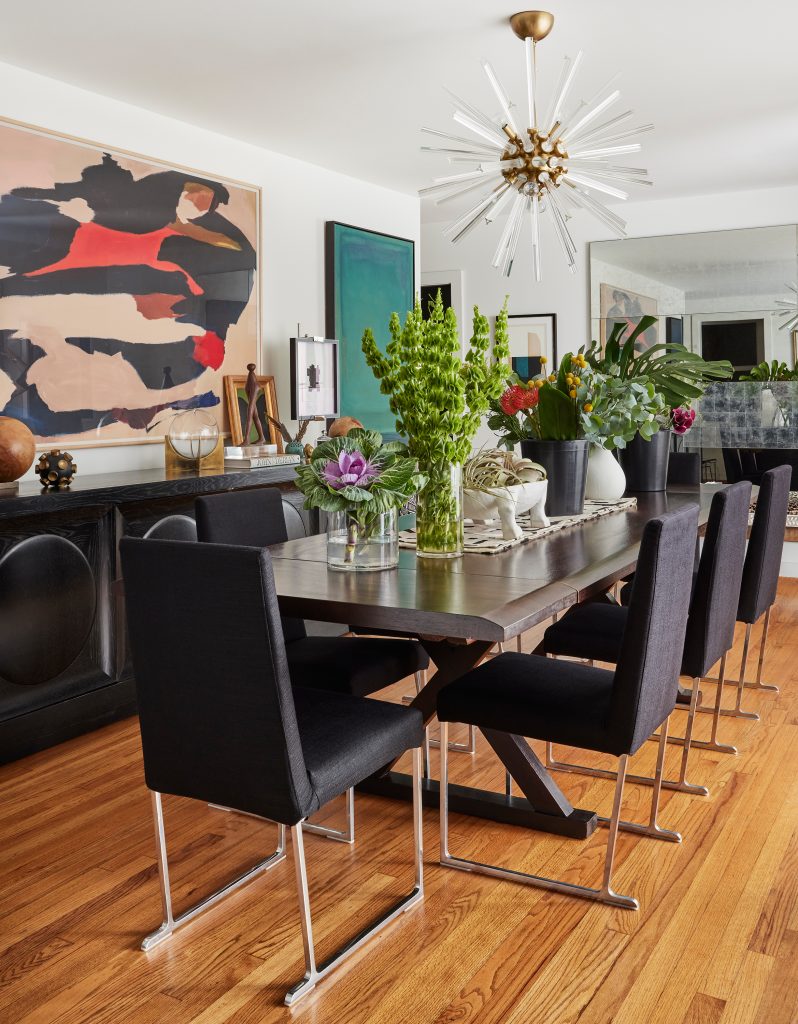
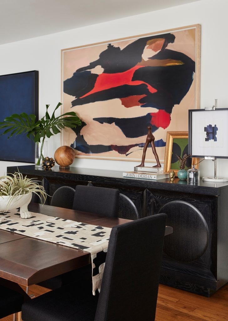
“While we aren’t having a lot of people over right now, this room is perfect for celebrations and dinners with friends and family,” Carolina says. “I added a mirror at one end from Julian Chichester to create a feeling of space, and it also helps to bounce the light around from the windows or that lovely Arteriors chandelier. One of my favorite pieces in the room is the Century sideboard – you can’t have too much storage in a dining room!” Incredible detail: The layered approach to art in the room – a Pulp signature look.
The Kitchen
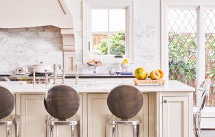
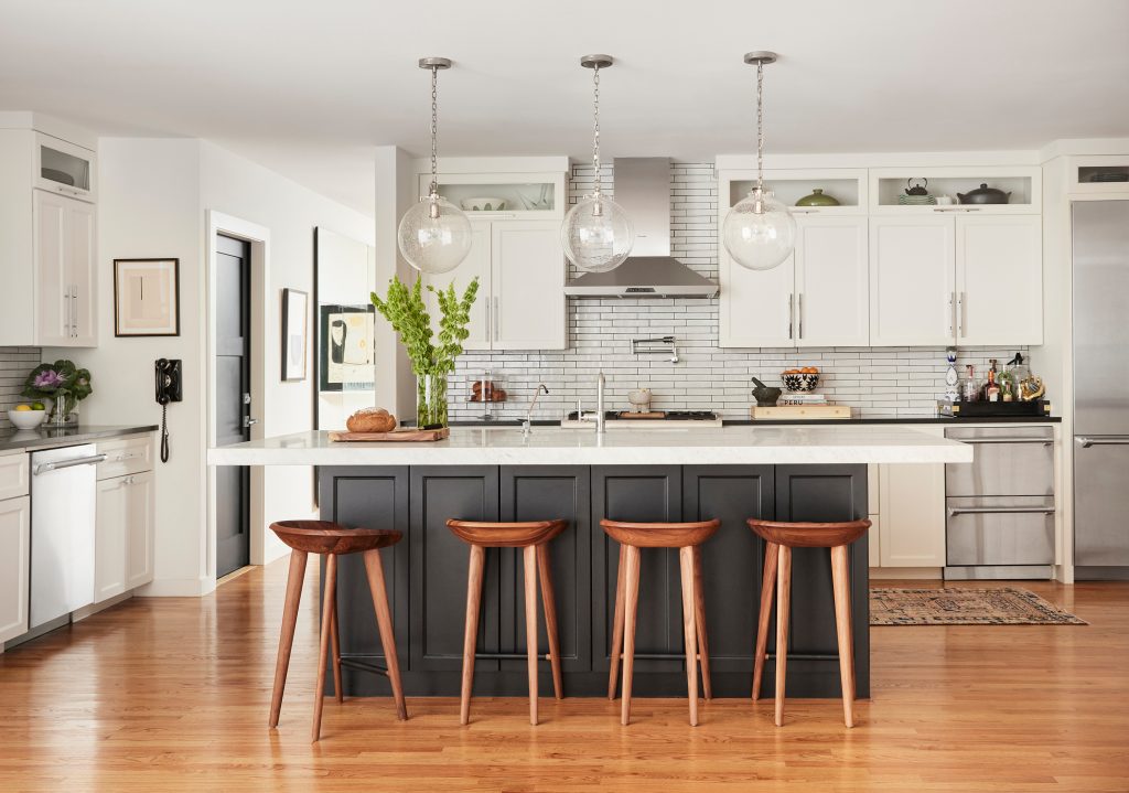
Carolina: “The kitchen took on the largest transformation… If you know me at all, you know I am a huge lover of food! We are major cooks and we love to entertain (when it isn’t a pandemic). We have had so many holiday gatherings in our home and the kitchen is the center of that. This is the most important room in the home and had to be the largest. And, since we lived in a loft for so many years, the open concept was really important to us.” Appliances are by Thermador and the pendants are from Visual Comfort. Incredible detail: The darker color on the island that “grounds” the look. It’s Sherwin-Williams Tricorn.
The Study
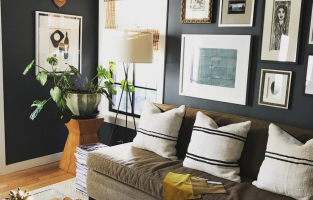
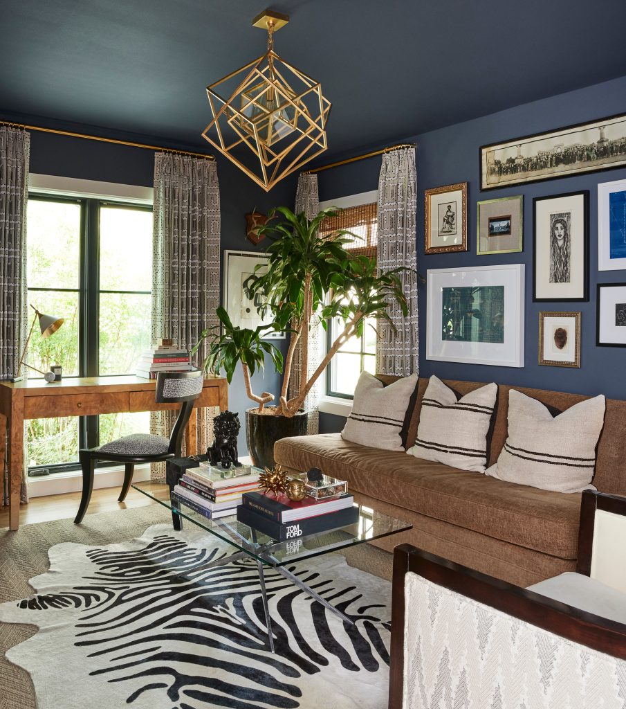
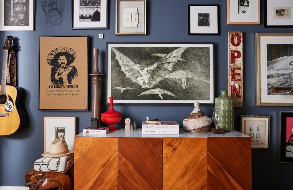
“This is probably the most popular spot in the house,” laughs Carolina. ” This was a guest bedroom, but we turned it into something completely different. We took the closet out and turned it into a library and TV room. It’s a great place for me to watch my Bravo shows while my husband has sports on. We made it extra cozy with that dark Outer Space paint color from Sherwin-Williams. It’s such a great multi-purpose room with its own vibe.” Additional sources include a light fixture from Kelly Wearstler for Visual Comfort and a sofa by Mitchell Gold. Incredible detail: The Samsung Frame TV that looks more like a stunning framed piece of art (do you see it??).
The Principal Bedroom and Bath
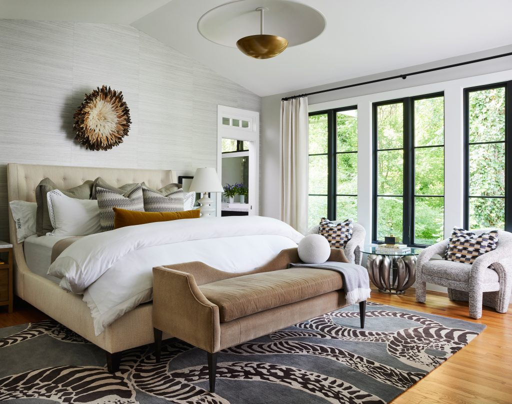
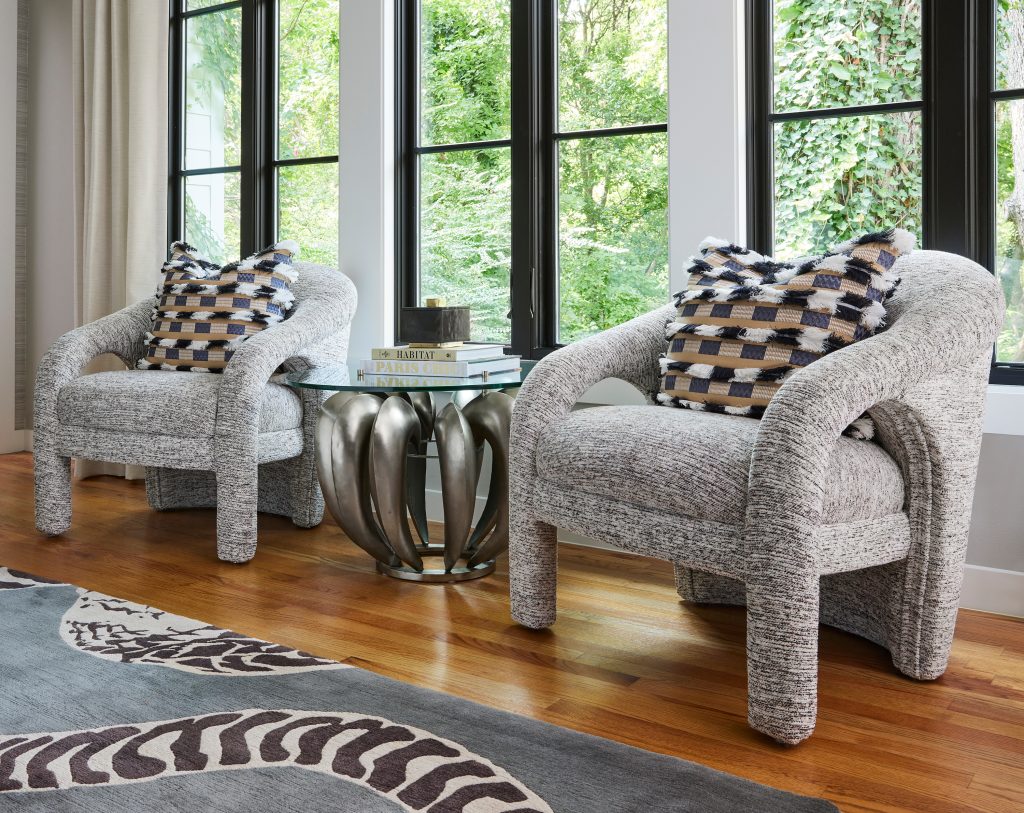
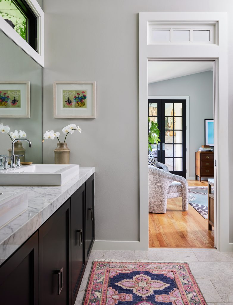
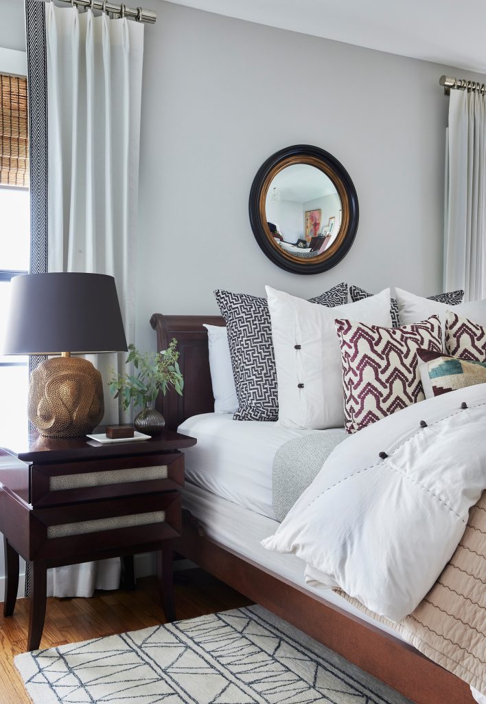
“This is my oasis from the world!” Carolina says. “It took us a while to get this suite just right, and now we absolutely love it – we never want to leave. That Bernhardt bed with the gorgeous Matouk linens is always calling my name! And finding those vintage chairs, now covered in upholstery from Pollack Textiles, was the perfect final touch for the room.” Additional sources include a Theodore Alexander light fixture, Holly Hunt wallpaper, Fabricut drapery, and a Vanguard bench in the bedroom. In the bathroom is Daltile Arctic Grey Limestone on the floor, and White Venatio Marble on the counter. Incredible detail: All of the amazing natural light – and the fabulously ssssnaky rug from The Rug Company.
Guest Bedroom and Bath
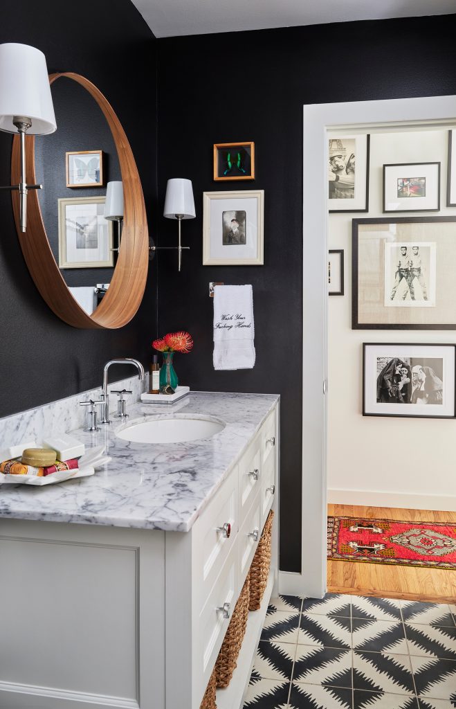
Beth Dotolo, Carolina’s co-founder of Pulp, is the person who calls this space “home,” Carolina says. “I keep this space stocked with all of Beth’s favorite amenities, so she says it is her space!” The key to the best guest rooms is to make them as welcoming as possible, Carolina points out. “I include fabulous linens and as many pillows as possible for the bed. And in the bath there are a selection of soaps, amazing lotions, and even a Pulp-branded fluffy robe. It’s all designed to give guests a luxe experience.” Incredible detail: Those graphic and gorgeous cement tiles for the floor – they are Ann Sacks Popham Designs Paccha Zig Zag Tile.
If you have any comments or questions, follow and direct message us over at our instagram accounts at @pulpdesigns, @carolinavgentry, and @bethdotolo!
Credits

SECTIONS
Design InsiderEntertaining + Home Living
Health + Beauty
News + Announcements
Pulp At Home
Pulp Design Work
Shopping Guide
The Business of Design
The Pulp Edit
Travel
Videos
GET INSPIRED
SUBSCRIBE TO OUR NEWSLETTER TO
GET AN INSIDER LOOK IN YOUR INBOX


