Before and After: A Retro Home Reimagined

Our clients were close to selling their beloved mid-century modern home when they realized they just loved it too much to give it up. But as much as they wanted to keep it, they also knew it needed a major modern makeover. We completely gutted the structure and gave them an addition, adding light and space, and bringing in a contemporary vibe for the interiors. All of which was perfect for this creative and modern family!
Entry
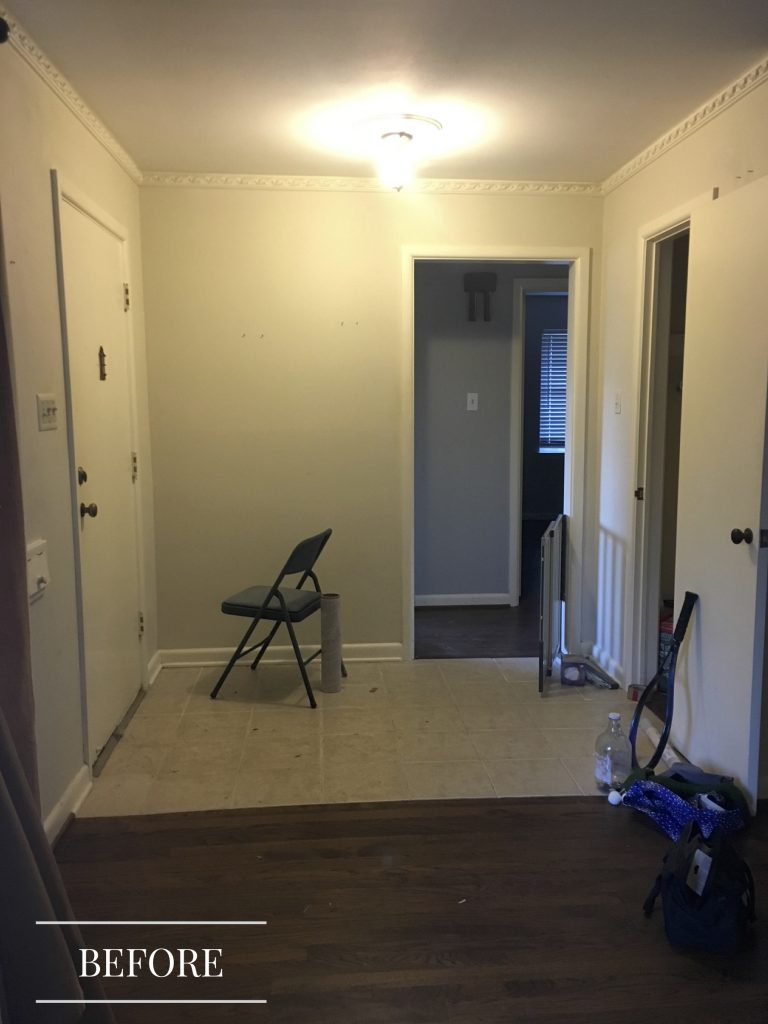
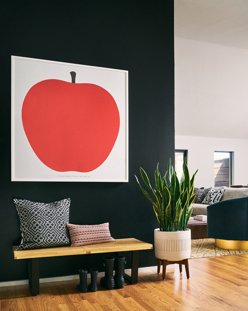
Like most of the house, the original entrance was dim and dull. Besides opening it up, we also brought in a dramatic black wall and a fabulous piece of art to make a big first impression for visitors.
Open-Plan Family Room
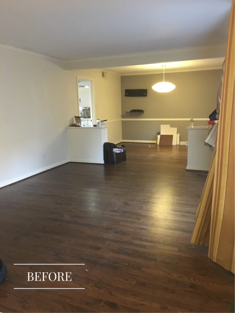
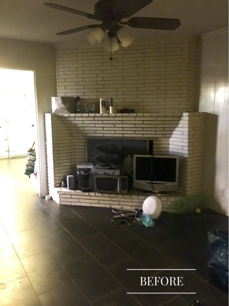
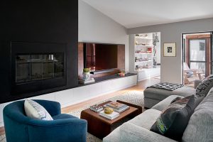
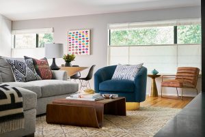
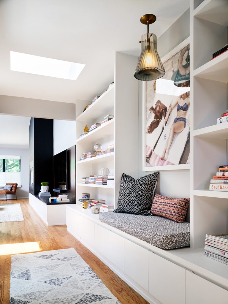
We took out a wall to open up the living room, dining room, and kitchen into a large and airy living space. And we took inspiration from the age of the 1955 house to give it more of a mid-century modern vibe than it originally had. The original living room had an awkward corner fireplace covered in brick and the ceilings were low. We lifted the ceiling as part of the addition and created a sleek wall for the fireplace and television. You can also see part of the new addition below – the hallway next to the living space.
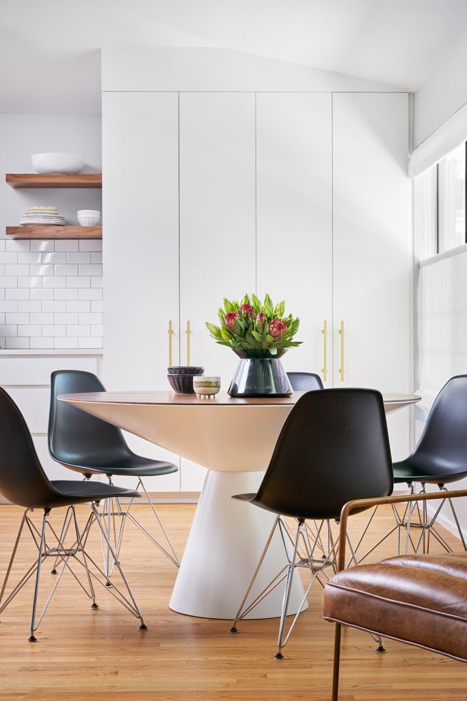
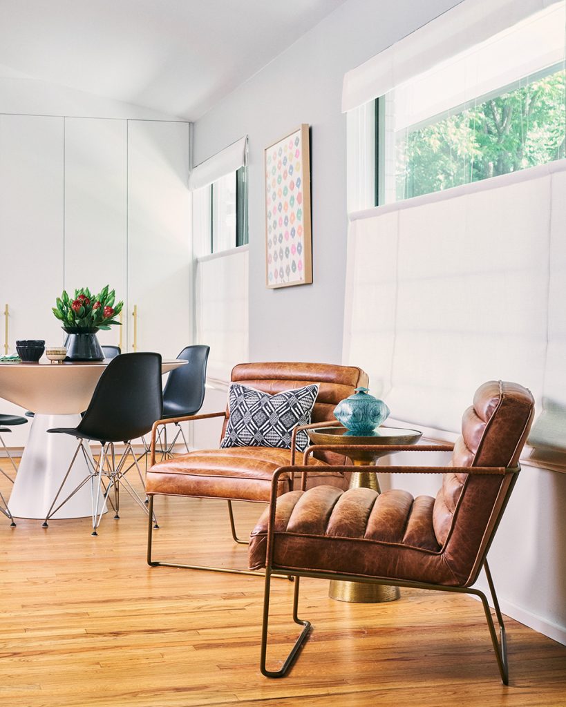
The Kitchen
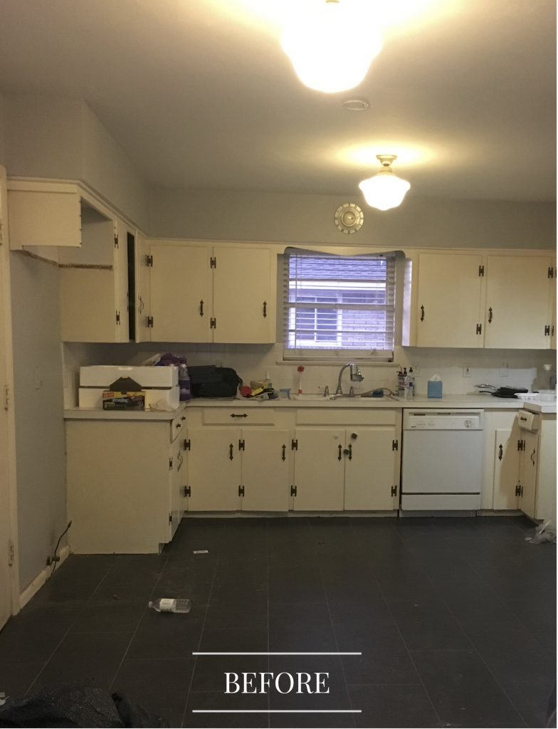
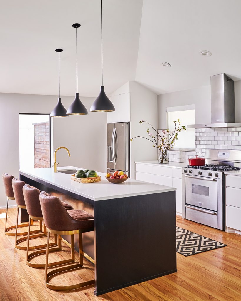
As historic as it might have been, the old kitchen needed a major update. When we removed a wall and opened up the living area, we were able to expand the kitchen into a bright and modern space.
The Powder Bath
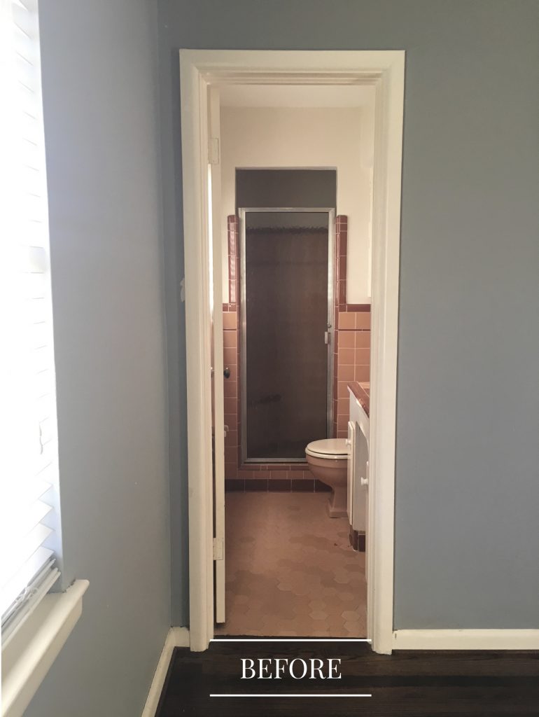
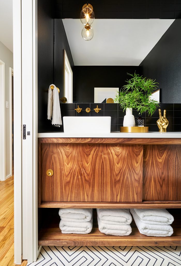
That pink and black tile we had to remove was so common during the 1950s. We decided to keep the retro and remove the out-of-style, and the result is a dramatic powder room that’s perfect for the 21st century!
Master Bedroom
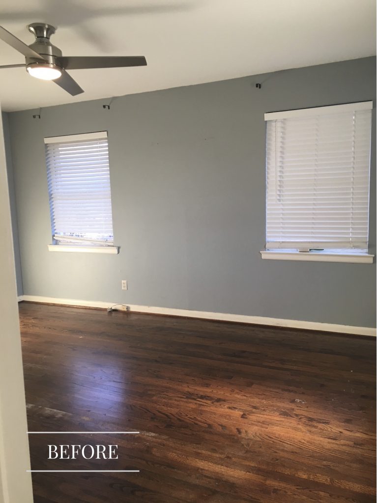
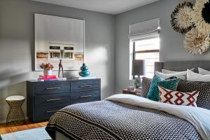
Mid-century homes are notorious for not putting a lot of emphasis on bedroom design, so we had blank canvases in this home. The master bedroom had space, but no personality. We updated the colors, added fabulous art, and brought in more of the clients’ personalities. And in the process, we created a beautiful oasis for them!
The Addition
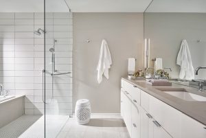
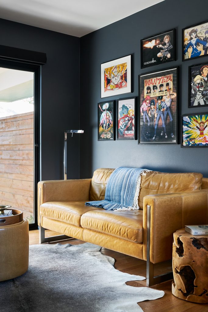
The new addition to the home gave us the opportunity to add a gorgeous master bathroom, a study/home office, and a hallway to connect the spaces.
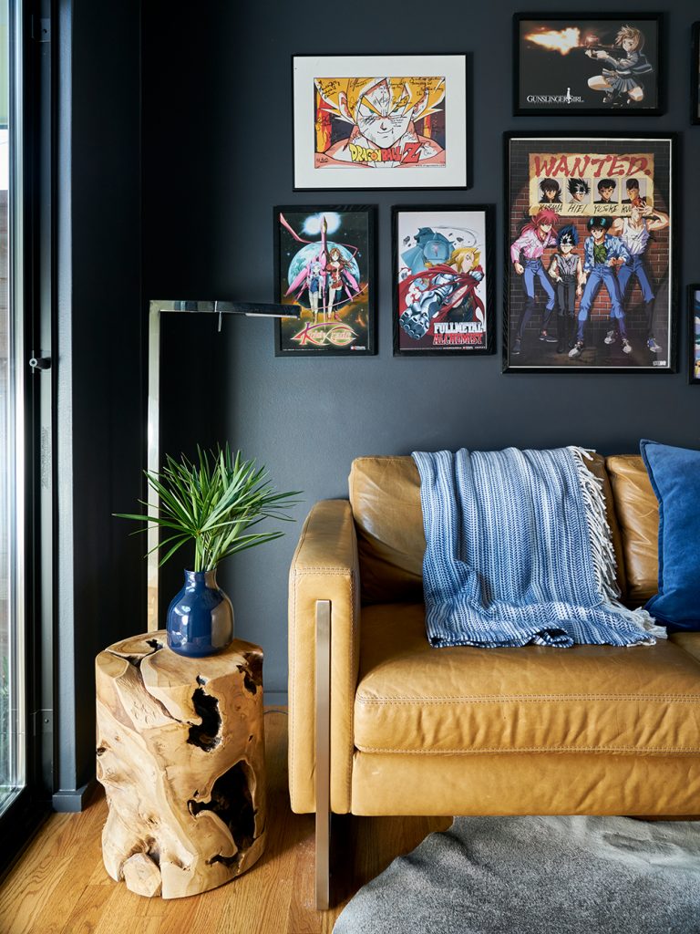
Play Room + Child’s Bedroom
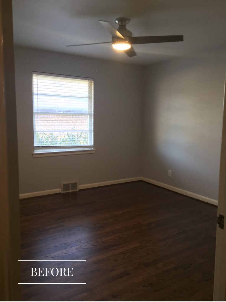
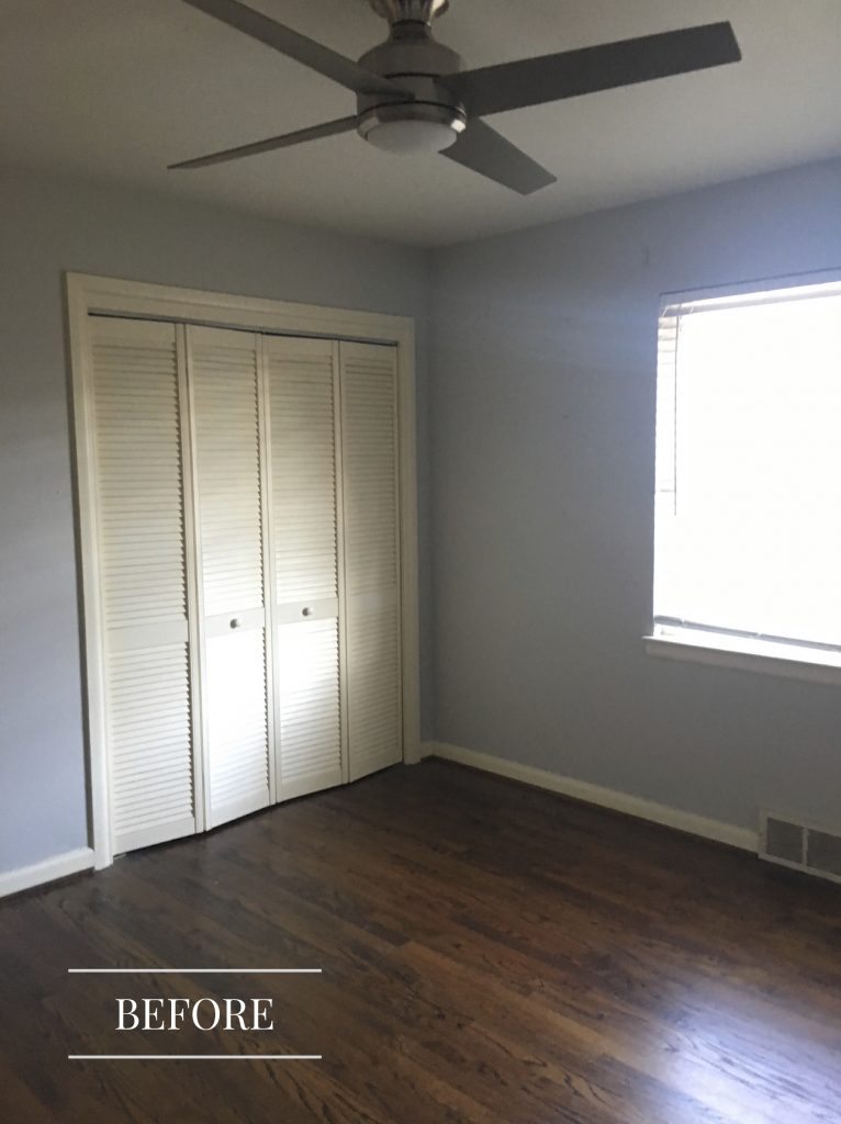
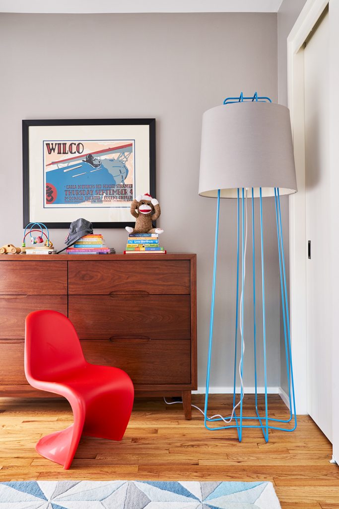
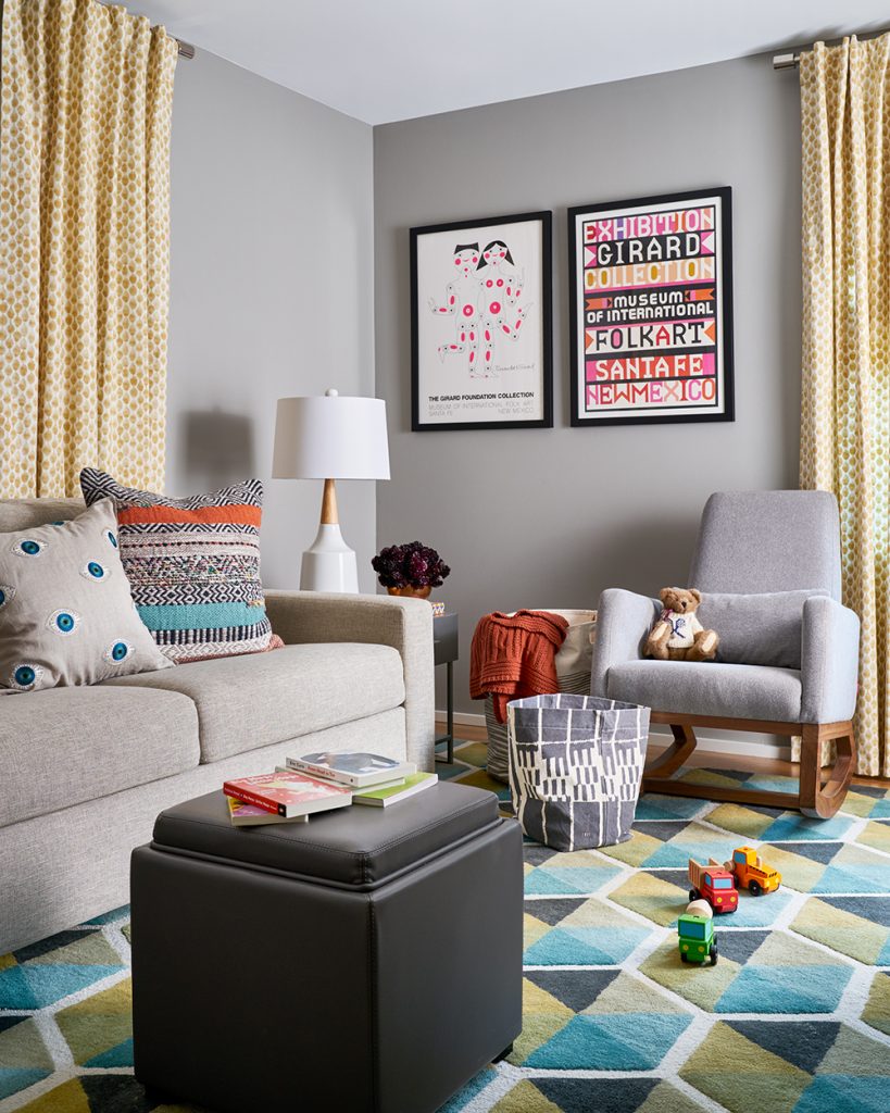
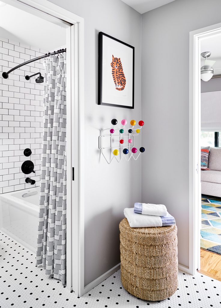
We took two of the original bedrooms and created a cute suite for our clients’ little boy. Between the fun and colorful playroom and the adjoining bedroom is a jack-and-jill bathroom.
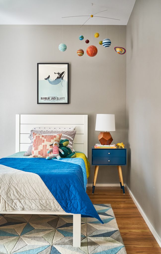
There’s even more to see in the full project – just click here to take a tour!
Want to know how we can transform YOUR home?
Book a complimentary call to discuss how we can help!
Credits

SECTIONS
Design InsiderEntertaining + Home Living
Health + Beauty
News + Announcements
Pulp At Home
Pulp Design Work
Shopping Guide
The Business of Design
The Pulp Edit
Travel
Videos
GET INSPIRED
SUBSCRIBE TO OUR NEWSLETTER TO
GET AN INSIDER LOOK IN YOUR INBOX


