Home Tour: A Hip Haven for Creatives
We love mid-century modern architecture, so when our Dallas clients came to us with a 1955 home that needed major work, we couldn’t wait to get started! This creative family was looking for a hip and modern vibe that would give them space to work from home, and entertaining areas for friends and family. We gutted the home and created an addition that included a home office and also opened up the home’s floorplan. Take a tour with us of the mid-century modern makeover, and see the full tour here.
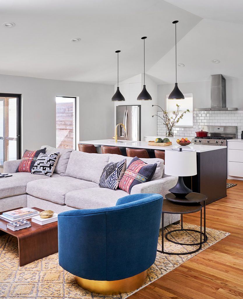
Q: How did you open up the space?
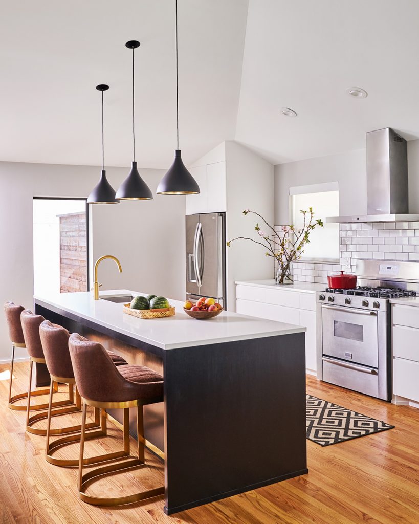
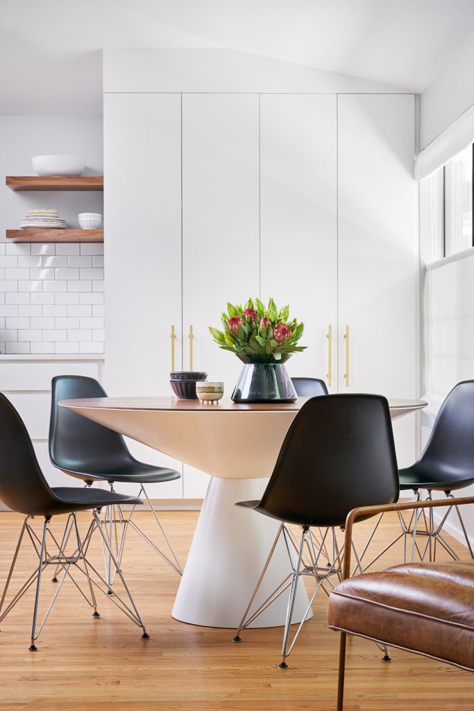
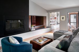
We did a complete gut for the renovation, which allowed us to take out walls and make a more open floorplan in the main entertaining spaces. It has a great flow for the family and also for hosting their friends and guests. Our clients loved the result and the way the kitchen, dining area, and living space work together.
Q: You created an addition onto the home – what rooms did that include?
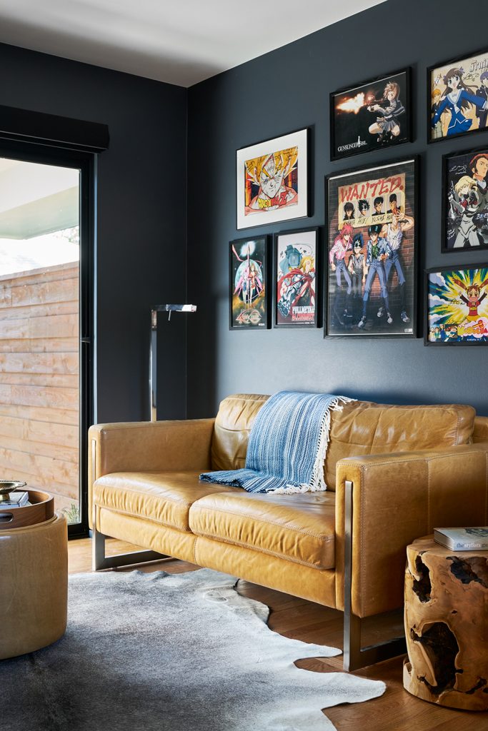
These clients are creative people and he even works from home, so we wanted to be sure to give him a home office that would help spark his creativity and would give him a great place to work.

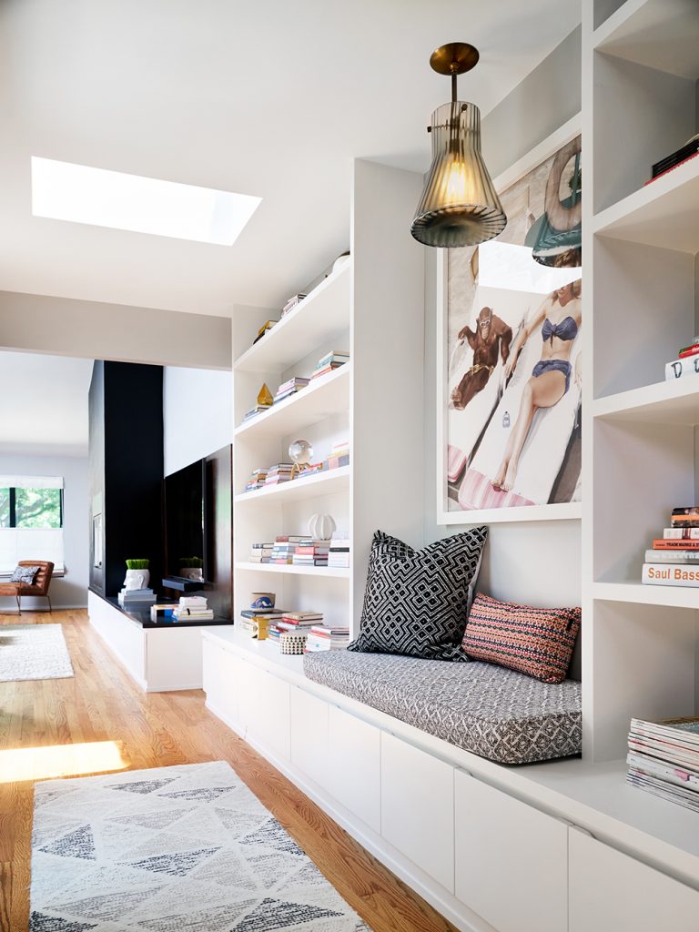
We also added a hallway that offers a lot of storage since the home is only 1,900 square feet and they have a growing family.
Q: How did you combine the history of the home with the more modern updated look the client wanted?
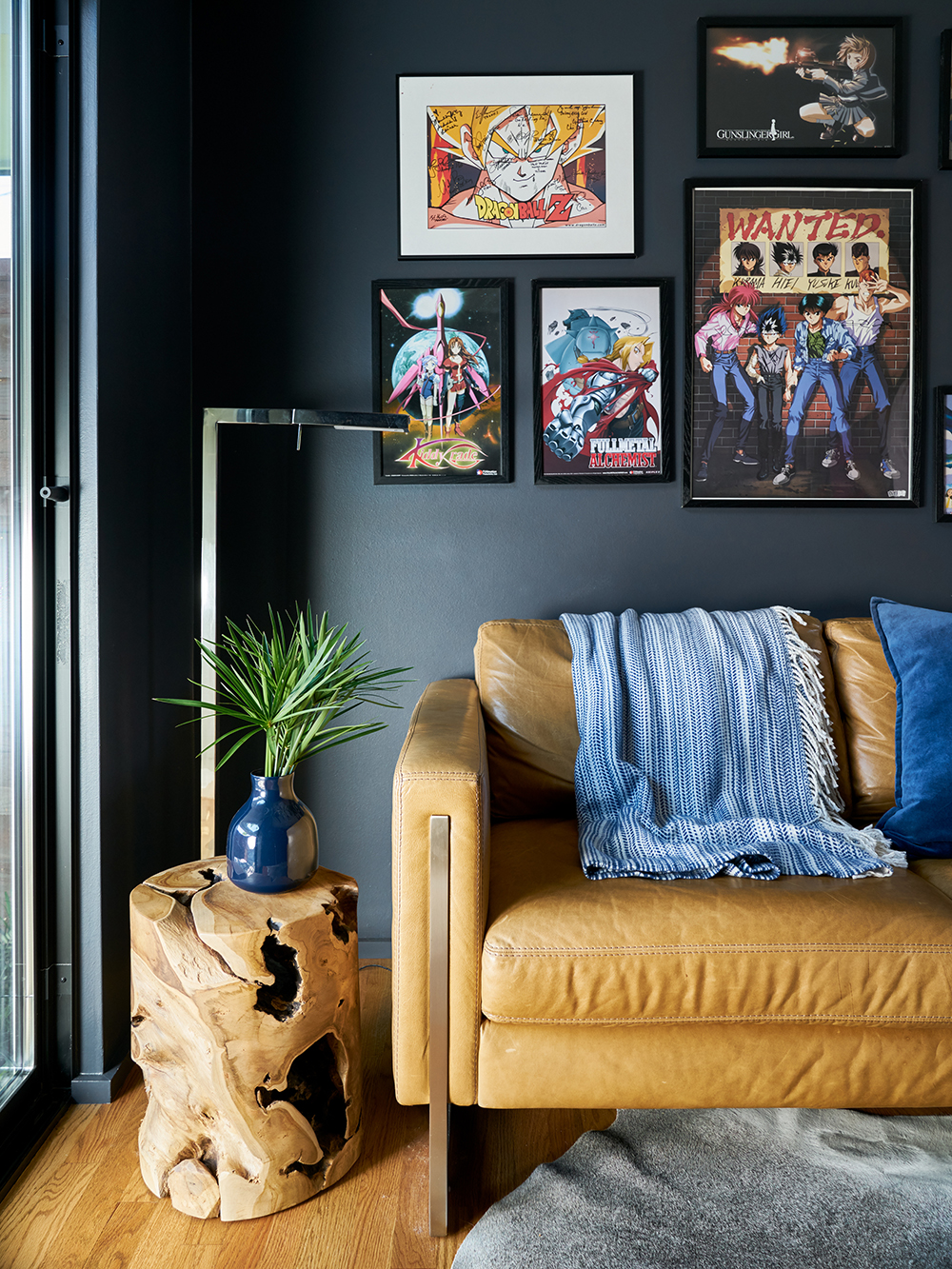
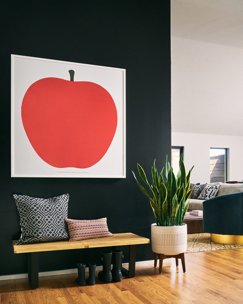
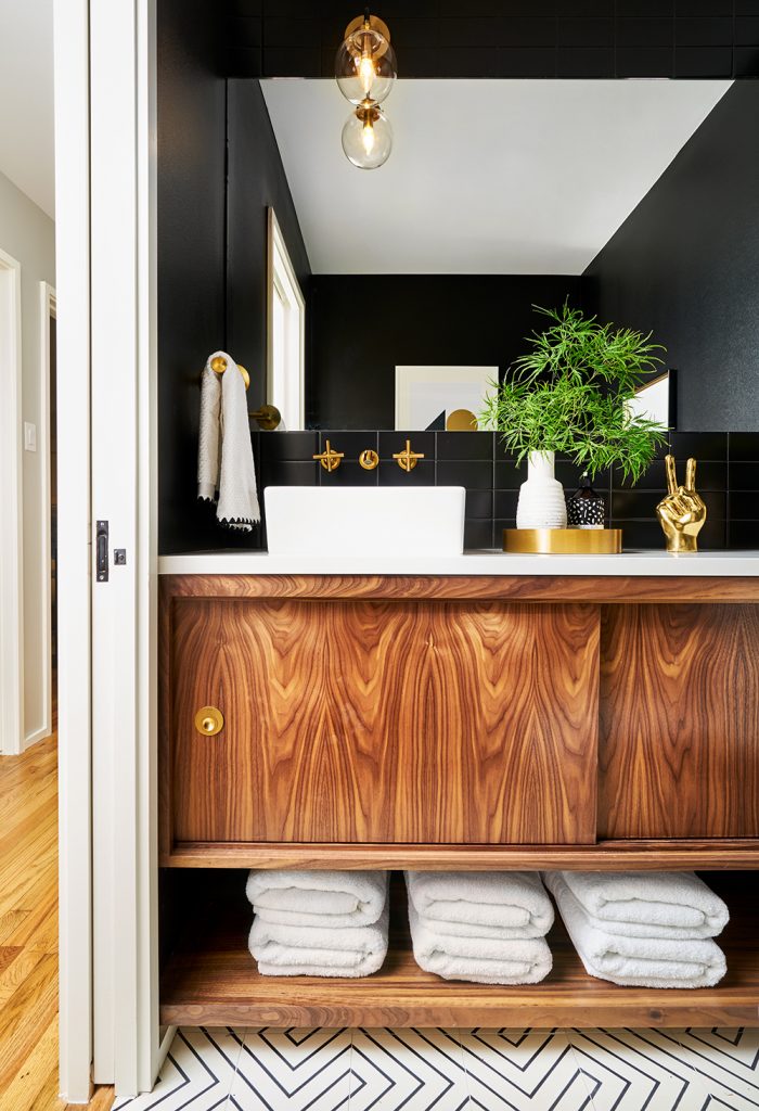
Luckily, with midcentury modern design you already have a lot great architecture and details that lend themselves to a 21st century modern look. We used their art collections, unique custom details, and dramatic wall colors (like black!) to give the home a super-hip vibe that still fit with the home’s 1955 design.
Q: What is the clients’ favorite space?
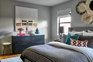
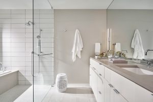
They wanted an oasis for their master suite, and the new addition gave us the space to create a fabulous spa bathroom for them. We designed the suite to be a calm and reflective area where they can recharge their batteries!
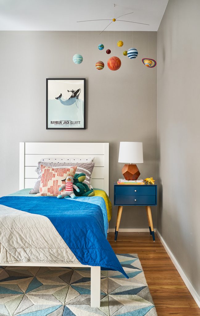
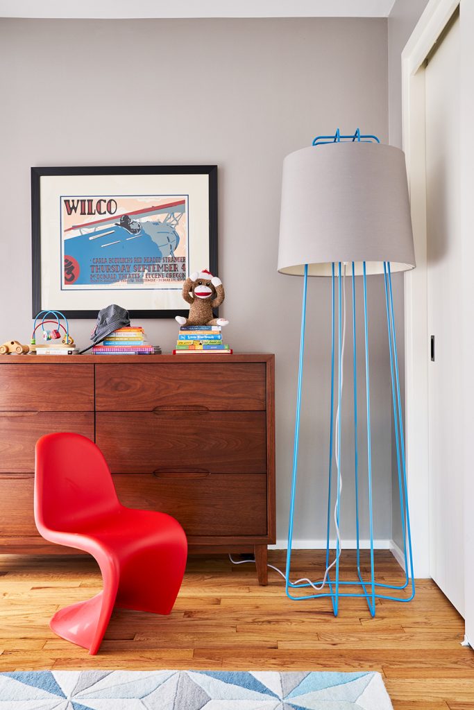
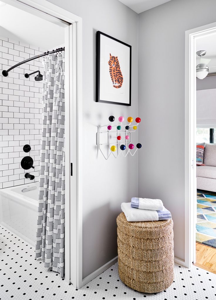
Q: The clients have a small child – are there any spaces that you designed specifically for kids?
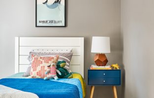
Definitely! The home needed to function for their child and for their pets, so we gave them a fun bedroom, bathroom, and playroom that would be colorful and full of pattern to spark a little one’s creativity, too.
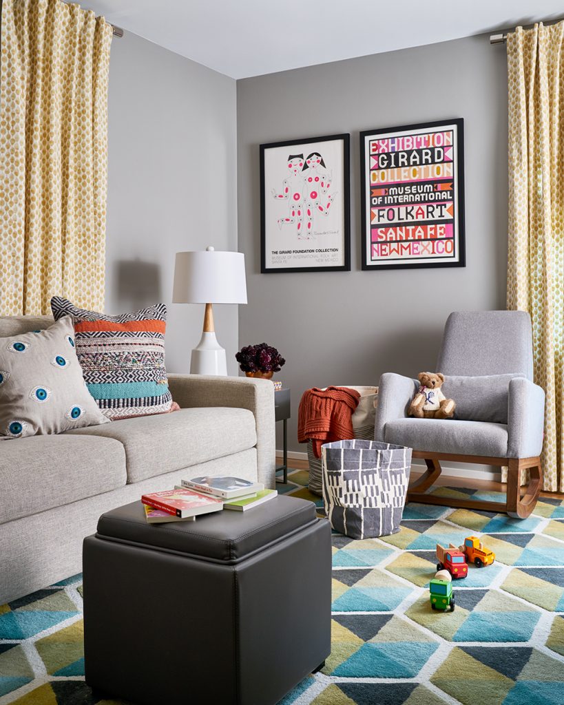
Q What is your favorite space in the home?
Definitely the powder room! We love the impact that the black paint color makes in this space, especially combined with the natural wood and brass. It’s a showstopper!
Credits

SECTIONS
Design InsiderEntertaining + Home Living
Health + Beauty
News + Announcements
Pulp At Home
Pulp Design Work
Shopping Guide
The Business of Design
The Pulp Edit
Travel
Videos
GET INSPIRED
SUBSCRIBE TO OUR NEWSLETTER TO
GET AN INSIDER LOOK IN YOUR INBOX


