Seattle Modern Bungalow Home Tour
We love to show off our projects, especially ones that turn out this fabulous! This Seattle home renovation was so fun to see the transformation of a dark interior to a bright, colorful, and full of pattern home. Be sure to head over to our portfolio page for some interactive before and after galleries. This hidden house needed to be brightened up with some paint, wallcovering and colorful fabrics. Playing with colors and patterns is one of our favorite things to do, so when a client is requesting it, we let our creative minds run!
THE KITCHEN
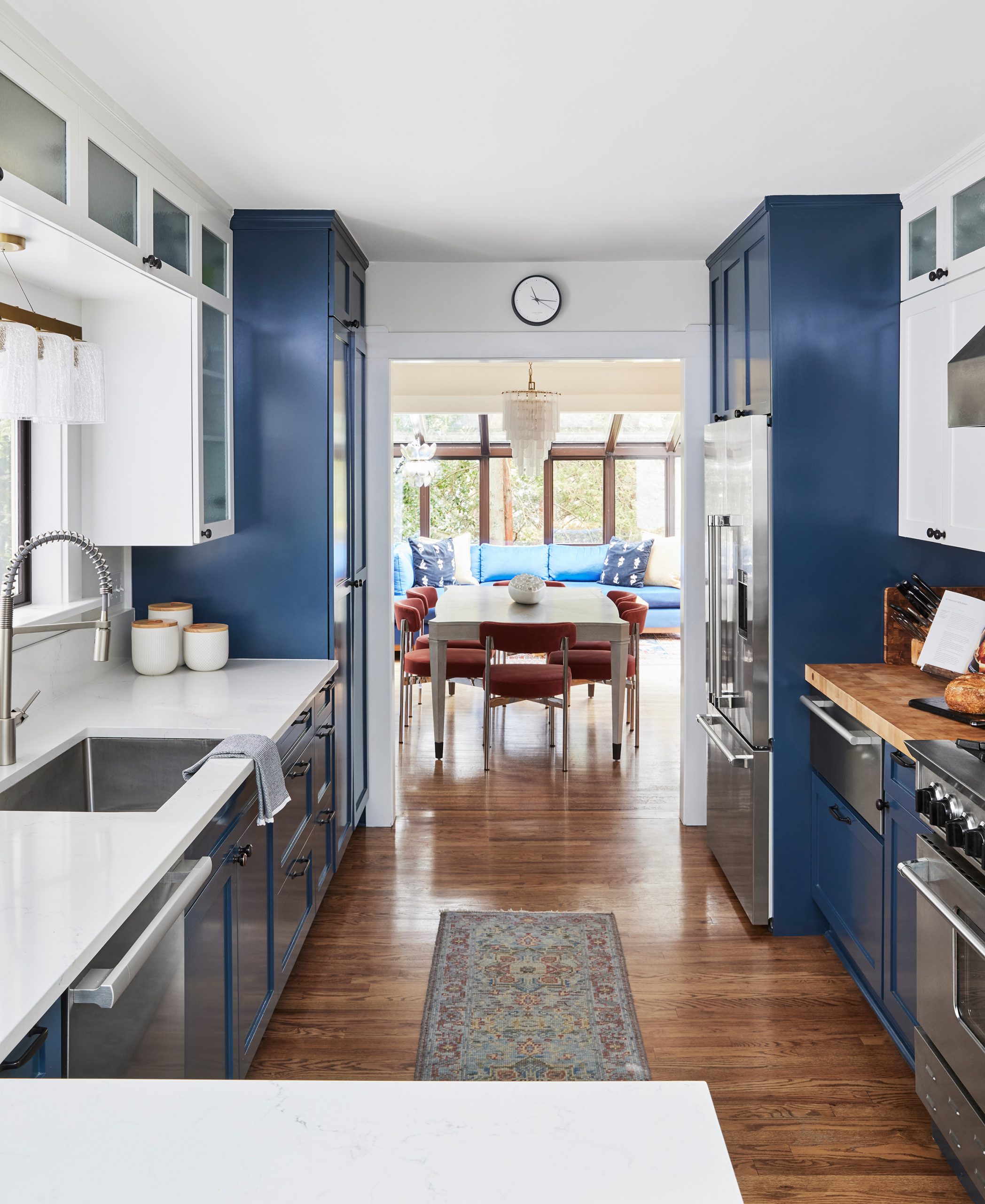
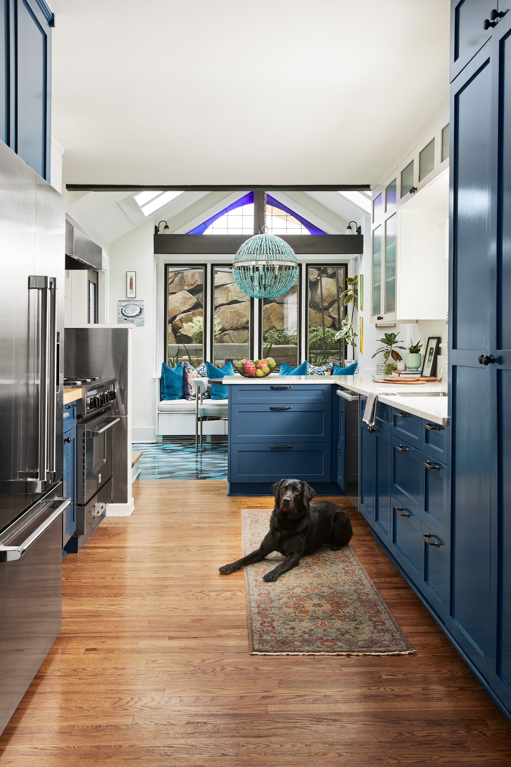
The main goal of this kitchen was to brighten it and bring some much needed color to the space. When we first started on this project, the cabinets were dark brown and made the space feel very heavy. We overhauled it with a fresh coat of paint, new countertops, and tile. The combination of fresh white countertops and brighter upper cabinets, with the deep blue lower cabinets, made this kitchen stunning. It completely opened up the space and brought amazing natural light to this room, making it feel happy and functional.
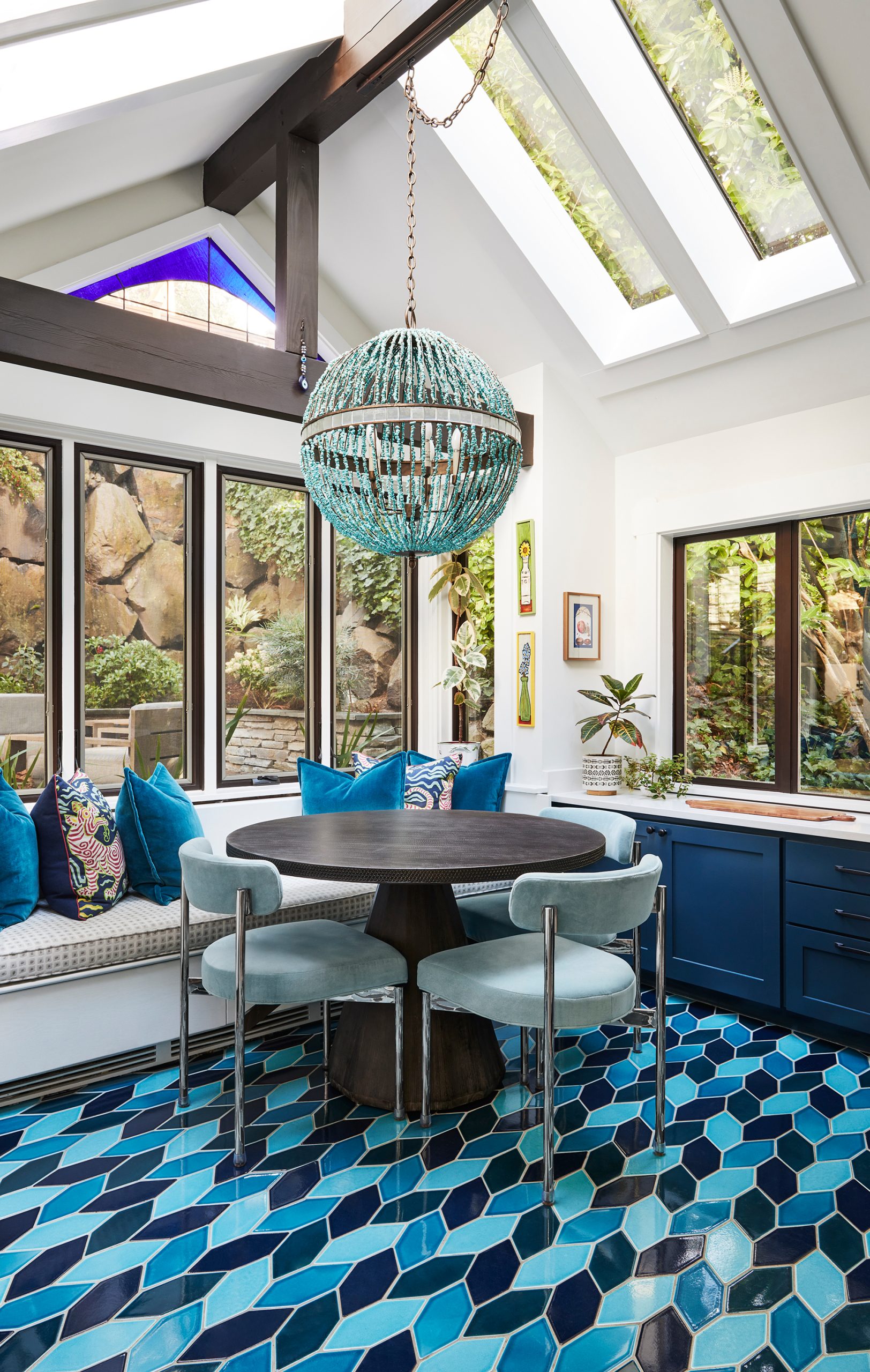
THE BREAKFAST NOOK
When we saw this breakfast nook, we knew we had to make it feel like part of the kitchen and bring a little life and joy in. We added a Fireclay custom tile installation with variations of blue and a bright statement chandelier. The blue leaning kitchen and breakfast space are now super inviting and feel like a great way to start and end each day with their family.
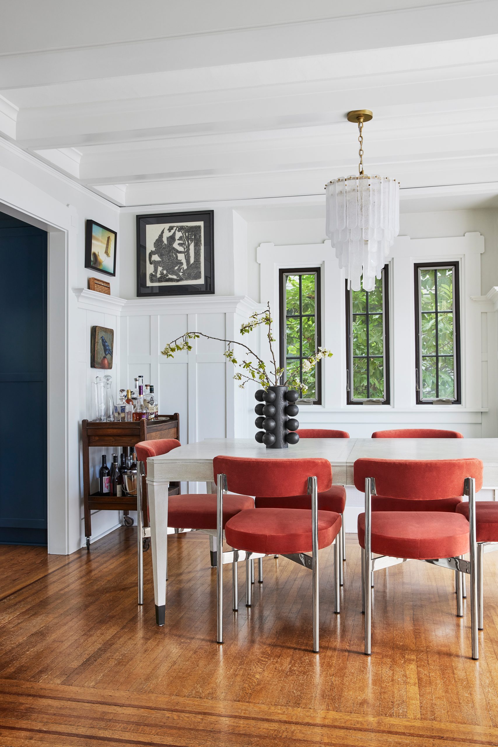
THE DINING ROOM
Transitioning from the blue Kitchen and Breakfast Nook, we incorporated these stunning persimmon dining chairs for another amazing pop of color. Along with the bleached wood dining table, the home owners can host intimate gatherings with their guests. This is another room that needed brightening and the solution, paint! We painted the walls and trim tonal shades of white and framed the tree-top views with a dark brown at the window mullions. It instantly brought beautiful light to the dining room and brings an element of cleanness to this space.
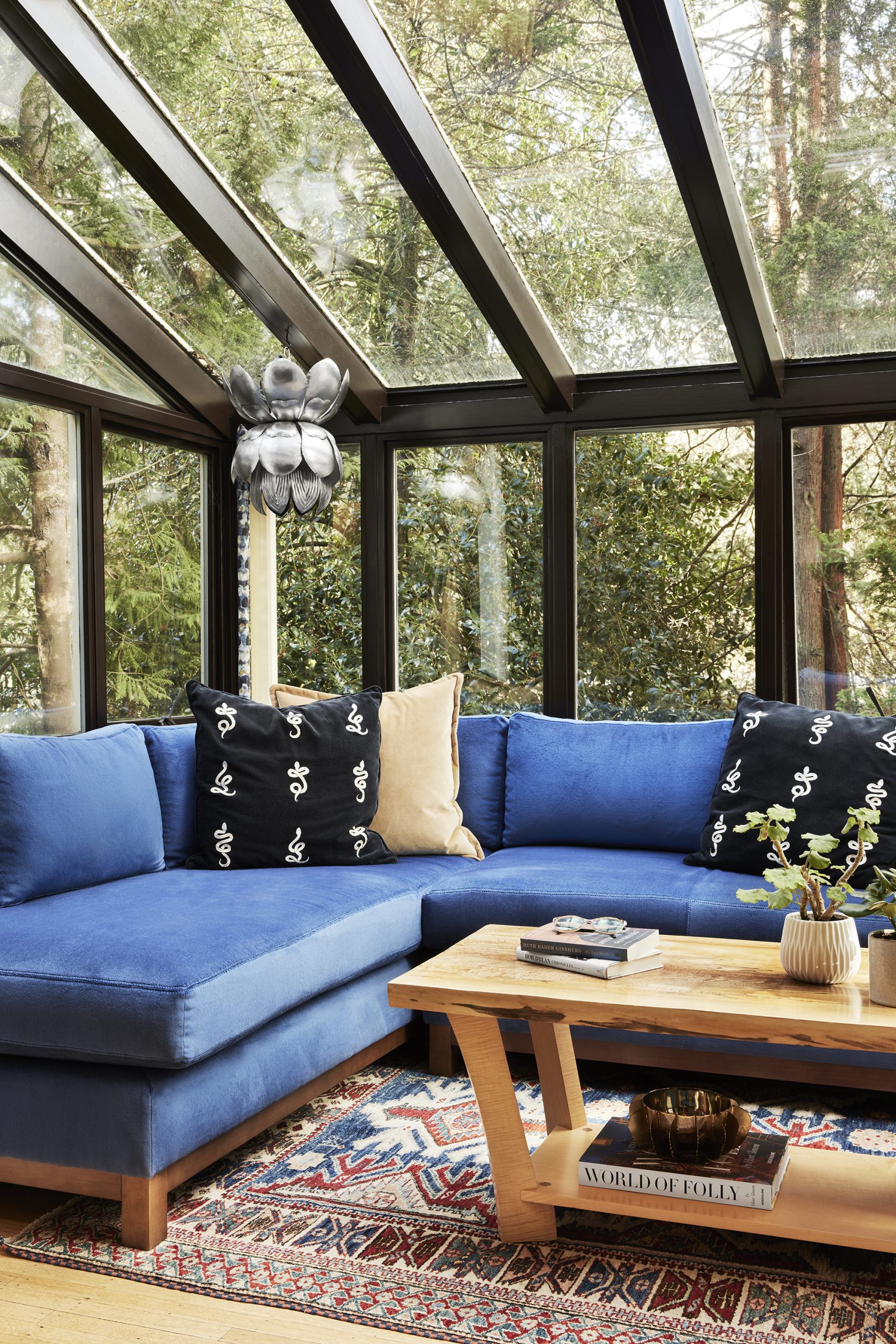
THE SUN ROOM
Even Seattle homes have to have sun rooms! This came out stunning not only because of the view, but also the design elements we included. The velvety soft Mitchel Gold Bob Williams couch is a great statement for this corner of the house. We of course had to make sure we chose a performance fabric that wouldn’t fade in the sun, and this was a great choice for the sofa. Everything about this nook would make me want to curl up with a good book and lounge. We even added a little functional jewelry for reading with a lit pendant, complete with custom cord scrunchie in our Pulp for S. Harris fabric. Charming!

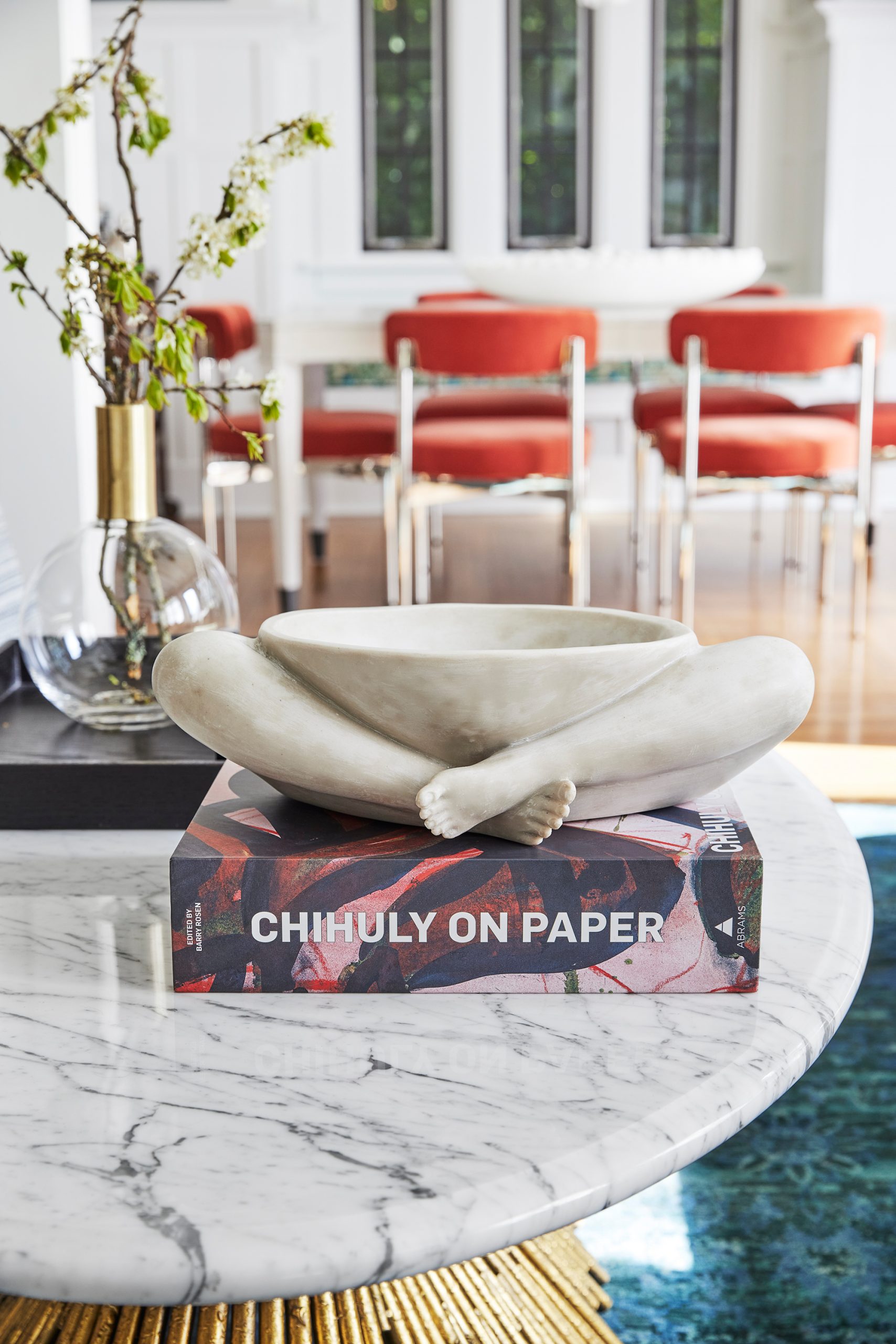
THE LIVING ROOM
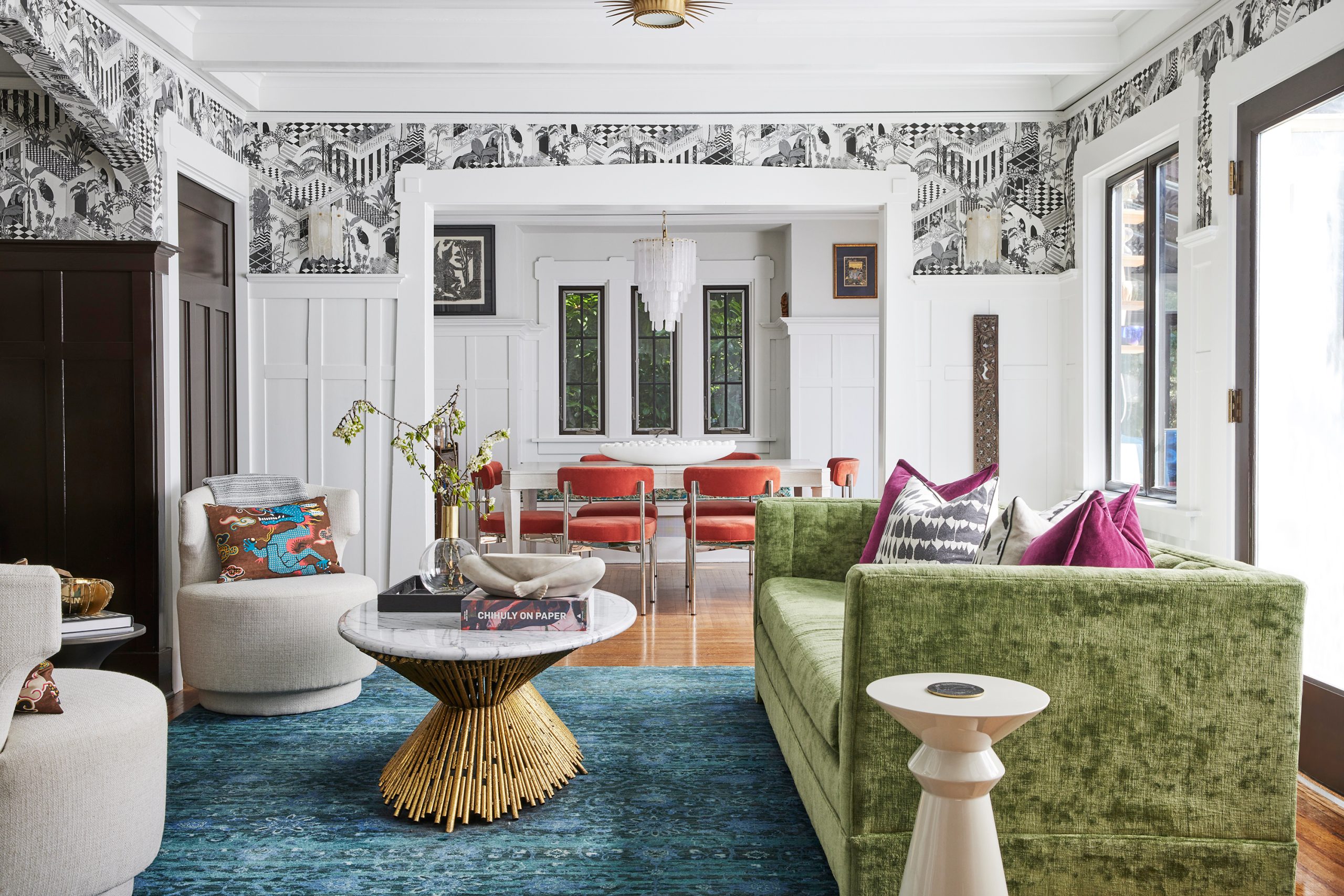
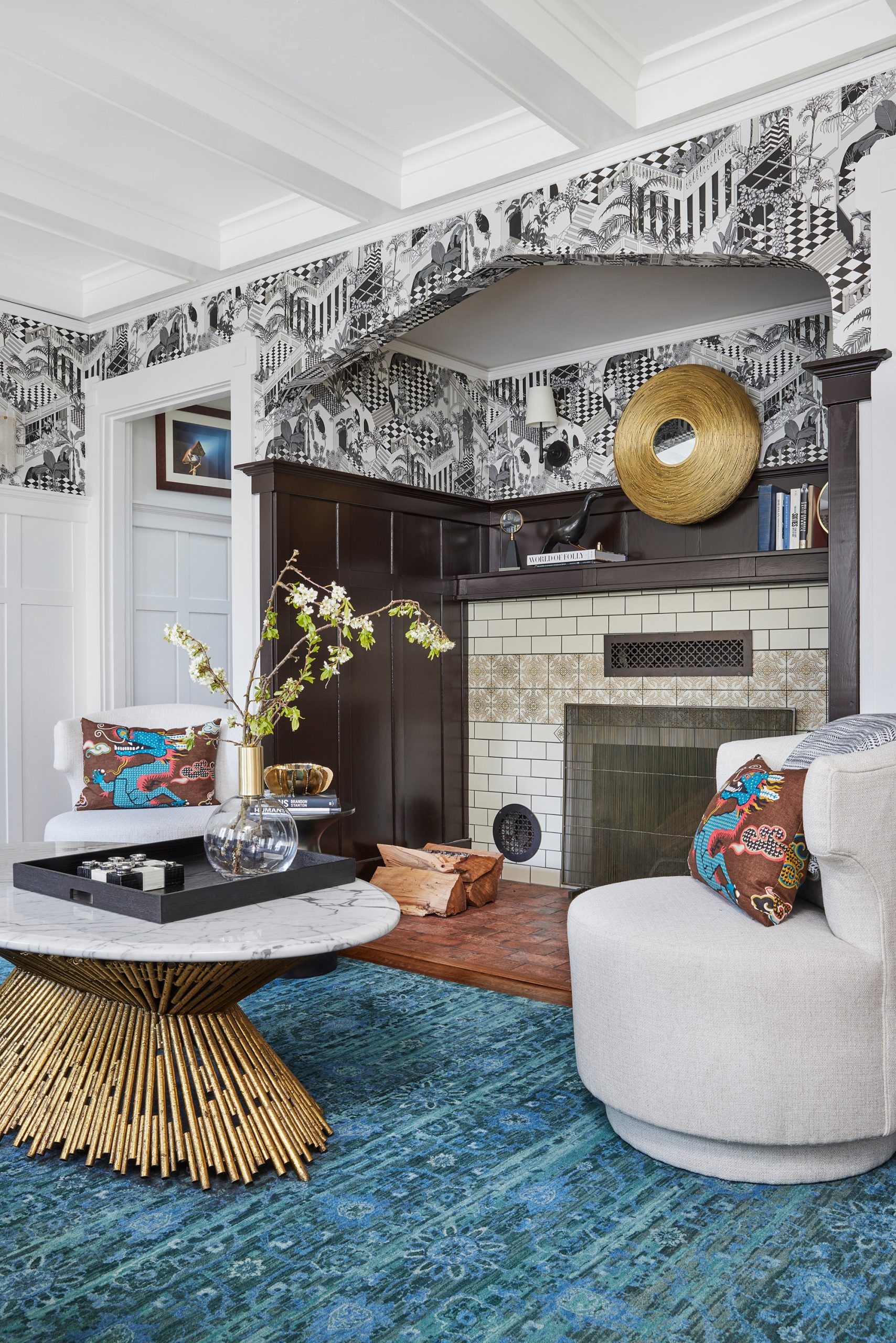
All of the colors, patterns and textures are what make this room so stunning. We chose this detailed black and white wallcovering from Cole & Sons that brings great contrast to a room full of color. The pops of jewel colors within the room were per the owners request, but brings such a fun color palette to the room. The clients requested a sofa that they could sit at head to foot together and read and talk… is that not the sweetest?! They asked and we provided! We also designed in a pair of petite swivels for extra seating while entertaining or for enjoying the fire.
THE INGLENOOK FIREPLACE
This is such a unique feature that many modern homes don’t have and in this home is the center axis. An inglenook fireplace is the statement of the living room. The clients spent a year on the tile selections before we came on board and we wanted to highlight it and find a way to make the tile work in the new design scheme. We enhanced the inglenook with dark brown paint and it really made the existing tile stand out.
THE MEDIA ROOM/GUEST ROOM
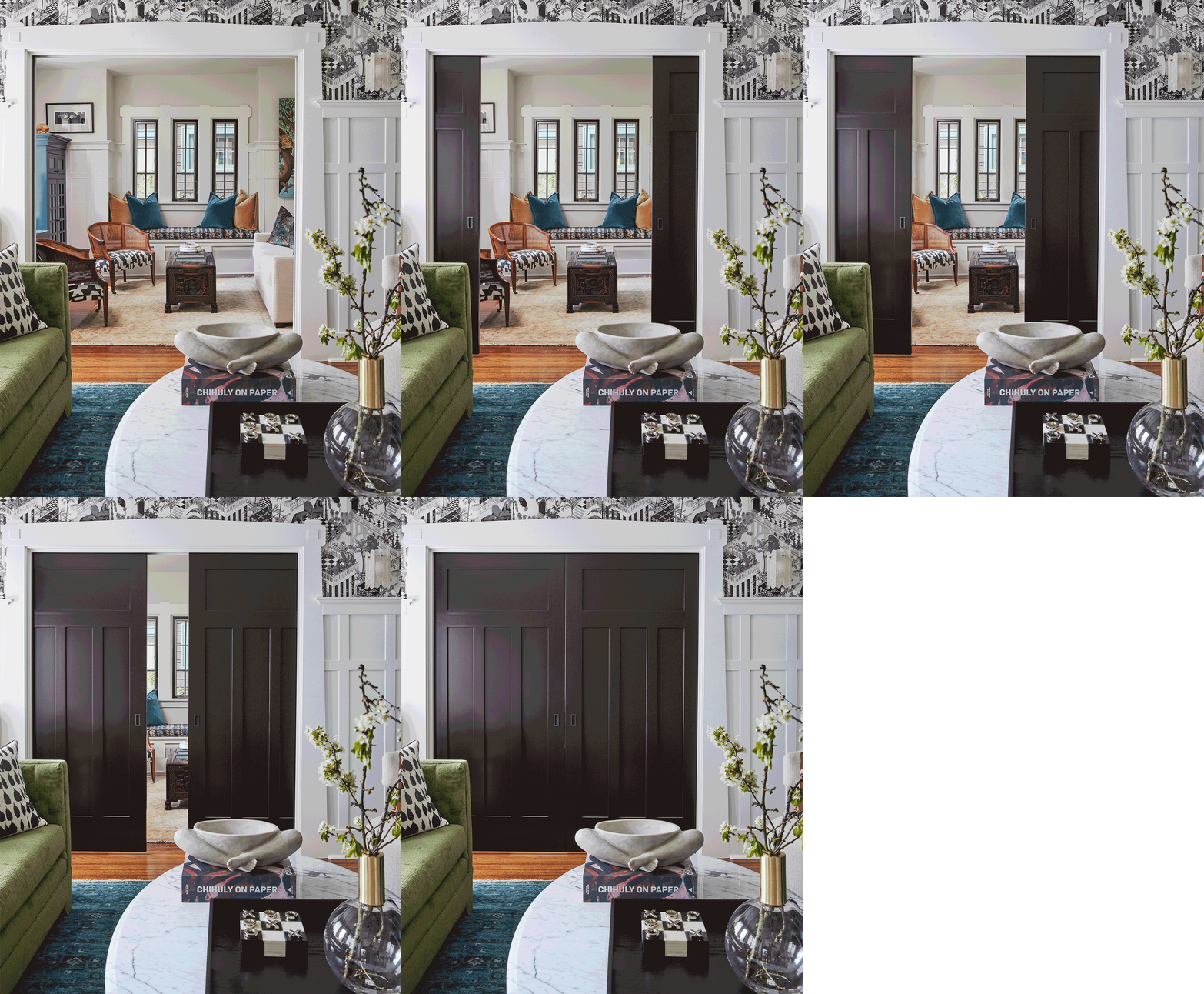
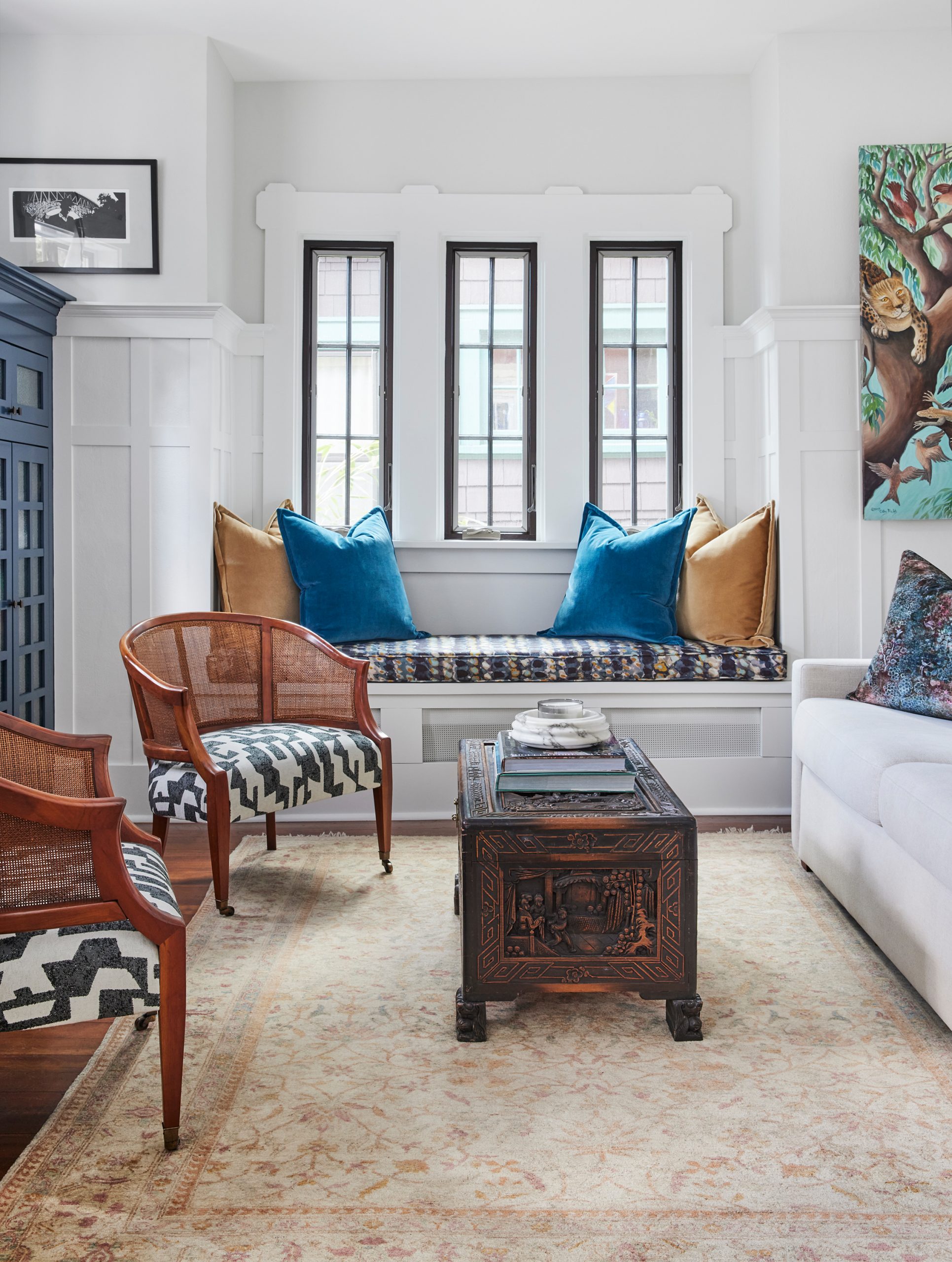
We wanted to make the media room cohesive with the living room, since it is an open concept, but with the hide-a-way door it gives an option of privacy. This also doubles as a guest room with a pull out sofa, perfect for any visitors. We love to incorporate Pulp fabrics into all of our projects and this room features two from our Pulp for S.Harris collection. We love to see how we can use our fabrics in different ways for each project!
To see how we transformed this space go tour our portfolio page, with new before and after galleries: Montlake Modern Bungalow
Follow along with all of our projects over on our instagram @pulpdesignstudios!
Credits

SECTIONS
Design InsiderEntertaining + Home Living
Health + Beauty
News + Announcements
Pulp At Home
Pulp Design Work
Shopping Guide
The Business of Design
The Pulp Edit
Travel
Videos
GET INSPIRED
SUBSCRIBE TO OUR NEWSLETTER TO
GET AN INSIDER LOOK IN YOUR INBOX


