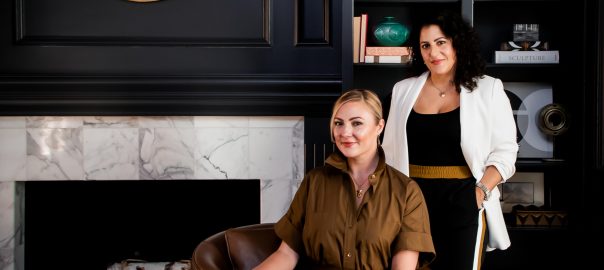
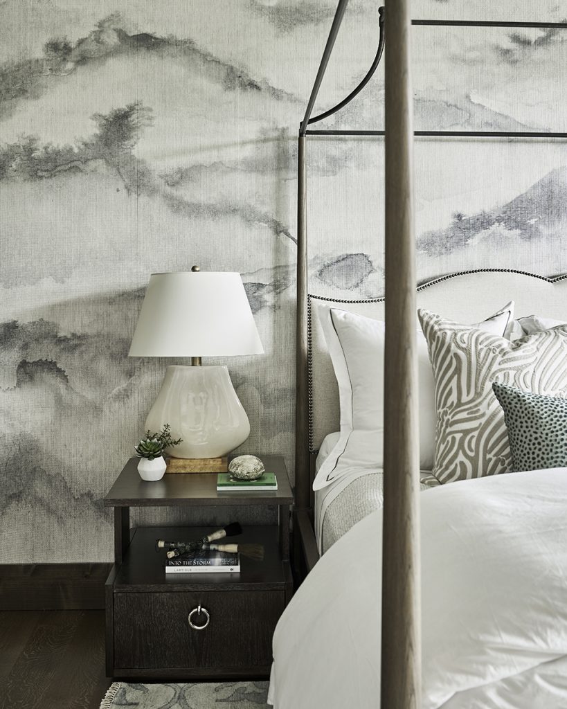
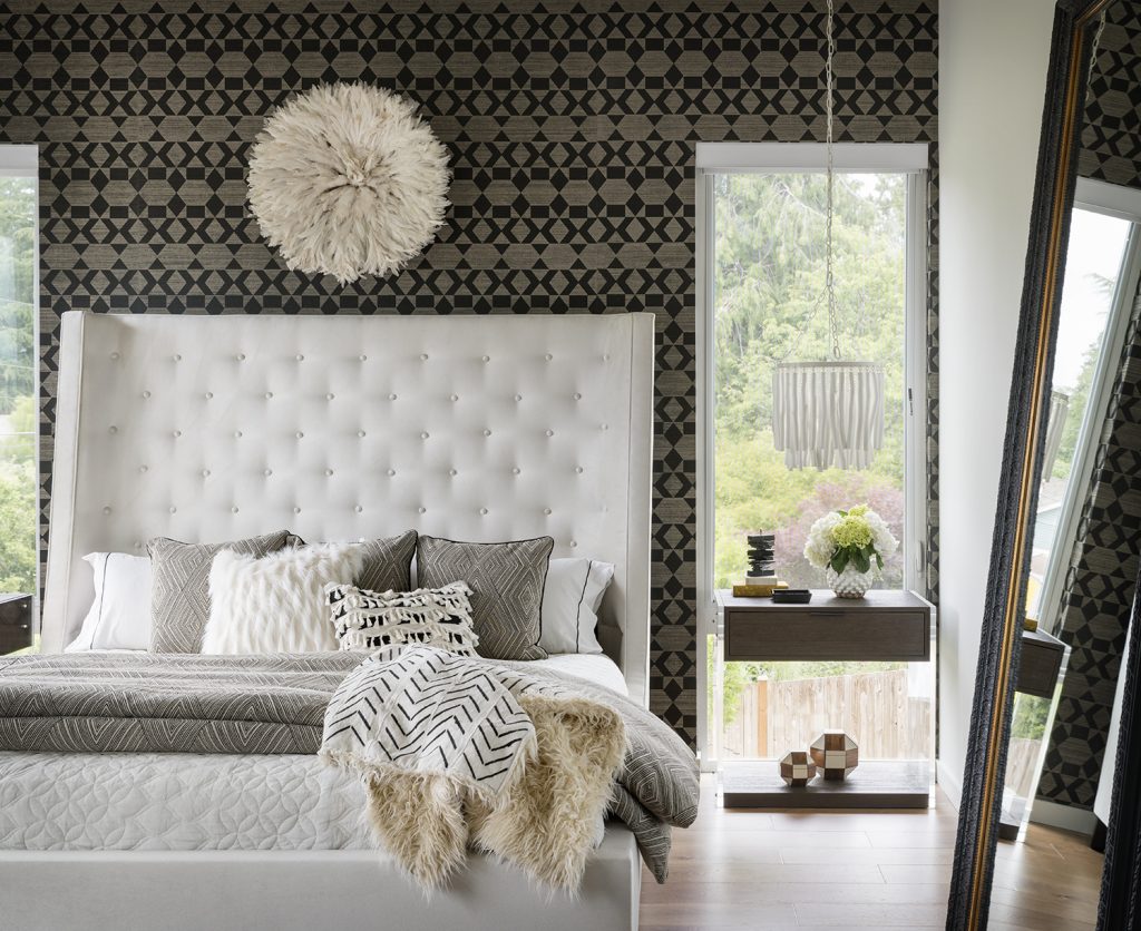
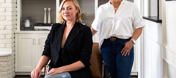
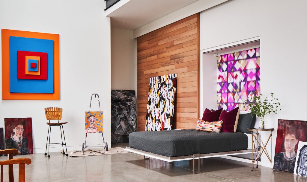
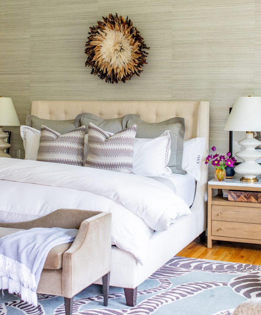
There is nothing more inviting at the end of a long day than a well-dressed bed, with a fluffy duvet, soft sheets, and fabulous pillows. But there’s an art to getting that beautiful look. So Pulp co-founder Carolina Gentry agreed to give us the top 3 tips for making a bed like a designer, with an inside look at her own bedroom!
1. The Essentials
For the best bed look, you have to have these essential pieces: luxe sheets, a matelasse, duvet, pillows, shams, and a throw. Select the options that are best for you. For example, some like cotton sheets and other prefer the feel of percale. During our in-depth design process, we ask our clients exactly how they like their duvet, whether super fluffy and plush, or lightweight and cool, and customize our selections to their preferences. That ensures the best sleep possible.
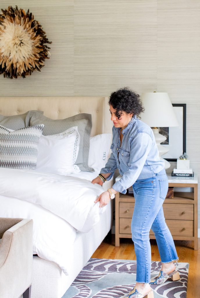
PRO TIP: Tuck the flat sheet under the mattress all the way around. It creates a crisp and tailored look
2. Create Layers
The most welcoming beds have depth and layers. Mix in different textures and patterns for adventurous or understated luxurious style. This is where we really customize the look for our clients — so bring your personality out! There’s also a functional reason for all of the layering, too. If the room cools at night, you have more options for staying warm and cozy.
PRO TIP: Fold back your matelasse and tuck it below the mattress. Fluff out that duvet and double or triple fold it back to the foot of the bed. If you have a lighter-weight duvet insert, triple fold it to give it extra volume, creating a plush and fluffy look.
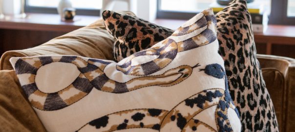
3. Pillow Talk
Why do you need so many pillows on a bed? They aren’t just for sleeping. Pillows help prop you up to watch TV, to have breakfast in bed, or to snuggle in with a good book. So we like to include enough pillows that our clients will always be comfortable. A tried-and-true setup for a king bed includes three euros, two king shams, an accent pillow or two, and a lumbar.
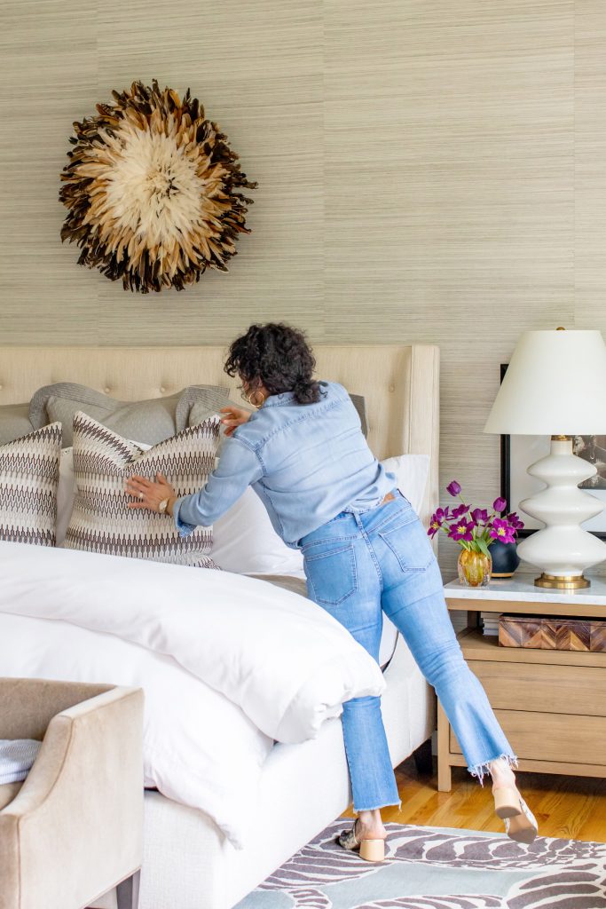
PRO TIP: To chop or not to chop – we get asked that a lot! We do like a nice chop on accent pillows. Not only does it add visual interest, it adds a more tailored look to a bed that has super-soft pillows with less structure.
Custom spaces that elevate your everyday life are our thing — details down to the down fill and pillow arrangement are always uniquely personalized for our clients. We always say, it’s time to make your home a reflection of you. Need help? Give us a call!