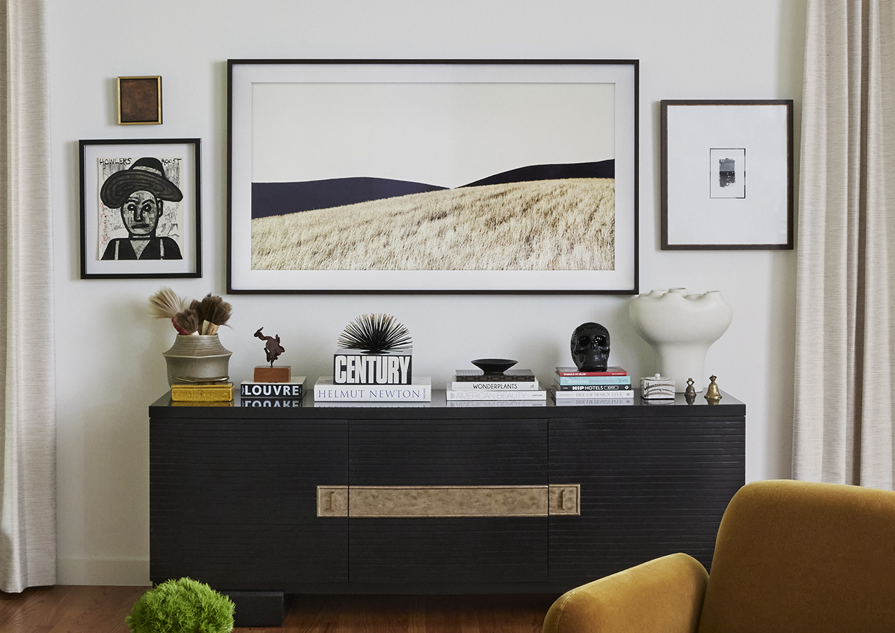
For years there’s been a debate about whether to hide the television in a cabinet or in some other clever way, or to leave it as a big black square in the room. Designers are always looking for ways to cover up the “black hole” of a TV so the room has a cohesive design, but it isn’t always possible. Now there’s a TV available that solves the design dilemma, and even enhances it!
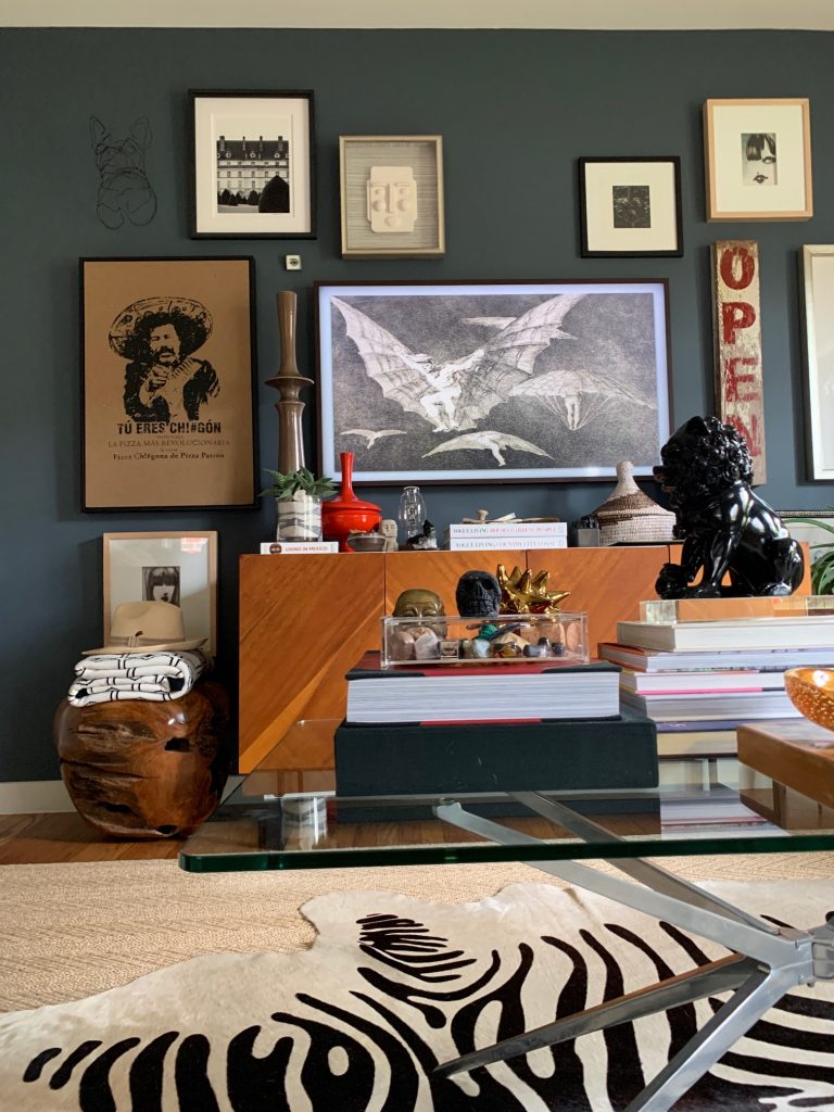
Samsung’s Frame TV is a high-resolution QLED TV when it’s turned on, and it’s a beautiful piece of framed art when it’s off. You can see in the photo above that it’s hard to tell which of the framed pieces is the TV!
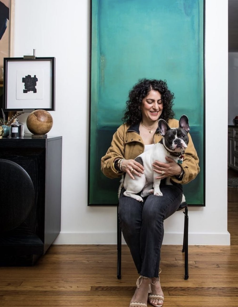
The Samsung Frame is so fabulous that Pulp co-founder Carolina Gentry bought them for her own home.
You can select from several frames for the television, giving you a lot of options for either matching frames in the room, or complementing them with a great coordinating look.
And with 1,200 available pieces of art, you can find a look that’s inspiring and mesmerizing! Art is available from iconic institutions like Museo del Prado, the Victoria & Albert museum, Artspace, Saatchi Art, Minted, and more. You can change up the art to suit your mood or the decor – the options are up to you.
The technology is also cutting edge since it’s a Smart TV that offers the highest-quality picture and sound. It also offers tap view, voice controls, multi-views and an eco remote. Accessories include an easel, a customizable wall with shelving, and hidden wiring. With looks AND smarts, we’ll be recommending this design solution to our own clients!
If you haven’t heard… our sister company, Pulp Properties, is working on launching a new rental property in Palm Springs! Our design team has been busy putting the Pulp touches on this new house. We have been exploring all Palm Springs has to offer with restaurants, small businesses, and so much more. In fact, we are headed there for Modernism Week in just a few days! If you haven’t heard of Modernism week, it highlights the architecture, interior, art, and the other culture surrounding Palm Springs. While we’re there we plan to try all the new restaurants that everyone is raving about and revisit some of our favorites. We’re breaking them all down for you here, so that when you book your first stay at The Pulp House: Palm Springs you have a great list to get you started…
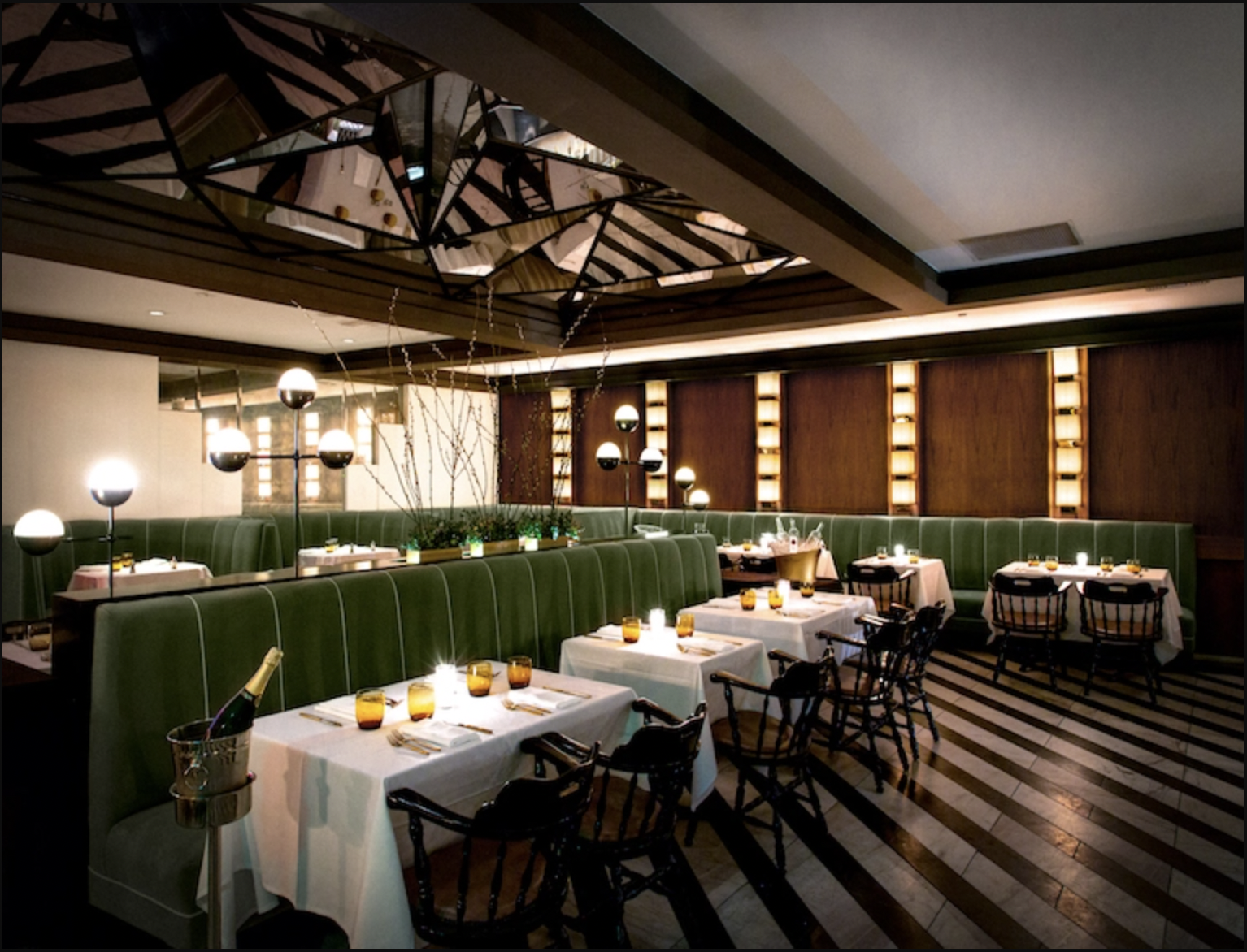
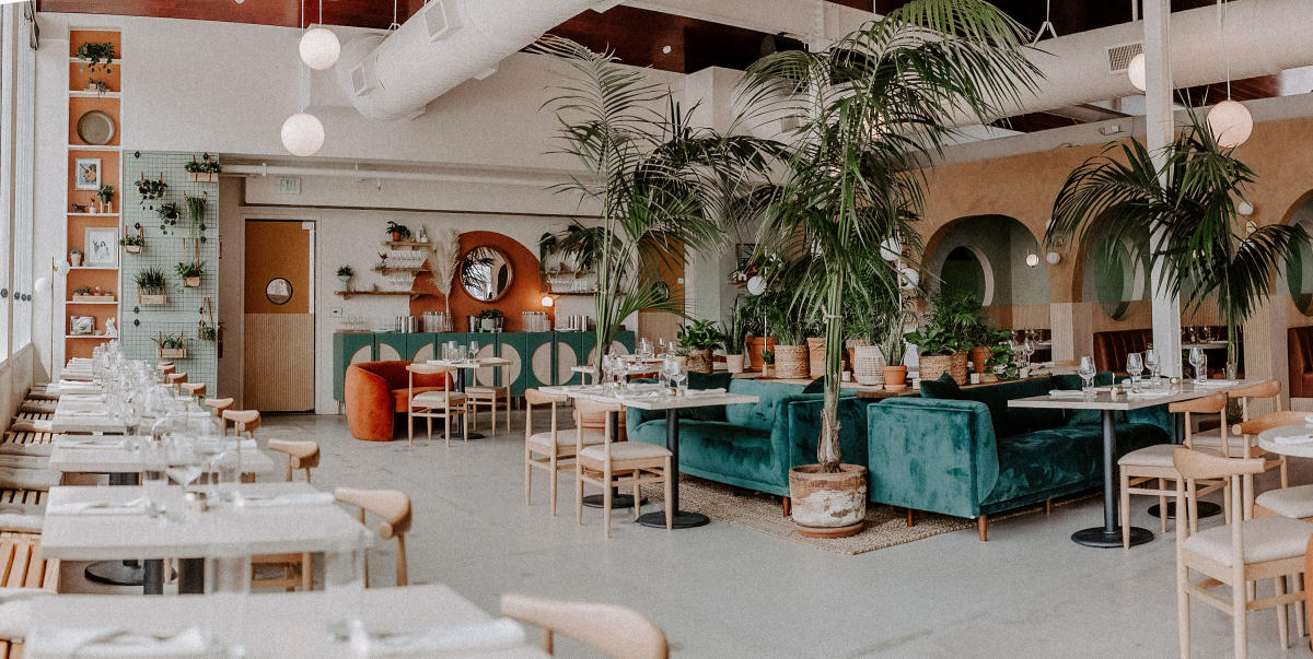
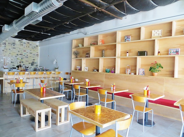
One of our personal favorites is Mr. Lyons, a modern steak house that has a great ambiance, but even better food and drinks. The interior is moody with dramatic black and white tile floors and green velvet seating. This will definitely be a revisit whenever we’re there.
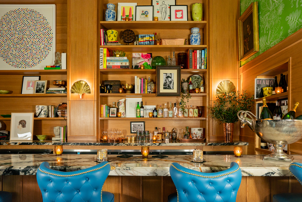
Another favorite is Bar Cecil, which has great cocktails and a variety of food. The crazy fun interior almost makes you feel like you’re dining at home with bright blue barstools and multicolored wallcovering.
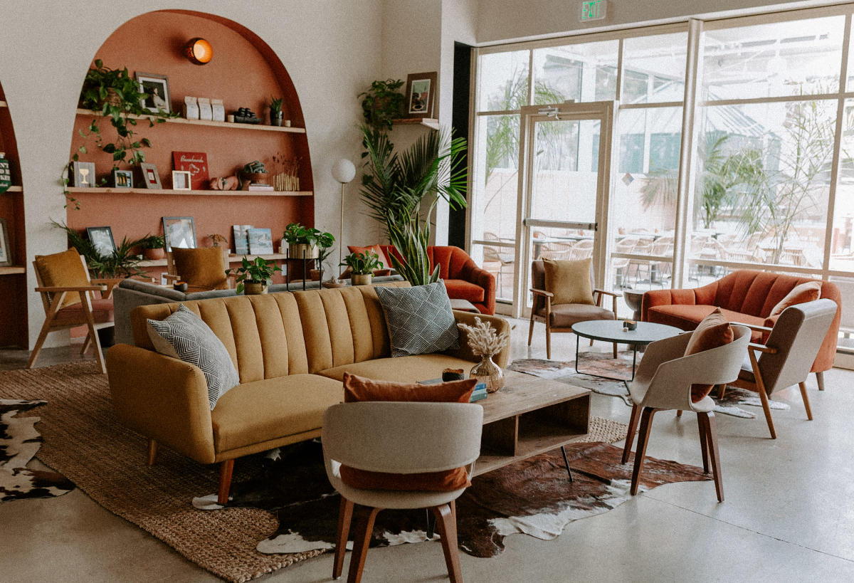
If you’re looking for a great place to get a delicious brunch or dinner check out Boozehounds. The name says it all, they have great drinks and a bonus, you can bring your dog! We love all the pops of orange, green, and yellow and of course the plants that scatter the restaurant.
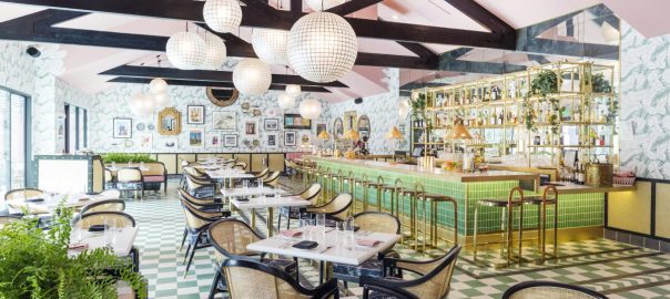
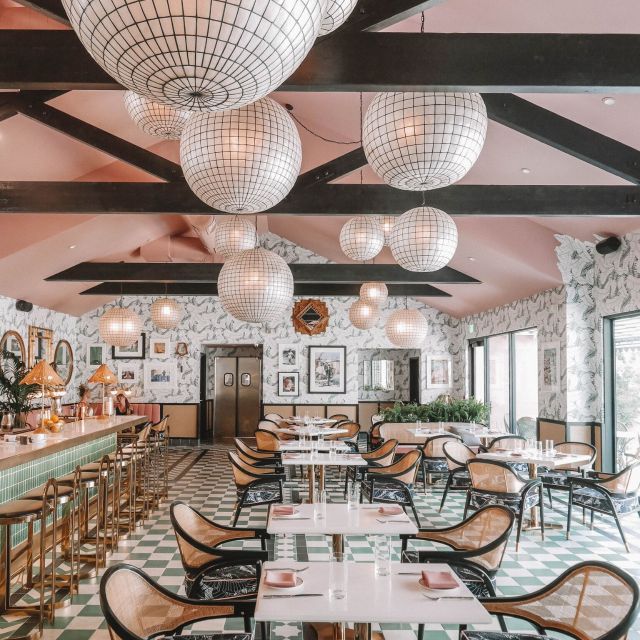
Love, love, love everything about The Pink Cabana! If you’re looking for a totally insta worthy restaurant that also has great food and cocktails, this is the place to go. Every aspect of the interior is so fun with the wallcovering, green and white checkered floor, green tile bar and the disco ball esque lights. This is a must when visiting Palm Springs!
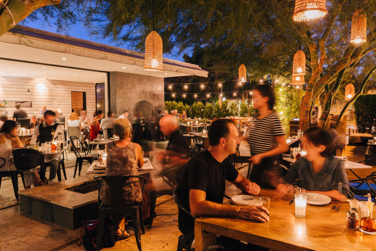
Every town needs a staple Italian restaurant and Birba is it, with their amazing pizza and pasta that will make anyone’s mouth water. Their patio adds to the dining experience and is perfect for anyone who is looking for outdoor dining. We love the hanging lanterns and string lights that cover the whole patio to create an intimate dining experience.
We’re huge sushi lovers and Sandfish Sushi & Whiskey has the best sushi and cocktails around! The interior also ties in the seafood theme with the tiling that resembles fish scales and the wallcovering with waves crashing. We recommend checking this out when you have your next sushi craving.
Looking for the best tacos and margaritas? Check out Tac/Quila! It is the best place for amazing tacos and a unique twist on a margarita. The interior has bright red seating, a unique floor tile and mirrors all over the walls, which adds to the fun environment of the restaurant.
We have heard nothing but raving reviews about Rooster And The Pig, but haven’t had the chance to try it. They’re a Vietnamese-American fusion that sounds completely mouth watering! We love the simplicity of this interior with the red and yellow pops of color. We’re hoping to try this place out soon!
Another moody restaurant is Del Rey, which has a unique mix of food and cocktails. We haven’t been yet, but have only heard great things. The restaurant has an all black theme with the walls and chairs but has a statement fireplace with vibrant blue and white tile. I can’t wait to try this place out the next time we’re there!
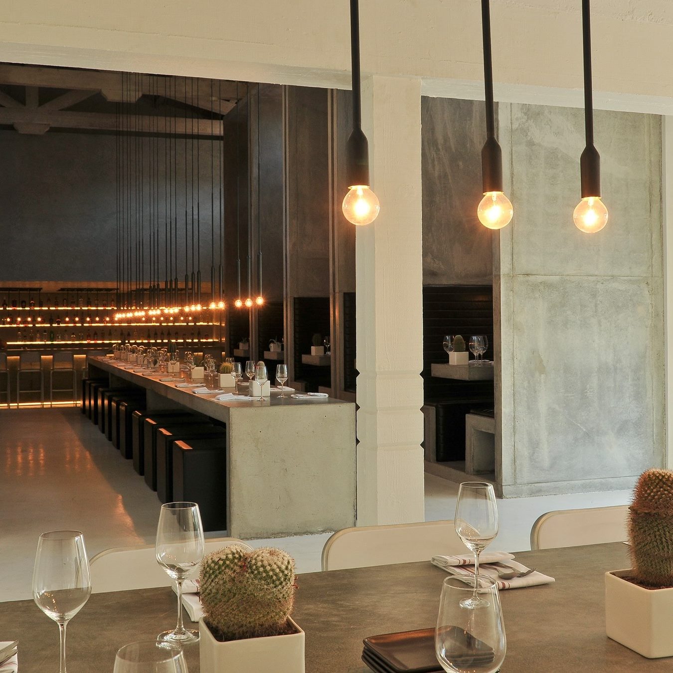
Last, but not least we have Workshop Kitchen + Bar is another place which is next on our list of places to try. The interior is everything! The use of the concrete gives off an industrial vibe that is so elegant. We’ve heard the food and drinks are newsworthy and we can’t wait to check it out the next time we’re there.
Stay tuned for the reveal of our Pulp Properties Palm Springs house that we have been working so hard to get ready!
Here are some of our current favorite finds that we want or that are making our lives better and more stylish, right now…
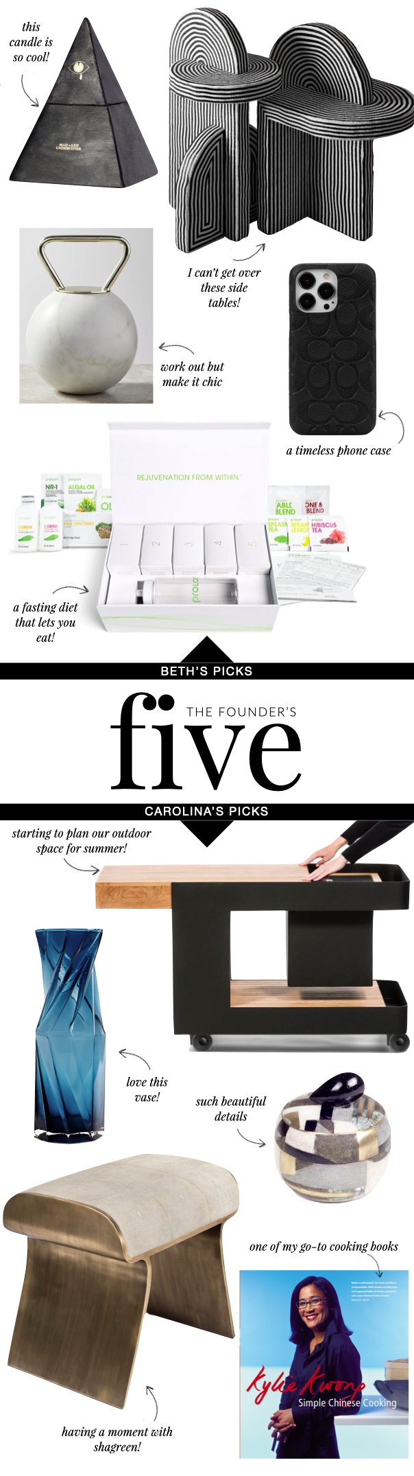
BETH’S PICKS
I’m loving the shape of this candle! It’s such a unique, fun way to have a candle in the home. It elevates any space and smells amazing!
I can’t get over these side tables. The black and white stripes create a beautiful dramatic illusion of chaos. They are the perfect statement piece.
I love to work out and I’m in the midst of creating a home gym. So finding chic workout gear is a must. I love the idea of using natural materials to create kettlebells and dumbells!
It’s the little luxuries that I love most! This phone case is a perfect accessory for anyone’s iPhone.
This fasting plan is one that I truly love and have found works wonders! Unlike other fasting plans this one actually lets you consume real food!
CAROLINA’S PICKS
This outdoor bar cart is everything you need for entertaining in the summer! I also love how sleek it looks.
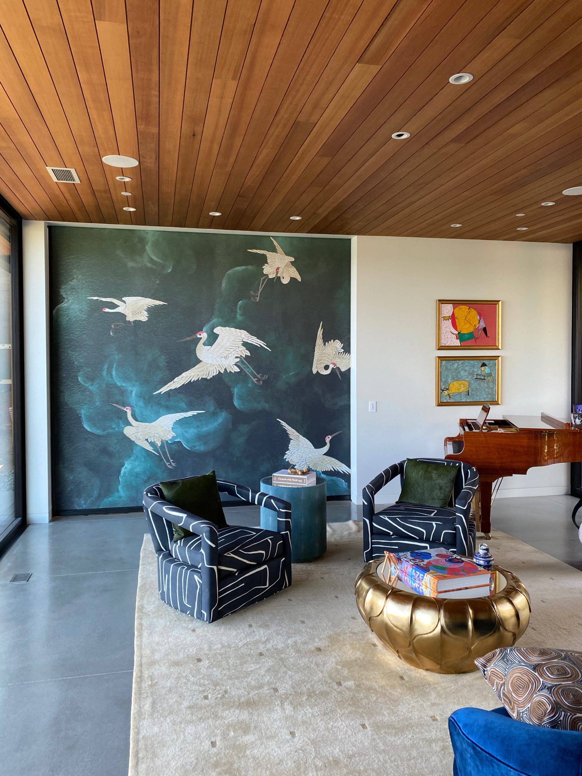
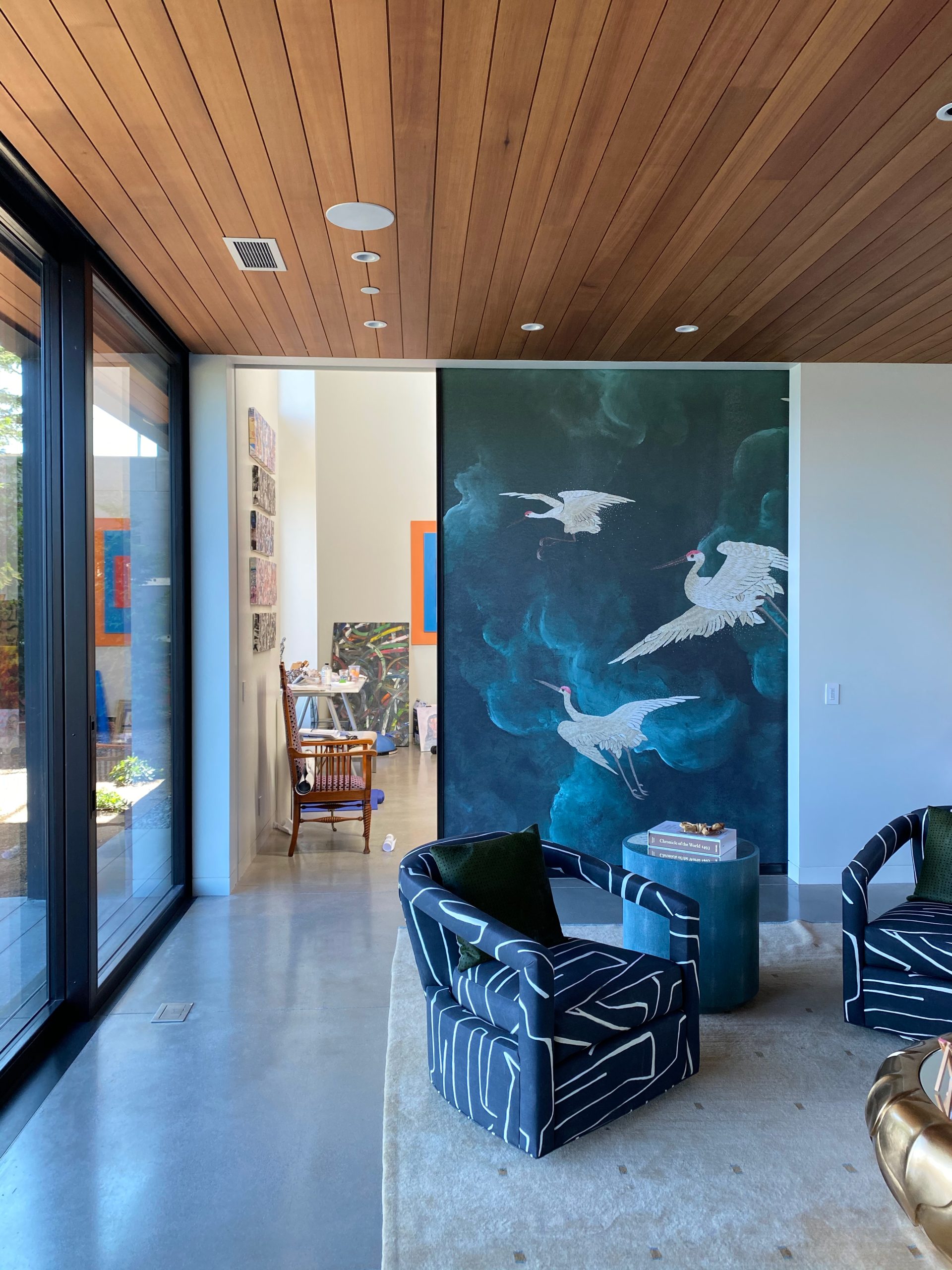
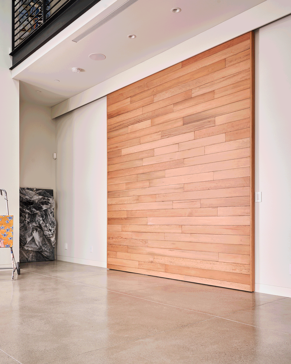
Homeowners face the issue of figuring out what to do with awkward spaces and how to utilize them in a useful and unique way. We always love the challenge of incorporating a secret space that can be used in any way the homeowner desires. From a hidden bedroom, wine cellars, or even an art studio, we have done it all. It’s always a great surprise to any new guest coming over to show off these fabulously hidden spaces. We hope this can inspire everyone to use every square inch of open space within their home!
A Secret Creative Space
In this project we incorporated two elements of surprise within the home that helped utilize the space. Using this crane wallcovering made the room look like an art piece in itself but, what guests don’t know is beyond that secret door is a large creative space that can be open or hidden at any time. The other hidden piece was the Murphy bed, which is a great addition to any open room. We love how these turned out and how it brought a great a statement piece to each room! Tour the complete project here.
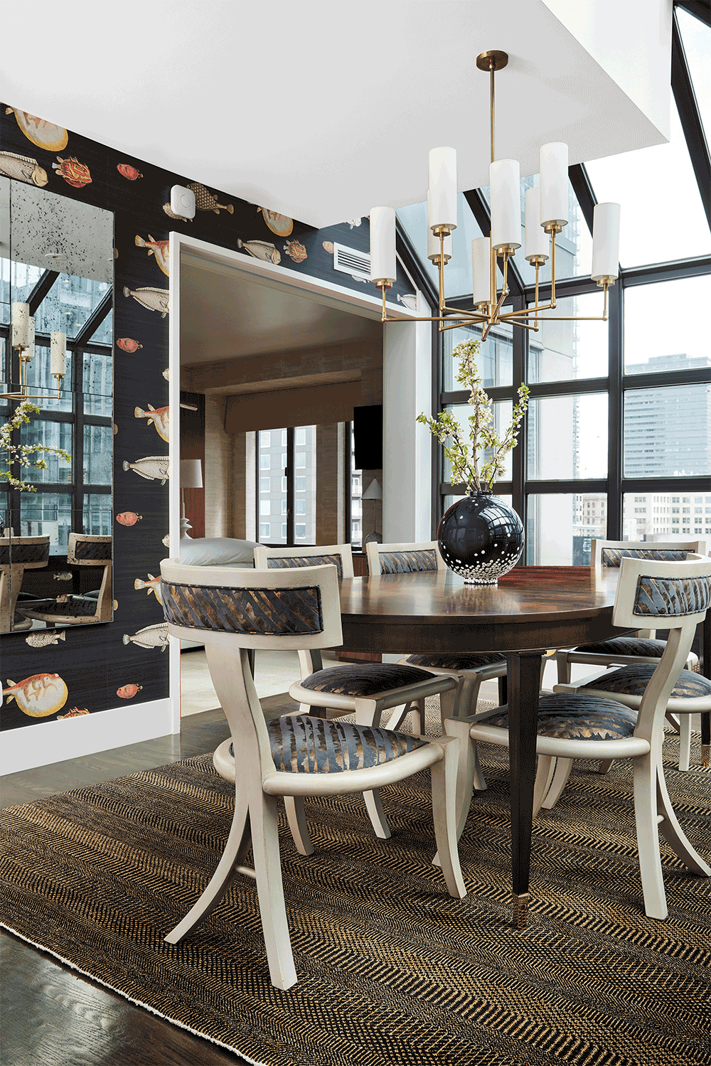
A Pop of Color with a Purpose
For this project, we wanted to be able to separate the dining room with the primary suite to have an element of privacy, while adding a stunning pop of color! This was a great addition to the Penthouse that would give the option of an open space, or divide when needed. Being able to incorporate this into a home is so unique and will get all your guests talking. Check out the rest of this project here.
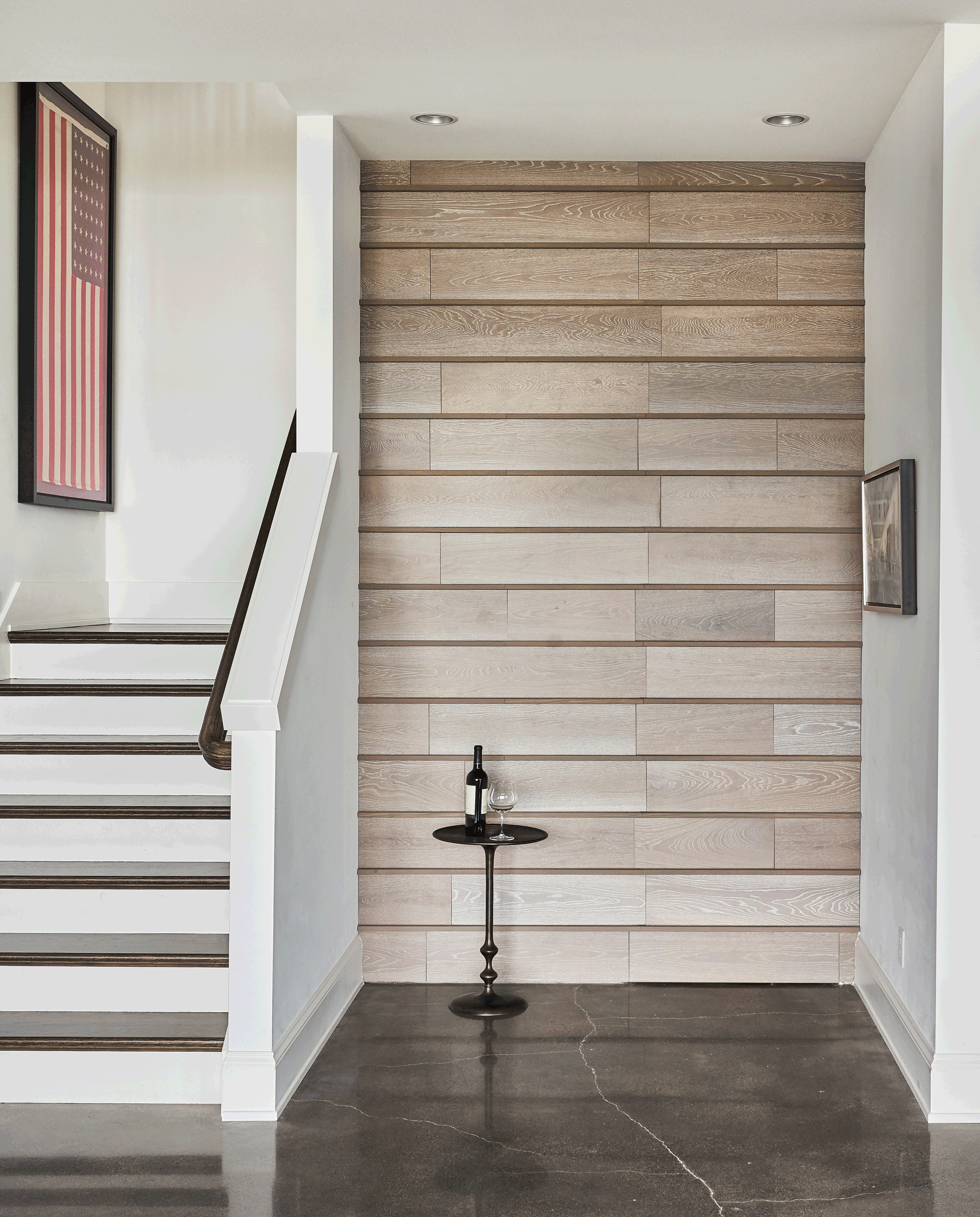
The Perfect Wine Cellars
Who doesn’t want a wine cellar in their home? We love transforming awkward or unused spaces within a home, into a secret wow factor. This is exactly what we did for both of these projects, which had extra space to incorporate something as great as wine storage! In one project, we transformed an open wine cellar into a hidden space, unnoticeable to the eye. Our other project, you may think is just a basic mudroom, but opens up into a fabulous wine room.
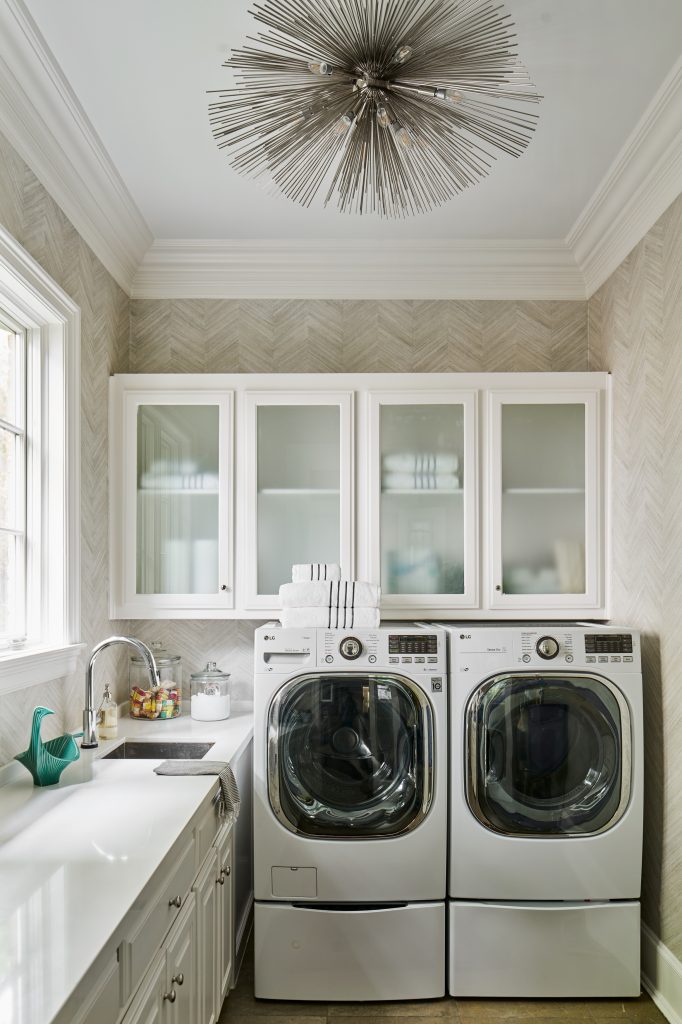
Okay, we confess that we love the smell of fresh laundry, especially when it comes to bed linens! That clean and soapy smell is the best. Your laundry room may not be the first room you think of when you’re designing your home, but you’ll spend a LOT of time in that space. So we always walk our clients through what we consider the most important essentials for this space. Of course the appliances are key, and each person will have a different idea of what they want or need when it comes to their washer and dryer. But our essentials move beyond the appliances to other things you should consider. Let’s take a look!
1. Storage
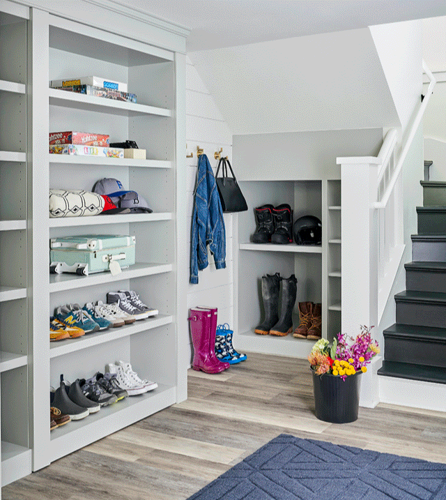
You need much more storage in a laundry room than you may think. Besides all of the soaps, prewash, dryer sheets, and detergents you will use, it’s a great space for storing extra towels, cleaning supplies for the rest of the house, an iron, steamers, and more. In the laundry room above – part of a gorgeous modern lodge in Seattle – we designed a bank of cabinets and drawers for maximum storage.
2. Sink
It’s amazing how many clients say, “A sink?” when they see our designs for a laundry room – and then admit that they use it all the time once they’ve moved in! Sinks in this space are perfect for delicates, to prewash heavily soiled items, and to give you another water source for any clean up. If your laundry also serves as a mudroom, you’ll use this sink all the time, we guarantee it.
3. Counter Space
This is not only essential, it’s critical! These surfaces give you the perfect place to fold all of that laundry and ready everything for distribution into closets and dressers. The more counter space you can give this room, the better, especially for folding sheets and larger items.
4. Lighting
Since the laundry room is a task-oriented space, it’s important to offer strong light sources. And the Pulp team is known for creating chic spaces in every part of the home, so this room is no different. As you can see in the laundry above, we used a sophisticated fixture to give the room a fantastic glow.
Bonus ideas for the laundry room include fold-down ironing boards, a built-in clothes steamer, cedar-lined storage, and more. Give our team a call if your laundry – and your home – needs a refresh!
Here are some of our current favorite finds that we want or that are making our lives better and more stylish, right now…
BETH’S PICKS
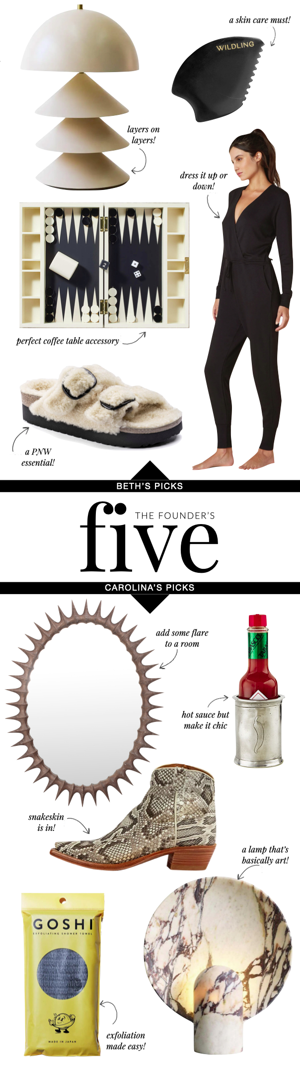
This table lamp gives an illusion of the rigid pieces floating in thin air. This is a great piece to put in any room for dimension.
With everyone raving about Gua Sha’s I had to try the Empress Stone! It helps to reduce inflammation as well as lift, tone, and sculpt your face.
I have been living in my Beyond Yoga Jumpsuit that can be styled for any occasion. The ultra soft fabric makes it so easy to be on the run or lounging at home.
Seeing this box you would think it is just a great accessory, but it turns any hangout into a fun game night. The fold-out Kimbra Backgammon Set is a perfect piece to have in any home.
If you’re looking for a great slipper that is totally acceptable to wear in public these Shearling Slides are it! The shearling material is extra cozy, extra comfortable with amplified big buckles for a bold style.
CAROLINA’S PICKS
This Thorn Mirror adds great texture to any room while keeping a contemporary look. Also, it’s the perfect mirror for a selfie!
Who doesn’t want to elevate their hot sauce? This Hot Sauce Holder is a great gift idea for the spice lovers in your life!
Snakeskin has always been in fashion, but it’s making a comeback, especially when it looks this good! The pointed toe, short heel, and beautiful python pattern will make any outfit pop.
I’m obsessed with this Marble Lamp and need it for my house right now! This stunning lamp gives an ambient and sculptural feel and with it being handmade, every lamp has its own unique veining.
If you’re looking for a great shower exfoliation, look no more. This Exfoliating Shower Towel will make your skin softer and cleaner than it’s ever been!
We’re officially past the holidays and moved into the New Year! But we aren’t over 2021 quite yet… we’re taking a look back at our most-loved blog posts of the year! Happy reading!
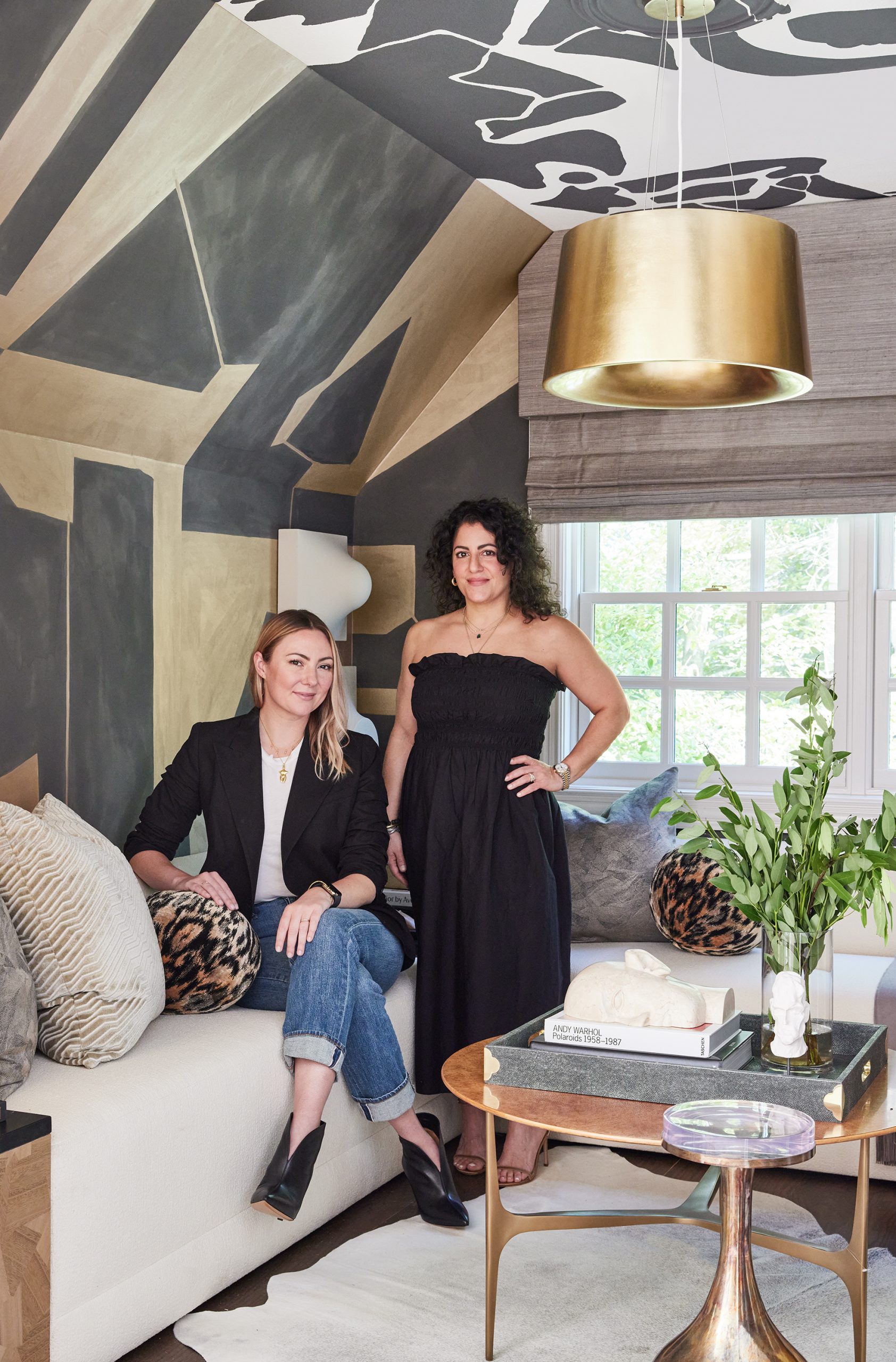
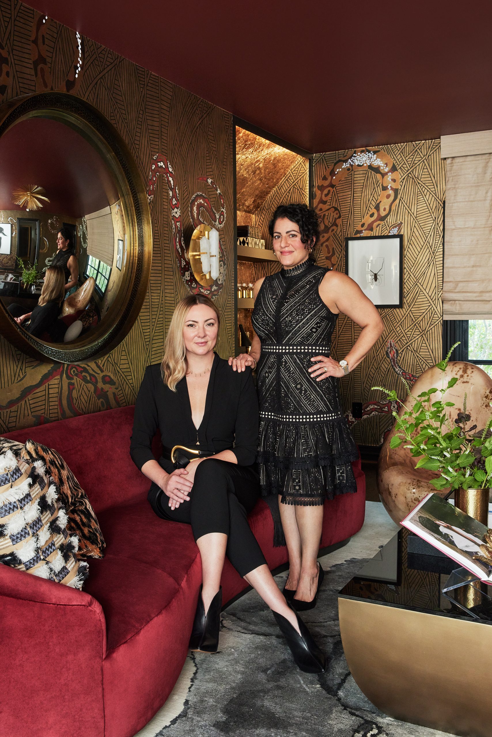
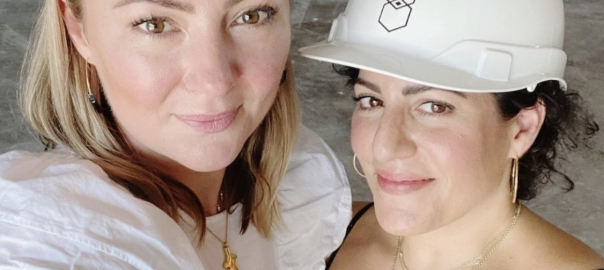
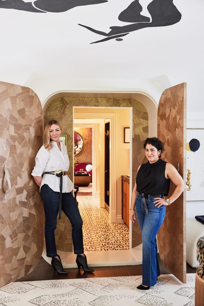
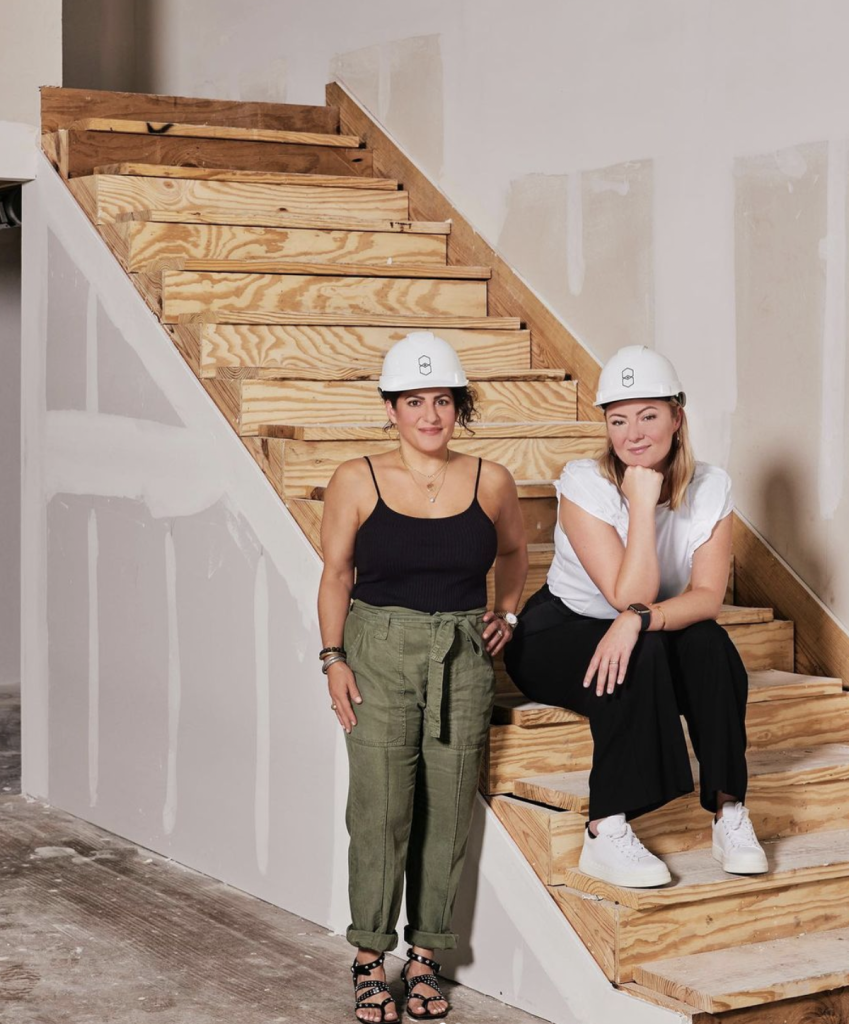
When Beth Dotolo and Carolina Gentry, co-founders of Pulp Design Studios, were named to the design team for the Kips Bay Dallas Show House, they knew they wanted to make a big statement and to push the envelope on interior design. Their Wise & Wicked space is bold and beautiful, and tells the story of iconic women like the Pulp duo. We asked Beth and Carolina to walk us through each of the rooms in their Kips Bay space, giving us insight into their design vision. Read more!
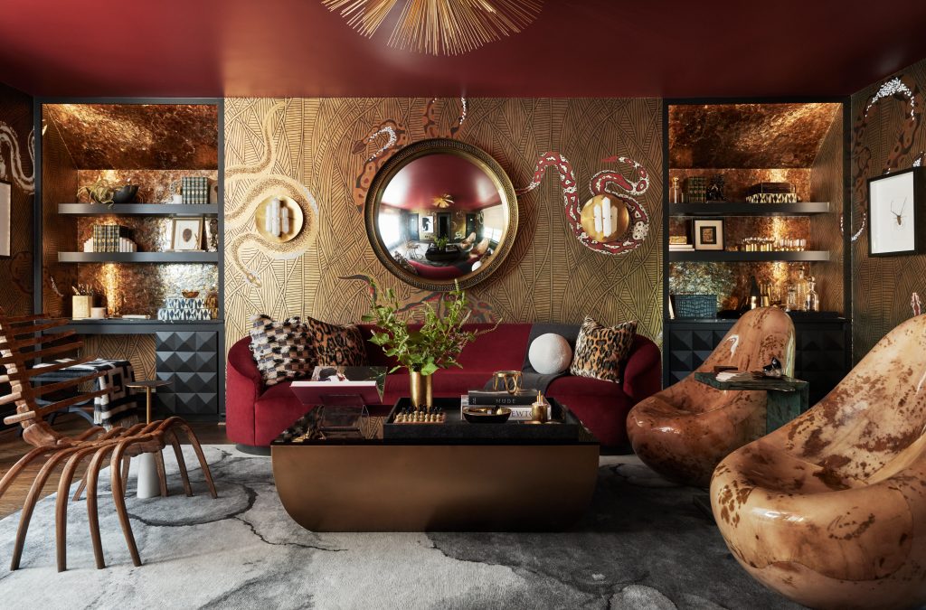
For their Kips Bay Dallas Show House space, Beth Dotolo and Carolina Gentry, co-founders of Pulp Design Studios, wanted to create a design that would showcase a duality with a Wise & Wicked theme. The rooms are an homage to a modern woman, a paradox who is both wise about her business and also wickedly amusing in her off time. She’s graceful and glam, playful and polished – and this loft space reflects those two sides of her personal style. We asked Beth and Carolina to walk us through each of the rooms in their Kips Bay space, giving us insight into their design vision, and we’re excited that they’re going to tell us all about the Wicked lounge, also known as the ‘Sinner’s Den.’ Read more!
The Pulp team are experts at using multiple patterns in a room, but it can be tricky! In fact, it’s one of the most popular questions that we get. So we want to break it down and make it easier for you! Here are our top 7 ideas for making that magic mix in your home. Read more!
The Pulp team is constantly asked – by both clients and other designers – how we keep everything going. We do have a lot to juggle with our projects, the Kips Bay Dallas showhouse (stay tuned!), product design, and so much more. But the key for our team is to stay organized and to keep our systems and processes running smoothly. Here are tips from each of our co-founders on how they get it all done! Read more!
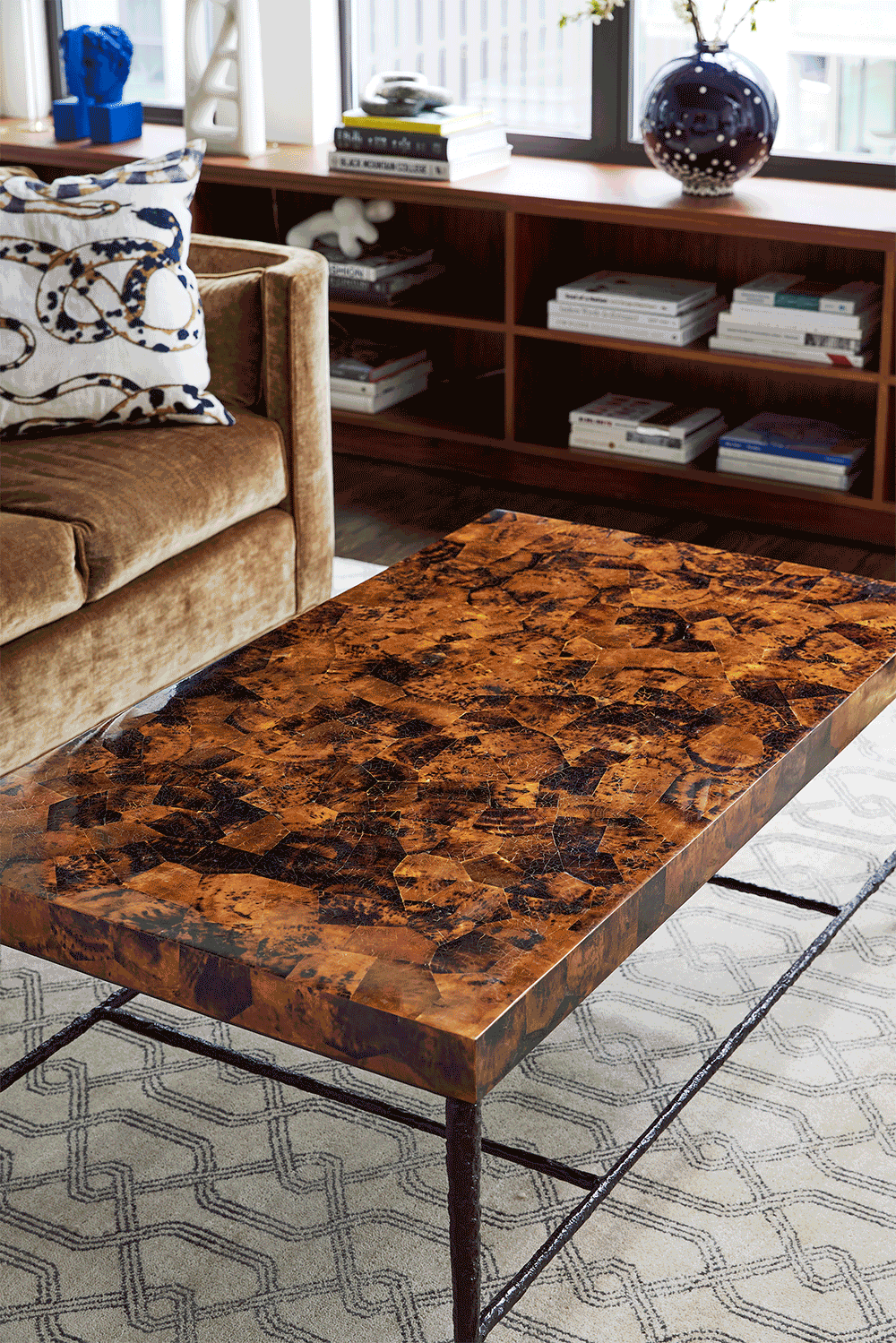
One sure way to get a magazine-worthy look in your rooms is to style them perfectly. But it’s hard to achieve the right balance, especially on surfaces like coffee tables. So we asked Pulp co-founder Beth Dotolo to show us – step by step – how to get that professionally styled look for your coffee table! Read more!
What a whirlwind of a year! We can honestly say that 2021 was one of the busiest years in our company’s history, and that’s certainly not what we thought would happen at this point last year. Then, we were looking at a pandemic that just didn’t seem to want to leave (still facing that now, ugh). But with home becoming the oasis for everyone, it had a major impact on our business, and our year. As we review how the last 12 months went, we want to thank ALL of our fantastic clients who knew we would produce fabulous and functional homes that they would love, and who were so patient as the world dealt with supply chain issues and delays. We hope that 2022 resolves that particular issue. Next year is Pulp’s 15th anniversary, and we have BIG plans in place, so stay tuned for that. Meanwhile, we believe in celebrating every single success (especially in a year like this one), so here’s the Pulp review of our 2021 highlights!
Kips Bay Show House
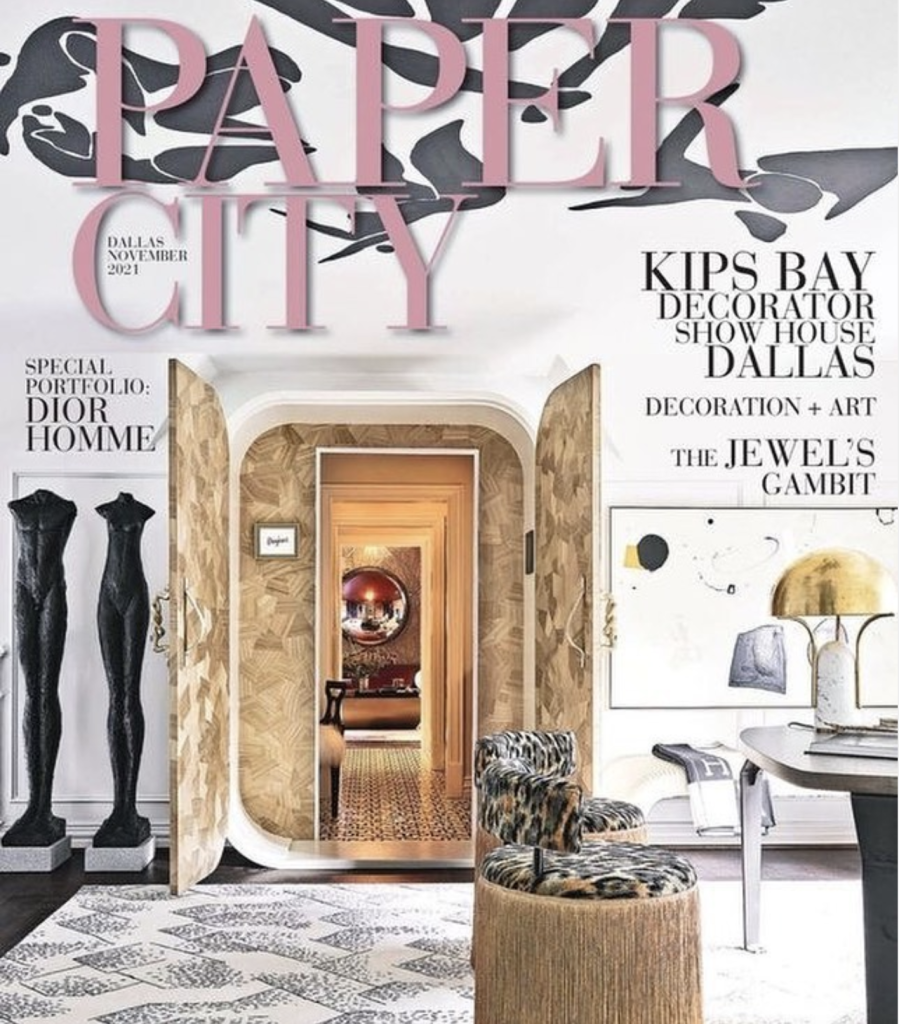
Being a part of this show house, which is really like the Emmys of design, was such an honor. We approached our Wise & Wicked space with an eye on the modern woman and how she has transformed her home for her 2021 needs. That included light and sophisticated office for her days filled making smart work decisions, plus a luscious space for her to lounge and get away from it all…tapping into her wicked side. We want to once again give a huge thank you to all of the amazing brands that helped us bring this space to life! If you missed the reveal, click here to walk through the home office and here to see the “sinner’s den.” We were so honored to see our spaces featured by top publications like Elle Decor,Arch Digest, and Veranda, and we also made the cover of Paper City magazine!
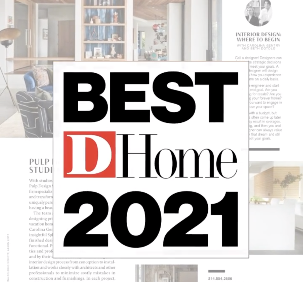
Pulp Named Top Designers (Again!)
We were absolutely thrilled to be named top interior designers by D Home magazine for the 7th year! This means so much because we were selected by showrooms and professionals in the biz. It’s a huge honor and one we take very seriously.
Pulp Properties Makes Its Debut
In 2021, we were also thrilled to launch Pulp Properties, a real estate development and experiential hospitality business. This new division will give us the chance to allow others to experience our approach for interiors in both their work and vacations. First up? A commercial space in Dallas that will house our headquarters and be home to multiple women-owned businesses. And we have an iconic Meiselman house in Palm Springs that will be a dream vacation destination that’s also shoppable. We cannot wait to take you along on the journey as we renovate, search for more properties, and open our doors! Stay tuned for more news and photos in 2022!
Pulp Partnerships
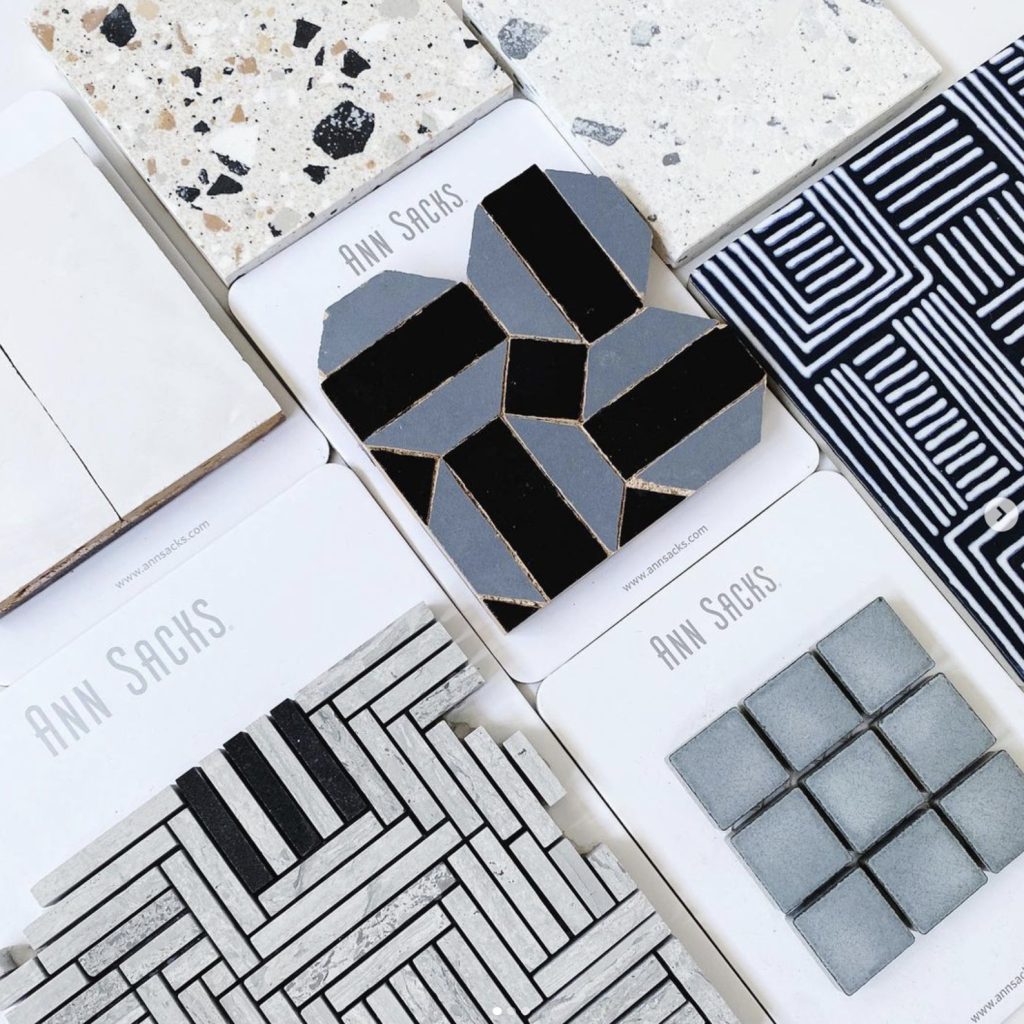
Pulp absolutely loves to partner with other home companies, whether it’s for a show house, product design, an ambassador role, or on an advisory council. Pulp has an amazing partnership with S.Harris for our fabric collections, and we serve on the House Beautiful Advisory Council and the Thermador Design Council. This year, we were also excited to be named Ann Sacks Ambassadors. Since we love their tiles and use them all the time, this was a natural fit!
Our Fabulous Clients
As we said above, 2021 was one of the busiest and craziest years in our company’s history. We had so many amazing clients and projects, including a fabulous Seattle high-rise pied-á-terre that we debuted on our website earlier this year. We were so thankful for our patient clients who knew we were going the extra mile in 2021 to find and deliver their furnishings. And we could not have accomplished everything we did without our amazing team members. We had record projects, amazing growth, and what seemed like dozens of photo shoots. It was a wild ride!
We are so thankful for such an incredible time in 2021! And we have amazing plans for 2022, including a fabulous trip to celebrate Pulp’s 15th anniversary. So here’s to a fantastic new year!
There is something so magical about the holidays – especially this year. There is a focus on family, new beginnings, and resetting our priorities. The Pulp team also puts a spotlight on wellness during the holidays. We close our offices from Dec. 24 through Jan. 2 so that our entire team can rest and recharge. It’s so important to make your wellness a top priority, now more than ever. And the holidays – a time when the world slows down – is a great time to refocus your attention on self care! Here are the top wellness goals that the Pulp team has for their holiday season.
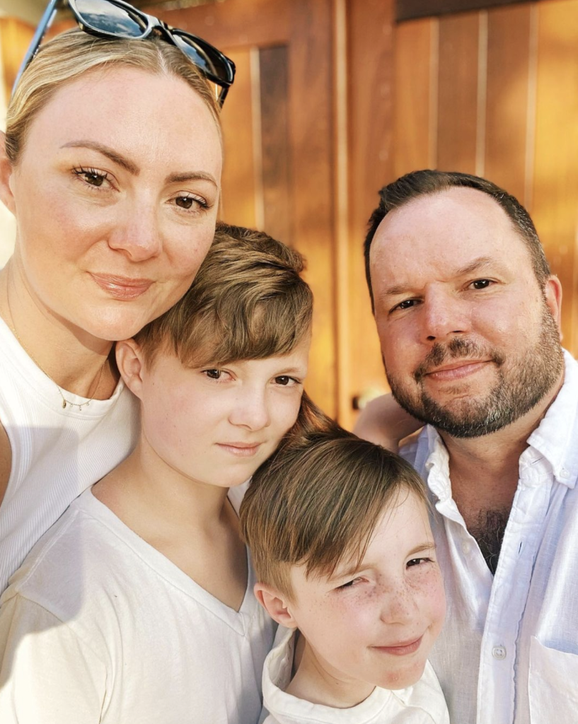
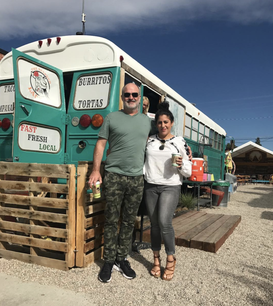
Beth Dotolo with her familyCarolina Gentry and her husband
Family Time
The Pulp co-founders Beth Dotolo and Carolina Gentry love to spend time with their families! This has been a whirlwind of a year for the Pulp team, so having time set aside with no deadlines or design challenges is a huge luxury. If we’ve learned nothing else from the pandemic, we have all realized that there is nothing more important than our loved ones. Spending time with people that mean the most to us is the key to happiness, so Beth and Carolina plan to make the most of that time during the holiday season. And that includes their fur babies Luna and Bennie!
Carolina with Luna
Beth with Bennie
Healthy Eating
Of course there are fabulous things to indulge in over the holidays, but both Carolina and Beth love to create and eat healthy meals. Eating as green and clean as possible keeps them strong and at their creative best, so that’s the key to their holiday wellness season. It’s great to have that hot chocolate or a slice of Christmas pie, but use this season to also remind yourself of how important it is to keep your focus on your health. Especially during a pandemic, it’s key to allow your body to build up its immune system to keep you operating at your very best! But be sure you feed ALL of your senses by also taking the time to serve meals that look as good as they taste. Use your best plates, bowls, and serveware, and show you care by setting a stunning table! You don’t have to have guests to make it beautiful – you’re worth it, too!
A Restful Holiday
We all know how critical good rest and sleep is for our health and wellness, and there’s the temptation to see the holidays as the time to “catch up.” But the most important thing we can do is make good sleep our priority for 2022. We love to create restful rooms for our clients, with the right mattress, soft sheets, and comforting blankets and comforters. We also need to make a commitment to put our devices away at least an hour from our bedtime. Nothing should get in the way of a calm and restorative sleep. Create your own oasis for the very best rest in 2022.
The Outdoor Tonic
So many studies now show how important it is to our mood and our health to spend time outdoors. No matter how cold it is, or what the weather is, the Pulp team believes in getting outside for fresh air and vitamin D. Make time for walks or hikes, especially if you have dogs in the family. Take deep breaths and enjoy the gorgeous views – it should be a focal point for any wellness plan!
A Wellness Routine
Time to yourself is also an important part of self care, and that includes spa appointments, reading, meditation, yoga appointments, and more. Women, in particular, can dismiss things like that as indulgences. But lowering your stress level and doing something for yourself is essential to a healthy lifestyle. Commit to allowing yourself the time and investment to recenter your health!
We hope you’ll make your wellness a top priority over the holiday season and into 2022. Merry Christmas from the Pulp family to yours!
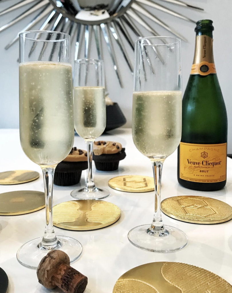
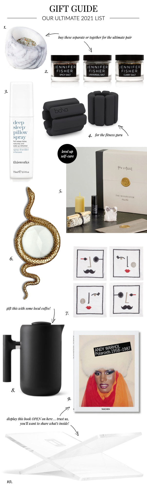
This year, the Pulp team is into moments that make memories for the holidays. Whether it’s creating a fabulous meal, meditating with amazing scents, mixing the perfect cocktail, or taking good care of yourself, we believe that memories are so much more important than things. So use our Ultimate Gift Guide to show your friends and family how much you care! Happy holidays!
3. The gift of a good night’s sleep with Deep Sleep Pillow Spray from This Works is something everyone could use (including the Pulp team!).
4. Elevate at-home exercise withBala Bangles, perfect for inspiring a good workout.
5.The Ritual Manifestor Ritual Kitoffers a way to up-level your self-care with a formulation that’s designed to amplify prosperity and abundance in all areas of your life.
6. A desk accessory that will slither its way into your daily routine, the Snake Magnifying Glass amplifies your view.
7. Perfect for the barfly or art lover in your life, the Muse Cocktail Napkins by Jonathan Adler offer a cheeky way to serve up your favorite drinks.
8. For those on your list who appreciate the perfect brew, the Clara French Press would be a perfect pair for a local coffee roaster.
9. + 10. This Andy Warhol Polaroidsbook is a great gift for anyone who is into photography or art. We would pair it with the lucite bookstand from Assouline for a great display.
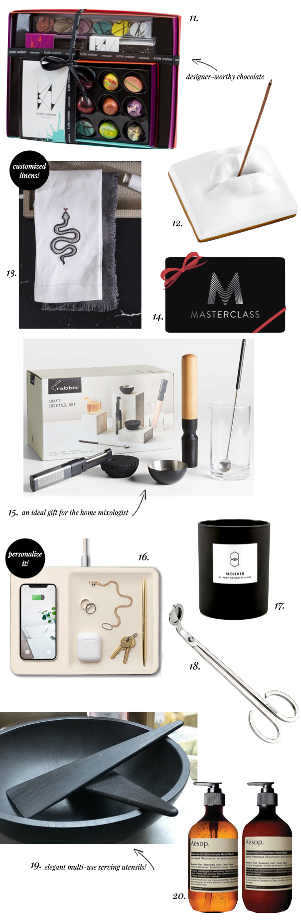
11. Who doesn’t love chocolate (we don’t want to know them)? But this is chocolate on a whole other level with artistically designed treats in the Chocolate Gift Box from Kate Weiser.
12. Pucker up and blow fragrant kisses to friends and family with this fabulous Oh Mon Dieu Incense Holder.
13. Customized linens are always a great hostess gift during the holidays, so why not offer an edgy design that was featured at the Pulp Design Studios Kips Bay Show House space? We loved these Leontine linens that were created just for us!
14. Inspire your loved ones with a Masterclass Membership. They can take classes from superstars in design, art, writing, and more!
15. A great gift for any mixologist in your life, the Craft Cocktail Setfrom Crate & Barrel offers the perfect tools for creating fabulous drinks.
16. The Catch:3valet from Courant is the new home for your most essential items, including a wireless charger.
17. + 18. There is nothing better than candlelight over the holidays, and Pulp has a cozy Mohair scented version that’s perfect for welcoming people home. And for smoke-free burning, the Diptyque Candle Wick Trimmerhelps recenter the wick while you extinguish the flame.
19. Perfect for serving up sides at holiday soirees, the Salad Serversfrom The Wooden Palate would be a great hostess gift!
20. As we still grapple with a worldwide pandemic, giving a gift that encourages hand-washing while providing soothing scents is a smart move. A Pulp favorite is the Resurrection Duetby Aesop.
Wherever You Are
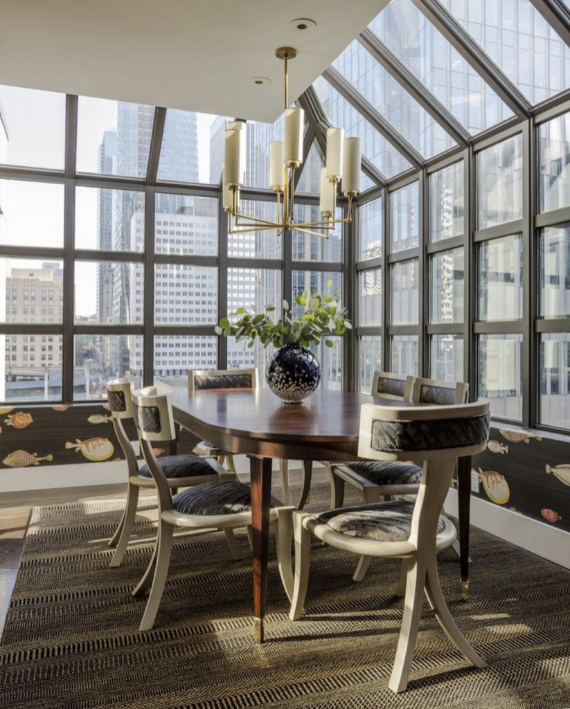
We work all across the country, designing primary residences, pied-à-terres, and vacation homes, for our clients near and far.


 Samsung’s Frame TV is a high-resolution QLED TV when it’s turned on, and it’s a beautiful piece of framed art when it’s off. You can see in the photo above that it’s hard to tell which of the framed pieces is the TV!
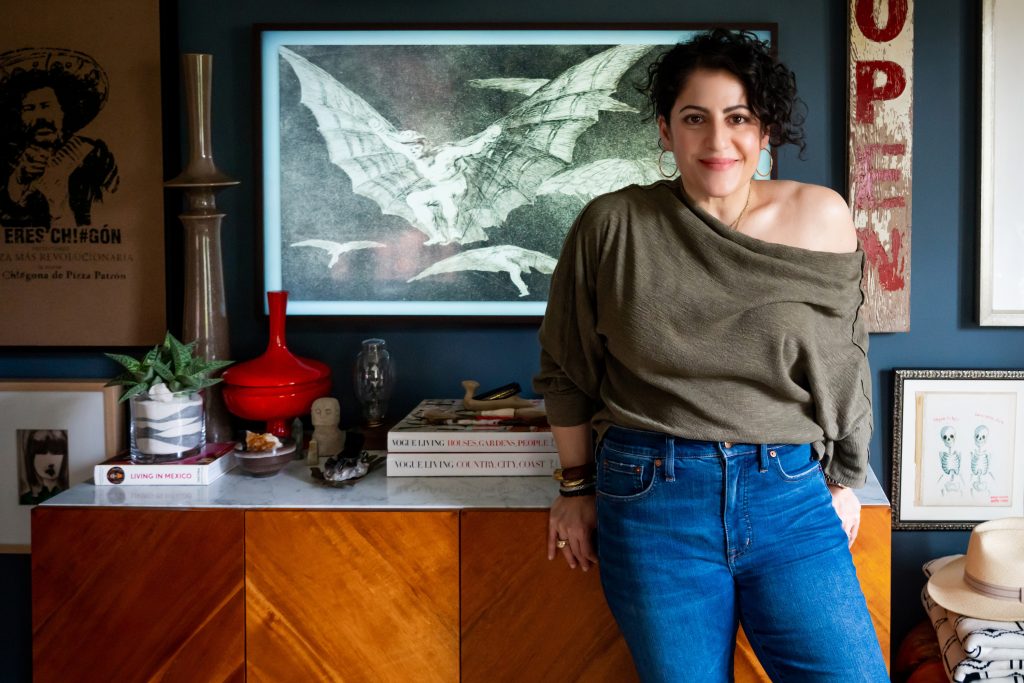 The Samsung Frame is so fabulous that Pulp co-founder Carolina Gentry bought them for her own home.