


There’s one thing we hear over and over – most people are still fearful about using bright colors in their homes. They either think it will be “too much,” or that they’ll get tired of it quickly. But those bold colors are important as we spend more time at home. In fact, now is the perfect time to experiment. It’s your home and it should make you happy. So the Pulp team has 4 foolproof tips for getting bolder in your home’s palette!

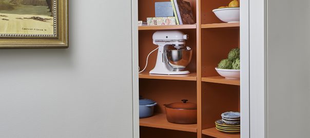
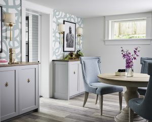
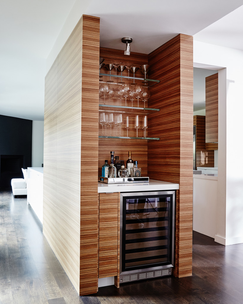
Go Small
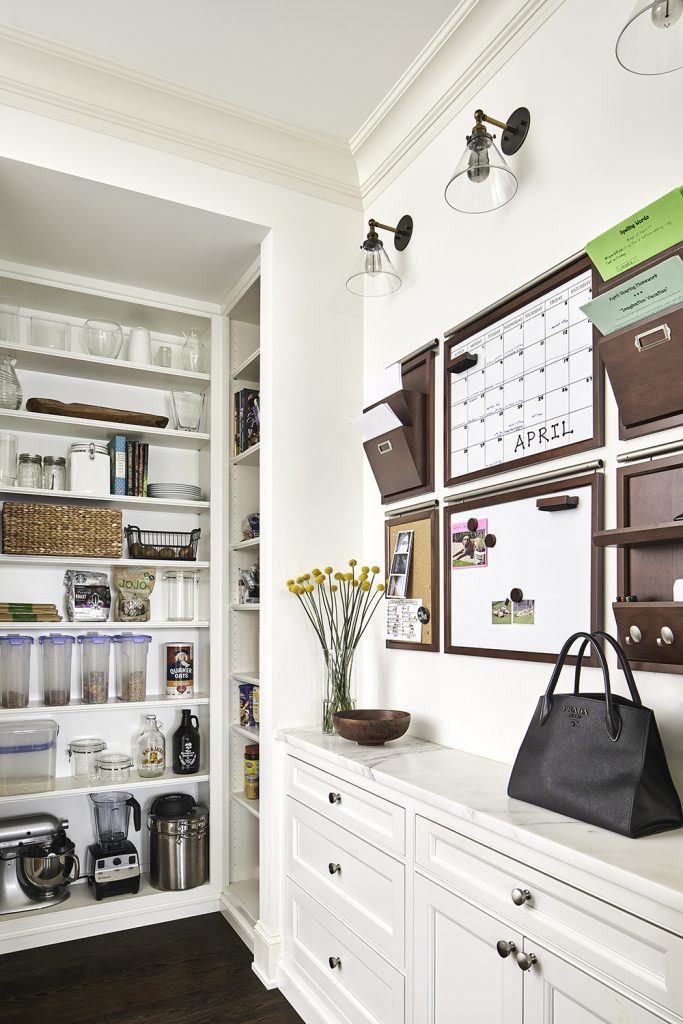
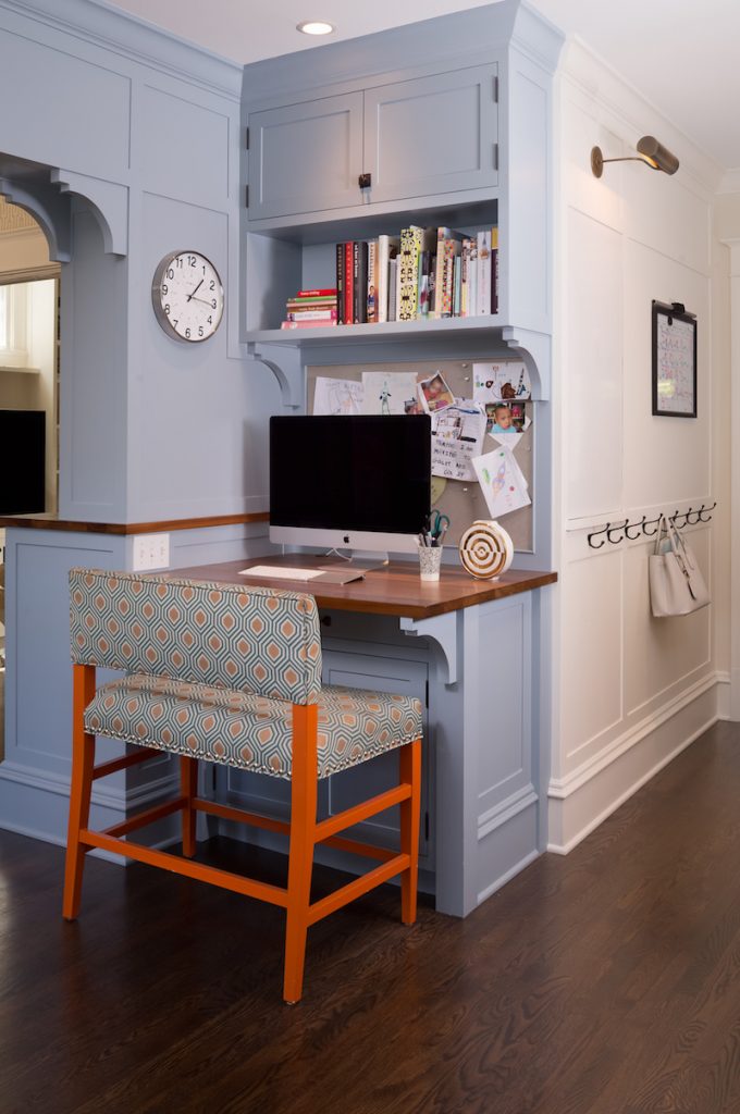
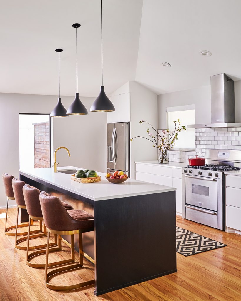
A little can go a long way when you’re trying out color in your home. Find a small space where you can experiment, like in the pantry at the top of this post, or the cabinetry we designed in the kitchen above. Those little hits of color should complement the rest of the room, and we guarantee they’ll make you smile. If you’re super-nervous, use spaces that don’t get a lot of traffic or that are inside a closet or small space.
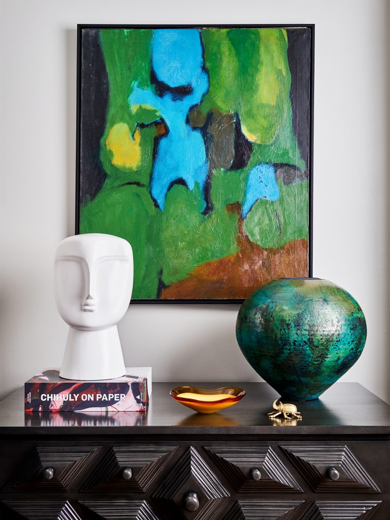
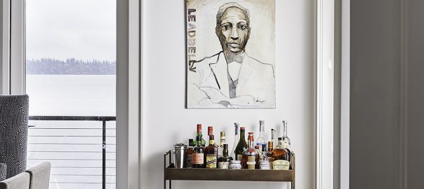
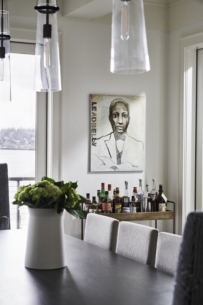
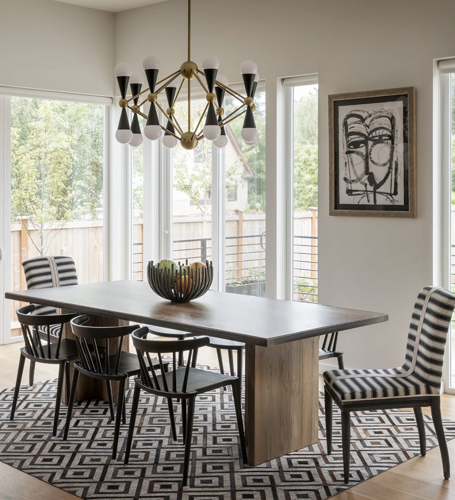
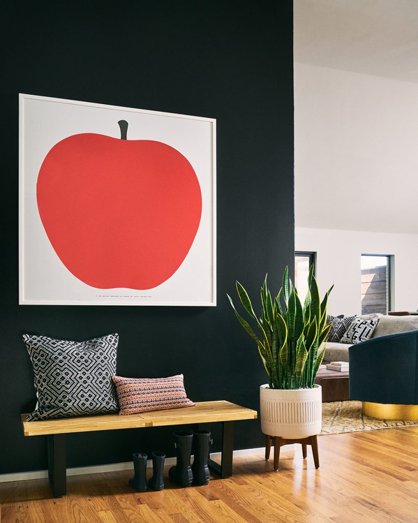
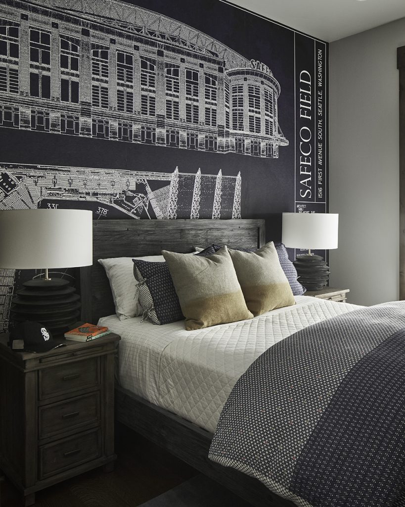
Be Art Smart
Art is a great way to bring dramatic colors into your rooms. Choose pieces that you love, even if the color is bolder than you might normally try. You also might want to select an oversized piece to cover a large wall and make a big statement. Then you can bring in accessories that complement the colors in the art. This is a great way to slowly build up a strong color story in a room!
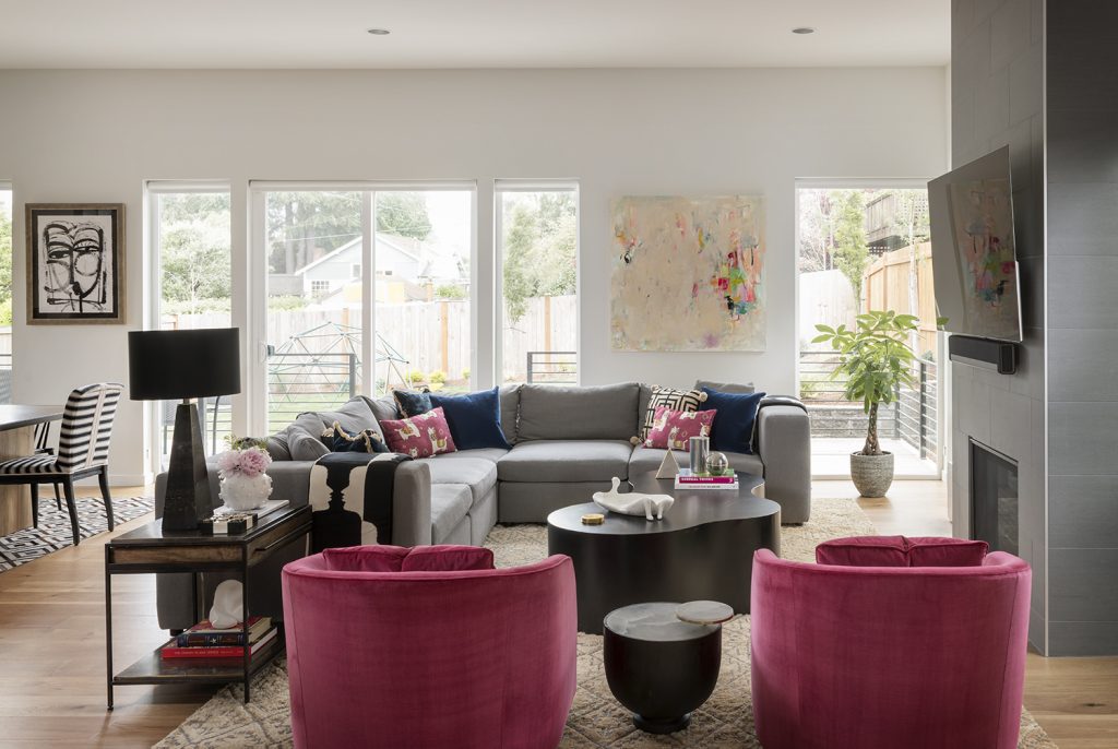
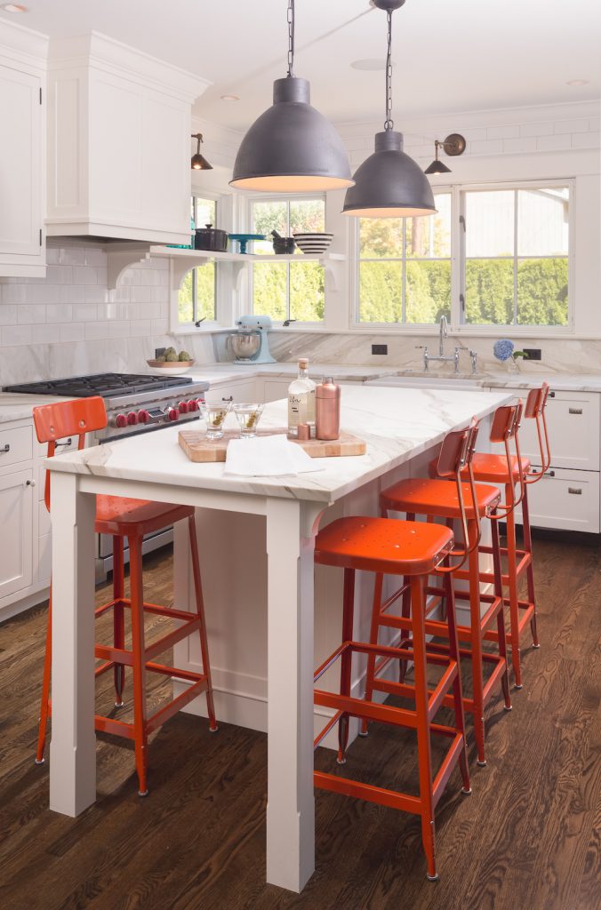
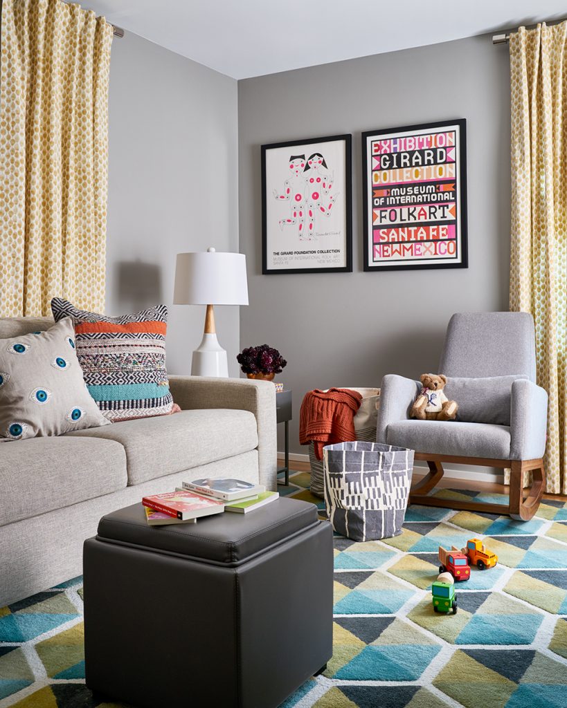
Accent the Positive
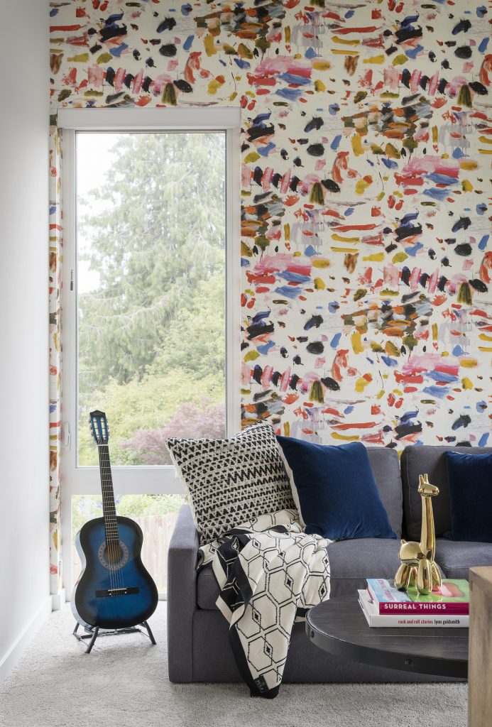
Try accent pieces in super-bright colors as a foray into a bold new world! We loved using these hot pink swivel chairs to brighten an otherwise neutral space. And notice that we also used the same color in pillows and even in book covers. The great thing about using pops of color like this is you can easily switch them out if they don’t work for you. And with a neutral main palette, you can play with the accent colors until you find the perfect one.
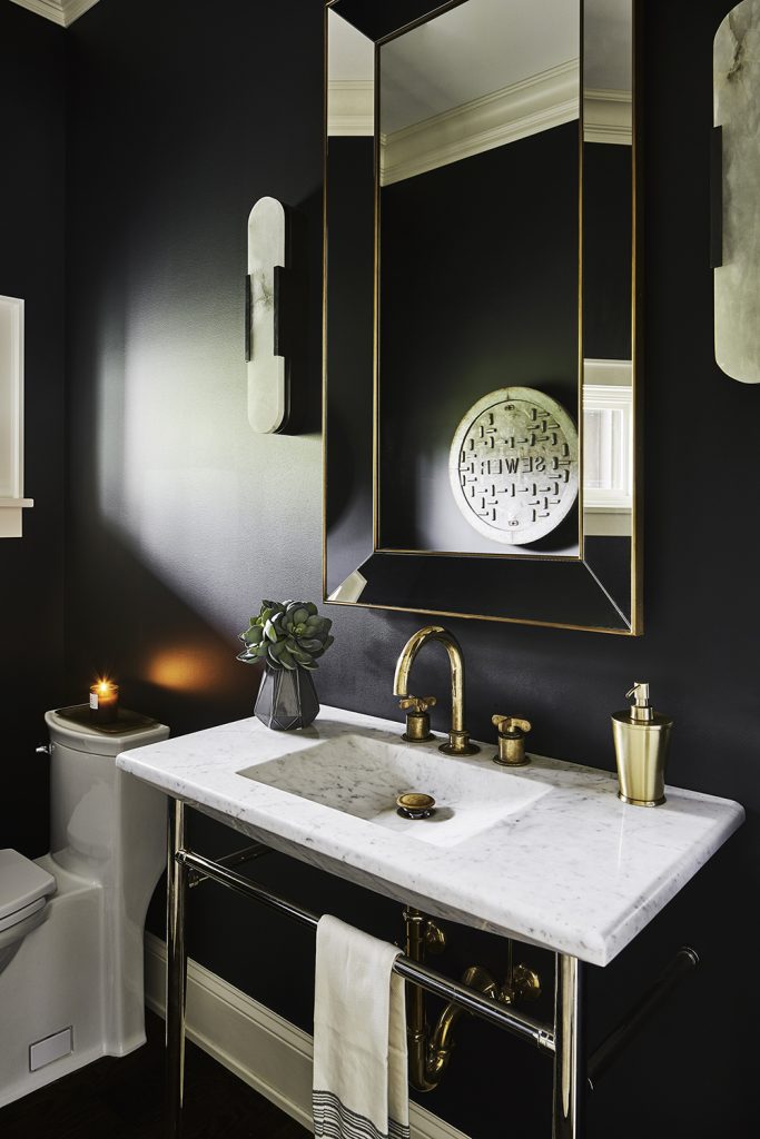
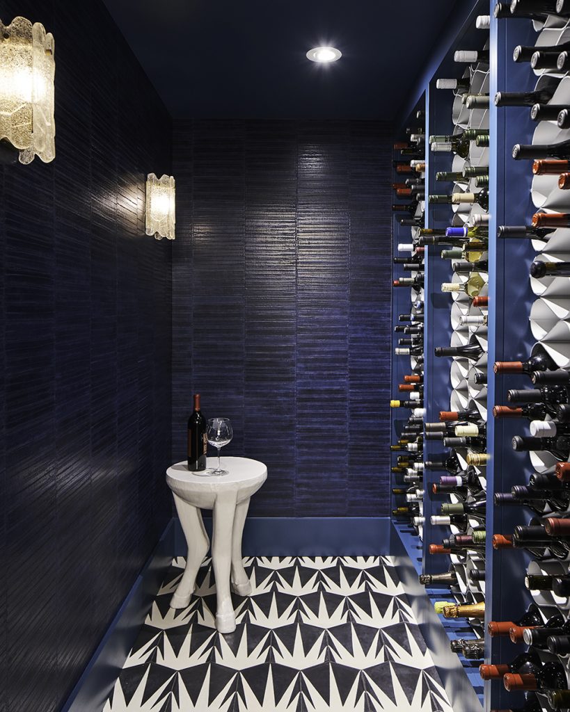
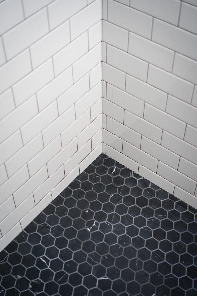
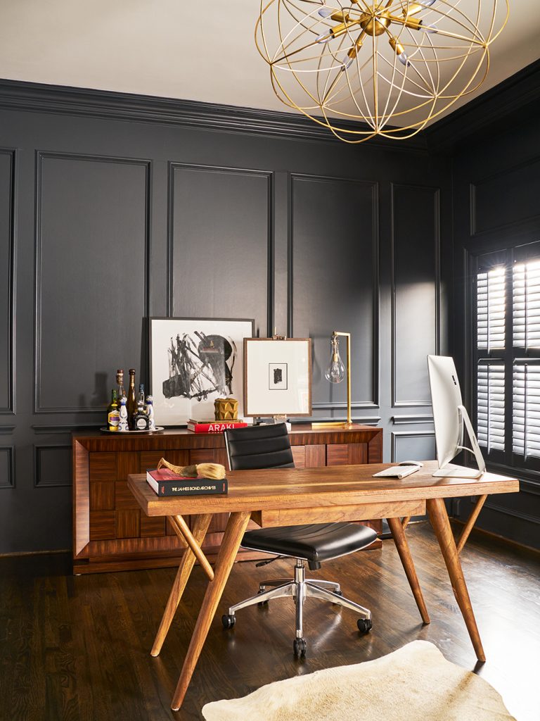
Drench It
We love a monochrome room! That’s a space that is absolutely drenched in one dramatic color, like the black bathroom above. This is a room that your friends and family will talk about – and they’ll marvel at how brave you are. To take this approach, again choose a color that you really like, but don’t go pale and quiet. Think about cobalt blue, bright emerald, sizzling saffron, or deep merlot. Don’t use too many other colors in the room to help you achieve the perfect look.
Try going this bold in the smallest room in your house – the powder room! This is the perfect room to experiment in because you won’t see it all the time. Drama works very well in these little spaces, so really go bold. Remember, paint doesn’t cost a lot, so if you don’t like it, it’s easy to change.
We LOVE to work with bold color and we know how to select the perfect ones for each of our clients. Need help with color and personality in your home? Give us a call!


