All posts by Beth and Carolina

How to Layer Light Like a Pro

Electrical plans aren’t exactly the sexiest thing when it comes to interior design – but it’s so critical to a room’s functionality. The Pulp team likes to layer light into a room so there are lots of options from romantic to insanely bright. But what do we mean by “layering light”? It’s all about giving yourself plenty of choices. Here are our favorite go-to light options.
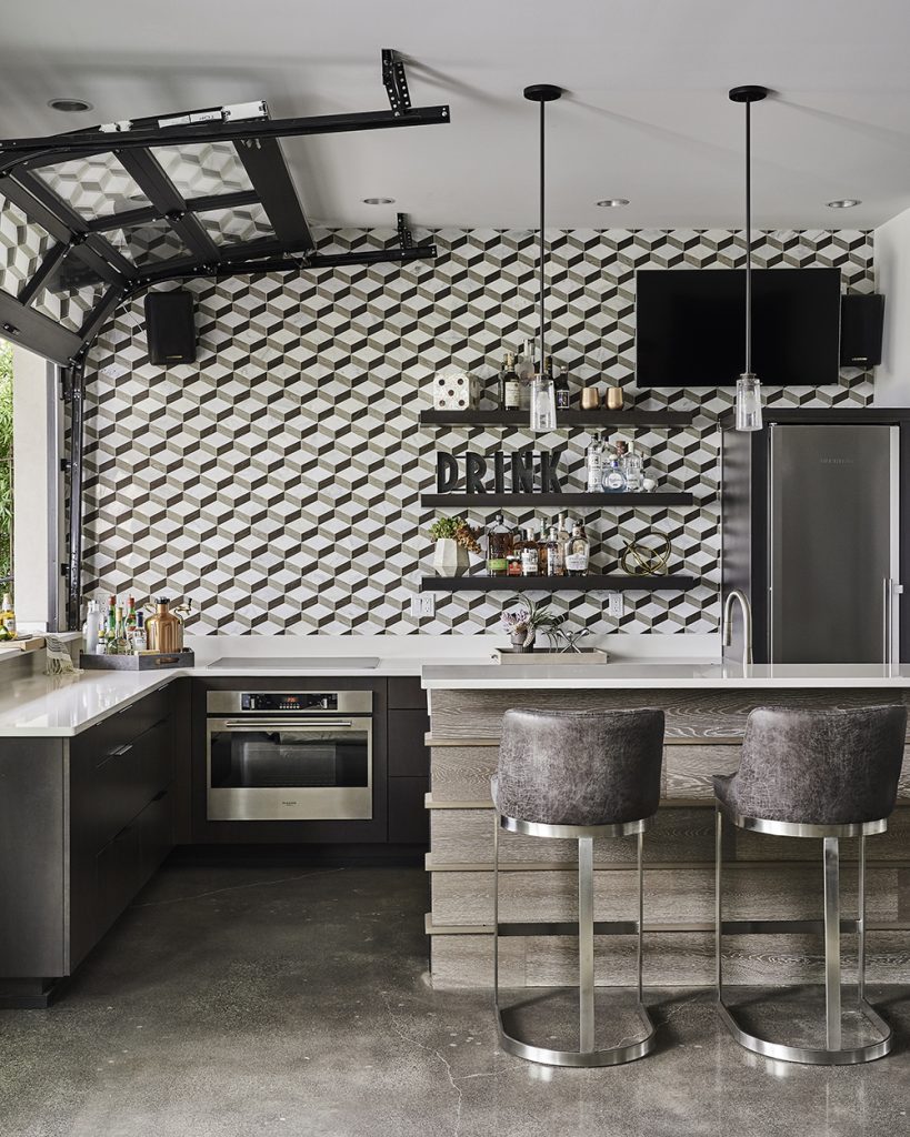
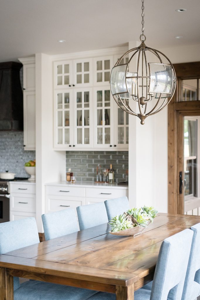
Task Lighting

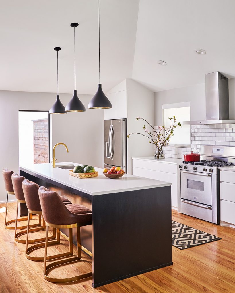
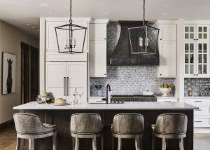
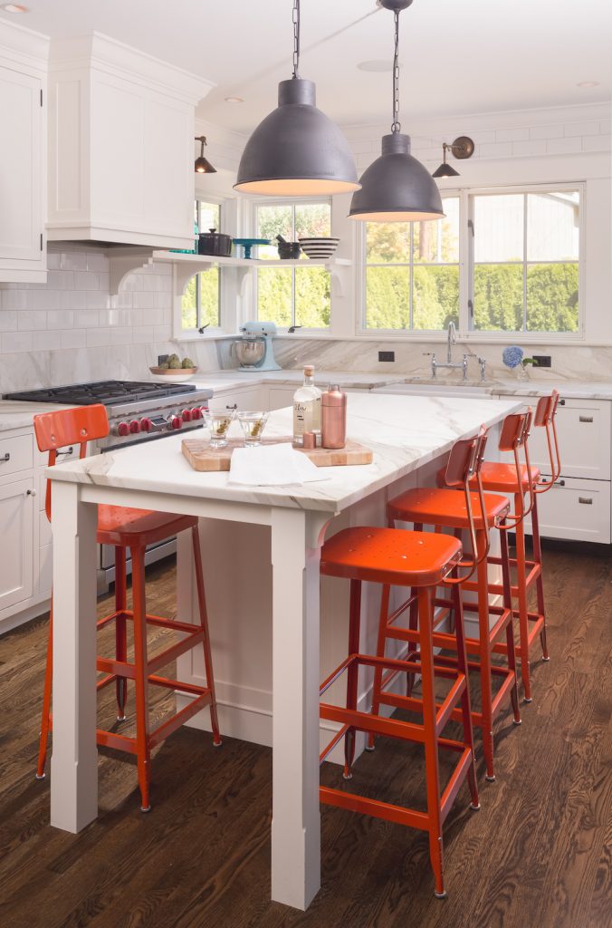
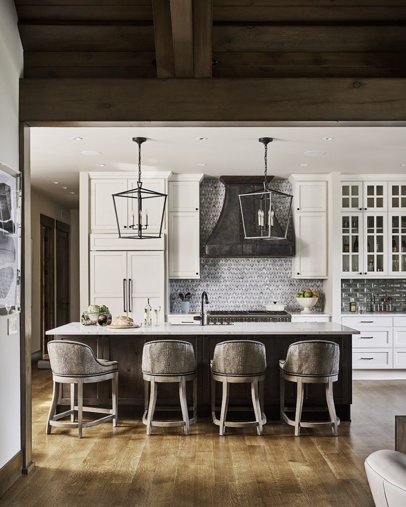
Task lighting is a light source that shines directly on an area where you are working or reading. This is a layer that’s so important in a kitchen. As you can see above, the pendants shine right on the island for meal prep, homework, and more. Task lighting can also be a bright floor lamp with a swing arm that can be positioned over a book or needlework.
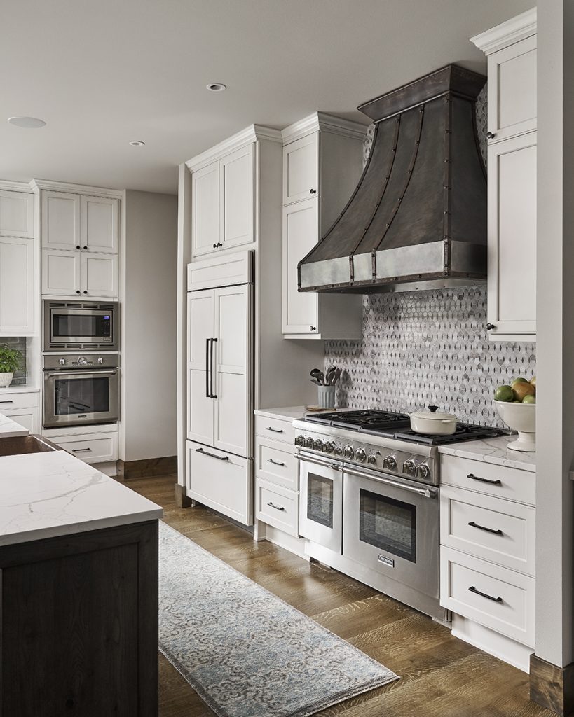
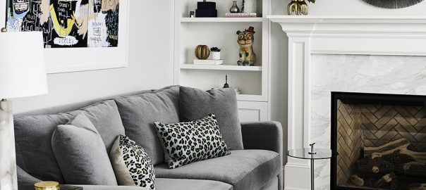
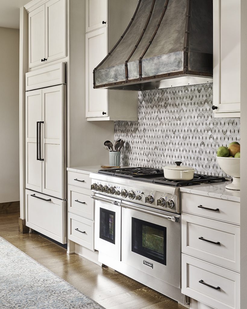
Canned Lights

Canned lights are set flush with the ceiling and give the brightest light, but stay out of sight when they aren’t needed. You usually see these in a kitchen or living area. And this is where an electrical plan is important. With that plan, you are determining where every outlet, USB port, light, and ceiling fan needs to go. So it’s smart to think about where you’ll need the brightest light. Canned lights can also be set on a dimmer, which gives you even more control.
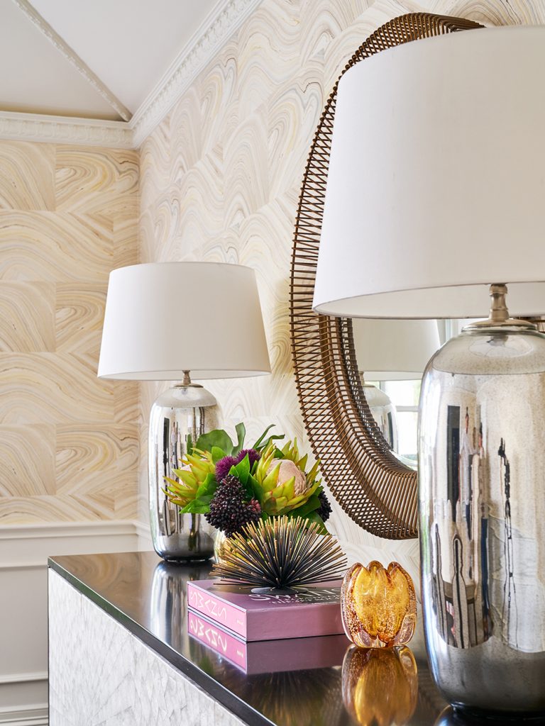
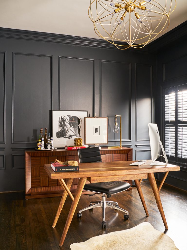
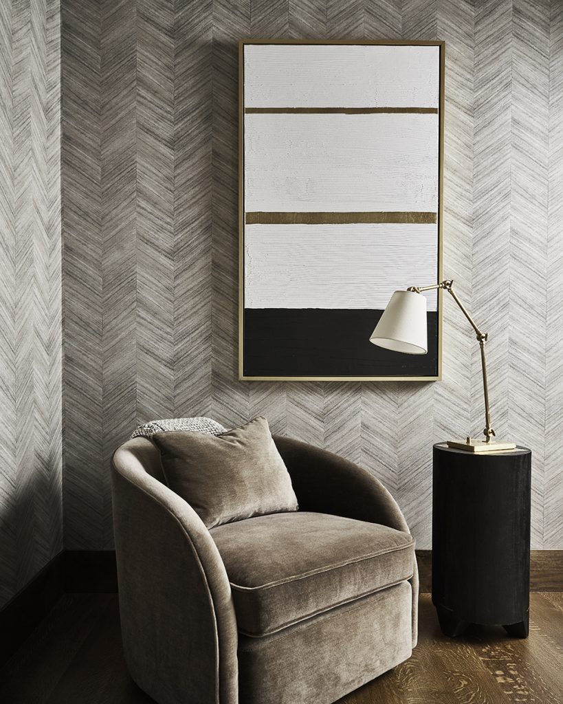
Table Lamps

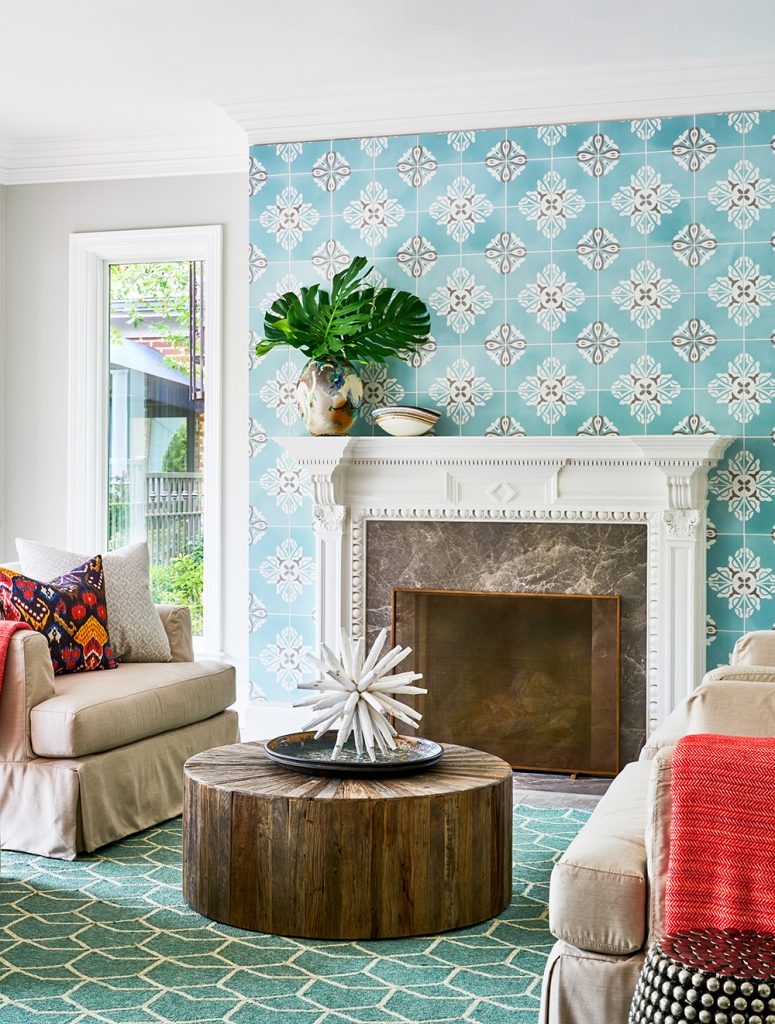
When you want to set a mood, there’s no better light than a table lamp. If it’s burning solo, it softens the room. Add it to another light source and it can really bring the brightness. We love to use table lamps on dining room sideboards like the one above. That gives you the choice of using the overhead light (usually a chandelier) or just the table lamps to set a mood.
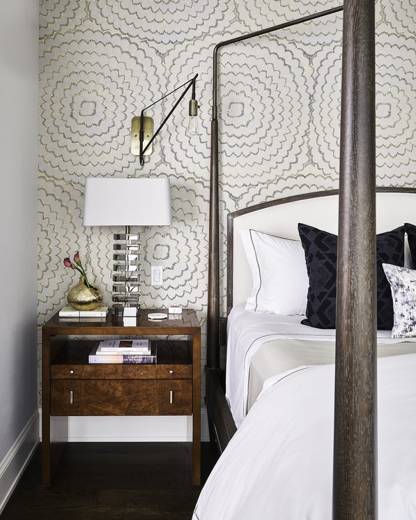
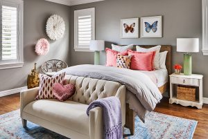
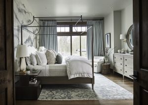
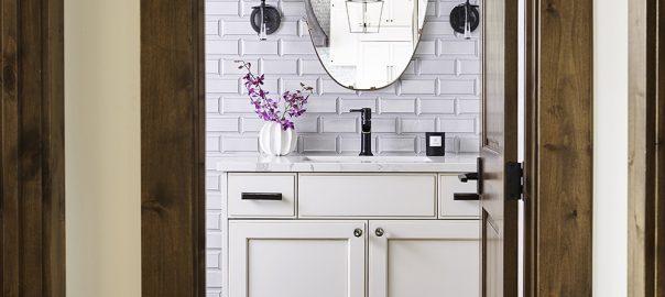
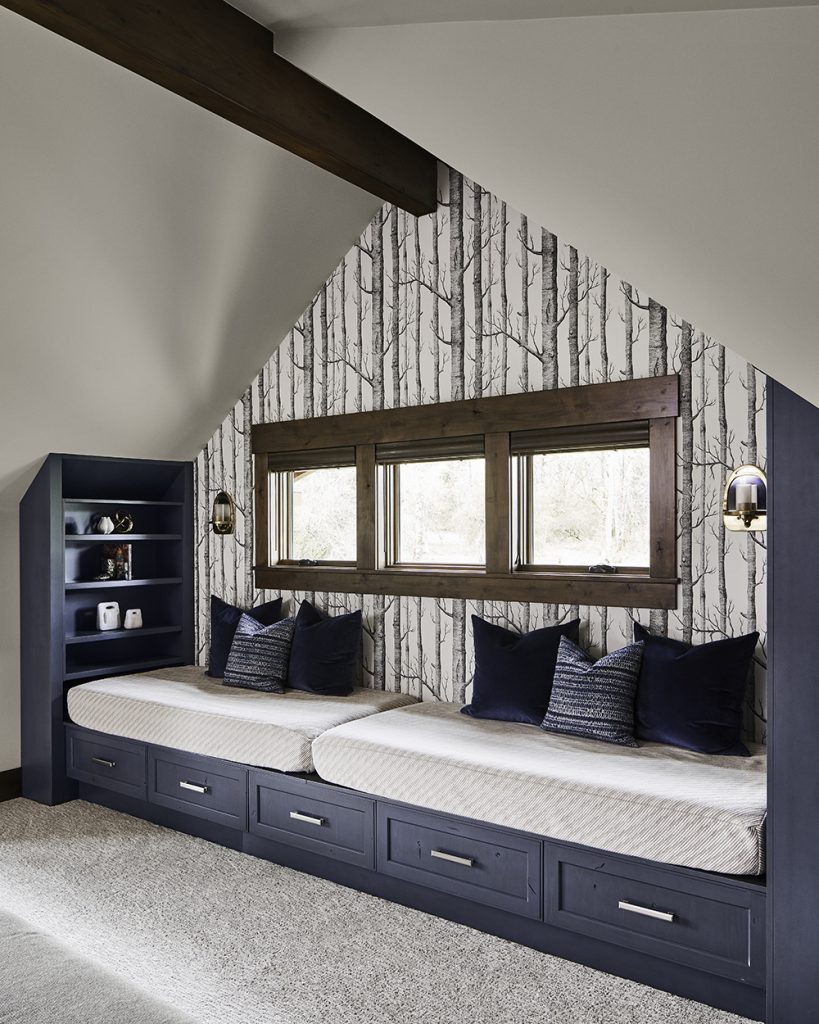
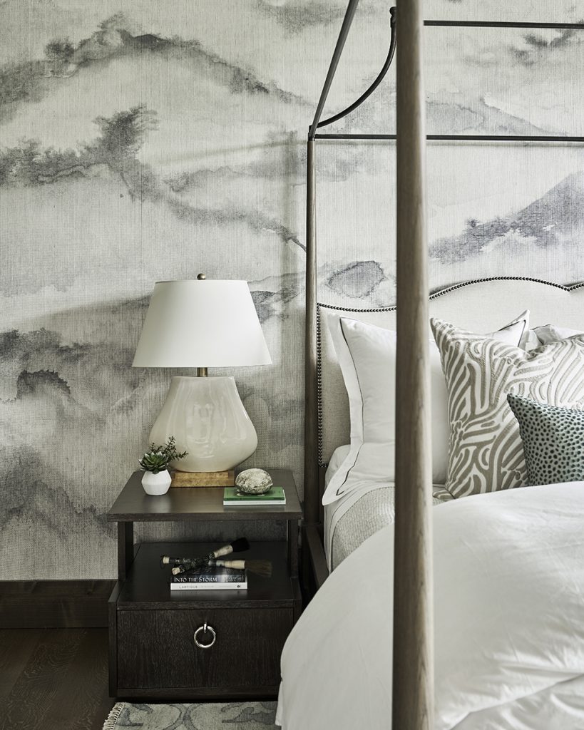
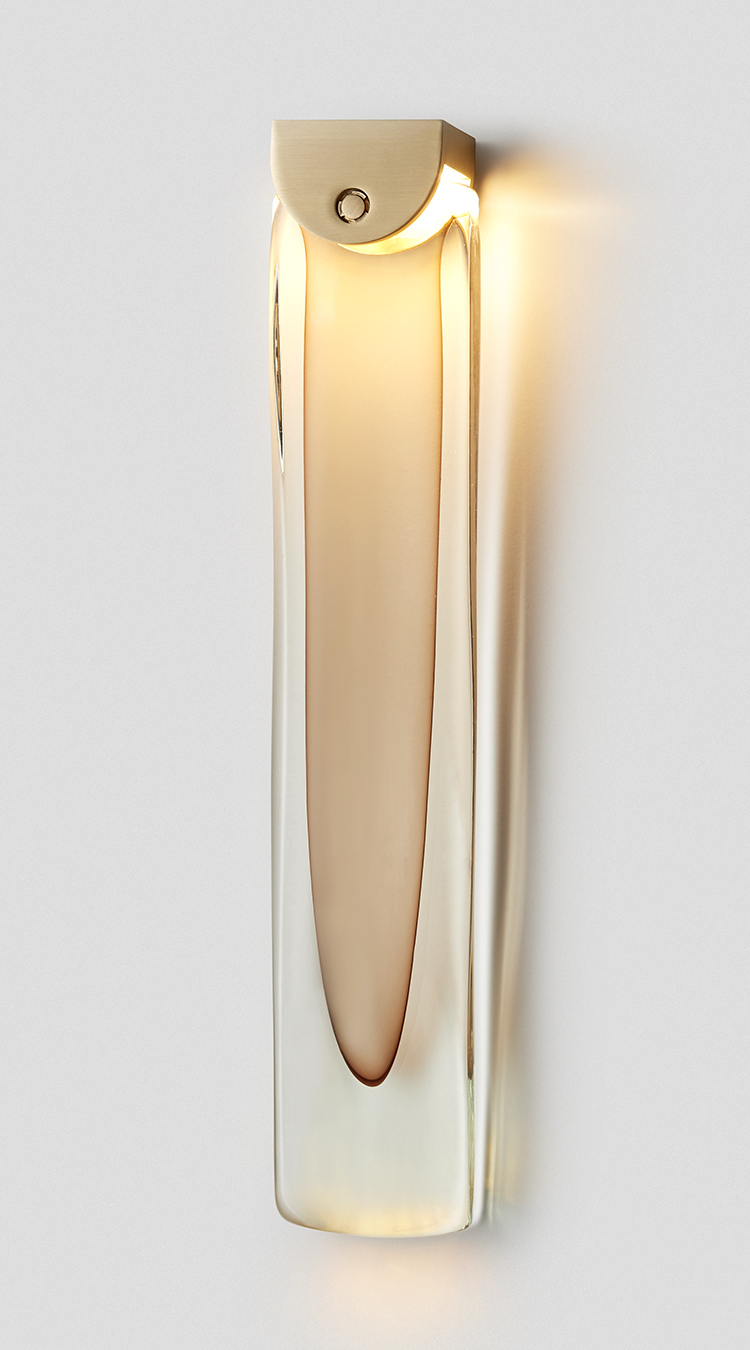
Bedside Lighting

The photo above really showcases layered lighting. The table lamp is great for lighting the room, but that wall-mounted reading light will put the light directly on a book for our client who loves to read in bed. As you can see, the more light options, the better!
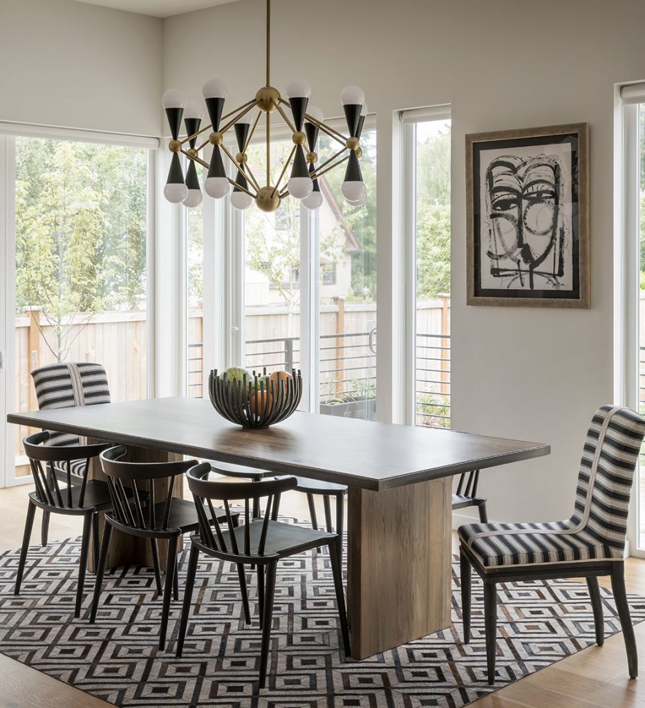
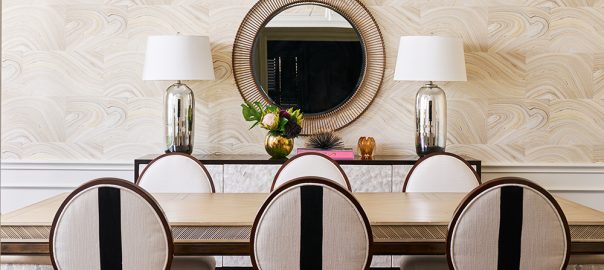
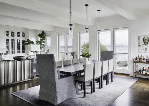
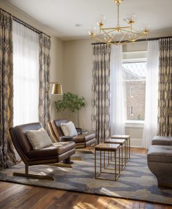
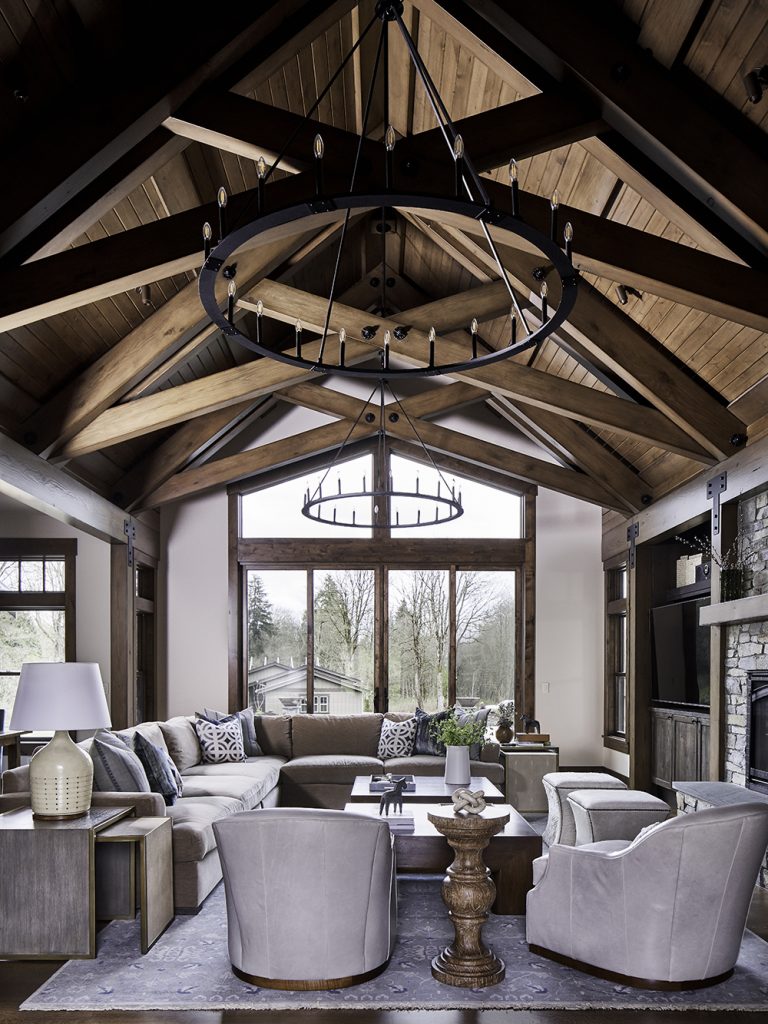
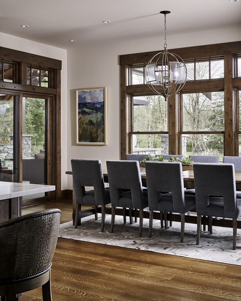
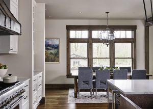
Statement Lighting

Whether it’s a chandelier, a flush-mount design, or a pendant, a statement light fixture serves a dual purpose. Of course it should be functional and provide great light. But it also can be a gorgeous sculptural moment that wows. We love the one above – it gives our clients a real moment of drama in this dining area. And we also added a dimmer to give it even more functionality.

Need help with that all-important lighting plan? We definitely can create that for you as part of our full-service design! Contact us by clicking here.

Founders’ Five: 10 Things on Our Wish Lists

When the weather gets cooler, we want to get cozier! We’re obsessed with health + wellness, warm knits, skin care and more. Take a look…

Health + Wellness Faves

BETH’S PICKS

We recently put these boxes from Global Views in a project and now I’m ordering one for me!

I’ve had this Henley bodysuit from Goop on my list for a couple of years and I’m finally going to order this investment basic.

I’ve been doing lots of backyard happy hours, at a distance. I love giving everyone their individual setup like this one from Crate & Barrel. 

I love this tea-colored sconce with brass accents from Articolo Lighting. It’s modern, with a hint of femininity.

After our managing director, Tracy, recommended this personal microdermabrasion device from PMD, I’ve been using it once a week… A skin saver!

CAROLINA’S PICKS

These salts from Jennifer Fisher are sure to kick up any dish you create!

Everything I have made out of this Cook Beautiful book has been delicious. Makes for a great gift too!

This Omega Juicer is the most amazing juicer and it makes nut milks, baby food and nut butters!

The Cuyana Throw is cozy cape that can dress up some athleisure or used to cozy up on a sofa at home.

Just like a silk pillow on your face, the Hope Silk Mask from Ravella is extremely comfortable and chic.

This article originally appeared in our latest issue of ICON! Subscribe to early access to fabulous content like this – just click here

5 Ways to Use Black in Your Home

There is a fear factor about using color in the home, especially bold color. But there’s one that people fear the most, and that’s black. It seems too mysterious and daring for some, but the Pulp team loves using black in the interiors we design. It’s a cozy color and it evokes a sense of power and calm, including a grounding feeling. Here are 5 ways to use black in your home, from a whisper to a WOW!

1. Use It to Accessorize

This is the easiest way to try touches of black in your home. Whether it’s a pillow, lamp, or piece of art, you can introduce this dark color in a way that’s easy to change. But trust us, your eye will be drawn to the bold look! And if you love the fabrics you see above, you can have them in your own home! They’re part of our collection with S.Harris Home – just click here to see them all.

2. Take It to the Floor

If you’re feeling a little braver, consider hitting the floor with this dramatic hue in a rug or carpet. The color will anchor the room and add a lot of personality. And think about using a pattern with black in the background in a rug or in the accessories. That helps you feel more confident about using this color since it isn’t just an all-black look.

3. Try It in Tile

Tile is another great way to add bold black to a room. We used smaller penny tile in the bathroom above, with a grey grout to really define the shape. Want to go bigger? Use black tile on a backsplash in the bathroom, or behind the range in the kitchen!

4. Accent the Positive

Okay, are you ready to take it up a notch? Try painting an accent wall with a deep black, like Sherwin-Williams Tricorn. This is one of our favorite blacks, and it’s the perfect background for our client’s art in the photo above. Using it just on one wall, or in an entry like we did in that photo, will add interest but won’t be overwhelming for anyone who is nervous about the color.

5. Drench the Room

This is the bold and beautiful way to use black! Rather than being too dark or overbearing, painting your walls black actually creates a cozy and quiet space. It definitely is a grounding color and we love how it creates a sense of calm in the office we designed above.

Now how do you feel about using black in your home? The key is to experiment and find the right place and hue for you. Need help? Give us a call!

5 Tips for the Perfect Kids’ Spaces

Kids’ rooms have always been important in homes, but they haven’t always been top-of-mind for designed spaces. Whether it’s a playroom or a bedroom, creating a great space for the littles in your life is critical today. These areas have to function for school days, play time, rest and relaxation, and so much more. Here are 5 tips that will help you support what your children, and you, need at home.

modern eclectic design, unique furniture, where to get furniture, seattle modern home, seattle home ideas, seattle interior design, seattle interior design ideas, playroom ideas, music room ideas, splatter paint wallcovering, splatter paint wallpaper, art room ideas, how to style a guitar

1. Make It Worry Free

Use performance fabrics or treated materials to keep stains and spills down to a minimum. That way they can play and you don’t have to worry! The music room above has a painterly wallpaper designed to inspire the young artist who lives there. We gave the room plenty of functionality, as well as worry-free fabrics, so the family loves hanging out here together.

2. Make It Fun

Add a sense of fun and wonder to spaces. Let them reflect what your child loves. If they are into dinosaurs, then use a whimsical dino print on the walls or bedding. Teens definitely do not want to have spaces that make it look like they’re kids, but they do want them to still reflect who they are. In the space above, we added great mural of a baseball stadium for a major sports fan. Still fun, but more grown-up.

3. Tech Talk

Everyone needs tech for school and play today, so be sure you have good WiFi, lots of USB plugs, and great lighting to protect those eyes. Consider boosting your internet plan if there are a lot of you at home during the day now. For older kids and teens, give them a space that’s ready to work as hard as they do. In the room we designed above, there is a ton of storage, and a more hip vibe that will look fab on Zoom.

4. Perfect Palettes

Keep your child’s favorite colors in mind. We always ask our clients’ kids what they would prefer. It makes their rooms feel like they’re made just for them. Go bold and bright in play and work spaces, but keep things quiet in bedrooms to help quiet their minds. For example, the patterned rug in the room above becomes a raceway or a building zone when the toys come out. Color inspires imagination!

5. Grow Up

Remember that teens also want spaces that are their very own. In fact, privacy is more important to them at this stage of their life than almost any other. So give them a sense of style and “cool” in their rooms.

For more inspiring kids rooms, see our portfolio. And give us a call for help creating work and play spaces in your home!

The Most Calming Color Palettes

Home is a haven for us more than ever before. Really, it’s our refuge against all the craziness happening out in the world. To make the most of your oasis, use these colors to create serene rooms that will destress your family and help you stay cool, calm, and collected.

ICY BLUE

In color psychology, a grayed blue creates a feeling of harmony, peace, and calm in people who view it. Mix in a quiet gray color and you have an icy combo that will chill any bad vibes.

GRAPHITE

Gray symbolizes neutrality and balance – and it’s a color that everyone loves. This mid-gray creates a seamless sightline from the room to the lake beyond, designed to soothe away our clients’ cares.

LINEN

Shades of white gives us a feeling of softness and tranquility – perfect for a family room that doubles as a family oasis. Color psychology also shows that this color makes us think of innocence and sincerity, so it’s great hue for making you feel better about the world.

OCEAN

The perfect mixture of blue and green, this color evokes the sea and the sky. Being near water is proven to lower blood pressure, so creating this “watery” mood was our way of bring that outdoor setting inside.

Nod to Nautical Family Home in Queen Anne, Seattle, WA 98119, Modern Family Home, Traditional Meets Modern Interior Design, Elegant and Textural Living Room Design, Modern Home Decor, Modern Leather Arm Lounge Chairs, Brass Globe Lighting Pendant, Graphic Rug, Unique and Well-Style Storage Ottomans, Formal Living Room Design, Interior Design Seattle, Geometric Window Panels, Vibrant Velvet Sofa, Teal Sofa, Modern Art, Rich and Edgy Living Room, Credenza Styling, Round Coffee Table, Coffee Table Accessories, Geometric Throw Pillows

CAROB

Brown is an earthy color that represents security, comfort, and a down-to-earth quality. Creating a room around this color helps it become cozy and almost intimate – the perfect hideaway from the world.

DAFFODIL

In color psychology, yellow speaks to optimism, happiness, and positivity – and couldn’t we all use more of that? Using pale yellow in a room is almost guaranteed to make you smile, so we added this uplifting color to our client’s family room to keep their spirits high.

Need to create an oasis in your home? Contact us for a free consulting call here!

The Pulp Edit: Tranquil Journey

Calming Home Decor

We’re ready to sail on a stormless sea, to take a tranquil journey that will calm and soothe. Here are the colors and looks that will make that fantasy a serene reality at home.

Bauer is a breath of fresh air from Bridget Beari, a color that is gray, green, and even the palest of blue – all depending on the light.

Gentle waves of ivory and gold create a luxuriously serene scene in Onde – taken from an early 20th century textile designed by Mariono Fortuny.

Creating harmony in gentle paths is the Good Vibrations pattern from Perennials. It’s a movement toward inner peace.

This serene wallcovering from Holly Hunt offers texture and dimension in a restful Pebble pattern of taupes and sands.

Bathroom designs are in the top 3 most-requested renovations today. Here’s a look at some of the very best from Architectural Digest.

Artist Amy Opsal creates stunning works that are both thought-provoking and soothing. They will spark quiet contemplation in your home.

Schumacher’s Sozan Velvet was inspired by an ancient Chinese drawing of billowing clouds, providing the perfect perch for a quiet slumber.

The organic design of this tub from Claybrooke is ready to gently cradle you and wash away stress.

The warm tones of natural wood, like this burl look from Worlds Away, bring the outdoors into the home, helping to create calm.

Can stone be called ‘soft’? When it comes in hushed tones like this terrazzo, it definitely can. The pattern is Venezia Terrazzo White from Artistic Tile.

The 4 Projects Everyone Is Asking For

Our homes have become so much more in the last few months. We’re using them in ways that we never thought we would, like as schoolrooms, theaters, restaurants, getaways, and sanctuaries. Home improvement, redesign, and remodeling projects are up by an incredible 60% to help our homes function for all the ways we use them now. Here are the four projects that everyone is asking us for today!

The Kitchen

This is the room that’s probably getting the biggest workout now. We’ve always considered the kitchen to be the heart of the home, but now it’s command central for the family, too. If you’re spending more time cooking and less time eating out, you’ve probably noticed a lot of things you’d like to change. And that is exactly why this room is #1 when it comes to requests for remodels!

Outdoor Spaces

Travel is on hold for the foreseeable future, but we all still need a great place to unwind. So backyard projects are exploding in popularity, particularly for living spaces, pools, and kitchens. Landscaping and outdoor rooms also have a very high-return on investment, boosting resale values by almost double what you spend!

Home Office

Everyone is working in the home now, from the youngest to the oldest, so having plenty of work and study areas is key. Mom may need a dedicated office, while the kids need desk space in their rooms. However you configure it, these spaces are critical to getting things done and to help reduce stress in the home.

Bathrooms

Who knew we could wash our hands so many times in a day – but that’s our new normal. Bathroom remodels come in two main areas. Some people want a gorgeous spa-like sanctuary that helps them escape, while others are looking for better clean-up stations. Either way, this room is getting more attention than ever before!

For tips on decor for each of these rooms, be sure to see our new issue of ICON. It has ideas for calming colors, great ways to include wellness in your home, and so much more.

Pulp Design Studios specializes in remodels and design projects that support you and your family. To start on any of these home projects, set up a consult call with us by clicking here!

Our 4 Go-To White Paint Colors

Choosing a white paint color sounds so simple. But it’s the one thing people ask us about most! White paint is rarely ever perfectly white. There are a lot of undertones that a white paint can have, like gray, yellow, pink, blue, and even green. Any color next to a white with undertones is going to either complement it, or make it look like an entirely different color! And then different light – natural, yellow bulbs, clear bulbs, etc. – can change it again. Here are our 4 top picks for white paints, and why!

Sherwin-Williams Moderne

In the home above, we chose Moderne from Sherwin-Williams because it is a lovely white that has a gray undertone. As you can see, it really works with the grays in the painting and the marble on the antique chest. This is also a very contemporary home with a lot of color in the accessories and art, so we wanted to provide a neutral palette that would support other colors well.

Sherwin-Williams Pure White

In this office, we used Sherwin-Williams Pure White because it’s a great crisp look. It isn’t too bright and reflective, but it also isn’t too creamy and warm, either. One key to getting exactly the right white is to paint a sample in a room and then look at it in all sorts of light. Natural light can change it, even from morning to evening. And different bulbs in lighting can also make it look like another color entirely.

Benjamin Moore Mascarpone

Mascarpone is a creamier shade of white with a yellow undertone, so it works really well in a kitchen. You can see above in the kitchen we designed that it doesn’t look quite as creamy in the photo – that’s due to the lights the photographer used. We told you that whites can change in different lights! But the reason we chose this particular color was because we wanted it to give the kitchen a more traditional look, and we wanted a shade that works well with the orange stools and the wood. A bright white would have been too stark.

Traditional Home Dallas Showhouse, Bridget Beari Wallcovering, Buscemi wall covering, tina turner art, geometric railing, chaise lounger, s. harris brushstroke, double volume entry, modern staircase, entryway, circa lighting, gold chandelier, green and gold lamp, easel, Jonathan Adler easel, coffee table books, tom ford book, harpers bazaar book, credenza, dark credenza, black credenza, circle accent furniture, bowl, s. harris, drapery, curtains , gold lighting, gold chandelier, colorful rug, the rug company, original art, human form art

Behr Nano White

Believe it or not, this white has a little bit of a blue undertone, and that makes it a nice sharp white without being too glaring. Nano White is great as a supporting player to bold, bright palettes. And it really plays well with black, making it look like a perfectly tailored pair!

Use these go-to whites to start your search for the perfect one in your home. But again, be sure you sample the paint and watch the light in each room! Good luck!

Family Time

Formal living rooms are rarely seen anymore in today’s homes as people get smarter about how they want to use the spaces they have. One of the most requested rooms for Pulp is the “family room,” which can mean a TV room, game room, great room, and more! Most importantly, these rooms need to entertain the family living in them. Here are some of our best family room designs, with ideas for you to try in your own homes.

Make It THE Hang-Out Space

Our families are going to be spending much more time inside our homes as the weather gets cooler. So be sure your family space has things that will make your crew want to hang out. That includes nearby snack stations, like beverage refrigerators, food storage, and maybe even a microwave. And of course they need lots of comfy seating!

Make Room

A sectional is great for a family room because you can squeeze a lot of kids onto it. We also like to have extra seats in the room, like those ottomans. You can either pull them out to sit on, or use them to prop your feet!

Let’s Talk Tech

If there was ever a time to upgrade your TV, game system, and WiFi…this is it! We probably still won’t be going to movie theaters or other entertainment venues this winter, so do yourself a favor and be sure you have what you need to keep everyone entertained. And if you’re planning to still work from home while the kids do their online schoolwork, get the fastest internet bandwidth you can afford. You can thank us later!

Think About the Grownups

The grownups need their own spaces, too! Adding a home bar to the family room is a great way to make you feel like you’re out on the town at your favorite cocktail club. We also added a TV to this room, so the person preparing the drinks and apps doesn’t miss out on the latest binge-a-thon.

Make a Move

We like to use swivel chairs in family rooms. They’re perfect for watching TV and then moving around to talk to the other people in the room. Kids also love them, just because they twirl around. Kidding – not kidding. Speaking of kids and furniture…we also recommend performance fabrics in family rooms. Then you don’t have to worry about spills, dirty shoes, or pets.

Keep It Cozy

Have plenty of pillows and throws nearby – they’re perfect for creating a cozy mood. You can find our exclusive Pulp throw (seen at the edge of this sofa) and the fabric on these pillows on our Pulp shop. Just click here.

Remember that your rooms need to function for you and your family. That means they can BE anything that you want. There’s no rule that says a formal living room has to stay a formal living room. Let your imagination run wild! Or call us and we’ll help you design the room of your dreams!

Home Tour: The Perfect Blend

To create the perfect blend, you have to use a deft hand, have plenty of expertise, and be able to achieve balance. And that’s exactly why these clients, owners of a well-known whisky distillery, came to Pulp Design Studios! They had two very different design ideas, but wanted to bring them together in their ground-up design build project located in the Seattle-area wine country. We were excited by the challenge and thrilled to deliver a house our clients absolutely loved! Let’s take a tour…

Q: What two styles did your clients gravitate to?

He was drawn to an Acadia lodge style that reflected the mountains around this country locale. And she wanted a more refined transitional look that would be the perfect backdrop for entertaining friends and family.

Q: How did you bring those two styles together?

We designed an open-plan interior with warm woods and gorgeous views of the outdoors, combined with modern touches and more complex details. The wood trim, beams, and some of the design details were definitely more of his lodge style. But we added modern shapes and furnishings to showcase her more refined style.

Q: Was there one design idea that the clients agreed on?

Absolutely – they love to entertain, so they wanted great spaces that would support that. Each room flows into the next, and for summer soirees the glass doors open to the pool area for seamless indoor-outdoor living.

Q: What is the clients’ favorite space?

It’s actually a space that they hadn’t planned for at all! The home’s upstairs attic area was originally planned to be unused space. But the Pulp team developed the idea for a media room with a built-in bar. Now it’s one of the family’s favorite spaces.

Q: What is your favorite room?

We love the master bedroom – it’s such a serene and calm space. The colors and that fabulous Phillip Jeffries wallpaper give the feeling of being among the clouds!

Q: All of the bedrooms have personality! How did you achieve that?

We wanted to give each family member a space that really spoke to them and what they love. So you’ll see a custom wallcovering that showcases a baseball stadium, for example. In a family home, everyone needs a place to work and play, too, so the home office was also another critical room for showcasing that personality!

Q: The wood finishes in the home are gorgeous – how did you get that rich, warm look?

That was a very complex staining process. It required many steps to get it exactly the way we wanted it!

Take the full tour of this Seattle project here, or read about it in ICON magazine!